Landscape Architecture for Landscape Architects › Forums › GENERAL DISCUSSION › Is it just me… or do we need to rethink our illustrative quality of figures in the landscape?
- This topic has 1 reply, 17 voices, and was last updated 14 years, 9 months ago by
 Ben Yahr.
-
AuthorPosts
-
July 19, 2011 at 1:51 am #173325
 Frank VarroParticipant
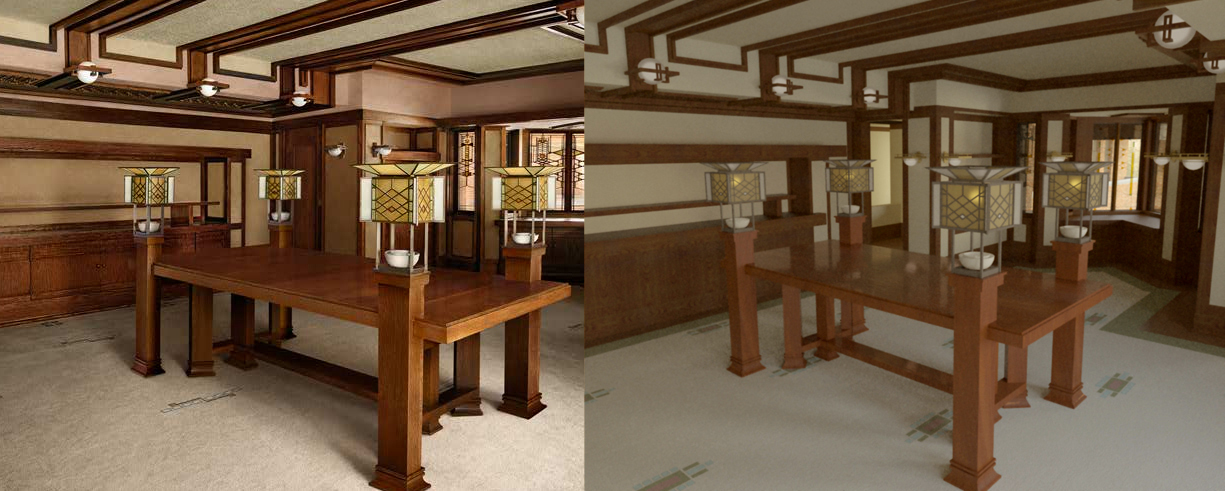
I think its in part due to the fact that as programs get better, people find themselves falling into the “uncanny valley”, where things looks ALMOST photorealistic, but just enough not real to REALLY throw people off. That means to get a good looking photorealistic rendering more work has to be done on the front end with good materials, and with powerful Rendering rigs. Of you could use it to get you images that look similar to hand renderings, but with easier edits (just move that tree over there and take another print-screen), and view-changes (just rotate the camera up). I think there are almost 3 types of perspective renders at this point: hand, hand/PC hybrid, and photorealistic PC. I have to say, I find it helpful when doing a perspective by hand to block it out in sketchup quickly, and then trace over it. I could go through and set up my vanishing point, and get similar results, but its easier to make a quick model, and then use that for every view. However, If I’m going to have something rendered straight off the PC, no hand involved, I prefer to go all out and go photo realistic. It takes more time, but once the model is made, you have infinite views, and the ability to animate a walk-through.
This is a rendering of Robie house that I am adding furniture to right now, next to an actual photo. Its not as quick as a hand rendering would be, but I think they both have their own benefits.
 July 19, 2011 at 3:02 am #173324
 Andrew Garulay, RLAParticipant
I am anything but a graphic guru, but one thing that I have come to believe is the possibilty that the more impressive the computer graphic is, the more people separate the design from the designer. They seem to think that the computer did it and the designer is just operating it. The last thing that I want is to have clients disconnect me from the design.
I’m all about selling “me” rather than my paper products. Perhaps it is because I don’t have much to offer in the way of graphics that pushed me to concentrate on verbal communication. I have a very high closing rate on design sales for one reason or another. I’m very certain that I am not dazzling prospects with graphic style (accurate and detailed plans, but only black & white line work and stock plant blocks).
I have a very hard time believing that the use of a font, the style of people drawn, or photo-realism is going to sell more design. If selling design is not the point of improving the nuances of graphic design in landscape architecture, then what is compelling reason to do so? I honestly think that we dwell on this far more amongst ourselves than our clients ever do.
July 19, 2011 at 3:28 am #173323 earthworkerParticipant
Here’s my three cents on hand vs. computer illustrations. It is my observation that there are a few reasons why we are drawn to hand sketches versus computer graphics. For one, a good hand drawn perspective represents the ‘field of view’ that your eye sees normally. A computer perspective has finite fields of view. They restrict the viewing angles that your eye is used to. Also, unless you are using advanced 3d comp graphics, the comp rendering does not convey a sense of foreground, middle ground and background. Items in the background are just as crisp as the foreground in a comp illustration.
A hand sketch sharpens the detail around those elements of the drawing that are important. This is how we perceive the world naturally. When it comes to color, hand colored perspectives may be not be photo realistic, but are accurate in the way we perceive color. Hand colored perspectives tend to fade color out to the edges. This mimics the way our eyes see the world; less detail and less color at our peripheral field of view.
Sorry to get bogged down in such detail. I just happened to remember these observations as my biology class and drawing-the-landscape class were in the same semester when I was in college.
BTW-any technique is the right technique if it gets the point across and is profitable.
July 19, 2011 at 1:01 pm #173322 David BarbarashParticipant
BTW-any technique is the right technique if it gets the point across and is profitable.
I couldn’t agree more with this statement.
Even though I tend to use 3ds Max for my 3D work, and I like the physical cameras for rendering (to provide realistic viewing angles, horizontal compression, and focus), I tend to render to elements (each component layer separate i.e. trees, buildings, ground, etc) and use a series of blur effects to simulate depth of field. Sure the physical camera in Max can do it for me, but the cost in render time is usually prohibitive for all but the hardest to Photoshop DoF effects. Plus using this render to elements workflow, it’s easy to desaturate, fade, or distort specific image components towards the edges of a drawing to provide focus on the important parts of an image.
July 19, 2011 at 1:06 pm #173321 David BarbarashParticipant
While a certain level of personality has gone into gaining work at places I’ve been, more often than not, it’s the design that sells a project, and the graphics that sell the design. This has been true for both public and private contracts that I’ve worked on, though mostly for first time clients in the private realm. once a relationship is established, if they like your work, you could submit crayon on napkin to them and they’d be happy with it.
For me, the more “impressive graphics” as you say are for specific situations. it isn’t usually in budget to produce these photo-real renderings (or professionally hand rendered for that matter) unless the client wants to use them for marketing or advertising purposes. having a stocked component library of past works can help reduce the costs of producing photo-real images over time, but computer down time is still an issue to be dealt with.
July 19, 2011 at 5:26 pm #173320Anonymous
InactiveI see my portfolio as a glorified brochure. During initial meetings with developers, architects, etc., I don’t even take it out until their pretty much sold on me already. Half the time it stays zipped because I feel it’s getting in the way of me connecting with the prospect. It makes it harder to sell when you’re focused on impressing people you’re your graphic and design wizardry. My mind set with my potential clients (and clients) is – of course I do good work. That should be a given. Let’s focus on you and your needs. I’m not the star you are.
July 19, 2011 at 5:35 pm #173319Anonymous
Inactive“I have a very hard time believing that the use of a font, the style of people drawn, or photo-realism is going to sell more design.”
Amen to that Andrew! The decision makers in development and construction are not going to be wowed by glossy photo-realistic images. They see them all the time; most of the time when they see a slick production they become even more suspicious about the design you’re presenting. I have no problem with the photo-realistic stuff. I see it as another way for a designer to communicate and a great marketing tool for developers. But if a client is on a limited budget and has to choose between paying me to produce photo-realistic images versus paying me to spend time selecting materials and on site, I would always recommend the later.
It takes a decade or so to become a good landscape architect. There’s so much knowledge that needs to be accumulated. It just seems silly to me to focus on something that means absolutely nothing once a project is built. First it was fonts and now we’re talking about the quality of drawn figures. I’m starting to think that the reason I’m seeing so many crappy built projects is because some LAs have become computer graphic specialist. Time that should be spent improving a design or starting over for something better is lost to creating imaginary worlds that people will never inhabit.
Please people put your creative energy into what’s going to be built. Find a good professional graphic style and work with it. Spend your time learning how to design and work with people while getting intimate plant and building materials. This is how you will feed yourself as a landscape architect. These days you’ll starve to death worrying about flighty things that people expect us landscape architects to worry about. This kind of s**t is the very reason why engineers and architects look at us like we’re nuts.
July 19, 2011 at 6:06 pm #173318 Frank VarroParticipant
Quick link: the uncanny valley I mentioned get explored in some new research: http://gizmodo.com/5822648/why-brains-get-creeped-out-by-androids
July 19, 2011 at 6:12 pm #173317 Jon QuackenbushParticipant
There is no universal formula. An approach that may work for one client and project may not for another. Some proposals benefit from pretty graphics. Some site design does as well. Inversely there are times you don’t need them at all.
It is just another trick in the bag to bring in work and stay gainfully employed, or aid in green-lighting the project for a client. If a pretty picture gets you the work or on the shortlist or approved, it obviously holds great value–even post construction.
And by the way, LA’s are nuts, but so are architects and engineers–just in different ways.
I’m starting to think that the reason I’m seeing so many crappy built projects is because some LAs have become computer graphic specialist.
Or they are giving their clients exactly what they want. Sometimes great design is replaced with the battle of less bad design because the guy paying your bills wants it that way.
July 19, 2011 at 7:11 pm #173316 Melanie Reber, RLAParticipant
Personally, I believe that ANY time used to improve one’s skills is never a waste of time. BTW, this topic was started almost 2 years ago… and in my humble oppinion, what a way to try and kill a perfectly valid and interesting conversation. Not that your oppinion is not as important or valid as the rest… but do we really need the condescending attitude Craig?
July 19, 2011 at 7:46 pm #173315 G. Ryan SmithParticipant
i hear you melanie. i ended up getting a second degree in studio drawing while i was getting my bachelor’s in landscape architecture… in part b/c professors put a lot of pressure on us to provide graphics but not much time was given in class to instruction. i had a lot more freedom in my drawing classes, and i have friends in the illustration and design industries, so i’m used to seeing a lot of varied styles and people’s expectations aren’t quite so narrow.
i have no problem with leggitt and lin’s styles – i like them both and they’re very pragmatic and effective. i think it’s just a matter of, that tends to be all people within the industry are familiar with so they either just have a hard time imagining anything different, are resistant to change, etc.
which is sort of odd, b/c i hear a lot of people, with 3d walkthroughs and the like referring to them as being ‘cinematic.’ which technically may be true, but if you compare them to hollywood movies or even video games, they don’t really come close to engaging the viewer in the way those forms do.
July 19, 2011 at 8:07 pm #173314 Jason T. RadiceParticipant
Depends on the client. You sometimes need slick graphics and nice renderings to sell the job, especially in this economy where there is such fierce competition. In a firm I worked for, 3D models were a loss-leader. They did not make any money on them, in fact they lost money, but they attracted better clients with deeper pockets. They made out better in the long run. It is especially critical in the commercial sector where the developer is counting on your renderings to sell the project to the local planning/zoning board and perhaps to the public themselves. If it is a big-dollar public project or private developer looking to sell to investors or prospective tenants…graphics are a BIG deal.
July 19, 2011 at 8:19 pm #173313Anonymous
InactiveIt’s not about one way of doing things. I think after 5 or so years getting a degree and working in an office for a year a person should have enough graphic skills to communicate their design intent in a professional way. I feel that some landscape architects get so caught up in producing incredible presentations that the design becomes secondary. I’ve worked with a few of these graphic specialists at different companies. These are the guys that cranked out awesome presentation packages that were later built into lifeless landscapes that just didn’t work. The common issues that they had was a lack of understanding of proportion, how different hardscape materials connect together and poor plant knowledge. My point is where does a landscape architect cross the line into being a graphic artist? I just think that a young landscape designer that wants their projects built should master landscape architectural design before he/she masters computer graphics.
We’re design professionals, everything we do should be “pretty”. Even though I use photoshop, sketch-up etc., I’m at a point where it just make sense to have someone that makes photo-realistic images all day do it for me.
“And by the way, LA’s are nuts, but so are architects and engineers–just in different ways.”
You absolutely right, BUT they’re not cold calling me or knocking on my door to get me to team-up with them. I’m trying to secure my next project from them.
July 19, 2011 at 8:36 pm #173312 Jon QuackenbushParticipant
I concur.
July 19, 2011 at 8:44 pm #173311Anonymous
InactiveNah we don’t need my condescending attitude…Sorry Melanie. I had a rough meeting this morning with the civil and architect on one of my projects. I was feeling over heated and crabby. Next time I’ll have a little snack and a nap before I start posting stuff – Peace?
-
AuthorPosts
- You must be logged in to reply to this topic.


