Landscape Architecture for Landscape Architects › Forums › GRAPHICS › monochrome graphic presentation
- This topic has 1 reply, 10 voices, and was last updated 13 years, 10 months ago by
 Frank Varro.
-
AuthorPosts
-
March 27, 2012 at 4:01 am #158090
 Hakim OthmanParticipant
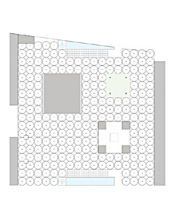
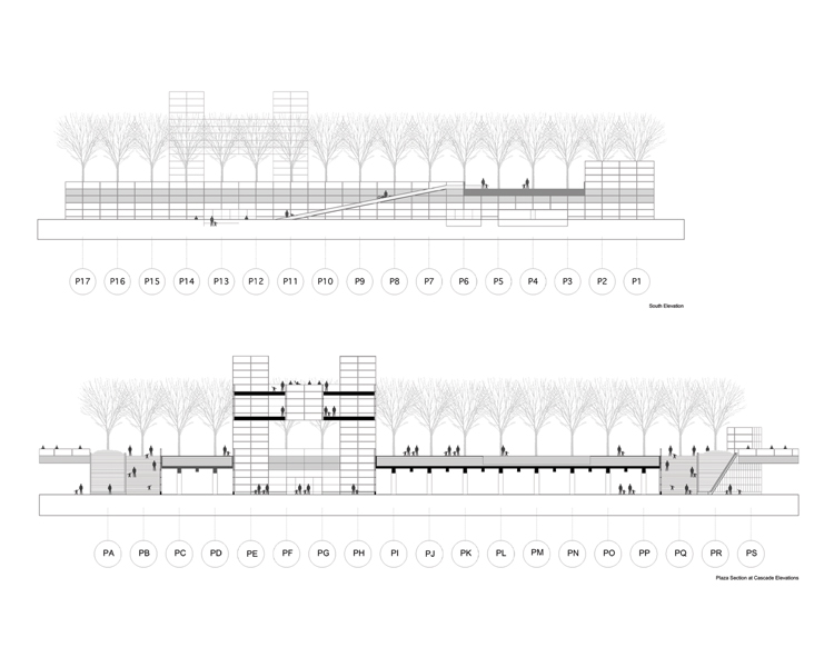
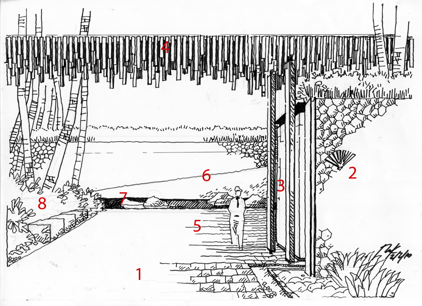
hello there. is there any example of monochrome colour graphic presentation out there?? especially for the sketches and sections. i am thinking on applying the monochrome style on my presentation but i dont know if it is suitable or not.
March 27, 2012 at 7:51 pm #158102 Frank VarroParticipant
Are you thinking just black inkline type work, or something where everything is in shades of green, or blue? I think either can work, but its not an easy thing to pull off. I have tried it in the past and while it never went terrible, I’m not sure it was worth the extra effort for me with my graphic design sensibility.
March 28, 2012 at 9:36 pm #158101 Ryland FoxParticipantMarch 29, 2012 at 12:22 am #158100
 Andrew SpieringParticipantMarch 29, 2012 at 12:44 am #158099
 Walter Bone, RLAParticipant
Hi Hakim, check out http://urbansketchers-singapore.blogspot.com/ Urban Sketchers is a great blog with many photos, sketches, etc. I think if yo go through the Singapore group, you will see many b/w or grey toned sketches that may give you some ideas.
March 29, 2012 at 9:12 pm #158098 landplannerParticipant
Hi Walter:
You may have read my postings before, but if you have not, let me introduce myself. I am Landplanner and yes, that is my psuedonym for now. If we strike up a closer camraderie here, then we can advance beyond my selective anonymity.
Anyway, I am writing you in a three fold manner. First fold is to say that the urban sketchers link is a very good one. I for one have been a member of the Portland, Oregon Urban Sketchers group which is incredibly talented and active. It would appear there is no shortage of sketching superstars in Singapore either. I hope to get that good. In case you were not aware of it, the new book “The Art of Urban Sketching” is now out by the guy who started this whole movement. I got a copy last week and it is very inspirational.
Second fold, is that I am returning to China after coming up empty-handed in endeavoring to find comparable work (in projects, responsibility and commensurate pay (or even anything close or nearby to those three factors) here in the States. I have taken a six month stint with an internationally based (UK, Australia, a couple of offices in second-tier China cities and even a few here in the States) and will be their director of landscape and urbanism in one of those two China cities. Overly fancy title, but a lot of responsibility and projects that go with that responsibility, I think you have a similar position with EFDA.
Third and final fold, is in the form of a question….. If you could find, like I searched for in coming back to the Pacific Northwest (PNW) and greater west, a senior level landscape architecture/urban planning or urban design position here in the States, would you return from China ? My obvious boomerrang back gives you my answer to that same question.
I would be interested in your perspective and experiences of practicing our profession in China. I’m sure we share a lot in common in that regard. I would be happy to let you sample mine.
I hope to hear back from.
March 30, 2012 at 12:38 pm #158097 Doug DaviesParticipant
This guy has some great tutorials on how he does graphics, some of them are monochrome!
April 1, 2012 at 11:14 am #158096 Hakim OthmanParticipant
thanks.. this would really help in my presentation next time.
April 1, 2012 at 11:18 am #158095 Hakim OthmanParticipant
yeah, thanks Walter. this is the kind of things i am searching for. i would actually want to develop my style of presentation which is in monochrome and the blog does inspire me.
April 1, 2012 at 11:21 am #158094 Hakim OthmanParticipant
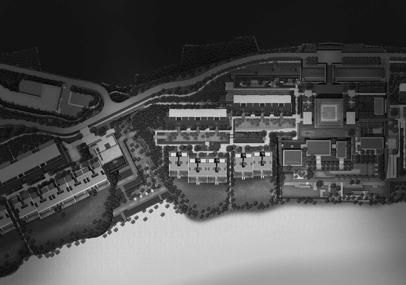
thanks. this is my first time seeing b&w masterplan. i always thought that the masterplan must be in colour or not it would be considered as an unfinished work.
April 2, 2012 at 10:43 am #158093 Trace OneParticipant
My only thought on monochrome, which is of course beautiful, is that it would be nice if the decision to go monochrome had some relevance to your design.
April 7, 2012 at 8:02 pm #158092 Craig de NeckerParticipant
You can try Google SketchUp – accurate drawing and you can choose to use a myriad of styles…
May 21, 2012 at 10:09 pm #158091 Chuck ByrdParticipant
There were several books out in the late 1970;s (Plan Graphics, Plan and Section Drawing, etc..) that showed many examples of monochrome graphics. Of course, it could have been that the drawings were originally in color, but the books presented them in “black and white.” Some were obviously monochrome, though. I remember doing projects in school on brown butcher paper drawn with a sepia pencil and marker. Back then, you could also get a “sepia” print just as you could a “blackline” instead of the standard “blueline” from drawings on tracing paper or vellum. The main thing is just to experiment with different media, and find a method you’re comfortable with. Check with your local art supply stores for book and maybe even advice. It can be done, and done well….
-
AuthorPosts
- You must be logged in to reply to this topic.


