Landscape Architecture for Landscape Architects › Forums › GENERAL DISCUSSION › NYC AIDS Memorial Park Design Competition…And the Winner is…what do you think?
- This topic has 1 reply, 11 voices, and was last updated 14 years, 2 months ago by
 nca.
nca.
-
AuthorPosts
-
January 31, 2012 at 1:42 pm #158737
 Trace OneParticipant
The rest of the entries are weird, but I do sort of like the ones that make some big sculptural AIDS ribbon – sometimes a sculpture is better than a park, for something complex.. And it looks like a very tough site..Very tough..Perhaps an option would be to say, choose another site, like Olmsted the Great Father did..(sp?)/
But I also wanted to note that in my Pottery Barn catalogue they have some mirrored bureaus (NOT bathroom stuff..) – really weird looking..Thought it was a hideous idea..
What is it with mirrors, except vanity, self-interest..as Tanya said..And something that does not do well outdoors..
January 31, 2012 at 3:21 pm #158736 Trace OneParticipant
http://aidsmemorialpark.org/gallery/entries
OK, guys, check out #1745 in the “Entries ” category – this is our own HENRY COHEN with a terrific design that proves what we are all saying, that it takes a Landscape Architect to really see a site properly – this is a great job, and a really nice contrast to that silly mirror thing!!!
Congratulations, Henry – good job! And good job on just getting it done – it takes a lot of discipline..I can’t think why Whoopi Goldberg (she was on the jury..) didn’t appreciate your project proposal..!!
January 31, 2012 at 3:45 pm #158735Aaron Kraemer
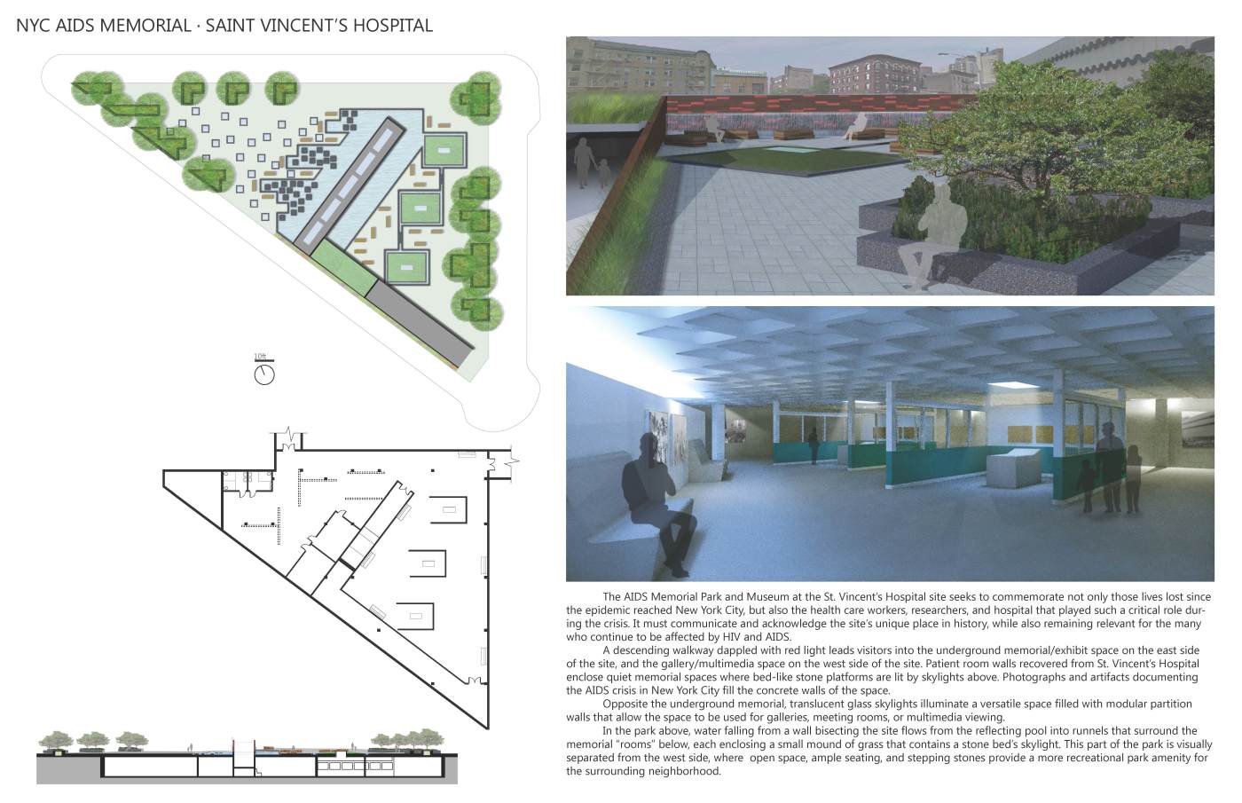
ParticipantFigures that a giant rendering would win. Heck even the developer didn’t like the winning entry. Competition Winner Snubbed by Developer. The one thing I do enjoy about all of these though is the ability to see all the entries and how different designers tackle the same problem.
Oh and for what its worth here is my entry. (I collaborated with a friend who is an architecture student who designed the below grade space).
 January 31, 2012 at 4:05 pm #158734
 Trace OneParticipant
 January 31, 2012 at 4:07 pm #158733
 Trace OneParticipant
This is Henry Cohens…
January 31, 2012 at 5:41 pm #158732 ncaParticipant
I don’t think that’s Henry’s. If so, it’s extremely similar to my proposal.
January 31, 2012 at 5:54 pm #158731 ncaParticipant
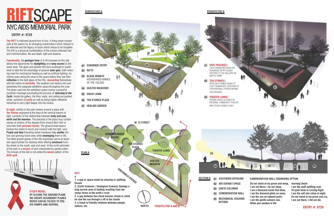
For what its worth, here’s my entry. I only started the project a week before the deadline and spent my free time working on the concept, so what I ended up presenting is what I would consider ‘concept graphics’ not refined renderings like many of the entries had. My mistake. Aside from the ribbon schemes, I think the scheme I chose of a rift or tilted planes was pretty popular, probably for a reason – it makes sense, accomplishing the goals outlined very specifically in the brief with the fewest number of moves. The brief emphasized daylighting, access, and a neighborhood park program. The graphics I included are digital freehand, so I did not build a model as seen in the majority of the entries. I’m not surprised a concept like mine wasnt chosen given the jury. Lesson #2 is know the jury! I joked with my girlfriend that this jury would want to see a field of 100,000 chocolate donuts, but what can I say? I mistakenly followed the brief, including all of what I considered necessary dwgs. I’d love to do another competition just like this tomorrow! Learned so much..
January 31, 2012 at 6:27 pm #158730 Trace OneParticipant
oops!! not good at cut and paste! No excuses..should I delete it, or let the unnamed enjoy notoriety….
Can you paste yours, Henry?
January 31, 2012 at 6:30 pm #158729 Trace OneParticipant
 January 31, 2012 at 6:31 pm #158728
 Trace OneParticipant
Here’s Henry’s ..Nice design, with Louvre overtones – good job!
oh, man, I did my taxes this morning also..oy veh..maybe clocked in at only 15%!
ok..apologies to Henry for my personal confused state!!
January 31, 2012 at 7:38 pm #158727 Thomas J. JohnsonParticipant
You guys are quite the jokers…
-
AuthorPosts
- You must be logged in to reply to this topic.


