Blog

Why Listening to the End Users is the Key to Great Design

Why Listening to the End Users is the Key to Great Design

Article by Carlos Cortés Kyushu Sangyo University Landscape Design, by DESIGN NETWORK +ASSOCIATES, Fukuoka, Japan. For Principal Designer Shunsuke Furuie of DESIGN NETWORK +ASSOCIATES, “The word ’landscape‘ suggests the presence or activities of human beings.” He also states that; “landscape architects should create environments that affirm the presence of people.” As student or professor, there is one thing that can make a great difference in how you develop your activities at the university. We are talking about our relation with the place where we spend lots of hours as we study or work. In this article we take a look on how DESIGN NETWORK +ASSOCIATES managed to design a park-like campus that revitalizes and brings cohesion through the flow of people between spots placed over a renovated landscape that consists of three major areas at Kyushu Sangyo University.
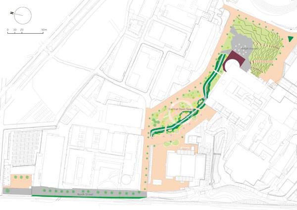
Masterplan of Kyushu Sangyo University Landscape Design. Image courtesy of DESIGN NETWORK +ASSOCIATES
Masterplan of Kyushu Sangyo University Landscape Design. Image courtesy of DESIGN NETWORK +ASSOCIATES

Overview Of The Project Even before the redevelopment of the KSU open spaces, the students provided unity to the campus by doing one of the most common activities we humans do: walk. The design’s general objective was to keep and encourage that movement but also to create a diversity of places where students can relax and spend free time.
Central Plaza at Kyushu Sangyo University. Image courtesy of DESIGN NETWORK +ASSOCIATES

Central Plaza at Kyushu Sangyo University. Image courtesy of DESIGN NETWORK +ASSOCIATES

Three Major Areas at Kyushu Sangyo University

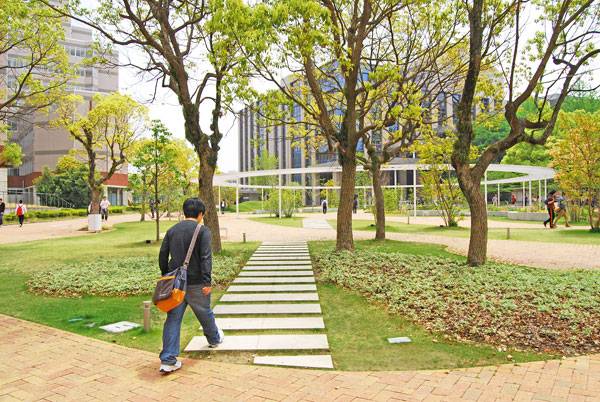
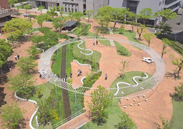
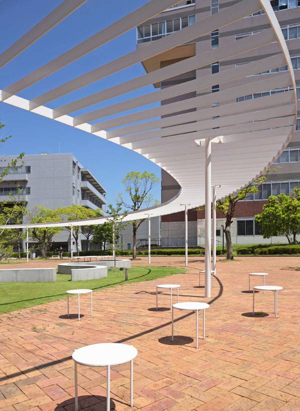
Central Plaza: Furniture to Enjoy the Landscape Distinctive for its oval pergola, the Central Plaza connects directly to the other major areas. There you can use one of those cloud-shaped benches or three-legged stools, or admire the curved lines that complete the white colored furniture of the site. On those you can relax and enjoy the beautiful variety of plants including shrubs, flowering perennial herbs, vines and trees that embrace seasonal change.Perhaps you would like to take a walk and read the descriptions of each type of featured plant.
Central Plaza at Kyushu Sangyo University. Image courtesy of DESIGN NETWORK +ASSOCIATES
Central Plaza at Kyushu Sangyo University. Image courtesy of DESIGN NETWORK +ASSOCIATES
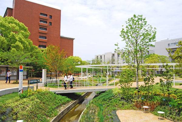
Notice that there are no clear circulation rules for this plaza so you can walk truly freely! This results from the surveys DNA collected from students, asking for preferred routes and traffic information.
Central Plaza at Kyushu Sangyo University. Image courtesy of DESIGN NETWORK +ASSOCIATES
Central Plaza at Kyushu Sangyo University. Image courtesy of DESIGN NETWORK +ASSOCIATES

Park-like design The clients asked DNA to keep the waterway that crosses all over the area and take advantage of it. This waterway has a drainage function and it’s now bridged over. Here designers built what looks like a fun shortcut made of two white concrete blocks between the other two bridges. In general the plaza works as a landmark and with its playful furniture covered with organic lines, its design can make you feel like you’re in the playground of a park.
Central Plaza at Kyushu Sangyo University. Image courtesy of DESIGN NETWORK +ASSOCIATES

Central Plaza at Kyushu Sangyo University. Image courtesy of DESIGN NETWORK +ASSOCIATES

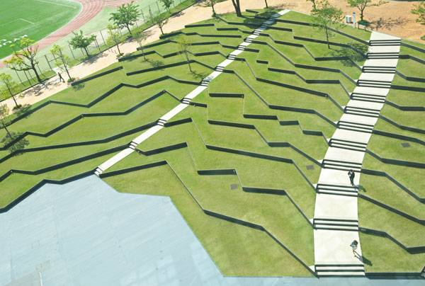
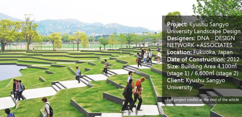
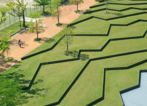
Amphitheater Composed of beautiful irregular lines recalling traditional terraced rice fields, this area was designed over the already existing slope. Here clients didn’t want too much planning on the site and designers took advantage with a marvelous idea. From each place you stand you will get a stunning view of it. Irregular Lines to Flow and Relax Comfortably covered by the shadow of camphor trees, a path is set to surround the bent lines of the site connecting with the football field that is next to this area. Here you can see the purpose of the design clearly as terraced lines featuring the necessarily spots to relax but also inspiring people to walk through, creating four ways to four different buildings or places. See More Great Projects in Japan:

Amphitheater at Kyushu Sangyo University. Image courtesy of DESIGN NETWORK +ASSOCIATES

Amphitheater at Kyushu Sangyo University. Image courtesy of DESIGN NETWORK +ASSOCIATES
Amphitheater at Kyushu Sangyo University. Image courtesy of DESIGN NETWORK +ASSOCIATES

Amphitheater at Kyushu Sangyo University. Image courtesy of DESIGN NETWORK +ASSOCIATES

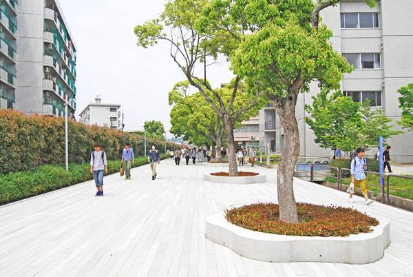
North Street North Street is a popular student’s way to and from the University. The constant activity we have been talking about in the article may start from here. On the Way to School People walk in a linear path where on one side camphor trees reaching 15 meters in height provide shade to spare on their white wipe board planter box made of concrete. On the other side, green and red toned plants cover the wall making an elegant combination among the white and light grey colors from the floor. It is not just another street but a place that reflects the essence of the landscape design at Kyushu Sangyo University.
North Street at Kyushu Sangyo University. Image courtesy of DESIGN NETWORK +ASSOCIATES

North Street at Kyushu Sangyo University. Image courtesy of DESIGN NETWORK +ASSOCIATES

And in this way we should come back and see the project as a whole, reminding ourselves of its response to its users and the exploitation of already existent conditions like the waterway or the slope. There is no discordance between elements in the Central Plaza and elements from the Amphitheater or North Street. Together they form a landscape, a body for the open spaces at the campus and that’s why Kyushu Sangyo University Landscape Design is a great example on how to bring cohesion to a place through its normal activities like walking from building to building.
Central Plaza at Kyushu Sangyo University. Image courtesy of DESIGN NETWORK +ASSOCIATES

Central Plaza at Kyushu Sangyo University. Image courtesy of DESIGN NETWORK +ASSOCIATES

Here designers asked users for information that resulted in the redevelopment of three very important areas of the university, each one with spots to watch the landscape and paths to move through it but not lacking a sense of unity given by the colors used in the furniture, walkways, and trees. What do you think of the Kyushu Sangyo University landscape design? Let us know in the comments below! Go to comments
Amphitheater at Kyushu Sangyo University. Image courtesy of DESIGN NETWORK +ASSOCIATES

Amphitheater at Kyushu Sangyo University. Image courtesy of DESIGN NETWORK +ASSOCIATES

Full Project Credits For DNA:

Project: Kyushu Sangyo University Landscape Design Designers: DNA – DESIGN NETWORK +ASSOCIATES Location: Fukuoka, Japan Date of Construction: 2012 Size: Building Area 4,100㎡ (stage 1) / 6,600㎡ (stage 2) Client: Kyushu Sangyo University Learn more about DNA: Website: www.dna1986.jp Blog: www.dnandn.exblog.jp Facebook: www.facebook.com Instagram: www.instagram.com/dna_1986 Recommended Reading:

Article by Carlos Cortés

Published in Blog

1 Comment

Leave a Reply

Lost Password

Register