This week’s Sketchy Saturday top 10. This week’s Sketchy Saturday top 10 brings with it a rich diversity of styles as well as artists as we reveal works from everything from professionals with a wealth of experience to students just starting out on their journey in design. And of course at LAN we’re so happy that we can join you on your journey no matter where you are. One thing that struck us about this week’s selection is that each style has its own strength and influence, from the minimalist approach to the highly illustrated approach, each has the ability to convey different aspects of the subject, and there is certainly not one style that suits all situations. Working to your strengths will always beat working on your weaknesses. Enjoy this week’s Sketchy Saturday top 10! 10. by Münire SAĞAT, landscape architect at Studio BEMS Landscape Architecture and Urban Design, in Turkey, Ankara
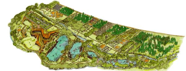
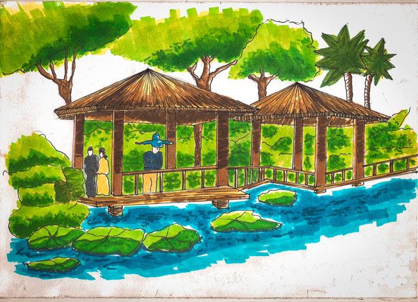
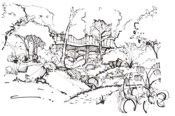
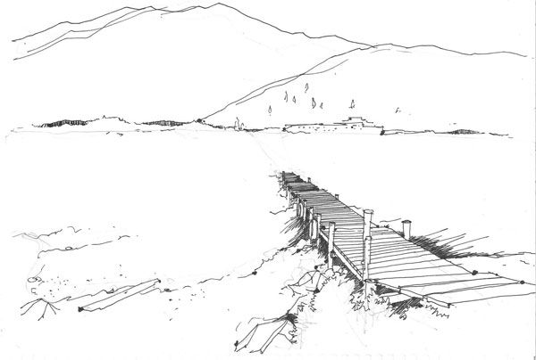
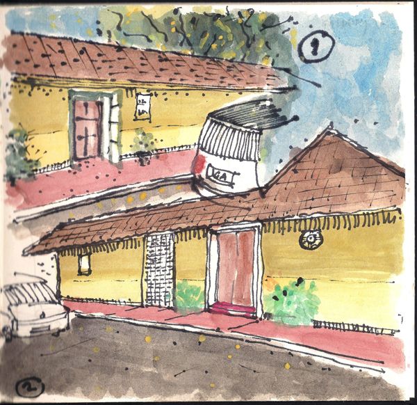
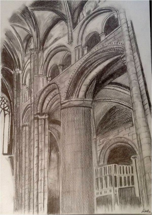
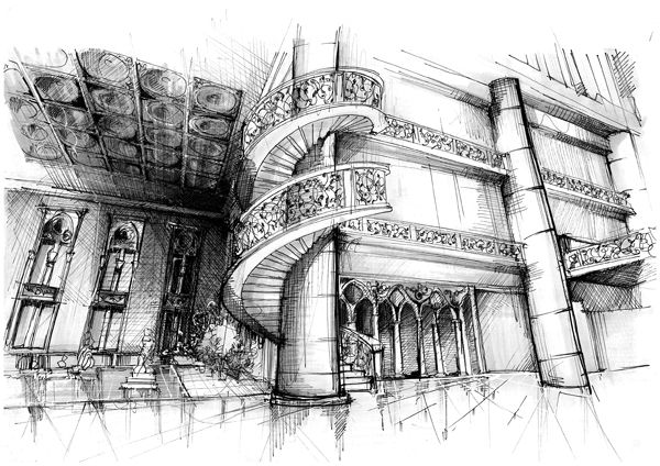
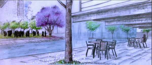
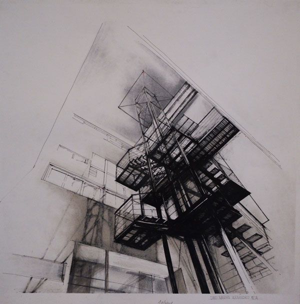
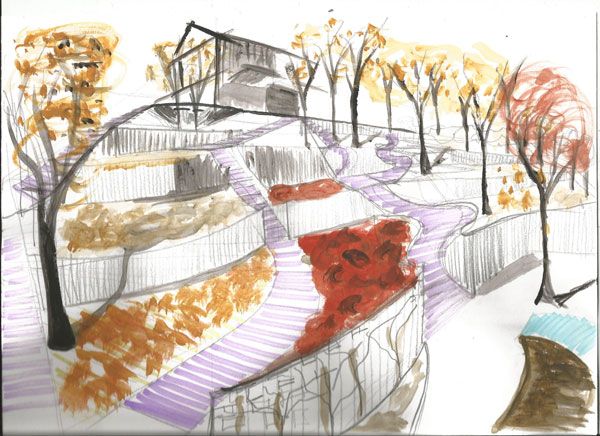
“I made this sketch for the “Llosev Natural Living Center Competition”. The area is a natural life village in Cankiri Cerkes. I drew it with promarker on a white sheet and produced an axonometric perspective”. 9. by Mayra Alves Zanin, studying Architecture and Urbanism in Federal University of Paraná (UFPR) in Curitiba, Brazil “This sketch is a perspective from a landscape project for my college. The design was a revitalization of a very important central plaza located in Curitiba, Brazil. Our motivation concept was to rescue the sensibility in people’s daily life, so they could live the urban space. The drawing was made on tracing paper and freehand with markers, black ink pen and colored pencil. If you’re interested, this is the link to the design in my portfolio”. 8. by Mohammed Zaki Hosni, a pre-junior student in the faculty of engineering – Ain Shams University in Cairo, Egypt., studying in the Landscape Architecture Department “This is a small freehand sketch exercise done for a presentation course in college, drawn in pencil, inked and then colored using Alpha markers”. 7. by Blake Andera Iowa State Student of Landscape Architecture, USA “This is a class project for a school trip designed with minimal impact to the site. Illustrating the bridge connecting the two high points on the site. I used ink.The site is based in Maquoketa, IA”. 6. by Benjamin Loh, Senior Landscape Architect, New Zealand “The first inspiration came directly from my current employer who produces a lot of quick sketches for clients within 30min for each sketch. My second motivation comes from Linescape on Facebook who uses a pen (ink) for quick sketches.The ability to quickly record impressions and expression through sketching is what I am trying to achieve in 2015. The site is in Wakatipu Lake, Queenstown, New Zealand. Drawn using a 0.5 Pilot VBall”. 5. by Manoj Joshi Architect, Interior Designer( Practicing ), Traveller, Sketcher. Also teacher at Local Architecture & Interior Design Colleges “I am an Architect, fond of travelling and also sketching, I capture memories through a sketch. It helps me to walk around the places and in giving me the real experiences of the streets and cities I visit. The sketching helps me to understand the local architecture, elements, culture, flora, fauna around, street v/s building relations etc. It’s basically a watercolour sketch, but I tried to sketch it like the sketches drawn with dry pastels. Also, a tinge of black ink pen adds to the fusion of different mediums and indirectly hinting at the cultural and other changes that particular cities or streets go through. A small detail like GA on a car’s number plate indicates the state of India not completely showing the whole number of the car. The small plants and the rich colour palette of Goa were the focal agendas to be depicted in the sketch. The site is located at a h The site is located at a house converted in Art Boutique in a street in Campal Area ( A colony established around late 1800s during Portuguese Influence ) in the city of Panjim, Goa State, India. I used Pencil, Water Colour, Ink pen and Love to Sketch 😉 “. 4. by Dinu Marian Alexandru , student University of Architecture and Urbanism Ion Mincu Bucharest “I was always fascinated, by the way, each staircase, either made of pale wood or classic metal, can change the atmosphere of a space. From smooth concrete curves and twisting corkscrews to structures built from reclaimed wood and rusty steel. Stairways have endless functions to a building, some of which are that they act as a a means of escape in cases of fire,they attach rooms to each other, and,what I think is more important,they provide space for movement.As an architectural element of the house, this modern concrete staircase is suitable for many applications.More and more manufacturers build a metal staircase due to its applicability in everyday use. This staircase, which rises in a straight line to the height of the sky, certainly requires careful planning. Important requirements for the stability and resilience of the scale are external substrate and infrastructure perfectly executed. The wild beauty of cement is often interspersed with steel balustrades and stainless steel, perfectly fitting the surroundings“. 3. by Raluca-Mihaela Serdaru, Romania, Professional Landscape Designer & Urban Planner “The sketch is made for a contest of landscape design for a private garden from USA, California in 2014. The big slope from the garden was the one that motivated me to sketch a view to the existing house which was located on top of the slope. Through this sketch, I wanted to show better how the retaining walls are modeling the terrain and how the vegetation and alleys with stairs will look like. The methods used for the sketch is watercolor markers, watercolor with brush and pencil”. 2. by Delia Bittner, Student studying Landscape Architecture at the Writtle College, Nationality German “When I was visiting the city of Reims in France I entered the famous Cathedral to have a look. I was overwhelmed by the tranquillity inside. I started sketching a part of the beautiful architecture and finished my drawing later from memory. I choose a fine pencil for my sketch because I not only wanted to catch the beauty but the peacefulness and the wonderful atmosphere as well”. 1. by Rawan Waleed Al-Qabbani Free lancing Architect,Damascus,Syria “The main reason behind sketching the view was helping a friend of mine in presenting his graduation project. And though classical architecture was not my favorite pattern of a sketching object, I found myself enjoying every detail of the many elements composing the scene. Considering a style in which the sketch was made, there won’t actually be much to be said: tools used are a pencil and lots of sketching multi-markers since the origin sketch on canvas was slightly colored”. – That’s this week’s Sketchy Saturday Top 10, congratulations to all of you who featured, you have come out on top of a very talented bunch of people. Check out the Sketchy Saturday official Facebook album and see literally 1,000′s of incredible sketches! Follow all the winning entries on our dedicated Sketchy Saturday Pinterest page. If you want to take part send your entries to us at office@landarchs.com Recommended reading:- Sketching from the Imagination: An Insight into Creative Drawing by 3DTotal
- Architectural Drawing Course by Mo Zell
Article by Scott D. Renwick Return to Homepage
Published in Blog