This week’s Sketchy Saturday Top 10. Sketchy Saturday is back for another week of awesome Sketchy Saturday talent, highlighting the best sketches of the growing LAN community (Currently 1,185,018 fans on Facebook) up 20,287 fans since our last Sketchy Saturday edition. Incredible 🙂 This edition took several weeks to compile as we had a lot of sorting through to do and of course, waiting on people to send us back their descriptions slows down the process, but it is a process worth waiting on, as we get a variety of opinions directly from the people who created the works, making each one of our Sketchy Saturday editions unique and worth reading for insights. Take a look at this week’s highlights and who knows perhaps you’ll be featured in the next one.
Enjoy this week’s Sketchy Saturday Top 10
10 by. Francois van Rooyen, director Red Landscape Architects in Stellenbosch, Western Cape, South Africa
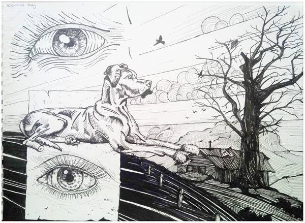
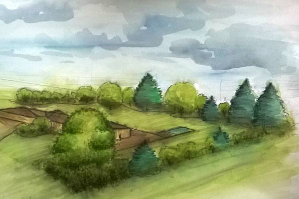
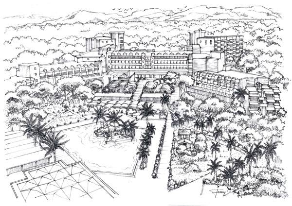
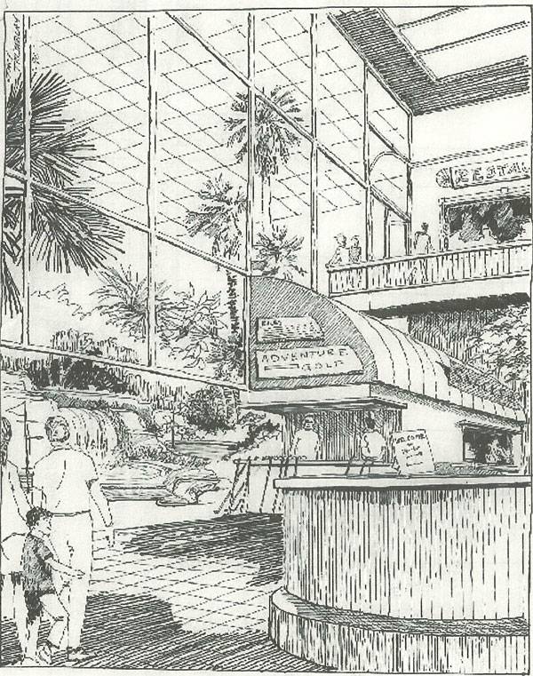
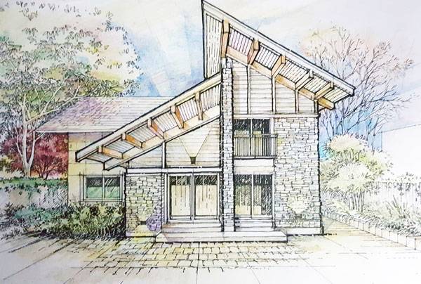
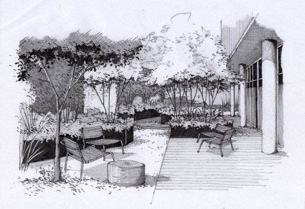
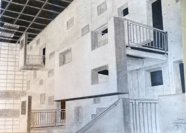
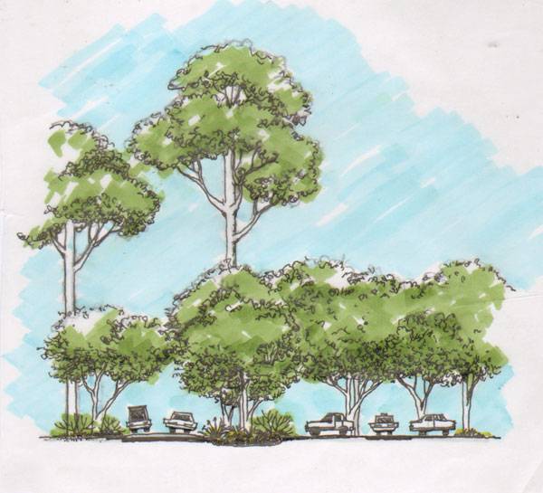
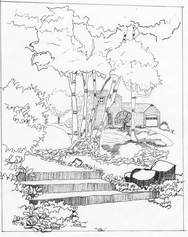
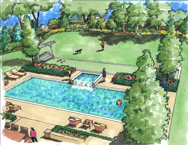
“A3 Fabriano Paper, various black tip ink pens. A need to capture my surroundings and thoughts in a sketch book and create a visual diary, guided by various drawings and graphics from inspiring artists. Living in a mountainous landscape with our dog Suzy where the natural elements and seasons dictate my visual experience and day to day mood”. 9. by Simon Paulais, Student in Landscape Architecture in Angers, France ” I made this sketch in the frame of my study of landscape architecture in Angers, France. I started to draw it on the field, inside this building, which is a cultural centre but I finished the drawing afterward at home thanks to a photo that I took. I concentred my efforts on the shadows and the vanishing point to make understandable the complexity of the structure and architecture of this modern building. I used only pencils for this drawing.” 8. by CHARAIRAT BOWORNWATTANA. Studying in Environmental Design and Planning program at Maejo University, also teaching assistance in Landscape design studio at Agriculture Faculty, Chiangmai University, Chiangmai, Thailand. “I used a black pen on tracing paper and added color by markers. This sketch is a part of my thesis. It presents a strategy for Payap University, Chiangmai, Thailand, to provide more living plant biomass/unit area which will also give better heat reduction effect and minimize its impacts on microclimates from roads and parking lots. This is done by providing shade from Emergent layer and canopy layer tree canopy”. 7. by Katarína Fuková, a graduate of Slovak Agricultural University in Nitra, Slovakia, Faculty of Horticulture and Landscape Engineering, Department of Garden and Land Architecture “I realized this garden for a family which had moved from a big city to a small village in the Czech Republic. As this garden is in the countryside, I wanted to make it natural, to connect the garden with surrounding nature. I used only local plants, shrubs and trees growing in Czech nature. This sketch was made with aquarel, pen, and copic markers”. 6. by İsa Eren AKBIYIK “It’s a conceptual sketch for “Nota Design – Crystal Hotels Hand Draw Album”, 2-point perspective with 0.05 – 0.1 – 0.3 – 0.5 drawing pen on A3 sized paper. Marker pen and PS used for brightness and contrast levels. Location – Belek /Antalya /Turkey.” 5. by Jack Tremblay “It is ink on Opulux. It was never built. The idea was to make an adult mini golf area. It’s an indoor perspective done for presentation purposes”. You can follow Jack on Facebook or on his website, alternatively, you can support his Go Fund me Campaign here. 4. by Christopher T. Pugh, student at Academy of Art University, studying Landscape Architecture, the United States of America, state of Alabama Unfortunately, we didn’t get Christopher’s description for this sketch, and that usually means we would not post it, but this was just so good, we felt we could not leave it out. We love the crisp, strong lines and feelings the image creates. 3. by Bibek Chatterjee “This is a hand sketch done for a residence. The medium used is ball point pen,rotring technical pen and color pencils. There is no digital media used for presentation and is purely on an old-school drawing”. 2. by Damian Ayarza, Landscape architect, Buenos Aires, Argentina “This sketch was done for a client in Vicente Lopez, Buenos Aires, to help them understand the garden design. It is a long narrow place situated at the back of a future office building, an excellent opportunity to produce oblique views. For a sensation of extra area, we create a plot of broken lines which are the raised beds that define different meeting points. The original sketch is 8.27 × 11.7 inches, made with black pencils on trace paper”. 1. by Linda Farrington, Landscape Architect, United States “This sketch was for a client in Northfield, Illinois to show them an alternate design for their backyard. They understand the sketches better than the plan views, so we showed them a few options. I used site photos and SketchUp to start the drawing. Then, I drew everything with black pens and color rendered the drawing with Chartpak markers and Blick pastels. I saved time by not having to build a super-realistic computer model, and the loose graphics conveyed the idea without getting too specific in the conceptual stage”. – That’s this week’s Sketchy Saturday Top 10, congratulations to all of you who featured, you have come out on top of a very talented bunch of people. Check out the Sketchy Saturday official Facebook album and see literally 1,000′s of incredible sketches! Follow all the winning entries on our dedicated Sketchy Saturday Pinterest page. If you want to take part send your entries to us at office@landarchs.com What did you think of this week’s top 10? Let us know in the comments down below! Go to comments Recommended reading:- Sketching from the Imagination: An Insight into Creative Drawing by 3DTotal
- Architectural Drawing Course by Mo Zell
Article by Scott D. Renwick Return to Homepage
Published in Blog