Article by Tahío Avila Les Quais – Ville De Bruxelles, by Espaces Mobilites, in Bruxelles Centre-ville, Brussels, Belgium. On the edge of the Senna River and right of the city center lies the new “green route” of Bruxelles: a safe pedestrian and cyclist green route developed to encourage recreational leisure and increase gatherings and activities in the zone. This long-neglected embankment has become a place that enhances the quality of life of Bruxelles’ inhabitants and promotes user-friendly public spaces between the historical center and the commerce area of the district. It is a project with the perfect combination of past and present that we (as landscape architects) are happy to develop and bring to life.

Les Quais – Ville De Bruxelles. Photo credit: Espaces Mobilites
Les Quais – Ville De Bruxelles
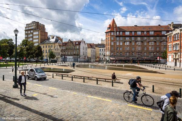
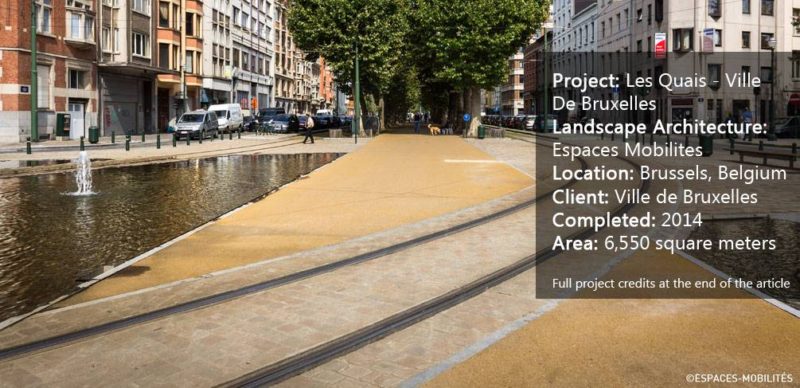
The Starting Point For several years, this crossroads was a neglected area. It was considered an oversized space with no special provision for cyclists or pedestrians, remaining a very unappealing area. It was used very little in the summer, was reserved for car use only, and had no safety measures or protection when it came to tram intersections. We are going to see how, with a simple but functional design, this area has become a formal square that has been given back to pedestrians and cyclists. At the same time, it integrates and complements the public transportation route.

Les Quais – Ville De Bruxelles. Photo credit: Espaces Mobilites
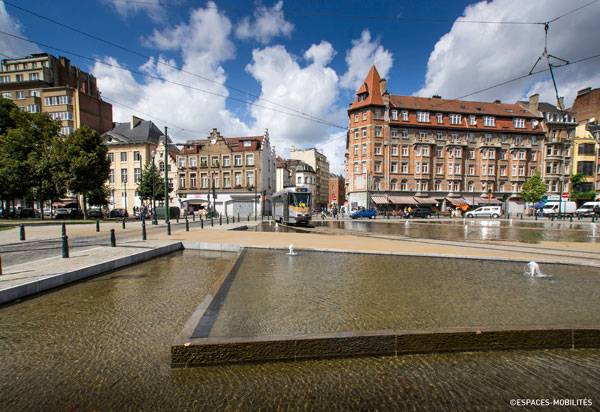
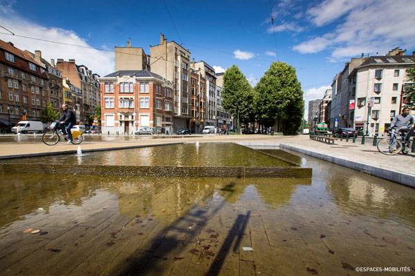
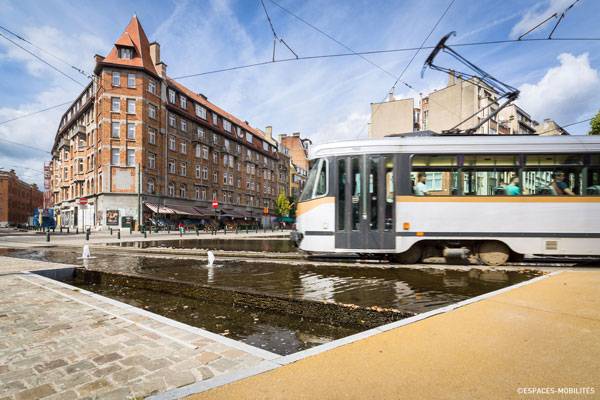
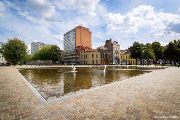
The project is designed to reverse the car traffic and offer an open space to pedestrians and cyclists, transforming it into an articulated point in the town center, where different public spaces and visual perspectives join together, in addition to a pond or water mirror crossed by the tram line. This design highlights the many assets of the zone. One of these is the orientation — it is obviously an open space, but there’s no shadow from other buildings during the day, giving the perfect amount of light to the square and making it an ideal place to visit and relax during both summer and winter. The open space comes from the design of old platforms or embankments, which offered big, open spaces as a refuge for all users. Water also occupies an important part of the area.

Les Quais – Ville De Bruxelles. Photo credit: Espaces Mobilites
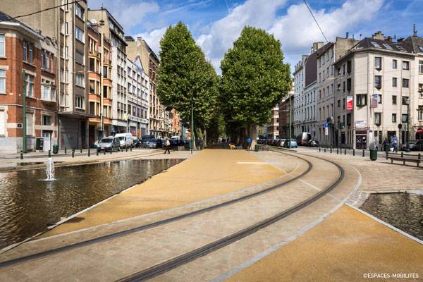
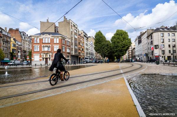
Another interesting part of the design is the integration of the tram line, which becomes an essential part of the square, crossing it right in the middle of ponds or water mirrors, trees, and seating areas. The square became an articulation point once the designers from Espaces Mobilites transformed it into a meeting place where urban spaces and perspectives join together in a single layer of street crossed by a line of public transportation, pedestrians, and cyclists.

Les Quais – Ville De Bruxelles. Photo credit: Espaces Mobilites
One of the purposes of this project was to change the way inhabitants see and use old platforms in Centre-ville. The design makes it an accessible verge that invites all kinds of users — locals, tourists, pedestrians, cyclists, skaters, etc. — to spend real time in this square. Another idea was for the verge to become a place for strolling, walking, playing, interacting, and meeting. The designers succeeded in the most important purpose of the design: to renovate the area into a more “human” space that breaks the barrier between users and a functional urban space, as well as between the quality of historical spaces and new areas.
A Simple Square Freshly Composed The designers worked on the project in a very fresh and clean way; they used colored ocher asphalt tone — the same tone as the dolomite used on the embankments’ pavement around the area.

Les Quais – Ville De Bruxelles. Photo credit: Espaces Mobilites
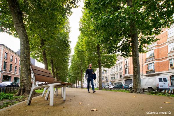
A green zone was projected with a “tunnel” of trees with seating areas, guiding the pedestrian trajectories around the square to other locations or from one platform to another. The designers used plane trees very proximate to each other so that they can grow tall (instead of wide) and form a natural tunnel structure that you can easily visualize from the outside.

Les Quais – Ville De Bruxelles. Photo credit: Espaces Mobilites
The square is a combination of views and simple natural areas among an open space, articulated with water mirrors or ponds crossed by the public transportation, to remind users of the presence of water in the past embankments and giving a mix of elements in the same square. The presence of stone and water restates the environment and history of the square. Car traffic (almost eliminated) remains as discreet as possible, so that it is integrated easily and safely into the landscape. “
The verge and the park in the immediate vicinity of the crossroads are physically connected by removals or restrictions of traffic and geometric continuities and/or surfaces. The tram now crosses in a place where it glides peacefully over the water and enables the passengers to see their reflection,”
the designers say. 
Les Quais – Ville De Bruxelles. Photo credit: Espaces Mobilites
Clean landscape design can change any area into a mature and formal square such as this. A good design can and must change not only the physical space, but also the perspective and point of view of the inhabitants. People need to feel included in the process of design of a public or urban space. In the end, they will be the ones who spend most of their time passing by places such as this, which nowadays, has became an important requirement for a good quality of life. People should “live” the landscape every day.
Do you think this project has the details necessary for its intended use?
CLICK TO COMMENT

Les Quais – Ville De Bruxelles. Photo credit: Espaces Mobilites
Full Project Credits For Les Quais – Ville De Bruxelles:
Project Name: Les Quais – Ville De Bruxelles Landscape Architecture: Espaces Mobilites Location: Brussels Client: Ville de Bruxelles Research: 2009 – 2011 Completed: 2014 Area: 6,550 square meters Budget: 63.500 € VAT incl study Budget Execution: € 1.23 million including VAT Recommended Reading:
Article by Tahío Avila
Published in Blog