Author: Adam Regn Arvidson
In Place: Mesa Arts Center: A (Not So) Dry Country
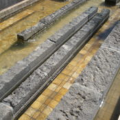
The dry arroyo wasn’t dry when I visited Mesa Arts Center last fall. This gold tile and lava rock gash in the so-called Shadow Walk that arcs through the site was supposed to be dry most of the time—like an actual desert arroyo—but it seems the water runs almost constantly. “I don’t know of anybody that has seen it dry,” Shauna Gillies-Smith told me recently. She was one of the key designers of the project at Martha Schwartz Partners (Design Workshop’s Tempe, Arizona, office was the local LA of record). The planned dryness would reference the surrounding Sonora, of course, but Schwartz’s office also had a practical reason.
Gillies-Smith, who now has her own office called Ground, remembers that MSP had just finished Exchange Square in Manchester, UK. There, it was unclear whether there would be enough money or maintenance to run the fountain all the time, so MSP designed it to look good wet or dry. I am sure you have a mental image of that project: the fragmented grey strip looking like, well, an eroded mesa. “[Manchester] was in the back of our minds,” says Gillies-Smith, “as we started Mesa Arts.”
I should be more clear. The arroyo wasn’t dry, but it also wasn’t full. The project description from MSP’s ASLA award entry (Mesa Arts Center, completed in 2005, won an Honor Award in 2007) says the arroyo was meant to flood exuberantly from time to time. When I visited, it was obvious from the wear of the lava rock and the water-staining on the tile that the water had been higher. I could picture how much more dramatic the flow would be in flood, but the half-full condition wasn’t bad either.
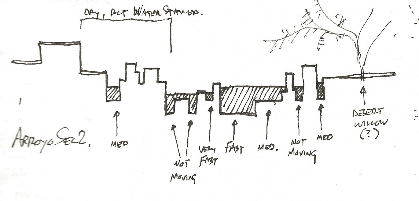
That’s credit to the cross-section. The arroyo is essentially a tile basin with a jagged bottom. Fins of lava rock rise from the basin, creating channels of different widths, depths, and (this is the best part) water speeds. Water in one channel might be moving twice as fast as the water on the other side of one of the black fins. When the fins end and the channels combine, the water roils and churns, trying to find another path and some equilibrium of velocity. Then the flood splits again, some of it spreading out, some slipping into a micro-canyon and rushing downstream.
Find more videos like this on Land8.com
Find more videos like this on Land8.com
Neither the section nor the abrupt beginnings and endings of the black fins have any documentable rhyme or reason. The design is intricate and carefully detailed, but not beholden to any overwrought formula or module.
Gillies-Smith told me the office explored the design of the arroyo physically—with a “casual working model,” in her words. That allowed the landscape architects to visualize the design and play with form and line. “You can get your eyes right down in it,” she says. Interestingly, during the design process the arroyo materials swapped places. Early on, the lava rock formed the base and the tile the upper levels and fins. That might seem more geologically accurate, I suppose, but I have to say the final gold base and black crest achieve an important contrast and more effectively show the movement of the water.
When there’s water, that is. Which is most of the time, it seems. Which is too bad—but not too too bad.
In Place is a Land8 column that resurrects the design field trip. If you haven’t yet, read the intro and my previous posts here.
Photos, video, and sketch by the author.
In Place: Village at False Creek: Take a Seat!
When I think of William H. Whyte, that pioneer of urban observation, one image comes to mind. I watched Whyte’s 1980 film “The Social Life of Small Urban Spaces” in either 1994 or 1995 in an architecture building classroom. Still today in my mind I can clearly see that famous overhead time-lapse of people on the Seagrams Plaza as they follow the sun. But the picture that sticks with me is the one of the guy trying to find a comfortable spot in a plaza mostly bereft of seating. This overworked gent has trundled down from some beige office for his lunch break and finds all the walls are topped with short metal spikes. He is not deterred. He wads up his jacket, lays it upon the spikes and sits. In the film he looks terribly uncomfortable. Whyte’s deadpan voice-over says: “As we found out, people are very adaptable.” (See the video here; the spike-sitter is at 12:55)
What to do about seating? We know we must include it in our plazas and public spaces. Seat salespeople are in abundance. The ads in our design magazines tell us that having the coolest seating will surely attract pretty girls (and, less often, tall-dark-and-handsome men). Big projects seem to deserve custom seating, which is good work if you can get it, but also far trickier than it seems.
In my experience, public spaces tend to pick one theme for seating and stick with it. There’s a particular bench in a particular color scattered throughout the site. There’s a customized theme in metal or wood. There are walls with wide tops a comfortable 16 or so inches off the ground (usually studded these days by metal anti-skateboard strap-ons). It’s all so predictable.
Which is why a walk around Vancouver’s Village on False Creek is like being a kid in a candy shop (or a backside in a furniture showroom). This is the old Olympic Village from Vancouver 2010. It occupies a stunning spot: cozy against the dead-end downtown bay called False Creek, with the Vancouver skyline glittering across the water. The overall development is the work of PWL Partnership, while the central plaza was designed by Phillips Farevaag Smallenberg (PFS). Both firms office in Vancouver.
Aesthetically, the seating is all over the place, which works here amongst the pleasant jumble of buildings, pavements, and elevations. Remarkably, it’s all custom designed AND comfortable. I phoned Margot Long, a PWL partner, and e-mailed Kelty McKinnon, a principal at PFS, to get the scoop. Here are my favorites and their backstories, starting with PFS’s plaza:
Bundles of wood strapped with metal reference the area’s history as a shipbuilding center. Stacks of lumber would historically have been scattered everywhere, slowly becoming boats. These seat-bundles, designed by Chris Phillips, aren’t uniform, though. It’s as if the stevedores had already pulled a few boards away, leaving the rest in a jumble. That makes for interesting seating at different elevations, some even with little arm-desks. While there I saw a mom and her son perched on the same bundle at different heights, heads level, having an adorable conversation.
Drawing on another historical reference—this time the Salt Building that still faces the plaza—low seat tables are meant to look like blocks of good old NaCl. The tops are resin and illuminated at night.
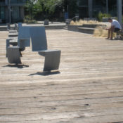
Over on the boardwalk beside the water, PWL has managed to solve the perennial problem of providing both solo and sociable seating: swiveling captain’s chairs! These simple metal elements are rooted to the substructure of the boardwalk by a single post. PWL designed them in collaboration with Landscape Forms. They’re nice on their own, but placement is key—close enough to each other for conversation, but easily swiveled away from strangers or your opposite in a lover’s spat.
Nearby, white metal chaises longues offer two vantage points at once. Stare north at the city or south at the sun (or gaze longingly at the object of your affection after the captain’s chair spat is over). PWL worked with Landscape Forms on these, too, and they got the contours just right.
My favorite seating option, though, are the wood-topped concrete walls. It took me a moment to realize what the strange indentations were for. Once I did it was hard to leave.
I see (and use and test out) a lot of seating—both custom and off the shelf. False Creek is my gold standard. There are plenty of options, and each element is either playful, meaningful, or both. Definitely no need to throw an overcoat over a spike-topped wall. William Whyte would be quite content.
In Place is a Land8 column that resurrects the design field trip. If you haven’t yet, read the intro and my previous posts here.
All photos copyright the author. No reproduction without permission.
Book Review: Literary Post-Mortem
The big recent news from the world of preservation is the listing of Peavey Plaza on the National Register of Historic Places. This Paul Friedberg-designed space is also the subject of a lawsuit brought by The Cultural Landscape Foundation (TCLF) and Preservation Minnesota against the city of Minneapolis, which owns the site. You can Google for all the gritty details, but suffice it to say that Peavey feels a little like a line in the sand for TCLF. And, one could argue, rightfully so.
Former Landscape Architecture editor William Thompson wrote in 2005 that, “Built works by modern masters have been dropping like nine-pins all over the country.” Friedberg is one of those modern masters. So is Lawrence Halprin. We all know Lawrence Halprin: Freeway Park, the FDR Memorial, the Auditorium Forecourt Fountain in Portland, Skyline Park. If you haven’t actually visited any Halprin works, these are some big ones worth seeing. Except you can’t see Skyline Park any more. It was, to crib Thompson’s metaphor, bowled over in 2003 and, to quote him directly, “replaced by [a] more acceptable, if terminally bland, design.”
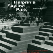
Thompson is quoted in the recent book with the Google-friendly title Lawrence Halprin’s Skyline Park by Ann Komara. She’s a landscape architect who teaches at the University of Colorado at Denver. The book is a post-mortem on the titular Denver landscape, which was built between 1972 and 1975. Komara is joined by some heavy hitters: there’s an essay by Laurie Olin, an epilogue by Halprin himself (his final published essay), and a foreword by TCLF’s Charles Birnbaum. Yes, this is a TCLF vehicle: the first in a series called “Modern Landscapes: Transition and Transformation.”
 Skyline Park, Denver. Image copyright Charles Birnbaum, The Cultural Landscape Foundation.
Used with permission. All rights reserved.
When I first picked up the book, this concerned me. Not that TCLF isn’t doing good work. Its just that my fact-finding hackles get on guard whenever I encounter a single-issue source or organization. I worry about credibility. Was this going to be another preserve-it-or-else propaganda piece?
It’s not. The book is a measured and factual visit to Skyline Park and into the Halprin studio during the design process. Komara’s prose stays firmly away from the persuasive (until the very end, that is, when she lets loose some obviously pent-up frustration). Instead, she takes you on a journey, block by block, detail by detail, story by story. Dozens of photos, sketches, construction details, plan drawings, and pattern studies appear in the book. There is even an image of a project management board from the Halprin office. “The demolition of the park has resulted in an untold loss—an erasure of urban memory,” writes Komara. “Fortunately, images and records of the park are preserved….” And now those images, records, and stories are collected in one place.
 Skyline Park, Denver. Image copyright Charles Birnbaum, The Cultural Landscape Foundation.
Used with permission. All rights reserved.
I ran into Charles Birnbaum at the ASLA meeting in Phoenix and we talked briefly about the book. He admitted that it was a natural project with which to start, since the memory is still fresh and the discussion was vibrant. But he said the series would not limit itself to landscapes already gone. According to him (and the back of the Skyline book) Pittsburgh’s Simonds and Simonds-designed Mellon Square is next on the list—and that masterwork is undergoing a restoration, not a replacement.
As a resident of Minneapolis, I hope Peavey gets its book, too. Whether that will be a post-mortem like Lawrence Halprin’s Skyline Park remains to be seen. Either way, books like these are necessary additions to the understanding of landscape architecture. Documentation of the masterworks will always be important. This is our legacy. It is a worthy project.
Lawrence Halprin’s Skyline Park (Modern Landscapes: Transition & Transformation)
By Ann Komara
2012
ISBN 978-1-61689-091-9
Critique is Critical
If you haven’t read any Herbert Muschamp (the late architecture critic of the New York Times and elsewhere) consider it. And Jane Jacobs, too. And Lewis Mumford. These are a few of the best writers on urbanism this nation has ever produced. Through their assessments of cities, buildings, and landscapes they illuminate not only the stories behind specific works, but also the broader context. They ask big questions. What does design mean? Why does design matter? How can we see our surroundings more vividly.
So they’re great reads for design professionals—part of the canon, if you will, beside Design With Nature and Gardens Are for People. But don‘t necessarily rush out and buy Muschamp’s collected works, or Jacobs’s Death and Life. Instead buy this book: Writing About Architecture by Alexandra Lange. Lange, who blogs for Design Observer and teaches at NYU, has collected six critical essays ranging across about a hundred years of American design history. Joining the three mentioned above are Michael Sorkin, Charles W. Moore, and Frederick Law Olmsted (who was a journalist before plunking some little park down in Manhattan).
These six masterworks alone would be worth the price of admission, but Lange accompanies each with a stunning essays of her own. The purpose of the book, as she puts it in the introduction, is to educate a new wave of citizen critics “equipped with the desire and the vocabulary to remake the city.” To that end, she takes apart each essay (referencing others on the same subject) and tries to discover why the piece works and how we might apply those lessons—to our writing, yes, but more importantly to our seeing.
The book grew from Lange’s architecture criticism classes, so each chapter also includes a few simple exercises. This is hardly a textbook, however. It is an historical slideshow of excellent design writing coupled with fun and enlightening critiques of the criticism. There is nothing out there like this book. It seems a specialized subject, but think of it not as a primer on actually writing design criticism, but on understanding design. Lange concludes with: “The ability to write about architecture…is relevant to more than criticism.” This book both inspires and teaches the use of the critical eye, a useful tool for any designer.
by Alexandra Lange
2012
ISBN 978-1-61689-053-7
In Place: 100 Acres Art + Nature Park: The Power of the Path
‘In Place’ is a Land8 column that resurrects the design field trip. If you haven’t yet, read the intro here.
What’s a path, really? A way to move people from one place to another? Or a design statement? Visiting 100 Acres in Indianapolis, I initially assumed the former (and in fact wondered why a big name landscape architect was needed to lay out a few paths). But I’ve changed my mind.
The officially named “100 Acres: The Virginia B. Fairbanks Art + Nature Park” is one in a series of landscapes managed by the Indianapolis Museum of Art. IMA is what some would call an encyclopedic museum—meaning it has a little bit of everything, from across historical artistic periods. Most major cities have one of these, but the IMA is odd in that it also “collects landscapes,” as Frank Edgerton Martin wrote in Landscape Architecture Magazine (January 2011—the first issue with the new graphics). I also wrote about IMA for LAM some years ago, when local office Browing Day Mullins Dierdorf reworked an old Sasaki design to create a lovely formal garden atop a new parking garage (LAM, October 2007).
Including 100 Acres, IMA’s landscape collection now includes an Olmstedian “Country Place,” a mid-century sculpture garden, a modern icon (Kiley’s Miller House, farther south in Columbus, Indiana), a contemporary entry, and a naturalistic sculpture park.
But to get back to the paths….
The walkways at 100 Acres are nothing but crushed white aggregate, likely local limestone, and they wander through the forest somewhat haphazardly. Picture yourself strolling through any state or national park, and you get the idea. But there’s more to them than that. In a few places, the paths turn a big circle around nothing in particular, like a highway roundabout. In some places they run in broad sweeps, while in others they wiggle through the woods. The reasons behind this are not perfectly clear right away, but there are reasons.
The landscape is the work of the late Ed Blake, a landscape architect best known for a pretty soft touch and a deep, almost obsessive, desire to know a landscape. He collaborated with local art/landscape architecture office NINebark (Eric Fulford and Ann Reed. As Frank Martin wrote in LAM, just after the park opened (and just after Blake died suddenly) in 2010, Blake found and mapped a degree of subtlety in the landscape that is frankly hard to see when you’re actually there. His analysis graphics (published in LAM), note magically named landscape types such as “flatwoods drain stand,” “ridge hammock side slope,” and “old river swamp bottom.”
The paths follow and cut through these landforms, varying their texture and alignment as they go. For instance, the roundabouts tend to signal your ascent up onto the “floodplain ridge hammock,” which happens to be just a foot or so higher than the rest of the site. On this hammock sits the park’s interpretive center (designed by Marlon Blackwell).
That’s a nice trick. But at the moment the landscape itself gives no signal. Apparently, Blake did complete a set of restoration guidelines that will guide IMA staff in stewarding the landscape over the coming decades. For now, you’ll have to trust the paths.
And also their associated low steel bridges, which cross little gullies seemingly unnecessarily (only 4 or 5 inches between bridge and soil!), which proves they are completely necessary to communicate the landscape. I would have missed the “old river swamp bottom” if not for my feet clinking on metal all of a sudden.
If you visit, pay attention to when the paths change–in alignment or width–or when they split from each other. Look more closely at the landscape, the groundplane, the surrounding elevation (and by elevation, I’m talking inches). The landscape is probably changing, too. The paths help you tune into that.
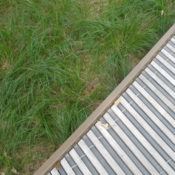
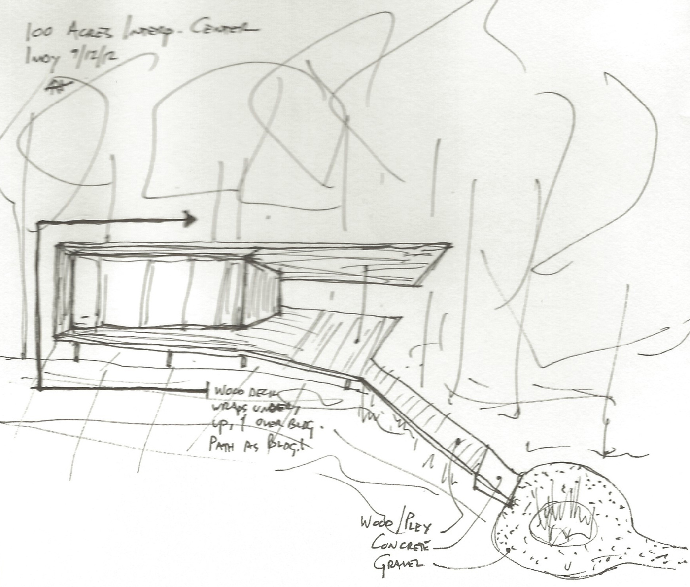
Near the interpretive center the paths gain their full expression. The white gravel gives way to white concrete as it rises up out of the earth. A wood and plexiglass walkway slices into the concrete at an angle and rises farther up to form the floor (and roof, actually, and some walls) of the interpretive center itself. Where Blake’s work ends and Blackwell’s begins is hard to tell–which is a good thing.
Path interprets landscape nuance. Path becomes building. And here I thought paths were just for moving people around….
— Adam Regn Arvidson
All photos and sketches copyright the author.
In Place: a new Land8 column
Remember college field trips? Besides the imbibing and canoodling and hijinx (to resurrect a few words sure to make me seem older than I am), do you remember the places you went? You might have sketchbooks or slide-sleeves or flash-drives full of your recollections. You must have spent hours (initially at the urging of a prof but later out of your own fascination) documenting materials, finicky details, flows of water, tree selections, whatever. Remember how this informed both your designs and your in-studio discussions?
Richmond Olympic Oval, Vancouver
Where I went to school, our big field trips were these: Kentucky’s Daniel Boone National Forest; Columbus and Indianapolis, Indiana; Chicago; and the desert southwest. I vividly recall the changes in vegetation and temperature (aka microclimate) while descending into a thin Kentucky river gorge. When I work with rigid geometry, the Miller House is still a touchpoint. Mesa Verde’s villages taught me a few things about density, views, and garbage disposal. And on and on.
What happened to that? Do we explore anymore? Do we really take apart a site when we travel, learn from it, sketch it, figure it out, apply it to our own work? Perhaps not. We have kids in tow, or a spouse rolling their eyes at us. Or we just want a break from the rigors of design. Or we think we have it all figured out.
But we don’t. We can still learn a lot from field trips.
Me, at the Village at Southeast false Creek, Vancouver
And here’s where I admit to being pretty lucky. I get to travel the country to learn about built works of landscape architecture. No, not always on someone else’s dime, but always with the same mission: I have to complete a magazine article that analyzes, takes apart, and figures out a project. And usually I visit a few other sites, too, while I’m in town. Like a field trip.
Recently I was back in Indianapolis. I also went to Vancouver and Phoenix. I have full flashcards and (somewhat less full) sketchbooks. I’ve been thinking about projects in these cities and what they mean in the context of landscape architecture as a whole. I’ve been thinking about what the critical lessons are from works both old and new.
Mesa Arts Center, Phoenix
“In Place” is a new Land8 column that resurrects the landscape architecture field trip. When I travel, I’ll take apart a project or two here. And when I’m about to travel, I’ll let you know, so you can make suggestions of what I should see.
Yes, I know intros like this are a turn-off in a blog, but so is high word count. So I won’t go into the first project right now. Subscribe and stay tuned: Indianapolis’s 100 Acres Art and Nature Park is coming soon (very soon, like, in three days).
100 Acres Art and Nature Park, Indianapolis
I’ll build on Lucy Wang’s recent post on ChopStick and look at the overall plan by Edward L. Blake. If you’ve been there, get ready to weigh in, too. If not, take a digital field trip with me. (And feel free to imbibe, canoodle, or have hijinx while reading.)
– Adam Regn Arvidson
(Top Image: White River State Park, Indianapolis)
My Kind of Town
Maelo Maldonado works for Chicago-based Hoerr Schaudt Landscape Architects, the recent merger of two nationally recognized design firms. He’s also involved in planning the upcoming ASLA annual meeting, which will visit his city in September. I asked him about both big events.
How long have you been with Doug Hoerr?
Oh, wow. Actually, this is my second tour of duty with him. I started working with him as a summer intern when I was getting my Masters and then left for about a year and a half and then came back. This time around, it’s been about five years that I’ve been back.
So you were there before the merger with Peter Lindsay Schaudt’s office?
Yes, I was.
What was that transition like: two of the top firms in the Chicago area coming together?
Yeah, it actually was pretty interesting. I remember one day Doug gathered all of the staff in the lunchroom here and then he announced that he had decided to partner with Peter. Then, looking back, I kind of remember seeing Peter in the office maybe a year before that and it had struck me as odd. But, you know, in a way, I was totally surprised. A lot of the staff was.
But going through it, we are so focused on the projects that we have that we haven’t stepped back and said “wow, here we are, these two powerhouses getting together,” which actually, if you look at it on paper, it’s pretty awesome. This is a combination of two completely different styles in the same office. It is pretty amazing. And the body of work from both of them is incredible. It’s definitely a great time to be here.
Are you excited about the National ASLA gathering coming to your city?
Yeah, definitely we are. I’m a member of Illinois ASLA’s organizing committee for the convention, and we’re trying hard to improve on the last time the convention was here in Chicago. I was a senior in college then, so I remember it vividly. It wasn’t a very good one. So we’re trying our best to change that memory.
And what kind of things are you trying to do to make it better?
Well, the venue, first of all. The venue that was used the last time — not the best one. [This year’s convention will be held at McCormick Place’s Lakeshore Center, right on the water.] Specifically, I’ve been working on the tours and hopefully that will be a big success. And I’m an overall cheerleader, getting people involved. That’s always the struggle: getting new blood involved.
What do you think are some of the benefits to landscape architects of getting involved in planning an event such as this? What do you tell people when you’re seeking out volunteers, that new blood, if you will?
Well, first of all, networking. You have to know the people that have been around a while to know where you want to go. You have to know what they’re doing so you know what you want to do. You can’t move forward with blinders on. You have to become part of the design society as a whole, and stay connected.
So what should landscape architects who come to town for the convention definitely not miss, design wise?
Oh. Millennium Park, for one. That is a true example of collaboration. It used pretty much every single trade you can imagine: planners, landscape architects, architects, artists. You name it. Also its use of new technology. It’s a must-see. And then of course, [Doug Hoerr’s] project the Michigan Avenue medians.
Also Garfield Park. And the Morton Arboretum Children’s Garden. That’s a good one as well. A lot of good technology and good planning went into that one. And Soldier Field is a must.
And how about outside the design profession?
You mean the tourist traps?
Maybe something out of the way, some of your favorites? How would they get to know the city?
Well, if you’ve never been in the city, the Sears Tower [now called the Willis Tower] is a must. Also head out to the Museum of Science and Industry. There’s always something going on there. It’s kind of on the outskirts of the city towards the south side. A few years back, they redid the grounds and sunk all the parking under ground. It is a good place to go. It doesn’t matter how old you are, you’re going to have fun there.
And the lakefront, you have to check that out. North beach is pretty cool. And also the Chicago Botanic Gardens. People that love nature and get inspired by different types of gardens will surely get a real kick out of that one.
Chicago has this big reputation now for being one of the greenest cities in the country. It’s doing a lot of things with green roofs and planted medians and permeable paving and all that. Why do you think Chicago has gone so green?
The Mayor. That’s easy.
Mayor Daley wants his legacy to be Chicago as a park. It’s even in our city motto, the City in the Park [Urbs in Horto]. And now people are looking to Chicago as an example, as a leader in the green movement. For instance, there are a lot of incentives being given to new construction and renovations to install green roofs on buildings. That alone has helped a lot. If you look at aerial pictures of the city a decade ago and you compare it now, it’s a very striking difference.
To learn more about design in Chicago, look for an upcoming city design profile in Landscape Architecture Magazine’s July issue.
Expat Ph.D.
Native Minnesotan Noah Billig is currently completing a Ph.D. in Planning, Design, and the Built Environment from Clemson University‘s program in Istanbul — while he is living in Vienna. I asked him why he’s moved abroad, and why he would pursue a rare “built environment” Ph.D.
What drew you to move and study overseas?
The draw overseas was really an agreement with my wife. She is a high school counselor and for a long time wanted to try the overseas international school circuit. In February, 2006, she signed up for a hiring fair in Iowa and by the end of the weekend we had signed on for two years in Istanbul.
My decision to study overseas came later that spring. I was trying to make contacts with landscape architecture and planning people in Istanbul. I saw that Clemson University had a study abroad program there, and then learned I could complete most of a Ph.D. while in Istanbul. It seemed like an opportunity I shouldn’t pass up, so I signed on.
It’s somewhat rare that an LA would pursue a Ph.D. What made you want to do this?
While in Minnesota’s Masters of Landscape Architecture / Masters of Urban and Regional Planning program I thought it would be great to end a career as an instructor at a university (after some years in professional practice), but I never thought about a Ph.D. Going to even more school seemed a bit nutty. However, the opportunity through Clemson (via Istanbul) seemed serendipitous. I also looked at the potential doors it could open down the road, particularly in academia. I discovered that if one is serious about becoming an academic researcher, the Ph.D. is a degree worth getting.
I joke that, if nothing else, the Ph.D. will make my price-per-degree go down, because the Ph.D. is funded by the university.
How will a Ph.D. help you in your future exploration of design and the built environment? What benefits will it bring to your career?
Practically, the Ph.D. will allow me to get a tenure-track position in a university or get a position at a research institute. The Ph.D. teaches how to conduct innovative, quality, peer-reviewed research. Peer-reviewed publication is often the most important criterion for advancement in an academic career (“publish or perish”). Thus, obtaining these skills is important.
I think the Ph.D. also pushes one to understand what quality research is about. This forces people to ask bigger questions: How can we obtain knowledge (epistemology)? What assumptions underlie certain systems of ideas (ontology)? What procedures can be used to really investigate a situation (methodology)? Although thinking in these terms may seem a bit esoteric to a practicing landscape architect, I think they really help establish a purpose and/or understanding when approaching real design problems. So, even if I end up in professional practice and not in academia, I think these skills are useful.
Although landscape architecture programs have the MLA as their traditional terminal degree, it does seem important that the discipline establish itself as a leader in academia and research. I think landscape architecture is the lynchpin that often holds a lot of disciplines of the built environment together (or at least it often could/should be). So why shouldn’t landscape architects be leading – or at least a part of – academic research about the built environment? In order to get on the same page as other parallel academic disciplines, the Ph.D. has to become the terminal degree for researchers. So, Ph.D.s help raise the status of the profession and discipline as a research area.
Can you give me an overview of your dissertation?
I am looking at the urban design aspects of squatter housing in Istanbul and how that can contribute to generative urban design theory (think – organic, adaptive approaches to design, planning and the built environment proposed by Christopher Alexander). Istanbul is a huge mega-city (12-20 million, depending on who does the counting). Half of the residents live in squatter housing or informal housing. However, this housing is not like the slums of Rio or Indian cities or even Cairo. Istanbul’s informal housing neighborhoods are more connected with the fabric of the city and have most of the typical infrastructure in place.
What fascinates me are the innovate forms that have emerged as a result of the squatter phenomenon there. The open spaces accommodate great social connection, economic activity, neighborhood interaction, etc – a lot of the things that proponents of “generative” urban design advocate. I think Istanbul squatter settlements can teach us something about user-based planning and design processes, adaptive responses to environmental and social factors, and how these can result in innovative and useful forms.
Specifically I am looking at two squatter settlements on the European side of Istanbul. Thirty years ago these settlements were one, but then a freeway split it in two. One settlement has stayed one and two-rise buildings with gardens and yards and a very quiet feel. The other settlement has tall apartment buildings and is very dense. It’s an interesting juxtaposition of form that can be directly connected to planning processes in the past. It also points to valid, yet different, outcomes for open space that emerge from a user-based, generative design process.
Do you plan to come back to the US, or has the wider world captured your soul for good?
I wish I knew the answer. I often find myself vacillating between desires for international living and desires to get rooted in a community. It’s hard to do both. There are a lot of factors to consider about where we will go next. We will definitely stay in Vienna through summer 2010. Our next move will likely be where I can get a job. It looks like it will be very tricky for me to get hired as an LA, planner or academic in Vienna because I am not a citizen of the European Union. However, if I do land a job we likely will stay for a few years. I’ll more likely find a job in the U.S., but if the right situation comes up for working and living abroad, it will be hard to pass up.
Traveling, studying, working and living abroad are fabulous experiences, particularly as a landscape architect. It is impossible for us LAs to look at a new city or street or vista without getting fascinated with the richness of our environment. I would guess that the wider world has captured the soul of most landscape architects that are fortunate enough to travel. Even if I move back to Minneapolis or elsewhere in the U.S., I will try to make traveling a priority for the rest of my life. And, of course, I will hopefully return to Turkey many times.
Language Lessons
by Adam Regn Arvidson, ASLA
www.treeline.biz
Strategic communications is, perhaps, a lot like landscape architecture. Both are focused on understanding a client and then creating something specifically for them. Both rely on long-cultivated talent to create successful outcomes. Neither is well-understood by the general population.
Christina Marshall has been practicing strategic communications (public relations, marketing, branding, media planning) for more than 20 years. Her company, Toronto-based Vivant Communications, has done work for the provincial government and various professional organizations. More recently, Christina has been working with landscape design firms. I asked her what it’s like to deal with us, and how the planners, sketchers, artists, designers, and detailers out there can improve our written message.
Tell me about your company, Vivant Communications.
My consultancy was formed five years ago. I’ve developed it in such a way that it can meet the needs of a variety of different clients by putting together teams of accredited strategic communications professionals — to provide clients with more horsepower, so to speak. I work from my home and so do many of the other accredited consultants, so we don’t need to charge the premium overhead that often accompanies senior expertise.
So would you describe this as a public relations collective? Do you have a set of professionals that you regularly draw upon?
Because I’ve been involved in public relations professional societies, I’ve had great opportunities to work with some of the leading professionals in Canada, and several of them do run their own consultancies. So when they have something that comes up they’ll ask if I would participate, and the same goes when I have an inquiry from a client. For example, the project may be too large for one senior consultant so I can bring in other consultants, or perhaps the client wants something different and I know that one of my colleagues has really good media connections in that area, then I’ll ask if that person will join the team as well. Also, if I ever have any questions, anything I want to discuss, there is basically a team of experts that I can just pick up the phone and talk to.
So what’s your connection to landscape design and landscape architecture?
I’ve had landscape design clients for about three and a half years now, and one of them referred me to the Association of Professional Landscape Designers (APLD). I was able to do some public relations work with APLD last year, and that was a great fit for me in terms of having some landscape design expertise and also understanding the value and the needs of a professional association.
Do you think that landscape architects and designers are, in general, good at public relations and communications?
Let me put it this way: I have a garden. I’ve done some of my own design with it, and yet I know that a landscape designer would look at what I’ve done through a completely different lens and be able to take it to a different level that I couldn’t possibly do because I simply don’t have the expertise that they have. It’s in the same way that, I think, a public relations professional can help a landscape designer.
Public relations practitioners can typically write extremely well and make sure that it’s written in a way that’s of media interest. Over the years I’ve seen many people do their own attempts at a media release, and typically they aren’t written in a way that will get media attention. So in that regard, I do think that a communications professional adds value for landscape designers that are looking to promote their business within specific target areas.
I think that looking at it from a lay perspective, from a non-landscape designer’s perspective, enables one to see the things that are really interesting, things that might seem really quite basic to a landscape designer. Sometimes less in-depth knowledge can help bring out the real nuggets of interest and relevance for the public, so that people understand that landscape design is not just eye candy, and that there are very functional roles that landscape design can play: bringing people together, and environmental contributions like dealing with storm water runoff.
It’s also really hard for people to have time to run their own landscape design business and to do the public relations.
I think landscape design professionals are often viewed in the general public as either arborists (“What’s wrong with my sick tree?”) or contractors (“What do you do in winter?”). How do you combat some of those perceptions to the press or to the general public?
Well, one of the best ways to help people understand things is through stories. So one of the things that I’ve done for a client is that I’ve written stories that are specific to the geographical area that they live in. They describe things that would be relevant to their audience, as opposed to something that applies to a totally different type of environment and geography. It has to be relevant in their day-to-day life — that’s the key to it.
Also, think of the “what’s in it for me?” Any type of story needs to answer the “so what” question for the reader, in a way that’s an engaging story. Use writing that is short, concise, and to the point, without some of the technical terminology that can be part of a landscape designer’s language, like for example, “plantings.” Well, general public doesn’t talk about “plantings.” They use different terms so you need to translate it back into the language of the reader.
Have you enjoyed working with landscape design professionals?
It’s been an honor working with landscape design professionals. I love working with people that are committed to excellence and professionalism and really taking something to the next level, and that’s what I’ve consistently found with the people that I’ve worked with. I think that what they do is really important, and it’s been an honor to be able to help get that message out to the different stakeholders that need to know this, whether it’s the public, municipalities, or potential funders.
What a Picture is Worth
by Adam Regn Arvidson, ASLA
www.treeline.biz
Starting up a new website is hard, especially when you’re trying to create a niche that wasn’t there before — and are hoping to make a little money, too. Chris Whitis, along with partner Brian Phelps, has spent most of his free time over the past few years doing just that. Sitephocus.com is a searchable image database of the built environment. It has tens of thousands of high-resolution photos ready for download. It is, in a word, voluminous. Because sitephocus was specifically created for design professionals, the images are of things we actually want to see: streetscapes, rain gardens, bollards, paving patterns, etc. But the hordes haven’t exactly come running, and ASLA has seen the site as a potential advertiser, rather than a good resource created by its members for its members.
Recently, I chatted with Chris about how sitephocus works, what he hopes it will become, and some of the challenges of the start-up.
Tell me how sitephocus.com began.
It happened not long after I had started work at Hawkins Partners [a landscape architecture firm in Nashville]. Somebody in the office was looking for photos of ornamental gates for a presentation with a client. My sitephocus partner, Brian Phelps, and I, we were just sitting there and I said, “Wouldn’t it be great if there was a Web site you could go to and just type in ‘gate’ and hundreds of pictures of gates would come up?” I thought that could be better than having to go to Google or Flickr and sift through all the low-resolution images, or the photos of people at a bar named The Gate.
A few days after I made that statement, Brian walked into the office one day and said, “Well, we’re going to do it. We need to do it.”
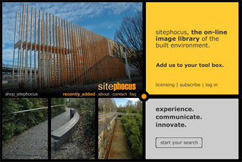
What are the features of the site? How might it benefit landscape architects and other design professionals?
Basically, all of our photography is key-worded and catalogued specifically for landscape architects, architects, designers, and planners. We’re currently at about 20,000 images, all of them key-worded by what’s in the photo as well as their location. If you’re a subscriber you have what we call an image board, where you can tag individual photos related to a specific project that you’re working on.
We’re also planning, in the next few months, to add some more features, like slideshow capabilities and the ability to share photos with clients via the web.
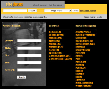
Search features allow you to find images by location, keyword, or category.
How do you add content?
Currently everything is done by Brian and me. At this point in time, since we’re not profitable from an economic standpoint, we’re traveling on personal time. A lot of my trips are usually to places my wife and I would like to visit, and then I just run around the city and get photos. We provide 300 to 500 new photos per month.
You mentioned that the site is not profitable right now. How many subscribers do you have? How close are you to financial solvency?
I think we’re a long ways from that. We have about a dozen subscribers, which covers our hosting costs. But in terms of us turning this into a full-time project it would take quite a bit more. So in that regard, we’ve been a bit disappointed, and in some cases we feel like we’ve taken the wrong approach in not doing enough marketing.
Aside from not marketing enough, what else do you wish you could correct? On what do you wish you could get a do-over?
The thing that we haven’t done well enough is selling this as a resource and as a cost-saving benefit. A lot of people come to the site, see $25.00 a month or $300.00 a year and just view that as a cost only, rather than seeing the efficiency of getting the images quickly and getting exposure to more and more projects. That’s actually a cost savings if you factor it into billable rates.
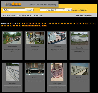
In this sample search results page (I was looking for fences), you can see the number of images (47 pages of fences) and geographic breadth of the content (pictured here: Murfreesboro, Wilmington, Barcelona, Louisville, Durham, Indianapolis).
Do you fear, though, that you will always compete with Flickr, Google, and other sites like those?
Oh, definitely. I think there’s always that mindset that you can get anything on the Internet for free. But there’s still a cost to using those sites. If somebody could come to our site and get 100 photos of townhomes in five minutes, well, if they’re doing that on Flickr or Google, it’s going to take them a little longer. The efficiency comes in with billable rates: you’re spending more time doing stuff for presentations when you could be designing.
Not to be pessimistic, but how long will you maintain the site? Do you and your partner have a moment in mind at which point you’d say, “You know what, we gave it a great shot, but it’s just not working?”
We haven’t had that discussion yet. I’m sure it’s probably coming in the near future, but we’re both enjoying traveling and looking for new stuff, so we still feel that this is a good tie-in with our professional lives as well.
It may be that the site will morph into something else. If we get to the point where we’re saying the 300 to 500 images a month is too much of a commitment, or the subscriber-based system isn’t working, we may move to another model, such as pay-per-image or to add advertising.
Would you ever consider not practicing landscape architecture, and instead focusing on media full time?
Specifically with sitephocus? Yeah, we probably would. It would be great to always be somewhat in touch with design, because it’s obviously what our passion is, but we would definitely love for this to get to the point where we could focus on this full time and provide even more content. That’s definitely the end goal.


