Author: Caleb Melchior
10 Questions with @thelandscapeofmemes

Inspired by the article “Iced Out” by Brian Barth in the February 2019 issue of Landscape Architecture Magazine
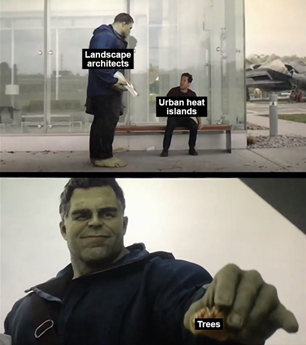
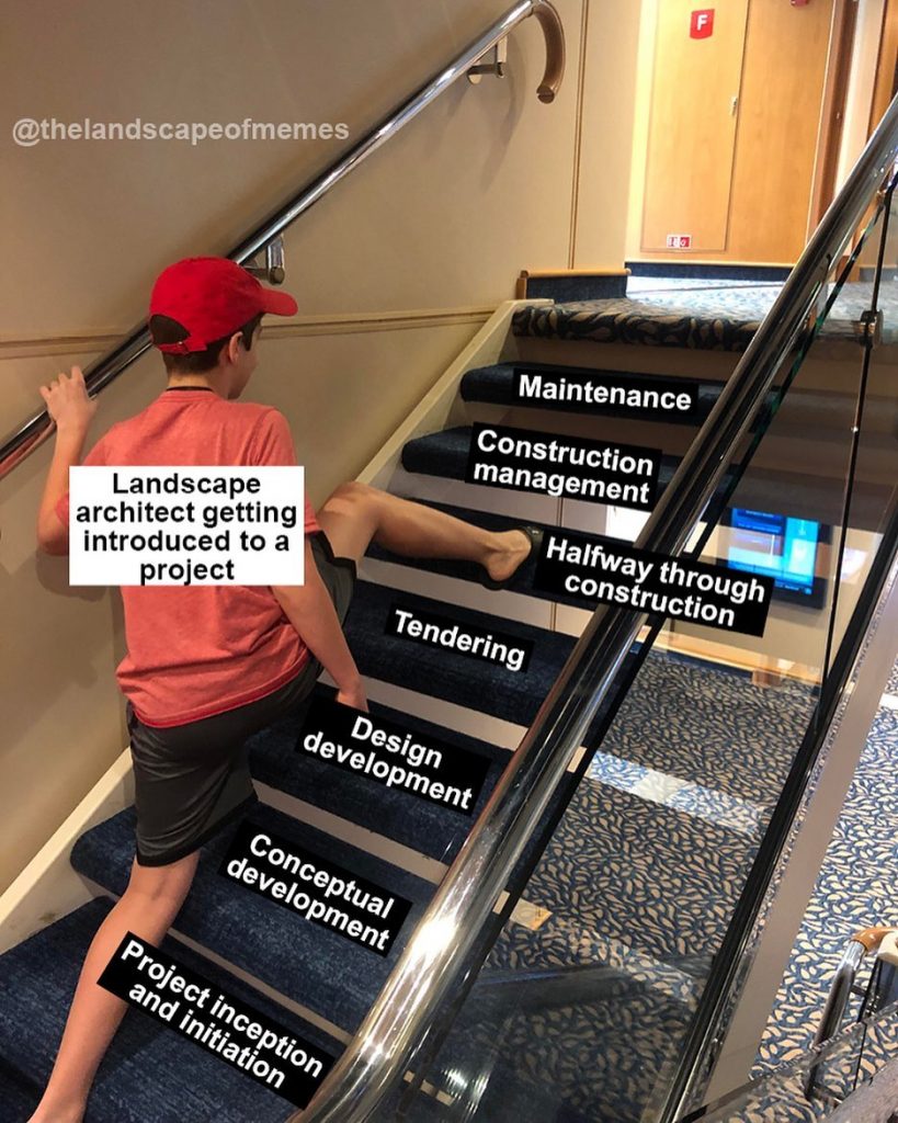
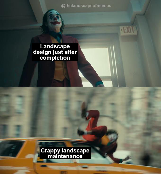
Those clever landscape architect memes your friends are sharing? They’re probably from the new instagram phenomenon @thelandscapeofmemes.
Land8 had the opportunity to ask @thelandscapeofmemes a series of questions about their work. Here’s your chance to learn from a meme master who thinks seriously about the possibilities of our profession. Make sure to give them a follow @thelandscapeofmemes on Instagram or Twitter.
I’m an avid viewer of memes and one day I randomly decided to search “landscape/landscape architecture memes” and what I saw was… interesting. I’d seen so many funny meme accounts for architecture, graphic design, medicine etc and I would always think, “It would be cool if there was a decent, relevant meme page dedicated to landscape architecture/design.” After a while of pondering the idea, I just decided to start an account – it was really a “why not?” moment. I also liked the idea of adding an amusing way for people within the profession to engage with one another.
Whose work (could be anyone – designers, cartoonists, musicians, puppeteers) inspires you?
I like the work of Joan Cornellà and how he delivers social commentary through his unsettling and weirdly amusing comic strips and artwork. His work has little to no text and uses only a few frames but still manages to convey a power message relating to our society. That’s basically the meme format – short, relevant and direct. Floccinaucinihilipilification is also another cartoonist whose comic strips I enjoy and get inspiration from because they’re so relatable. I also admire the blunt and defiant nature of Banksy’s work. Then there’s Theo Jansen and his surreal kinetic sculptures. The way he infused art and engineering in such a harmonious way is truly amazing.
In terms of landscape architects – it has to be Catherine Mosbach for me. Her work is unique, refreshing and reveals intriguing ways to design landscapes which may not fit into “mainstream” notions of landscape design.
New Zealand is a stunning country with such a variety of magnificent landscapes. I’ve been fortunate enough to see and experience them for myself and it strengthened my love for the natural environment. It also hit-home how a lot will need to change from a global, environmental perspective if these landscapes and their associated ecosystem will persist. The Neolithic sites of Carnacs stones located in Brittany, France – which I have to visit one day! They appear to be such fascinating and mysterious sites with a wealth of history. I recently rediscovered these sites while searching stone installations and I was reminded of the striking presence of the stone arrangements set against the rather flat landscape. The sites have me contemplating how simple interventions in the landscape can be profound.
How do you use memes as part of your creative practice?
Initially, my creative practice was mainly drawing, and I thought adding meme-making would be simple, but it really wasn’t. So, I work on memes a couple times a week – but I never force the process. Sometimes a meme idea sprouts spontaneously from something I saw or read, and I know exactly what meme template to use and it just works. Other times, an idea doesn’t come so easily, so I just work on something else. Unlike drawing (which I attempt to do every day), I prefer to let meme ideas come more naturally.
What have you learned from creating @thelandscapeofmemes? What’s surprised you?
How much the global landscape architectural/design community has in common. How we have similar/common experiences, frustrations and thoughts about the profession. It’s pleasant to read comments where people relate completely with a post or feel validated by it. I’m also starting to discover that there’s so much going on in the landscape architectural/design field beyond the news that’s on popular design websites. I try and create some memes which relate to something very specific related the field and hopefully encourage people to do further research if they’re interested.
Have you heard of people doing things differently as a result of your work?
Not so far. It would be nice to hear some stories in the future.
What kinds of representation would you like to see landscape architects explore – both as part of design practice and in how we represent our work to clients and the public?
We could explore virtual reality more to allow anyone to freely immerse themselves in a landscape design. There is also an opportunity here to represent landscape over time – I think landscape architects/designers can be too focused on representing the final, mature landscape design and don’t think so much about the in-between. Virtual reality could play a valuable role in depicting how a landscape design evolves over a period of time. It’d also be nice to see more hand-drawings – although it is more time-consuming to do plans, sections and perspectives by hand. Digital representation goes a long way, but I do feel there’s a lovely quality in a hand-drawing which can also impress. I’ve seen other creative ways of representation such as collage and even custom-made stamps (of trees and textures etc) which were used to create a plan. So there’s so many (artistic) options to representation depending on the project.
In what ways would you like landscape architects to make space for humor in practice? How do we stay (or become) playful?
Chill out sometimes – some practices may be too stiff/formal and have no “office culture.” A simple office lunch once a week (where everyone actually has to leave their desk to eat together) can go a long way in building that friendly, light-hearted environment. Of course, work must still get done, but I think deliberately designating some time to do something relaxing or fun and get to know your colleagues (especially in larger practices) is helpful. Browsing social media occasionally and seeing all the funny accounts and channels also helps maintain some playfulness.
Is there something that you haven’t explored yet with memes or landscape representation that you’d like to try?
I want to explore editing video footage – taking classic video memes and adding a landscape architecture/design spin to it. There is a lot of footage out there that relate to the profession from lectures to references in movies and documentaries – it’s just a matter of how they are put together.
What are your dream projects?
It’s odd because my dream projects (that have been implemented) are pathways. The first is the pathway to the Acropolis designed by Dimitris Pikionis. It’s incredible how the pathway looks like it was constructed at the same time as the Acropolis even though it was actually implemented in the mid-1950s. I appreciate how the project is very mindful of the context as exemplified through the design and the use of local material and craftsmen. I can only speculate, but it seems like the project was implemented carefully and thoughtfully – it wasn’t rushed. The other pathway is at Punta Pite in Chile, designed by Teresa Moller Landscape Studio. Like the Acropolis pathway, the project was implemented very carefully and sensitively using experienced craftsmen. The pathway is brilliantly integrated into the rocky coastline – anyone can see how incredibly intricate and skilful the implementation was.The construction industry is so fast-paced, and it really forces architectural designers to produce results quickly; for me, it’s nice to see projects like the pathways mentioned, which demonstrate an acute sense of thoughtfulness and patience in the landscape design and implementation.
On the flipside, another dream project for me would be anything which is designed specifically for (sea or land) animals. I suppose zoos are one but perhaps that typology could be rethought. I don’t know of many projects where the design is intended for a specific animal or species for example. I can only imagine that this type of project would be exciting because it would involve a diverse team which would include professionals who work with or study animals.
Top Video Resources for Landscape Architects
As practicing landscape architects, it can be easy to feel distanced from innovation in the field. Designers outside of major metro areas – or remote from landscape architecture schools – can find it difficult to feel knowledgeable or inspired. In small firms, particularly, the resources necessary for continuing education are often difficult to justify. Fortunately, there’s been a recent movement for universities and other organizations to release online video of lectures and presentations. These lectures may not provide the social benefit of attending a conference – and you may not get an education credit, but they can be a cheap and flexible way of learning. If you’re needing some inspiration, flick over to YouTube or Vimeo. Listen to these experts. You’ll learn something. To start, here’s a quick list of 8 free online video resources for landscape architects:
Landscape Architecture Lectures, College of Environmental Design, University of California Berkeley:
An opportunity to learn from top professionals in the field without paying for the privilege? Thank the landscape gods that you were born in the internet age. Olmsted, Ferrand, and le Notre would be tumbling over themselves to have the opportunity to learn from the professionals we get an opportunity to hear via the internet. I found out about this stream when I failed to attend the 2018 Symposium on The Art of Planting Design, which featured practitioners from Mexico, Portugal, Sweden, and Australia – as well as a range of regions in the US. Even if you’re not a planting person, there are plenty of other memorable lectures here – make sure to listen to Diane Jones Allen on cultural landscapes and Nadia Amoroso on landscape representation.
Beth Chatto Symposium 2018 Recorded Lectures:
Planting designer Beth Chatto is particularly well-known in the United Kingdom, but her ecologically-driven approach has influenced planting around the world. In 2018, planting experts who work at a range of climates and scales congregated to speak about their work. Whether you design with plants on a daily basis or an occasional shrub-it-up kind of landscape architect, you’ll learn something from the fantastic panel assembled at this event.
Landscape Architecture Foundation:
If you’re at all interested in becoming a better designer, you pay attention to the Landscape Architecture Foundation’s work. Their earlier work focused on environmental sustainability, including the Case Study Investigation and the Landscape Performance Series which pioneered research on actual measurable results of design interventions. Today, LAF is beginning to broaden their scope to include equity and social justice – aspects of landscape architecture that our profession has often ignored. Give their videos a watch to learn from researchers and practitioners creating influential work. If you watch nothing else, watch the 20-minute documentary for the New Landscape Declaration.
Landscape Architecture Department Lectures, University of Washington College of Built Environments:
Did you attend lectures when you were in design school? No? You stayed in studio working on your projects? Well, make up for lost time by listening to this series of expert practitioners. UW has a really useful practice of including lectures from the entire college of the built environment in one stream. Learn from architects and planners as well as those in your own discipline. I learned about this channel through the GGN talk “Drawing What You Can’t See”, which included talks by Shannon Nichol, Keith McPeters, and David Malda. Give it a listen.
American Society of Landscape Architects:
You’re interested in landscape architecture, you know about ASLA. That’s not even up for debate. It’s the professional advocacy organization in the United States. ASLA’s YouTube channel is more scattered and clip-oriented than some of the other resources on this list, but pay particular attention to the channels on Designing for Diversity and Ask Me Anything.
American landscape architects have an unfortunate tendency to be a bit provincial about our understanding of our profession. Yes, the term “landscape architect” is an American invention. The earliest professionals (Olmsted and Vaux) to use that term and the first professional program (at Harvard) were American. But, today, there’s a vast body of landscape architectural expertise being created across the world. Take a look at the UK-based Landscape Institute YouTube channels for some great stormwater graphics and content on landscape architecture as a profession.
Public gardens are a great resource for landscape architects and planting designers. Dedicated to creating and preserving knowledge about the environment, botanical institutions are doing important work in this time of epic extinction rates and climate change. New York Botanical Garden has done fantastic work in recording the knowledge of regional experts. Explore their online content to learn more about biodiversity, plant communities, and climate resilience strategies. Don’t hesitate – while drawing out your next CAD details, listen to Charles Jenks on the Universe as Artist or Robin Wall Kimmerer and Elizabeth Gilbert on What Plants Can Teach Us.
The Cultural Landscape Foundation:
The Cultural Landscape Foundation focuses on connecting people to place. Their work protects and interprets four types of landscapes – designed, ethnographic, historic, and vernacular. As part of their interpretive work, TCLF’s YouTube channel includes oral histories of famous landscape architects, as well as conference presentations. Start with the oral history of Cornelia Hahn Oberlander, a Canadian landscape architect who has created significant landscapes throughout the US and Canada.
Land8: Landscape Architects Network has organized a series of of “lightning talks” with landscape architects presenting on the theme “Next Practices in Landscape Architecture”. The format of Land8x8 (“land-eight-by-eight”) Lightning Talks is 8 speakers for 8 minutes each. This exciting new format breaks away from traditional lectures and packs in 8 different talks in about an hour that will have you thinking and inspired about the future of landscape architecture from a variety of established and emerging leaders. Be on the lookout for 16 new talks to be published on a continuing basis starting next week.
Your firm may not be able to sponsor a trip to Hong Kong or Sydney or San Diego, where you’ll clink glasses and open your sketchbook to today’s hottest design experts. But you’re in luck. You don’t have to devote a full semester or pay tuition in order to learn from top practitioners and researchers in our field. Turn your web browser to Vimeo or YouTube, crank up your headphones, and give these online resources a listen. You’ll learn something.
—
Lead Image: Caleb Melchior
Show Secrets: Design Details from the 2019 Chelsea Flower Show
You’ve probably seen photos from Chelsea Flower Show. For a week in late May each year, the grounds of the Royal Hospital Chelsea in south London are filled with show gardens and horticultural exhibits. The Chelsea Flower Show is one of the most famous garden festivals in the world. It’s organized by the Royal Horticultural Society, the United Kingdom’s primary horticulture non-profit. The Royals usually open the show. The BBC broadcasts hours of coverage. Celebrities stand and talk to the cameras about their garden love. This year, Dame Judi Dench did a talk about dutch elm disease. Other shows might be more innovative or cosmopolitan, but Chelsea has prestige.
I’d been meaning to go for years. This spring, I finally got myself together, took a plane and a subway and a couple of cross-town buses, and went to Chelsea on press day.
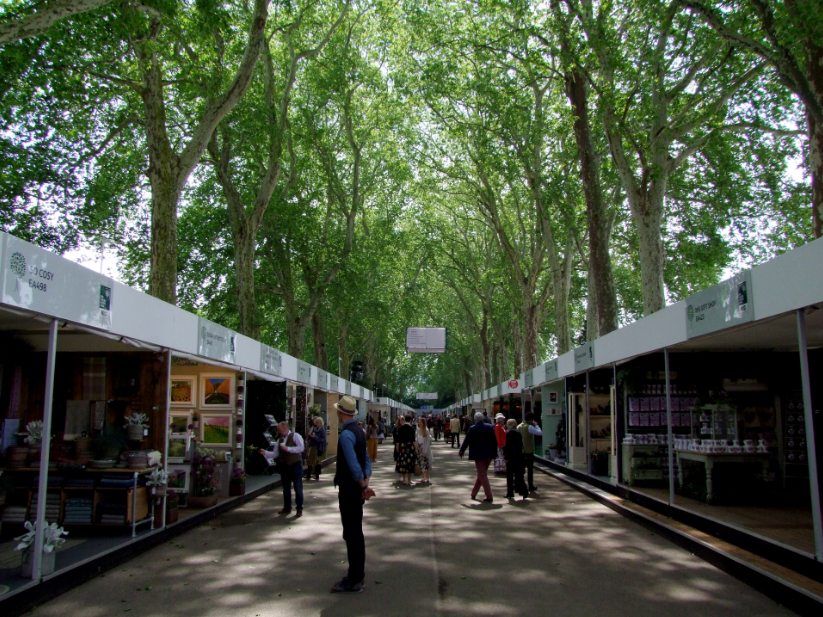
Main Avenue | Photo: Caleb Melchior
You enter into the Main Avenue. London Planes (Platanus x acerifolia) planted both sides of a wide walk create a vast canopy, flickering rows of booths. The uniform shape and color of the booths offsets the diversity of products and display styles on offer. In one booth, you could purchase some of Rachel Dein’s delicate casts – snowdrops, crocus, species tulips in bas relief. Others, garden tools or furnishings. You can sign up for Gardens Illustrated or The English Gardener magazine. But I was here for gardens, not to shop.
The show features three types of gardens: show gardens, urban gardens, and artisan gardens. Show gardens are the largest (1300-2100 sq ft / 120-200 sq meters), usually designed by high-profile UK garden designers and landscape architects, sponsored by large companies and organizations. They’re located around the Grand Marquis – the central venue where specialty nurseries and horticulture companies set up floral displays. Urban gardens, at 800-1100 sq ft/72-100 sq meters, usually explore contemporary forms and materials. They’re located against the backdrop of the Royal Hospital’s renaissance courtyard. Artisan gardens (220-430 sq ft/20-40 sq meters) are located back in the Ranelagh Gardens, to the east of the primary show grounds. They’re surrounded by woodland and typically explore looser, more rustic design styles.
Gardens in all three categories are incredible accomplishments. Anyone who’s been involved with making a landscape – particularly on a deadline – would be impressed at the craft and skill evident in these gardens. As a designer who works primarily in the United States, I’m highly impressed with the quality and range of plants available for these show gardens. The materiality is stunning.
But, looking at these gardens, I realized that there’s an integral element of the landscape experience that I missed. You can’t walk through most of the gardens. They’re set up like dioramas, beautiful jewel boxes that you can observe from the outside. As a press day attendee, I was fortunate to be able to have clear views of most of the gardens and walk around them without having to shove through a crowd. But I still felt like someone looking into a shop window. The gardens felt more like objects than spatial experiences.
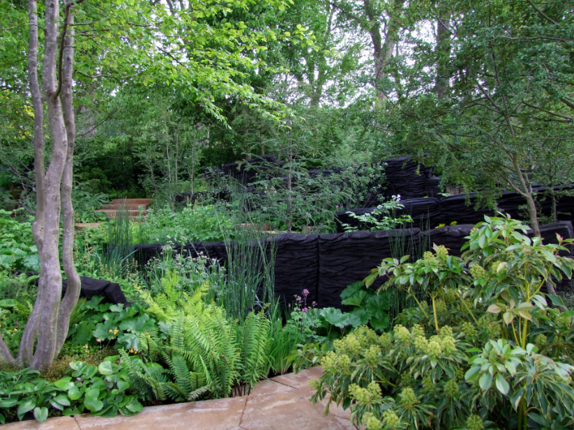
Andy Sturgeon | Photo: Caleb Melchior
Different designers addressed this spatial challenge in different ways. Andy Sturgeon’s Woodland Garden for M&G, the 2019 Best in Show winner, used a highly graphic approach. Strong lines (like swift charcoal strokes in a drawing) of burnt wood ledge sculptures by Johnny Woodford set up an underlying layered structure to the garden’s space. Quirky corky trees rose between the ledges, creating green veils. Then, between the ledges burst forth an intricate groundcover layer of highly varied woodland plants.
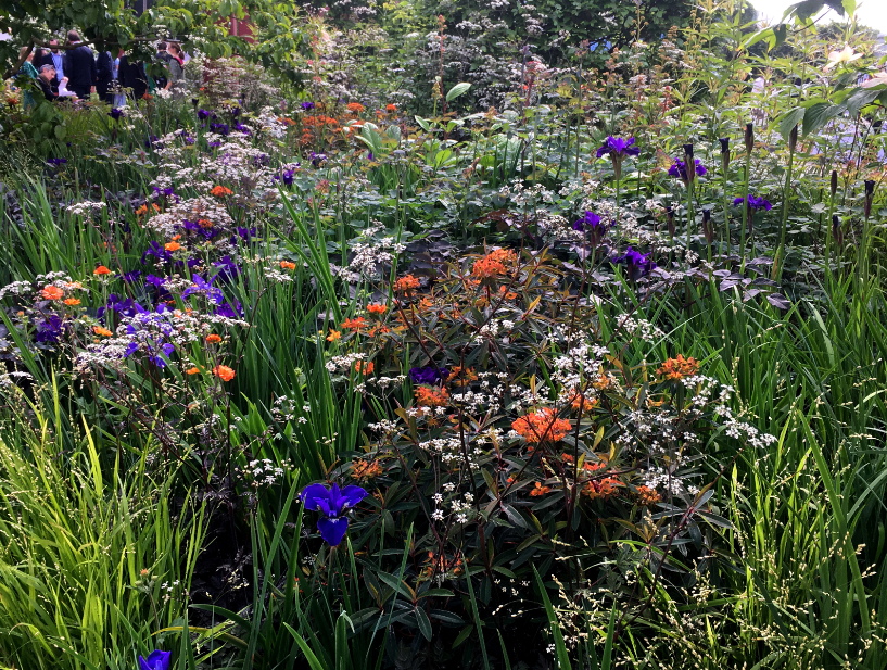
Intermingling Tom Stuart Smith | Photo: Caleb Melchior
Diffusion – incorporating small-flowered and small-leaved plants with wiry stems – seemed a common technique for bringing lightness and movement to counteract the flatness of these gardens. Tom Stuart-Smith’s Show Garden for RHS Bridgewater (one of the few that you could actually walk through) featured highly intricate intermingled planting in jewel tones: purple cow parsley, orange euphorbia, tangerine geum, blue siberian iris.
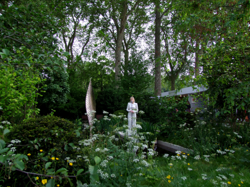
Chanteuse | Photo: Caleb Melchior
In the Savills and David Harber Show Garden, designer Andrew Duff used white-flowered cow parsley and golden buttercups at the front of the garden to create a diffuse edge – enhancing the more solid shrub blocks and water bodies behind.
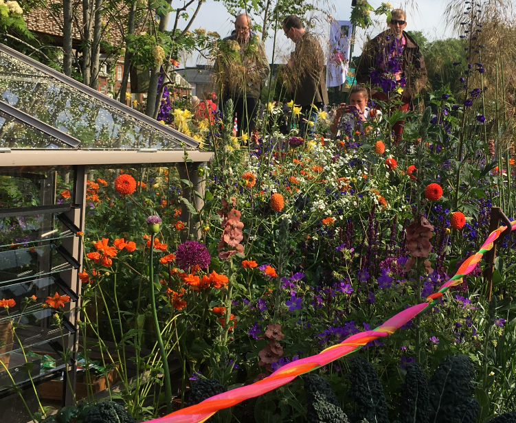
Montessorri Garden | Photo: Caleb Melchior
Diffusion was used in smaller gardens as well. Jody Lidgard’s Montessori Centenary Children’s Garden, one of the urban gardens, intermingled brightly colored flowers to create a display that a pointillist painter would love.
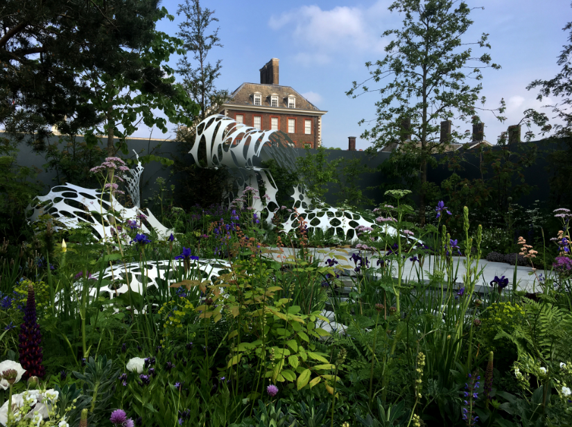
Laser Cut Aluminum Garden | Photo: Caleb Melchior
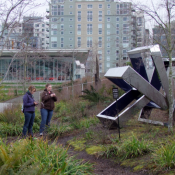
In addition to diffuse planting, designers used intricate and complex surfaces within the gardens to achieve depth. The Manchester Garden by Exterior Architecture incorporated a hand cut carbon fibre sculpture, Morpheus by Lazerian Studio. Morpheus’ organic form contrasted beautifully with the historical architecture of the Royal Hospital (visible in the background).

Moss Garden | Photo: Caleb Melchior
Kazuyuki Ishihare’s Green Switch Artisan Garden featured two glass cubes overlooking a moss-and-rock pool. The intricate surface of the moss, each soft hummock individually placed, created a sense of intense fascination. I couldn’t stop looking at it.
Reflecting on the show, the thing that I keep coming back to is the difference between my expectations and the actual experience of being there. Seeing photography of previous shows, my brain had interpolated an immersive spatial experience – an experience that the show didn’t deliver. This gap between expectations and experience reminded me of past visits to other high-profile landscape architecture projects that didn’t live up to the images.
Representation is always a challenge for landscape architecture and landscape architects. Visiting Chelsea – such a glorious temporary spectacle – made me wonder if sometimes the most meaningful landscapes are those we build only in our minds.
—
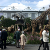
Lead Image: Driftwood Garden | Photo: Caleb Melchior
Portfolio Secrets for New Landscape Architects and Designers
A design portfolio, especially for the young and less experienced designer, is an intimidating document to create. We’ve all heard rumors of older students with silver bullet portfolios that secure them endless job offers from prestigious firms. Who doesn’t want to be fought over for employment?
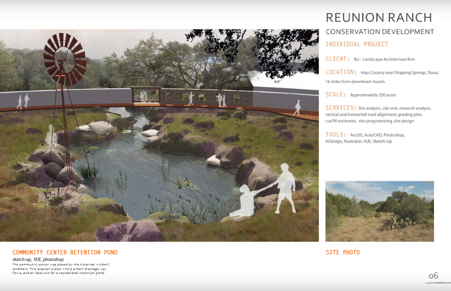
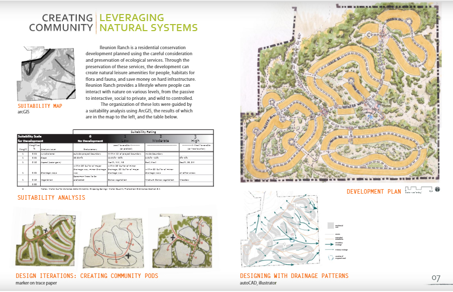
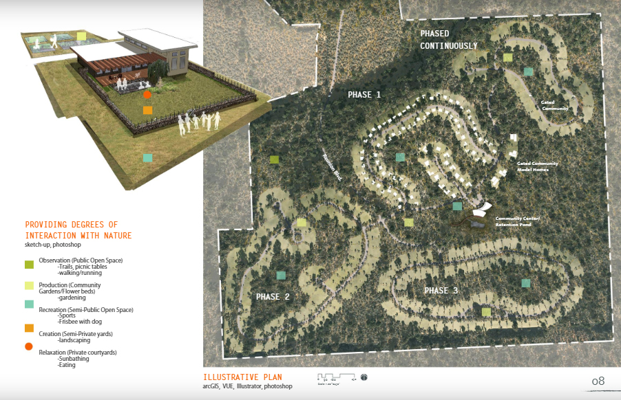
These three spreads from Ashley Schwemmer’s student portfolio demonstrate how to use multiple types of graphics to build a compelling story about a project. Schwemmer is a currently a landscape architect with West8 based in New York City.
The ideal portfolio represents the breadth of your skills and abilities. It demonstrates that you can communicate verbally and visually. It proves that you can think critically. That’s a lot of pressure on one document, which you preferably want to keep to no more than 10-12 spreads (5MB).
Design portfolios are useful tools. They demonstrate prospective employees’ aesthetic sensibilities, problem solving skills, communication styles, and technical abilities. But no 12-spread document can fully represent a person. There is no silver bullet portfolio.
After working with hiring teams at several different types of firms, I’ve been on both the creating and reviewing sides of the portfolio. Here are some considerations that can help you feel confident that the document appropriately represents you to potential employers.
- Make sure the document is easy to view. Many offices receive hundreds of portfolios for each job posting. The portfolios that will be remembered are those that are graphically clear and compelling. Make sure each spread reads at a quick glance. Format for easy viewing on small phone screens. Your knowledge of graphic and typographic design, layout, page structure, and hierarchy is reflected in your portfolio. Plan for good contrast so everything reads on a small phone screen or printed out in grayscale. You want to draw attention to the work itself, not to a complicated graphics scheme. Avoid complicated keys and labels.
- Minimize text. You’re a designer. Keep descriptions short. Demonstrate problem solving and critical thinking through graphics. No one is going to spend thirty minutes reading your description of a bioswale planting.
- Show design thinking. Pretty graphics are only part of the story. Tell the story of your processes through sketches leading to more refined graphics. Captions that include information about what tools/programs you used to create specific graphics and a rough estimate of the time it took you to create the graphic can be useful to a potential employer.
- Demonstrate multi-scalar thinking. Use different types of drawings (exports from 3D models, concept sketches, photomontages, plans, sections, etc) together to show that you’re accustomed to thinking through design problems at multiple scales and in varying degrees of precision.
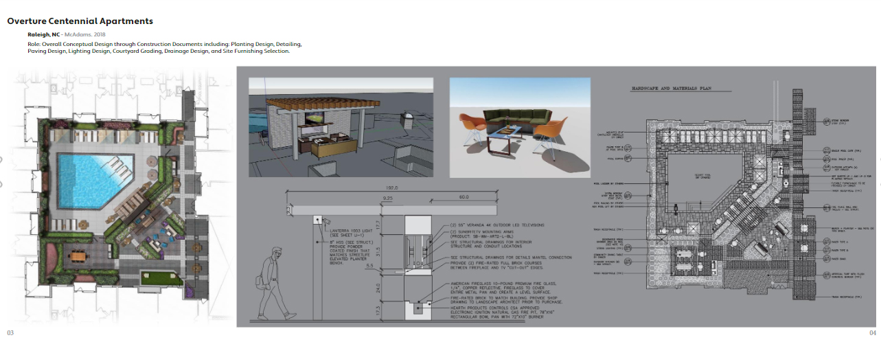
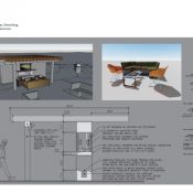
This spread from Ryan Albracht’s professional portfolio demonstrates design thinking at multiple scales, with a plan relating to construction details and exports from a 3D model. Albracht is a 3D visualization specialist with McAdams in Durham, North Carolina.
- Use space wisely. You have 10-12 spreads to capture a potential employer’s attention. Don’t waste it. One of the most useless sections I’ve seen in a lot of design portfolios is a photography section. If you’ve made it through design school, you can probably compose a successful image. Use this space to demonstrate a unique skill.
- Tie everything visually together as much as possible. Your portfolio, resume, website, and social media should read as a coherent experience that supports your expertise and areas of interest as a designer.
- Demonstrate unique knowledge & skill. Design is all about application of specialized knowledge and skill. It’s hard to spend much time developing new skills when you’re in the middle of a busy design practice. As a younger designer, you probably have skills (particularly in technology and social media) that may add capabilities to a firm – enabling them to offer new services and take on new types of projects. Demonstrate the design research techniques that you’ve learned in school and show how to apply them in design projects. If you have statistics knowledge that informed a project, demonstrate that. If you know some neat tricks and tips, show them in your portfolio. If you have experience in fine art, list competitions and exhibitions. Show off your fluency with different media.
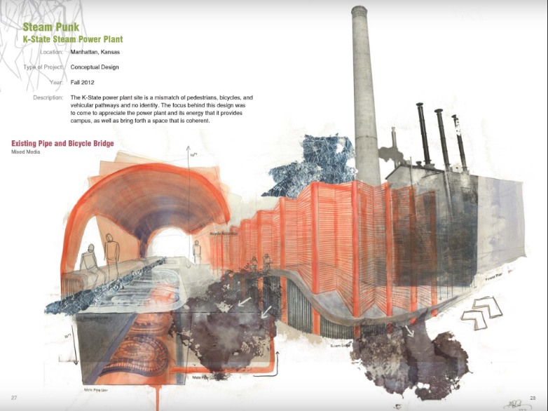
This spread from Elizabeth Levkulich’s student portfolio demonstrates explorations of mixed-media drawing in a Jon Hunt’s Poetic Image studio at Kansas State University. Levkulich is a landscape designer with TBG Partners in Dallas, Texas.
- Demonstrate hands on experience. Hands-on experience with landscape maintenance, retail horticulture, construction, graphic design, research methods, and business administration can be highly useful to landscape architecture firms. Demonstrate how real-world experience supports your creative practice.
- Customize some of your portfolio. Keep a major block of your portfolio ready to go, but customize a few pages for firms that you’re particularly interested in. Do research and you’ll get a feel for the firm’s aesthetic – both in graphics and built work. Read staff bios – you’ll often get a sense for the type of language that firm appreciates. Google around to find out about new projects they’ve obtained and what they’re working on – you may have skills that enable a firm to take on new types of projects and offer new products.
- Have a personal professional website. This doesn’t have to be fancy. It can be a wordpress site that just includes the material from your portfolio. Keep adding to it over time, even in practice. You’ll find that it’s highly useful to have an online place where you can demonstrate expertise.
- Make it easy to contact and find you.
5 Top Planting Design Resources for New Landscape Architects
Clients and employers often complain that landscape architects, particularly young designers, are failing at planting design. Previous articles on Land8 have identified planting design as a challenging area for the profession in several other articles, including “Why Do Some Graduate Landscape Architects Have a Poor Understanding of Planting?” and “Garden Designers & Landscape Architects: Resolving the Identity Crisis”.
Planting design is a complex and time consuming aspect of practice. In the horticulture community, individuals devote their entire careers to understanding how to grow specific plants. Landscape architects don’t have that luxury. We are expected to have a thorough understanding of regionally appropriate plants, as well as the ability to specify them appropriately and provide direction for planting and maintenance. We need to quickly and efficiently create high quality planting plans and specifications. This requires a substantial body of knowledge and experience.
To fulfill this challenge, we need to draw on all of our resources to be able to fulfill our employers’ and clients’ expectations. As a start, here are five resources that will help you get better at planting design today:
1. Public Gardens
Public gardens are your top local resource for seeing what plants grow well in what situations in your area. Go, take a look at what’s growing – whether as a studio tour or a leisurely weekend trip. Introduce yourself to the horticulture staff. Find out their areas of expertise and current research interests. They probably have a designated help desk where you can ask specific plant-related questions.
Explore their online resources as well. Many public gardens have extensive resources that you can access from the comfort of your desk. Try Missouri Botanical Garden’s PlantFinder Database and Chicago Botanical Garden’s Plant Trials Evaluation Notes.
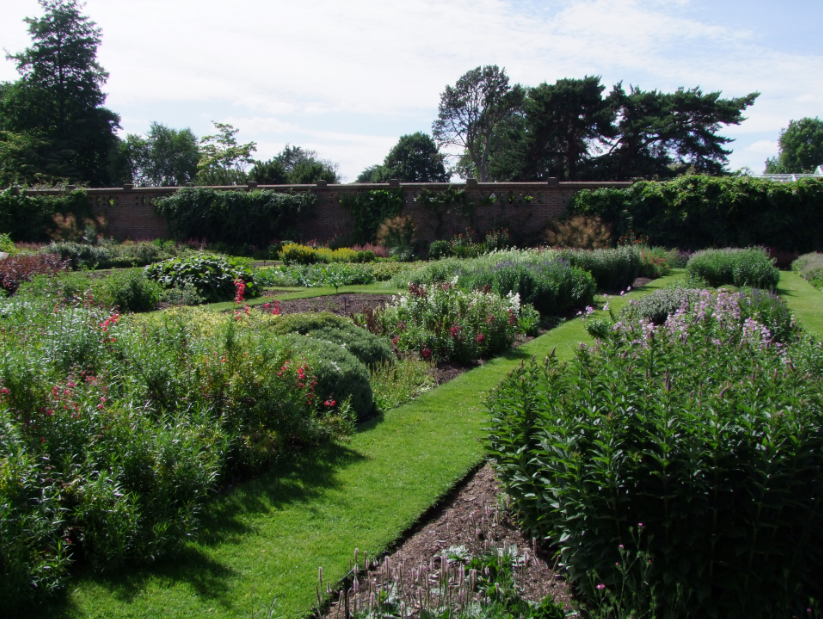
Regional botanical gardens, such as these Plant Family beds at Kew, Richmond, UK, are a fantastic resource for designers to see plants growing in specific physical situations | Photo: Caleb Melchior
2. University Extension Resources
Looking for evidence-based information? University extension publications have it. They aren’t just for your country cousins. University Extension fact sheets are especially useful when you need information on specific plants or horticultural and agricultural practices. Best of all? They’re free. University of Florida and Cornell both have exceptional landscape-related online resources.
3. Trade Organizations
Throughout the United States, plant propagators, growers and nursery-people unite through regional trade organizations. Attending their conferences and nursery tours will enable you to understand what plants are available in your area, along with typical sizes and seasonal differences. Go talk to these nursery-people – a good relationship with potential sources will help smooth over project challenges. For a start, try the Washington State Nursery & Landscape Association or the Louisiana Nursery & Landscape Association.
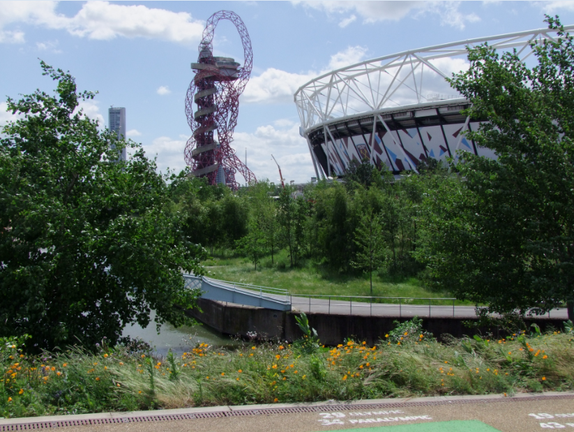
Contemporary naturalistic plantings, such as these mixes at Queen Elizabeth Olympic Park, Statford, UK, often have wide plant palettes that can be difficult to manage both in design and construction processes. Softwares for planting design management and plant sourcing can make these complex processes more efficient and profitable. | Photo: Caleb Melchoir
4. Planting Design Management Software
The most comprehensive and widely available planting design management software in the United States is LandFX, an AutoCAD add-on. Using LandFX, designers can place plants as objects connected to a database. Once the design is complete, plant counts and schedules are generated automatically. This enables designers to quickly create plant lists with a high degree of accuracy and efficiency. Vectorworks, used more widely internationally, has these capabilities built-in.
5. Plant Sourcing Databases
You can specify the most wonderful plants imaginable, but if they are not available, you will be receiving endless calls from contractors and complaints from clients. Using plant sourcing databases, landscape architects can understand what plants are readily available – and at appropriate sizes – in their region. PlantAnt is one of the largest sourcing assistance sites, showing the inventories of hundreds of nurseries across the continental United States. It’s free, but many of the nurseries do not update their databases very often. The Plantium is a newer, more visually-oriented resource. To date, it only covers the Northeast and Midwest of the United States. In Europe, the RHS Plant Finder can help with some nursery sourcing, but it focuses on retail rather than wholesale sources. Any of these databases are only as good as the data that is fed into them, so it is often useful to use them as a general guide rather the gospel truth.
While planting design is one of the most challenging aspects of landscape architecture practice, it can be one of the most transformative elements of a project. Utilize these resources and we can start to erase the common complaint that landscape architects don’t understand plants.
—
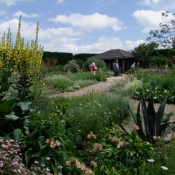
Lead Image: At Beth Chatto’s Dry Garden in Colchester, UK, a sophisticated knowledge of plants supported transformation of a parking lot into a multi-sensory experience | Photo: Caleb Melchoir
- 1
- 2


