Author: Radenka Kolarov
Beatrixpark Turns Art Installation into a Playground
The Beatrixpark by Carve Landscape Architecture (Amsterdam, The Netherlands)
The Beatrixpark is a place with a rich history that has story to tell. If you are familiar with a work of one of the first Dutch urban planners Jakoba (Ko) Mulder, a famous ‘’Miss of the Forest’’, then you know that one of her important works was a design of The Beatrixpark. The park was built in 1938 with a specific design approach, mainly as a transition from the romantic design style of the 19th century to the more functionalist style after the Second World War. At first, it had a paddling pool and a play pool for children, with a pergola. Influenced by English parks, with a small lake and open landscape, the Beatrixpark has received the status of the city monument in 2005. Today, the park has been designed by Carve Landscape Architecture as even more unique public space that attracts many visitors.
Let’s take a look closer at this project…
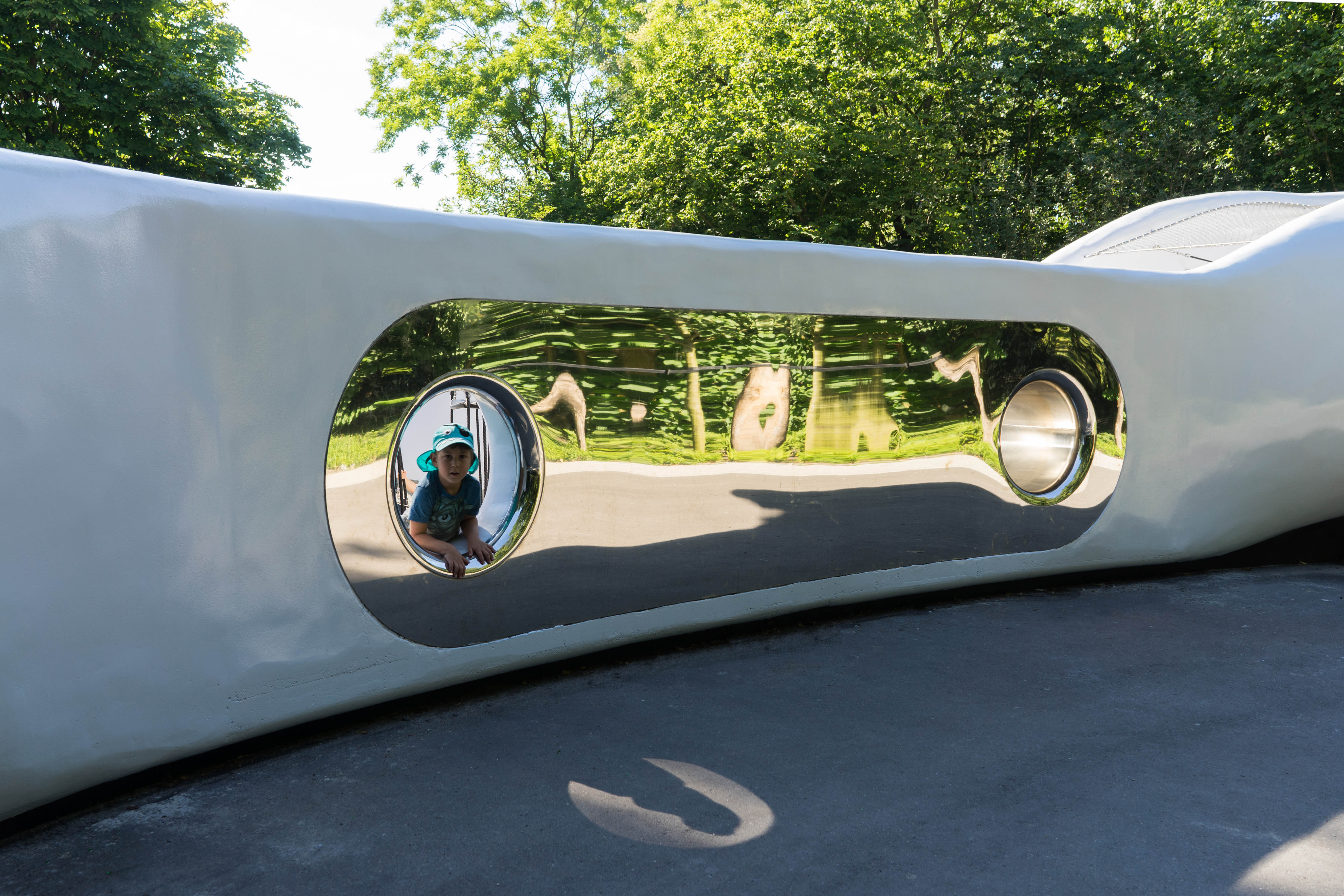
Image: Carve Landscape Architecture
Same location – new space
As we saw, the Beatrixpark is known as one of Amsterdam’s oldest modern city parks that is still in function and an important public space that has a role in developing of the area. Mainly because of its geographic position, it is valuable and a big deal! It is enclosed between an important infrastructural project, the Ring Road A10 that is going underground, the Beethoven Street on the west side, and the RAI Convention Center on the eastern side. In addition to the development of the Zuidasdok area, the area that is strategically situated between Amsterdam city centre and Schiphol Airport, the Beatrixpark represents an authentic public space that has a function to attract visitors from around the country. The plan is to extend the existing boundaries of the park to the larger area that would include the south-facing Sportpark Buitenveldert and beautiful the Amaliapark.
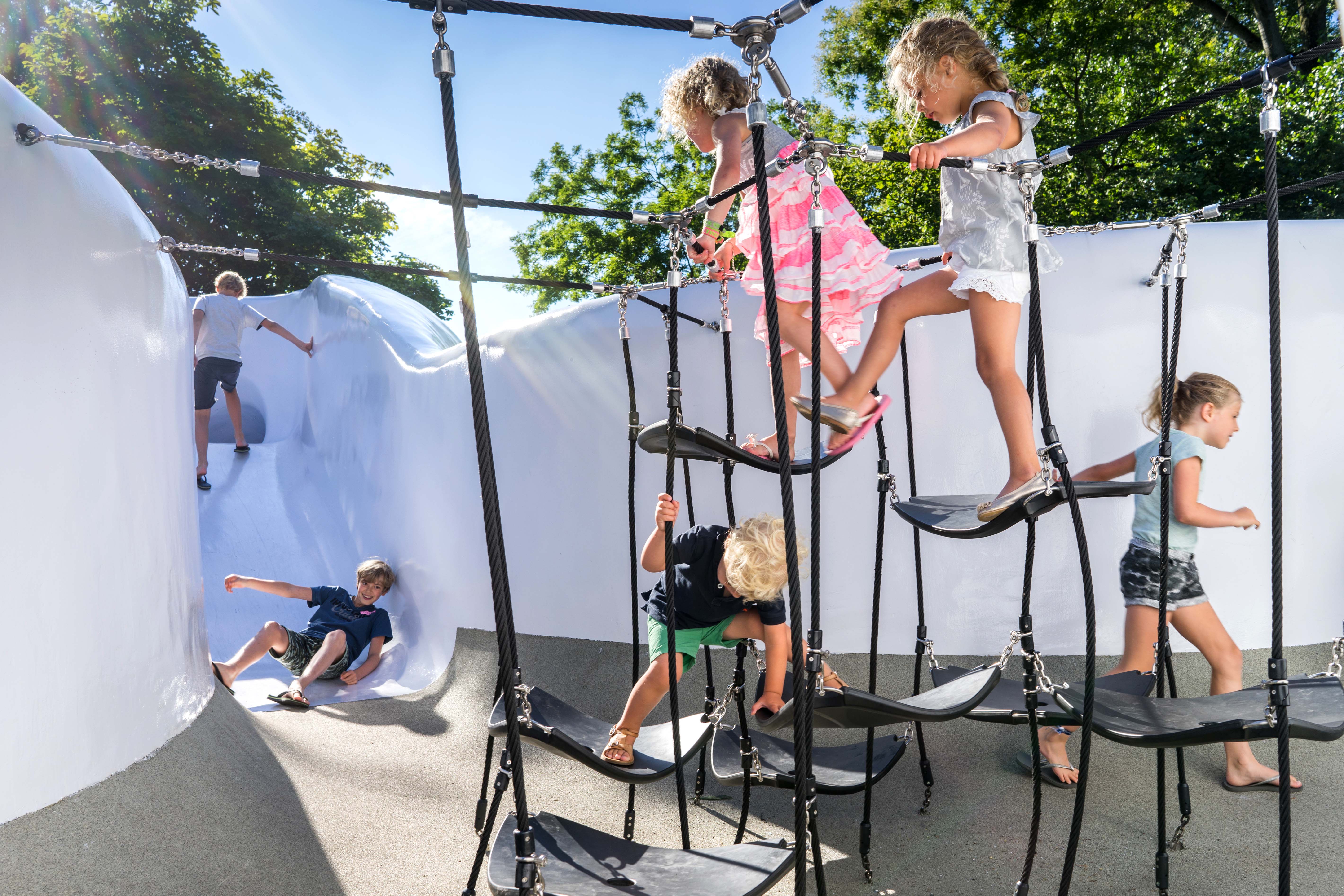
Image: Carve Landscape Architecture
Art approach in the design
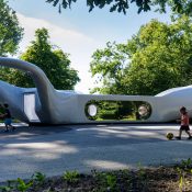
There was am existing neglected basketball court that intrigued Carve to make a new playground design that would enhance the space and make it even more attractive. The ultimate idea of a illusionistic sculpture installation was an awesome idea since it is multi-functional and intended for all users of the park. The sculpture itself is designed as a long oval mass with a hint of a bright lilac coating that makes it visible from the southern cycle path that surrounds the park. To satisfy the user needs and the wishes of the client, Carve made a form that is attractive for all age groups and at the same time serves as a meeting place for parents and an organically shaped playground that incorporates various play functions. Seen from the surrounding area, the sculpture remains hidden behind the trees, but its shape is open on both sides to intrigue onlookers. In addition to an existing playground for children aged 0-6, this is meant to be the second major play facility in the park. By arranging the requested functions in one binding object, the space around it is divided into three and thus redefines the environment. Inside the sculpture, children can climb, slide, and hang. Because these play functions are partially hidden, children experience this as exciting. The outside of the sculpture is a mirrored wall that has a mapped green environment on its surface. While playing or approaching the mirror wall, children and passersby are extremely distorted, which provokes immediate reactions. On one of the outer sides of the object, a trampoline is sunk into the ground. On another side, a goal has been painted on the wall, extending the area as a playing field. With the redevelopment of the Beatrixpark, Carve created as memorable of a project as it was when it was first constructed.

Image: Carve Landscape Architecture
Project as an example
As you saw in this article, Beatrixpark is a perfect example of a project that lays its bases on the history of a place, yet adds a completely new vibe into the designing approach. It was designed by Carve within three years of planning, and it represents a small oasis between urban environment and the airport that has a focus on both art and sustainability as a guiding principle. The park is functional and beautiful at the same time. With very modest influence of new materials and a wise choice of new technologies, these elements represent a very clever and promising park design.
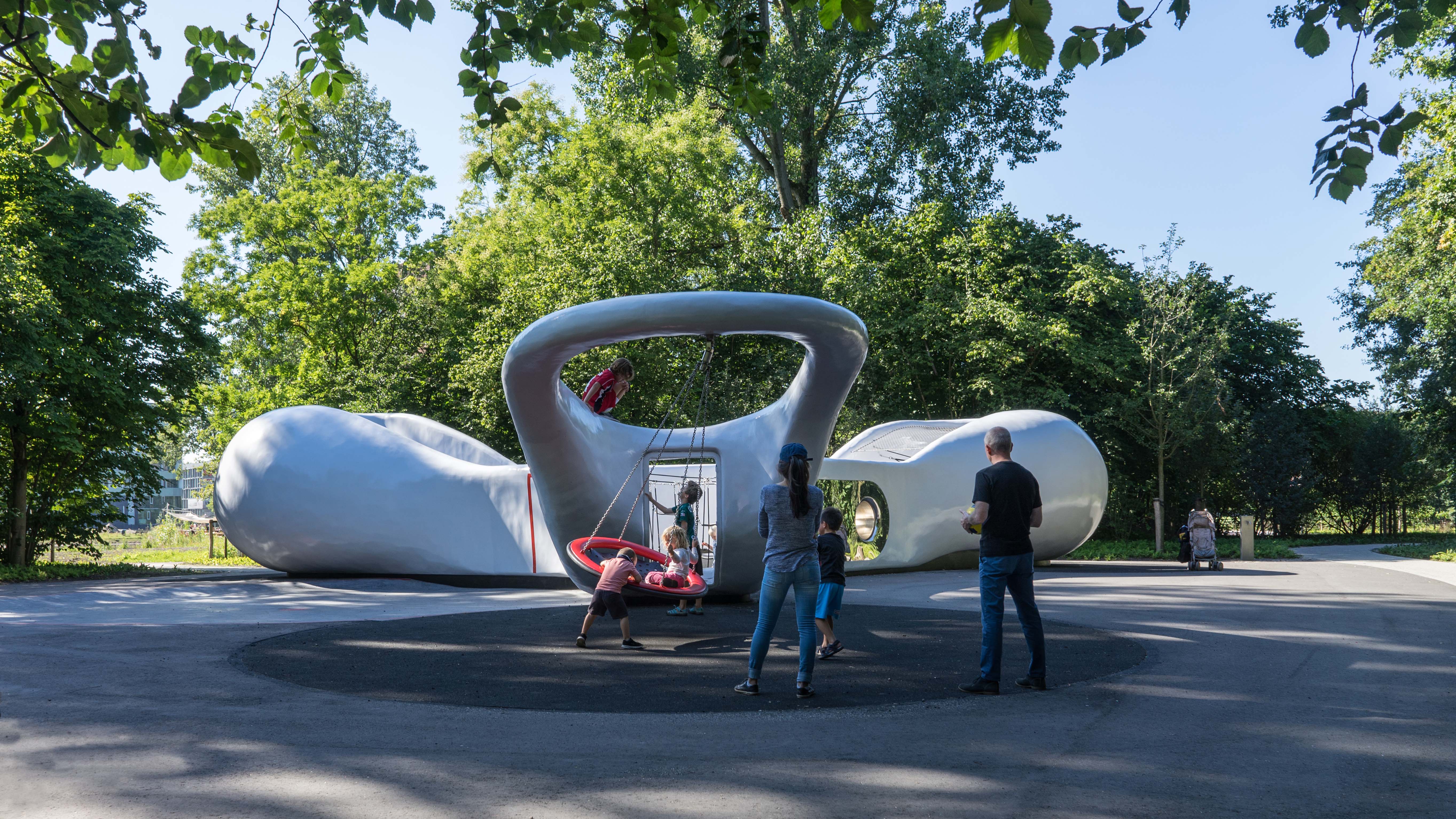
Image: Carve Landscape Architecture
Would do you think about this park? Have you thought about visiting it if you had a chance? Let us know in the comment section below!
Project Name: The Beatrixpark
Location: Amsterdam, The Netherlands
Design year: 2013 – 2016
Year Built: August 2016
Landscape Architects: Carve Landscape Architecture
All images courtesy of Carve Landscape Architecture
South Park in San Francisco Succeeds as an Ecologically and Socially Sustainable Park
It could be said that Fletcher Studio’s projects are formed generally as contemporary compositions, committed to a collaborative and contextual approach to spatial design practice and to the planning of unique and sustainable living infrastructures. That uniqueness lies in sudden details that make every Fletcher Studio design very recognizable. South Park is no different; it has an authentic look and valuable contents. In addition, it is a historically significant spot in San Francisco with a distinct history of development.
“It has been an invaluable experience working with the South Park Improvement Association and the community at large to rethink San Francisco’s oldest public space… We are grateful for the incredible amount of trust the community put into us that has resulted in a distinctive design solution we are extremely proud of,” said David Fletcher, Founding Principal of Fletcher Studio. Let’s take a closer look at this project.
The Oldest Park of San Francisco Made for Everyone
South Park was originally constructed in 1855 as the center of an exclusive residential community. Its transformation over the years has served an array of residents and community members including immigrants, longshoremen, artists, and young professionals. South Park played an important role during the “dot com” boom in the late 1990’s as a hub for various design and web-related businesses, such as Fuseproject, Slide.com, Twitter, and many others.
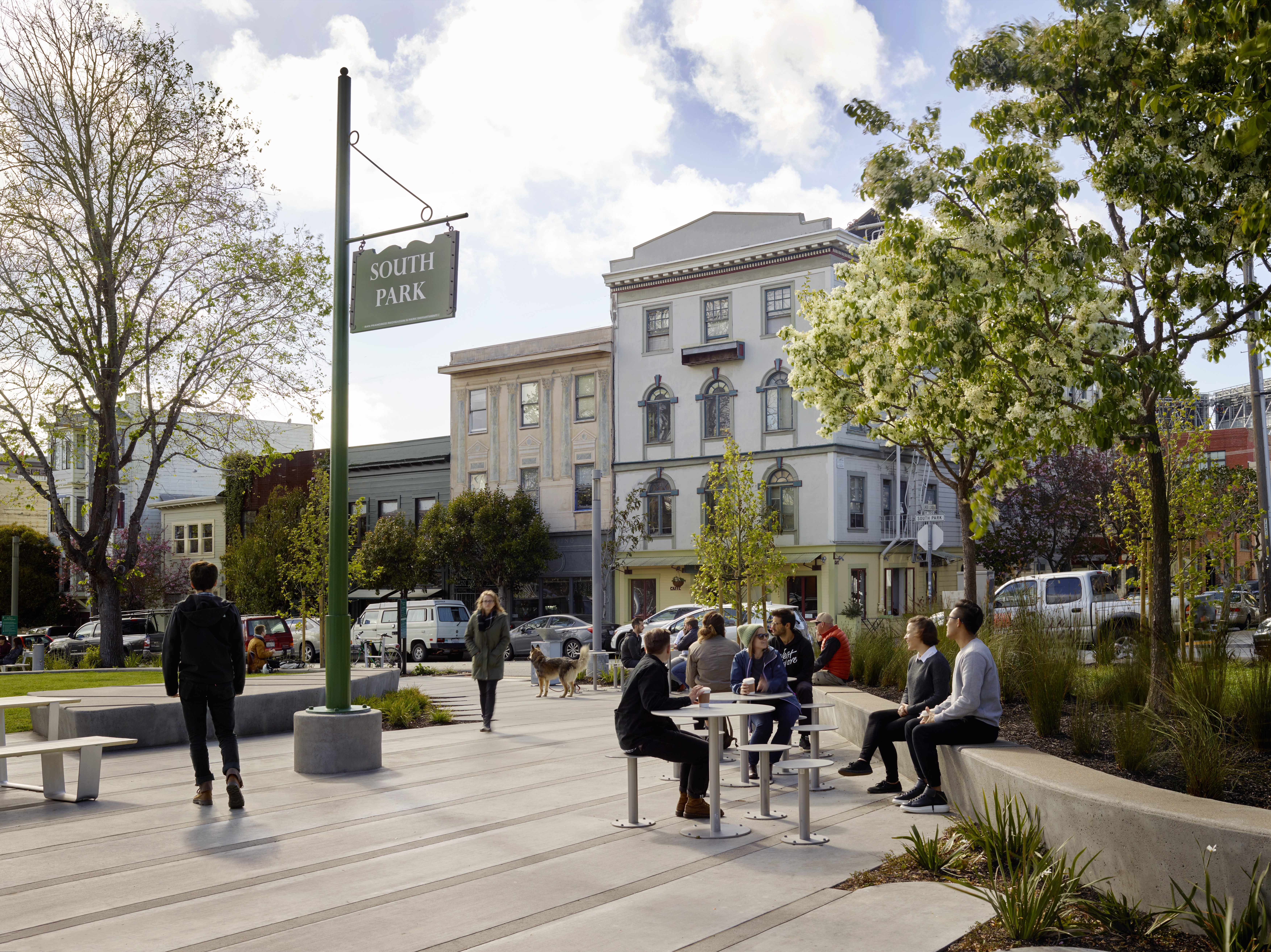
South Park seating elements. Image courtesy of Marion Brenner.
Today, it still acts as a center for tech-related and design companies providing eating establishments and retail ventures, amidst the backdrop of a flourishing green space. Located in the heart of the South of Market District (SOMA) of San Francisco, South Park has undergone numerous changes and fallen into disrepair over the years after a series of ad-hoc improvements. In 2011, the South Park Improvement Association appointed Fletcher Studio to work with the neighbors and community leaders to develop a master plan for the park.
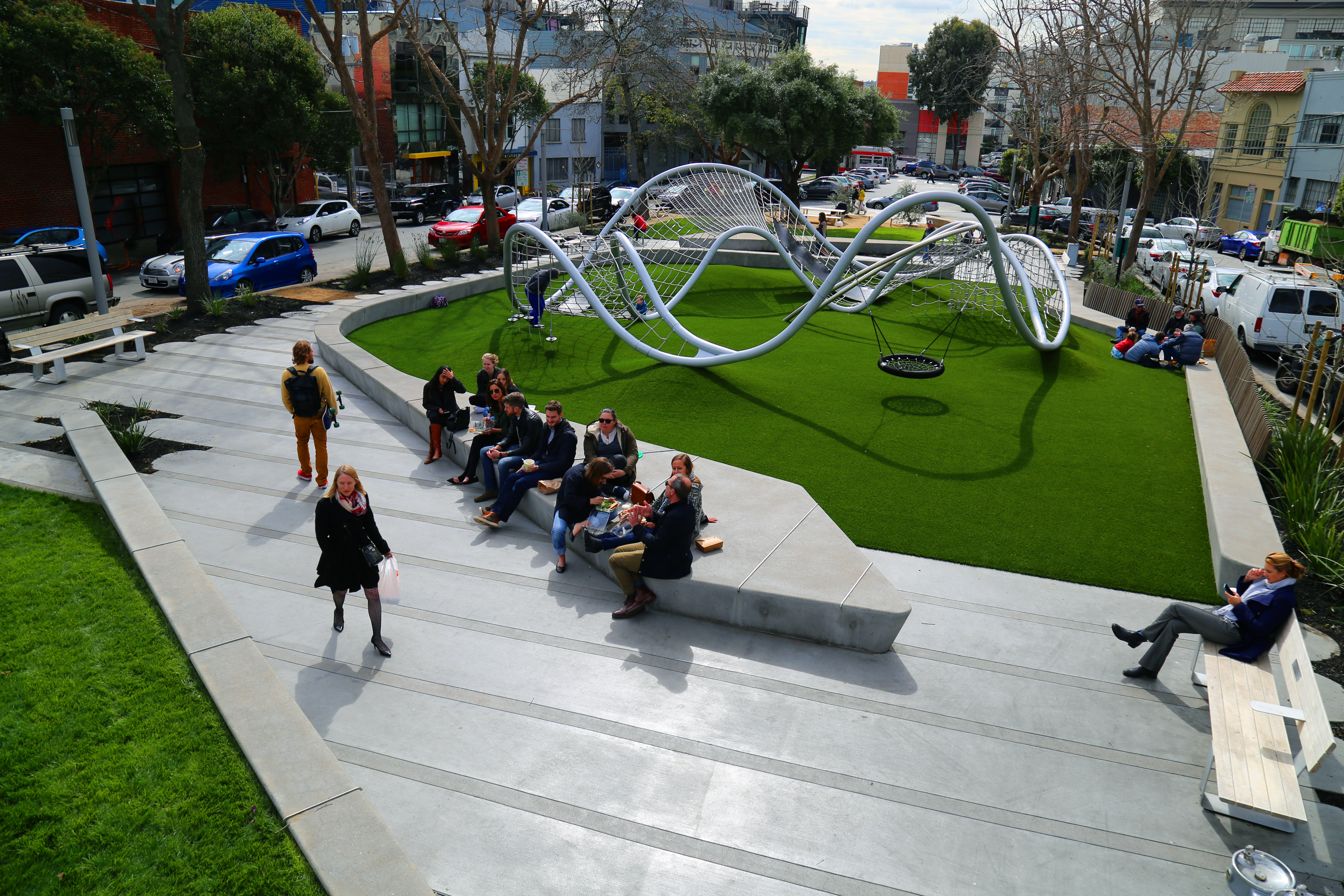
The landscape design negotiates between the creation of a public place for visitors, while alleviating major infrastructural and functional issues including poor drainage and lack of ADA accessibility. The design strategy utilized four tightly bound material systems including an expandable modular paving system, large sloping meadows, vegetated infiltration basins, and low retaining walls that mediate between paving and planted areas. The resulting design includes a series of long walls that flow through the park, to define spaces, hold grade, and provide seating and protection from the adjacent streets.
South Park. Image courtesy of Fletcher Studio.
Ecological Filter of the City
The design created major infrastructural improvements, including a state-of-the-art irrigation system, bio-infiltration swales, flow through planters, subsurface infiltration wells, and bulb-outs for improved pedestrian safety and traffic calming. Drought tolerant plantings, performative bio-infiltration gardens, and an irrigation system that utilizes rainwater collected on-site work together to create an ecologically sustainable design. A lack of fencing opened the park to all, while short concrete seat and retaining walls offer informal seating and stages for the theater of daily life. By combining historical analysis with parametric design and a contemporary aesthetic, South Park succeeds as an ecologically and socially sustainable park, setting the stage for use, connection, and delight while creating a space that is both magnetic and evolving.
The initial design was developed through an iterative analog diagramming and design process. Design decisions were made through intuitive understandings of the site, public feedback, and embedded in rule sets that guided design decisions. With over 22 feet of grade change on the site and tight tolerances to achieve an accessible public space, accurate elevation points of paving were input into Grasshopper to generate a topographic mesh. Modifications to the topography were checked against the master model for errors or adjustments. Drainage invert points were connected to each other, with the resulting vectors converted into tubes so that the drainage system could be evaluated in model form, helping to avoid potential conflicts as well as generate volume calculations for trenching spoils.
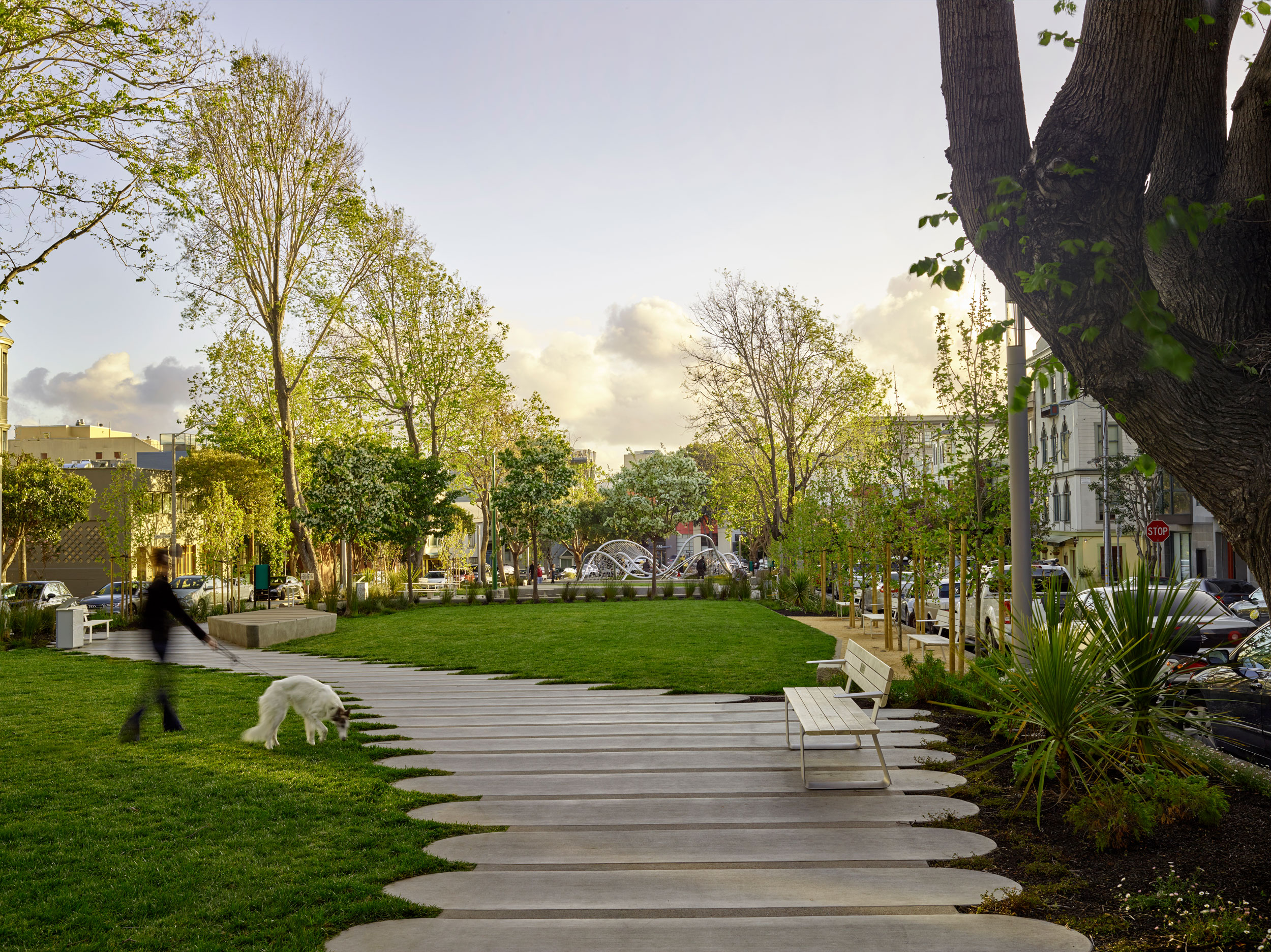
South Park in the evening. Image courtesy of Marion Brenner.
Design That Connects People
The social benefits of parks are particularly important for people who are living on lower incomes, newcomers, seniors, and other vulnerable populations. For example, one study found that local parks are critical for under-housed people living in cramped conditions who have little or no private outdoor space, such as those living in high-rise towers. The tectonic system for the path consists of a simply constructed combination of easily modified components that allow for diverse spatial, programmatic, and topographic solutions.
The path system is comprised of site-cast concrete paving constructed to look like individual “tablet” pavers with rounded edges and “slider” bands that are arrayed along the north/south axis throughout the park. The combination of these two elements allows for a coherent modulation in the width of the path responding to contextual/external spatial desires and fine-grain adjustment of the path edge that responds to site-specific conditions. However, the park is socially sustainable, meeting the needs of an economically diverse population, providing accessible play space for all ages, and offering diverse spaces for public use. The lightning bolt bench at the play area represents a tribute to legendary David Bowie, who died during construction of the project.
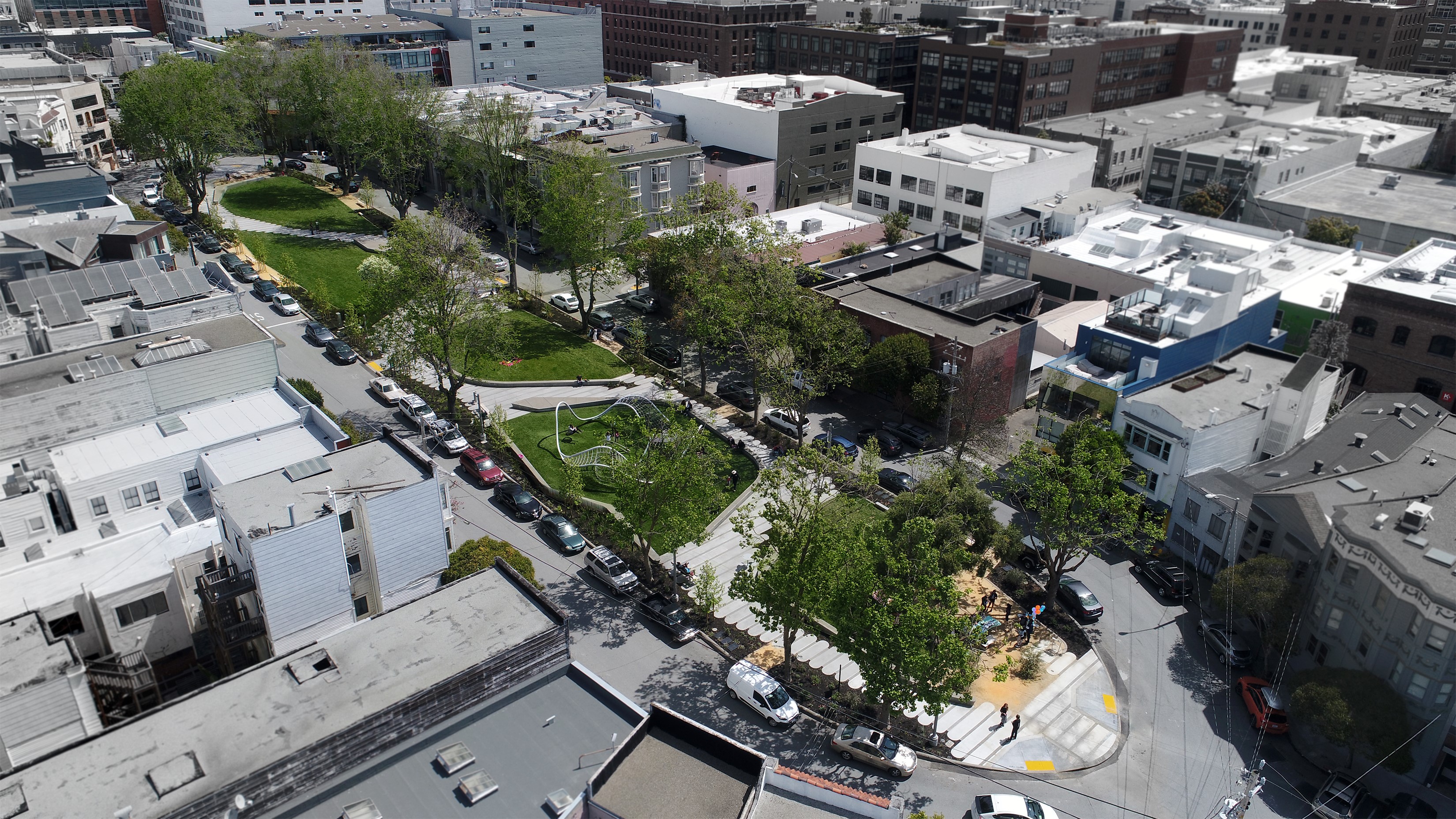
A bird’s-eye view of South Park. Image courtesy of Luke Hegeman.
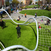
The Fletcher Studio recognized this as an opportunity to design this bench as a tribute and also a children’s safe zone. One programmatic element included a “universal” play area. The custom designed play structure form came from the simple goal of two connecting circles and the beautiful fluidity of nudibranch, a sea mollusk. Rounded berms rise from the play surface to meet the structure as it dips down towards the ground plane.
The mounds have multiple functions, providing informal play space, while providing points of access to play elements and framing an accessible area along the edge of the structure. Parametric software was again used to generate a responsive model for the custom play structure. This model allowed them to quickly generate multiple versions of the structure. It also would automatically distribute netting, fittings, and play elements, responding to the manipulation of the perimeter and interior tube forms.
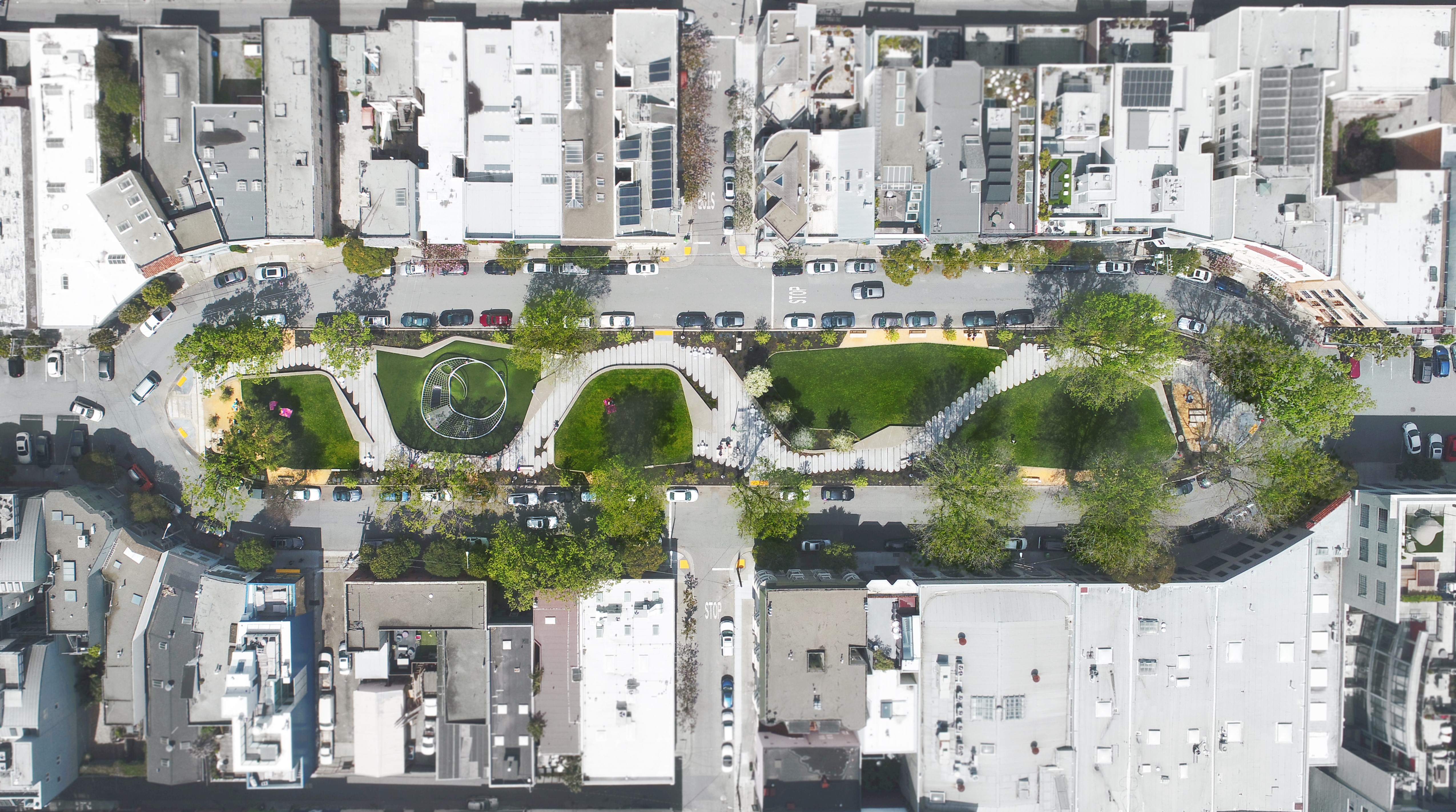
Aerial view of South Park. Image courtesy of Luke Hegeman.
Sustainability at its Finest
The project was developed as a uniting element that evokes a sense of belonging for the entire community. The role of an urban ecological filter in a big city like San Francisco is of great importance. It’s unquestionable that South Park has succeeded both as an ecologically and socially sustainable park.
Landscape Architect: Fletcher Studio
Project location: San Francisco, CA, USA
Design year: 2014-2016
Year Built: 2017
Lead image courtesy of Fletcher Studio.


