- This topic has 1 reply, 8 voices, and was last updated 15 years, 6 months ago by
 nca.
nca.
-
AuthorPosts
-
April 26, 2010 at 4:22 am #169927
 SamuelParticipant
So, I’ve been working on a project for the past few weeks, and I’ve been using an awful lot of curves partially because of the bold look rhythm and repetition they give (Yes, I know, I should really have a better reason why, but I’m only studied Landscape Architecture for a year, and my conceptually thinking is quite poor at this point of time). While I was working, I was wandering what makes most people so intrigued with curves? Yes, it’s not rigid, and seems to have a smooth transition… but my primitive knowledge has been unable to logically explain to myself why? Nor have I been find a proper theory or so about it. Ideas?
April 26, 2010 at 4:42 am #169945 ncaParticipant
I have a little theory that designers are drawn to curvilinear geometry because of the nebulosity of the form. You can apply almost any type of program to a curvilinear form. Curve tend to be all inclusive, loose, and also unsure at atimes, whereas bold axis and straight lines tend to speak to that part of our brain that needs to apply direct meaning and rationalism. I think most contemporary architects tend toward the modernist/minimalist ‘style’ (you could almost just call it a trend imo), especially because I think linear geometry tends to be most spacially efficient.
Halprin used linear geometry to imitate natural forms. His plans often looked very rigid and ‘computer-chip-like,’ but he he did this because he thought rectilinear geometry is just as easily evocative of nature and natural forms as curvilinear.
You could argue that curves promote wandering, exploration, and slowing down, while rectilinear forms promote efficiency, direct intention, meaning, and functionality–This type of design and its proliferation in the last few decades I think is due in a deeper way to primarily objective scientific thinking and the proliferation of science and a technology-driven (better word?) society. We love gadgets and we like to feel part of the computer chip.
fun discussion.
April 26, 2010 at 10:35 am #169944 Trace OneParticipant
Personally not into curves – and definitely watch out for what I call the two boobs effect – although this may be more visible in plan..I find curves to be excessively controlling and too specific, contrary to what Nick is saying, while simple classical lines allow the landscape the flow through the circulation patterns..
April 26, 2010 at 11:37 am #169943 Andrew Garulay, RLAParticipant
Some of the appeal of curves is from what we see in nature on a big scale – meandering rivers, undulating hills, shoreline, …
Also, rectilinear lines may be the shortest route between two points, but they create abrupt intersections that are extremely inefficient. rectilinear spaces create corners in those spaces which may not be as comfortable. Remember that the smallest perimeter to an area is a perfect circle.
A circle is psychologically a fixed space where a line is directional. I see a curve and it tends to make me see the inside of it as a space. I see a line and I tend to see a direction or a division. Both of these are worthy tools and should be used to control how you want people to feel about space or direction.
I would suggest that Samuel subconsciously knows this and has reasons for wanting to emphasize holding space rather than pushing direction.
April 26, 2010 at 12:29 pm #169942 Trace OneParticipant
Yup, just like I said, Andrew – curves are ‘holding’ i.e., controlling..Classical proportions imitate nature more ideally, while curves are sort of a human construct that is a pale imitation. Straight lines more naturally allow the plants to flow in their inevitably wild manner, while with curves, the planting plan must deal with the curve..I find them boring, frankly. When I was teaching, it was always the design-builders who wanted the curves. And always the men.
Of course both have their place. But for me, simplicity is a goal. I find the first impulse towards multiple curves is much more beautiful when worked out to more simple lines.
don’t like curves, generally..sorry.. How woiuld the viet nam memorial be if interpreted as a curve? How about Gertrude Jekyl gardens, redesigned as curves? On the other hand, Church, of course, made good use of curves, sometimes..Frank Lloyd Wright did not..Olmsted did..Hard to call his designs ‘curves’, much more loose than that, following the topography….
OK! How’s that for a throw-down!April 26, 2010 at 1:29 pm #169941 Trace OneParticipant
I have to qualify my statement – I found, while teaching, that men certain types of men can get STUCK in the curve design mode, with every plan having the same curves, all over it…I think if one finds oneself stuck in curve mode, it is your responsibiltiy as a designer to investigate other things, just as an excercize – perhaps you will come back to curves, but don’t get stuck.
People and things naturally move in wave form, and I find that a straight line allows the organic matter to choose its own form, whereas if the designer insists on a particular curve action, he has limited and chosen not only the leg one is moving on (horses at a canter have a leading leg, depending on which direction they are moving) but also limits the choices of the actor in the landscape as to which ‘waves’ he will move in.
A curve also does not allow for corners, as you say, however I see that as a detriment, once again controlling – one more type of space that is shut off for choice..Corners have a natural place in the plant world, in the world, – some things prefer the corner..You can jump a corner, but only if the corner is given to you – a curve removes that choice..
I think Samuel is doing a good thing by asking the question, why he is drawn to curves. Self-knowledge is the most important thing for the good designer..
April 26, 2010 at 2:24 pm #169940 SamuelParticipant
Interesting. What do you mean by “Nebulosity” of the form? I’m unfamiliar with the term. Looked it up in the dictionary, but couldn’t quite make sense of it.
Oh! and which Halprin are you referring to?
Thanks for your thoughts!
and sorry for all these questions…
April 26, 2010 at 2:32 pm #169939 SamuelParticipant
I can see what your seeing. I feel like I got slightly carried away with my curves, and realized I was getting off track with my concept. I’m not quite sure if I understand how classical lines allow the landscape to flow. I guess I always thought as classical lines as a more rigid manual feeling. Something contrary to a natural flow. You seem to have an interesting personal experience. But yes, like you said both have their places. I just lack in understanding more of the appropriate places in which they are placed. So I thought people who were further in the profession could explain, or even suggest their opinion. So thanks! I really appreciate it!
April 26, 2010 at 2:35 pm #169938 SamuelParticipant
I agree with most of what you said, though I personally think that repetitive curves can create a sense of movement, and almost direct one person to another space, and a formal group of line can create a space in which the space inside is emphasized. Maybe there are places for everything, in various manners?
April 26, 2010 at 3:36 pm #169937Tanya Olson
ParticipantVery interesting discussion, Samuel.
After I thought about it for a while, I realized I primarily use curves to hold and create space in larger landscapes and rectilinear shapes in smaller more intimate landscapes. As Trace explained, the rectilinear shape allows the plants to flow in contrast, explode out of the box if you will, which seems to be most powerful at the intimate scale.I used curvilinear forms to organize plantings in a large subdivisions for the same reason – the form of the subdivision happened to be ‘boxy’ and the large-scale curvilinear design functioned as a scaled-up representation of the geometry of the plants.
To me it made the planting seem like a river flowing around the boulders and driftwood of streets and buildings. As we all know, water is the universal solvent and maybe I’m hoping the power of the flowing form helps dissolve the architecture.I guess I don’t think necessarily of being drawn to the curvilinear vs. rectilinear, but trying to understand what a particular site requires from the landscape – contrast to, reinforcement of, or creation of form and space.
April 26, 2010 at 5:33 pm #169936 Trace OneParticipant
nice concrete advice, Tanya! Interesting, Megan..Weren’t the Indians drawing their circles to keep spirits out? And the squares of the europeans provided for ‘transition spaces’ like parks, where man and nature could co-mingle, eventually bleeding out to true countryside, and on the opposite side, dense city, the checkered pattern of Broadway boogie Woogie, as opposed to the golden circle of protection and defense..
Ah, abstract arguments..So fun…..
And if you give water it’s curves, aren’t you taking away water’s right to choose it’s course, just as with walkers? Paley Park is square, the seats are movable – the choice afforded by the linear, square design. A curved design would limit choice.
.
I think of course they are both fine in their place..I just see that we as LA’s tend to overuse the curve, as landscape arch.s..there is nothing more irritating to me than a design that has introduced arbitrary curves..If you are going to do that you have to make it look like it fits, or design the curves only where they actuallly do fit..No boilerplate curves, please, stamped out over the landscape..The curved sidewalks of the sensitive subdivision..silly.April 26, 2010 at 6:51 pm #169935Tanya Olson
ParticipantI totally agree with you about the curved sidewalks of the sensitive subdivision! When I lived in Santa Rosa there was an office park that we went for walks in with those curved sidewalks – there was absolutely no point to them! They were just wavey to be wavey. The planting was still rectilinear of all things! ha!
I’m not sure I agree with the idea that Native Americans settled in ‘natural’ configurations, Megan. Certainly depends which culture / tribe. The site at Chaco Canyon looks very much like ancient Rome or Athens…. Lakota formal camp (when multiple bands gathered) was in a circle, but a lot of pictures of other temporary camps don’t look arranged like that – my understanding is that they were arranged by social order and relationships, so rectilinear / curvilinear didn’t have anything to do with it – it was a built representation of kinship and respect. Certainly some of the midwestern pyramid builders and of course Mesoamerican cultures had very formal geometries. Of course that would be the difference in relationship with the landscape….Maybe it would be more appropriate to compare nomadic cultures to each other and permanent settlements with each other instead. SO the Anasazi would be more appropriately compared with small European towns and the Lakota camps would be more appropriately compared with Berber or Mongol camps.
April 26, 2010 at 7:54 pm #169934 ncaParticipant
Interesting. What do you mean by “Nebulosity” of the form?
I was responding to the way I see most designers likely using curvilinear geometry in their work–It’s easier to work with and allows a designer to be more loose. I think it’s easier to or feels more natural to make curvilinear geometry be whatever you need it to be versus rectilinear geometry in my mind needs a strong purpose and defines space more clearly. I think curvilinear geometry can also tend to be very weak in that the designer didnt really know if the space should be a circle or a square for instance, so they made an amoeba. I guess thats what I meant about nebulosity.
Oh! and which Halprin are you referring to?
I was referring to Lawrence Halprin–I was particularly thinking of the miller garden and donnell garden as well as this:
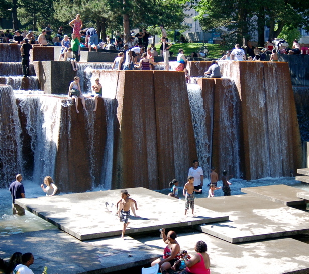
Halprin ‘modernized’ an Oregon cascade. Looking at this image again also made me think about how mechanical weathering works on bedrock to create boulders we see in a natural landscape. They start out as blocks and essentially break into cubes before they are weathered to rounded or still blocky forms.
There’s an interview by MVVA of Halprin somewhere on youtube where he talks about rectilinear geometry in nature and the miller garden. I think I miscommunicated some of my points.
April 27, 2010 at 12:27 am #169933 Roland BeinertParticipant
I remember seeing a subdivision in Boise where the sidewalks were wavey just to be wavey like Trace and Tanya describe. I don’t mean the sidewalk just curved around a corner. It actually curved back and forth for no apparent reason. My first thought was that no one would want to walk like that.
I think the use of curves definitely has its place. Jens Jensen’s council rings would not have worked as squares. Permaculturists will curve a swale along a contour to give it a longer edge. Like other people have already said, it all depends on the context and what you are trying to do.April 27, 2010 at 1:25 am #169932 Jon QuackenbushParticipant
trace, i got distracted while reading your post, & it took me about five minutes to get through… i don’t know why.
i like contrast and asymmetry, and without question curves juxtaposed with rectilinear forms can create that…
curves and compound curves are most certainly in my playbook.
-
AuthorPosts
- You must be logged in to reply to this topic.


