Landscape Architecture for Landscape Architects › Forums › GRAPHICS › Help! Making Sketchup more realistic
- This topic has 1 reply, 21 voices, and was last updated 14 years, 8 months ago by
 David Barbarash.
-
AuthorPosts
-
June 27, 2011 at 3:00 pm #163091
 ALEX PParticipant
Photoshop. Just do the base stuff in SU, then photoshop the sh*t out of it. I believe cs4 onward has a 3d function that allows easier editing, and lets be honest, SU does not look good.
In my humble opinion its called sketchup, not finalproductup for a reason!
June 27, 2011 at 5:13 pm #163090Anonymous
Inactivesketchup should be used for nothing more than massing and basic rendering. it can end up making projects look very childish and unprofessional once you start using “sketchy” edges and all the other crap it comes with. Photoshop is a MUST to get good renderings
June 27, 2011 at 5:16 pm #163089 Jon QuackenbushParticipant
I couldn’t agree more.
June 27, 2011 at 5:29 pm #163088 David BarbarashParticipant
It’s for this exact reason why I’m not a fan of Sketchup for the standard office design process. It works well for finished 1-off images after they’ve had a good amount of post-processing in Photoshop, but what happens if the client comes in and asks for a change? What if a building needs to be rotated, a road realigned, or grading revised? What if the client wants the image to be at a slightly different angle or view? Then very little of the time consuming Photoshop work can be re-used (and it’s likely that much of the SketchUp model needs to be rebuilt).
This is why I’m a fan of more robust modeling programs with x-ref and recursive modeling options that can produce more complete renderings that need MUCH less post processing work. Of course cost and rendering time becomes an issue then but that’s a different argument…
June 27, 2011 at 5:36 pm #163087Anonymous
InactivePersonally I think the most complete program out there that is most comparable to SU is Revit. Thats not to say they are the same. Also by using BIM and its other grouping features, changes are VERY easy to make. But like you said, rendering times, and cost become an issue.
June 27, 2011 at 6:25 pm #163086 Frank VarroParticipant
Sketchup is a tricky thing. You CAN get decent results with careful material work in sketchup itself, but its hard, and without bump/displacement mapping and reflections, its limited. Daniel Tal is a big fan of the ShaderLight plugin. It gives him some really good work, with the ease of modeling of SketchUp.
I am using a program called Thea (thearender.com) which is a new, inexpensive, render engine ($430 a seat). They have a freetrail you can download, which is only limited in that there are watermarks on your images, and resolution is capped, but you can learn everything, and get a feel of if it is for you. They do also have a freeware program called Kerkythea which is basically a dumbed-down version of Thea.
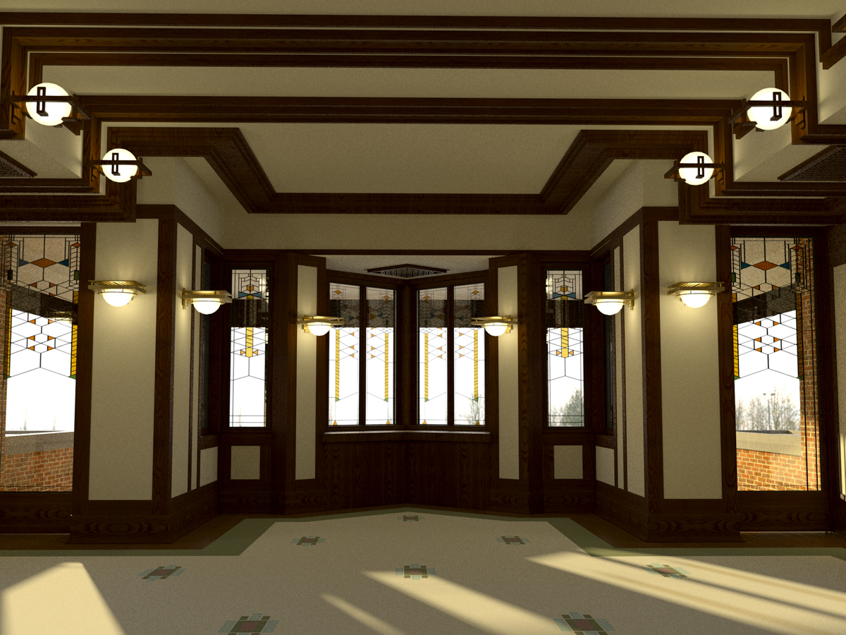
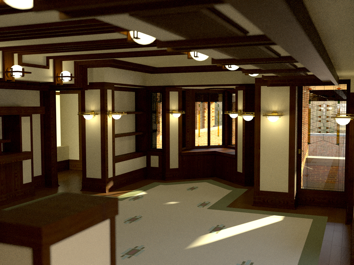
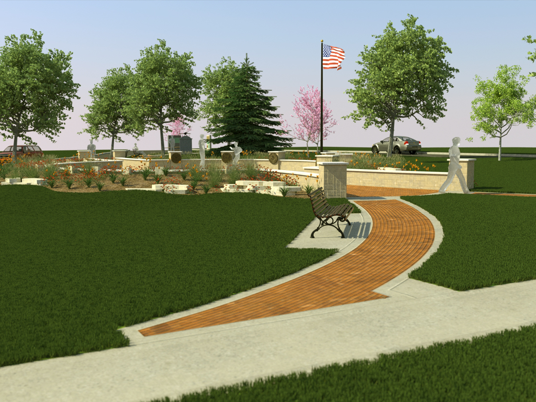
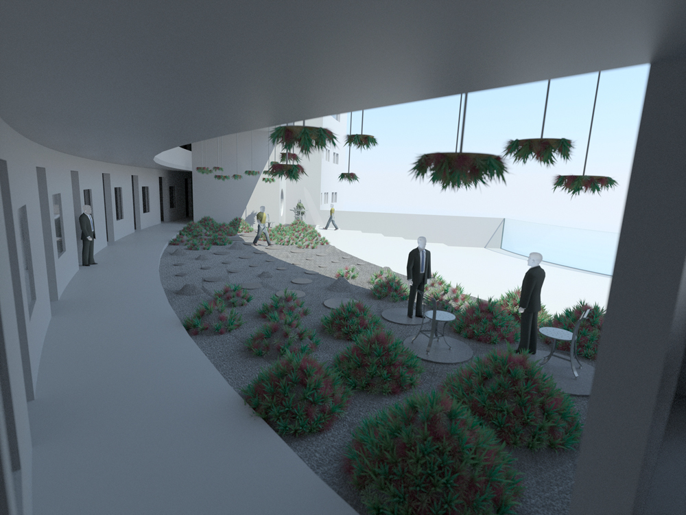
These are all modeled in SketchUp, and rendered in Thea, with 0 post production:
June 27, 2011 at 10:17 pm #163085 Ryland FoxParticipant
We got RenderIn, it is $160 a seat I believe and the results are pretty good. Plus it has real time preview with materials and lights which is nice.
June 29, 2011 at 9:31 am #163084Maria Papadopoulou
ParticipantThat’s really great ! I was wondering how much hours did you spend in Photoshop ?
June 29, 2011 at 8:22 pm #163083 David BarbarashParticipant
Under $600 for the software? No I can’t name anything else. But factor in the time (in dollars) it takes in Photoshop (an additional expense) to improve the image to presentation quality, and add in the time spent re-modeling and re-Photoshopping after the client asked for changes and then see how much difference there is between Sketchup and a higher end 3D program.
As for billboard trees, they can look great but cast unrealistic shadows and are useless in aerial views. They have their place and more often than not are a great method, but I’ve had tons of instances where it was easier to go with a fully 3D tree and let the image render overnight. (This mostly happened when doing aerials, isometric views, or where shadows fall over complex geometry).
June 29, 2011 at 9:26 pm #163082 ncaParticipant
The image I attached earlier took approx 4 hours in skup and 4 hrs in pshop. To each her own, but I think in many cases we’re wasting our time in programs like max..just my two cents.
June 29, 2011 at 9:59 pm #163081 Chuck B. EdwardsParticipant
I think it mostly depends upon the client’s needs. I mostly deal with residential clients and anything beyond SketchUp is overkill (that’s just my opinion, and I have been known to be wrong before). Larger developments might need a more finished look – but maybe not. We are selling ideas/designs, not pretty pictures (well the drawing has to look good at least).
I really think that each designer will have the program they feel most comfortable with and go with. I don’t think there is a right answer – each program will have there +/-See some designs here, most are done with SketchUp.
my 2 cents for the day…. sorry for rambling.
June 29, 2011 at 10:24 pm #163080 Chuck B. EdwardsParticipant
David,
I think we are on the same page.
Except for plan view renderings, we do all our commerical perspectives and animations in SketchUp — you can see a few here — it works for us.
Here are some SketchUp Animations
Thanks for the kind words.
Chuck
June 29, 2011 at 11:27 pm #163079 David BarbarashParticipant
For me it’s a matter of work-flow (and the fact that I was a Max/Viz guy before Sketchup existed). I like the live linking between plan and 3D that CAD + Max can give and I’m fast enough with it that modeling times aren’t that much more than Sketchup. Then again I’ve worked mostly on large sites with complex topography and a lot of sub-contractors (which means lots of changes).
I’m not knocking Sketchup but I DO wonder where it will be in the long term since more CAD and BIM programs are integrating 3D modeling directly into one package with the ability to produce editable construction documents directly from the plan drawing.
June 30, 2011 at 6:07 am #163078Anonymous
Inactivei really like your hand rendering of the “no turf” backyard. great example of a strong and cohesive color palette
June 30, 2011 at 2:12 pm #163077 Chuck B. EdwardsParticipant
Aaron,
Thanks for the kind words. I am an old fart who still does his plan view renderings by hand.
In our office, our larger projects our rendered in Photoshop by one of younger guys. I could / should learn to use Photoshop; I just have not had the time to play around with it. Considering I can produce a colored plan is just about the same time as Photoshop, it not too much of a big deal – unless I want to change any of the colors – -
AuthorPosts
- You must be logged in to reply to this topic.


