


Landscape Architecture for Landscape Architects › Forums › GRAPHICS › Simple Tips of Applying Colors to a Drawing
- This topic has 0 replies, 1 voice, and was last updated 13 years, 7 months ago by
 Mike Lin.
-
AuthorPosts
-
August 25, 2012 at 8:37 am #156681
 Mike LinParticipant
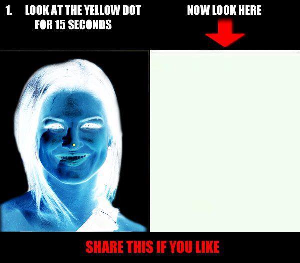
Do you know when we stare at a color (Blue for example), we actually saw the opposite color of the color wheel (Orange), these blue and orange colors are known as complementary colors in the color theory (see below left for a test).
Therefore two colors (Blue-Orange, Red-Green, and Yellow-Purple) complement each other and create interest and excitement. I am including the following examples of each pair of complementary colors:
Blue – Orange
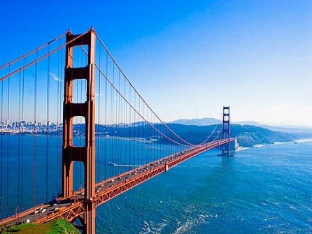
Blue- Orange: A well known San Francisco Golden Gate Bridge was purposely painted orange color to compliment the blue sky and ocean. That is also why nature creates human skin in orange color to complement 75% of the universe (sky and ocean).

No wonder why every television’s talk show always has blue color background to make people’s faces look more interesting to watch on the TV screen. If you are swimming in the ocean and need to wear a life jacket, orange color is the best choice so people can easily find you if you are in trouble. You can also wear blue if you don’t want to be found.
Red – Green
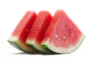
Red – Green: What are two most colors you see during the Christmas? Of course the red and green, because these two colors create excitement when stand side by side. Many fruits are in these two colors combination like; watermelon (left), apple, strawberry, and red rose.
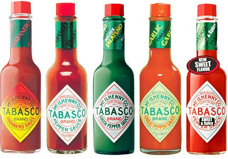
A popular hot sauce named “Tabasco” was designed in red/green to stand out from other brands (left). Remember when complementary colors are placed side by side, it produces excitement, and allows people to be more relax when watch. Now you know why most hospital’s walls are painted light green or light blue and surgeons always wear earthy green uniform so when they perform surgery by seeing red blood, they need to see green walls and each others’ green uniform to relax their eyes.
Yellow – Purple
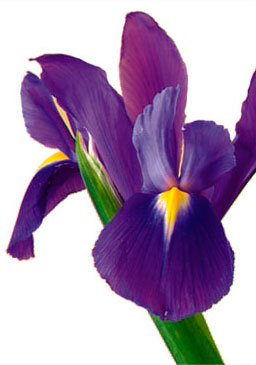
Yellow-Purple: Although fewer examples can be found, the most common one is iris flower (left) and Easter colors.
Therefore, we as a designer must understand the above tips and apply them to either design projects or renderings. A group of people wearing shirts or hats in red should be illustrated on a green golf course rendering, a very bluish tone rendering should include orange sunset in the sky to enhance the drawing quality.
The following are some basic tips of applying colors to a drawing.
- Color Rainbow: Use all six colors (Red, Orange, Yellow, Green, Blue and Purple) on
a drawing. Better yet, use all 6 colors on any single object in a drawing, for example, use all 6 colors on a tree but use more green so it looks like a tree, or apply all 6 colors on a brick but more red on it.
- Color Glow: Apply light value on white background paper so the drawing shows energy and glow of the light.
- Color Repeat: Apply not only 6 colors on every object of the drawing, but repeat it on ever 1-3 inches so color will echo and create harmony.
- Color Change: Within the same surface of the object, change colors from one to the opposite color of the color wheel (Purple to Yellow, Blue to Orange and Green to Red), this is due to the reflection and can create interest of a drawing.
- Color Earthy: Apply earthy (dirtier) tone to objects so they look the way we see in real life. As I said before, our human eyes see opposite color on the color wheel, therefore when sun light hits any surface, we therefore see darker of that color, by toned down the value is ensuring the correct color we see. The best way to apply color earthy is to 1. Outlined with black, 2. Toned down with black color and 3. Mix the complimentary colors or all 6 colors.
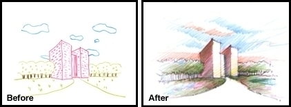
The “Before” drawing (left) only uses 3 colors, no color repeat, no color change, no color earthy. The “After” drawing (right) uses all 6 colors, applied color repeat, color change and color earthy by outlined with black and mix all colors. These two drawings were actually done by the same person in just 3 hours with such a drastic improvement during our BeLoose Graphic Workshop.
- Color Rainbow: Use all six colors (Red, Orange, Yellow, Green, Blue and Purple) on
-
AuthorPosts


- You must be logged in to reply to this topic.