Landscape Architecture for Landscape Architects › Forums › GRAPHICS › Student looking for unique ways to indicate grasslands, meadows and prairies
- This topic has 1 reply, 10 voices, and was last updated 13 years, 5 months ago by
 Frank Varro.
-
AuthorPosts
-
July 19, 2011 at 8:57 pm #161507
 Jon QuackenbushParticipant
The proper use of shadows is what gives it the 3d look. I don’t like to use the typical adobe ‘drop shadow’ in the layer blending menu because it just offsets the layer, and it doesn’t look right when used for building shadows (aka no shadow being thrown from the edges of buildings). instead, i create a unique layer(s) and use a proprietary shadow forming technique that is constantly evolving, and getting closer to that which I am completely happy with…
I love the hand drawing method, like I said previously I have a fine arts background. However I am also a realist and can see where the graphic portion of our profession is heading. Pens, pencils and other smudge-able medium will always have a rock solid place in design iteration & creation, but just like CAD has taken over drafting, photoshop(esque) software has taken over rendering.
I do use a tablet for the finer rendering details, as this softens and naturalizes places where digital renderings can feel rigid. It does not track the same as a pen and paper, and it takes a while to get used to because you aren’t looking at your hands while drawing, and if the orientation of the tablet is skewed differently than your brain is the line you see on screen won’t be drawn at the same angle as you intended. That fact will lead to some minor frustration, but in the end, pen tabs are awesome and absolutely worth it.
October 22, 2012 at 12:36 pm #161506 Matt HawkerParticipant
woah double cowlick!
October 22, 2012 at 2:21 pm #161505 Trace OneParticipant
HAHAHAHAHA!!! Don’t take it personally, Thomas!
October 22, 2012 at 6:02 pm #161504 Phil MooreheadParticipant
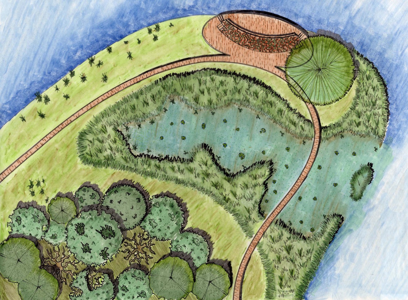
 Here’s an example of something I did in school. Use breaks in mono-cultures to drop shadows and show height. Fields of grass reveal their stalks when they are blown sideways by the wind, and the wind can create eddies of swirling patterns which can be represented in plan. Within a larger monotonous expanse, you can “stipple” with simple plants symbols, and/or splashes of color to represent flowering plants. I also find color blending useful in creating variety.
You probably shouldn’t follow my example on the trees, though… I wasn’t extremely happy with how they came out. Which makes a great segue to another tip: practice and experiment with different methods.
October 22, 2012 at 6:17 pm #161503 Phil MooreheadParticipant
Also, whether or not to include cookie monster in our renderings is a call each of us has to make on our own.
-
AuthorPosts
- You must be logged in to reply to this topic.


