Landscape Architecture for Landscape Architects › Forums › DETAILS & MATERIALS › What is your first impression of this bench?
- This topic has 1 reply, 20 voices, and was last updated 15 years, 4 months ago by
 Mandy.
-
AuthorPosts
-
December 11, 2010 at 12:28 pm #166397
 Andrew Garulay, RLAParticipant
I’d find a home pretty quick if I had to sleep on that bench. … another example of landscape design elements reshaping society for the better!
December 11, 2010 at 2:08 pm #166396mark foster
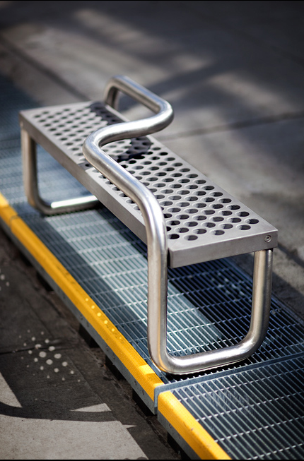
ParticipantIt reminds me of a victorian love seat (if victorians had stainless). It also looks like it may get used as a bike rack.
Snarking aside, I like the idea of encouraging people to sit on opposite sides of a bench–it gives a sense of privacy, and would probably allow people to be closer to each other than they would otherwise feel comfortable doing.
Probably not appropriate in all sites–I can just see myself missing the bus because I picked the wrong facing direction!
December 11, 2010 at 7:46 pm #166395 Andrew Garulay, RLAParticipant
I believe that I might find it discomforting to be sitting there and then have a stranger sit on the other side because we’d be almost face to face. At least with a conventional bench you’re not forced to engage the person sitting next to you.
I don’t want to be on a love seat with some dude at a bus stop.
December 12, 2010 at 1:34 am #166394 Taj HansonParticipant
Sorry guys… the rails aren’t long enough for skateboarding. It isn’t a rail slide if there’s no room to slide 🙂 The bench is definitely not ‘Civil’. Take the bars off the top and widen it a bit so people can sit, sleep, and skateboard freely.
December 12, 2010 at 3:12 am #166393 Thomas J. JohnsonParticipant
Sorry Taj, I grew up skateboarding. The bench is 4′ long, making each section of rail 2′. That is plenty long to pop up on as you’re cruising down the street for a quick rail slide. It would also be really nice for a fakey nose grind.
December 12, 2010 at 11:51 am #166392 Thomas J. JohnsonParticipant
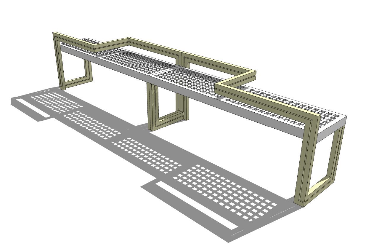
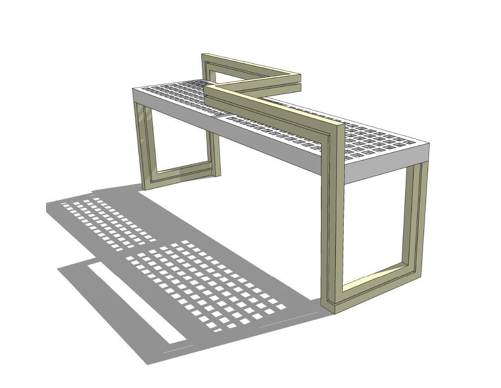
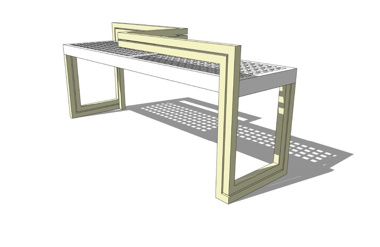
Well, I had to buck-up and walk the walk, if I’m gonna talk the talk. Here’s my straight-line version of the Civic Bench. I like to call it the Civil Bench 😉 The colors need a little tweaking but overall I’m pretty happy with it. Check out the corner detail on the base. Dig it. The frame is 1″ boxed steel, two runs, spaced 1/4″ apart. The seating surface is 1/4″ thick (something, composite maybe) with 1″ square voids and 1/2″ solid grid. It should give people a nice waffle pattern when they sit on it…
Please let me know what you think… If I critique, I should be open to critique as well… I plan on doing a more rounded version also, based off of the original rail design.
December 12, 2010 at 12:28 pm #166391 Thomas J. JohnsonParticipantDecember 12, 2010 at 1:01 pm #166390
 Trace OneParticipant
Man, Thomas, you are good at that! You’re hired! (just kidding!)..
As other posters have noted, I can’t imagine a more uncomfortable juxtapostion of sitting like that at some bus stop with a stranger..And I know bus stops..
I am often peeved by placement of benches for transportation spaces – blocking off the central portion of a huge transportation building space for benches arranged in squares is one of my most loathed arrangements.
To most avoid contact with strangers, everyone should face the same direction, and they should all face the walking lanes, basically. You can range two sets of seating on either side of the walking lanes, but the little squares arrangement, particularly when set down, sometimes blocked off with clear plastic dividers, in the center of a space – god I hate that..LA’s Union Station is a classic example, despite the beauty of the materials in that space..
why why why why why – oops, got my foot caught in betweern metal bars and seat again..ouch.
I think the one guy nailed it – this bench is for geriatrics to take showers sitting down, in institutions..
And Thomas, the thought of the ‘waffling’ on peoples posteriour parts, after sitting on the (hot?) bench – thanks for that!
December 12, 2010 at 1:22 pm #166389 Thomas J. JohnsonParticipant
Gee, thanks for getting my hopes up T-1… You really had me going there for a minute. But with all your talk of torture and institutionalized madness, I’m afraid the stress of that gov’t job might be getting to you.
December 12, 2010 at 4:34 pm #166388 Ryan A. WaggonerParticipant
haha, nice work thomas! but i think it’s obvious that the bench is made for high traffic use, deterring both homeless people and skate boarders and to that end it probably succeeds. if they raised the bar right at the ends or added some sort of knuckle that would even make them harder to use as rail slides. but it is obvious these are functionality based creations, with little thought to comfortability for users, and i guess sometimes that’s a good thing….everything has a purpose….
December 12, 2010 at 8:02 pm #166387Matt Sprouse
ParticipantIt’s gone too far in my opinion. Sad that the idea skateboarding or a homeless person sleeping on it has created such a monstrosity. Inelegant. Engineered. Clumsy.
December 12, 2010 at 9:24 pm #166386 Rob HalpernParticipant
If you are planning for a bench that deters sleeping, deters skateboarders, and doesn’t even welcome sitters for more than a minute before the pain kicks in, why spend the space, materials and budget on a bench at all? A simple sign that says “Keep moving, buddy, nothing to see here” would be cheaper and could be more elegant.
December 13, 2010 at 4:40 am #166385 Thomas J. JohnsonParticipant
Thanks, I didn’t change the dimensions of the bench at all. It’s still 12″ wide x 48″ long x16″ high. The frame still follows the same path, I only wanted to experiment with consistent forms and materials (boxed frame w/ straight lines) instead of the mix of curved/straight and aluminum/stainless. When I get a minute, I’m going to do an all curve/radius based design applying the aesthetic of the rail to the seat. I’m really just having fun playing with SketchUP, keeping my skills sharp.
Forms+Surfaces is generally one of my favorite amenities designers. I love their style and it’s great that they provide SketchUP models of their products. You’re right in that the bench does exactly what it is intended to do, functionally. It’s the look that I’m interested in playing with and it’s got me thinking of some other designs that accomplish the same goals. Thanks for the feedback!
December 13, 2010 at 6:05 am #166384 Andrew SpieringParticipantDecember 13, 2010 at 6:09 am #166383
 Andrew SpieringParticipant
Great comment!
-
AuthorPosts
- You must be logged in to reply to this topic.


