Article by Nick Shannon Pop-up Park in Metcalfe Park, by ASPECT Studios, in Sydney, Australia. Landscape architecture is a profession that brings uncertainty. When designing a site, it is necessary to research and analyze existing conditions in the beginning, but after a project is implemented, natural and human processes usually change the landscape in unexpected ways. We can never fully predict how people will use a space, or what they would want, but research and analysis can help to create an informed design. Testing ideas is another way to ensure functionality and the thriving movement of temporary landscapes does just that. They act as a space to test site elements that encourage people to use public space, whether it be a pop-up-park, park(ing) day or an art installation. Temporary design is an exciting way to activate an existing park or public space to create new uses and identity.

Metcalfe Park. Photo credit: Florian Groehn
Metcalfe Park
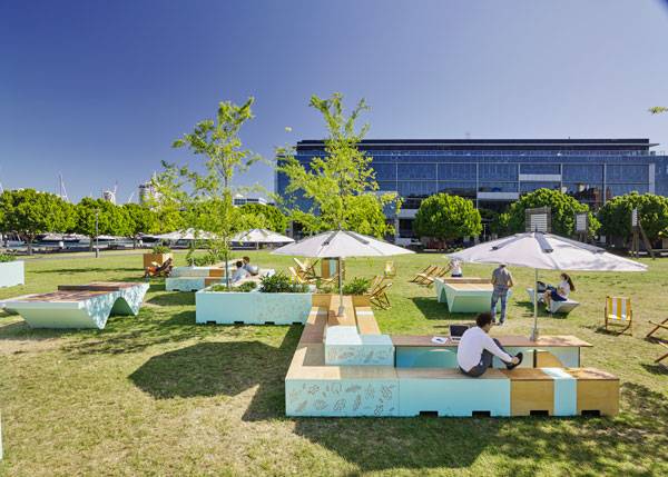
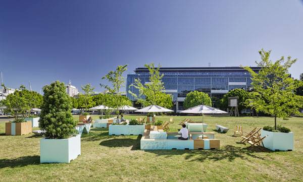
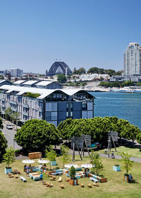
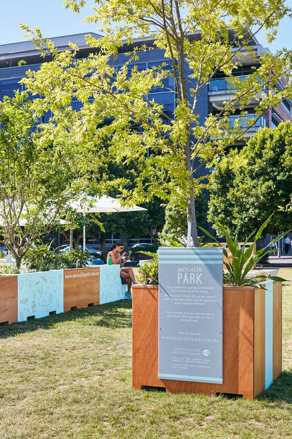
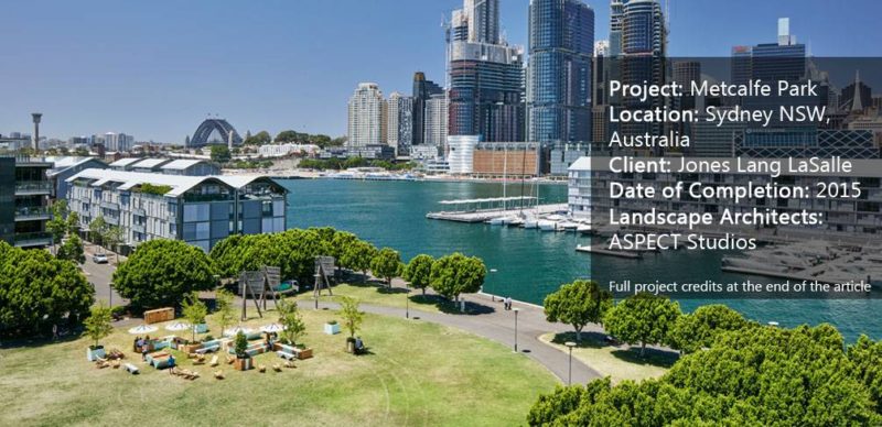
Metcalfe Park, by ASPECT Studios in Sydney, Australia, created a park within their park through community support and engagement to give the residents a space to stay, exercise and play. We will explore why this had to be done and how the temporary park was designed within its context. Breathing Life into an Existing Park Metcalfe Park is hidden between two buildings within Pyrmont’s commercial and technology precinct in the city of Sydney, Australia. Previously just a vast open lawn, the space was not used to its full potential. Although it’s in a great location featuring views of the western city edge of Sydney, it didn’t accommodate any programming or amenities for its users so people just used the park as a transitional space to walk through or around.

Metcalfe Park. Photo credit: Florian Groehn
In an effort to create a more functional public space, Google Australia started this project and quickly gained the support of several local businesses surrounding Metcalfe Park. They joined efforts to create a precinct partners working group to commission the temporary park. The goal was to create a useable and inspired experience to encourage greater interaction by the surrounding community. This idea was then taken further by the landscape architecture firm ASPECT Studios, who designed the temporary additions to the park for the summer of 2015.

Metcalfe Park. Photo credit: Florian Groehn
Any good design starts with a thorough analysis of the site’s existing conditions. This is exactly how ASPECT Studios started their process, in order to encourage community engagement and create an informed design. Site research started with key usage, where the population who use the park was analyzed through on-site observation. A variety of people used the park, either for exercise or bringing their dogs for a walk. However, during the weekdays, they took the shortest route through the park and didn’t stay.

Metcalfe Park. Photo credit: Florian Groehn
It was found that the average number of people who use the park fluctuates from
1500 people per day during the week to
880 per day on the weekend.
82% of these people merely pass through the park, which raised concern because the park is situated harbourside in a great location and offers an exciting opportunity to connect people to green space in the urban environment.
The next step for ASPECT Studios was to think of ways to encourage people to stay. 
Metcalfe Park. Photo credit: Florian Groehn
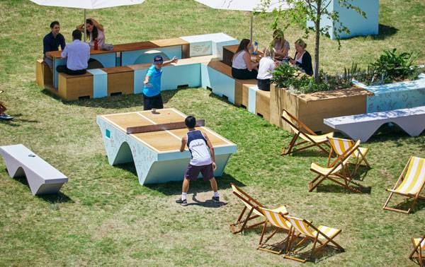
The goals for this temporary pop-up-park were to encourage people to stay, exercise, and play within a sustainable design, to engage the community, and to provide an identity to the space.

Metcalfe Park. Photo credit: Florian Groehn
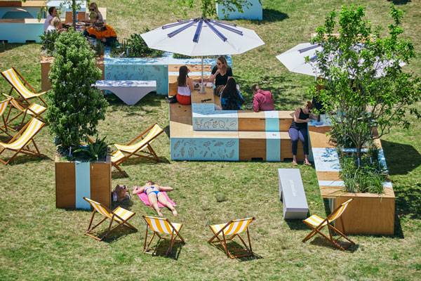
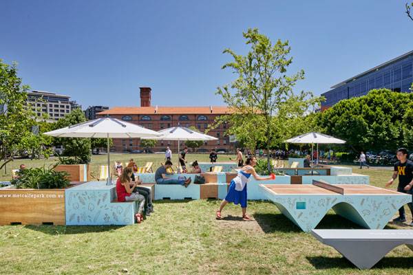
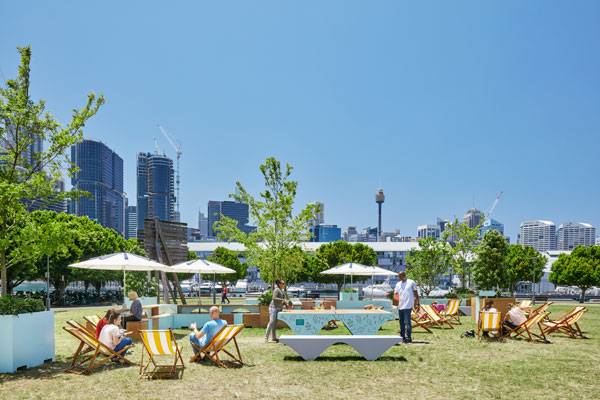
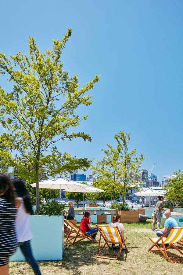
The site furnishings create a space for the Pyrmont community to come together to eat lunch, hide under the shade of an umbrella, or lay in the deck chairs in the sun.
Free public WiFi creates an environment that allows users to stay connected while enjoying themselves.
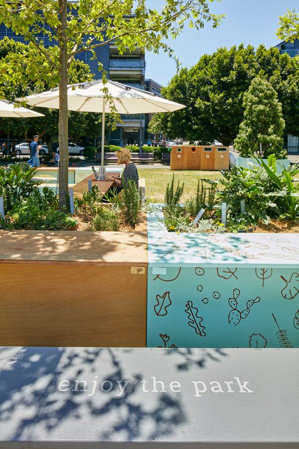
How Sustainable is Temporary Design? Temporary design is inherently unsustainable because you are only using the materials for a specific period of time. However, ASPECT Studios and the surrounding businesses recognized this and chose materials and site elements that were repurposed or renewable, provided separated waste collection to the area, and utilized solar harvesting. The umbrellas collect solar energy and allow users to charge their devices.

Metcalfe Park. Photo credit: Florian Groehn
After the current patterns of use were observed and evaluated, clear lines of heavy use were kept and the center remained unprogrammed, enhancing existing patterns and keeping occupation to the edges. The unique site elements were created with efficient storage and future use in mind. If this design works well enough, the local businesses will encourage the landowner to create a permanent solution.

Metcalfe Park. Photo credit: Florian Groehn
On the edge of the park, the existing deciduous tree canopy in the foreground presents the western city edge of Sydney in a distinctive manner and encourages people to relax and appreciate the view. Mature trees were integrated with planters and seating space, creating distinct lines of activity that melds into one form. Movable furniture, trees and shade umbrellas allow people to create their own use for the space as well.

Metcalfe Park. Photo credit: Florian Groehn
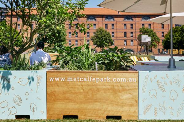
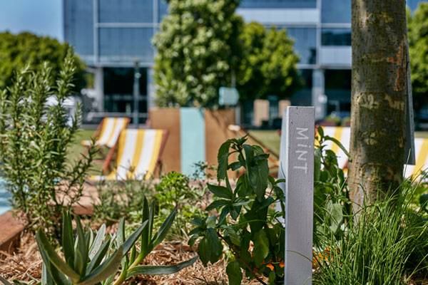
The wooden material of the site furnishings creates a softer experience that is easier to sit on and they are painted with symbols to create a unique identity for the area. Edible plants are grown in the planters to engage the community even further.

Metcalfe Park. Photo credit: Florian Groehn
The documentation of existing conditions is not where ASPECT Studios stopped their research and analysis. The temporary park was used to test how people interact with site elements to decide what could work in the future. It was documented with three x 21-day trials to analyze the effectiveness of the design through mapping key usage and peak usage, as well as activity analysis.

Metcalfe Park. Photo credit: Florian Groehn
Community engagement continues to drive the design and is used on both website and social media platforms through a direct feedback ‘suggestion box’. This will help the local businesses create recommendations to the landowner to work on a permanent solution. Through the addition of a few key elements, Metcalfe Park became an exciting space that engaged the surrounding community. It activated a unique public space and encouraged people to stay, exercise, and play, which is what we strive for as landscape architects. The park also created a testing ground for new ideas, which is how we come up with design that works.
Do you think these site elements created a more exciting public space? What would you change? Let us know in the comments below! Go to comments 
Metcalfe Park. Photo credit: Florian Groehn
Full Project Credits For Metcalfe Park:
Project Name: Metcalfe Park “Park within a Park’ Fabrication Engineering and Instillation: Fleetwood Urban Location: Metcalfe Park, Pyrmont, Sydney NSW, Australia Date of Completion: 2015 Precinct Partners: Google, The Star Sydney, Doltone House, The GPT Group, Mirvac, Fairfax Media, Sydney Harbour Foreshore Authority Project Management: JLL, Margot Natoli Project Management Design Team: Lead Designers and Landscape Architects: ASPECT Studios Fabrication Engineering and Installation: Fleetwood Urban Photography: Florian Groehn Learn more about ASPECT Studios: Website: www.aspect.net.au Facebook: www.facebook.com/ASPECTStudiosLandscape Twitter: www.twitter.com/ASPECTLandscape Recommended Reading:
Article by Nick Shannon
Published in Blog