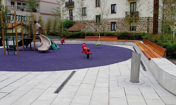
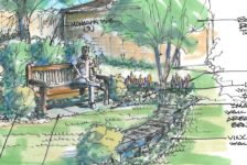
Atalaya Park design by G&C Arquitectos. Striking in its detailing and function, Atalaya Park is an example of a modern, inviting public and community landscape space. Nestled between buildings that look somewhat between the combination of modern and traditional, the space, designed by G&C Architects, screams “Look at me! Come and see; enjoy what I have to offer!” This once leftover space is located in Lemoiz, which is a small town in Northern Spain with a population of 1000. The space was built to create a brand new image for the area. As you probably noted from the photographs, the design could very well have been in a crowded cityscape. But why does this modern design work well in this small and pristine town? Why is it that this feels like a space that promises adventures?
Reshaping the Past If we all concentrate on designs that seek the special loci of the local surrounding as inspiration, we might opt for a low key or high activity public space depending on where in the world we are. For Atalaya Park however it was a different story. Its pristine mountainous and seaside environment should have been enough to give waves of inspiration for a calm and quiet multi-use space. The surroundings that stand around this town speak for itself. However, the mismanagement of the city’s planning system has led to messy conditions of the town’s built environment. Buildings are arranged in a disorganized manner and parking is also random and uncontrolled, along with disruptions to the pedestrians and vehicle flow. There is also a lack of open public space that called out for Atalaya Park to be the first savior to regenerate a brand new image to the existing chaotic clump. Hence the rationale in this modern design begins to make sense.Park Design Bold in its Execution
The design objective was to create a space that would support outdoor gatherings such as festivals and exhibitions to add to the appeal of Costa de Sol as a tourist destination. Nevertheless, the design was not created to simply just perform as a gathering space, it had to resolve the existing physical conditions and pave the way as a good example for better design in the future throughout the whole town.
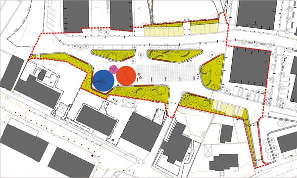
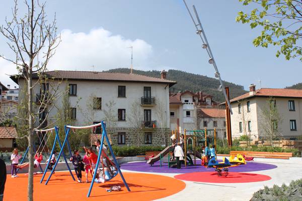
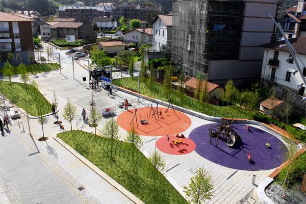
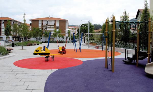
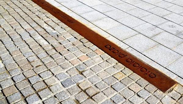
The process involved the demolishment of derelict buildings, such as an unused school, so that a reputable town square could be formed that was architecturally well defined and opens the space out to the sea and the near-by harbor. The colourful design makes a statement of change and the space stands as a unifying element to the surrounding area. Paving the Way The spaces are differentiated by different treatment of the pavers. Each was carefully chosen and the designers paid attention to their layout, colours and textures. For example concrete pavers are used for vehicle traffic, granite for pedestrianized areas and granite cobbles with a written detail strip saying “Atalaya Park” was used for areas dedicated to public events. They were not afraid to go bold all the way and chose bright colours for the rubber pavers that zoned out the circular playground spaces. Related Articles:- Car Park Turns into Public Park!
- Community Turn Abandoned Industrial Site into Public Park
- MFO Park in Switzerland
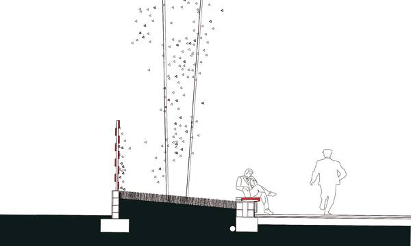
Wrapping up the Space The vegetation wrapping the edges of the central square softens the hardscape. Planting species are also equally considered in detail, ranging from groundcovers (such as Cotoneaster dammeri, Hebe franciscana, Lonicera pileata and Rosmarinus oficinalis) to medium sized shrubs with aromatic planting (such as Nandina domestica, Lavandula angustifolia) to a range of tree species (Betula pendula, Carpinus betulus ‘Fastigiata’, Phillostachys nigra, Liquidambar styraciflua and Tilia tomentosa) that surely matches with the dynamic material pallet that takes place.
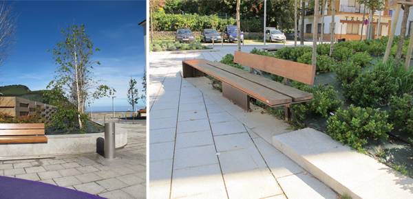
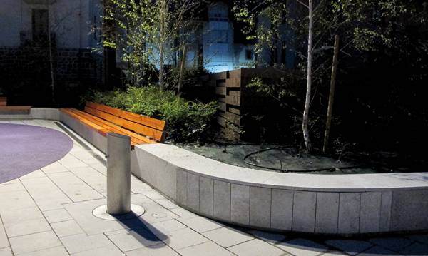
Aside from the planting beds, the area is kept flat throughout to facilitate easy mobility for the pedestrians. Lighting is the only thing being kept simple with lampposts lining the space. Granite seating with timber detailing meanders through the space as a form of connecting the different areas inside and outside the square. So going back to the questions of why exactly this incredibly modern design work so well in this small town and why the space promises the adventure…well, it just goes to show that when a strong need for change in towns and cities are needed, it doesn’t do any harm to abandon old ideas and traditions or sticking to what makes this place “special” and just reinventing something completely different that makes the locals look forward to something new. Atalaya Park may just be the beginning of a more organised and well-integrated design and planning changes that may contribute to the future layout of Lemoiz. We can applause G&C Architects in the execution of their bold design because whatever changes and demolition of the old was made to this space, it looks like these will impact the area in a positive way. Recommended Reading:- Designing Small Parks: A Manual for Addressing Social and Ecological Concerns by Ann Forsyth
- The Urban Design Handbook: Techniques and Working Methods (Second Edition) by Urban Design Associates
Article written by Win Phyo Return to Homepage
Published in Blog


