Landscape Architecture for Landscape Architects › Forums › SUSTAINABILITY & DESIGN › Quality Design
- This topic has 1 reply, 9 voices, and was last updated 15 years, 5 months ago by
 Trace One.
-
AuthorPosts
-
October 26, 2010 at 5:00 pm #167184
 Zach WatsonParticipant
I’ve been thinking and I’m trying to understand both myself and design work, so any feed back is appreciated.
What is quality design? It does not seem to be quantitative, there is no formula to follow that will give you good design. What do you base your understanding of quality design on? How do you know that what you are perusing in your project is the path that should be taken?October 26, 2010 at 5:17 pm #167212 Trace OneParticipant
I like McHarg’s word, “fit’…. fitness…
For me the word encompasses all the different levels at which a design should be judged..
And it is not in the golds Gym sense of fitness..
October 26, 2010 at 6:04 pm #167211Vanessa Alyse Thompson
ParticipantBeing in a well designed space reminds me of hiking through the mountains. Often plant material, a stone, or some other object catches my eye and draws me over to experience it. Out of curiosity I pick it up, feel its weight, its texture, its consistency…discovering the properties of such an object is naturally very pleasing to me. It is such a simple notion, but such experiences can prove to be overwhelming.
When this experience is hindered in some way, a space can be very unappealing. If I see a stone bench, and I expect to feel stone, but feel plastic, I am often put off, for example.
I feel it is this search for the pleasure of natural experience that can be equated to “quality design”. The use of real materials where possible, and the creation of an experience that is nearly as natural as hiking through the mountains.October 26, 2010 at 7:27 pm #167210 Thomas J. JohnsonParticipant
Nicely said Vanessa!
Along those same lines, from one of my favorite books, Zen and the Art of Motorcycle Maintenance:
“The result is rather typical of modern technology, an overall dullness of appearance so depressing that it must be overlaid with a veneer of “style” to make it acceptable. And that, to anyone who is sensitive to romantic Quality, just makes it all the worse. Now it’s not just depressingly dull, it’s also phony. Put the two together and you get a pretty accurate basic description of modern American technology: stylized cars and stylized outboard motors and stylized typewriters and stylized clothes. Stylized refrigerators filled with stylized food in stylized kitchens in stylized homes. Plastic stylized toys for stylized children, who at Christmas and birthdays are in style with their stylish parents. You have to be awfully stylish yourself not to get sick of it once in a while. It’s the style that gets you; technological ugliness syruped over with romantic phoniness in an effort to produce beauty and profit by people who, though stylish, don’t know where to start because no one has ever told them there’s such a thing as Quality in this world and it’s real, not style. Quality isn’t something you lay on top of subjects and objects like tinsel on a Christmas tree. Real Quality must be the source of the subjects and objects, the cone from which the tree must start.”
— Robert M. PirsigOctober 26, 2010 at 9:41 pm #167209 Andrew Garulay, RLAParticipant
Good design starts from the general and works toward the specific. First you have to address the general concept of the project and make sure you understand client/budget/regulation/end user/and the site to do so. Good design takes care of the macro as it works toward the micro. The micro should always support the macro. Great details mean nothing if they are mounted on junk and great concepts fall apart when great details don’t follow.
Big to small, general to specific – it does not matter what scale the project is.It can be a city plan or a flower arrangement. If you start with the details, you are working backwards.
October 26, 2010 at 11:45 pm #167208 Jason T. RadiceParticipant
Ditto
October 27, 2010 at 1:40 am #167207 Thomas J. JohnsonParticipant
One word: Beauty. Beauty is synonymous with Quality.
If your process is beautiful, your design will be beautiful. If your design is beautiful and the execution of your design is beautiful, the built environment will be beautiful.
I constantly ask myself, or rather I’m constantly aware of, beauty. If you feel disharmony, listen to yourself and examine what is making you feel that way, in your process, your design or the work in progress. Beauty will always lead you down the right path.
 October 27, 2010 at 2:04 pm #167206
 Theodore TegenParticipant
I really like this last reply Thomas, as well as your first.
I really do take notice when a design or sketch of mine “feels off.” I try to really focus on what is making me feel that way, and brainstorm/sketch new ideas until I arrive at a solution that I feel confident in. It’s very important, as Vanessa said, for the space to feel very natural and intuitive.
Another aspect of good design, in my opinion, is that is integrates human needs while respecting the natural environment, as well as respecting the context of the design.
October 27, 2010 at 2:41 pm #167205 Rob HalpernParticipant
Perhaps the question was intended to just flesh out the philosophical, but I notice no one has mentioned “maintainability.”
Is design “good” if it pleases the mind but cannot be maintained in the real world? Or cannot be maintained given the resources available to maintain it? Is a design good if it doesn’t function? What is “function”? Over what time period would it need to continue to “function”?Now, I’m not talking about “sustainability” or any other buzz-word concept. Just whether a design translates into a landscape the client can keep alive and attractive.
And yes, I do feel that this is a component of good design.
@Thomas – when I speak with landscape curators or maintenance people, I focus on the measure of Beauty. I heartily agree with your post.
Still, when I speak with Landscape Architects, it often seems necessary to ask about Maintainability.October 27, 2010 at 4:36 pm #167204 Andrew Garulay, RLAParticipant
There always seems to be an expectation that a landscape is (1.) permanent and (2.) natural. This is not the case. Maintenance, human needs, and integration with nature are criteria that good design would address to the degree warranted by the project. There should never be an assumption of criteria. Good design starts by fleshing out the criteria for the particular project. Standardly applied criteria is not good design.
October 27, 2010 at 4:42 pm #167203 Rob HalpernParticipant
Andrew,
I agree with your principles but not this detail. A landscape does not need to be either permanent or natural of course… it just needs to be the landscape it was intended to be…for more than 15 minutes.For me, every project is approached as though it is brand new, yet to design a landscape that cannot be mowed, pruned, weeded, whatever… is simply not good in any sense (except perhaps the designers ego and banking account…for a very brief time). It may be good design in some rarified Platonic realm but not here.
If you are to design a “clock”, it is assumed it is so as to measure time. To design a clock that cannot keep time may be fine as a student project but if form without functionality than it is sculpture not a clock.
October 27, 2010 at 5:18 pm #167202 Zach WatsonParticipant
Thanks for everyone’s input, over the last 24 hours I have given this quite a bit of thought, and one point that I want to mention is the idea of ‘what is the soul of the space?’ or ‘what is the soul that will be brought to the space?’.
The architecture students went to the Salk Institute earlier this semester and took a few photos, when I saw it this picture, my thoughts were ‘this place lacks a soul’ it is all cold stone and concrete.
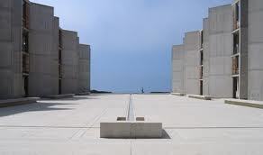
I’m beginning to think that much of what creates good design is about coming to understand what the soul the space is or what can it become. We can build just about anything, but if it never creates or enhances activity/soul, has it really ever accomplished anything? I would have to say no.
I’m still working my way through this learning process, but I have really enjoyed reading what all of you have had to say about how you see design.
Zach
October 27, 2010 at 7:17 pm #167201 Trace OneParticipant
I used to work at UCSD, where Salk is – it is an extremely famous design, for the “landscape” as well, and it turns out that the famous single runnal in the middle is a great place to put cables for any public event you might be having there..
: )
October 27, 2010 at 7:53 pm #167200 Zach WatsonParticipant
See and this is what is so interesting to me about design but at the same time really frustrating me, personally at least with where I am in my design development level I would never propose that for my concept but based upon what you just said the design of space works well. I just feel like there is something that I’m missing but I can’t put my finger on what it is, or how to find it.
Zach
October 27, 2010 at 7:56 pm #167199Tanya Olson
ParticipantSo…Function and adaptability to add to the list.
I had to chime in on this one, having traveled through some hilarious landscapes over the weekend (I wish I would have stopped to take some pics to show you all).
Seems like there is design all along the scale of goodness > badness, from sublime > what the @%#*$? Do you know it when you see it? Are there really any quantifiable ‘rules’? More important – how do people who aren’t landscape architects respond to it?I saw a ‘what the @#$*&?’ landscape over the weekend – a new retail strip mall parking lot planting where they threw everything including the kitchen sink at it (clearly the result of a new landscape ordinance).
They had tons of grasses stuffed in with shrubs of all kinds, trees, more grasses and more shrubs – all about the same height (@4′)and not really having any relationship with each other at all. It literally looked like someone was throwing plants off the back of a truck and then planting them. Here’s what it didn’t do – it didn’t make space or mark spatial relationships in any way, it didn’t have a sense of scale, rythym, proportion, hierarchy. It didn’t have ANY relationship to the surrounding landscape, which is mostly prairie / farmland / cottonwood river bottoms. (Though as Andrew said, probably wasn’t in the criteria) The colors were all wily nily. It was the Liberace of landscapes.Here’s what it DID do. It made me look. Maybe it was the reality tv show of landscapes -so over-the -top you can’t help but look. Maybe thats the correct function for a strip mall….As for maintenance – most of those plants will die from overcompetition in the next few years. Disposable landscapes? I certainly would take it any day over a strip mall parking lot that is paved from the edge of the building to the edge of the roadway., but it was pretty bad on the badness scale.
Then I kept driving down the road and saw some planting along a community bike path – just to mark intersections, mind you, a simple planting of rabbit brush (Chrysothamnus) and Rocky Mountain Sumac. Not a huge design in the scheme of things, but was absolutely beautiful, fitting, and elegant. It reminded me of the stone cairns you run across hiking above the tree line – a sudden human interaction with the landscape that creates order (or harmony) out of chaos…then slides gently over time back into chaos.
-
AuthorPosts
- You must be logged in to reply to this topic.


