In this day and age, presentations are a necessary way of conveying information to a large group of people. Because of their perceived staleness, they have become one of the most dreaded things to make, give and listen to. For designers, the presentation is do-or-die time for selling a project. Perhaps that is why architect and visual designer Adam Somlai-Fisher, from Budapest, began using a zoomable user interface (ZUI) in 2001. His initial presentations were coded separately but when presentations were successful, he and Assistant Professor Peter Halacsy, Budapest University of Technology hatched the idea of ‘Prezi’ in 2009, as a publicly available ZUI. They brought in technology entrepenuer Peter Arvai and their product has really taken off in recent years. They are constantly updating and adding new functions, so for tech junkies out there, it is a fun concept to watch evolve.
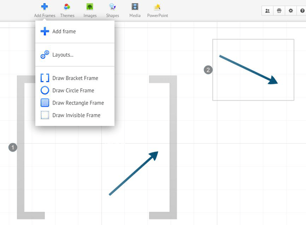
How does Prezi work? For those that have used architectural programs such as Autocad and Sketchup, Prezi is not difficult to pick up. Here we will run through some of the basic tools, and show a presentation of our own to display the ways designers could use Prezi. The zebra tool is their signature way of editing objects, text and other media that can be integrated into Prezi. It is used for rotating, scaling, deleting, cropping and grouping. As you can see in the diagram, it is pretty straightforward. Text is created in Prezi simply by double clicking anywhere in space. The text editor is still somewhat limited, and font options have to be controlled through the themes editor in the top toolbar. Other features of the toolbar include the ability to integrate images, Powerpoint, Youtube videos, shapes and frames. Fancier edits and enhancements Frames represent one of two ways to create transitions between scenes. The other is to ‘add current view’ under the path editor on the left side of the screen. Frames allow you to control the view with more precision. Frames can be rotated a full 360 degrees, allowing for a sort of spinning effect during the presentation. Frames can be visible during the presentation as a bracket, circle, or rectangle, or they can be invisible. Objects in Prezi cannot actually be viewed as if they are in 3D space, although it can be made to feel that way. For instance, in our example, the earth is a 2D image, not an actual globe that can be seen from all sides. It looks like it could be because of the 3D background feature, in this case outer space. This allows for up to 3 images to be overlaid, with a fading effect between them. Prezi takes care of the 3D effect through the themes editor’s advanced settings. The size of the backgrounds depends on the size and pixels of the image, a feature that is still a bit tricky to get to work consistently, although they do state a recommended width of 3000 pixels for 3D backgrounds. The potential for this program is immense! There is much more to learn with experimentation, and the potential for this program is immense. The best way to learn is to try it yourself and push the limits of what it can do. Some people have done just that, creating special flash buttons that can be pasted into Prezi to do things it is yet unable to, such as background music. We wanted to give you a few ideas on how Prezi could be used in our profession so without further ado, here is our Prezi, featuring The Netherlands’ Park 20|20, by William McDonough+Partners. If Prezi fails to load click on this link Article written by Peter SalamonThis article was originally submitted to Landscape Architects Network
Published in Blog


