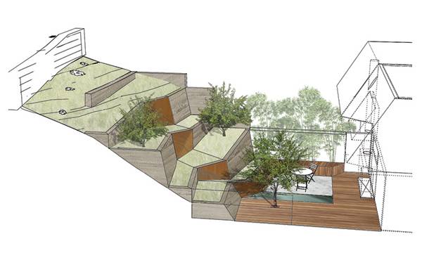
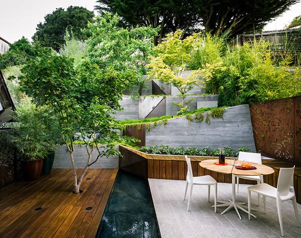
Hilgard Garden, an outstanding take on the terraced garden by Mary Barensfeld Architecture. The landscape proposal for Hilgard Garden, designed by Mary Barensfeld, follows a series of simple concepts that are reflected in each element of the garden: elegance, interaction, and simplicity. From the beginning, let’s analyze the visual connection between indoors and outdoors. This concept is gained by respecting the existing topography and using it as the core of the garden. By proposing different levels of landscape, the visual connection between the house and the surrounding forest creates a sensation of being inside a bigger garden and, beyond, being inside the forest.
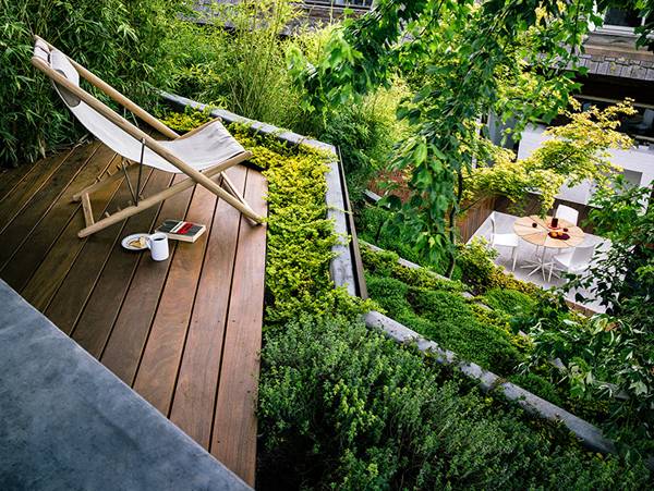
The topography of the upper garden and upper deck also provides sufficient height to see the San Francisco Bay. The plant palette vegetation, which we will analyze later, also plays a particular role in the upper deck’s function, by obscuring nearby houses and focusing views on San Francisco Bay.
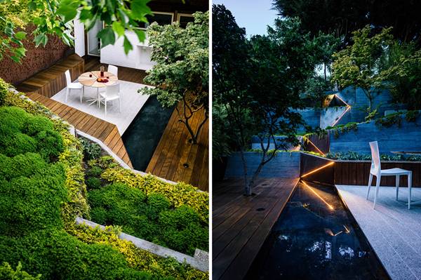
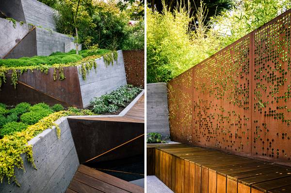
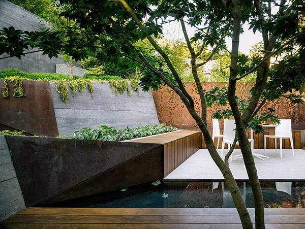
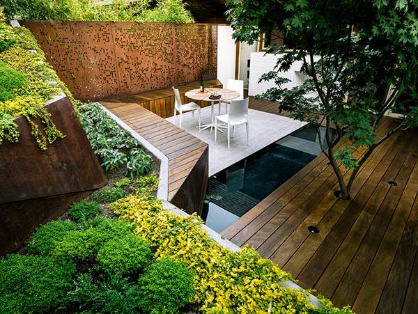
The general geometry of the garden not only responds to topography and the visual interaction of the garden with the forest, but also reacts to the design of the planters, creating a central axis that divides function, colors, and textures of the garden. The character of the axis is reinforced with corten panels and led lights. At night, it becomes the element that changes the perception of the landscape design.Despite being a small garden, with a minor vegetation proportion, the variety of species creates a special natural treatment. The plant palette consists mainly of trees and shrubs (lemon thyme), arranged in a strategic pattern. For example, the garden only comprehends three trees that follow a zig-zag arrangement. With this, again, the visual integration of the landscape design becomes stronger. The form of shrubs and grasses is not natural, but the result of specific pruning that allows each of the plants to have an elegant and simple ovoid form.
Also see: Award-winning Garden Project Along The Swan River Stunning Contemporary Garden Design!
Cedar shingles are used to create benches that serve as outdoor furniture and as planters. These bench-planters create a strong differentiation between the granite platform, which functions as an extension of the living room, and the garden. One of the most interesting characteristics of the furniture is how each piece represents a different action. While the wooden bench represents the permanent furniture, chairs and table are temporal. Also, the location of the permanent bench is near the shrubs, while the temporal furniture sits away from the plants. This arrangement allows different types of relationships between users and vegetation.
A very good detail to change the conventional fence was the idea of using a different material — the corten wall — combined with bamboo to define it. Contrasting characteristics of both elements creates a new design when we think about fence examples: greens against oranges, horizontality vs. verticality, and nature against mineral. The character of the fence defines itself as a unique element and as outcome of the combination of both elements.
Even though Hilgard Garden is a small outdoor area nestled between two houses, it allows direct connection to the forest and the natural environment of the zone. The landscape design allows this integration by respecting the existing genius loci of the site, proposing specific plant palette vegetation, and disposing specific elements with distinct materials. By mixing all these elements, Hilgard Garden is a perfect example of how landscape architects can change the perception of a space that, sometimes, is considered as a residual space. Recommended reading: The Garden Source: Inspirational Design Ideas for Gardens and Landscapes by Andrea Jones Private Paradise: Contemporary American Gardens by Charlotte M. Frieze
Article written by Luis Eduardo Guisar Benitez RETURN TO HOME PAGE
Published in Blog


