What should public space be? How should it function, and what should it look like? These are some of the major challenges facing a landscape architect approaching a new public space project. Everyone has their own opinion, and they’re entitled to it but I don’t believe there is currently a right answer. Instead, it would increasingly seem that public spaces can no longer simply be ‘attractive’ or serve a single function such as providing office workers with somewhere to eat lunch. Instead they must also be: sustainable; low-cost; environmentally friendly; safe; accessible to all; inclusive of all user groups; increase biodiversity; aid rainwater drainage; provide social, economic and environmental benefits, et cetera, et cetera… But how, if at all possible, can we tick all of the boxes? No One Solution Fits All Of course, each site is unique and should be designed based on individual case needs and circumstances, but many will have one thing in common: the requirement to maximise the use and potential of precious public space. Maybe that’s easier said than done but innovative ways of delivering multi-functional public spaces are springing up all the time. We can also learn a lot from some of the successful examples of public places that have been around for a while, places that are able to adapt to changing needs and still provide multiple functions to multiple users. Here’s one prime example: The city of Portland, Oregon seems to have it figured out with Pioneer Courthouse Square. Located in the heart of downtown Portland, the city’s main urban park is known as ‘The city’s living room’ and attracts around 10 million visitors per year.
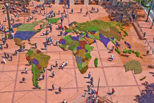
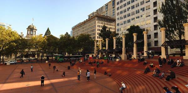
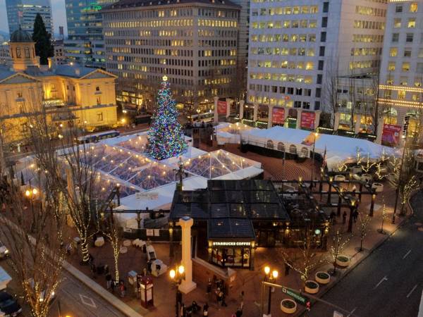
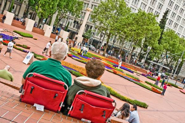
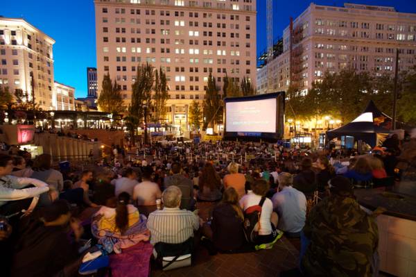
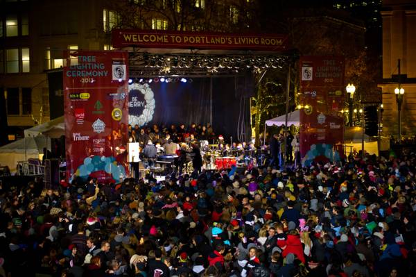
An Electric Hub of Activity Surrounded by 4 blocks of shopping, dining, entertainment and business, the square is an ideal gathering, meeting or resting spot. The key to its success is seemingly its pro-active management, prime location and simple design. Instead of filling the square with clutter and trying to define its function, the design is fairly minimal, retaining a large flexible space at its centre which is used to put on a busy events schedule (322 last year) and thus providing entertainment, interest and above all a reason to keep going back, for a range of tourists and locals alike. The layout cleverly uses the slope of the land to facilitate the use of steps which provide amphitheatre style seating around one corner and two sides of the square, allowing for a large number of spectators at any one time. The square is home to a transport office within the tourist information and travel office and is well served by transport options. The flagship Starbucks store sits on one corner in its home city, but all other vendors are mobile, allowing further flexibility in the squares service offerings. Maximising Green Space Whilst there is not an abundance of ‘green space’ in this urban park, trees line the edges of the square to provide shade and shelter and plant pots are regularly brought in to add colour and life to contrast the red bricks that dominate the design. The calendar of events includes: cinema, international festivals, concerts, markets and many more which mark the square out as a prime attraction, year round. The events also generate income for the continuing operation of the square. It is well looked after, with a team of janitors and security guards maintaining cleanliness and security. Thinking About The Future In the case of Pioneer Courthouse Square, it would appear that staying flexible, or not trying to prescribe function, allows it to actually serve multiple functions. The design element did not finish when the square opened in 1984, instead a management trust was set up to manage it on an ongoing basis, ensuring it continually delivers on its aims to activate and enrich the environment of the park to serve the people of Portland and its visitors. Watch: Pioneer Courthouse Square & Pioneer Place So if you’re struggling to fit a vegetable garden, wildflower meadow, play equipment, rain garden, urban forest and ample seating into your next design project, just remember that sometimes, less is more. Recommended reading: Life Between Buildings: Using Public Space by Jan Gehl Insurgent Public Space: Guerrilla Urbanism and the Remaking of Contemporary Cities by Jeffrey Hou Article written by Simon Vive Return to Homepage Published in BlogLogin
Lost Password
Register
If this is your first time on the new site, please click "Forgot your password?". Follow the steps to reset your password. It may be the same as your old one.


