Author: Caleb Melchior
Plant Production for Landscape Architects and Designers
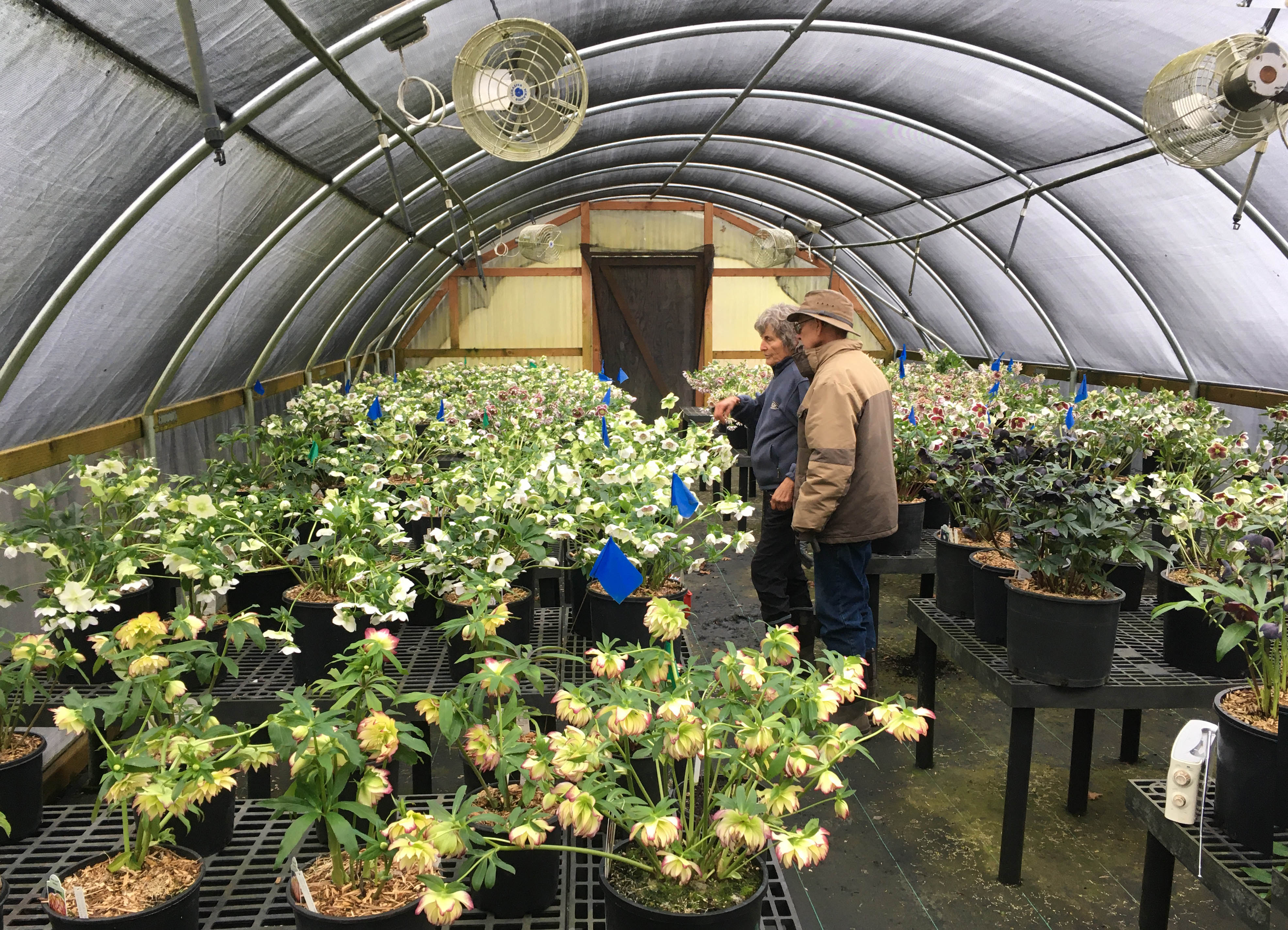
Ernie and Marietta O’Byrne of Northwest Garden Nursery in Eugene, Oregon, have spent decades selecting, perfecting and growing the Winter Jewels strains of Helleborus x hybridus. This decades-long work resulted in markedly improved plants with increased garden worthiness, brighter, and larger flowers.
How often have you gotten excited about a plant you’ve encountered and enthusiastically included it in a design – then had your hopes dashed when a contractor just can’t find it anywhere?
Whether or not a plant performs well in the landscape is an entirely different matter from its ease of production in a nursery context. Many excellent plants for landscape are difficult to produce. Some are difficult to propagate, others don’t thrive in a nursery setting, many are infuriatingly slow. When you ask – “why isn’t [fill in the blank plant] available”, there probably are reasons. Those might not be reasons that matter to you as a landscape architect, but they affect the material that you have to work with so it’s good to understand them.
Plants don’t end up in nurseries just because they’re beautiful or ecologically valuable. They have to also fit the constraints of the commercial nursery industry. Getting good plants to nurseries – and getting them there consistently – requires immense knowledge, labor, and skill.
Here are some basic aspects of the plant production process that shape what you see on availability lists, in wholesale nurseries, and – eventually – on your job sites for installation.
Propagation:
Making new plants is known as propagation. The two main modes of plant propagation are sexual reproduction (in which every resulting plant is genetically different) or asexual reproduction (in which every resulting plant is genetically identical).
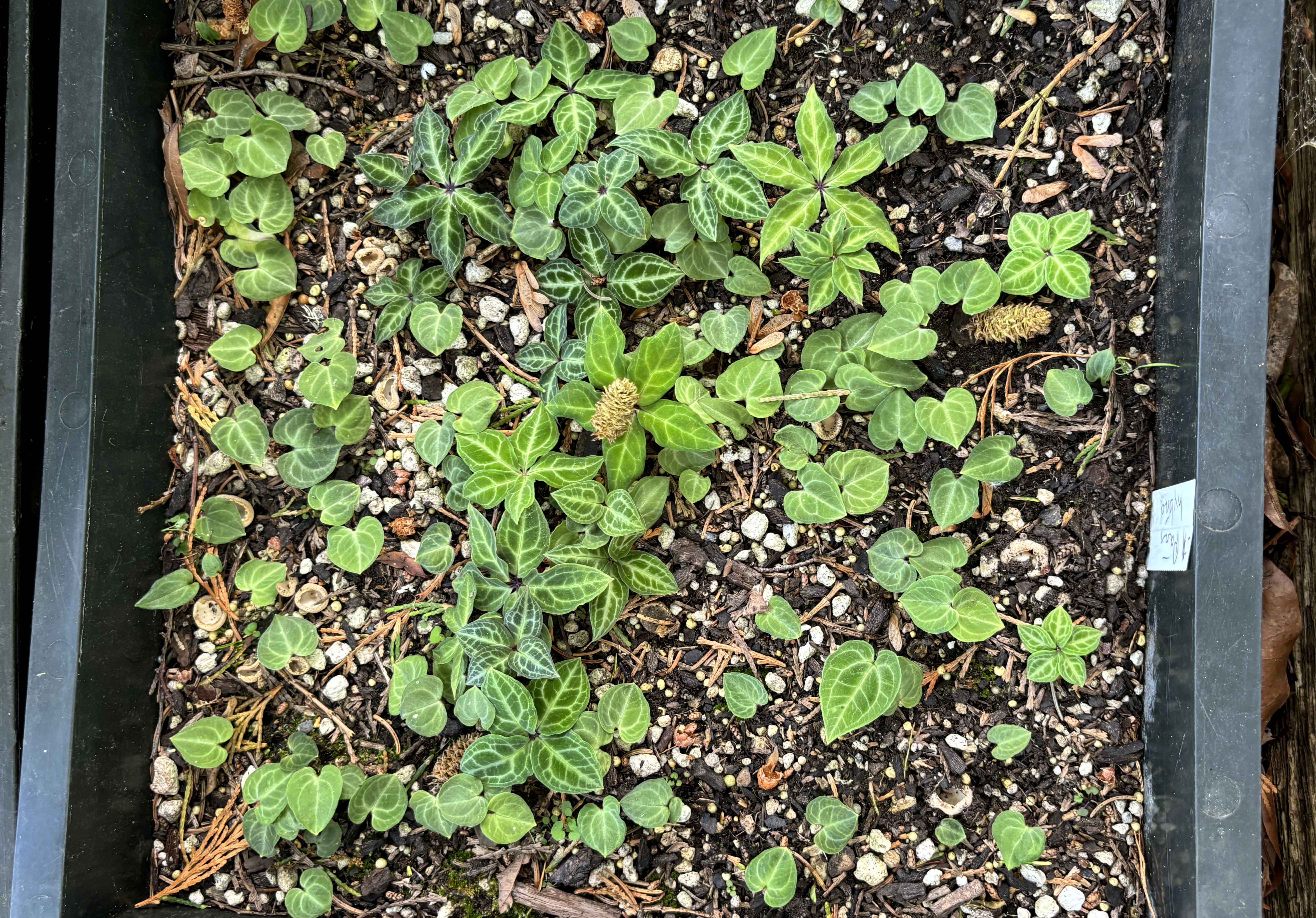
Propagation by seed can be a slow process – these Paris hybrid seedlings took over 2 years to germinate and have been growing for 2 years at Northwest Garden Nursery in Eugene, Oregon. Each plant reflects an investment of time and care, as well as the expertise needed to grow this unusual group of plants.
Sexual reproduction usually starts with seed. As with anything else with plants, there are a few exceptions. Ferns, for example, sexually reproduce through spores. But for most sexual reproduction, you’ll start with a seed.
Seeds are usually planted into a growing medium of finely milled peat moss, compost, coconut coir or other organic material with perlite and/or vermiculite. For seed starting, growers will typically sterilize the growing medium to minimize the presence of moss, mold, fungus and any other organisms that might damage vulnerable young seedlings. Planted seeds are kept lightly moist and given the light and warmth conditions that will stimulate them to germinate.
Each species has adapted to specific moisture, temperature and light conditions that instigate germination of seeds. Expert growers recreate the conditions under which a plant evolved in order to achieve germination. Some plants require special treatment of the seeds (such as cycles of chilling and heat, exposure to darkness, exposure to light, or even exposure to smoke) to stimulate germination. Other groups of plants are remarkably difficult or slow to grow from seed under nursery conditions.

Vriesea bromeliads at Bullis Bromeliads in Homestead, Florida. The uniformity of these plants reflects that they’re aesexually propagated.
Asexual reproduction starts with a piece of plant tissue that is placed into a growing medium – typically similar to a sterile seed starting medium – and allowed to grow. The simplest form of asexual reproduction is cuttings – when a chunk of the plant is cut off and planted into a medium until it forms roots and begins growing. Plants differ from animals in that they will often grow a new plant from a cut off part. Imagine being able to cut off your finger, put it in some soil, and grow a new you? Different plants can be reproduced from cuttings of different parts of the plant, usually with active growth points, including stems, buds, and even roots. Plants differ by species and even selection in which type of cutting will work, as well as in their ideal seasonality for propagation and their light/temperature needs.
The most dramatic form of asexual reproduction is tissue culture – where growing points of plants are dissected into tiny pieces, treated with growth hormones, and grown on gel medium. With tissue culture, hundreds and even thousands of plants can be produced from a single growth point. This makes production much faster and easier than more traditional propagation methods – but different plants respond in different ways. Bizarrely, despite tissue culture being a form of asexual reproduction, the chemical treatments used can stimulate genetic variation – occasionally resulting in plants that differ genetically from their parents. (In case you haven’t noticed yet, plants are weird and behave in unpredictable ways)
Another method of asexual reproduction to be aware of is grafting. In grafting, a small growth point of the desired final plant is physically bonded to the roots of another physically compatible plant. If the graft is successful, the two plants will fuse together. The roots will genetically remain the same and the top growth will be the desired variety. Why would you do this? Some woody plants, especially fruit trees, grapevines, some conifers, roses, and certain ornamental trees/shrubs grow substantially better when they’re grafted onto a different rootstock. It’s been an agricultural practice for thousands of years and is still used today. Grafting is one of the many reasons why sometimes a plant will send up shoots that look miraculously different from the top – or after a particularly cold season, the top might die leaving just the rootstock to grow.
Understanding if the plants that you are specifying have been reproduced sexually or asexually will help you understand the variability of the plants that you’ll receive. If you want diversity in different characteristics such as height, shape, or flower color – you might want seed-grown plants. If you need uniformity, you’d probably be better off with something asexually produced.
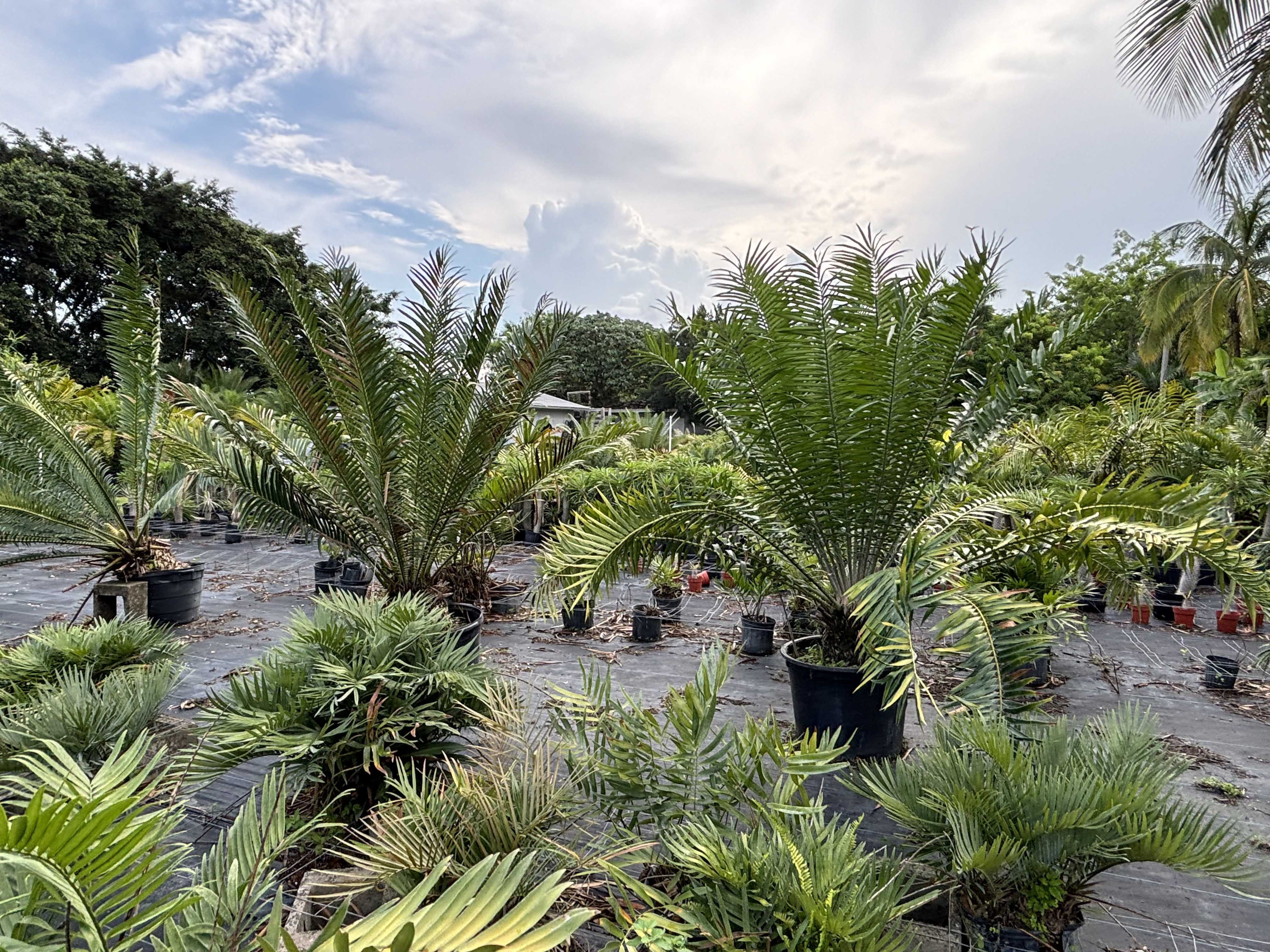
Some plants take decades to mature into specimens – these cycads at Redlands Nursery in Homestead, Florida, put on approximately 1inch of trunk diameter per year, meaning that many are over a decade old.
Nursery Production:
You have the plant propagated. There was one and now there are more. What happens next? Again, it depends on the species. Some species spend a year or more in their initial production conditions, putting on roots and beginning to grow. They’ll then be planted up into the next size of pots with a growing medium appropriate for that species to grow under nursery conditions.
What does this look like in the life of a plant? Any individual plant may have been – in fact is most likely to have been – shunted between any number of nurseries before it makes it to your job site. Some nurseries specialize in the initial stages of propagation. They’ll start seeds, cuttings, graft, or generate plants through tissue culture. They produce plants that are anywhere from an inch (for herbaceous plants) to a foot or so (for woody plants). These plants are called liners (or plugs) for herbaceous plants, whips for woody plants. Once they’ve reached a stage where they can be shipped, the young plants are often shipped to a wholesale grower who will grow them for anywhere from a few weeks (for fast-growing herbaceous plants) to years (for slow-growing herbaceous plants and trees). Species grow at different rates. Slower, bigger, more difficult = more expensive. Eventually, when the plant has reached the finished size it is sold to a landscape contractor to fulfill your specifications. It’s loaded onto a truck and transported to be installed somewhere it will [hopefully] live a full life thriving to maturity.
You knew plant production wasn’t magic. Well, maybe, it’s just a little bit magical that you can plant a seed or stick a tiny cutting and end up with an entirely new plant. But now you have a fuller picture of the incredible expertise, labor, and time required to produce the plants that make up our landscapes. Understanding what it takes to get your plants install-ready will help you advocate for their value to your collaborators and clients.
If you’re looking for more basics on common mistakes landscape architects make in specifying plants, check out my previous article, Getting What You Want: Considerations in Specifying Plants.
Top 10 Landscape Architecture Books for 2025
Thriving in the work of landscape architecture requires maintaining inspiration, often as much as growing your knowledge and experience. To stay fresh, the right book can be your greatest ally.
In 2013, Land8 created a list of the “Top 10 Books for Landscape Architects”. We still value these texts (and may even have selected a few for re-inclusion on this list), but today our profession has grown increasingly dynamic, interdisciplinary, and deeply tied to the urgent needs of our planet. We need new guides to this expanded field.
Everyone loves their favorite landscape architect’s latest studio monograph, but we’re not playing favorites. You know if your fav studio has a new book out. Instead, we’ve chosen a spread of works in different topics within the profession to feed your practice and stoke your inner fire. Each book offers something singular: a narrative, a challenge, or a set of tools to enrich your work and expand your vision. Whether you spend your days drafting pocket parks, conducting field work, or scheming up whole new worlds, pick up a few of these books – they might just be the provocations you didn’t know you craved.
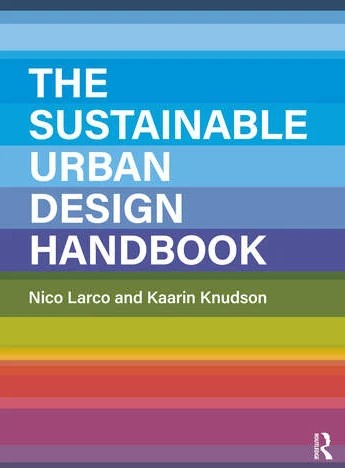
The Sustainable Urban Design Handbook
By Kaarin Knudson & Nico Larco, 2024
For the urban designer – or urban design wannabe:
The Sustainable Urban Design Handbook By Kaarin Knudson & Nico Larco, 2024, Routledge
You’re accustomed to the topics – Energy Use (transportation based), Ecology + Habitat, Energy Use (+ production), Equity + Health. You’re used to thinking at different scales – Regional, Neighborhood/District, Street/Block, and Project/Parcel. But have you been able to find a condensed overview of these concerns across scales all in one place? This recently published handbook provides designers with a framework for multiscalar thinking across different issues in urban design. It’s also a great tool for you to use in educating your community and decision-makers towards more sustainable futures.

Landscape Architectural Graphic Standards
By Leonard J. Hopper (Editor), 2006
For LARE candidates:
Landscape Architectural Graphic Standards By Leonard J. Hopper (Editor), 2006, Wiley
This hefty tome is the foundation of your mentors’ bookshelves. Time to step up and get your own copy. This reference is like having a team of highly-experienced construction experts at your fingertips. Don’t just reproduce what you see here: study to understand the components of each detail and how they work together. If the full version is beyond your needs as a soon-to-be-landscape architect, consider the Landscape Architectural Graphic Standards, Student Edition.
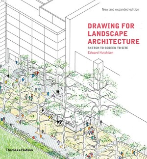
Drawing for Landscape Architecture: Sketch to Screen to Site, by Edward Hutchinson, 2019
For the maven of the sketch walk:
Drawing for Landscape Architecture: Sketch to Screen to Site By Edward Hutchinson, 2019, Thames & Hudson
Drawing – whether digital, analogue, or somewhere in between – is one of the key skills of landscape architecture practice. Hutchinson’s guide offers a spread of useful techniques with examples applicable to each stage of design thinking and production. We appreciate the clear detailing of drawing materials used and production time required to create each drawing.
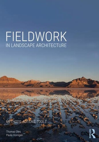
Fieldwork in Landscape Architecture, By Thomas Oles & Paula Horrigan, 2024
For the person who sleeps in their safety vest, hard hat, tape measure, and site photos:
Fieldwork in Landscape Architecture By Thomas Oles & Paula Horrigan, 2024, Routledge
Landscape architects have long had a troubled relationship with fieldwork. This valuable new handbook introduces students and early career professionals to the complexities of design as it meets the realities of land and construction. With its thoughtful categorization of “what you seek”, “what you carry”, “how you act”, and “what you leave behind”, this book will stimulate even highly experienced professionals to see aspects of site they may have ignored.

The Death and Life of Great American Cities: 50th Anniversary Edition, By Jane Jacobs, 2011
For the porch-sitting, coffee-drinking, social theorist:
The Death and Life of Great American Cities: 50th Anniversary Edition By Jane Jacobs, 2011, Penguin Random House
Hermit, dweller of the urban core, or something in between, you can learn something valuable from Jane Jacobs. She drew attention to processes as a component of city planning – as well as the compounding effects of seemingly small variables in a city’s function. Read Jane Jacobs and you’ll never see your sidewalk, street, park, or neighborhood in quite the same way again.

Lost in the Transit Desert, By Diane Jones Allen, 2018
For transit-oriented teens (and adults, sure, as well):
Lost in the Transit Desert By Diane Jones Allen, 2018, Routledge
You’ve heard of food deserts – but are you ready to take on the transit deserts? Dr. Jones Allen traces the origins and causes of transit deserts, examines specific case studies, and lays out a range of potential future approaches to this vital issue. This book will provoke you to think about how underserved communities creatively navigate vehicle-focused development for daily survival – and challenge you to action towards a more navigable world for all.
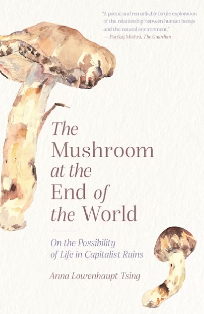
The Mushroom at the End of the World, Anna Lowenhaupt Tsing, 2021
For fans of Dr Robin Wall Kimmerer’s “Braiding Sweetgrass”:
The Mushroom at the End of the World By Anna Lowenhaupt Tsing, 2021, Princeton University Press
Are you craving thoughtful exploration of the relationships between humans and other beings? Tsing untangles human-landscape interdependence through stories of matsutake, the fruiting body of a fungus revered in Japanese tradition which grows in highly disturbed landscapes. Tsing traces the human networks around matsutake as a guide to gesturing toward a future of survival through collaboration and care.

AI 2041: Ten Visions for Our Future, by Kai-Fu Lee & Chen Quifan, 2021
For the guy who won’t stop talking about AI (and the confused principal having a bespoke model developed using in-house data):
AI 2041: Ten Visions for Our Future By Kai-Fu Lee & Chen Quifan, 2021, Crown Currency
Midjourney, ChatGPT, and every software now featuring “new AI functionality” has become daily reality. Where might these new technologies be taking us? Lee & Chen picture 10 scenarios for the year 2041. Their engaging stories lay out a wide potential range of AI impacts on different areas of life in various global cities. Whether each scenario excites or worries you, you’ll be thinking about aspects of these stories long after you finish the book.
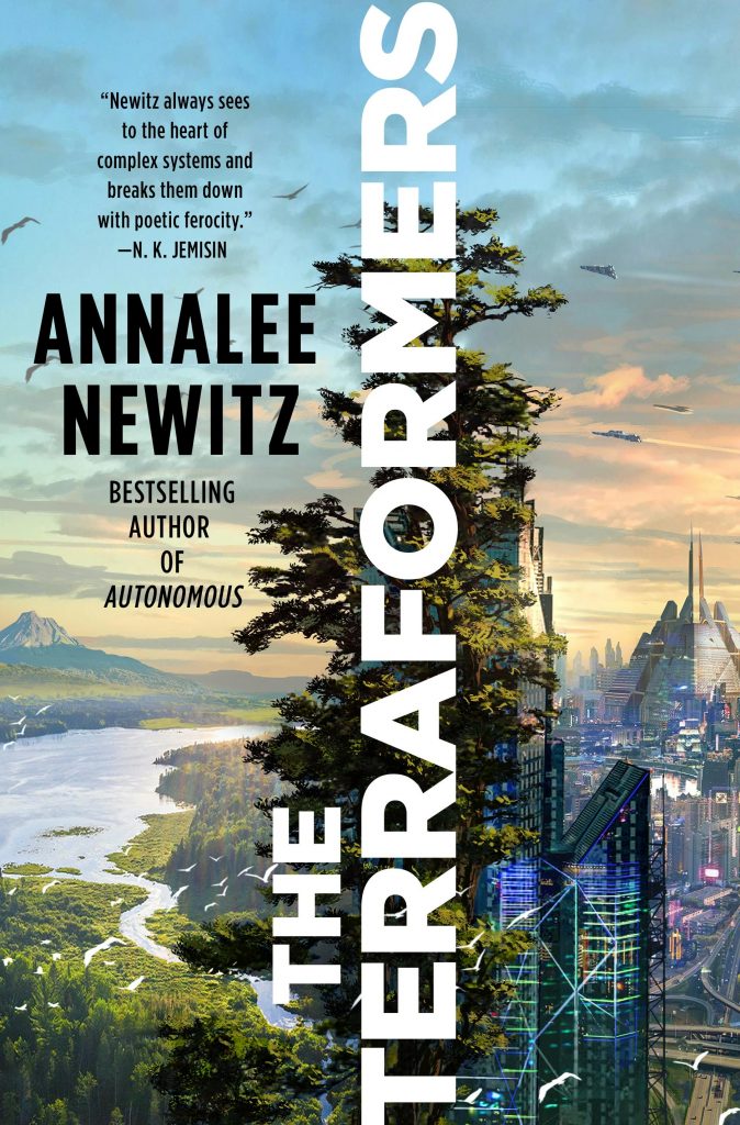
The Terraformers , By Annalee Newitz, 2023
For the far futurists among us:
The Terraformers By Annalee Newitz, 2023, Macmillan
Crack open this climate fiction adventure and step into a universe shaped by artificial intelligence, biological consciousness, and large-scale climate modification. The issues landscape architects tangle through today have grown, in this universe, to shape the lives of every being. Newitz has written a story to think-with that’s also a breeze to read and enjoy.
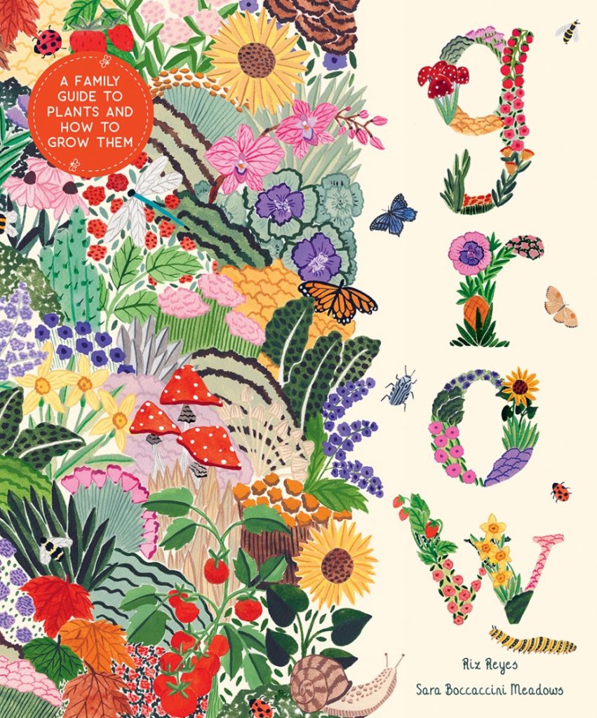
Grow: A Family Guide to Plants and How to Grow Them, By Riz Reyes, illustrations by Sara Boccaccini Meadows, 2022
For budding landscape architects:
Grow: A Family Guide to Plants and How to Grow Them By Riz Reyes, illustrations by Sara Boccaccini Meadows, 2022, Abrams
Want the best start for your future landscape architects? Introduce them to the joyous interactions between plants and humans with this thoughtful botanical guide. Global examples of plant culture demonstrate how each of the included hero plants enrich the lives of humans and other beings. Beautiful illustrations and thoughtful text just might sow a future appreciation of plants in the hearts of young readers.
How Can Landscape Architects Learn From Botanic Gardens?
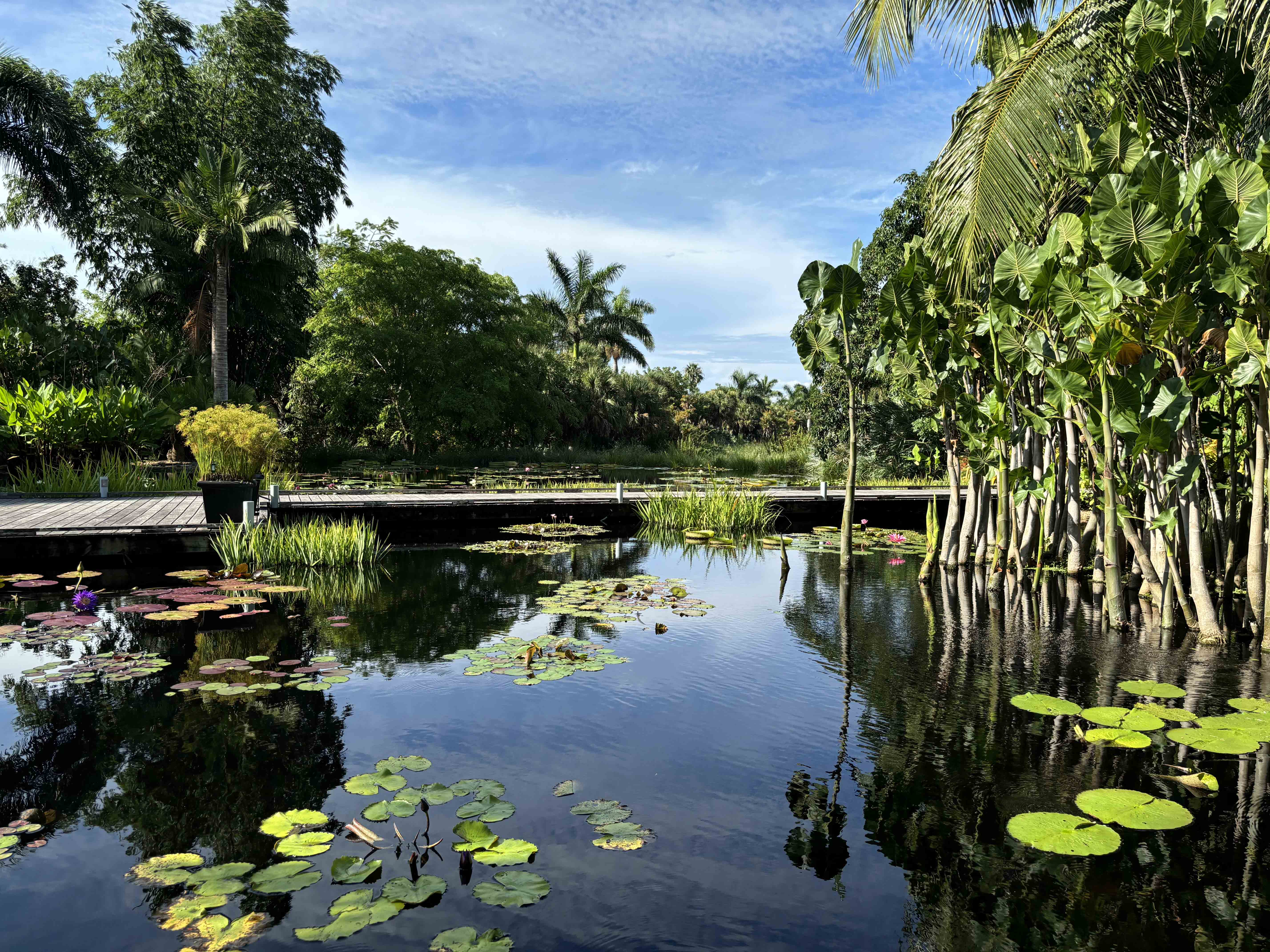
Naples Botanical Garden in Collier County, Florida, is an example of a garden that demonstrates scientific research, conservation, display, and education.
If you’ve worked in the landscape architecture field for long, you’ve likely noticed that landscape architects often struggle with plants. Plants are one of the primary materials in our palettes, but they’re often undervalued by clients and the profession. Most landscape architects don’t learn much about planting at university. Unless you get a lot of early planting experience or mentorship, it can be difficult to learn much about planting design from behind a computer.
Fortunately, landscape architects’ attitudes towards planting are slowly changing. High-profile planting design projects such as the High Line and larger conversations around ecological performance are forcing landscape architects to acknowledge the value of thoughtful planting design. As the legislation increasingly restricts planting choices and climate change affects plant availability and survival, landscape architects are increasingly stretched beyond standard street tree lists and the cheapest standard groundcovers.
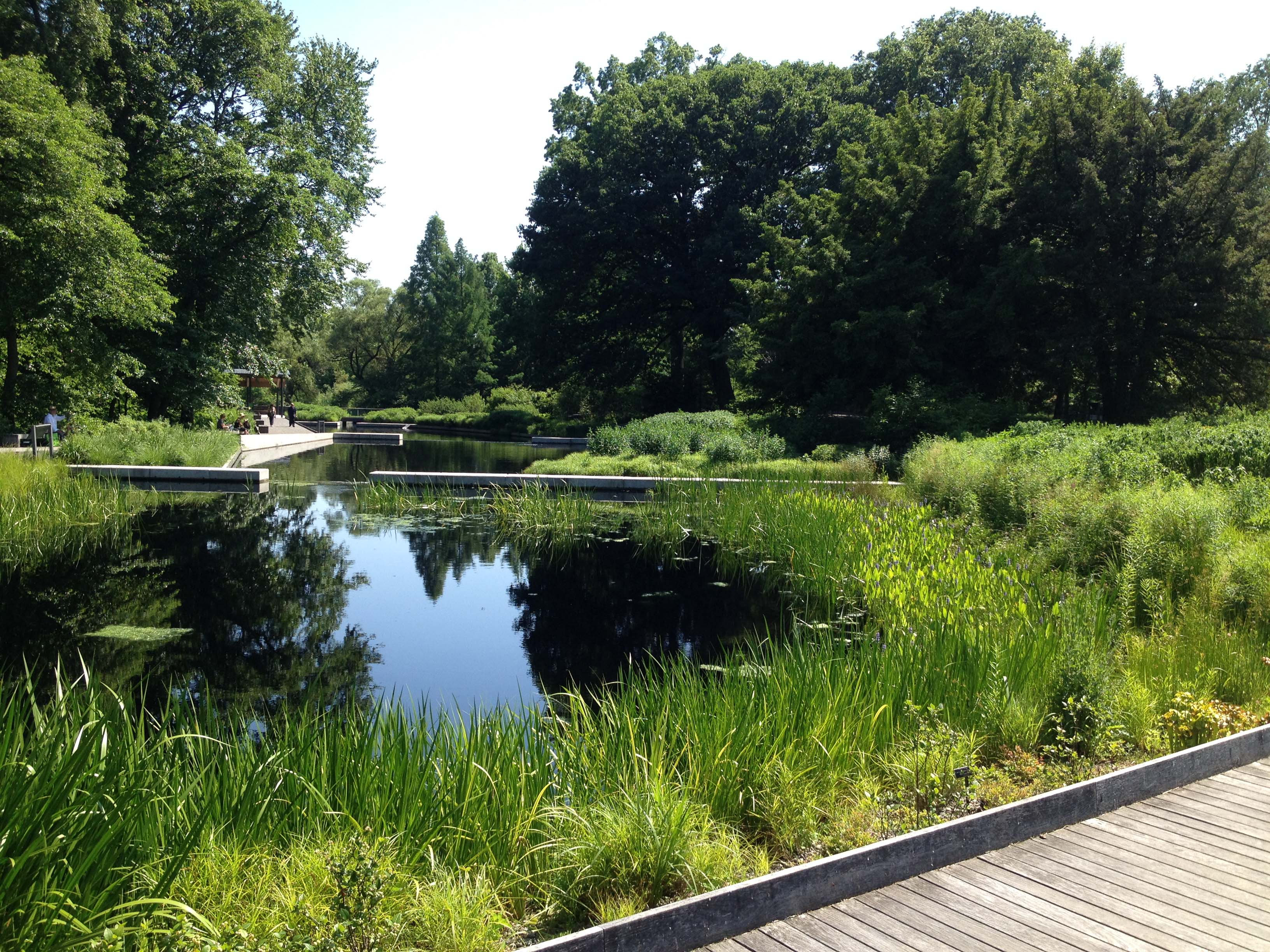
The Native Plant Garden at New York Botanic Garden was designed by OvS and Eric D. Groft, Landscape Architecture, to display the plants typical of northeastern US ecosystems.
So you want to get better at planting. Where should you go? Start at the cultural institutions dedicated to plants: botanic gardens.
If you’re not a garden geek, you might think of botanic gardens mostly as places to go for a nice day out. Hopefully, they have a cafe, shade, good places to sit. But that term “botanic” signals something important* – a botanic garden isn’t just for looks.
According to Botanic Gardens Conservation International(BGCI):
“Botanic gardens are institutions holding documented collections of living plants for the purpose of scientific research, conservation, display, and education”
Gardens with this “botanic” designation go beyond providing beautiful experiences. They hold living collections and build knowledge about plants. They’re a great place for you to learn from networks of experts.
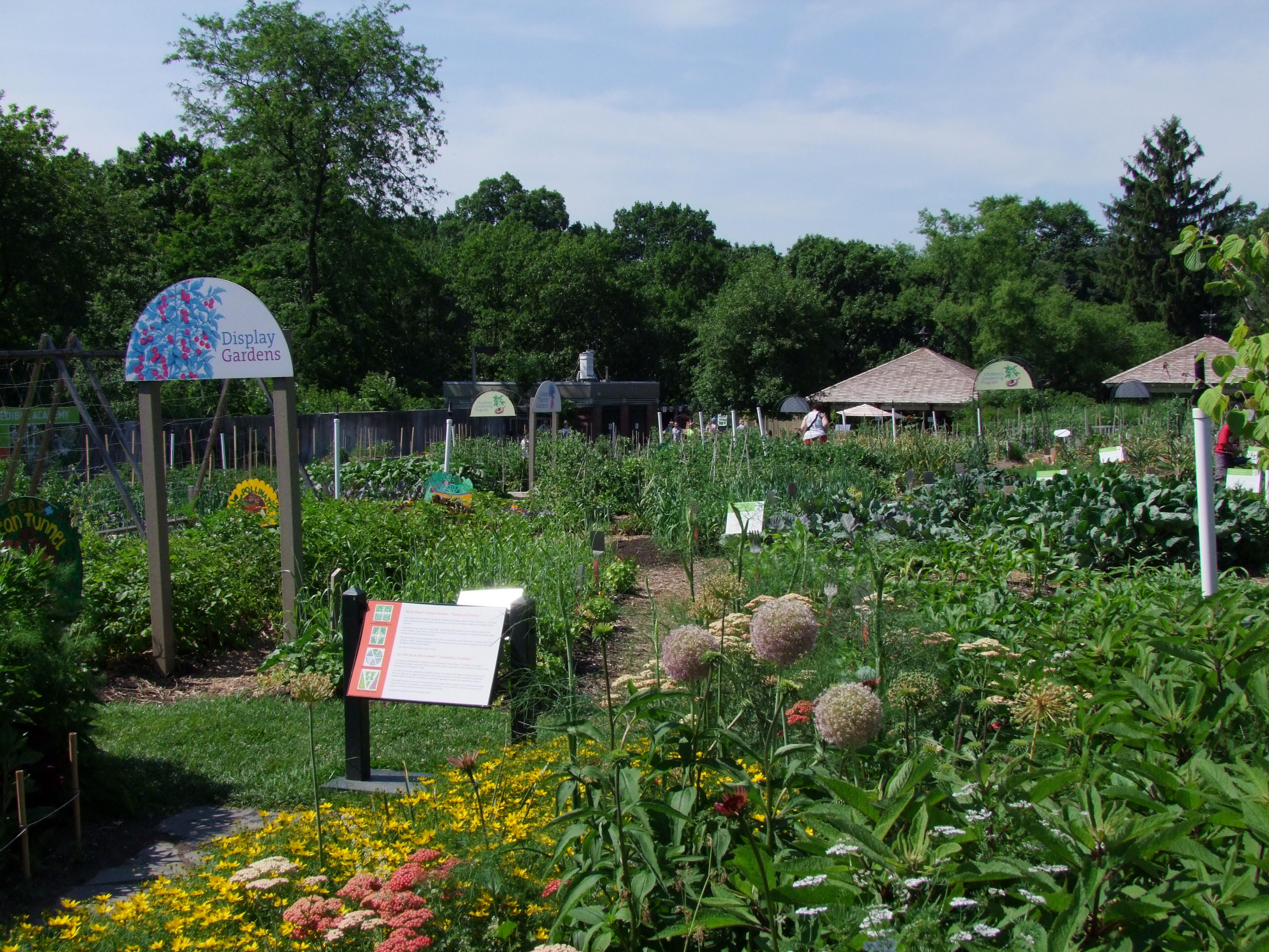
At Brooklyn Botanic Garden, multicultural display gardens incorporate the traditional crops of different communities that live in the region.
Maybe the most obvious way landscape architects can learn from botanic gardens is by experiencing them as visual and physical references. Visit your regional botanic garden at different times of day and different times of year. Observe what plants grow, what conditions they need, how they look at different stages in their lifecycles.
Pay attention to different ways that plants are managed. How are they pruned? How does that affect their appearance? Visiting and paying attention is the first step. Do it soon, repeat often!
Don’t just look at the plants. Pay attention to how the infrastructure of the garden is designed to support different communities. While botanic gardens are often operating in the wake of challenging colonial legacies, many are actively working to broaden the scope of people they serve – and removing barriers to communities that have previously been excluded. Botanic gardens are leading in efforts at decolonialism through interpretation and outreach. At Naples Botanic Garden in Naples, Florida, signage is now multilingual (English, Spanish, Haitian) to make interpretation easier for a wider range of people in the community with different languages.
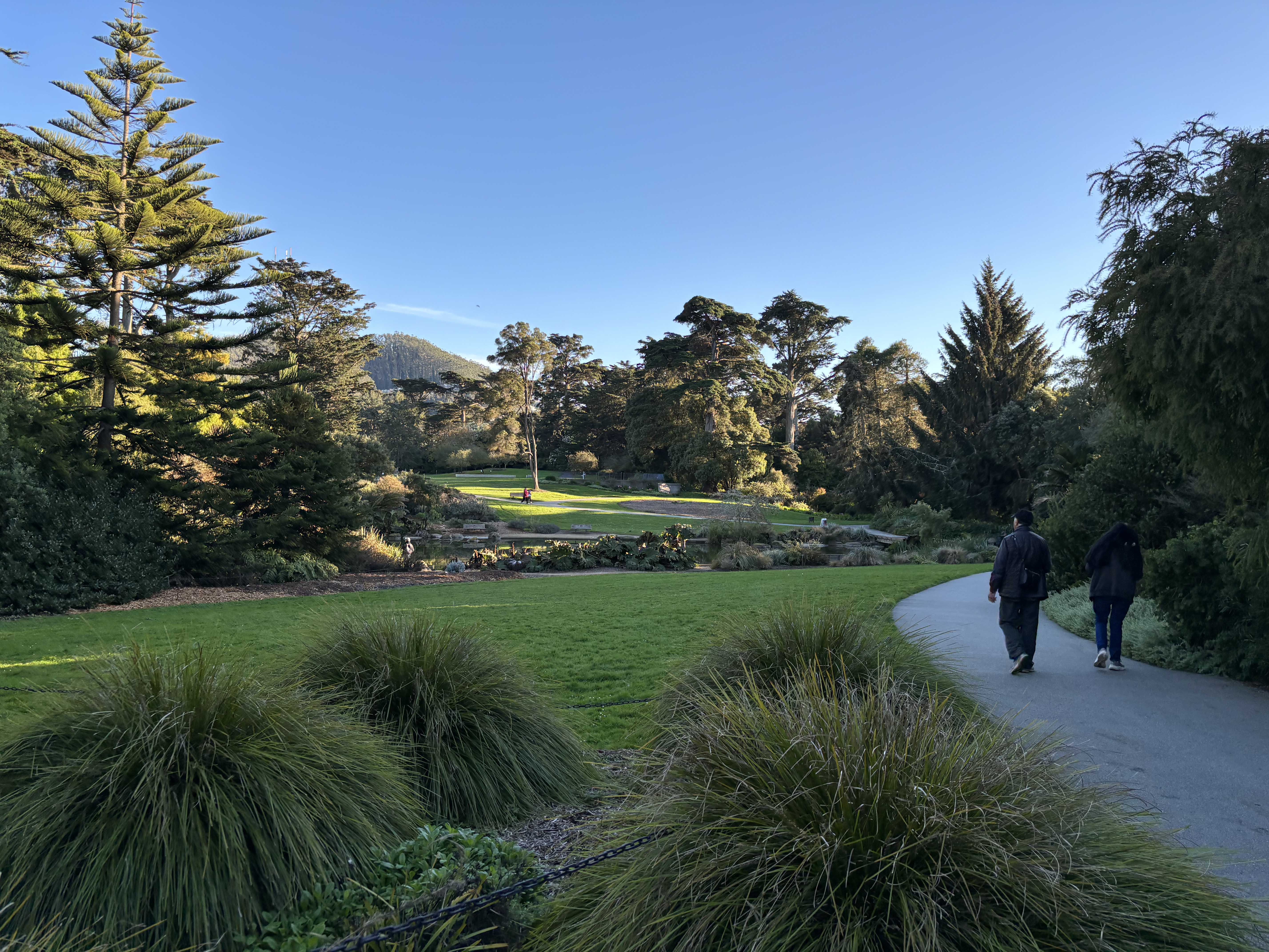
San Francisco Botanical Garden serves as an essential public space for recreation while also displaying the diverse global plant palette that grows in the Bay Area.
Beyond learning through the garden experience, find out how you can learn from the experts on staff at the botanic garden. Botanic gardens have the greatest concentration of expertise about plants that you’ll encounter in one place. Attend their public lectures, classes and workshops. Hire botanic garden experts to talk to your studio or consult on specific projects. Volunteer, if you can, for a hands-on experience.
In my experience, gardens – especially botanic gardens – tend towards cultures of generosity. People happily share their time, their knowledge, sometimes even their plants. But to be respectful, you need to reciprocate with your own surprising kindness. As landscape architects, we’re used to our own expertise being undervalued. When you’re engaging with horticulture professionals, make sure that you are fairly compensating experts for their knowledge. Support your regional botanical gardens as you can professionally and personally. As generalists, landscape architects are strongest when we’re enmeshed in networks of experts. Root into your local botanic garden – grow yourself as a professional and contributor to your community.
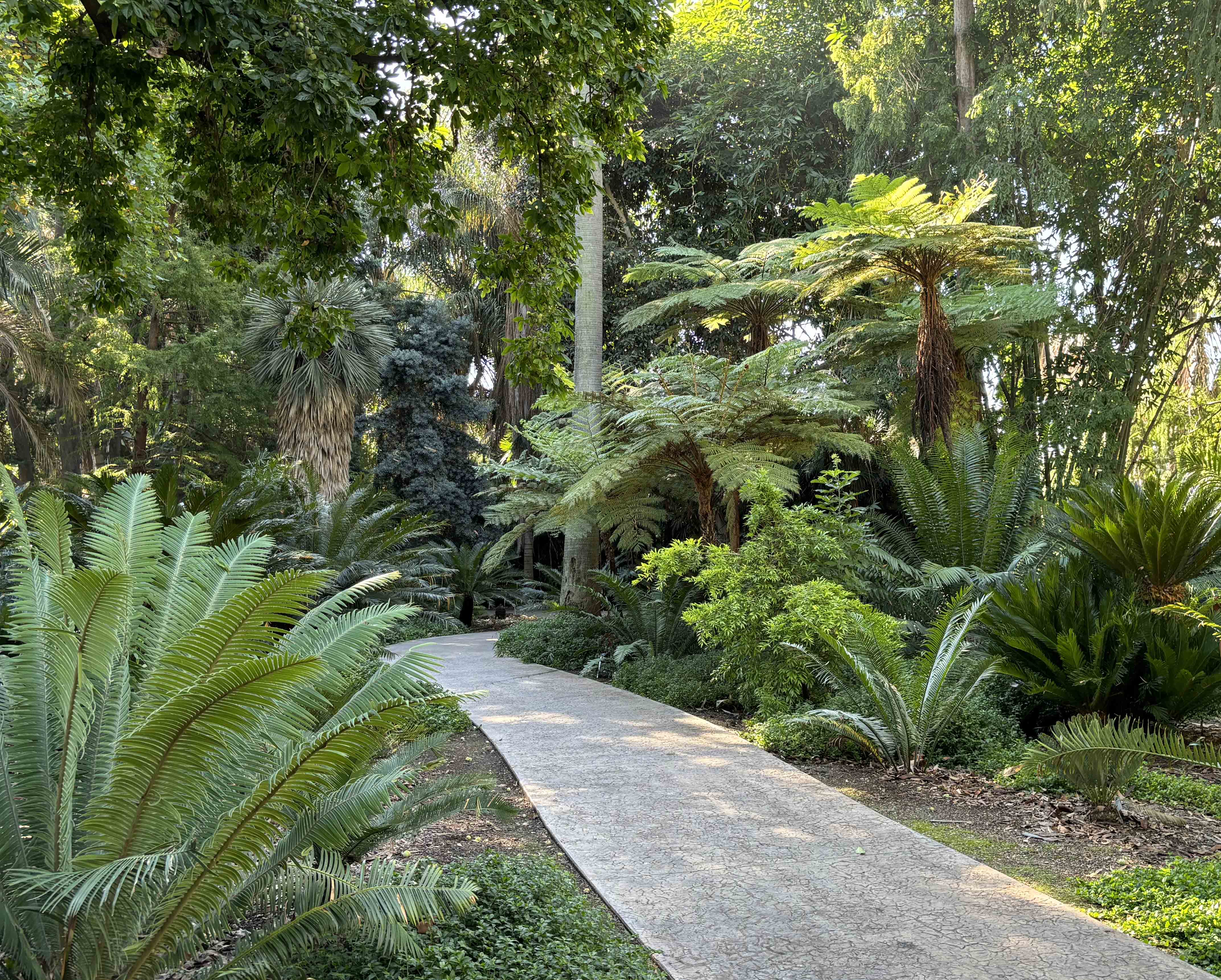
Botanic gardens often demonstrate a range of plants that might not be expected to grow in a region – such as these cycads and tree ferns at the LA Arboretum. Horticultural care makes it possible for these species to thrive in unexpected regions.
*The term “botanic garden” is used differently in the United States versus the United Kingdom. In the United States, it’s typically used as defined by BGCI. In the United Kingdom, the usage is often more specific – designating gardens using species (rather than horticultural forms or cultivated varieties) arranged to reflect scientific classification.
AI Image Generation in Landscape Architecture Practice
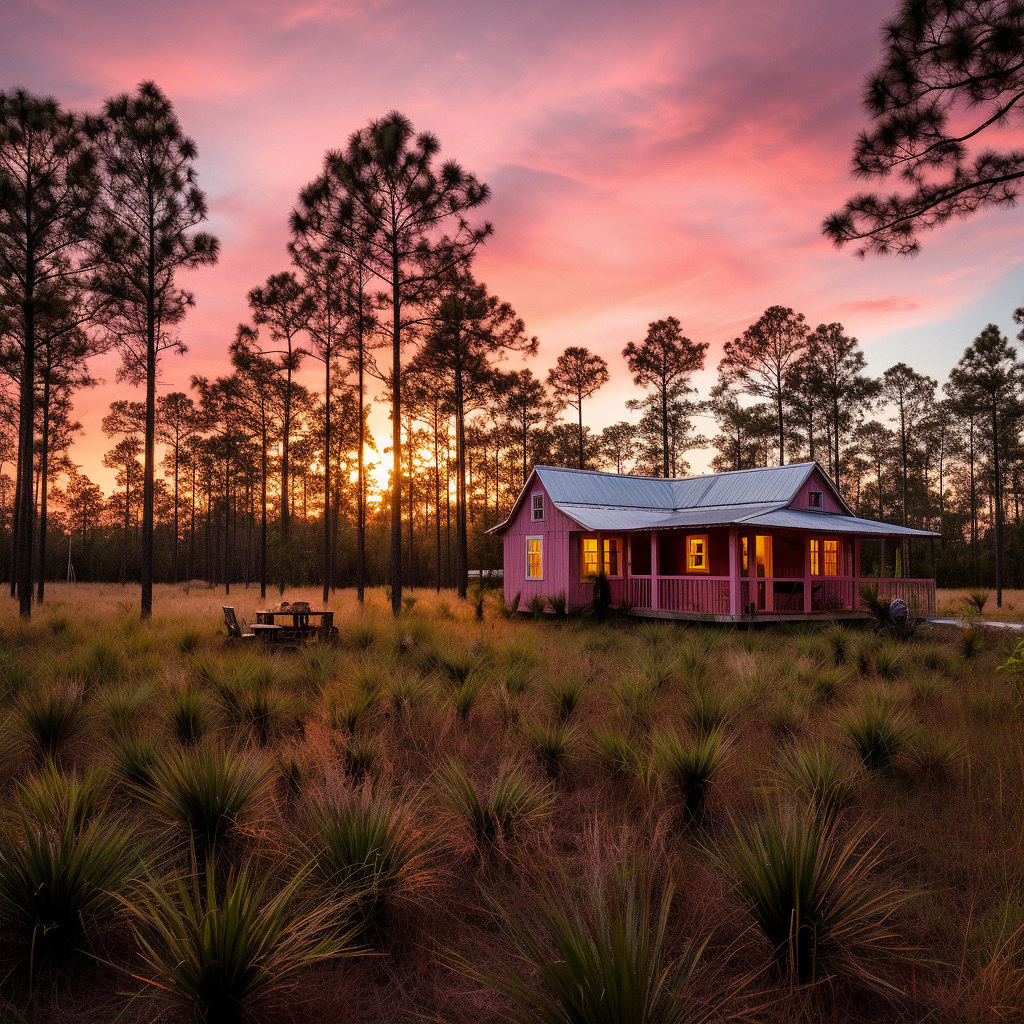
Who wouldn’t want to live in this magical cottage in the Florida pine flatwoods? Cadence created this wonderful image – check their social media for the full story.
Landscape architecture as a discipline has a long and troubled history with images. The English word landscape, to start, originated in European painting tradition. Landscape architecture theorists and practitioners still argue over the role that images should play in our profession. So it’s perhaps unsurprising that the public introduction of generalist machine-learning image generators – such as Dall-E and Midjourney – in Spring 2023 was met with consternation in the profession.
Speculation over the following months has been hyperbolic. Will these tools free up landscape architects’ time and help us better communicate the futures we imagine? Or will they strip all the creative components out of our practice and automate the fun away? I spoke to designers from 4 different practices and practice types across the United States that have been experimenting with AI image generators. They’ve had a range of experiences – check out their work and see how it aligns with your own practice’s experiments.
If you follow #landscapearchitecture on Instagram, you’ve seen @pangeaexpress – the Instagram handle of Eric Arneson, who operates Topophyla – a southern California-based landscape architecture studio with Nahal Sobhati (read Nahal’s answers to 8 questions from 2021 here). Topophylla describe their practice as “analysis and process driven” and actively share their experiments with different tech tools and workflow techniques.

Topophylla use Midjourney at both the concept level – integrated with modeling and construction drawings – and to create vibrant illustrative bouquets showing the site materials and design vision.
Topophyla’s channels were one of the first places many landscape architects saw the future possibilities of AI image generation. Dall-E invited high-profile creators from a range of professions to play with the software and demonstrate the capability of AI image generation. “We got invited to the beta testing for Dall-E almost 2 years ago now,” Arneson says, “We tested it out with landscape architecture applications, seeing how it produced plant materials, how it laid out plans.” These days, Topophyla mostly use AI image generation for ideation, mood boards, and plant palettes.
While enthused about the possibility of using AI image generation to support practice, Arneson saw people commenting on images that – to him – were clearly AI generated and thinking they were photographs. “I wanted a platform to address the fact that not a lot of people know what AI is capable of,” Arneson says. To counteract misconceptions and help people recognize AI generated imagery, Topophyla have started a new Instagram account, @artificial_olmsted. Give it a follow to learn the latest “tells” for AI-generated imagery and stay up to date with new development affecting our profession.
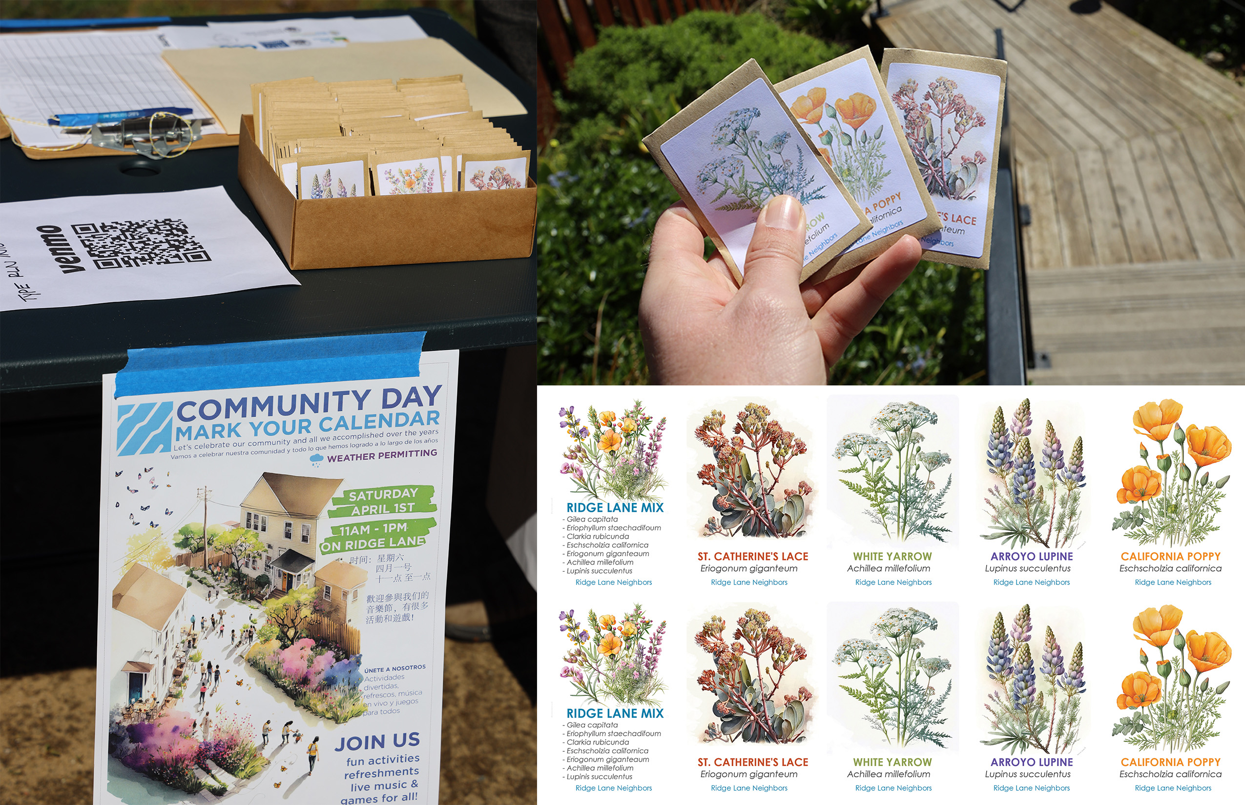
Topophylla used Midjourney to create watercolor images for seed packets as part of a community garden project – making for a deeper level of engagement/excitement.
Florida design enthusiasts – especially those with a penchant for native plants – follow Cadence, a south-Florida based landscape architecture studio known for beautifully-crafted designs celebrating regional style and materials. I spoke with Stephanie Dunn, design associate, about some images the Cadence team created. “We got this thought, with the whole Barbie trend, should we play in this realm of imagination?” Dunn says. The Cadence team would usually start drawing something by hand or modeling, but for this social media experiment, Dunn used Midjourney to create a couple of images envisioning fantastic Florida landscapes with a bright pink color palette.
Cadence’s Fort Lauderdale design team started with plant lists for the dream scenes that they wanted to envision, and Dunn started plugging away with test prompts. For the first one, the Barbie beach house, Dunn notes that she was really learning the program and had quite a bit of trial and error up front. But, for the second image, depicting a cabin in the pine flatwoods – the overall composition she had in mind emerged as part of the second round of images. Dunn notes being struck by the “instant satisfaction of seeing something right away – versus a lot of what we do. You push a button, and 20 seconds later what was in my head has come out and this is amazing. It’s also, at the same time, a little startling, and slightly terrifying, but very cool.” Dunn and the Cadence team made sure that the images they produced using Midjourney accurately represented the plant species that they would use and built out social media posts using photographs of native plants to demonstrate what species could actually be used to create the kinds of environments shown in their images.
Cadence’s team has been deeply considering the potential role of AI image generation in their practice and workflow. “Our clients are hiring us because of the way we think,” Dunn says, “To us that’s highly valuable.” She notes the importance of accuracy in representing plants – something that’s been challenging with Midjourney, but can also be an issue with existing tools like Sketchup and Lumion. Dunn sees the Cadence team integrating these softwares if “AI could help us produce something quickly in order for us to have more time to devote to designing, if it could take away some of the menial things or analysis, but without taking away the thoughtfulness that we really care about.”
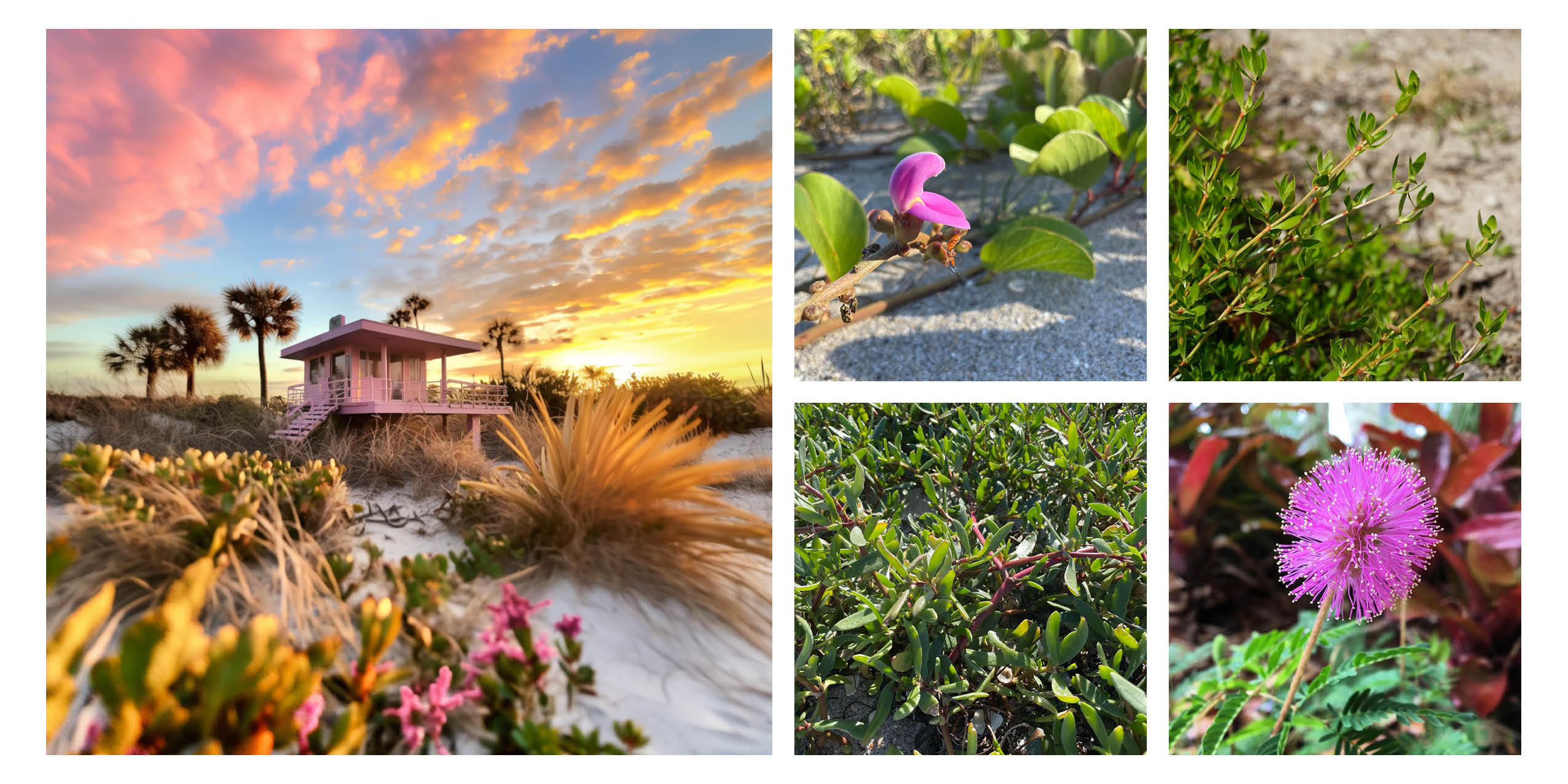
Cadence envisioned a fantastical beach cottage – and explained the Florida native plants that they’d use to actually create this landscape. Plant (starting upper left, clockwise): Baybean (Canavalia rosea), Beach Creeper (Ernodea littoralis), Sunshine Mimosa (Mimosa strigillosa), Pink Purslane (Portulaca pilosa). photos by Stephanie Dunn.
SmithGroup is an integrated design firm – engineering, architecture, landscape architecture, campus planning to name a few of the in-house disciplines – with 20 offices across the US and China. I spoke with landscape architect Brandon Woodle about how he and his team have been tested the use of AI image generation in their design process. “Our experiments with AI image generations were happening in a decentralized way,” Woodle says, “Different designers were messing around, mostly in their free time, exploring how it could influence their work and practice.”
Woodle and his team were working through early concept stages of a project with highly specific conditions: an existing tunnel reimagined as a pedestrian and bicycle connection.The specificities of the project led Woodle to “try and use AI as a tool because it could craft the prompts in a way that would be applicable directly to this certain type of environment that’s not a typical park”. Woodle began with Midjourney and notes that it was interesting to see how prompts using basic terms around ways of shaping space and experience – such as repetition, light, enclosure – were interpreted by the AI image generator.
Woodle quickly found that, while Midjourney would generate many images quickly, the images were overall very similar to each other. He broke the monotonous results using a few different techniques. Woodle used ChatGPT to write prompts, which generated much more variable images than those generated by his earlier prompts. He also took rough hand sketches and combined them with text prompts. “That was an interesting way to iterate on my own sketches in a bunch of different ways,” Woodle says.
The generic quality of the images limited the usefulness of Midjourney for anything beyond concept imagery. “Even incorporating images of the tunnel itself, Midjourney takes liberties and abstracts a great deal,” Woodle says, “I didn’t get quite to the point where I could picture something in my head, describe it with a prompt, and get the image that was in my head. That’s where we kind of hit a wall with it.”

Brandon Woodle – landscape architect at SmithGroup – started with hand sketches (“Portal”, on the left) and worked with Midjourney to generate concept images for a pedestrian tunnel.
Curry Hackett is the founder of Wayside Studio (est 2015, currently based in Cambridge, MA) and a transdisciplinary designer with a background in architecture and urban design. He began experimenting with Midjourney in spring 2023 as part of a studio at Harvard GSD. Collage has long been part of Hackett’s practice – he uses it as a critical practice for challenging perceptions and relationships within images.
Starting with Midjourney to create components of collages and renderings, Hackett began exploring how “to use Midjourney as a way to bring that kind of collageness to a new way of making images. In a way, taking people, black people, and putting them in uncanny settings was a way of me thinking about – what can this do?” Hackett says, “How well does this, can this, program render blackness, black lives, black joy, black abundance?”
Hackett’s images often begin with a detail or joke that he explodes to create images of landscape and urban scale experiences. “I’m advocating for the visibility of southern blackness, also advocating for the inherent sophistication of what I call “the so-called mundane” as it pertains to everyday black life,” Hackett says. As an example, one of Hackett’s experiments into AI-generated video (using Runway) was grounded in his experience growing up in rural Virginia. “The bathtub series, people growing vegetables, that’s coming from a real trope of southern black traditional gardening, on the farmlandt, my great aunt and uncle as long as I can remember growing flowers and plants out of toilets and bathtubs and sinks.” Hackett played around with visualizing the concept using AI, speculating, “What if that customary – but also kind of obscure – trope was scaled up to be hypervisible and placed in a setting like Harlem?”
Hackett is the only practitioner I spoke to who mentioned regularly using Midjourney through Discord’s mobile app. “A lot of people are surprised – 98% of the images that I’m making online, I’m making lying in my bed,” he says, “Or I literally had a funny idea and sat at a coffeeshop and banged it out in like 15 minutes.” Hackett notes this ability to quickly iterate is part of the potency of AI image generation.
Hackett’s conceptually compelling and visually impactful images have drawn widespread social media attention. “When I started doing this work, I had about 3000 people following me on Instagram, mostly peers, family, and friends, but with a pretty heavy design/architecture bias,” Hackett says, “I’m really excited that this work is resonating with not only more people, but more people that are not big A architects or not in our discipline in a direct way – the following is much more coalitional. I’ve got people from the black hair care space following me, I’ve got people in black music space, black food space, black farming space, there’s this really cool cornucopia effect over the past 4-5 months that I might not have had with my existing organic growth.”
As his audience grew, especially through social media, “I was surprised by how disturbed some people were by images of what I thought were joy, that were clearly artificially made,” Hackett says, “For me it highlighted rightly that black folks are suspicious about how we show up in historical narratives, suspicious of how history is authored.” Hackett found that adjusting text descriptions to explicitly frame these images as speculations and AI-generated imagery shaped how people reacted to his work. For Hackett, this experience highlighted that “AI is necessarily going to be interacting with other disciplines. It is going to be embedded in how we consume media, how we write.”
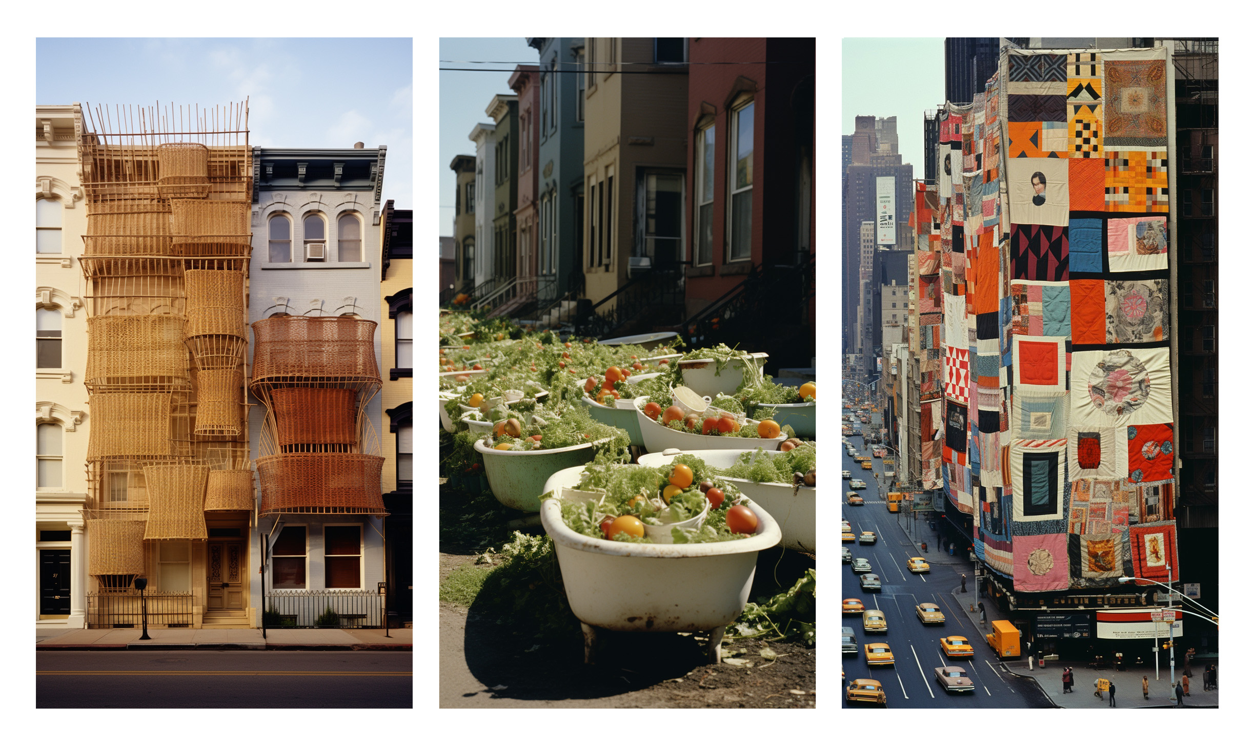
Curry Hackett’s images investigate speculative pasts – and hopefully inspire a new generation of creators to build a more beautiful world.
If any profession claims a right to embed images in understanding of different fields, it’s landscape architecture. Our interdisciplinary profession is well accustomed to picking up tools and combining them with a generalist’s eye to picture the kinds of futures we want to bring to life. If landscape architects follow the example of the practitioners interviewed for this piece and put these tools to work for us, we could design and represent our ideas more effectively. Let’s do it.
FURTHER:
I’ve written this article from the perspective that people, at this point, would likely have a general understanding of how machine learning AI image generators work. If you’re unfamiliar with how AI image generators work, PBS has a useful article here.
Knowledge Management for Landscape Architects
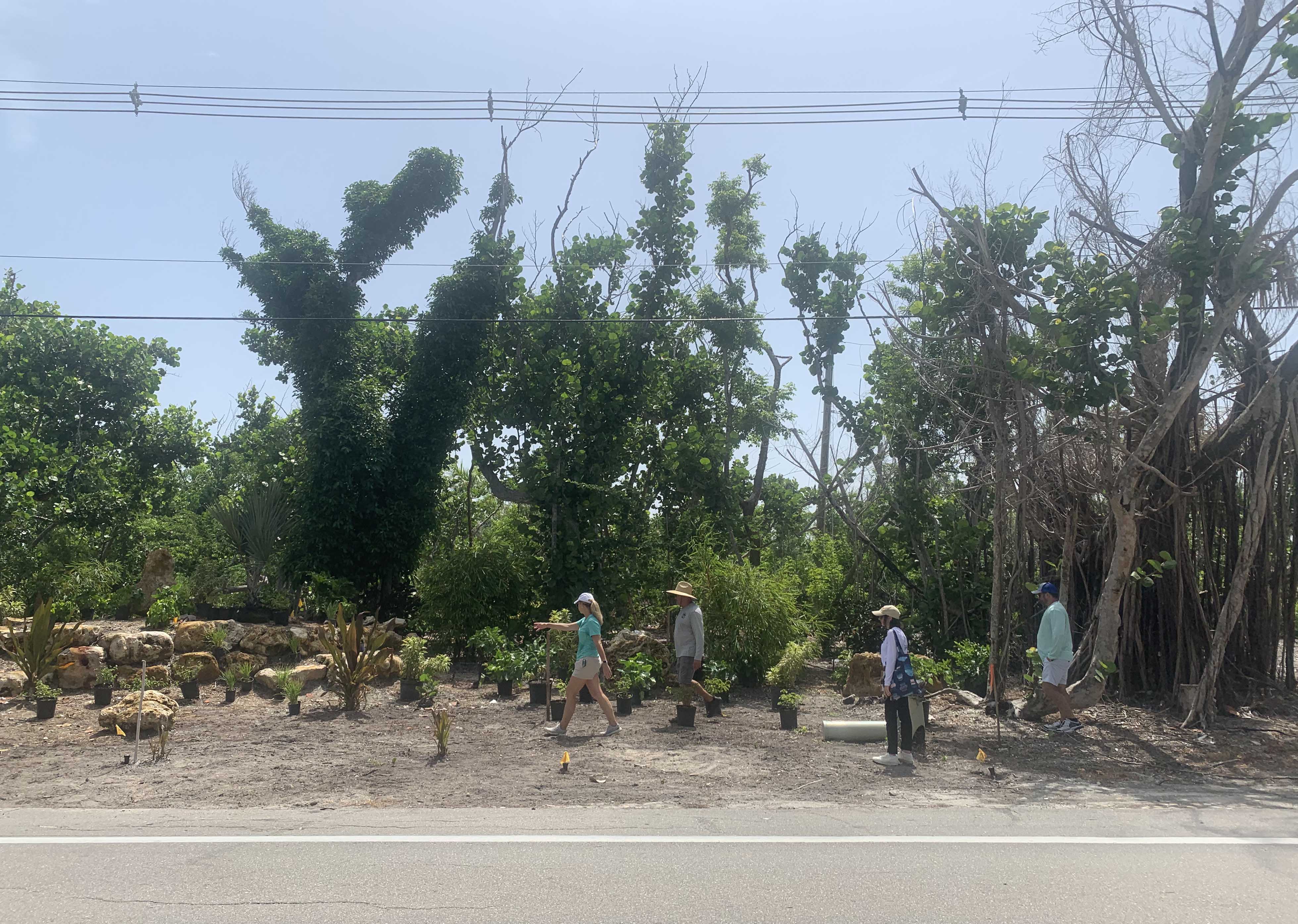
Working together with more experienced designers on site is a one of the most effective ways for new designers to build knowledge quickly.
Landscape architects are expected to know a lot about a lot. Ecology, social dynamics, construction detailing, CAD/Adobe/BIM? That’s just a one-hand list we all spin through in a few years at design school. However, once we emerge into practice – the expectations are still there, but the knowledge-building gets more haphazard.
In practice? Carol knows how bidding processes work and who to call at each department of the city to get permits moving. Imani can estimate slope percentages without pulling out a tape measure. Chris is the plant person. You’ve all seen it.
Individual designers having specialist expertise is great – but too much fragmentation in a design organization’s knowledge base creates problems for individual designers, projects, and businesses.
Lack of clear knowledge management practices creates intergenerational frustration. Experienced designers complain about younger designers not knowing how to do things. If there’s no clear path to building skills and positioning yourself for advancement, young designers aren’t empowered to mature and grow as professionals. Failure to share all of the necessary information results in wasted design time and unnecessary revisions. Knowledge silos make businesses highly vulnerable to staff turnover.
How might a landscape architecture studio build their knowledge assets intentionally? Looking for a structure of how to approach this topic, I asked ChatGPT to define knowledge management:
“Knowledge management refers to the process of capturing, organizing, storing, sharing, and applying an organization’s collective knowledge and information to achieve its goals and objectives. It involves the systematic management of both explicit knowledge (information that can be documented, stored, and shared) and tacit knowledge (intangible insights, experiences, and expertise held by individuals)”
What would it look like for a landscape architecture practice to fulfill these five components of a knowledge management process? Let’s go:
CAPTURING
EXPLICIT KNOWLEDGE
Design professionals are accustomed to capturing explicit knowledge. Especially when it comes to project-related information, we’ve got this down. Gather base information. Research the history of the site. Document site conditions with photos and videos. Take clear notes with deliverables and responsibilities during client meetings. You’ve got this one.
IMPLICIT KNOWLEDGE
When it comes to implicit knowledge, most designers’ glasses fog up. We all respect the seasoned professional who just seems to know what to do regardless of the situation. How do you transmit this breadth of experience in an effective way?
One practice for transmittal of implicit knowledge is to schedule regular Learning-In-Action sessions involving more- and less-experienced designers. I’ll go into this in detail in the “sharing” section at the end of the article.
You can also turn implicit knowledge into explicit knowledge by creating templates, workflows, and checklists. Figure out the steps that an experienced designer goes through in considering common design situations. Perhaps it’s configuring a site plan for a specific parcel and pro forma. What information does that designer gather? What steps do they take to get to a final result? Forcing your experienced designers to be explicit about what they’re considering – and attempting to document the mental models/workflows that they’re bringing to bear on the situation – will improve their processes as well as making their implicit knowledge available to other team members. Maybe the documented workflow won’t yield entirely the same result, but if it can get a younger team member 90% of the way there – that’s a huge improvement on floundering in the dark.
ORGANIZING
FILE STRUCTURE
How often do your team members struggle with finding the information they need? If the answer is anything more frequent than “rarely” – improve your file structure.
Map out your most common workflows and talk to your team: where are the common issues, areas of conflict and confusion? Every office, studio, and firm operates a little different depending on major project types and workflows. Your file organization should reflect what’s important to your organization. One popular method for thinking about structuring knowledge is Tiago Forte’s PARA – Projects, Areas, Resources, Archive. Looking at how Forte structures information may help you figure out a more effective system for your organization.
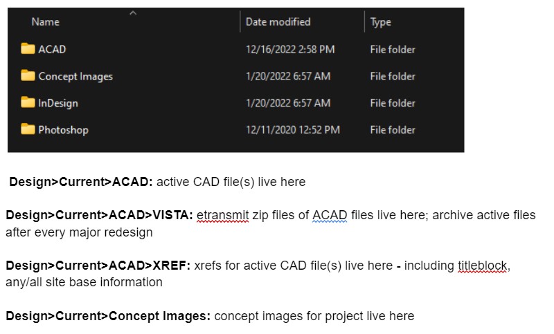
Establish clear guidelines for what goes where within your file structure – maintain a reference as part of your training materials.
LIBRARIES
As a project manager, I’m always trying to identify the annoying tasks that we do over and over again. What are the things that waste our time? Building libraries of preferred design elements is an easy way to reduce unnecessary time. Some examples of libraries to consider include:
Details Libraries – establish standard details sheets and libraries of details. If these standard components are pre-approved by project managers, you’ll have major components of construction documents ready to go.
Image Libraries – build libraries of imagery of inspiration, materials, detailing, and plants. The more of these are pulled from your projects and area of specialty, the better. You can make sure these fit principals’ and project managers’ preferences – that way entry and mid level designers are starting with materials that fit the studio’s style.
Topic Libraries – when you’ve gathered research for a specific topic, make sure that information is available and easy to access for other design team members in the future. Build databases of relevant articles/charts/references for your studio’s common topics. Including small summary documents and office best practices based on research is also an easy way to make knowledge accessible across teams.
STORING
DIGITAL DOCUMENT RETENTION
Yes, much knowledge is stored in your staff’s brains. But the majority of easily reproducible information in any organization is stored digitally. As licensed professionals, landscape architects are required to maintain client records for a period of at least several years – exact duration depends on jurisdiction. Check with your insurance company and state policy experts to understand the duration requirements that affect you. Have a clear office policy about document retention. Follow it.
As part of your document retention policy, work with your IT to understand when, where, and how your office’s digital information is backed up. Understand what happens if someone accidentally deletes something – or file corruption occurs. Redundant backups are essential – typical best practices are to have backups to at least 2 independent locations. The Theory and Craft of Digital Preservation (see Further) has good guidelines to discuss with your IT and ensure your digital information is appropriately stored.
SHARING
PROJECT-SPECIFIC
Do you have a regular practice of sharing information about projects? Schedule kickoff meetings at the beginning of projects with all involved team members to share parameters and establish common expectations. Open communication at the beginning of a project can help set up everyone involved for success. Clearly communicating priorities and expectations help production-oriented designers do work that better reflects that project’s intent. The more individual team members are equipped with the information that they need to make decisions, the happier you’ll be as a project manager. Identify critical paths and decisions to make sure you have the design documents necessary to support client decisions at the next ship point.
TRAINING MATERIALS
One of the biggest hurdles to entry at any firm is the learning curve. Entry periods are tough for any businesses – and new employees. Figure out training resources that will give new team members autonomy over their learning. Our studio has an onboarding/processes document with step-by-step instructions (with screenshots) for all of our primary workflows. This also allows new designers to check back if they’ve already been walked through a procedure and don’t recall the exact steps. Despite having created the majority of the document, I find myself referencing it sometimes for infrequent tasks – like how to load a plot style on a new machine in AutoCAD or what our principal’s preferred naming system is for downloading site visit photos.
Rather than thinking about creating these training materials as a gargantuan effort that takes away from billable hours, integrate creating this kind of a document while you’re going about the process of a project. It’s easy enough to screenshot and record step-by-step-instructions when you’re already going through a workflow. Do one common task at a time and you’ll soon have a good record of your studio’s preferences ready to share with new hires – as well as ensuring consistency of workflows with your existing team.

Training materials should include specific guidelines for preferred procedures and settings – these should also be easy to search and reference for later use.
SKILLS-BASED SHARING
Establish regular appointments for open learning together as an organization. I’ve heard of some studios who regularly read and discuss self-development or business books. Our studio schedules regular lunch-&-learns where a team member showcases a new workflow that they’re developed or some standard procedure that we’re exploring. As a hybrid team (some remote, some in-person), establishing these points has been helpful and effective. We may not physically be around a table, but we bond around the virtual hearth. Designers can ask for a lunch-n-learn about a topic or workflow they feel uncertain about. Or, they can show off something they’ve been experimenting with – like incorporating Midjourney image generation into render workflows. We haven’t gotten this far yet, but you could video record these sessions and add them to your office library so everyone can reference them in the future.

Drawing together – whether with work spread out on a physical table or across a digital interface – is an effective way of transferring implicit knowledge between team members.
APPLYING
LEARNING-IN-ACTION
We’ve all watched an hour-long youtube training video and emerged at the end with zero information absorption. By contrast, one of the most effective ways of transmitting information is learning-in-action – a process described in detail by Donald Schon in The Reflective Practitioner (see below). Learning-in-action involves a coaching process where 2 or more people work through design problems together. This type of working-through a situation together is especially useful for transmitting implicit knowledge between more- and less-experienced designers.
Scheduling regular times to work through problems together helps make these types of learning situations happen. Especially in working with fully remote team members, I have found that committing to screen sharing and working together – drawing back and forth – is one of the most effective ways to transmit both explicit and implicit design knowledge.
BEYOND THE OFFICE
Becoming known as a thought leader in your community can help position your business (and landscape architecture as a profession) as go-to professionals for action. Many landscape architects are active members of development, planning, and ecology/nature groups – organizations whose interests ally with our profession. Think a little more broadly: who can you collaborate with who may share common interests that aren’t so obvious? Talk to your local gamer and tech groups – they are often fascinated by the potential of collaborating with designers to bring their skills into the physical world. Can you share your work and knowledge with local politicians? What about your regional media and tourism industry? Start on social media, if that’s easier, then build on those connections. Being an expert in public will help build your personal reputation as well as advancing our profession.
FURTHER
As you build a knowledge management strategy for your organization, spend some time with the following 2 texts:
The Reflective Practitioner, (1983) Donald Schön – Old, yes, but still around for a reason: this text presents useful frameworks for understanding how people learn through designing. Especially good for thinking through how to pass on implicit knowledge in day-to-day practice.
The Theory and Craft of Digital Preservation, (2018) Trevor Owens – The intended audience for this book is information professionals and archivists, however it’s the clearest guide that I’ve found for thinking about knowledge management. This book will give you the keys to communicating your team’s needs with IT professionals and making sure your knowledge management practices are working for your organization.
I’ve framed this piece from the perspective of a project manager since people in positions of power have the strongest ability to change their organization’s knowledge management processes. However, if you’re an entry- or mid-level designer, thinking about these practices will help you more effectively ask for what you need to do your job – and position you for stepping into leadership roles. Regardless of your current position, implement the knowledge management strategies presented in this piece, think-with these two texts, and you’ll be on the way to a stronger, smarter, better-informed team.
Getting What You Want: Considerations in Specifying Plants
Mastering plants as a design material is a life-long challenge. Learn the names, qualities, and ecological preferences of any of the hundreds of potential species you could use and – guess what? – you’re only halfway there.
As a landscape architect, you probably won’t have direct control over the plants that go into your project – instead you create instructions (a plan, a plant list, maybe some notes) that will enable someone else to build the landscape and achieve the outcomes that you have envisioned. The better you get at creating those instructions, the more likely you are to end up with design outcomes that match your intent. I’m going to introduce you to the basics of how we think about specifying plants at Coastal Vista Design, as well as some of the common issues we’ve encountered with plant specifications.
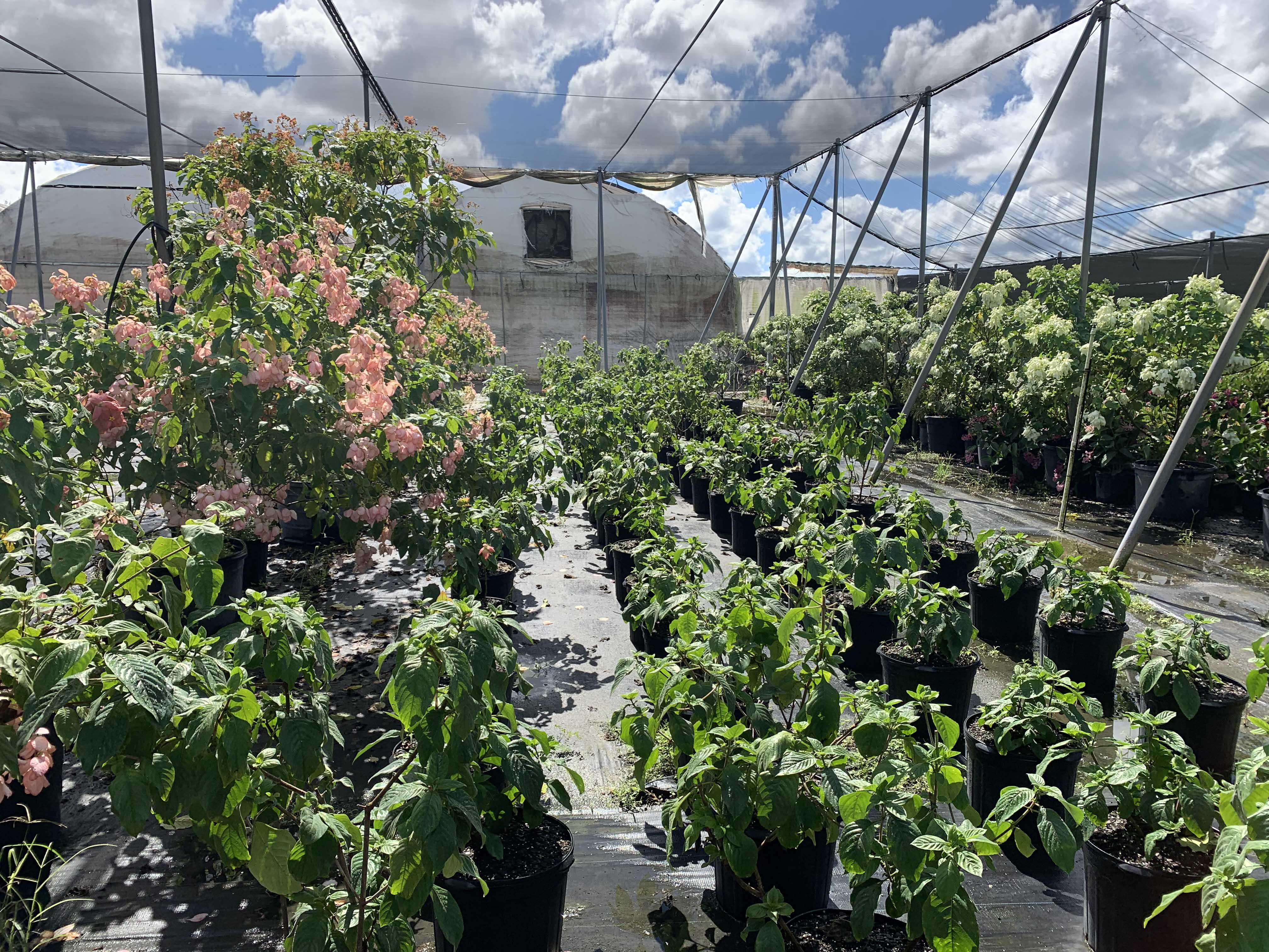
The Mussaenda on the right and left are in the same size container – which do you want for your project?
DESIGN
Planting design can absorb all the time and resources you’re able to give. So, from the outset of any project, you need to understand the parameters for planting in this specific design. In general, complicated layouts and a greater number of species (especially rare species) exponentially increase a contractor’s costs in installing the plan – and also the cost to your client. If you’re doing a minimal-budget design for a commercial space, your plants should be easy to source, install, and maintain. By contrast, if the project has a budget for you to spend time administering the construction, sourcing plants, and spending many hours on site doing layout – let your imagination and plant palettes go wild!
Most landscape contractors will not be growing the plants they use in installations themselves. Instead, they source them from wholesale nurseries – often referred to as growers. Different growers specialize in different types of plants, usually depending on how the plants are produced (in plastic containers, in the open ground, or some combination thereof). The availability of different plants depends widely on where you’re working. Some US regions (south Florida, Oregon, California, and Tennessee for example) have large nursery industries and many growers occur in close proximity, making it easy for landscape contractors to procure a wide variety of plants. Other regions may have to transport plants from far away. If a contractor has to make special trips to sources for specific plants, those extra trips will be reflected in their pricing and likely in their attitudes towards you as the designer.
If you’re starting off in your career (or in a position with a new studio), pay attention to your studio’s typical palettes and specifications. Local codes are also a major factor in determining required planting, so ask about special parameters in the regions where you work. When you’re starting out in your career, you’ll need to learn as much as you can from planting experts in the studios where you work, as well as the install and maintenance workers who care for projects you’ve designed.
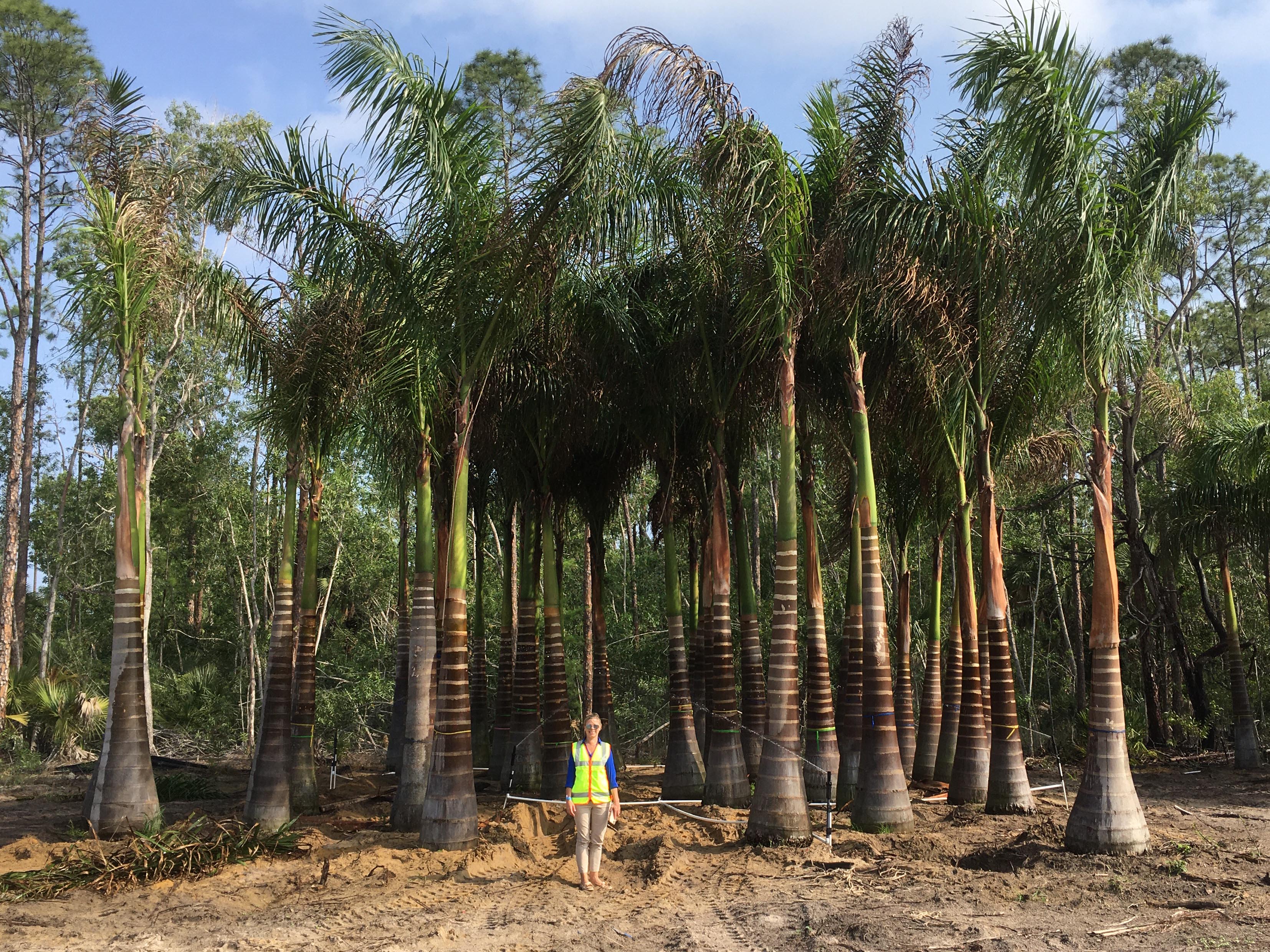
Construction administration on large projects can include verifying the condition and size of trees delivered to a site – as Leigh Gevelinger, principal of Coastal Vista Design, demonstrates here
CONSTRUCTION ADMINISTRATION
Beyond the physical design, consider your role in the project. How involved will you be in construction administration? As briefly mentioned in the introduction, most landscape architects aren’t directly installing planting. Instead, you’ll be creating instructions for other people to install plants and fulfill your design intent.
If you have a construction administration (CA) scope on the project, you may be more involved with approving or sourcing the actual plants to be used for your project. The most common CA task is accepting or rejecting plants. A landscape contractor will send you photos of plants they’ve sourced for you to confirm or deny whether or not they meet the specifications you included in your plans and bid documents. Use this power carefully – rejection should be firmly rooted in your design specifications.
For a few select materials, you may need to do sourcing trips to flag specimens. These would typically only be the most iconic and high-dollar items. Go into flagging trips with a strong idea of exactly the physical size and form you need for specimens for this specific project. It’s easy to get overly excited and want to just start shopping, especially if you’re with an enthusiastic client.
If you’re working on a project with a large number of unusual species, special demands, a long timeline, and a client with a generous budget it can be useful to figure out how to have plants produced specifically for your project. This is referred to as contract growing in the industry. It would typically require a client/contractor to put down a deposit of some percentage of the cost of the plants in order to secure them prior to installation. Contract growing is only an option for specific projects, but it is the most secure way to ensure that plants are being produced exactly as you need. For slow-growing species and large specimens, there’s still a limited aspect to the exact parameters you can achieve through contract growing – you won’t be able to get slow-growing trees or palms to specimen sizes in 3 years.
Even with construction administration for a project, be aware of the value of your own time. Are you consistently having contractors call because they have issues with how you’re specifying plants? Sometimes, a certain species or selection is important. For example, you may need a certain species – Spartina patens is 18” tall, while Spartina bakeri matures at 4-6 ft – or a specific selection – a grafted male Ginkgo, to avoid decades of messy and smelly fruit. Try to use unusual selections and hard-to-source plants in limited areas and only where it makes a significant difference to the design.
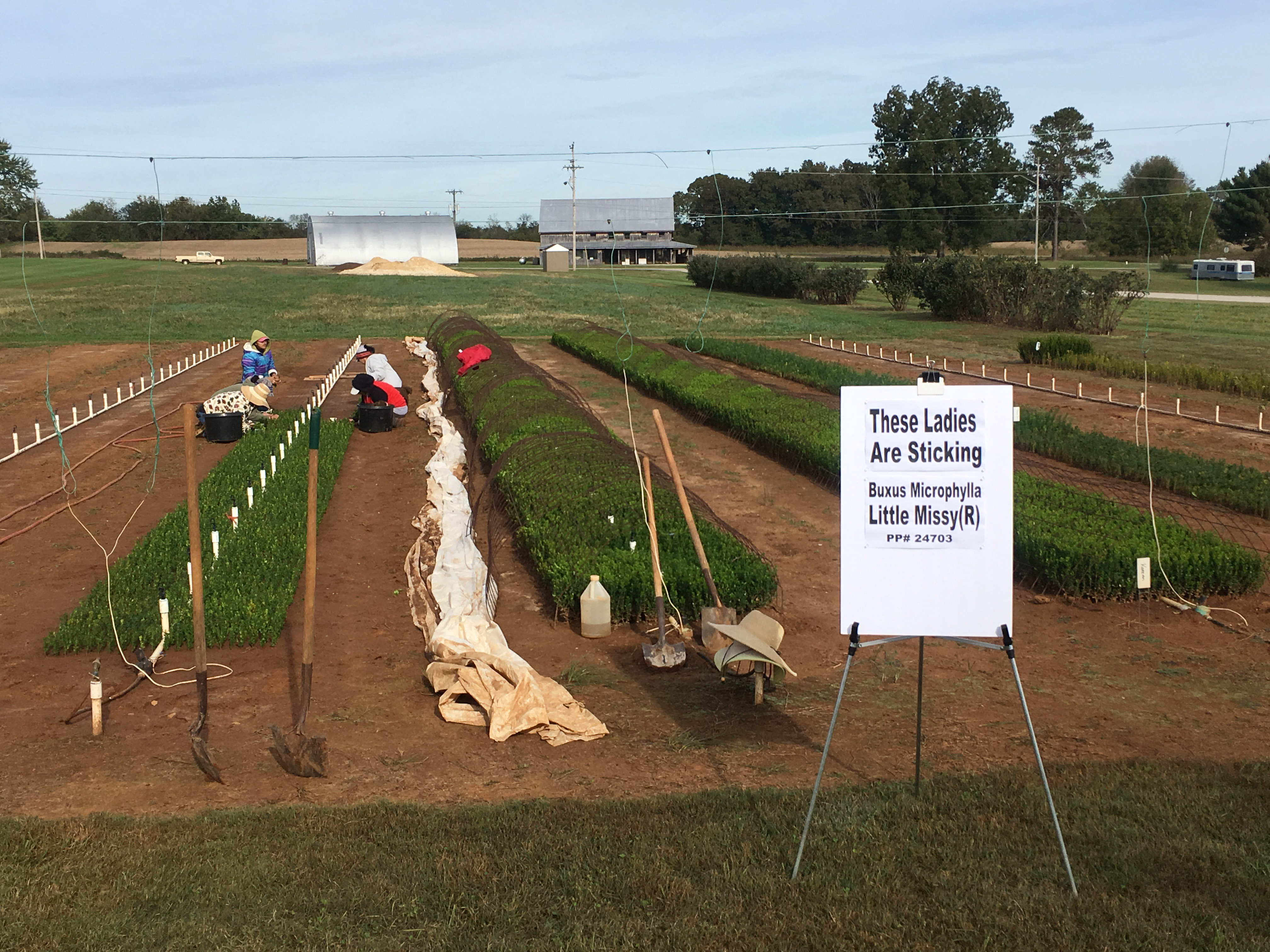
In some parts of the country, plants are still started with cuttings directly stuck into the ground to root – as these workers are doing with boxwood
PLANT SIZING
The nursery trade is complicated and varies from region to region – especially in how plants are sized. In the United States, we do have some forms of standardization and consumer protection around nursery plants. I’ve detailed some resources below in the notes.
In practice, the biggest distinction in specifying plants is typically between trees and shrubs/groundcovers. Trees are typically sized using calipers and/or heights. Caliper is the diameter of the tree’s trunk, typically measured at “breast height” (caliper is sometimes abbreviated as DBH – diameter at breast height). For deciduous trees which gradually increase in caliper over their lifespans, this measurement works. However, for palms (which don’t increase evenly in caliper as they grow) or for multistem trees, specifying by height is be typical. Code enforcement can be a complicating factor. Make sure that you list ALL requirements to make sure that your proposed plantings fulfill all code requirements. For example, if code requires your trees to be 2” caliper and 14’ overall height, make sure that your plant schedule specifies both of those things. You don’t want a contractor showing up with a 2” caliper tree that’s only 13ft high.
Traditionally, trees were grown in open fields (the industry term is “field grown”), with their rootballs either wrapped in burlap or growing directly in the ground. Since the 1960s and proliferation of cheap plastic, trees are increasingly grown in ever-larger containers. Many species transplant better when grown in containers, since their roots are less disturbed when transplanted than if they’re dug from the fields. You may see or specify gallon-sizes on trees, but often the safest bet is to specify by height.
Unlike trees, shrubs and groundcovers are typically specified by container size. In the US, this is listed in gallons. Confusingly, gallon is usually used more as a vernacular term rather than a specific volume so plants with a specified gallon size may arrive in containers of different sizes and shapes. Shrubs are typically 7-gallon, 10-gallon, 15-gallon, or 25-gallon sizes. Groundcovers are typically 1-gallon or 3-gallon. Smaller than 1-gallon plants are specified as plugs or 4-inch containers.
Most shrub and groundcover species have one or two sizes at which they’re most typically sold (the industry term is “finished”). Spend some time with availability lists for regional nurseries and you’ll see which sizes are typical. Again, check the code requirements – make sure to include any height requirements as well as gallon sizes for code-required plants.
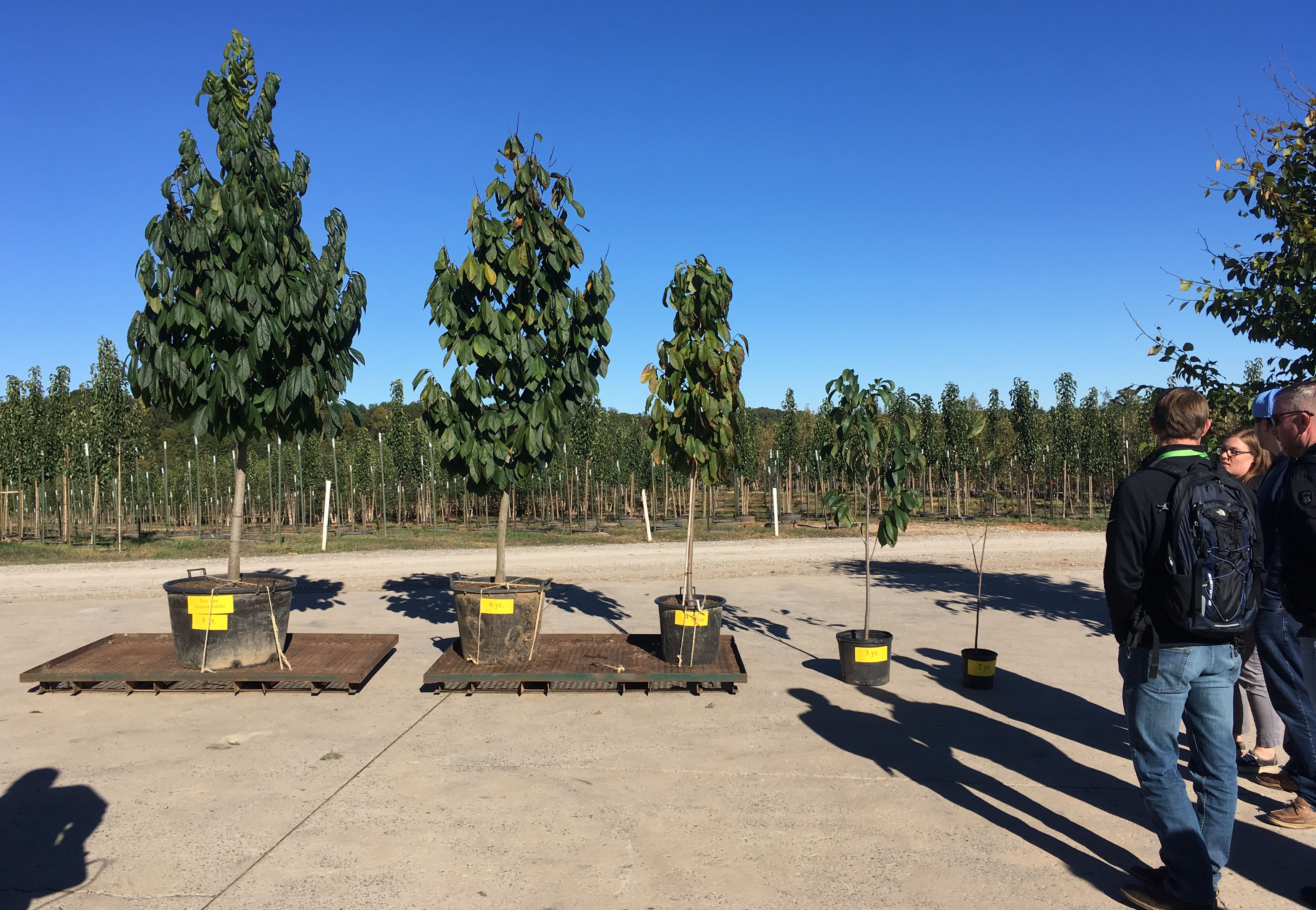
This image demonstrates pawpaws at different ages, from 11 years old on the left to 1 year old on the right
GROWTH RATES
I often hear complaints from landscape contractors who are annoyed because (other) landscape architects specify plants in unusual sizes – or unfeasible combinations of gallon size and height.
Unfortunately, there is no overall rule of what size a plant in a specific gallon size will be. Plant species vary widely in their habits and their growth rates. Plant costs reflect the space, resources, and labor required for care for them over that time. Understanding the general growth rate of the species that you’re specifying is a first step.
Many of the most desirable plants, especially for urban projects, tend to have slow growth rates. They’re often stronger, more long-lived, and less likely to outgrow a designated space than fast growing species. This slow-growing nature is reflected in their price.
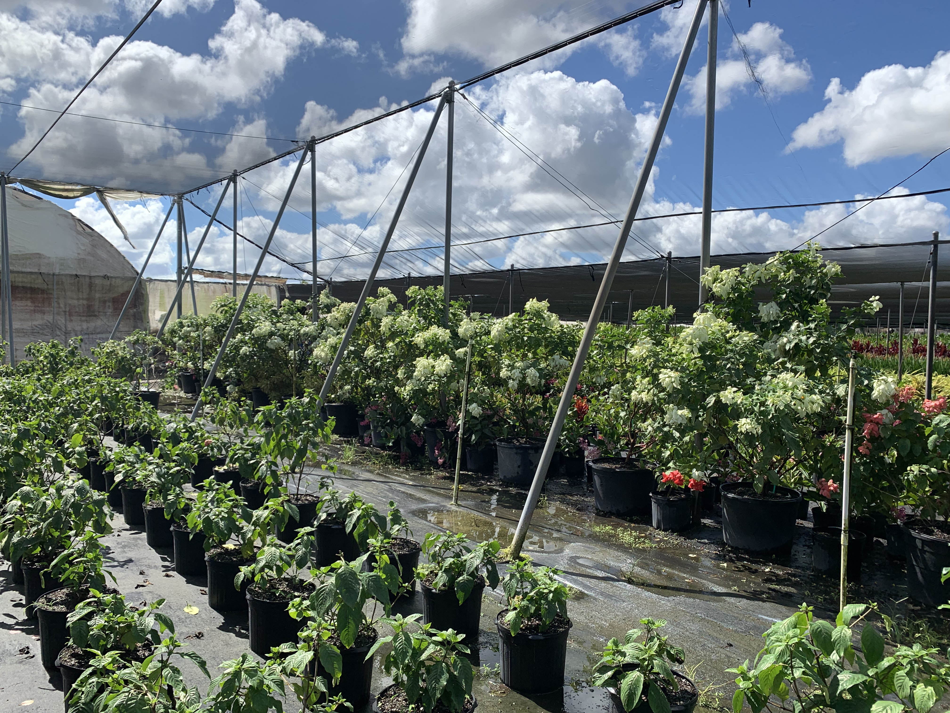
These Mussaenda are in full bloom on the right, but about ready to be cut back and stored for winter (on the left)
SEASONALITY
Depending on where you work, plants may have differing availability across the year. In temperate climates, spring and fall are often the primary planting seasons when the widest array of plant species will be available. In tropical/subtropical climates, you can plant at most times of year – but some species still have seasons of more limited or widespread availability.
Even if a plant doesn’t have a strong seasonality when established in the landscape, it may have times of year when it struggles under nursery conditions. Last year, in early spring installations, we had extreme difficulty getting contractors to procure nice Mussaenda. Talking to growers, I found out that – while completely fine in gardens – mussaenda tend to rot in cooler weather and get diseases in the nursery, so the growers tend to get rid of them prior to the cool months.
Understanding the seasonal availability patterns in the area where you’re working will require coordination and research. If you’re new to an area, refer to my earlier piece on “5 Top Planting Design Resources for New Landscape Architects”. These resources can help you establish an understanding of plant availability in your area.
Work your whole career in one region and you still won’t know as much about the specifics of certain plants as a landscape contractor, grower, or horticulturist who works with plants on a daily basis. However, a general understanding of plant production and installation processes will help you create better instructions for the people trying to realize the vision in your brain.
RESOURCES
These considerations reflect my experience working with multiple planting-focused studios throughout the southeast United States as well as our team’s robust experience with South Florida planting design and construction. For more technical information, refer your region’s legally-established plant specifications. In the US, these typically occur at the state level, at least in states with significant nursery operations, and are typically handled through the Department of Agriculture. In Florida, the Department of Agriculture and Consumer Services has a legal document Florida Grades and Standards for Nursery Plants which serves as the basis for plant specifications. California uses the terms “California Nursery Stock Grades and Standards Laws”. Oregon refers to them as “Grades, Standards and Labels for Agricultural and Horticultural Products”. Check with your state Nursery Growers Association if some quick searches don’t turn up the relevant standard where you’re working. If you’re working somewhere without state standards, it can be useful to refer to AmericanHort’s “American Standard for Nursery Stock”. In the European union, the European Nurserystock Association produces “European technical & quality standards for hardy nurserystock”, to which adherence is voluntary, with different countries having their own quality standards. In China, the Administration of Quality Supervision, Inspection, and Quarantine (AQSIQ) handles quarantines for imports and standards around nursery stock. I am unfamiliar with nursery standards in other countries, but would be excited to learn of any resources that are working towards international standardization – or even just a of summary resources on international nursery stock standards.
Site Analysis for Naturalistic Planting Design
As landscape architects and planting designers, most of us have been trained in basic practices of site analysis. We map and analyze site features such as topography, circulation, views, and existing site elements. The scale of detail that we document depends on what we are tasked to do on the site.
When you’re planning to use plants as your primary design medium, you will need to pay attention to the aspects of a site that affect their thriving and survival. Small-scale differences in topography and aspect can have a significant influence on what species thrive. If you’re planning to use a lot of herbaceous plants, you need to observe at an especially detailed scale – on a meter by meter (even foot by foot) basis. Identifying where those differences occur and how they interact will be essential to creating a successful design.

Creating successful designed plant communities requires designers to build a strong understanding of site conditions. Image: Caleb Melchoir
The long-term success of projects by planting designers such as Piet Oudolf, Isabelle Greene, James van Sweden/Wolfgang Oehme, and Christy ten Eyck is rooted in their deep knowledge of different plant species and how they behave. Building that knowledge base requires time and attention, but you can get started by explicitly identifying the physical aspects of a site that will influence your plants’ success.
Gardeners get to know sites intimately through observing and interacting with them over time. Professional planting designers don’t have that luxury. We’re on the clock. We need to be as efficient as possible with gathering the information that we need.
When I walk a site prior to design, I look for factors that affect availability of plants’ 3 big needs: light, water, and nutrients. Other factors – such as management – will affect what plants will grow well, but I don’t need to observe those on site. The aspects that I absolutely need to observe and document on site include the availability of:
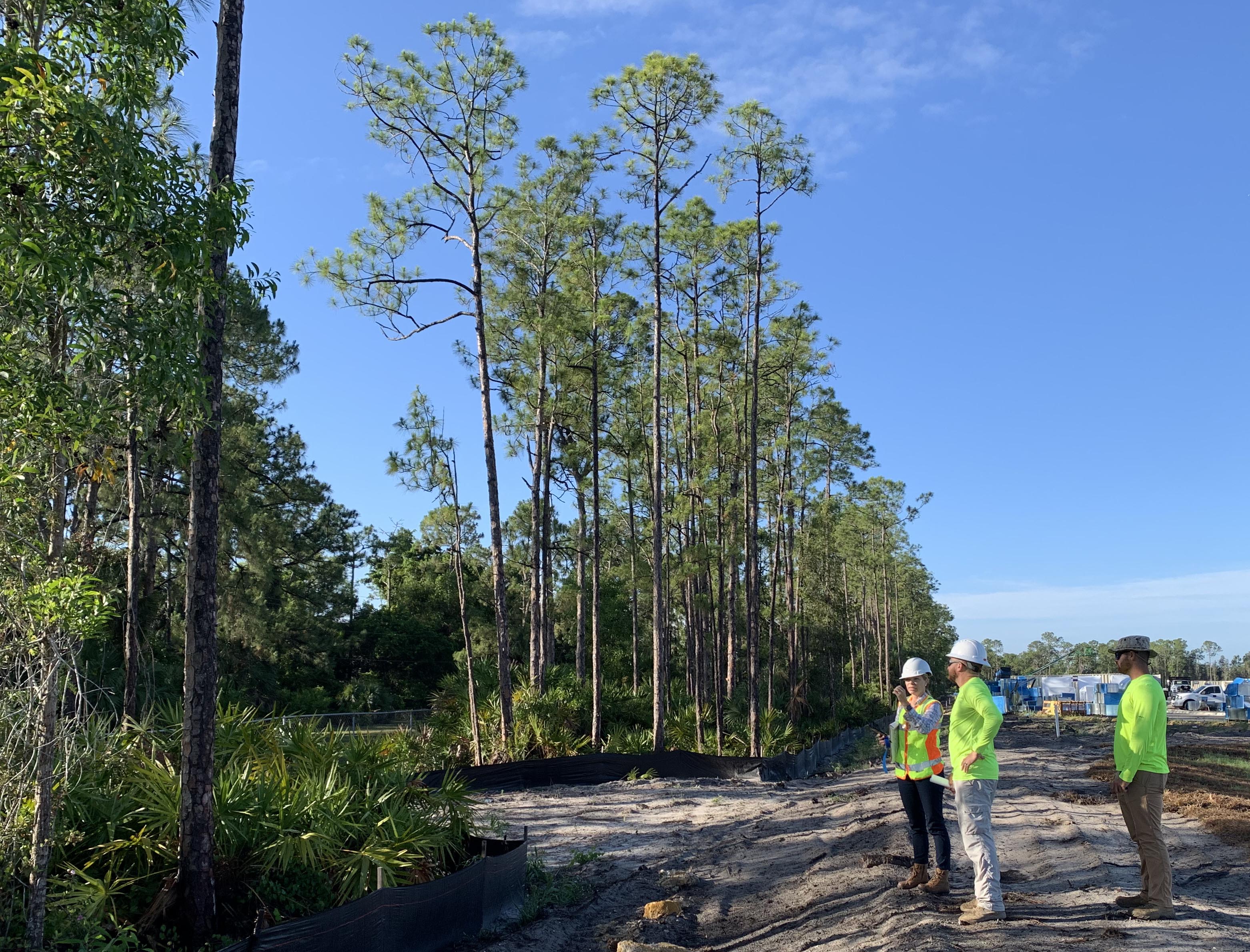
Identifying existing zones of sun, partial shade, and full shade is essential in order to understand which species will thrive. Image: Caleb Melchoir
LIGHT
Light availability occurs at the scales of climate and site.
If you’re practicing in multiple geographical regions – maybe designing for a climate with which you’re not familiar – you’ll need to understand the annual patterns of light (and temperature) in the region where you’re designing. Temperate (and colder) climates have strong seasonal variation in the availability of light. Subtropical and tropical climates tend to have less seasonal variation in light availability. Identifying the overall annual light cycles will help you choose appropriate species for your design.
At the site scale, I find it useful to distinguish areas of full sun (6 hours or more of direct sunlight), partial shade (less than 6 hours), and full shade (no direct sun). In partial-sun conditions, aspect (north/south/east/west) and time of day that sunlight is received are highly influential. North and east-facing areas tend to receive gentler morning light, while west and south-facing areas receive the harshest rays of the sun when it’s hottest. (This is inverted in the southern hemisphere) Any shaded condition is complicated by the degree of shading – tree species differ widely in how much light their canopies block from reaching the ground. Building shade tends to be very dark. If you have the opportunity to observe or get site documentation at the brightest time of year (summer, northern hemisphere) versus the darkest, do it. Find out as much as possible about how the light shifts over the year on your site in order to choose appropriate species.
You also need to consider how light levels will change over time. If you’re planting trees, you may be tempted to plant shade-loving plants underneath. However, at the time of planting and for 10-20 years following (depending on the size of the trees), the groundcover around your trees need to be sun tolerant since the canopy coverage will be minimal until your canopy trees mature.
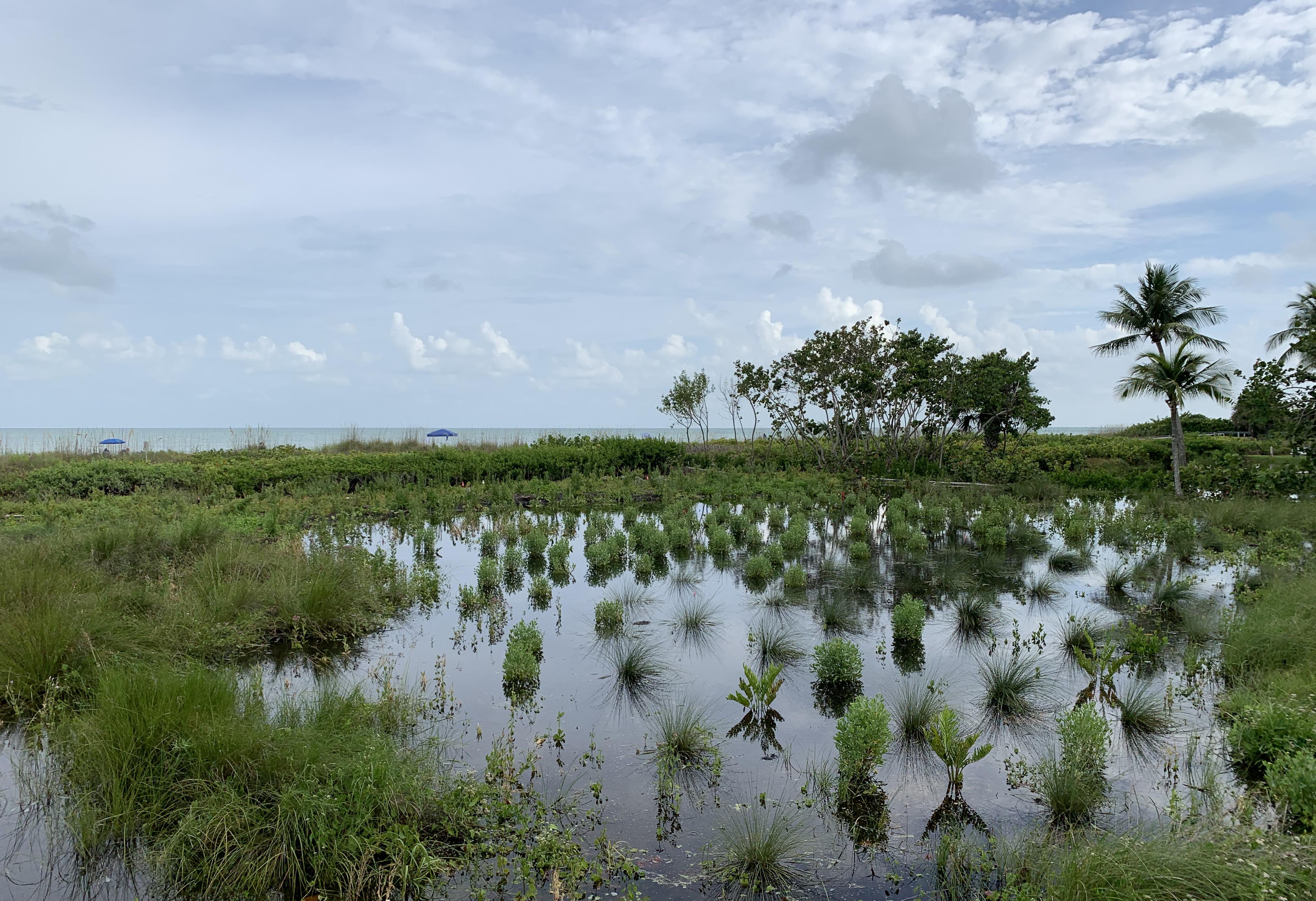
If you are designing in a region with alternating wet and dry seasons, it’s essential to understand where water accumulates seasonally – this strongly affects species selection. Image: Caleb Melchoir
WATER
Water availability also occurs at scales of climate and site.
Understanding the yearly (and multi-year) patterns of precipitation will inform your planting design. Plants have typically evolved in response to specific annual patterns of precipitation. In temperate climates, moisture availability mostly matters during the growing season. In the midwest and eastern US as well as throughout mainland Europe, precipitation is relatively consistently available during the warm season. The Gulf Coast of the United States as well as the Caribbean has a summer-wet, winter-dry precipitation pattern. The West Coast has a summer-dry, winter-wet precipitation pattern. These moisture availability patterns affect which species grow well where. Identifying your overall moisture availability pattern will help you identify which species are likely to thrive.
At the site scale, variations in topography are often the best way to identify how water flows across a site – where it’s more abundant and where it’s scarce. If it rains on your site visit, celebrate! You’ll be able to see how water actually moves across the site. Looking at the plant species which are already growing on site is also a good way to identify moisture distribution. Dry-loving plants are a clue that an area is dry, while wet-loving plants clue you in to the opposite. If there are strong seasonal variations in precipitation, try to get photos of the site during wet and dry seasons in order to see the extremes of moisture on the site.
Too much water is equally damaging to plants as too little water. Most plant species cannot tolerate their roots being submerged for more than a few hours. Water completely submerging the roots prevents plants from accessing oxygen and they will suffocate (Missouri Botanical Garden has an article explaining how this works). If portions of your site regularly have standing water, you will need to look for wetland and marsh species that are adapted to those conditions.
You can address a lack of water with an irrigation system. Depending on the infrastructure of the region that you’re working in, this may be a useful solution. As someone who designs as much as possible with site conditions, rather than fighting them – I tend to design plantings that will require irrigation at establishment and only in severe drought conditions following.
One big challenge in tropical and subtropical regions, especially in regions with a specific dry season (summer-dry like the west coast/Mediterranean or winter-dry like south Florida and the Caribbean) is that lawns require frequent and abundant watering during dry season to stay green. This is often highly detrimental to adjacent plant communities which require less water. If you’re designing next to lawns that you know will be watered regularly (regardless of your personal aesthetic or moral stance), make sure to use species that won’t be harmed by the frequent watering.
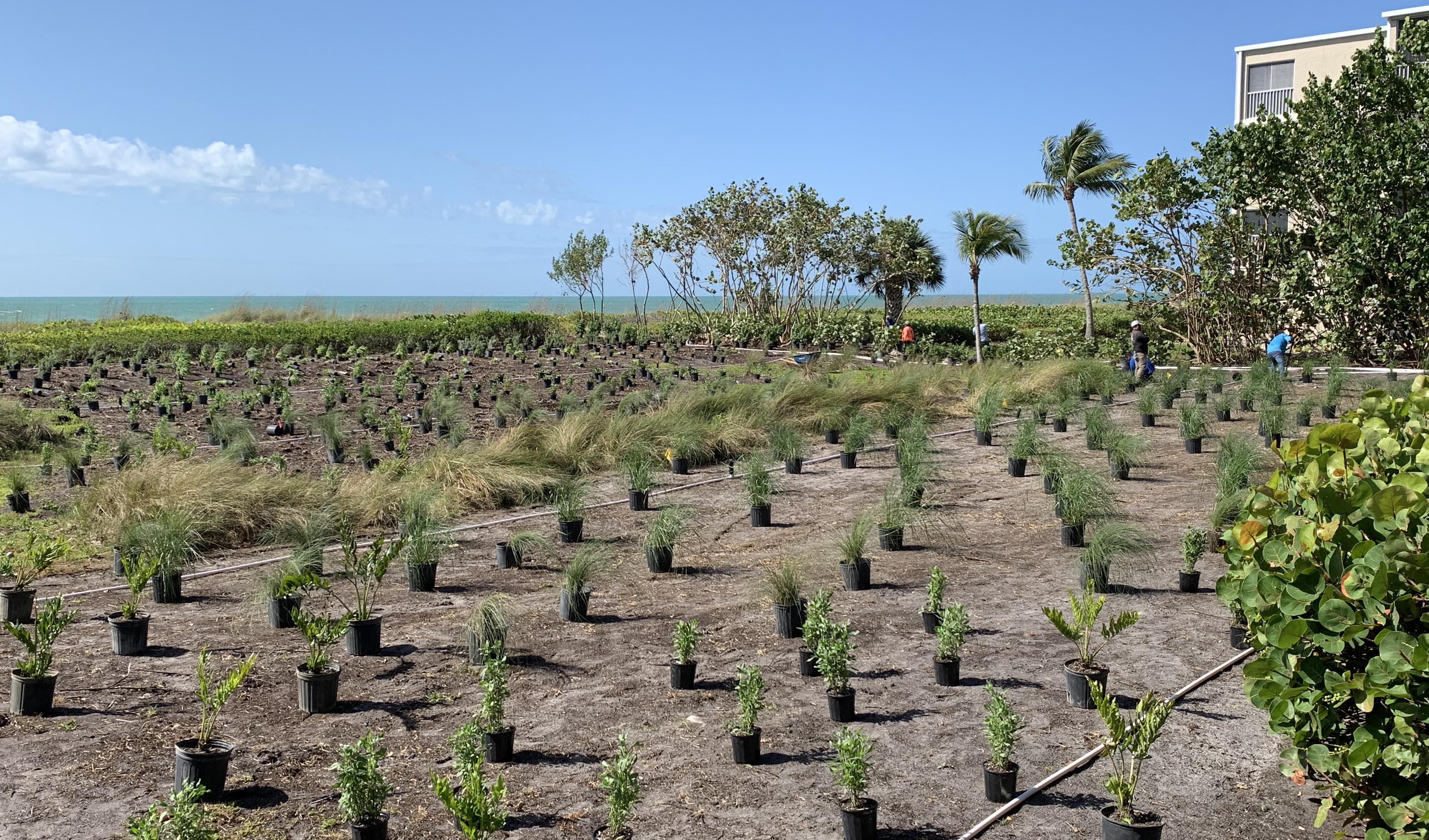
On barrier islands with purely sandy soils, plants must be selected for low nutrient conditions – as well as exposure to blazing sun, salt spray, and wind. Image: Caleb Melchoir
NUTRIENTS
While plants are able to manufacture much of the energy they need from sunlight and water, many do have specific nutrient needs from the soil. In the ethos of trying to work with site conditions as much as possible, rather than fighting them, I generally try to choose plants that will thrive in the existing soil conditions rather than trying to change the site soil to suit different species.
Three aspects of soil determine which species thrive: soil texture/particle size, pH, and organic matter.
The soil texture/particle size is the first thing you’ll notice when looking at or feeling the soil. Soils are typically categorized by texture as sand, silt, and clay – or loams, which are roughly mixed between these different types. You can learn how to distinguish different soil types using visual inspection and the hand squeeze test with these videos from Purdue: “Soil Basics:Texture”. Sandy soils, with their large particle sizes and gaps between particles, tend to lose nutrients and water quickly. Clay soils, with small particle sizes and gaps between particles, hold on to nutrients and water.
pH is an important factor in plant health because the pH of the soil affects how plants are able to absorb nutrients from the soil. pH refers to hydrogen ion concentration in the soil – it’s significant because it affects how soluble minerals and nutrients are in the soil, which determines whether or not plants are able to absorb them. On the south Florida sandbar where I practice, our natural soil pH is very high (basic) which means that it’s very difficult for plants to absorb the nutrients they need, even if they’re present in the soil. Applying acidic fertilizers can help unlock existing soil nutrients for plants. In any case, it’s best practice to select species which are more adapted to the pH conditions of your site rather than those with highly different nutrient needs.
While the basic texture of soil is based on the underlying rock from which it was formed, organic matter content also has a strong influence on what species. Organic matter helps increase levels of soil moisture and microorganisms. When you think of “good soil” for growing vegetables or seasonal bedding plants – something dark brown and easy to work – you’re thinking of a loam that’s high in organic matter. On a potential site, high organic matter soils would usually be present only in greenfield sites that were recently forest or prairie. If you’re trying to create a plant community that mimics an ecotype with naturally high organic matter in the soil, such as a temperate forest or bog, you will want to amend your soil with organic matter.
A relatively new trend in planting design is that of choosing to design with species that are adapted to low-nutrient conditions. Perhaps counterintuitively, many desirable flowering plants actually thrive in low-nutrient conditions. Numerous designers throughout the world are experimenting with growing plants in gravel and/or sand. As someone who works on an island that is essentially a giant sandbar, I sand garden by necessity rather than by choice. One of the benefits of designing low-nutrient requirement plant communities is that weed competition can be significantly less problematic.
If you’re having issues with nutrient availability and soil, you may want to check the pH of any water sources for irrigation: wells and municipal water supplies can have different pH from the soil on your specific site, which over time will affect nutrient availability for species you’re planting.
The potential aspects of a site that you could document and consider in design are endless. But if you’re starting to get serious about designing planting, availability of these three things that a plant needs – light, water, and nutrients – are a good place to start.
LIMITATIONS
This piece is specifically about what I, as a practicing landscape architect with a focus on planting design, look for when I’m approaching a site that I am tasked with designing. Aesthetic and management considerations deserve a piece of their own. When you’re designing dynamic plant communities – where plants are intended to move around on their own and change over time – you need to consider their life cycles and methods of reproduction, as well.
I don’t always get this luxury, but I prefer to see a site in at least two conditions – preferably once when it’s sunny and midday to get the sun/shade patterns, as well as once when it’s raining to see how water flows across the site.
The goal for all site observation is to be able to use it to inform your design strategy. Depending on your design goals, you will need to change the site to varying extents. That may include adding irrigation, adding topsoil, removing contaminated soils, establishing a fertilizer regime, or any other number of horticultural care practices. But without a base understanding of your site conditions, your plant selection and care recommendations will fail to support your design intent. Learning to see the physical qualities of a site and how they shape plant performance will inform your practice and help you to create design strategies that fulfill your aesthetic and experiential goals.
8 Questions with @nahalsbt (Nahal Sohbati)
As recently as 10 years ago, when I went through design school, the primary drawing references available to aspiring landscape architects were design magazines and books of renderings by famous landscape architects. Today, the situation is dramatically different. Visually-oriented social media, especially Instagram and Pinterest, have opened a vast repertoire of drawing types and styles – making them accessible and available to anyone with an internet connection.
On Instagram @nahalsbt, Nahal Sohbati shares beautiful and playful drawings. We asked Nahal a few questions about her experience in landscape architecture and social media.
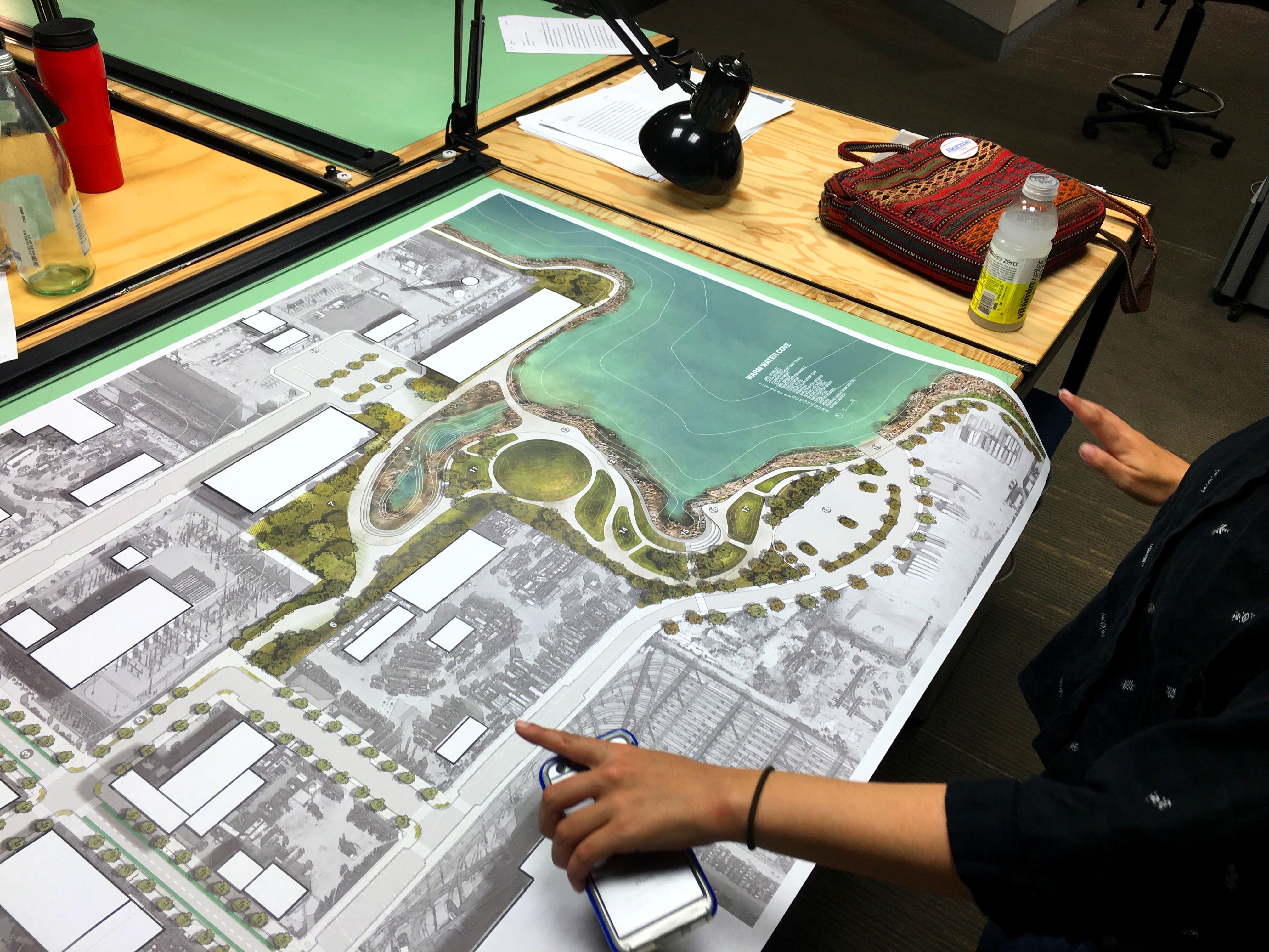
Let’s start off with a little about drawing – Did you draw as a kid? What are the first things you can remember drawing?
As a kid I drew, of course, but I developed my formal drawing skills with still life objects. Anything from vases to fruits bowls. My favorite medium was always pencil and later charcoal. I was fascinated by how an organic based medium can create such expressive and emotionally charged images.
Later my mom bought me a copy of “Drawing Animals” by Victor Ambrus book and I immediately fell in love with drawing animals. I re-created almost all of his drawings and learned about techniques of creating textures, patterns and forms. Later in design school I always referred to my charcoal drawings when learning about basic design terms such as harmony, contrast, unity and rhythm, etc.
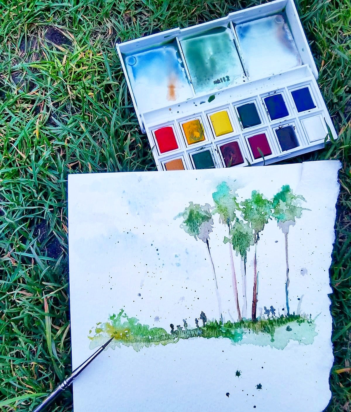
What inspired you to build a social media account around landscape architecture drawing?
I started posting my daily life as a landscape architecture student back when I was studying for my master’s degree at the Academy of Art. Immediately after posting my drawings, I was entered into a bigger community of architects, landscape architects, botanists and plant lovers who I learned a lot from. Studio work can be very isolating and introspective, and I found that sharing what I was doing with this larger audience helped me grow beyond just the classroom.
Over the years of building my audience it has been a great experience to not just collaborate but to also spread awareness of landscape architecture around the world. It feels great to be connected to this larger community beyond borders and culture that shares a mutual passion and interest for design.

What’s been surprising to you about how your social media audience engages with landscape architecture drawings?
I always thought my best works were the perfect renderings and drawings I made for final presentations. However I was surprised that the posts that always got the most love were the ones that showed more of the behind the scenes process of how I work as a designer to result in the final renderings / installations. I believe these daily imperfect and rough sketches make the process more approachable and tangible for others.
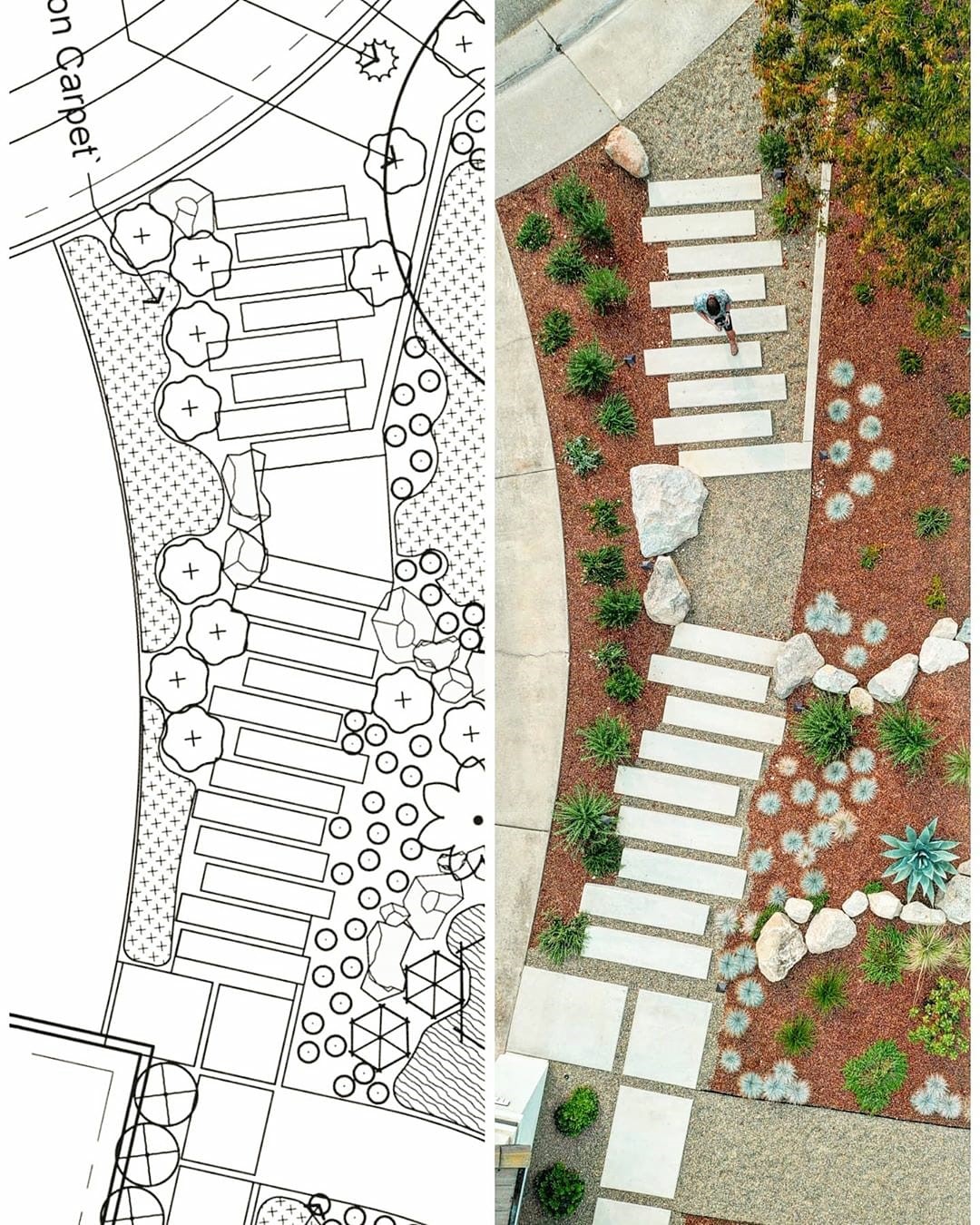
How has your success on social media influenced drawing in your design practice?
I’d say it encourages me to experiment with new styles and techniques to have more diverse and engaging content. I am having fun experimenting with these new techniques but also find it very inspiring when someone takes some of these ideas and cultivates it in their own unique way and vice versa.
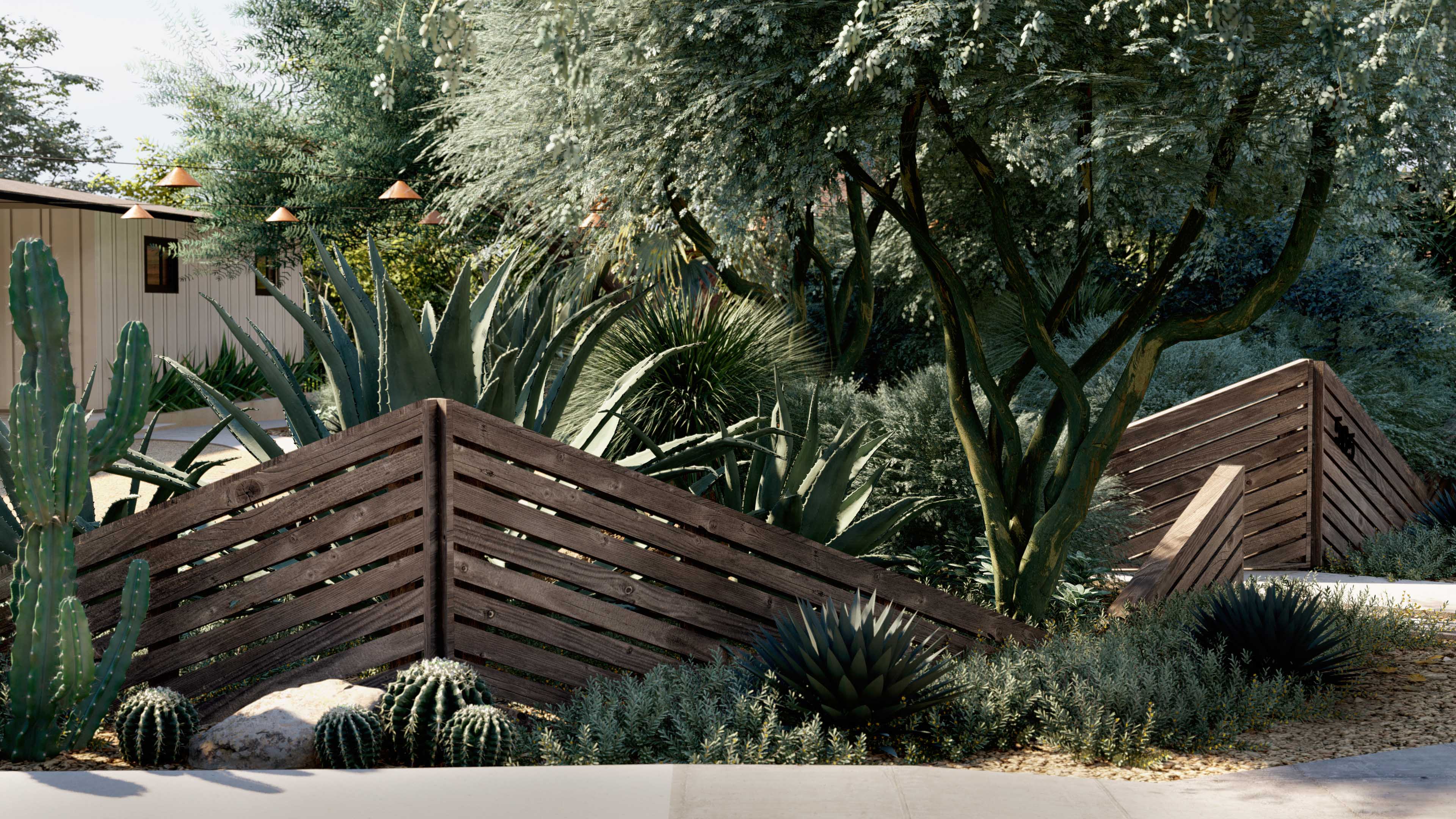
What’s the biggest gap between design drawings and installed work? How do you navigate that process?
To me the biggest gap between the drawings and installed work is the unpredictable nature of construction with materials, living plants and the environment they are in. While there are some elements of the design that are set in stone, so much of what we do is manipulated by external forces that we must anticipate with design and maintenance solutions. I think a lot of design drawings, especially renderings, are romanticized notions of what the actual design will be. That’s why in many of our renderings we like to incorporate a little “memento mori“ to ground our designs in reality. This hints at how materials age, wood color changes, concrete might crack, graffiti will take place, and plants will die and be replaced. I think that’s the beauty of creating a space that has a life of its own and evolves in unpredicted ways.
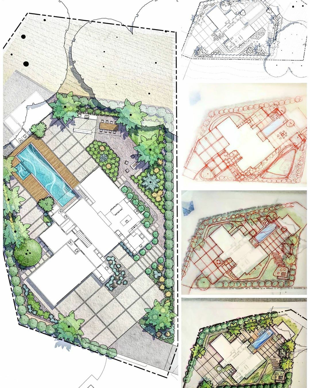
What opportunities are landscape architects missing? What would you like to see more landscape architects explore?
I believe Landscape architecture is such a diverse field that can and does bridge many gaps and solves so many problems but with that said I think we, along with the rest of society have a long way to go.
Landscape Architecture has an obvious issue with minority representation in the field and I think we as a whole profession need to actively continue to work to improve this. Whether it be outreach to underserved communities, community service or scholarships, we need to do better.
I also believe that Landscape Architects need to pursue public office at some capacity. We need politicians that are educated in the functions and importance of the natural world, as well as how things get done, and Landscape architects are just that. We are constantly pushing a green agenda but – without more representation – these agendas will hardly move.
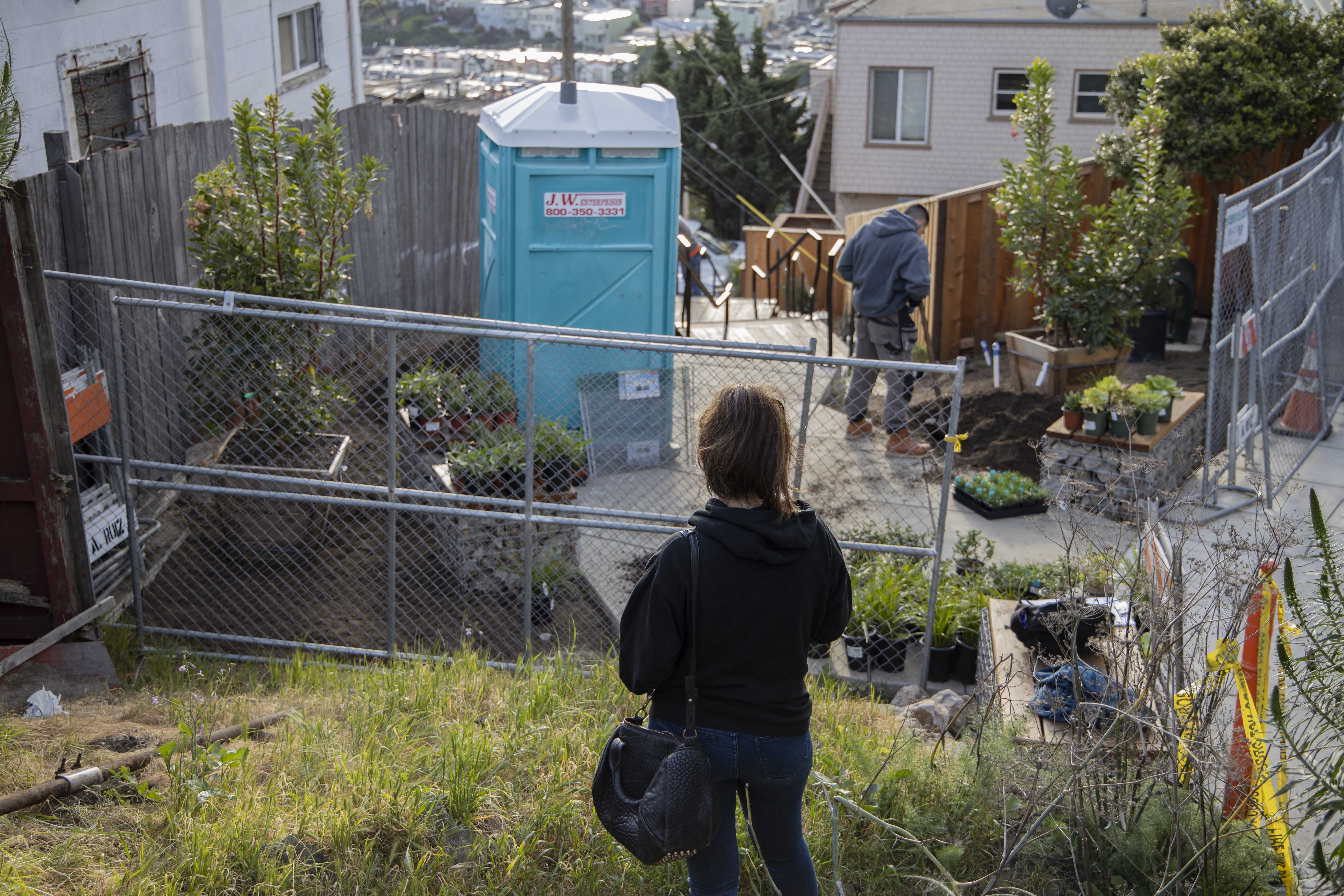
Whose work influences and excites you? What compels you about their work?
The work of French Garden Designer Gilles Clement strikes me in particular. His philosophy in regard to the landscape was to treat it as an ever-changing living thing and not be too strict with boundaries and expectations of what a garden should be.
I am also very inspired by the work and office culture of Terremoto. There work is a refreshing take on design and annihilates traditional definitions of beauty resulting in something truly regional and Californian. They are also not shy about what they stand for and their values and that’s what we need more of.
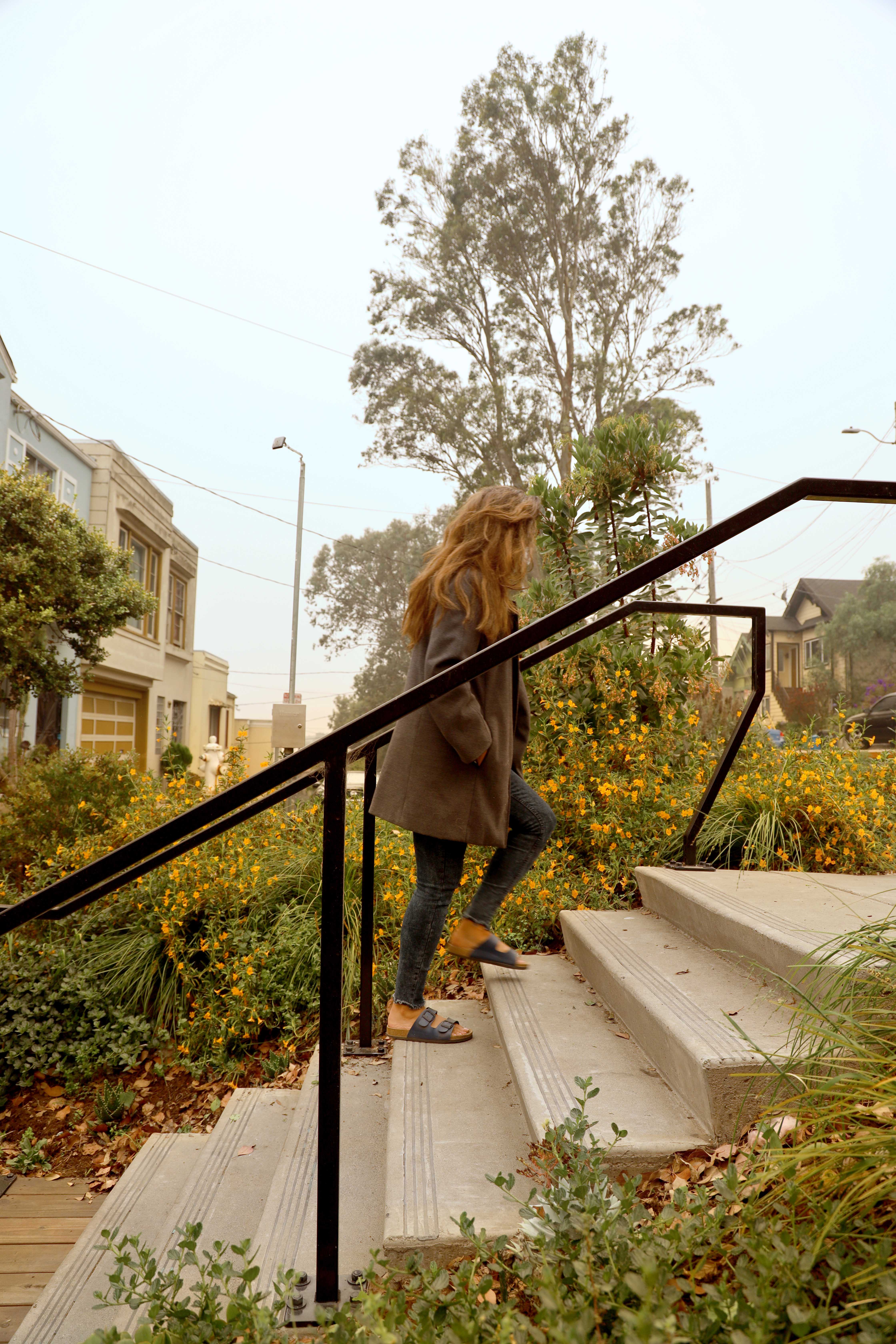
What types of projects would you like to take on in your future?
One of the great things about the profession of landscape architecture is the wide breadth of projects and skills that can be explored. I would like to always have a wide variety of projects that challenge me and keep me on my toes so that I am always learning and developing as a designer.
I especially value community projects. My experience with the community driven Ride Lane project made me appreciate these unexpected, daily used spaces. I genuinely enjoy working with diverse community members and would love to work on similar projects in the future.
Thank you, Nahal, for answering these questions. Go follow Nahal on Instagram @nahalsbt and support her studio, Topophyla.
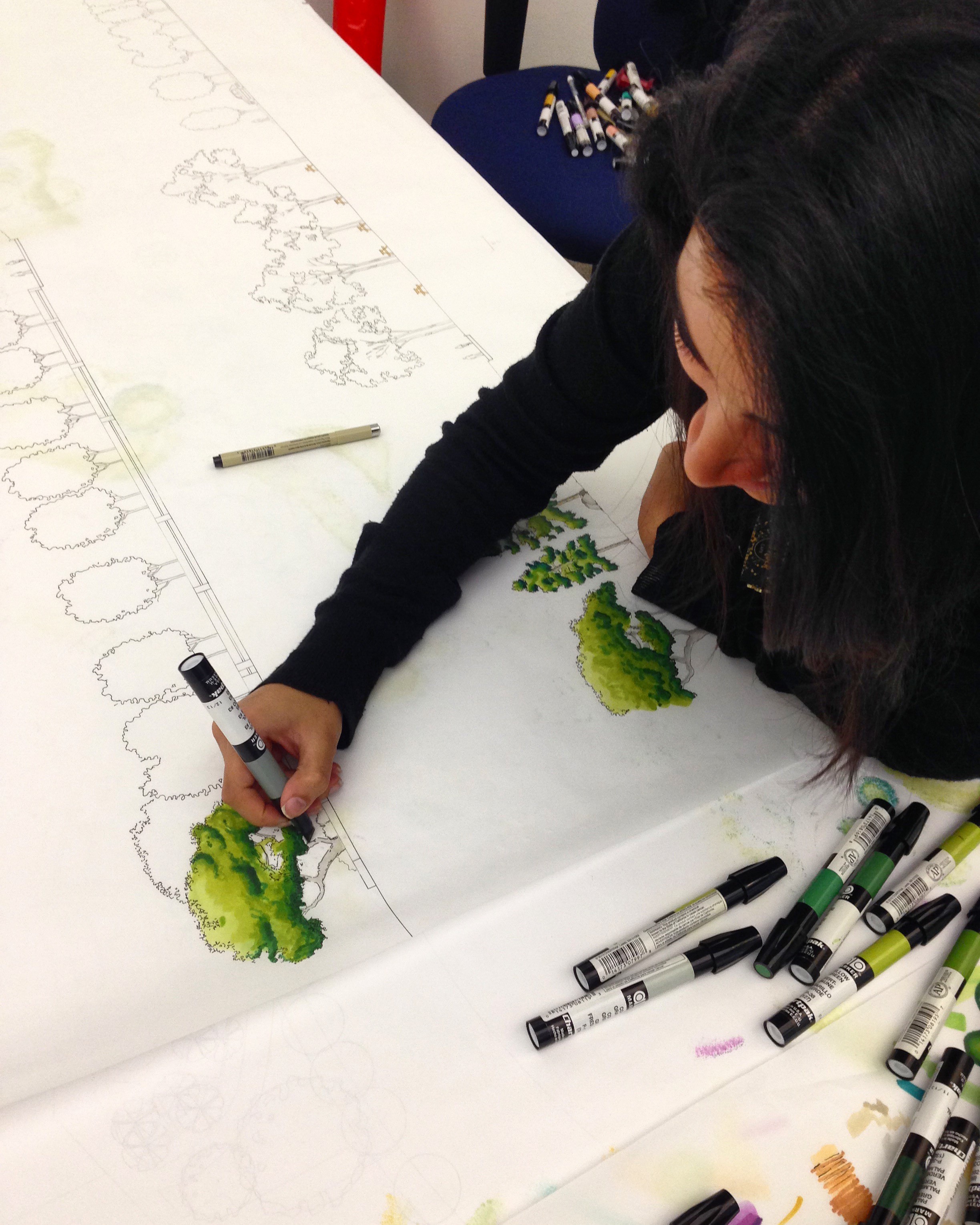
Nahal Sohbati is a landscape designer and a co-founder of Topophyla. After receiving her bachelor’s degree in interior architecture, Nahal developed a passion for public open spaces with high social impact. Her passion lead her to pursue her masters in Landscape Architecture. Nahal strongly believes that design is an advocacy tool to change “what is” into “what it could be” to improve the social wellbeing. Ever since her first experience with her award-winning community service project, Ridge Lane, Nahal has made it her goal to continue to contribute design services that connect communities to their environment.
Planting in Public: Resident Planting Preferences for Vacant Lots in East Kansas City Neighborhoods
People who care about cities have long been troubled by the presence (and reputation) of “vacant” land. Landscape architects, city officials, and residents often worry that, unless something positive is actively happening on a site, it will foster undesirable activities.
Cities and communities have tried different approaches to managing vacant land. Low budget strategies, such as poorly planned ecological planting or wildflower seed mixes, can increase the sense of a neighborhood lacking effort or care. Guerilla gardeners, such as the well-publicized Ron Finley, come into conflict with neighborhood HOAs and city code enforcement when their interventions don’t fit with a space’s authorized use. Community-led efforts to transform vacant spaces into gardens or parks often end with communally-developed space being sacrificed with private developers profiting from community labor.
As landscape architects tasked with protecting the health, safety, and welfare of communities we serve, we need to be able to advise our clients on how to manage vacant land in an equitable way that respects the desires of communities most impacted by it. Elsa Stoffel, a graduate student at Kansas State University’s Landscape Architecture Regional and Community Planning Department, decided that she wanted to understand how to use ecological planting as a strategy for managing vacant lots in high-vacancy neighborhoods. What kinds of planting would appeal to residents of surrounding communities?
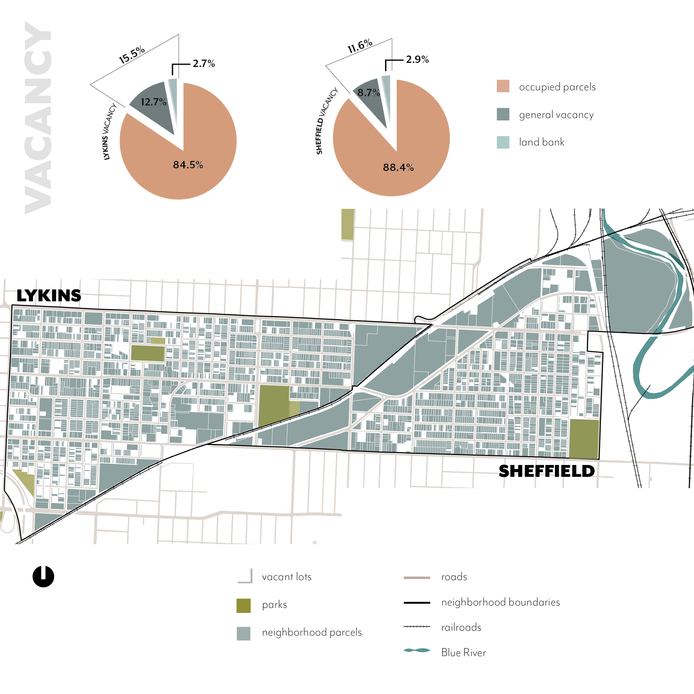
Vacancy in Lykins and Sheffield by Elsa Stoffel
Following research for an earlier studio project, Stoffel chose to focus on two high-vacancy neighborhoods, Lykins and Sheffield, in northeast Kansas City, Missouri. These neighborhoods have a combined population of just under 8,000 residents, with average household incomes significantly lower than average for Kansas City. The vacancy rate for these two neighborhoods is high, around 14%, according to Stoffel’s analysis.
In order to begin to develop a sense of social involvement within these neighborhoods, she attended community meetings and vacant lot cleanups. To gain a law enforcement perspective on vacancy and social behavior on the site, Stoffel conducted a ride-around with Kansas City Police Department (KCPD) East Patrol Division officers. Through these feet-on-the-ground research experiences, Stoffel understood that residents are “very interested in reducing crime rates, increasing feelings of safety, tackling ‘signs of disorder’, and promoting neighborhood engagement”.
Stoffel utilized theoretical frameworks such as Rey Jeffrey’s Crime Prevention Through Environmental Design, Joan Nassauer’s Cues to Care, and Aiyer et al’s Busy Streets Theory to identify factors influencing resident perception of potential planting in vacant spaces. Factors examined included planting diversity, order and maintenance, views through the site, trails and paved space, and safety preferences. Stoffel created photomontage images showing different types of plant communities that vary in degree of evidence of each of these factors. She then incorporated these photomontage images into a bilingual survey, which received 43 responses from residents of her study area.
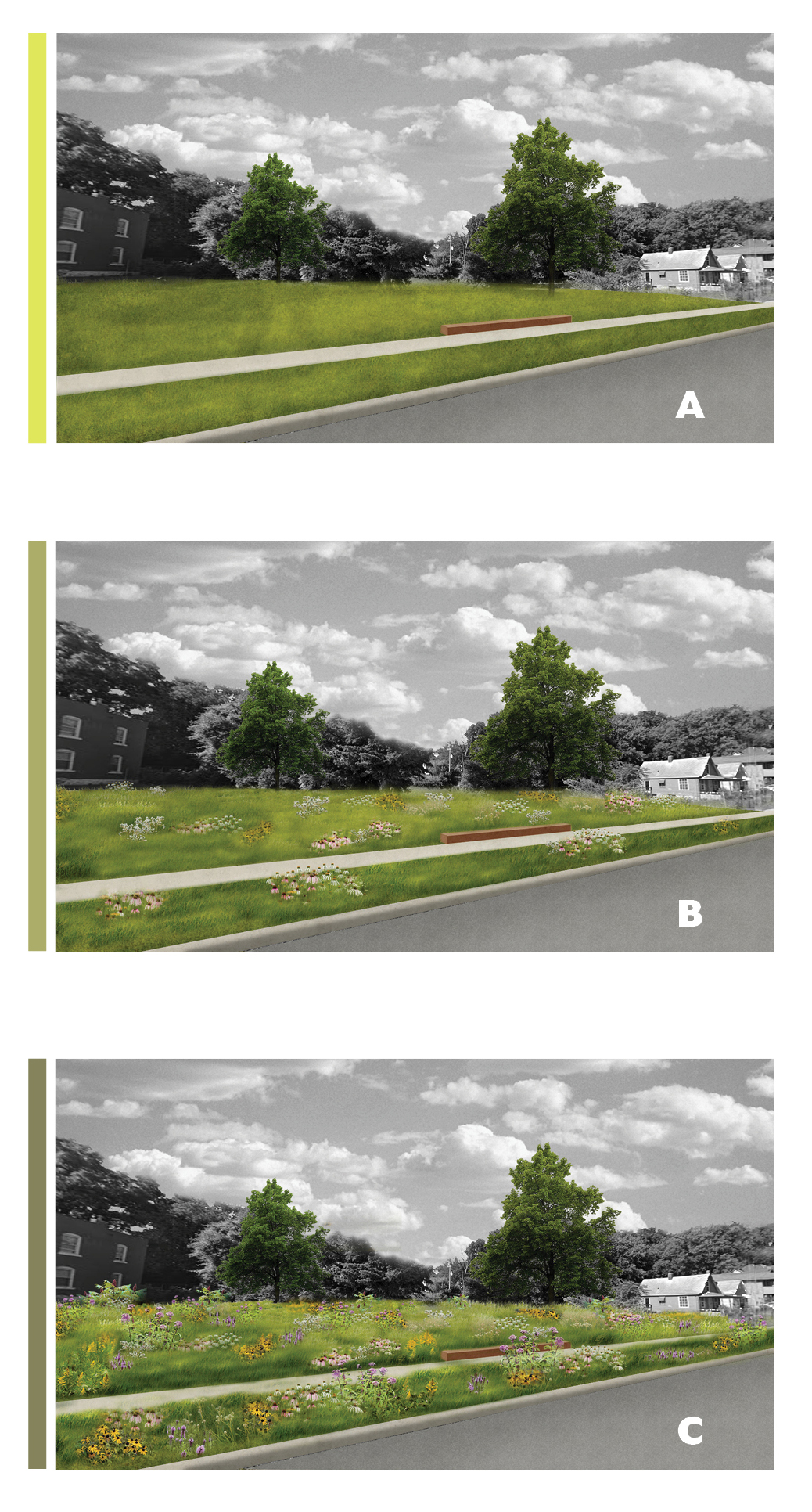
Planting Density Preferences by Elsa Stoffel
Through survey responses, Stoffel identified that residents prefer planting in vacant lots which:
- includes a mix of high-diversity planting with mowed lawn spaces
- offers a high level of maintenance with legible groupings of plant species.
- doesn’t block the view through the site, keeping the space clearly visible from the street where all paths can be seen
- contains a mix of trail options and paved space
- offers cues of ownership and maintenance, especially lighting
These are ambitious goals for any municipality with a high level of vacancy. Further research will need to examine how such spaces – maintained to the level of a park or other civic space – can be funded and managed over time. However, it’s useful to understand what physical qualities would give residents a sense of security, safety and pride in their neighborhoods. Understanding residents’ preferences will help cities and the designers they employ create better management strategies for vacant properties throughout the communities they serve.
Elsa Stoffel is currently working as a landscape designer with site design group in Chicago. Her research was conducted under the supervision of Dr. Sara Hadavi at Kansas State University’s Department of Landscape Architecture and Regional & Community Planning, as well as committee members Huston Gibson and Travis Linnemann. You can read her full report, “Perceptions of safety and plant diversity preferences: a case study of high vacancy neighborhoods”, on K-Rex, the repository of graduate research conducted at Kansas State University.
Lead Image: “Pollinator Patch Nature Play” photomontage by Elsa Stoffel
Paving the Way for Naturalistic Planting Design
Confronted by the jewel-like intensity of Piet Oudolf’s Lurie Garden or Tom Stuart-Smith Studio’s 2019 Chelsea Show Garden (pictured above), you might assume that these plantings are individual works of genius. Around you, masses of plants ebb, water-like, tumbling into each other and between. Seedpods thrust skywards. Fuzzy stems glitter with morning dew.
These gardens seem such a stark contrast to the ordinary landscapes—static and banal—that most of us accept as part of our daily routines. They’re like wild landscapes—but richer, more colorful, more condensed. What features distinguish these contemporary plantings from more traditional approaches to planting design? My piece “Learning the Language of Contemporary Planting Design” offers an introductory vocabulary. In brief, these plantings are designed and managed as communities, rather than individual groups or specimens. Aesthetically, they have a wild look—they’re physically distributed in a way that looks organic, rather than geometrically in blocks, rows, or distinct groups.
Dr. Noel Kingsbury, in his writings with Piet Oudolf, has extensively documented the evolution of naturalistic planting design post-World War II. In particular, his books Planting: A New Perspective (2013) and Hummelo (2015) offer a detailed history of its development. However, I felt it was important to look a little farther back to better understand the forces shaping planting design today. Contemporary planting strategies didn’t suddenly emerge over the past 70 years. Instead, they reflect management practices and aesthetic concerns that have engaged practitioners for generations.
Designing and managing plants as communities, rather than distinct individuals, feels like the most striking divergence from traditional agriculture. However it’s actually a management style utilized extensively by indigenous peoples throughout the world, often described as agroecology. In agroecology systems, desirable species are planted or sown, encouraged to grow, and harvested as part of multispecies plant communities—rather than as single-species monocultures.
In Dark Emu, Bruce Pascoe reports extensively on Aboriginal Australians’ management of landscape-scale plant communities which were cultivated to encourage the growth of desirable plants—while also fostering growth of complementary species. Describing the kangaroo grass (Themeda triandra) meadows discovered by colonizers, Pascoe writes “Orchids, lilies, and mosses flourished among the grain crop.” The first European colonizers noted that these complex meadows supported such rich soils that they had difficulty riding horses across the landscape. Grain crops weren’t the only plant communities managed by Aboriginal Australians. Pascoe writes that fire was used to encourage the growth of fire-dependent crops such as yam daisy (Microseris lanceolata) and vanilla lily (Arthropodium milleflorum), both important edible crops in Aboriginal diets.
Throughout the Americas, First Peoples also cultivated food and medicinal crops as components of managed landscapes. Every elementary school kid knows the “three sisters”—beans, squash, and maize—which were cultivated together, especially by the Hopi, Oneida, and Iriquois. But companion planting wasn’t the only strategy First Peoples used for managing desirable croops. Paiute and Kumeyaay utilized irrigation and biannual harvesting as techniques for managing intermingled communities of their two important food crops – yellow nut grass (Cyperus esculentus) and wild hyacinth (Dichelostemma pulchella). Up in what is now Wisconsin, the Ojibwe maintained wild rice (Zizania palustris) populations by allowing the earliest ripening grains to fall back into the swamps and protecting the plants from disturbance during early stages of growth.
These managed plant communities didn’t look like what European colonizers recognized as agriculture. To them, agricultural production meant monocultures with plants arranged geometrically or in blocks. There’s also a political reason colonizers ignored First Peoples’ management of these landscapes. It sounds better to say that you’re claiming “wilderness” than to acknowledge you’re stealing land that is managed and cared for.
In Europe, productive and ornamental gardens reflected Abrahamic and GrecoRoman religious traditions’ emphasis on physical order. They showed extensive signs of what Joan Nassauer refers to as “cues to care”—plants in monoculture blocks, geometric arrangement, physical evidence of cultivation such as trimming and mowing.

Botticelli, Primavera (1482)
The only time you see wild-looking plant communities with intermingled plants are as grassland components of agricultural fields. Grazed meadows allowed for the growth of many spring ephemerals—small perennials and bulbs—which would grow and flower before being outcompeted by summer grasses. Such low grassland complexes extended beneath orchards. A famous example of an intermingled plant community would be Botticelli’s Primavera (1482). While most people looking at this painting would consider the symbolism and beauty of the human figures—for a contemporary planting designer, the diversity of flora shown thriving in the grass is the more exciting bit. Some sources claim that over 130 flowering species are depicted in this meadow. Standing in front of the painting, I certainly recognized narcissus, fritillaries, bellis, hawkweed and iris. Such diverse flora isn’t only present in imaginary landscapes. You can still find such flower-rich meadows growing throughout Europe—particularly in the Mediterranean and at higher altitudes.
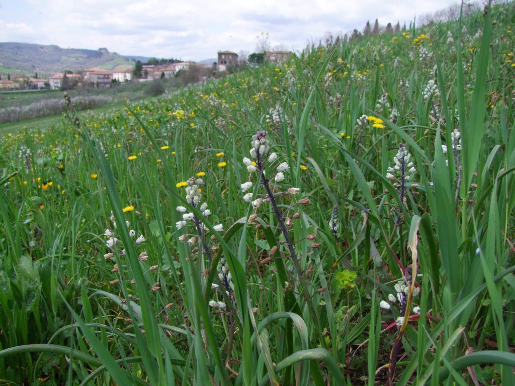
Meadow outside Orvieto, Italy
After centuries emphasizing human dominance over nature, the Romantic era brought a new enthusiasm for nature. With populations throughout Europe and the United States beginning to urbanize, nature began to be seen as a source of excitement rather than fear. Celebrity designers such as Lancelot “Capability” Brown and Humphry Repton created vast landscapes that created an experience of “enhanced nature”. They worked primarily in broad brushstrokes, shaping naturalistic earthforms and drifts of trees. The Romantic approach to landscape design was later adopted by Frederick Law Olmsted in America, creating such works as Central Park in New York City and the Back Bay Fens in Boston—public spaces designed to appear natural, not designed.
At smaller scales, a literature of ornamental gardening for working- and middle-class people began to emerge. Scottish horticulturist John Claudius Loudon developed experience as a landscape planner and agricultural consultant, before establishing the Gardener’s Magazine, the first horticulture-focused magazine in England, in 1823. Loudon’s wife, Jane Wells Webb Loudon, collaborated closely on the Gardener’s Magazine and produced a large body of literature framing gardening as a suitable occupation for women – including titles such as Instructions in Gardening for Ladies, The Ladies’ Flower Garden, Botany for Ladies, and others. The Loudons’ work focused on domestic gardens rather than grand estates. In America, Andrew Jackson Downing was developing his own interpretation of Romantic ideals around landscape and dwelling. His first book, A Treatise on the Theory and Practice of Landscape Gardening, Adapted to North America (1842), was strikingly influential on American domestic gardens – with a particular emphasis on front porches and lawns.
Irish garden designer William Robinson, in particular, was realizing a vision of Romantic values at the planting scale. In his books The Wild Garden (1870) and The English Flower Garden (1883), he proposed a new look for plantings. Rather than emphasizing the grand scale of tree plantings and vast lawns, he focused on vast swathes of herbaceous plants and smaller shrubs. These plantings were designed to look as natural and unplanned as a vast Brown or Olmsted landscape. He introduced the concept of “naturalized” planting – planning for plantings to be dynamic, with individual plants spreading and moving around, rather than being treated as static objects. Robinson worked closely with famed British planting designer and artist Gertrude Jekyll, who is still regarded as the prototypical garden designer and master of the herbaceous border.
A century and more later, it’s easy to see how trends in garden design were being influenced by trends in landscape representation. With photography becoming increasingly accessible, artists explored ever-greater degrees of abstraction. The French impressionists, in particular, represented light and color as diffuse and flickering. The landscapes they portrayed appear to dissolve. Even the bold textures of palms and yuccas shown in Monet’s The Moreno Garden at Bordighera (1884) appear as splinters of light and shadow. Such treatment emphasized the depth and movement of plantings, framing a new way to view the transient effects of light, shadow and color.
Monet’s The Moreno Garden at Bordighera (1884)
Widespread industrialization led to a renewed artistic interest in authenticity and making—evidenced in the Arts & Crafts Movement. Architects such as William Morris in England, Charles Rennie Mackintosh in Scotland, Gustav Stickley in New York, and the Greene brothers in California emphasized respect for materials and craft, particularly evidenced in domestic architecture. Gardens began to be seen as extensions of the home, with a similar close attention to detail.
With middle-class women achieving greater access to representation, free time, and money, there was an explosion of interest in and writing about domestic gardens. The cottage garden—a romantic fantasy of traditional working class plantings—became popular with early 20th-century influencers. Louise Beebe Wilder in New York and Elizabeth Lawrence in North Carolina were extensively published about cottage gardening for homeowners. In England, Vita Sackville-West wrote extensively about her experience creating the ultimate cottage garden at Sissinghurst.
Childe Hassam, Celia Thaxter’s Garden, Isle of Shoals, Maine (1890)
On the Isle of Shoals, in Maine, Celia Thaxter ran a hotel that served as a summer base for writers and artists, including the Impressionist artist Childe Hassam. Every spring, Thaxter would tote hundreds of annual seedlings across from the mainland to plant in the grounds of her hotel. Hassam chronicled the jewel-like intermingled plantings in a series of paintings, including “Celia Thaxter’s Garden, Isle of Shoals, Maine”.
While early 20th-century women were encouraged to make domestic gardens, men were out making noise about the loss of wild landscapes. In the American West, the impacts of uncontrolled exploitation became visible. Game quantities and sizes decreased. Ancient woodlands had been destroyed. The American spiritualist movement espoused by Emerson, Thoureau, and Whitman took a material turn. Theodore Roosevelt’s establishment of the United States Forest Service marked a new phase in American understanding of landscape as more than a resource to be thoughtlessly exploited. The emerging science of ecology established a basis for understanding how natural systems function.
By the mid-20th century, the Arts-and-Crafts gardening tradition and ecological science were being merged in design schools and offices to form the basis of contemporary landscape architecture practice. In England, Dame Sylvia Crowe experimented with different management practices and collaborative teams to understand how planting design could function in the context of projects at different scales. At University of Pennsylvania, Ian McHarg formulated a practice of ecological mapping as a design tool. Rachel Carson’s publication of Silent Spring in 1962 cracked open an international awareness of landscape’s vulnerability.
Today, landscape architects can no longer claim ignorance of the importance of good planting design. Practitioners who care about their work’s success have unparalleled access to knowledge about historical planting and management practices. Rooted in this knowledge, we will be able to create innovative plantings that will confront the challenges of the 21st century, provoking wonder and delight.
—
Acknowledgements:
Thank you to Naomi Brooks, Dr. Jared Barnes & Sloan Patton for reading progress versions of this piece. Your suggestions and edits were vital, and continue to hone my development as a practitioner and writer. Due to my education and experience, this piece emphasizes European and North American influences and practitioners in contemporary naturalistic planting design. I’m eager for readers to contribute to dialogue about naturalistic planting design and its development in other parts of the world.
Lead Image: Intermingled Planting, Tom Stuart-Smith Studio, Chelsea Flower Show 2019
Learning the Language of Contemporary Planting Design
Many landscape architects resist planting design. It’s complex, time-consuming, and site-specific. Results are highly intertwined with implementation and maintenance. Planting is also exactly what your dad’s friends think you do – “Come over, tell me what to do with my yard. And why don’t you mow the lawn while you’re at it.”
However, over the past 20 years, it’s become increasingly apparent that landscape architects can’t continue to rely on landscape contractors to “shrub up” their beautifully-rendered designs. Functioning and maintainable plantings are essential for projects to deliver the ecosystem benefits that landscape architects claim to value. High-profile projects like the High Line in New York demonstrate the power of good planting to capture the public imagination and convince consumers that landscape architects can deliver value for fees.
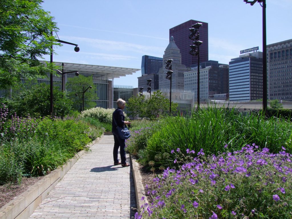
Lurie Garden, Summer 2014 – Planting by Piet Oudolf
Planting in the first 20 years of the twenty-first century has been defined by Piet Oudolf, a Dutch planting designer who rose to prominence in the United States when engaged to design several high profile projects – especially the aforementioned High Line and the Lurie Garden in Chicago. More recently, in America, Thomas Rainer and Claudia West have been widely publicized for their book Planting in a Post-Wild World and work at Phyto Studio.
These designers are most widely known for work with a highly specific look: flower-heavy herbaceous plantings that are basically a fantasy version of North American prairie plant communities. It’s an approach that Sheffield scholars James Hitchmough and Nigel Dunnett refer to as “enhanced nature”. UK scholar and landscape writer Noel Kingsbury explores in depth in his 2013 book with Piet Oudolf, Planting: A New Perspective. This style of planting has even spawned an enthusiastic Facebook Group, Dutch Dreams, with over 5000 members.
This style of planting is intimidating for designers (and clients) trained in more traditional approaches to planting design. Most landscape architects are working without the knowledge base of an experienced planting designer or a highly skilled and trained maintenance staff. Since efficiency equals profit, it can be challenging to experiment and learn about these new approaches to planting in the context of a professional practice.
As a starting point, I’ve compiled a set of widely used terms that you – as a designer – can use to describe the qualities you’re seeking to achieve in a planting design. Having this vocabulary in your toolbox should enable you and your clients to make impactful decisions and achieve the types of results you want.
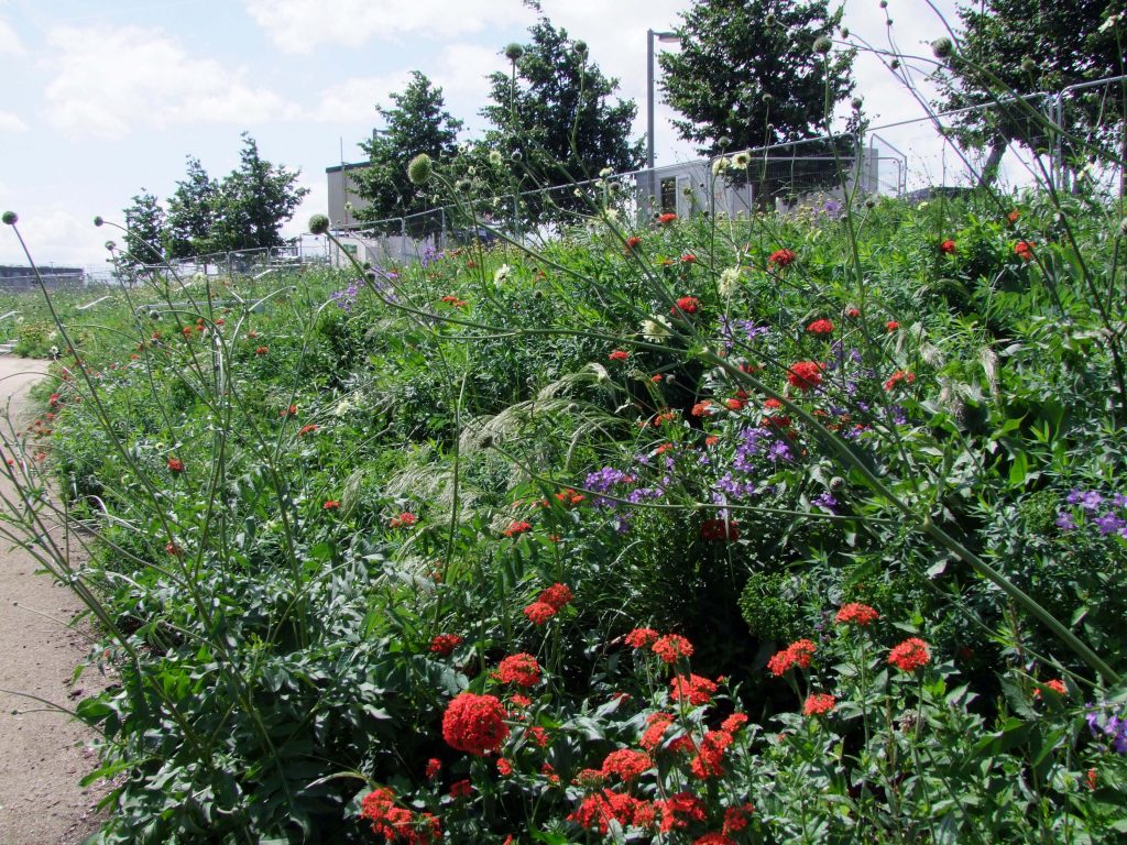
London 2012 Olympic Park. Planting by Nigel Dunnett, James Hitchmough, & Sarah Price
Naturalistic: The term “naturalistic” describes the appearance or aesthetic of a planting. Naturalistic plantings look irregular, organic, and naturally-occurring – rather than having some clear geometric order. While they may look “wild” or “natural”, they are designed.
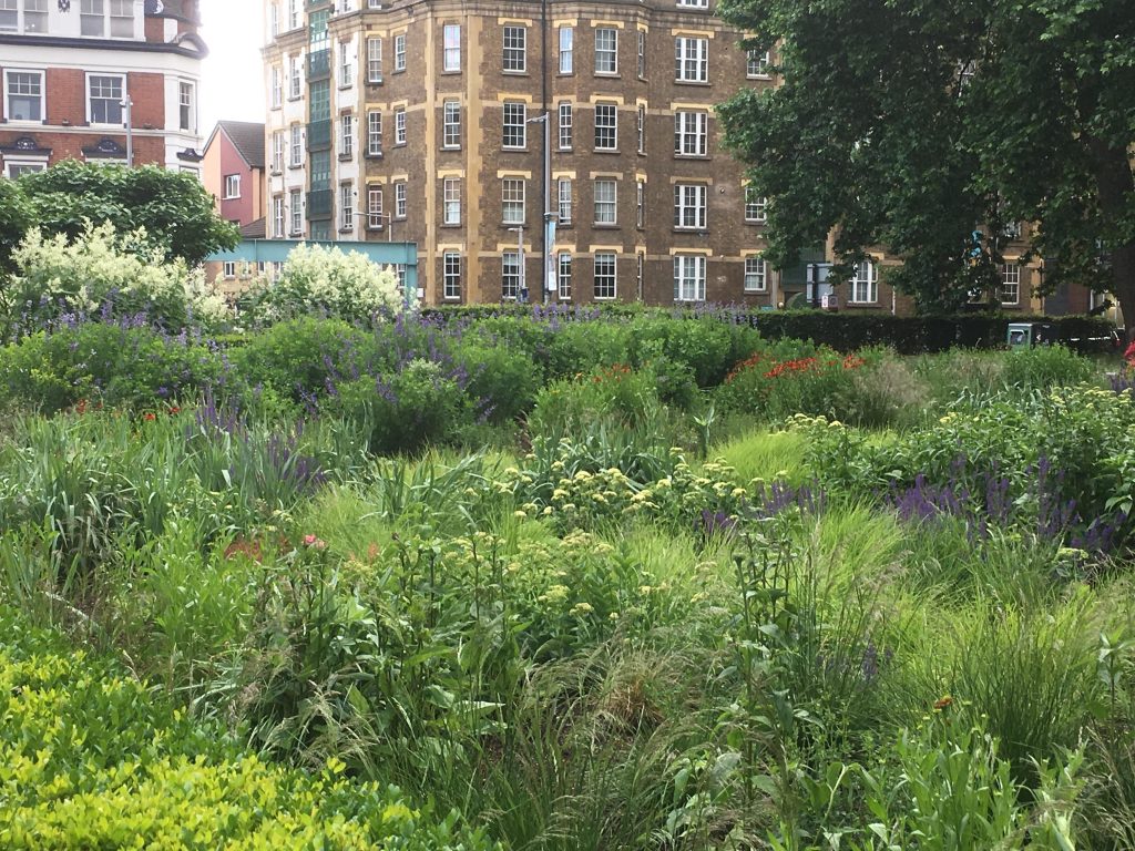
Potters Field Park, June 2017. Planting by Piet Oudolf.
Block Planting: “Block planting” is a planting placement strategy typical of traditional planting design, where multiples of the same type of plant form distinct groups.
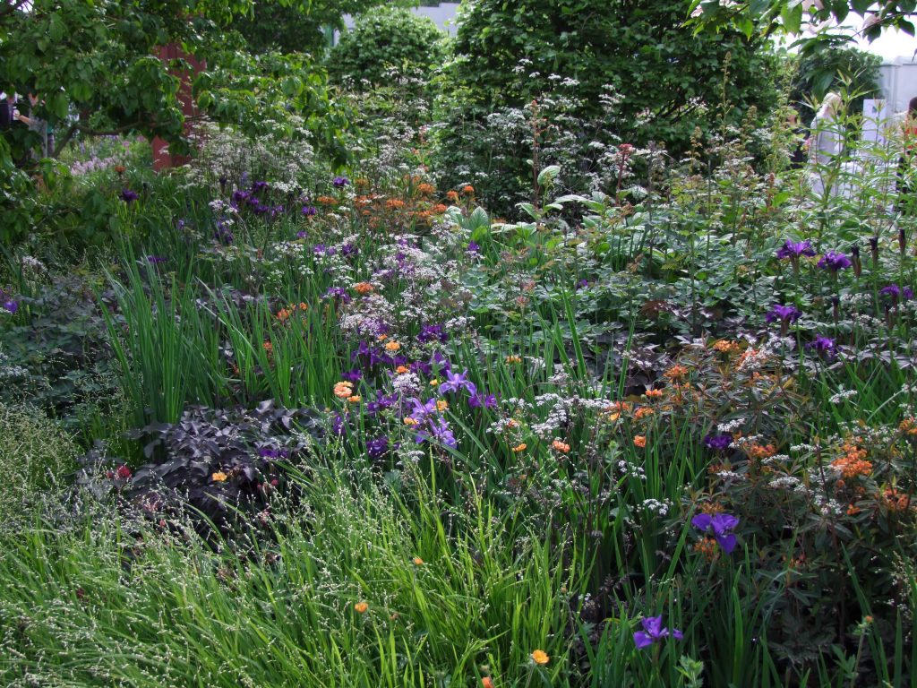
Chelsea Flower Show Garden, May 2019. Planting by Tom Stuart-Smith Studio.
Intermingling: “Intermingling” is about placement of individual plants in relationship to each other. In an intermingled planting, you’ll see a mixture of different types of plants together, rather than distinct blocks of one species.
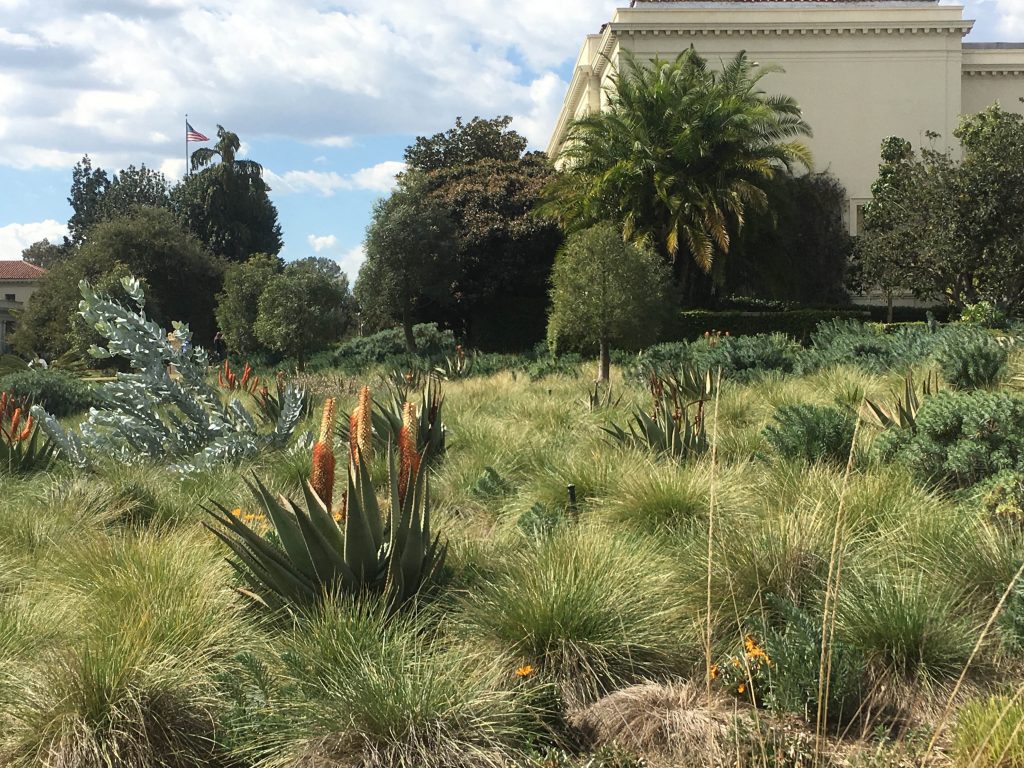
Grass Matrix with Aloes at Huntington Library & Botanical Garden, February 2018
Matrix: Primary dense mass planting of a single species (often a grass) with other species planted more sparsely throughout.
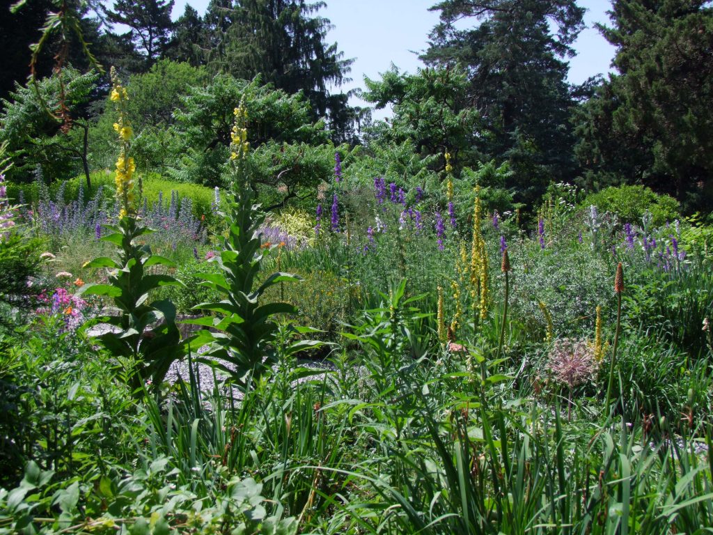
Wave Hill, June 2015
Dynamic: In a “dynamic” planting, physical distribution of individual plants changes over time, based on self-sowing and spreading. Placement of individual plants is not significant to the design intent.
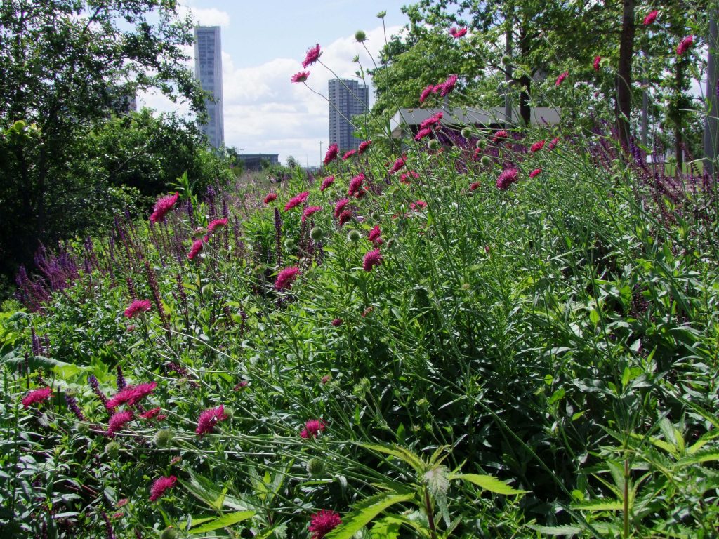
North American Plate, Queen Elizabeth Olympic Park, June 2017. Planting by Nigel Dunnett, James Hitchmough, & Sarah Price
Plant Community: The term “plant community” refers to a group of different species planted together that fill different spatial and temporal niches. In design terms, this means thinking about plants as groupings – rather than focusing on individual blocks or plants.
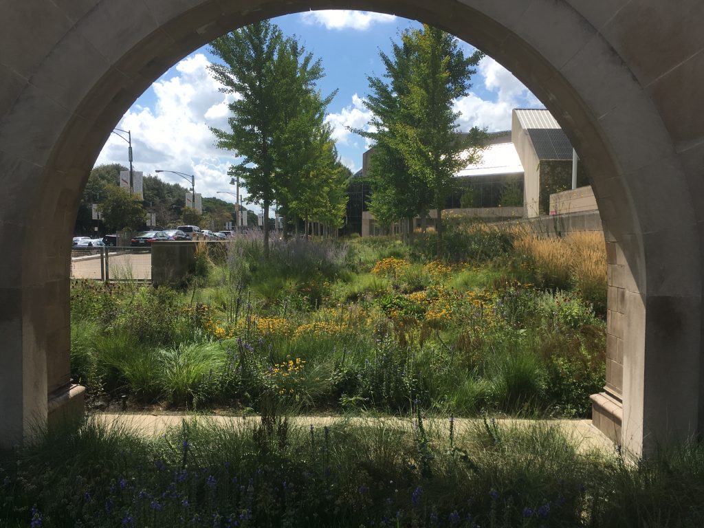
Chicago Art Museum Planting, September 2018. Planting by Roy Diblick.
Ecological: The term “ecological” describes a planting that is designed to have specific environmental functions and benefits. Most often it’s a term of hope, maybe even over-optimism. In the US, we have very little research demonstrating substantial ecological benefits from contemporary designed plant communities. Some research has been done in Europe, such as the BUGS study in Sheffield, which demonstrated that, at the metro scale, urban and suburban plantings did offer significant ecological benefits for biodiversity.
Acknowledgements & Further Reading
Noel Kingsbury – particularly Planting: A New Perspective (2013)
James Hitchmough & Nigel Dunnett – particularly The Dynamic Landscape (2004)
Thomas Rainer & Claudia West – Planting in a Post-Wild World (2015)
Julian Raxworthy – Overgrown (2018)
Jared Barnes – thanks for reading/reviewing – Plant-Ed Blog
—
Lead Image: Barbican – Planting by Nigel Dunnett
10 Questions with @ShitGardens
Are you tired of oversaturated beach scenes, breathy clouds of flowers, and manicured contemporary plazas filling your Instagram feed? Head over to @shitgardens, the popular Instagram feed where Bede Brennan and James Hull present images of landscapes that won’t be winning any beautification awards. We had the opportunity to ask @shitgardens a series of questions about their work. These guys focus on landscapes that don’t make it into glossy design magazines or landscape architecture textbooks. Pay attention, you might learn something – and get some good laughs along the way. Make sure to give them a follow @shitgardens on Instagram – and buy their book, Shitgardens.
What makes a @ShitGarden? How do you define it?
There is a spectrum. For us, shit is often a term of endearment, equivalent to quirky, eccentric or bizarre. We like gardens which take a concept further than anyone else or gardens where you can see the bold vision of the gardener, especially if the reality is not a realisation of this vision.
But there are also those more condemned varieties of shit gardens: neglected expanses of concrete, weed harbouring swamps, or lifeless and loveless coloured gravel. These are not our main focus, though they are sometimes worth a laugh.
While our Instagram feed has diversified into whatever we find funny on the day, we become much more purist and true to the original vision when it comes to exhibitions and publications.
All Aboard for Good Old Fashioned Fun by by @RegressionaryMovements
How do you classify types of shit gardens? What are your favourite trends in the landscapes that you feature?
We’re both fascinated with topiaries at the moment. They symbolise such a bizarre relationship between person and plant – growth by the plant constantly checked by the neurosis of the gardener – constantly in pursuit of the unattainable: a plant in the shape of something other than a plant.
Topiaries are infectious too. They seem to spread from one garden to another from over the fence. We devoted a whole chapter from our book to this phenomenon.
What’s the materials palette of a shit garden? What are its essential features?
The types of shit gardens we prefer tend to have grand statues, mid-century breeze blocks, and unprofessionally restored historic items. The types we don’t like are usually dominated by expanses of astroturf, with glowing red mulch, feature gravel and the odd Yucca. Once again there is a broad spectrum.
Fantasy Castle by Richard Unsworth
In creating @ShitGardens, and presenting on Detail Debacles at the 2019 International Festival of Landscape Architecture, what did you discover about how designers’ intentions can be interpreted in unexpected ways?
Designers’ intentions are not always an easy thing to read, or measure – but there is lots of fun to be had in subverting them. Often these subversions are a valid reclaiming of public space by groups or individuals who have been ‘designed out’, people with skateboards or spray-paint or whatever. I don’t think designers should be upset when people use the spaces they have designed in unexpected ways.
In what ways would you like landscape architects to make space for humor in practice? How do we stay (or become) playful?
Well, there is a long history of playfulness in practice, from automatons in renaissance gardens to Martha Shwartz Bagel Garden. Perhaps it feels harder, or less appropriate, to be humourous in the Anthropocene though. Maybe a darker sense of humour will emerge over the next few years…
Birds of Paradise by Tessa Shwartz
What are your favorite representations of shit gardens in popular culture – movies, tv, literature, advertisements?
There are so many good shit gardens in films. The scene from Broken Flowers where Bill Murray visits his uptight ex Dora in suburbia has some excellent shit gardens. Another good one is the “You just got three feet of air” scene in Napoleon Dynamite, where Napoleon is flanked by two glorious Roman Catholic statues – a Jesus and a Mary. Once you start looking for shit gardens in films, they turn out to be an often used motif, deserving of more recognition for their mood creation. It’s something we’d love to explore more.
What are you bored with on @ShitGardens? What gets submitted too much? What are you always happy to see?
So glad to get this question! Please dear readers, stop sending the one with lots of pairs of jeans stuffed with soil. We get this daily and it brings us no joy, any longer.

The Carpenter’s Son by @jorgosphotos
What did you learn from intentionally trying to make installations evocative of shit gardens at the 2019 AILA conference?
Making things is hard, even shit things. We have so much respect for everyone who creates real physical things. The tyre swan we made turned out to be the most arduous task either of us have ever undertaken. Even with the help of friends we spent a good 5 hours wrestling the thing until eventually the tyre invented and swanny could spread her wings.
Have you heard of other designers doing things differently as a result of your work?
Haha, well not in terms of changing their practice as designers. But we have had a number of submissions we suspect of being ‘staged’. I dare say that the most significant influence our work has had on design would be the potential discontinuation of certain trends, i.e. a decline in yuccas and radioactive gravel, due to us having made fun of these themes countless times.
Heaven is a Garden by Christa Cowell
If you could organize a tour of the world’s shittest gardens, what places would you want to include?
Shit gardens seem to be universal. Or at least present in all suburbs we’ve visited, with definite hotspots in certain areas. I guess shit is in the eye of the beholder. The northern suburbs of Melbourne will always be a Mecca for this aesthetic but internationally speaking, the US has a lot to offer. We get a lot of submissions from “middle America” which we are always astounded by.
Bede & James present at Festival of Landscape Architecture
Meet @shitgardens:
Bede Brennan is a landscape architect most interested in investigating our connections to the non-human world. He divides his time working between Melbourne firm Pollen Studio, teaching at the University of Melbourne, and on collaborative projects as BBLA. Bede has written for a number of publications, including The Planthunter and Kerb Journal. But his secret passion is, of course, shit gardens.
James Hull is a school teacher and plant enthusiast. He works with children who have special needs in the northern suburbs of Melbourne. James likes to keep himself sane by surveying and documenting the vast array of gardens and yard-spaces throughout Melbourne and surrounding environs. He has a passion for all things ‘internet’ and has a keen eye for the burgeoning aesthetics of suburban ‘shitgardens’.
Bede & James presented ‘Detailing Debacles’ at the 2019 International Festival of Landscape Architecture. They have also published a coffee table book “Shitgardens”, available online or in the odd bookshop if you care to hear their deeper thoughts on plastic flamingos.
—
Lead Image: Welcome to the Garden Home by Christa Cowell
- 1
- 2


