Author: Lucy Wang
Land8 Member Spotlight: Interview with Urban Sketcher Chunling Wu
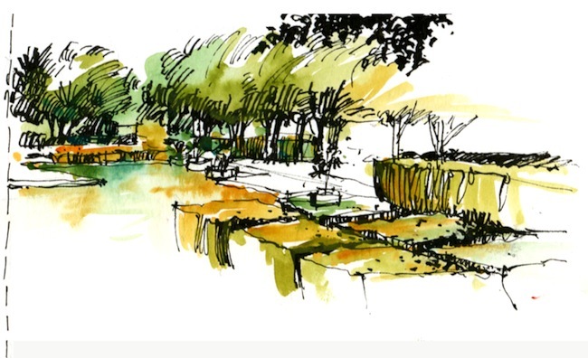
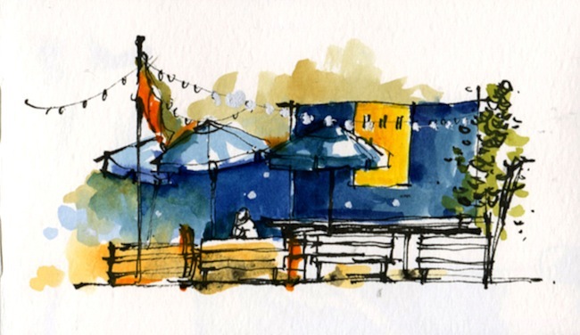
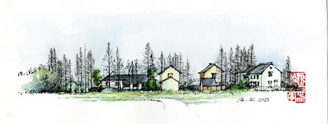
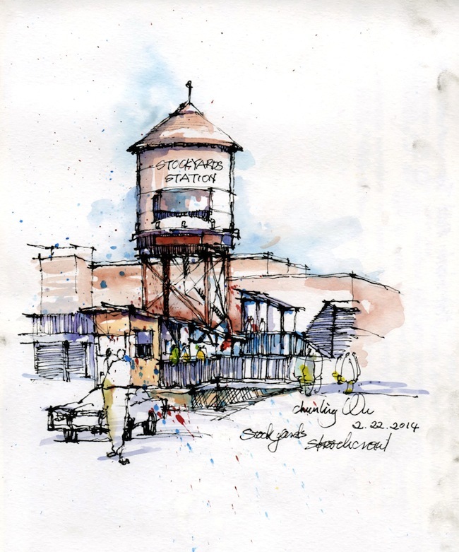
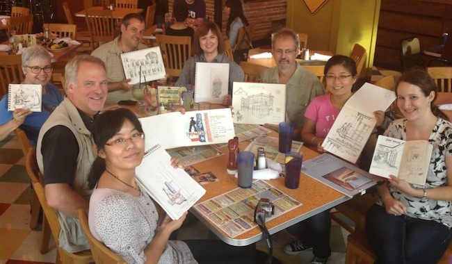
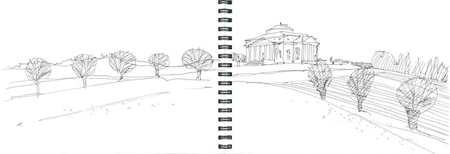
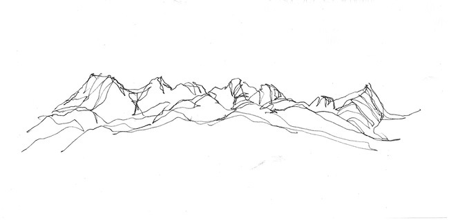
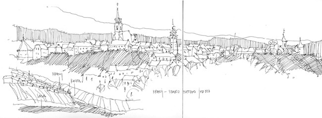
Chunling Wu stunned and inspired the Land8 community last summer with her “Urban Sketching” hand drawings. A UTA landscape architecture graduate student and active Urban Sketchers member, Chunling avidly practices and hones her beautiful freehand drawing technique. She joined us in an interview to talk about her background, process, and drawing influences.
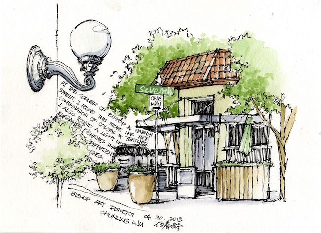 Can you introduce yourself and tell us how you got involved in landscape architecture?
I am a graduate student in the University of Texas at Arlington. I am also an urban designer, sketcher and art amateur.
My way to landscape architecture was complicated. For my undergrad, I majored in environmental art which included courses in architecture, interior design and a little bit graphic design–that was my start to a design career. Back then, I was focused on architecture and didn’t get involved in landscape architecture very much until I found my bible called German Landscape Architecture Design (Translation name, Chinese version published in 2001).
The projects introduced in this book were mostly built around the 90s, but I was attracted by this book and I realized that the many things I learned from architecture and graphic design could also apply to landscape architecture. In 2006, I started my first design job, where I worked on some large-scale projects. Meanwhile, I found another Chinese translated book called Design the American Cities by Richard Marshall. At that moment, I understood that landscape architecture is not just about plaza, garden or park design but also about urban design and planning, and all environments that relate to people. However, I knew I couldn’t find a landscape architecture job just based on passion alone. So after 5 years working in the civil engineering and architecture, I decided to give myself a new beginning and return to school for an opportunity in landscape architecture.
There are many fans of your artwork on Land8. How would you describe your drawing style?
I have had an account with Land8 since 2005 and have learned a lot from other people’s posts. But I never thought my sketching could be inspiring to others as well and appreciate the people’s feedback and warmth on Land8.
I don’t know how to describe my drawing style. I don’t think about style. Actually I believe I developed it from different stages and I am still improving it. I have been influenced by Japanese comics since 12. I learned classical sketching in high school. Later on, I was inspired by one of my best friend in high school who is good at calligraphy. When I was in university, I bought a book called The Art of Architectural Illustration. I was fascinated by some artists’ works in that book. During my first job, I had a friend, a young master in landscape graphic drawing, who gave me a lot of advice. Then I had a four to five year gap when I didn’t draw at all until I started my landscape architecture education in UTA in 2011.
You commented on Land8 before that you didn’t start sketching until you were inspired by “a famous landscape architect and really good mentor.” Can you tell us who that was and how you got started with sketching?
Yes. His name is James Richards. He is an urban designer, a professor in landscape architecture program at UTA, and the author of Freehand Drawing and Discovery: Urban Sketching and Concept Drawing for Designers.
Jim showed us his unique style in sketching in a faculty recruitment presentation. Right after that presentation, I immediately knew that I needed to take his class and become his teaching assistant. So I made an appointment with him, met up and showed him my work. In 2013, I became his TA for a communications class and I absolutely love it. He not only shows the photos and design samples, but he’ll also talk about his experience and stories in the local Urban Sketchers Group, an organization that does on-location drawings. The most important thing I have learned from him is that a designer should have an open-mind in order to appreciate other people’s work and to absorb wide knowledge from other fields. When I got involved more in his studio and urban sketching class, he encouraged me to sketch outside and participate in Sketchcrawl.
Who are some of the most influential landscaped architects and artists influencing your sketching style today?
Thomas C. Wang, Willem van den Hoed, James Richards, Chip Sullivan, Ch’ng Kiah Kiean, Thomas Schaller, and many traditional Chinese paintings.
How have you found sketching helpful in the design process?
Yes absolutely helpful. Some people would think sketching is to copy and replicate the objects, and one day uses them in a design. I would say, sketching is not only recording but also an observation and learning process. Once I need to improve a residential conceptual planning. A walking axis set among residential towers ended up with a sculpture. Image this, people are walking along the axis and get attracted by an interesting sculpture, but they find nowhere to hang out and enjoy the place. So the solution was to add a small plaza in front of sculpture that provided a gathering space and used sculpture as visual focal point at the same time. This is a lesson I learned from my observation in New York City and my hometown Shanghai. So I would say copy maybe tells me what sculpture I can use. But sketching is a process to train my eyes and brain to find problems in the design and seek solutions that are already around us.
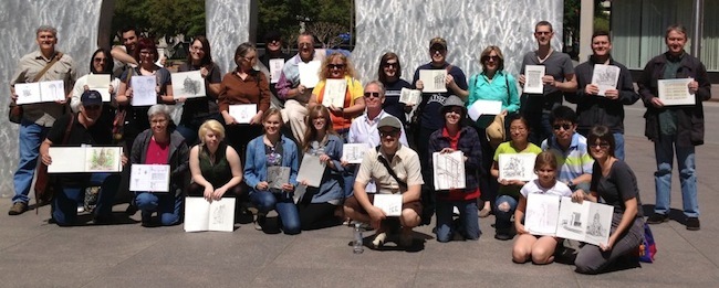 You are part of Urban Sketchers Texas. Can you talk a little about how being part of that organization helps you improve as an artist and as a designer?
It has not been a long time since I joined Urban Sketchers Texas. As I mentioned, Jim encouraged me to be involve in this group last year. The most wonderful thing of being part of this group is that it opened my eyes. I saw people’s passion from all over the world and from different occupations. I saw interesting skills and perspectives that are quite different from landscape architecture. I met people who are not shy to post their work, even when they lack drawing experience. The group reinforces positive qualities that artists and designers need to have to be successful: to be open minded, be brave, and be willing to learn from one another.
Any advice for landscape architects who hope to improve their urban sketching skills?
I’m still learning, so I’m not sure if I am able to give helpful advice. But drawing from my experiences I would say:
- It is ok to be frustrated, but it is not ok to give up.
- When you practice your skills, it is not shameful to copy other people’s style.
- Slow down when you feel that using a fast and loose style is not helpful to you.
- It is never too late.
Thank you Chunling for sharing your inspiring sketches, your story, and wisdom with Land8!
Filmtastic Fridays: The Mountain
Yesterday marked the first day of spring, and to pay tribute to the change in seasons we’re featuring one of the most stunning landscape timelapses we have ever seen. Filmed on Mount Teide in the Canary Islands, this short film is a breathtaking reminder of the beauty in nature. With jaw dropping shots of the Milky Way to swaths of yellow flowers, “The Mountain” is bound to inspire you to embark on an outdoor springtime adventure of your own.
From the description:
“This was filmed between 4th and 11th April 2011. I had the pleasure of visiting El Teide. Spain´s highest mountain @(3718m) is one of the best places in the world to photograph the stars and is also the location of Teide Observatories, considered to be one of the world´s best observatories.
The goal was to capture the beautiful Milky Way galaxy along with one of the most amazing mountains I know El Teide. I have to say this was one of the most exhausting trips I have done. There was a lot of hiking at high altitudes and probably less than 10 hours of sleep in total for the whole week. Having been here 10-11 times before I had a long list of must-see locations I wanted to capture for this movie, but I am still not 100% used to carrying around so much gear required for time-lapse movies.”
The Mountain from TSO Photography on Vimeo.
Missed last week’s Filmtastic Friday? No worries, you can check out our full archive of featured films here.
CSLA Announces 2014 Best Landscape Architecture Projects in Canada
The Canadian Society of Landscape Architects (CSLA) recently announced the winners of the 2014 Awards of Excellence in Canadian landscape architecture. Selected by a national jury of landscape architects, the national and regional awards are judged on a variety of factors from project management performance to application of environmentally friendly practices. Read on for a look at these award-winning landscape architecture designs!
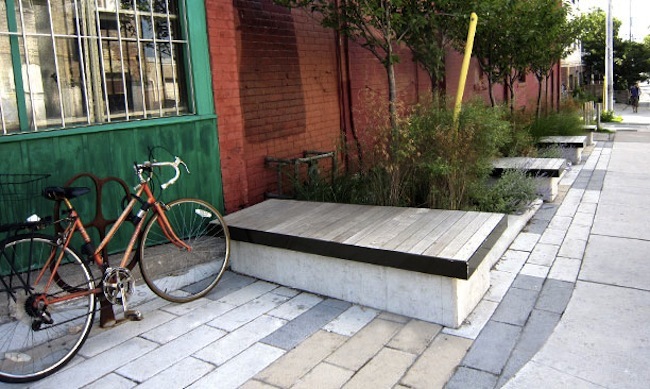
Dundas West Streetscape | PMA Landscape Architects
This year, 15 projects received national award out of a 29 total award recipients. The awards are presented in three categories: Honor, Merit, and Citations. “More and more frequently landscape architects appear to be leading projects that are increasingly multi-disciplinary,” says Brian Parker, Chair of the Awards of Excellence jury. “Collaborative work with engineers, architects and planners bodes well for the profession.”
National Honour / honneur national
Dundas Street West Parkettes (Toronto)
Fung Lee, PMA Landscape Architects Ltd.
Category / Catégorie : Design
The Landscape of Memory: Poppy Plaza (Calgary)
Dave Spencer + Marc Boutin, Stantec Consulting Ltd. With the Marc Boutin architectural collaborative inc.
Category / Catégorie : Design
Les promenades urbaines (Montréal)
Marie-Claude Séguin, Ville de Montréal, Direction des grands parcs et du verdissement
Categories / Catégories : Communications and Planning and Analysis / Communications et Planification et
analyse
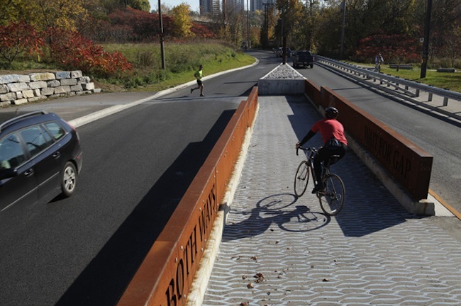
Pottery Road Crossing | PLANT
National Merit / mérite national
Toronto Natural Environment Trail Strategy (Toronto)
Erik Lees, LEES+Associates Landscape Architects
Category / Catégorie: Landscape Management / Aménagement des paysages
Pottery Road Bicycle and Pedestrian Crossing (Toronto)
Mary Tremain, PLANT Architect Inc.
Category / Catégorie: Design
East Bayfront Water’s Edge Promenade (Toronto)
Tanya Brown, West 8 + DTAH
Category / Catégorie: Design
Tree Planting Solutions in Hard Boulevard Surfaces: Best Practices Manual (Toronto)
Clara Kwon, DTAH
Category / Catégorie: Research
An Adventure in Firsts: The Variety Heritage Adventure Park at the Forks National Historic Site (Winnipeg)
Monica Giesbrecht, HTFC Planning & Design
Category / Catégorie: Design
Zaubergarten in an Urban Clearing, Childcare Centre Munich (Munich)
Dietmar Straub and Anna Thurmayr, Straub Thurmayr CSLA Landschaftsarchitekten
Category / Catégorie: Design
The Chemin-Qui-Marche Lookout (Montréal)
Isabelle Giasson, Groupe IBI-CHBA
Category / Catégorie : Design
Imperial Lofts – A Breath of Fresh Air (Montréal)
Isabelle Giasson, Groupe IBI-CHBA
Category / Catégorie : Residential Design / Design résidentiel
Parc Hydro-Québec | Claude Cormier
National Citation / citation nationale
Downtown Moves: Transforming Ottawa’s Streets (Ottawa)
Donna Hinde, Delcan and The Planning Partnership
Category / Catégorie: Planning & Analysis / Planification et analyse
John Street Roundhouse Park (Toronto)
Trevor McIntyre, IBI Group
Category / Catégorie: Design
TOM Field of Daisies/Field of Poppies (2012 & 2013 editions) (Montréal)
Claude Cormier, Claude Cormier et Associés
Category / Catégorie : New Directions / Nouvelles orientations
Parc Hydro-Québec (Montréal)
Claude Cormier/Sophie Beaudoin, Claude Cormier et Associés
Category / Catégorie : Design
Mid Main Park | Hapa Collaborative
Regional Honour / honneur régionale
Mid Main Park (Vancouver)
Joseph Fry, Hapa Collaborative
Category / Catégorie : Design
Credit Rivers Parks Strategy (Mississauga)
Mark Schollen, Schollen & Company Inc.
Category / Catégorie : Planning & Analysis / Planification et analyse
Lower Don Trail Access, Environment and Art Master Plan (Toronto)
Brent Raymond, DTAH
Category / Catégorie : Planning & Analysis / Planification et analyse
Victoria Park Subway Station – Green Roof and Landscape (Toronto)
Scott Torrance, Scott Torrance Landscape Architect Inc.
Category / Catégorie : Design
Ruelle verte Cartierville | Jasmin Corbiel, Groupe Rousseau Lefebvre via AAPQ
Regional Merit / mérite régional
John Lawson Park Playground and Splash Pad (West Vancouver)
Richard Findlay, Richard Findlay Landscape Architect Inc.
Category / Catégorie : Design
MacEwan Terrace Garden at Riverwood (Mississauga)
Rod MacDonald & Mark Steele , The Landplan Collaborative Ltd.
Category / Catégorie : Design
Designing Thunder Bay’s Image Routes: An Innovative Approach to Large-Scale
Streetscape Redevelopment (Thunder Bay)
Calvin Brook, Brook McIlroy
Category / Catégorie : Communications
Downtown Tomorrow: Linking Orillia’s Core to the Water (Orillia)
George Dark,Urban Strategies Inc.
Category / Catégorie : Planning & Analysis / Planification et analyse
Ruelle verte Cartierville (Montréal)
Jasmin Corbiel, Groupe Rousseau Lefebvre
Category / Catégorie : Design
Regional Citation / citation régionale
Courthouse Square (Goderich)
David Leinster, The Planning Partnership Ltd.
Category / Catégorie : Landscape Management / Aménagement des paysages
Wellington Place (Toronto)
David Leinster, The Planning Partnership Ltd.
Category / Catégorie : Design
Open Hearth Park (Sydney)
Gary Sorge, Stantec Consulting Services, Inc.
Category / Catégorie : Design
Plan directeur d’aménagement récréotouristique de Rivière-au-Renard (Ville de Gaspé)
Jean-Francois Rolland, Groupe IBI-DAA
Category / Catégorie : Planning & Analysis / Planification et analyse
Four Seasons Hotel & Residences (Toronto)
Claude Cormier, Claude Cormier et Associés
Category / Catégorie : Design
The awards will be presented at a gala during the CSLA Congress held at the National Arts Center in Ottawa on May 31, 2014. You can see a list of winners from previous years here.
Lead image via West8
Filmtastic Fridays: Viewpoint – An Urban Island Hideaway in London
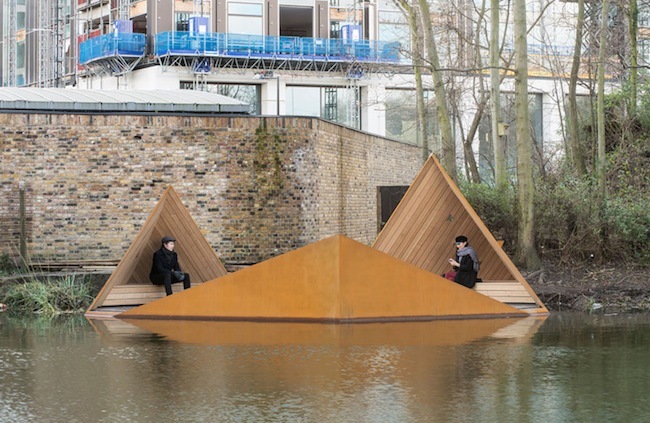
Finding peaceful respite in urban settings can be tough, especially in a city like London that’s constantly buzzing with activity. To help Londoners reconnect with nature, the Finnish architecture firm AOR designed and installed Viewpoint, an angular structure that floats over the Regent’s Canal and borders the Camley Street Nature Reserve. Clad in Corten steel and timber planks, this permanent public space doubles as a relaxing escape from the city and a ideal spot to observe wildlife in the heart of London.
From the description:
“Commissioned by The Finnish Institute in London and The Architecture Foundation for London Wildlife Trust, Viewpoint is an unique urban island hideaway set to bring nature and architecture together on London‘s Regent’s Canal at Camley Street Natural Park.
As a small man-made islet on the canal designed by emerging Finnish architects Erkko Aarti, Arto Ollila and Mikki Ristola, Viewpoint will act as an additional viewing platform, an invaluable new learning facility and workshop space for Camley Street Natural Park. Viewpoint is due for completion in 2014.”
Viewpoint – An Urban Island Hideaway from The Finnish Institute in London on Vimeo.
Viewpoint Installation and Launch Event
Viewpoint Installation and Launch Event from The Finnish Institute in London on Vimeo.
Images via Viewpoint London
Missed last week’s Filmtastic Friday? No worries, you can check out our full archive of featured films here.
Filmtastic Fridays: Jens Jensen The Living Green
Danish-American landscape architect and conservationist Jens Jensen (1860 – 1951) was a champion of the midwestern Prairie Style landscape. A proponent of native gardens and open spaces, Jensen was a dynamic figure who became a major influence in modern American landscape design. In “Jens Jensen The Living Green,” this documentary tells the amazing story of Jensen’s pioneering work in landscape architecture, prairie conservation, fighting corruption, and building the foundation for modern livable cities.
From the description:
Today four out of five Americans live in cities. Yet the connection between the urban experience and the physical and emotional need for city and national parks is only just beginning to be made. A century ago, a rebellious Dane, JENS JENSEN (1860 – 1951), rose from street sweeper to ‘dean of landscape architects’ to pioneering conservationist when he risked his career to stand-up to the great robber barons Andrew Carnegie and JP Morgan by staging a “Dunes Pageant” that drew an estimated 40,000 to the dunes. It was Earth Day, Woodstock and Lawrence of Arabia all rolled into one. His pageant whipped-up a conservation fervor that effectively stopped the steel manufacturers from industrializing the entire Indiana shoreline.
Jensen was a conflicted man, his Prairie Style revolutionized park design with 600 democratic and naturalistic landscapes for the workers of Chicago as well as the titans of industry. He predicted the devastating effects of the automobile on the environment, yet he worked for Henry and Edsel Ford. His story dramatizes an environmental battle that lasted five decades culminating in the creation of the nation’s first urban national park. A true conservation hero who used his art as activism, his philosophy and tactics on behalf of saving the land could not be more prescient.
Jens Jensen The Living Green Teaser from Viva Lundin Productions on Vimeo.
Jens Jensen The Living Green: CLIPS from Viva Lundin Productions on Vimeo.
Learn more about the documentary at Jens Jensen The Living Green.
Missed last week’s Filmtastic Friday? No worries, you can check out our full archive of featured films here.
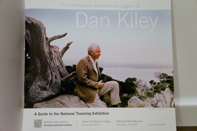
TCLF Spotlights Dan Kiley’s Endangered Landscape Architecture Legacy
Dan Kiley is one of the most significant and influential landscape architects of our time but his work is in danger of slipping away. On Kiley’s prolific and impressive designs, landscape architect Laurie Olin once quipped: “Dan’s thoughts are like rabbits–they just keep leaping out.” To celebrate his work and bring attention to the ongoing threats to Kiley’s legacy, The Cultural Landscape Foundation collaborated with landscape architects and firms across the U.S. to create a national traveling exhibition dedicated to the modern landscape architect’s work. The exhibit debuted last year at the annual ASLA meeting in Boston.
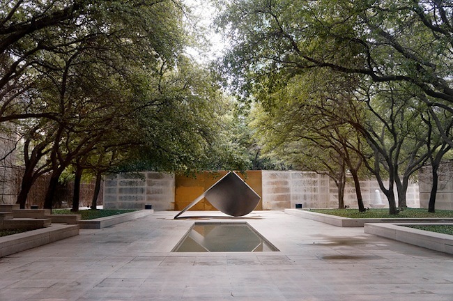
Dallas Museum of Art Sculpture Garden | Dallas, TX
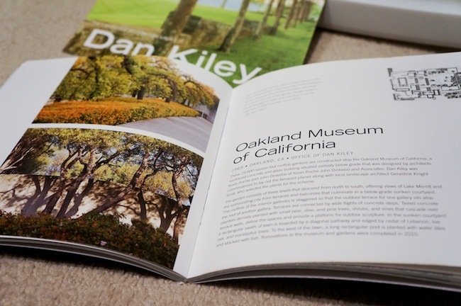
Recently, I visited the exhibition’s new location at the National Building Museum in Washington, D.C. The small compendium showcases 27 of Kiley’s most celebrated modernist works, each carefully selected to show the wide breadth of his design talents from Pittsburgh’s quirky Agnes Katz Plaza to the “Modernist Mecca” Miller House and Garden. Influenced by French landscape architect André Le Nôtre’s 17th century gardens, Kiley weaved together hundreds of modernist landscapes with his signature grid and geometric planting plans that reinforce the notion of landscapes as outdoor rooms, rather than mere window dressing.
A lack of public support and awareness, however, threatens to destroy Kiley’s landscape legacy with “quiet deaths” from outright destruction to careless alterations. “All of this raises the issue of ephemerality of Kiley’s work, and designed landscapes writ large,” writes Charles Birnbaum, President and Founder of TCLF. “This exhibition is meant to prompt questions and discussions about responsible stewardship, which is central to TCLF’s mission.”
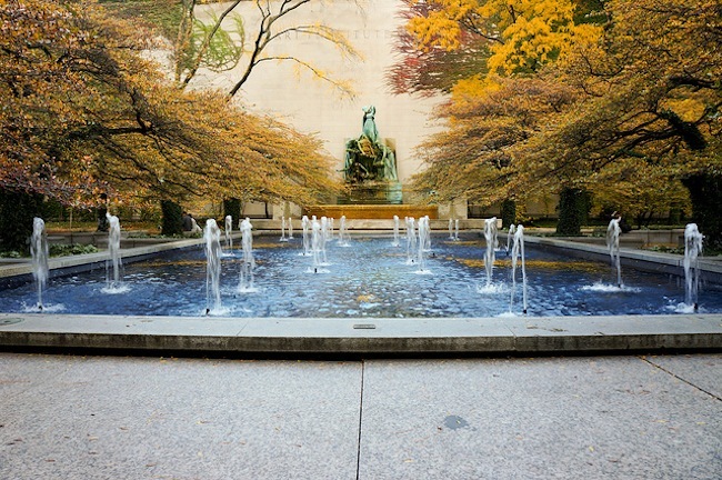
Art Institute of Chicago’s South Garden | Chicago, IL
Visiting the exhibit was a personally rewarding experience that brought back vivid memories from my trans-America landscape architecture trip. The exhibit displays each of Kiley’s works with one or two photographs of the landscape project accompanied by a brief history of the site, a plan view, and a quote by one of Kiley’s landscape architect colleagues. I was pleased to see many of my favorite landscapes featured in the exhibition, including the Art Institute of Chicago’s South Garden, which according to Peter L. Schaudt, Principal of Hoerr Schaudt Landscape Architects, is “Chicago’s finest outdoor space.”
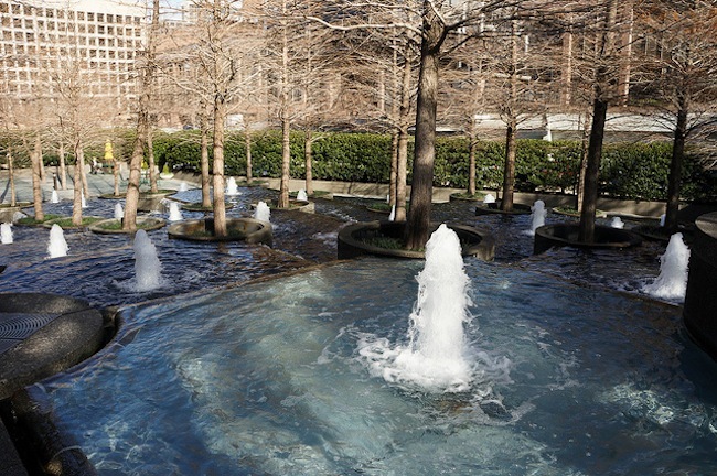
Fountain Place | Dallas, TX
Though I enjoyed the exhibit, I worry about efficacy of the compendium on non-landscape architects and those who haven’t visited Kiley’s work in person. Photographs are a poor substitute for the multi-sensory experience of Kiley’s landscapes, particularly the designs that highlight the sights and sounds of water. TCLF’s biannual What’s Out There Weekends, on the other hand, bring people on narrated tours of significant, sometimes threatened, landscape architecture works across the nation. I suspect that these tours have a longer lasting effect on both professionals and non-landscape architects. Hopefully, however, this exhibit will spur landscape architecture professionals and students into similar outreach efforts and encourage more dialogue and debate on how best to preserve threatened landscape architecture projects.
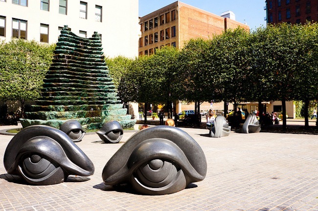
Agnes Katz Plaza | Pittsburgh, PA
Jefferson National Expansion Memorial | St. Louis, MO
If the TCLF’s Dan Kiley exhibit makes an appearance in your city, I highly recommend visiting the compendium and supporting the preservationist efforts. The loss of these historic landscape architecture works is a disservice to the discipline and future generations who lose the joy and opportunity of exploring these landscapes in person.
Guide to the National Traveling Exhibition
“The legacy of Dan Kiley is that his work demonstrates how place informs life and how in turn life gives meaning and value to place,” said landscape architect and former colleague Peter Ker Walker. “That he has done with art, grace and good humor to the lasting benefit of all.”
You can view the TCLF Dan Kiley Exhibition Tour List here. You can also view the Landslide 2013: Online Exhibit here.
Lead image of TCLF exhibit card. All other images copyright to author, landscapevoice.com
Filmtastic Fridays: Protected Intersections For Bicyclists
Bicycle commuting is booming in cities worldwide and the surge in bike-share last year indicates that this healthy trend is more than just a fad. A lack of proper cycling infrastructure, however, puts the urban cyclist at serious risk of injury or even death. Though our more cycling-conscious cities have adopted protected bike lanes and Sir Norman Foster has even suggested a pie-in-the-sky elevated bicycle highway, urban planner Nick Falbo says there’s a better way to keep cyclists safe: the protected intersection. In this incredibly clear and impressive video, Falbo explains how this Dutch-inspired design concept works.
From the description:
“Protected bike lanes are the latest approach US cities are taking to help their residents get around by bike. But these protected lanes lose their buffer separation at intersections, reducing the comfort and safety for people riding.
What the protected bike lane needs is the protected intersection.
This proposal for the George Mason University 2014 Cameron Rian Hays Outside the Box Competition presents a vision for a safe, clear intersection design that improves conditions for all users. Proper design of refuge islands, crossing position and signal timing can create a safe intersection that people of all ages and abilities would feel safe in.
Learn more online at ProtectedIntersection.com”
Protected Intersections For Bicyclists from Nick Falbo on Vimeo.
Missed last week’s Filmtastic Friday? No worries, you can check out our full archive of featured films here.
Land8 Member Spotlight: Interview with Gašper Habjanič | Linescapes
If you’re looking to brush up your drawing skills, you’ll want to check out Land8 member Gašper Habjanič’s excellent Linescapes video series. With a knack for both sketching and teaching, this Slovenian landscape architecture student started filming these short, inspiring tutorials on a semi-weekly basis since last summer. Armed with a pen, a sketchpad, and a set of watercolors, he captures the spirit of the various landscapes around Ljubljana as well as the other European places he visits on his travels. Recently, I had the opportunity to chat with Gašper for some behind-the-scenes insight on Linescapes.
Can you tell me a little bit about your background, are you a student or working professional?
I’m currently a landscape architecture master’s student in the middle of writing my thesis. I’m also working at a local landscape architecture studio. At the end of next month, I’ll wrap up my thesis and I plan to go work abroad at a bigger landscape architecture firm. I still plan to continue Linescapes even after I go abroad.
What inspired you to do Linescapes? Where did you learn to draw?
The biggest reason is that I just really like drawing. I started to learn when I did my bachelor’s in landscape architecture in Ljubljana, Slovenia; there were a lot of hand drawing courses there. The professors were really good; they taught us how to analyze the landscape through drawing, which is a process that I think is more interesting than just drawing or painting.
The professors taught me to put my camera away and use my sketchbook. I posted some sketches onto LAN’s Sketchy Saturday series but then decided last summer that I also wanted to make videos to show people the drawing process. It was my first time doing something like this and it was really exciting when I got the first views and feedback to my videos.
Where do you get inspiration for your drawing style?
I think this kind of analytical drawing is still pretty rare. I noticed that not many people see drawing as analysis. But I am looking for people with similar thinking and I’ve also started collecting similar artwork on Pinterest.
I’ve also been inspired by other analytical drawings from the field of geography. It’s related to landscape architecture and even though the emphasis is not on drawing skills, the idea behind it is the same: to analyze the landscape through drawing.
Can you describe how you set up your camera for filming?
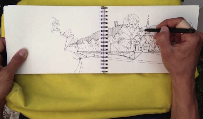
It’s very improvised. I film with an iPhone attached to a piece of cardboard and a tripod. Then I position my sketchbook underneath the camera and double-check that it’s in the frame.
There have been many times when I finish filming that I find out the videos out of focus, so it can sometimes take two to three tries to get the final take. Sometimes the wind tips over my tripod or someone interrupts me in the middle of filming.
You’ve got quite the following since your launch last year. What’s the feedback been like to Linescapes?
I’ve been surprised by the feedback–it’s been great! I never thought that so many people would appreciate my videos. Many people have thanked me for the videos and I hope it encourages more people to draw. This one professor in Nitra, Slovakia even contacted me to let me know that he’s been showing my videos to his students every week.
People have also asked for specific videos, such as a tutorial on drawing trees, and I think I’ll be making a video on what types of pen and paper to use. I encourage people to write to me on Facebook or email me their requests and their sketches. I’d like to make a photo album of sketches people submit to Linescapes.
What are your future plans for Linescapes?
One of my big plans would be to showcase not only my own drawings, but the drawings of other people. I view sketches as a recording of your thoughts at a certain time. In the future, I would like to contact people whose drawings I like and ask them to record videos of their drawing methods as well as get their perspectives on drawings. I’d ask them to share their story and tell a little bit about what drawing means for them and how it fits into their design process.
For the short-term, I think I might include a Digital Drawing Month or some kind of theme that shows off drawing methods other than hand drawing.
Other than Land8 and YouTube, where else can people find you?
Facebook, Pinterest, Twitter, and Behance.
What advice do you have for others hoping to improve their drawing skills?
My biggest piece of advice: Don’t be afraid of paper. Grab a pen and paper–it doesn’t matter what kind–and start recording your thoughts with a sketch. Sketches are graphical recordings of our thoughts, which means they don’t have to look good, they’re just meant as a reminder of a place or to capture your thoughts at a certain time. I think people should think of drawing as something personal and for themselves. Just don’t be afraid of paper–that’s the main thing.
Thank you Gašper for sharing your thoughts, sketches, and tutorials with Land8! You can check out his Linescapes videos posted in Land8’s video section or on his Youtube channel.
Filmtastic Fridays – Observing Director Park: University of Oregon’s 2013 CSI Research
If you’re a fan of William H. Whyte’s pioneering ‘The Social Life of Small Urban Spaces,’ you’ll love this time-lapse of OLIN’s popular Director Park in Portland, OR. Filmed by a University of Oregon landscape architecture research team, this short film captures the life and social patterns in one of Portland’s favorite urban parks over the span of a typical summer day. The project was conducted as part of Landscape Architecture Foundation’s 2013 Case Study Investigations.
From the description:
“The 2013 Case Study Investigation (CSI) research team from the University of Oregon worked to document the social benefits of Portland’s Simon and Helen Director Park. As part of the analysis, the team shot this time lapse video on Thursday, July 18, 2013, capturing three time periods: morning setup (8:30am-11:30am), lunch time (12-2pm), and evening (5-8pm). The time lapse is a compilation of over 1700 still images shot every ten seconds from a six-level parking garage adjacent to the Park. (Music: “Better to Run” by pawpaws)
Learn more at: lafoundation.org/news-events/blog/2013/07/31/csi-uo/“
Observing Director Park: University of Oregon’s 2013 CSI Research
Missed last week’s Filmtastic Friday? No worries, you can check out our full archive of featured films here.
Filmtastic Fridays – Piet Oudolf: Fall, Winter, Spring, Summer, Fall
For many, Piet Oudolf is more than just a master plantsman. He’s considered a gardening rock star and contemporary artist. Those fortunate enough to have visited his gardens know that his award-winning plant compositions are best enjoyed in-person, where one can better appreciate their four-season appeal, depth, and sense of movement. In appreciation of Oudolf’s complex landscapes, Thomas Piper, the Director of Production for the Checkerboard Film Foundation, embarked on a cinematography project to capture Oudolf “at work and in his own words.” The following short film is a documentary teaser Piper released to gather support and funds for the film.
From the description:
4 minute fundraising teaser for the upcoming documentary, Piet Oudolf: Fall, Winter, Spring, Summer, Fall, a film by Tom Piper.
If you would like more information on how you can help support the project, please contact Checkerboard Films at:
info@checkerboardfilms.org
Piet Oudolf documentary teaser from Thomas Piper on Vimeo.
Missed last week’s Filmtastic Friday? No worries, you can check out our full archive of featured films here.
Filmtastic Fridays – Day in the Life: Landscape Architect
The Office of Cheryl Barton, a San Francisco-based landscape architecture firm, recently released an excellent behind-the-scenes look at the work of a landscape architect. The short film, which was created by ConnectED Studios, follows landscape architect Janice Nichol and her thoughts on “the importance of creative expression and past experiences when creating eye-catching public spaces.”
From the video:
“What I love most about the field [is] the fact that we’re creating space, the places that people live in and spend their lives, and get to make them more beautiful, more functional, more enriching.” – Janice Nicol
Day in the Life: Landscape Architect from ConnectEd Studios on Vimeo.
Missed last week’s Filmtastic Friday? No worries, you can check out our full archive of featured films here.
Filmtastic Fridays: Landscape Architecture Internships
As a follow up to this week’s Summer 2014 Internship roundup, today’s Filmtastic Friday spotlights the landscape architecture internship experience as captured in these three short and inspiring films by Sasaki Associates, OLIN, and SWA Group. Keep reading for a glimpse into the work cultures and internship programs at these landscape architecture firms!
Sasaki Associates
In this video, our summer interns and former interns now on staff share what they loved about the Sasaki summer internship, and how it propelled their careers forward. Are you looking for a chance to work with a diverse, interdisciplinary team of designers and tackle some of the world’s most interesting design and planning challenges? Learn more here: sasaki.com/about-us/Internships/
Sasaki Internship from Sasaki Associates on Vimeo.
OLIN
What is an OLIN Internship? In this short video, past OLIN interns from 2012 describe their experiences. Check out additional OLIN internship videos here: http://vimeo.com/channels/olininternship
What is an OLIN Internship? from theOLINstudio on Vimeo.
SWA Group
SWA Summer Student Program 2013: Los Angeles River
Don’t forget to check out the other paid landscape architecture summer internship programs we rounded up in Wednesday’s post!
Missed last week’s Filmtastic Friday? No worries, you can check out our full archive of featured films here.


