Author: Mitch Howard
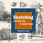
Book Review: Sketching from Square One to Trafalger Square by Richard E. Scott
“It is an intense, focused experience that you are really after. That is where the growth is, that is where the fun is, and that is where the reward is. The sketch then becomes a record of that in-depth experience.”
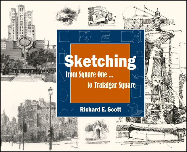
Richard Scott is a passionate champion of the sketch. He believes in the philosophy behind sketching, the process and the practice, the experience, and the resulting confidence gained by honing one’s sketching skills. In his book, Sketching from Square One… to Trafalgar Square, published by Sierra Madre Press, Scott provides a step-by-step process by which anyone, at any skill level can begin, improve, and refine his or her own sketching skills.
I recommend reading Sketching from Square One… to Trafalgar Square the first time through as if you were reading a novel. This is especially true if the reader is just beginning to learn to sketch. Scott’s expert, supportive, and generous prose is a reflection of his teaching style. In reading the lessons before beginning the actual work, readers will be exposed to his confidence-building techniques and a particular style that comes from many years of teaching the illustrative arts. The illustrations within the book, drawn by Scott, along with a few carefully chosen works by former students, provide a great deal of inspiration and instruction, making this an enjoyable page-turner as well.
Sketching from Square One to Trafalgar Square is organized around three main parts – within which are ten chapters. Part One, entitled Square One, provides the practitioner with “Ten Lessons to Better Drawing”. These lessons focus on developing an accurate sketch by measuring to achieve proportional accuracy, rendering alignments, angles and curves, and deciding in which sequence the lines and shapes will be laid down on paper.
Simplify
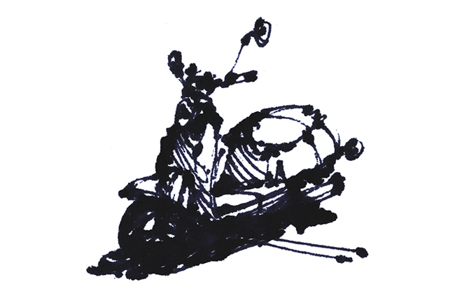
In Part Two, How To See, Scott uses the mnemonic device “S.E.E.” to demonstrate how we may begin to “see with the eyes of an artist”. The first of the three steps, Simplify, is a method used to investigate the act of seeing as it applies to choices and editing of subject matter, simplifying subjects into abstract shapes, and developing patterns out of what isobserved, and then simplified.
Emotional Response
The second step is titled Emotional Response. Here we look at one’s own motivation for sketching a particular subject. By asking yourself which features attracted you to this subject to begin with; such as composition, abstract shapes, etc., you begin to clarify the intent of your sketch, drawing only those features that are important to you and again editing out that which is not.
Examine & Compare
The final step of S.E.E. is Examine & Compare; Here Scott teaches us how to do just that, examine a single element within the drawing such as composition, edge, or tonal value, and then compare the relationship of this chosen element in the drawing to the variety of other elements. The intent being to “more accurately reproduce these (multiple) relationships in your sketchbook.”
Having laid out a philosophical groundwork for sketching and introducing us to many important concepts in Parts One and Two, in Part Three, How To Sketch, Scott now begins to walk us through the actual experience, the practice of sketching. Here, in my opinion, is one of the most vital lessons Richard Scott’s book has to offer.
“… improving your abilities to concentrate and see is the point of practice, not so much the development of drawing techniques or the making of pictures. It is an intense, focused experience that you are really after. That is where the growth is, that is where the fun is, and that is where the reward is. The sketch then becomes a record of that in-depth experience.”
S.K.E.T.C.H
In Part Three, Scott provides another acronym, S.K.E.T.C.H. (Selection, Keep it Accurate, Edges, Tonal Values, Contrast, Halt). This method is provided to help the reader remember the six steps involved in producing a satisfying sketch. Each letter also represents one chapter of Part Three. Chapter One Selection, discusses the defining, limiting, composing, and editing the chosen sketch subject. With many examples provided to illustrate the concepts, this chapter is a reassuring first step toward your ability to “draw less but express more”.
Keep it Accurate
In Chapter Two, Keep it Accurate, the author lays out some basic rules for creating an accurate sketch. These include the ideas touched upon in Part One, but here we delve into a finer-grained discussion regarding concepts such as “drawing what you see, not what you know”, “working from easier to more difficult”, and looking for visual clues for accurate proportion, alignment, and angles.
The sketching lessons continue to build upon one another through Edges, Tonal Values, and Contrast (Chapters 3,4, and 5) with the final chapter of Part Three being Halt. This of course is a tricky subject for even the most practiced of artists – “When to Stop Sketching”. Here the author’s approach is not so much from the practical standpoint of a highly detailed (i.e. finished) sketch, but from his more philosophical point of view. So I’ll leave this final lesson of Halt for Scott to impart, and for you the reader to absorb. Yet it is suffice to say that the resolution of a sketch returns us full circle to the initial dialogue concerning our expression and the experience itself.
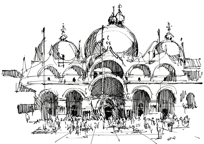
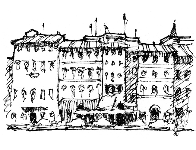
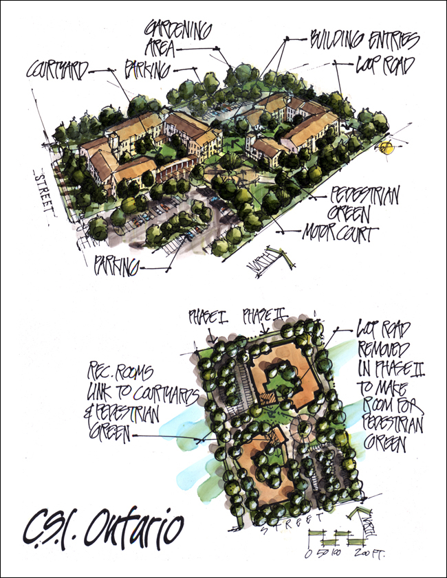
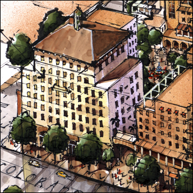
Sketch by Richard E. Scott
The blurb on the back-cover states; “Richard E. Scott is an artist, architectural illustrator, and licensed landscape architect.” This of course is true. Yet he is also more than this. Richard E. Scott is a teacher; that noble profession in which one gives generously of their time and talents for the learning benefit of others, and the evidence of this is all within the pages of Sketching from Square One… to Trafalgar Square. As stated above, I believe this is a great book for the current sketch practitioners among us. Yet it also doubles as a valuable companion and tour guide for those about to bravely embark upon their first sketching journey.
I highly recommend Richard Scott’s book, Sketching from Square One… to Trafalgar Square to those teachers and professors of architecture, landscape architecture, and the fine arts who are in search of an effective and enjoyable way in which to encourage students to pick up a pencil and draw. This book is motivation and encouragement for all of us to experience the many rewards that a routine sketching practice brings.
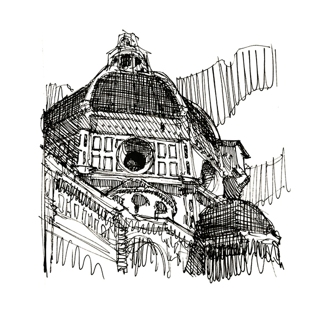
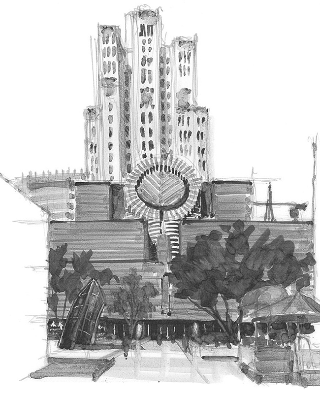
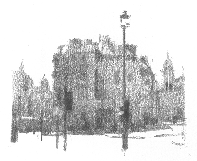
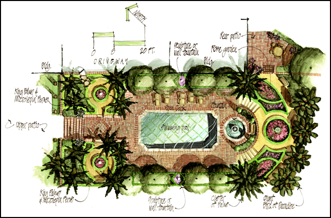
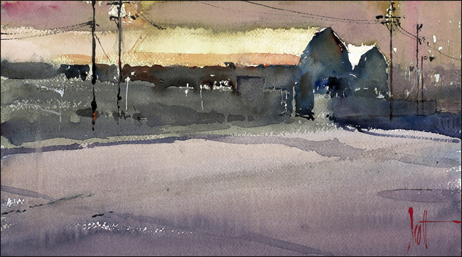
Sketch by Richard E. Scott
Richard E. Scott is a licensed landscape architect, architectural illustrator, watercolorist, and teacher. You can learn about his graphics workshops at www.graphicsteacher.com. To contact Richard about conducting a workshop at your office or school, or to inquire about hiring Richard to produce sketches or renderings for your office, he can be reached at richard@graphicsteacher.com.
An in depth interview with Richard from 2014 can be found here. https://land8.com/profiles/blogs/interview-with-landscape-architect-richard-e-scott/
Buy the book on Amazon
All images courtesy Richard E. Scott.
Interview with Landscape Architect Richard E. Scott — Why I Sketch
“I find that pulling out pens, pencils, and tracing paper and sketching, especially in meetings, changes the mood and the design experience for others in the room in a very noticeable way. The sound of a pencil swishing across the paper, the movements of the arms, people watching something interesting being made with the simplest of tools – it injects fun into the atmosphere, and credibility for the person holding the pencil.”
Richard, I’d like to begin this interview with the 25 year-old question: Do hand-drawing skills have any relevance in the landscape design office of the 21st century?
Yes, for specific reasons. The first reason is production. There are times in the design process, especially early on, when a sketch is hands down the quickest way to develop or present an idea.
The second reason is how a client relates to a sketch or hand rendering. These kinds of graphics express artistry, and they inject fun into the design process. We can overlook how important this is. A client’s perception of value is to a large degree based on emotion. In my experience, hand sketches and renderings elicit a different kind of emotional response from a client, as compared to a computer rendering. Their eyes light up in a different way. There’s more interest, more enthusiasm.
The third reason is credibility. When we sketch, we stand out artistically from those who rely on computers to express their ideas. I’ve seen this play out in many meetings. When a designer can draw, that designer is perceived differently. It’s assumed, even if only subconsciously, that he or she must also have good design skills. Of course this may or may not be true, but it’s the first impression that I’m talking about here. And that impression is key.
The fourth reason, and I believe this to be the most important reason that drawing will continue to be relevant, is it directly develops our own abilities to see and think. Personally, I’ve gained more from observational sketching, sketching from life, than any other activity. It was by doing this kind of sketching that I developed an acute sensitivity to composition, shape, gesture, tonal value, and texture–a sensitivity that helps me to be a better designer. Although it gets little attention in school and in many offices, I’ve found it to be one of the most valuable habits that a designer can adopt. I’m sure that we’ll get into this more during the interview.
So you’re optimistic about its continued necessity and importance?
Absolutely. There are plenty of clients today that value and desire artistry as part of what we do as landscape architects. And there will be offices that serve that clientele with a service that is more personal and artistic. When every firm uses the same software and delivers a product that looks more or less the same, from the clients’ perspective, the main difference comes down to who can do the work for the least price. Instead, I’d rather be focusing on how we can stand out.
How does the ability to quickly sketch out ideas affect the design process?
It gets the designer thinking about how a space will look and feel in three dimensions. It also impacts how others experience and participate in the design process.
First, when we design solely in plan-view, our tendencies are to produce a design that looks interesting from how we’re currently looking at it – from above. But, this doesn’t necessarily translate to a good three dimensional design. I was lucky enough to learn this lesson right out of school. A Landscape Architect mentor shared with me some photographs of a built landscape that he had designed that looked absolutely exquisite. He then showed me what that same design looked like as a site plan–it looked like nothing! I learned that plans and three dimensional spaces were two very different things. From that day forward, I sketched in 3D throughout the design process.
Also, I find that pulling out pens, pencils, and tracing paper and sketching, especially in meetings, changes the mood, the design experience, for others in the room in a very noticeable way. The sound of a pencil swishing across the paper, the movements of the arms, people watching something interesting being made with the simplest of tools – it injects fun into the atmosphere (and credibility for the person holding the pencil). Drawing invites participation in a very different way than when a group is looking at a 3D computer model on a screen. Freehand sketches don’t look polished or complete. They’re rough thoughts, suggestions, on paper. These kinds of drawings remind everyone in the room that we’re making something together. Using simple tools to make the sketches reinforces this point.
As a side note, I’ve come to appreciate the fun of these experiences. The joy of making something. The craft of it. When I was younger, I was laser-focused on the end product–the submittal, the approval, the built project. I now lose myself in each moment of the creative process. These creative experiences are what attracted me to a career in the arts in the first place.
In your book Sketching: from Square One to Trafalgar Square, there is a chapter entitled Emotional Response, where you speak of a “compelling motive”. In this chapter there is a discussion about the emotion, reaction, and editing process involved in deciding on the content of a drawing. How does this exercise of self-examination while sketching help one to become a more informed designer in general, and a more informed landscape designer in particular?
You learn how to connect more personally with a subject matter, and how to evaluate what is most meaningful in that subject matter. By going through this kind of self-examination process, we develop our own personal opinion on a subject or a project.
It’s this opinion that guides every decision, every action. Based on our own opinion, we emphasize those things that we believe matter most, we deemphasize those things that we believe matter less, and we remove those things that we believe are irrelevant. When we sketch, we gain direct experience with this kind of self-examination process. We develop thinking skills, not just drawing skills. And it’s our thinking skills that are of value to a client or employer.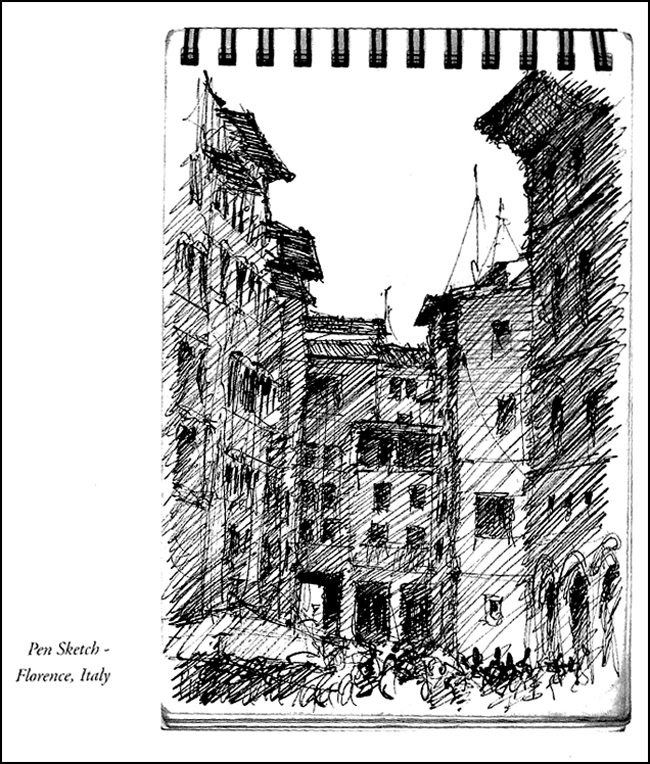
In the book, you passionately encourage travel as a way of immersing oneself in the act of being completely present in a particular place and time. Can you tell us more about that and how that quality of awareness relates to the act of sketching?
Your sketchbook is a record of what you notice. What you notice depends on your level of awareness. Sketching is an effective and fun way to sharpen your awareness. The better your awareness, the more sensitive a designer you will be.This kind of awareness is not accessed by simply looking around you with your eyes wide open. It requires that you actively participate in the experience. It’s in the process of sketching your environment that subtle qualities slowly reveal themselves to you. You become a better seer.
Just as playing a musical instrument will sharpen your ear for music and sound, sketching your environment will sharpen your ability to recognize compelling compositions, shapes, tonal values, and textures. There’s no question that a concert violinist experiences sound and music in a very different way from me, which is to say that she hears things that I don’t. Think about that. She hears things that I don’t, even though we’re in the same room. The same is true for how we see the world around us. When you sketch, you will see and notice things that you didn’t see before. Sketch each day for fifteen minutes, and in six months you’ll be impressed by how differently you see the world. This change can and should impact how you design and solve problems. But, even if it didn’t, it would still be worth your time because you would notice more – your moment to moment experience would be richer. What could be more important than that?
Last thing, although travel is important in broadening one’s perspective, and therefore choices, it’s not necessary to travel to gain access to a higher level of awareness. Simply open a sketchbook and immerse yourself in the place and moment you’re in right now.
How is your sketching style reflected in your landscape design philosophy? In other words, does your particular design philosophy relate in a conscious way to your sketching style or vice-versa?
Sketching has improved my awareness and appreciation of composition. And I’ve found that composition is one of the most difficult things to learn or teach in the arts. I’m not sure it can really be taught at all. But it can be picked up through experience. It’s through direct experiences, like sketching, that one develops a sensitivity to it.
My own sensitivity to composition impacts how I design landscapes. I look at every object, a tree, a terrace, a building wall, a doorway, a furnishing, and so on, as an abstract shape. Each shape that is introduced into the design must harmonize with the exiting shapes (the larger context). By this I mean that the “new” shape should be placed and configured in such a way that it makes the surrounding, existing shapes look better. It’s my opinion that most options will not make the overall composition better, but worse. My job as a designer is to find those relatively few options that improve the look and function of the whole.
When one does a good job with this, the new shapes harmonize so well with the existing shapes, that it’s hard to imagine it any other way. And when it’s built, it looks like it’s always been there.
Have you “always” been able to draw well?
I’ve had the impulse to want to draw since I was a child. Because of that impulse, I practiced a lot. Any ‘talent’ that people felt I had was simply a result of practice. I think that anyone reading this interview likely shares that impulse, even if they haven’t yet acted on it. When it comes to drawing, effort matters more than talent. It boils down to committing a portion of each day to sketching. Fifteen minutes each day, no matter what, is a great target to start with. The reader can find additional tips on my sketching website.
In the conclusion of Sketching: from Square One to Trafalgar Square, you describe the sketching experience in terms often used to describe the practice of meditation. What do you see as some of their more important commonalities?
Raising your awareness and, as a result, having a richer experience of day to day life can be experienced through both practices. Being less judgmental is another experience that can be learned through both. In sketching this means being aware when your mind criticizes your own work—a common experience when you’re learning, or are a perfectionist. In my book, I discuss how to shift your attention from what you see on the pages of your sketchbook to what is happening inside your own mind. This approach is critical to getting the most out of the experience, and generating the enthusiasm to keep at it.
In answering your question though, what really comes to mind is the inability of words to really describe either experience, and what can be gained by doing them. Awareness, seeing, and sketching are all words that seem easy to grasp, but these words really don’t connect with what the actual experiences feel like. The journey is very different from the map.
Experiencing them is the only way to learn or understand them. In adding these habits to our lives, we find that the greatest benefit, the greatest reward, is not in anything we produce, per se. It’s the subjective experience we carry around in our heads from moment to moment. Through practices such as meditation and sketching, life becomes richer, and we feel a deeper connection to the world that we’re a part of.
Can you tell us about that first job where your drawing skills were instrumental in helping you land the gig, and also how your story might be applied to today’s job seekers?
I got my first job in landscape architecture solely because I could draw. I was a year out of high school and was lucky enough to see a wanted ad in the local paper. I didn’t even know what landscape architects did. I showed them my drawings and was hired. I think I made six or seven dollars an hour at the beginning, and was thrilled to be making money for the first time by drawing. I was in heaven. After a few days on the job, I knew I’d found what I wanted to do for a living. I’ll forever be indebted to them for that first opportunity in the profession.
Drawing continues to be a sought-after skill today, even though it’s rarer than it used to be. And I think that employers who are designers at heart will always appreciate a person who has a love for drawing. I say this because the sensitivity, the creativity, and craftsmanship that one gains through drawing can very much benefit an office. I have a landscape architect friend who recently told me a story about some interviews that he conducted with students for an internship opportunity. The first one who pulled out a pencil in the interview got the job.
Since 2008, how has your business strategy evolved in order for you to stay afloat in the landscape profession?
My strategy is in offering a range of different services, and being continually mindful of why I’m hired to deliver those services.
As a landscape architect, I feel that the advantage I bring to a project is my ability to see (learned through sketching), and a willingness to listen (and ask many questions). To my mind, it comes down to applying those two skills again and again to better serve a client. I never forget that.
As an architectural illustrator, I feel the reason I gain work is my enthusiasm with working with other designers, and my love for producing compelling imagery. I do everything from quick concept sketches, to illustrative plans, to refined watercolor renderings. Wearing these different hats, designer and illustrator, means that each week is different, which I like. They also inform and enrich one another.
I also teach workshops, produce artwork, and sell books. All of these activities produces different streams of revenue, and all have a common theme: to add beauty to the world, and to help others do the same. Each morning, I wake up enthused by what I get to do each day, and appreciate what a privilege it is to make a living in the arts.
As a longtime educator, you’ve inspired countless design students to draw. Are there particular designers or artists whose drawings inspire you?
For years I’ve drawn inspiration from Lawrence Halprin, Roberto Burle Marx, and Laurie Olin, because they were landscape architects that successfully applied sketching and art to their design processes.
I also look to animation for inspiration. Each time Disney or Pixar produces an animated feature, they also release a book about the process of making the film, usually called “The Art of fill in the movie title.” You can’t believe how much usable information can be found in these books, and applied to what we do. And it’s inspiring to see how artists and designers at cutting edge companies like Pixar continue to freehand sketch today to design and develop scenes and characters.
As for artists, John Singer Sargent has made the biggest impact on my illustration and artwork. There’s a new book on him called “John Singer Sargent Watercolors.” A great go-to source for daily inspiration.
So in closing Richard, is there a particular up-coming project, or something “on the boards” that you would care to share with us?
I’m working on some designs for estates right now in Bel Air, Malibu, and Montecito. I enjoy this kind of work because I get to be involved in every aspect of the design and building process…from concept sketches to grading and drainage, to construction details. Back at the studio, I’m doing some watercolor renderings for architects and landscape architects that I work with. I also have a graphics workshop in the planning stages at UNLV, and I’m planning some graphics workshops later this year in Pasadena.
Richard E. Scott is a licensed landscape architect, architectural illustrator, watercolorist, and teacher.
Richard E. Scott’s new book, “Sketching: from Square One to Trafalgar Square” can be purchased at www.sketchingfromsquareone.com or amazon. You can learn about his graphics workshops at www.graphicsteacher.com. To contact Richard about conducting a workshop at your office or school, or to inquire about hiring Richard to produce sketches or renderings for your office, he can be reached at richard@graphicsteacher.com.
All images courtesy Richard E. Scott.
Lead photo of Richard by William Wray.
Thanks to Kim Rhoads for #s 7 & 8.
Interview with Bernard Trainor of Bernard Trainor + Associates
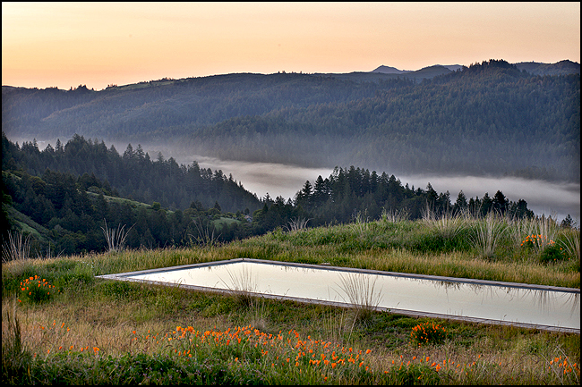
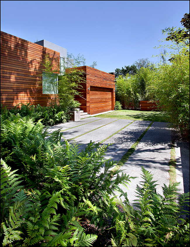
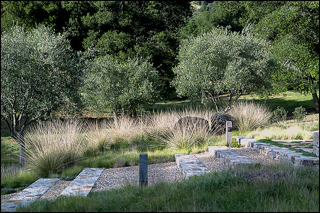
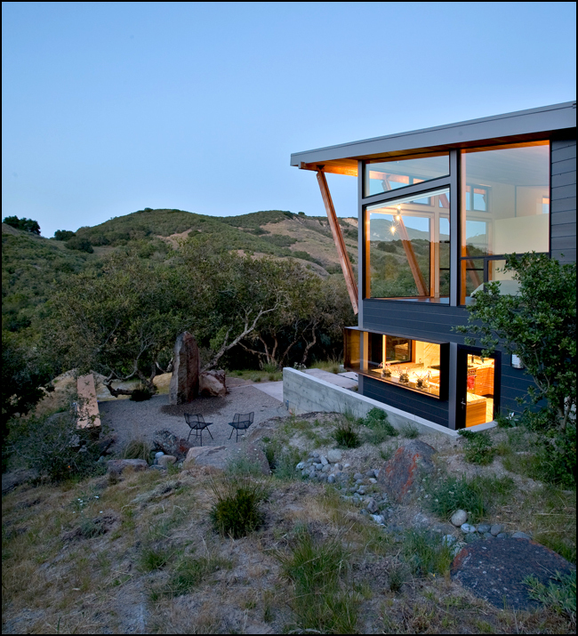
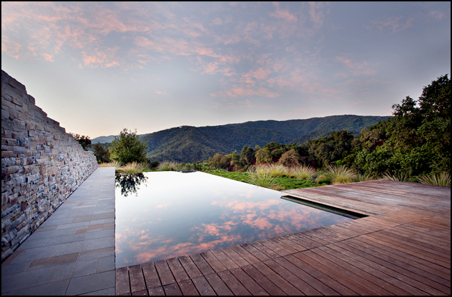
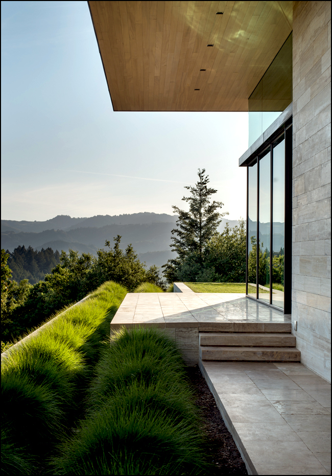
Bernard Trainor is founding principal and design director of Bernard Trainor + Associates in Monterey, California. Many of BT + A’s large-scale projects include sites adjacent to California’s protected areas and state preserves. So by necessity and desire, BT + A’s design work performs that integral dance between design intent and the elements of nature. His recent monograph, Landprints: The Landscape Designs of Bernard Trainor, by Susan Heeger, beautifully portrays 10 of these special places.
“I have come to realize that I am just adding a layer to the good work of the many who came before me. I am happy with that–I just want the layer I am adding to be really good!”
How does a young surfer from southeast Australia find himself designing regionally appropriate landscapes in central California?
Timing is everything. I would say that I arrived into the right environment at the right time with an intent to create meaningful designs. In retrospect, it appears like I had been working toward this, and when it all came together, it felt right.
Coming from Australia, do you believe you see the California landscape differently than one who has been here most, if not all his or her life?
I don’t think about, it but when asked I guess so. Maybe I look at the landscape with more inquisitive eyes than one who takes it all for granted. That said, I have met with clients who come here to build and on occasion they import ideas from elsewhere without looking for a connective tissue with this culture or place, so seeing it fresh does not always lead to good things. One has to arrive with open eyes and humility for the place. Too many people, unknowingly of course, want a design that would overpower and suffocate the local identity.
So how do you believe that difference informs your approach to regional design?
I try to remember that the best gardens I have seen throughout the world all have one thing in common—they look like they have grown from their particular location. This means the designer looked closely at what exists there. This is what I aim to do.
You’re known to spend many days walking a site before beginning work on a design. What happens on these walks?
I try not to arrive with any agenda. Naturally I stay open to my responses to the existing site. Yet these responses are not the design, they only inform and initiate the design process. Design can’t shy away from intention and intervention. My designs are certainly tailored and responsive to the site. They enhance the existing context, without replicating or being afraid to show that humans are involved–after all, we are nature too.
You spoke at Dwell on Design this past June; where you discussed the work on an Eichler remodel project in Sunnyvale California as informing your approach to some of the more recent projects. Can you give us an example or two of what sounds like a bit of adjustment in approach?
I would say the urban gardens are about manufacturing a sense of place, using all available design tools–while the rural projects are more about great site design without using all the design tools and gimmicks.
Where it can be gleaned, how much does the “original intent” of a previous design come into play when working on a remodel project such as the Eichler house?
On the good houses, I think there is a nod to the past. But time did not stand still since it was built, so I use everything I can to update the gardens toward a ‘today’ attitude. That said, the new ideas are an extension of the original design philosophy rather than being in opposition to it.
In the introduction to Susan Heeger’s Landprints: The Landscape Designs of Bernard Trainor, you mention your learning process as including some clumsy mistakes along with fulfilling successes. Your honesty has to be refreshing to emerging designers. For the sake of educating others, can you speak (in general terms of course) about a clumsy mistake made early in your career?
Scale, scale, and scale…look at the “overall” rather than item by item. Let me state the obvious: It is said often but rarely enacted well–less truly is more! Start with a clear analysis of the place and let this inform a clear design intent.
While reading Landprints, I was reminded of a quote by Richard Nuetra that advises designers to “heighten and intensify what it (in this case landscape) has to offer, never work against its inner grain and fiber”. This sounds like Bernard Trainor could have written this himself. Does this quote resonate with you?
The design masters who practiced from the 1930s through the 1960s are full of quotes like this. I am a bit of an old soul and many of my favorite Californian designers are from this general period. When I was younger, I tended to think the work I was doing was breaking some new ground, but in fact I have come to realize that I am just adding a layer to the good work of the many who came before me. I am happy with that–I just want the layer I am adding to be really good!
The most dynamic and vital zones within a landscape are the transitional spaces, particularly the zones that unite the domestic with the wild space. There is a wonderful quote in Landprints about your role as a landscape architect as “mediating between the human and the natural worlds”. Can you please speak more about these inclusive areas and your philosophy about their importance?
For me this is one of the most important parts of my work. It is very simple really–each of these zones has its own needs and these needs have to be acknowledged. It is about the tissue between them. There really is no formula. It is a feeling you get about what feels right–in a word, balance.
In my opinion, your work achieves that elegant and intuitive balance you speak of—the balance between, on the one hand design/development, and on the other, being a true advocate for the site itself, and the region beyond. Does this dual role create conflicts for you during the design process?
Not really–this is my thing and I have failed if there is a conflict there.
The incorporation, or re-use of existing (onsite) materials is a common element in much of your design work. Besides their sustainability value, can you tell us why these materials (both soft and hardscape) are important to you?
For a couple of reasons–there are of course the sustainable and economic reasons. Then it just feels so good to re-purpose something in a fresh way–to give something a new purpose and a fresh meaning in the context of the new design is thrilling.
Many visual artists struggle with the issue of “knowing when (or where) to stop.” In Landprints, you speak of a “total inevitability”. Can you define this phrase “total inevitability” for us? Also how do you approach this question of completion?
I am known for constantly refining the total design during the process. I think this has to happen in landscape design. That said, I am adamant that the philosophy behind the master plan be adhered to and there has to be a good reason for change. When I look back at our overall designs, they barely change, but the details are always being evaluated during the process–the ‘little’ things matter.
Who are some of your design influences from outside the world of landscape architecture?
David Nash, song writer Paul Kelly, Apple, Big Sur, and my girls.
Is there anything “on the boards” that you can share with the readers of Land8?
I would say there are many good projects. The thing that is most gratifying is the variety and professional level of architects we get to work with. It makes me proud to form long-lasting relationships with collaborators who are proponents of our work.This may sound cheesy, but the team in the studio is my best design–Michael Bliss, David LeRoy, Ben Langford, Chris Merritt, Vanessa Hefti, Braden Patterson, and my wife Melanie. If I had not put this group together I could not work on these projects–especially at the high level of design we aspire to.
All images courtesy of Jason Liske
Related Posts:
Book Review: Landprints: The Landscape Designs of Bernard Trainor | Ben Boyd
Member Spotlight: Interview with Bernard Trainor | Jessica Wolff
Interview with “Guru of Grasses” John Greenlee
Called the “guru of grasses” by Sunset magazine, John Greenlee is an outspoken advocate for the American meadow and the numerous benefits of grassland ecologies. In this interview, John speaks about growing up in suburban Southern California, designing with grasses and sedges, and the ecological wisdom of replacing that conventional lawn with vital habitat. Read on!
“For me, the draw of the meadow has to do with how meadows capture light and movement. No other group of plants can do what grasses and grass ecologies do.“
What makes a meadow a meadow?
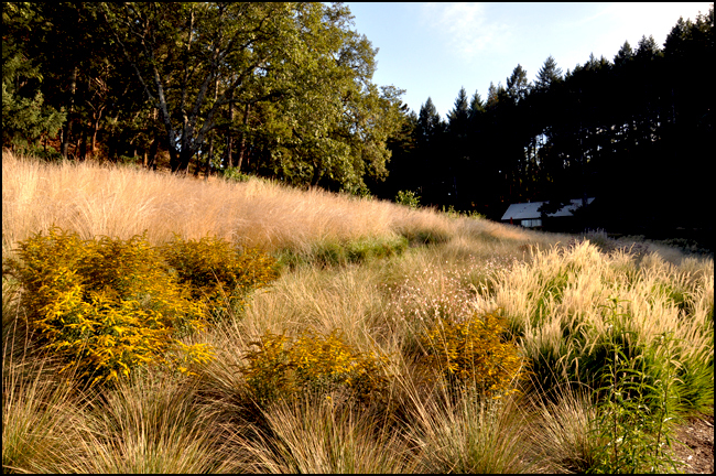
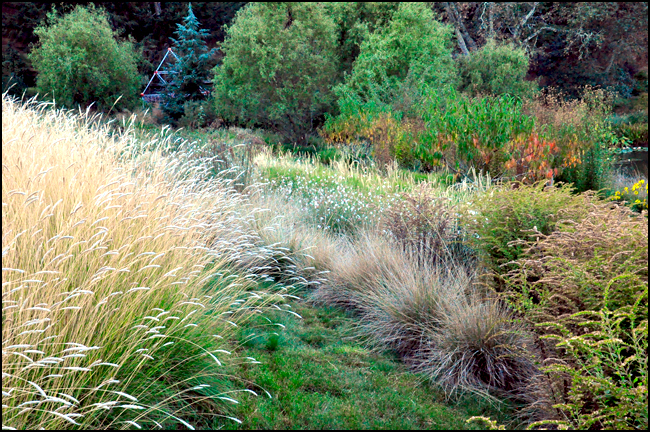
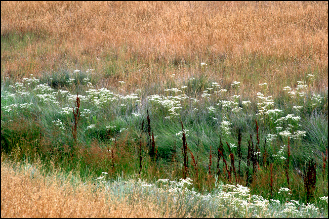
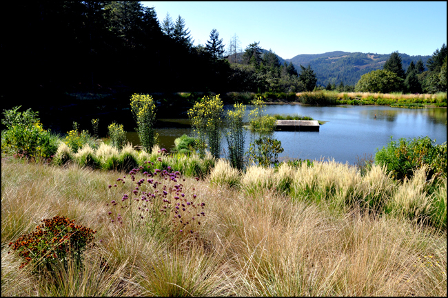
While there is actually no real scientific definition of a meadow, it is pretty much a term used to describe grass ecologies that are mostly comprised of cool-season growing grasses. Prairies are generally made up of warm-season growing grasses. Meadows also have a connotation that is more “romantic” or “people friendly” than prairies or savannahs. Many people think of mountain and forest openings as meadows. Most people have positive feelings about “meadows”, that is why I like the term. Meadows tend to be in the range of ankle to just under 3 feet tall.
Can you tell us what you believe to be the draw of meadows on our psyche?
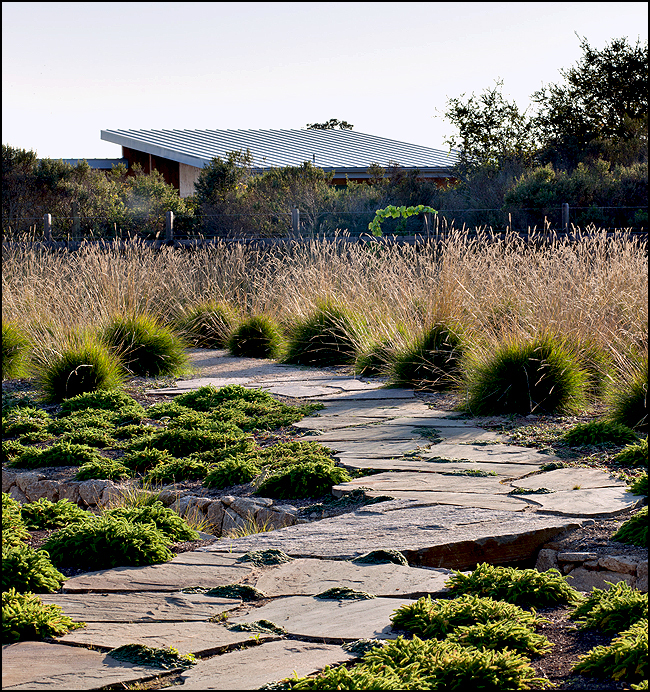
I find it interesting that most true meadow ecologies are where you want to live. Meadow ecologies are usually light-filled openings near trees and water. If it is too wet, it is a swamp; too many trees, it is dark and dank. Most meadow ecology is the sweet spot that is fertile with well-drained soil near trees and water. It is usually the first land to be farmed and inhabited. For me, the draw of the meadow has to do with how meadows capture light and movement. No other group of plants can do what grasses and grass ecologies do.
So many of our favorite blooming plants are found in meadows and I love how grasses work with flowering plants. Take wildflowers blooming in a meadow: how they emerge, put on a show, then take a step back, only to be sequenced by another component as the season progresses. In a real meadow, or well-designed grass ecology, there is a dynamic, ever-changing palette that is way more interesting and alive than any lawn. When I design meadows, I always try to put you in them, not just viewing them from the side.
original image: John Greenlee
So why do we need an alternative to the traditional lawn?
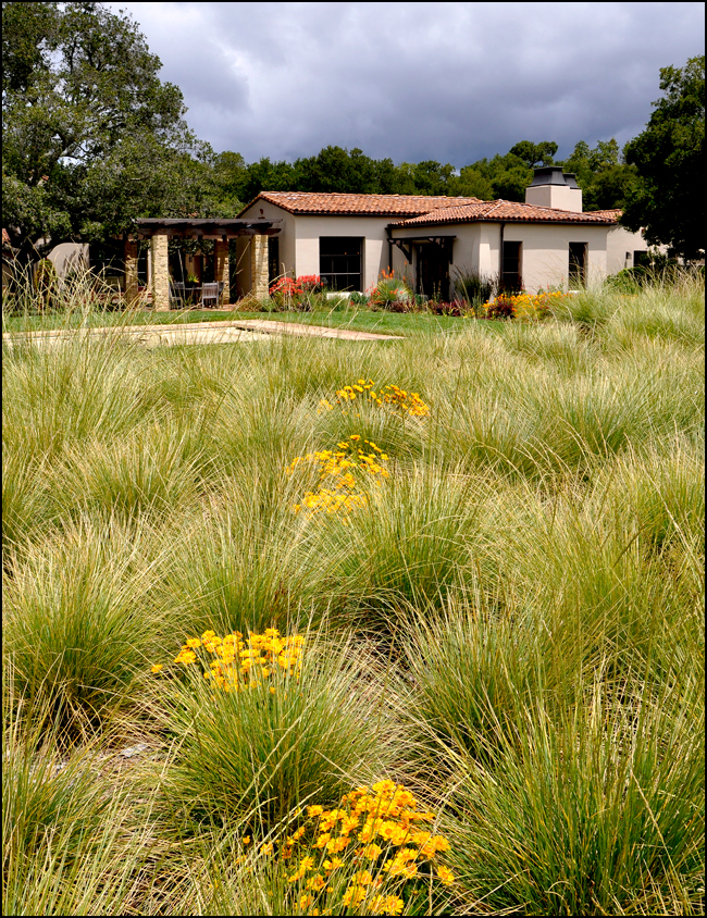
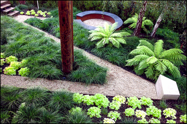
I prefer the term “conventional” lawns to traditional lawns. As a designer, I understand what lawns “do” as a design element. A low, green, uniform panel for the eye to rest, and of course for sports and recreation. But the truth is, the vast majority of mowed lawns are never used for sports or recreation. They are green rugs that have serious environmental consequences when the full effects of water use, chemical use, and air and water pollution are added up. If you want a green, grassy panel, why not plant “alternative” lawns out of native grasses and sedges like Carex praegracilis, Carex pansa, or Poa arachnifera? Once you stop mowing all the time, alternative lawns can actually create habitat instead of destroying it.
When and where did your passion for meadows begin?
As I say in my book, The American Meadow Garden, my love for meadows began as a boy scout, spending summer in the local San Bernardino Mountains. I grew up in suburban Orange County, California in the 1960’s when development was rolling down like a carpet over the landscape. There were no “meadows” where I grew up; I found them in the local mountains.
Also, in The American Meadow Garden you speak of a couple of your childhood experiences involving meadows. For those who have yet to read your book, can you speak more about those experiences?
I was always trying to dream my self out of L.A. where there were not typical seasons and all the rivers and creeks around me where literally paved. We did have an old field on the edge of the orange groves near our house when we were growing up. When you are 5 years old, grass really seams tall. There is something special about just grass and sky. It is powerful.
I distinctly remember coming across meadow lark nests as a child – blue eggs in a nest of grass stems hidden in the grass. That liquid sound of their call is so distinctive that once you know it, you cannot forget it.
original image: John Greenlee
Where do you stand in the “native species vs. introduced species” debate?
This is a great question because the planet is in serious trouble. For me, if a grass or sedge is not native to a particular region, it better be well-behaved. I use a lot of natives in my work but, by restricting plant lists to all natives and mandating only certain species, we are missing the point that you cannot stop evolution, and climate change is bearing down on us like a freight train. A panel of non-native grass, even perhaps a so-called invasive, does far less harm to the environment than a conventional, mowed lawn. At the rate we are destroying the planet, we are going to have to pick and choose our battles.
Some grasses are problematic in some climates and not others. In the south and west, Bermuda grass is the greatest enemy of native grass ecologies but you can buy seed and sod of Bermuda grass at the local, box store. Yet in my area, some fountain grasses are outlawed. Some communities ban the use of Roundup. Now what? You cannot just wish it away. I would need a lot more time to explain myself but there has to be a balance. You cannot just turn the “way back machine” to pre-European settlement and hold it there. Disturbance ecology and some non-native ecologies can still help clean up the environment and create habitat. A lot of native ecology must be burned to stay healthy so what then? We so need balance and compromise in our actions.
There is a wonderful essay by Kathryn Smith titled The Pavilion in the Garden. In this essay, Smith discusses the primacy of landscape and that successful architecture sits in dialogue with its regional landscape. Does this phrase “pavilion in the garden” have a resonance for you and your work?
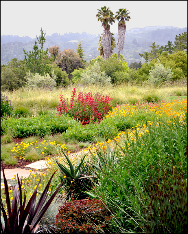
Well of course it does. California was originally over 1/3 grass ecology, now less than 10% of that is left. I am sure if there were more grasses in the nursery trade when Midcentury Modern was born, there would have been lots of grasses in gardens. Let us face it, many of California’s famous landscape architects were not good plantsman, and their gardens show it as they have not aged well. Ecology is important and bad horticulture makes for shitty design. Fashion is fine, as long as it is ecologically sustainable.
It is interesting that most grasses are a neutral design element. Pair grasses with succulents, it works; pair them with conifers, it is a woodland feel; with roses, a fragrant, romantic meadow. Grasses, well used, can fit into almost any scheme.
original image: John Greenlee
Habitat restoration is a vital element in larger-scale work done with governmental agencies as well as with some private clientele. What role have you played in this area of practice?
Finally we get to the heart of the matter. Lead, follow or get out of the way. Landscape architects, we are not just decorating the planet any more, we have got to think about all the other creatures on this earth. As a plantsman, I am here to help. Let us work together, architects and plantsman, to put habitat into every garden we make.
I will tell you a story. I did a consultation for a large hospital project in California’s Central Valley. They were afraid that if we made “habitat”, if “we built it and they came”, they would not be able to develop the rest of the property. So they went with lawn instead and insisted we not use the word “meadow” in our designs. How screwed up is that? There has to be a balance! The way many of these regulations are written, there is no room for common sense! We have got to change some of those regulations to allow for development and restoration.
Aesthetically speaking, how do you create an appropriate fit for meadows within the geometries of the currently fashionable retro-modernist gardens?
If modernism means you can only use 2 plants, I am not in favor of modernism. I understand the glory of going big with one or two plants but I have got to have seasonality and diversity in my gardens. If you are not adding plants for habitat and pollinators, your “fashion statement” shows a disregard for the serious trouble our planet is facing. This is the reason I like bulbs so much – in many of my meadows, there are maybe 3 species of grass woven together to be a fabric that reads as one. Then there may be over 20 species of bulbs and perennials that at any one given time, only one or two are firing off. So it reads simple but is actually quote horticulturally sophisticated. There is a progression of the accents as the year unfolds.
Are meadows functional at an intimate scale?
Of course meadows work on the small scale. Wolfgang Oehme said most American lawns are “silly lawns” – too small to be used, just plain stupid. In a small garden, a tidy panel of sedges, like Carex pansa in the west or Carex appalachica in the east, are not only better for the environment, they are more beautiful and easier to maintain. If we converted even 10-20% of America’s small lawns to meadows, the ecological benefits in reduced water use and better air quality would be enormous!
Landscape Design: Stefan Thuilot. Landscape Design Consultant: John Greenlee. original image: Stefan Thuilot
Landscape designer, consultant, nurseryman, meadow ecologist, business owner, and guru of grasses: How do you handle these different roles? Are they clearly defined on any given day?
Funny you should ask. Sunset Magazine labeled me a guru and I am still trying to decide if that is a good thing. I think being a nurseryman made me a better designer and being a designer made me a better nurseryman. When I see plants in nature, I am always thinking how it can be used in gardens. I am still always on the lookout for new plants. I am glad, however, that I sold my nursery to Suncrest Nurseries in Watsonville, CA and now I do not have to worry about growing the plants anymore. I was wearing too many hats trying to be a nurseryman as well as a designer. Now I can really focus on my design and consultation work and Suncrest does an excellent job of growing my plants. I do my own design work but much of my time is spent helping other designers create meadows and grass ecologies. My connections, forged from 30 years in the nursery industry, help me source the plants I need for myself and my clients.
I personally really enjoy making meadows. I do much of my meadow design and layout in the field and I tell my clients from the beginning that I prefer to layout the plants on site. That being said, I can put it on paper but that is a lot of work as well. When I am working with other designers, I tell them to get their best colored pencil set out and let us do a color study, and then a volume study, and I can take it from there. If you are a designer, I can help you with as much or as little help as you need. Many of my consultations are only for an hour or two of my time, but it is crucial to the success of the project.
A lot of my consulting work is fixing things that go wrong. It is so much better to do it right the first time. Too much of my consulting work is from failed, hydro-seed mixes; seeding is such a roll of the dice. I prefer planting meadows from plugs, or a combination of seed and plugs. There are so many ways you can go wrong.
The creation of meadows has taken you around the world. What are some of the more interesting locales where you have worked?
The most amazing part of being a “guru” is the strange projects I get drawn into. I loved working with Paul Comstock on Disney’s Animal Kingdom in Florida. I still think it is one of the most amazing gardens in all of North America. If you think kids and dogs are hard to design gardens for, try making a garden for rhinos. Actually much of my zoo work, working for animals, is immensely more satisfying than some of my clients.
I love the gardens I have made in Hawaii and north in Canada…it is exciting to work in different locales. The best part is the network of nurseries that I work with that provide me with local experts. There is no substitute for experienced, local, nursery connections. I am chomping at the bit to do something in Southern Europe because my last visit highlighted that we have more Mediterranean meadow plants here in North America than they do. I spent some time this summer with my hero and fellow plantsman, Piet Oudolf. I was amazed that my nursery associates in California, Suncrest Nurseries, had more native European grasses and sedges than Piet’s local sources. I am going to be sending him native Dutch grasses later this year! I also enjoyed working with James Corner Field Operations on Tongva Park in Santa Monica. This is one of the first of my meadow plantings to be a public park, not just a large private estate. We got to use some of my best, new grasses for California and lots of Mediterranean bulbs that never seem to get into public gardens.
Can you tell us about one or two of your personal favorite “wild meadows?”
I continue to search out native grasses ecologies wherever I go. In Southern California, you must see the Santa Rosa Plateau, a Nature Conservancy managed grassland. I just went to see the grass ecologies in the Eastern Sierra Nevada and was blown away by the saline meadows around Mono Lake. Lucky for me, wherever I go, there is grass. My last “prairie dog” adventure was to the Chiricahuas in southern Arizona. The Chiricahuas are a spine of the Sierra Madre Mountains that come north into the U.S. and are an ecology where desert grassland morphs into oak-pine forest. Edge ecology is always where the action is. Our trophy collections were pinyon ricegrass, Piptochaetium fimbriatum, which I had previously seen only in English collections. We still have so many great native grasses and sedges to bring into the nursery industry so we can put them in our gardens. I will say that I am really excited about the new clones and selections we are making on native western grasses like Leymus triticoides ‘Laguna’ (not yet released) or Bouteloua gracilis ‘Blonde Ambition”. These are standout performers of native grasses that are especially suited to meadow gardening in a Mediterranean setting. Seeing a plant in nature helps you understand how to use them in your work.
Santa Rosa Plateau. original image: Marie Carter
What do you see in the future for meadow ecologies?
The typical American lawn needs to become a thing of the past. Time is up. We need a new paradigm and grasses and sedges are the key. Every parking lot in America, every driveway, every street needs to drain into bio-filters and constructed wetlands. We need green roofs and living walls. We have got to clean up this mess we have made. Grasses and sedges will play an important role in this effort. I can tell you the grasses will be center stage in these movements.
original image: John Greenlee
So, in closing, is there a particular up-coming project or something “on the boards” that you can share with us?
(Laughs) I wish I could tell you. They keep making me sign nondisclosure agreements – it is frustrating but what are you going to do? It is such a small world what we do, does it really need to be a secret? Let us just say I am working on a project that, if they take my advice, will be the most sophisticated, Mediterranean meadow that has ever been made. The majority of the plants are California natives but we can use non-natives (mostly southwestern U.S. natives but some South African plants as well) as long as they “feel” like California. I cannot tell you how excited I am to work on this project because I am getting to work with some giants of landscape architecture who are not afraid to know when to raise their hands and ask a question.
Lead image: John Greenlee at Dwell on Design, June 2013; photo by Mitch Howard
Santa Rosa Plateau image via Marie Carter
Interview with Pete Nelson of Animal Planet’s Treehouse Masters
You may know him as “The Treehouse Man” from Animal Planet’s Treehouse Masters, but Pete Nelson of Nelson Treehouse and Supply is also one of the eminent authorities on the subject of arboreal architecture. He builds treehouses, writes books about treehouses, and provides the world with materials and supplies for treehouses. Treehouses have been a large part of Pete Nelson’s life for more than 20 years. It was Pete Nelson’s inspiring talk at Dwell on Design in June of 2013 that led to this follow-up interview.
Why build treehouses?
I build treehouses because they move me. They get me up, excite me, and put me outdoors and in the woods. They challenge my creative side and also unite me with friends, colleagues, and, when I’m really lucky, entire communities.
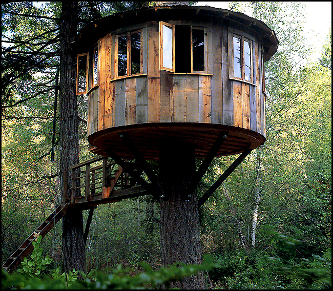 Sam’s Treehouse, Washington. Original Image Credit: Radek Kurzaj
Speaking of the communal experience, being in a treehouse seems to fulfill some primal need; sparking an instinctive joy in people of all ages. Can you tell us what you believe seems to be behind this experience, that in some way does seem primal?
I feel that it goes way back. Climbing up into a tree calms us. Our heart rates actually drop when we get up into trees. It must have something to do with feeling safe – escaping the dangers of the forest floor. The joy comes from creating a space that is often all your own. I can remember the feelings of joy I had when I built my first treehouse as a grade-schooler. Now-a-days, I get joy from working with what nature provides (in tree form) to create similar places for others. It’s a joyful experience no matter how you slice it!
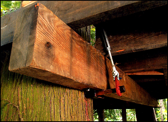 TAB (Treehouse Attachment Bolt) Original Image Credit: Michael Matisse
What are some elements of your treehouses that differentiate them from the neighborhood treehouse?
The two key concepts to grasp in building in trees is that trees grow and trees move in the wind. Hardware these days allow for both. The simple and strong TAB (treehouse attachment bolt) is a basic building part that we use to connect respectfully to living trees. They are big – 3” in diameter – and they withstand tremendous forces. In some cases they can hold 10,000 lbs. per bolt. We use them often, along with sometimes even more intense hardware, and they are obvious in each of our unique builds. They allow us to create just about anything we can imagine aloft, and not lose sleep at night!
So how does your company, Nelson Treehouse and Supply, use these methods and materials to minimize the impacts on the tree (or trees) that construction may have?
The arborist community has been involved in the treehouse building movement since we started meeting annually in the late 1990’s. We have found that the preferred hardware is being absorbed readily by healthy tree(s). We feel as a group that each connection to a living tree should be used to its greatest ability, and that the fewer tree penetrations, the better. Make each connection count, in other words.
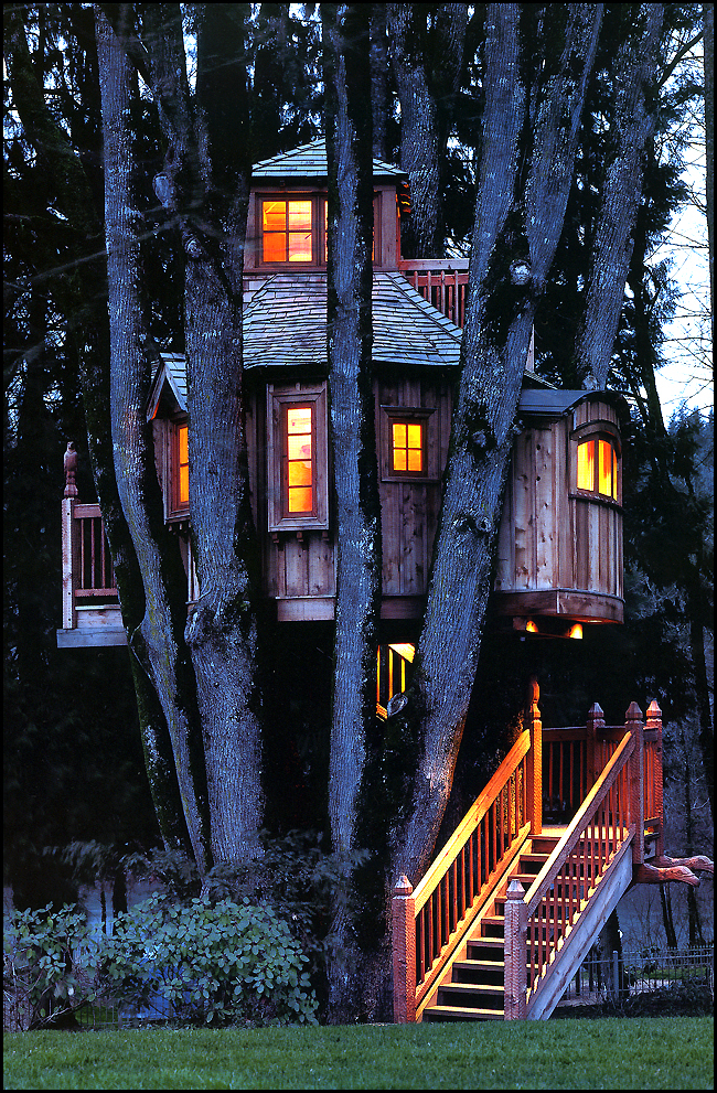 B’Ville Treehouse, Oregon. Original Image Credit: Paul Rocheleau
In many ways, treehouse construction is one of the best examples I know of site-sensitive and site-responsive architecture. Can you speak about this?
Well, we don’t cut down the trees to do our work, for one. We surely use wood in the construction, however. As much as we prefer to use recycled and re-purposed wood, budgets do not always allow for that. Site responsive design is imperative. The trees themselves set the parameters of every job. One of my favorite parts of this job is interpreting what the trees offer in terms of platform configuration. I am completely driven by what they allow. Only from that initial understanding does a full design take shape.
Speaking of re-purposing, I see you do a great deal of work using reclaimed materials. Can you tell us something about your particular philosophy regarding salvaged, or re-claimed materials in treehouse construction?
I initially used salvaged materials for the same reason that we all did – they were mostly free! In the true spirit of tree-fort building, you always needed to fit into the tight or non-existent budget of a 12 year old. As a result treehouses have an iconic rustic and scavenged look. It is always fun to recreate that look, but now we want the structures to last for more than just a summer or two. And the salvaged lumber business went mainstream. The prices for quality salvaged lumber shot thru the roof in the early 2000’s and now seems to be headed that way again. It feels great to use that stuff, though. To me, it’s like alchemy. We turn dark, splintery, nail-filled 2×10’s into gold! A salvaged fir floor, or wall, or anything is warm and beautiful. And you will always have a story of where it came from too!
I love the comparison between re-purposing and alchemy. Can you also tell us a bit about the practicalities of using salvaged materials on the job-site?
Using salvaged materials can be expensive. It sounds great when the friend says “come and get it”, but this is often the beginning of what can be a long journey. Cleaning and storing the material adds cost. I have collected great salvaged materials for years, and I have learned the hard way that storing lumber, for instance, can be tricky. Keep it stickered and dry. Otherwise it goes back to the earth rather rapidly. Especially where I live, outside of Seattle, where the weather is notoriously wet. It is also critical to be sure that if you plan to use salvaged timbers for structural elements – like the main beams – be sure that the wood is free of any serious knots and defects. These can compromise the strength of a beam in a big way.
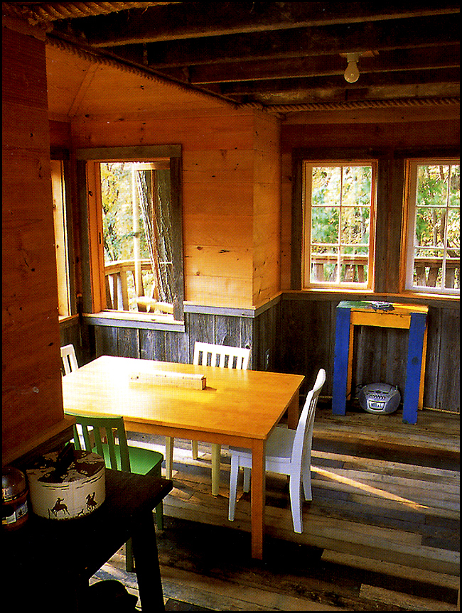 The Treehouse, New York. Using 100% salvaged materials. Original Image Credit: Pete Nelson
One common theme that runs through your workshops, talks, and your writing, is how to navigate the planning and building departments of local municipalities. In your most recent book, New Treehouses of the World, you speak of the possibility of developing guidelines in collaboration with King County (home of the annual Global Treehouse Symposium) officials in Washington for constructing treehouses in a responsible and environmentally sensitive manner. So how is that progressing? Is there a possibility that a set of guidelines may one day be codified?
It has progressed nicely in King County, WA. We now have guidelines that are meant to soften the visual impact of treehouses, should one appear in a riparian set-back, for instance. They mandate the use of natural materials for siding, and no direct lighting for instance. The permitting of treehouses is still a sticky wicket, however. It is hard to convince the powers that be that a certain tree can withstand the weight of a substantial structure. They like to see the stamp of a certified structural engineer to help deflect liability down the road. That is understandable. One day I hope to have the TAB understood to the point where there is a page or two in the International Building Code that can help building inspectors feel like they understand and are comfortable with a given treehouse project.
A Pattern Language by Christopher Alexander is a book with which many of our Land8 readers are familiar. How has this book influenced your philosophy and your methods of treehouse construction?
I love that book! My favorite part to tell clients about is in sighting a treehouse, try to avoid the most beautiful part of the property. If you have options, maybe preserve that part so it can become part of the view. You will never be able to improve the prettiest spot, so don’t try. I also like to go against one of the corollaries – the one that says a house or building should have a clear point of entry. I prefer to hide entrances to treehouses.
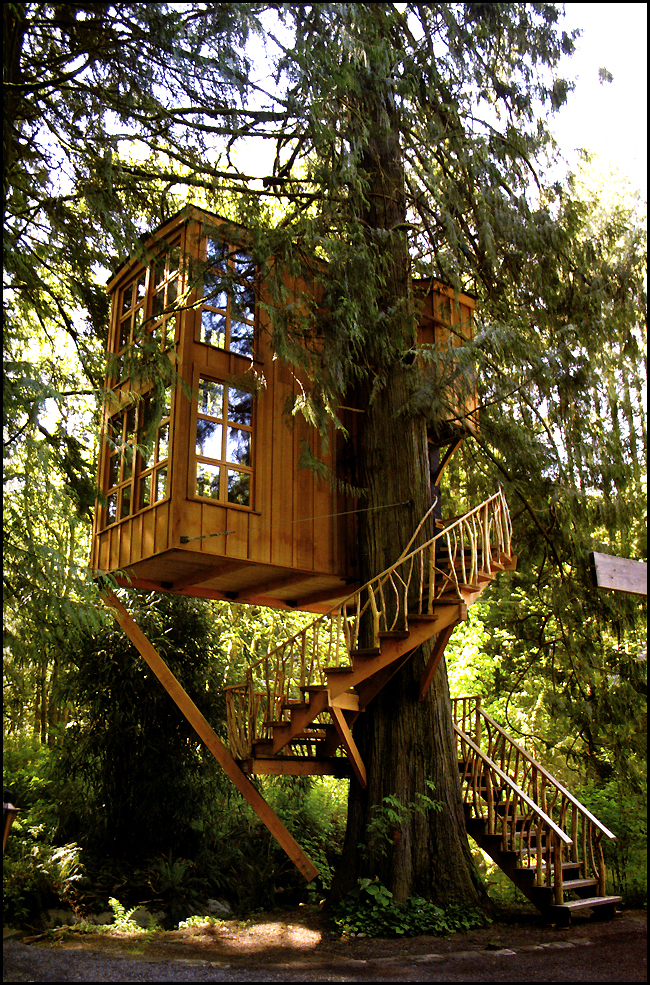 Trillium Treehouse, Washington. Original Image Credit: Pete Nelson
Have you built any treehouses in collaboration with a Landscape Architect?
We have worked with several wonderful landscape architects over the years. They all seem to get this concept!
Can you give us a brief rundown of different ventures you are involved in as the “Treehouse Guy”?
This career choice has opened up so many doors to me. It has been a truly glorious experience all along the way. Right now we are trying to figure out how we can start 401ks for all of us working at NTS (Nelson Treehouse and Supply). We have a successful TV show on Animal Planet called “Treehouse Masters”, and more work than we know what to do with as a result. The problem is that we all want to grow with intention rather than feel forced by demand. Our B&B, Treehouse Point, is doing well so we are starting to look for other suitable properties. The whole “e-commerce” thing has us excited. We are selling lots of treehouse plans and specialized hardware to treehouse enthusiasts all over the country. And I just finished my “how to” treehouse book – my third with Abrams – that is due out in March, 2014. I am really excited about that as it combines the nitty-gritty of how to design and build a treehouse with more sexy pictures of treehouses from all over the place. We even have a wickedly smart young guy who is about to finish a treehouse app! It’s crazy cool and takes a tour of 6 treehouses in a way that has never been seen before.
In New Treehouses of the World, you discuss the “greater good” that is done by constructing treehouses. Can you tell us some more about that?
No matter how you slice a treehouse, it’s good. They are just plain right. Short of over-serving yourself and falling out of it, there is no bad side to treehouses. The trees respond beautifully to them, and I don’t know of anyone in their right mind that doesn’t like a treehouse. They force you outdoors and into nature. They bring you together with family, friends, and, sometimes, entire communities. I really do think that world powers could come together quickly on all kinds of issues if the meeting were held aloft. We could start right here with the US Congress.
Your books speak of the ever-growing international treehouse community of owners and builders. How recent is this, and to what do you attribute this phenomenon?
This has really started to take off in the 2000’s. Things got a little quiet for us after the economy collapsed in ’08-09, but judging by the number of pictures I receive over email, treehouse building is on a global upswing. It has been slow to sink in, with only books, articles and an occasional television story on the subject. I am especially excited to see how it goes now that the TV show is out there. I think they have done a good job to show how to build respectfully and responsibly in the show – even though “education” is a swear word in television entertainment. Doing things correctly is critical if we want this phenomenon to advance.
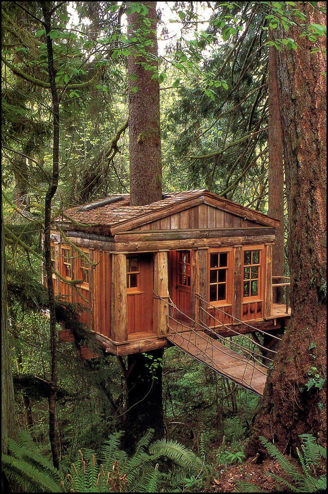
 Eucalyptus Treehouse, California. Original Image Credit: Pete Nelson
What do you see as one possible future for treehouse habitation?
I believe we are seeing the tip of the iceberg. People are opening their eyes to the possibilities. It is truly exciting. I don’t believe that everyone is going to move to the trees, by any means, but they will build more treehouses. That is happening already. And the vast majority are being built as a place to retreat to. A place for quiet contemplation. How great is that?!
So in closing, is there a particular up-coming project, or something “on the boards” that you would care to share with us?
We got the word that Animal Planet wants to do a Season 2 of “Treehouse Masters”. That is exciting. And I really look forward to getting the book out there so people can get a better idea of how to go about planning and building a proper “full scale” treehouse. They are no longer the structures that we were building as kids – and, of course, tree-forts are alive and well, thank goodness. I just want good information out there so nobody, including the trees, gets hurt!
 Temple of the Blue Moon, Washington. Original Image Credit: Pete Nelson
We’re all looking forward to season 2 of Treehouse Masters, your upcoming “how to” book, and of course the app. Thank you Pete for taking time out of your schedule to talk with Land8!
Check out more photos of his work on Land8, here.
Lead Image: Pete Nelson (R) at The Treehouse Workshop, Credit: Michael Matisse
Dwell on Design: The Top Ten Talks
Fellow Land8 writer Tony Ignacio and I attended Dwell on Design at the Los Angeles Convention Center June 21st through the 23rd. Our own summary of this annual design extravaganza can be found here. As promised, we now provide you with an entirely subjective (and in no particular order) list of what we believe were the Top Ten Talks of the weekend. We also believe that it is fitting for our list to be rather landscape centric.
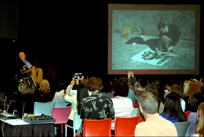
1. Keynote Address by Michael Graves: The thread that ran through Michael Graves’ address was his recollection of the two years he spent in Rome at the American Academy as a Prix de Rome Fellowship recipient and the influence that time has had on his life’s work. He spoke for almost an hour and a half; seemingly with no notes or cue cards. At almost 80 years old, his energy is enviable, his story telling epic, and his sense of humor spot-on. He pulled no punches when it came to his opinion regarding Target, JC Penny (one of D on D’s main sponsors), Harvard GSD, the borrowed view, and an ex-girlfriend or two. He also discussed his paraplegia and the effect it’s had on both his home product and architectural design work. This keynote address by Michael Graves was one of the best keynotes I’ve ever attended.
Then and Now. Keynote speaker Michael Graves alongside a projected slide of himself as a young Prix de Rome Fellowship recipient.
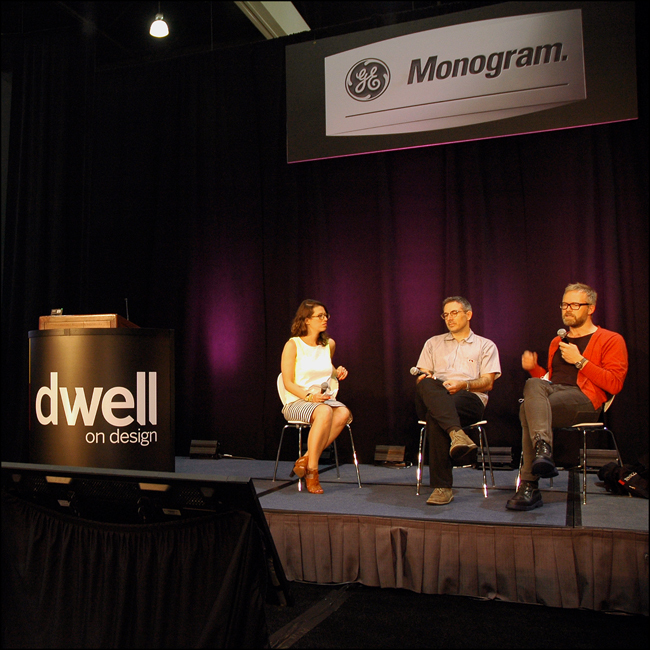
2. *Landscaping The Classics: Bernard Trainor of Bernard Trainor and Associates and Ive Haugeland of Shades of Green LandscapeArchitecture shared their inspiration, philosophy, and the practicalities of creating contemporary landscape architecture for Mid-Century homes. Both Haugeland and Trainor apply the tenets of modern design to their own landscape design work. To paraphrase one of Trainor’s slides they; “allow the function of a space to inform the elegant effects and patterns that will follow”. The resulting landscapes of both firms are certainly inspired by; yet do not imitate the landscape schemes of the past.
From Left – Dwell Media’s Diana Budds with Ive Haugeland of Shades of Green Landscape Architects and Bernard Trainor of Bernard Trainor + Associates
3. *Native Plants and California Landscapes: FormLA’s Cassy Aoyagi and Wendy Proud of Mountain States Wholesale Nursery discussed the beauty, appropriateness, and water-wisdom of installing California native plants into the residential landscape. FormLA has trademarked a lawn mix called “IdealMow” that can be formulated specifically for a general region, vicinity, or a specific microclimate, while MSWN’s “use of desert-adapted plants as landscape materials” has been on the leading edge of landscape architecture in the arid west for more than 40 years.
 From left – Diana Budds speaking with Wendy Proud of Mountain States Wholesale Nursery and Cassy Aoyagi of FormLA
4. Can Disaster Spur Innovation?: Kate Stohr, Managing Director, and Sherry-Lea Bloodworth Botop, Senior Development Advisor, of Architecture for Humanity described their rebuilding efforts in Biloxi, MS., after Hurricane Katrina. Their experiences highlighted the complex nature of these ventures and their stories underscored the importance of design in making communities better and stronger, emphasizing the need for designers to play a key role in disaster relief efforts.
5. *Born to Rewild: Green City Schemes: Landscape Architect and educator Margie Ruddick, described her fascinating experiences creating ‘wild’ landscapes in urban environments. She described how society’s perception of parks is gradually changing and that wild landscapes are also seen as places to recreate. She further explained how we as humans connect with nature and how this connection has a positive effect on our well-being. Ruddick finished by saying that wild landscapes can also benefit our wallets by costing less to maintain over time, and most importantly, how they improve the overall condition of our environment.
6. *Treehouse Workshop: Peter Nelson of Nelson Treehouse and Supply Co demonstrated the methods and materials for his treehouse construction system. He also spent time explaining his approach to city planning and building codes. Who can resist the intimacy and sanctuary of a treehouse high above the din and away from all the kids?
7. Never Built Los Angeles: This talk was given by Jenny Myers of Clive Wilkinson Architects and the design firm Myers Collective; Tibbie Dunbar, the Executive Director of A+D Architecture and Design Museum; and Sam Lubell, editor of The Architect’s Newspaper to coincide with Architecture and Design Museum’s exhibit of unrealized architecture, urban design, and regional-scale landscape proposals for the Los Angeles region. As co-curator Sam Lubell said; one important reason for this type of exhibition is to inspire “by example of consequence” and missed opportunity. Although, included in the exhibit is a proposal to extend the Santa Monica freeway into the Pacific Ocean and continue running parallel to the coast on man-made islands, reconnecting with land somewhere in Malibu. So not all has been lost by omission.
8. *Kinetic Energy: The Plan Behind The Lights At LAX; Artist Paul Tzanetopoulos discussed his inspiration and process of creating the iconic light towers at LAX. Paul described how the process was truly a collaborative effort, and surprisingly he was the only entity to make it through the whole LAX Gateway Design process from start to finish. The colors represent the diversity of the Los Angeles region and are described as color therapy. The LAX lights project is an excellent example of public art at its finest.
9. A Confederacy of Heretics: Architects Frederick Fisher, and Coy Howard discussed the reality and the myth behind their (and others) influence on contemporary architecture in Los Angeles. Fischer and Howard, along with Eugene Kupper, Roland Coate Jr., Peter de Bretteville, Frank Dimster, Frank Gehry, Eric Owen Moss, Thom Mayne, Michael Rotondi, Craig Hodgetts, and Robert Mangurian, were an unaffiliated group of bold, young (i.e. inexperienced) architects who changed the façade of late 20th century architecture in Los Angeles. This talk was in conjunction with a current exhibition at SCI-Arc titled Modern Architecture in L.A.: A Confederacy of Heretics: The Architecture Gallery, Venice, 1979 which runs through July 7th.
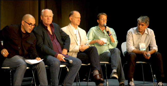 From left – SCI-Arc’s Mohamed Sharif, architects Coy Howard and Frederick Fisher, curators Todd Gannon and Ewan Branda.
10. Information Graphics, From Page to Memory: Andy Disl and Josh Baker, two Art Directors from Taschen discussed the cover designs on a number of their most successful books. Their discussion focused on how they use content based graphics along with size, format, and materials, to entice, inform, and introduce the pages within the book to the reader. I’ll always remember flipping through the real paper pages of my first Taschen book, Albertus Seba’s Cabinet of Natural Curiosities. At the time, I never considered that this tactile experience may one day become an esoteric activity.
From left – Kelsey Keith, Senior Editor Dwell, Josh Baker, Art Director Taschen, Andy Disl, Art Director Taschen
Tony Ignacio and I will be posting interviews with Cassy Aoyagi, Bernard Trainor, Margie Ruddick, Peter Nelson, and Paul Tzanetopoulos on future posts.
Lead Image: Michael Graves on stage at Dwell on Design.
All images by Mitch Howard (except LAX; courtesy of LAX Facebook page).
Were you at Dwell on Design? Tell us what you thought of the talks in the comments below…


