Author: Tony Ignacio
Top 10 Products from Dwell on Design
As mentioned in our recent DoD 2013 summary post, fellow Land8 writer Mitch Howard and I scoured the expansive DoD exhibit hall, poked and prodded, kicked and shook, and endlessly interrogated sales people, all to find the latest and greatest products for our Land8 readers. We were able to narrow down our extensive list to 10 (not in a particular order) of what we believe are the best of the best. You’re welcome.
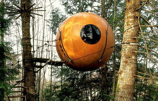
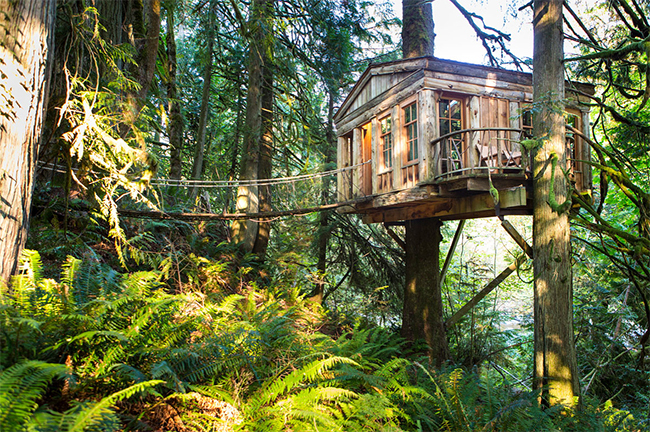
1. Treehouses by Peter Nelson: Do you or your clients ever daydream about being up in the trees, overlooking the landscape below? Well, you can now do it in style. Peter Nelson has designed and installed glorious treehouses all around the world. This is not your little brother’s treehouse. Even though this is not a product, per se, I would love to have one of these in my backyard! Now, if I only had some trees.
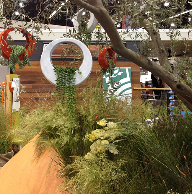
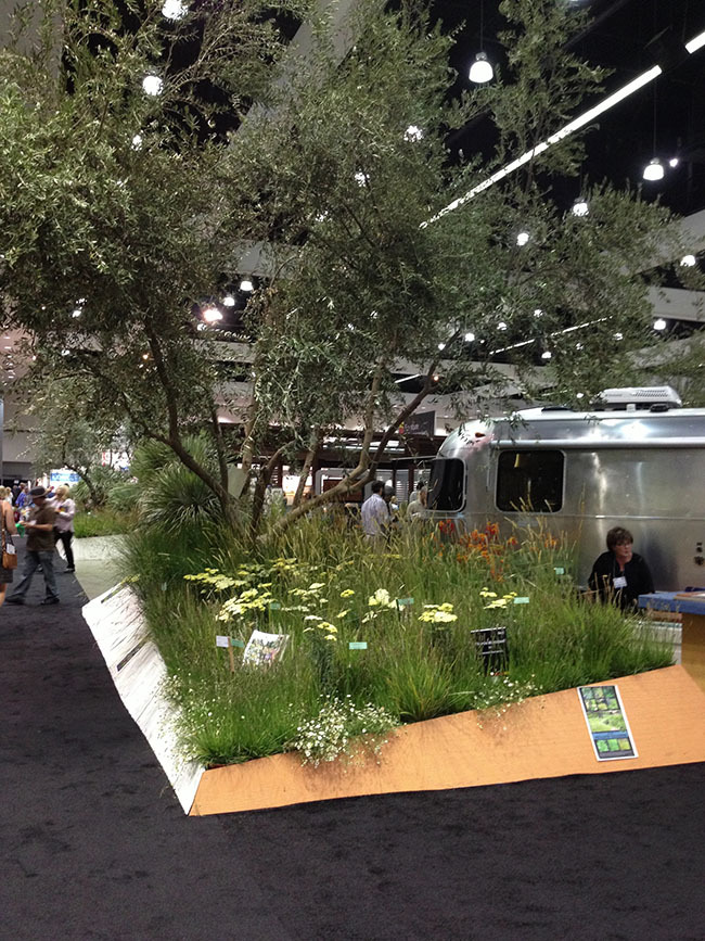
2. Meadow Grasses and California Natives by John Greenlee & Associates/Suncrest Nurseries and Shades of Green/Mountain States Wholesale Nursery: Need to turn your next project into a drought tolerant, dynamic landscape? Look no farther than meadow grasses and California natives! John Greenlee selected and Suncrest Nurseries supplied the beautiful grasses, and Shades of Green masterfully designed and Mountain States provided all the California natives for the Dwell Outdoor exhibit. The plants gave texture, movement and color to the space while showing everyone that natives are beautiful! They can do the same for your designs.
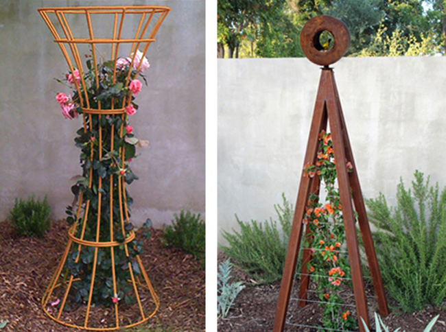
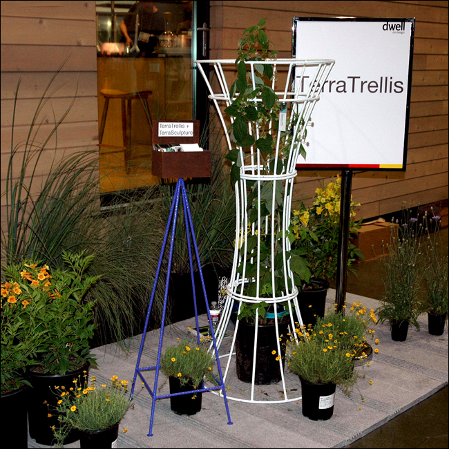
3. Trellis Sculptures by Terra Trellis: Trellises and other garden structures made from rebar and core-ten steel. They provide a twist in your traditional trellis, adding a modern element to your landscape designs. These are exposed armatures after my heart.
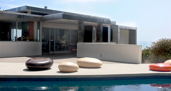
4. Pebbles sculptural seating by EIS Studio: These are organically shaped indoor-outdoor seats. They can be made of wood, stone, fabric, or fiberglass. Create spaces that allow for creative seating, or informal resting places, while still providing a modern aesthetic. Fun follows function, just don’t try and skip them.
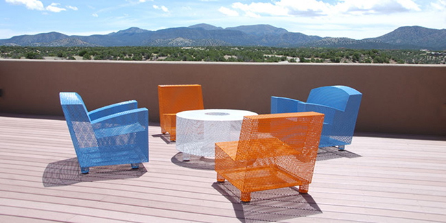
5. Stainless steel outdoor furniture by Half 13: Powder coated stainless steel that is simply designed, ergonomically proportioned and surprisingly comfortable. They are hand crafted and built to last. Use these furnishings as statement pieces indoors or out!
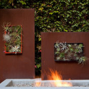
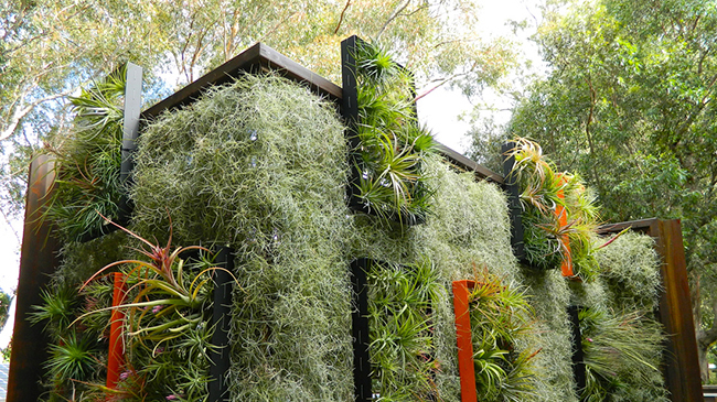
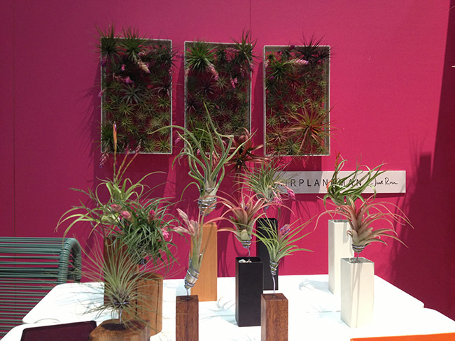
6. Airplantframes & Airplantvessels: by Airplantman Design: Framing and highlighting the incredible Air Plant, Josh Rosen designs elegant indoor and outdoor accents for your walls, tables or custom furniture. These air plants absorb water through their leaves and will not attract bugs. Cool.
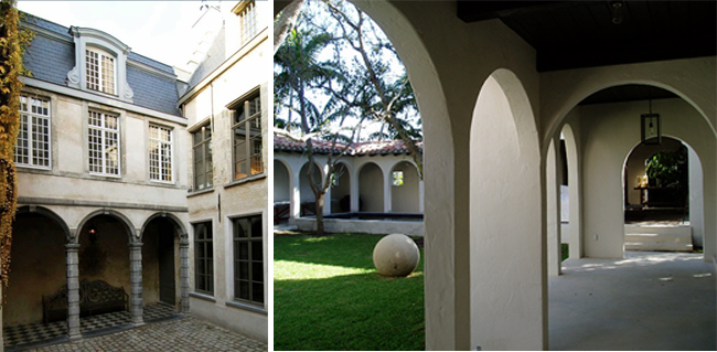
7. Lime-Based Paints and Plaster by Ad Applications: Creating and old world look or a clean, modern feel to your outdoor project? This versatile environmentally conscious product looks great indoors and out! Even though they are based in Europe it is available in the US for your next project. Check out their product widely used in celebrity homes all across the globe.
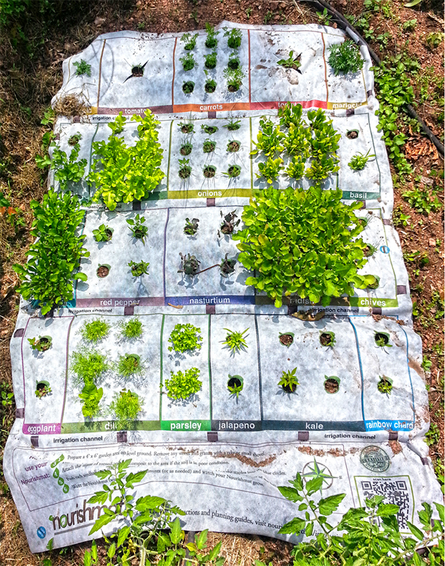
8. Nourishmat by Earth Starter: These pre-seeded mats would be great starter kits for a small balcony garden or any other sunny location where space is limited. Just hook up your water source to the built in irrigation and watch your garden grow. And don’t worry, you don’t need to keep track of what you planted, the nourishmat takes care of that. They also produce seedballs for a bit of guerilla gardening.
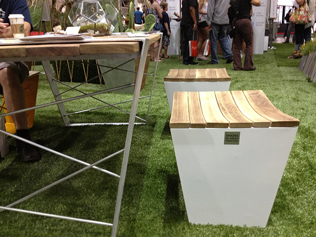
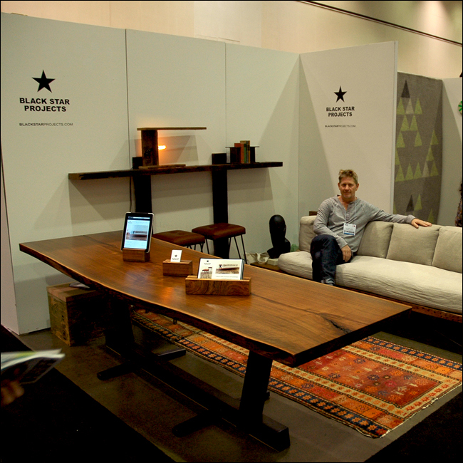
9. Oak Barrel Seats by Shades of Green: Reusing old oak barrels, these chairs, combined with powder-coated stainless steel, creates a modern outdoor chair. These seats would be great for wine lovers that have a modern aesthetic.
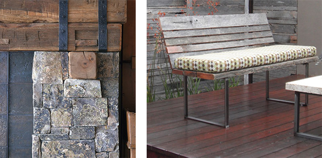
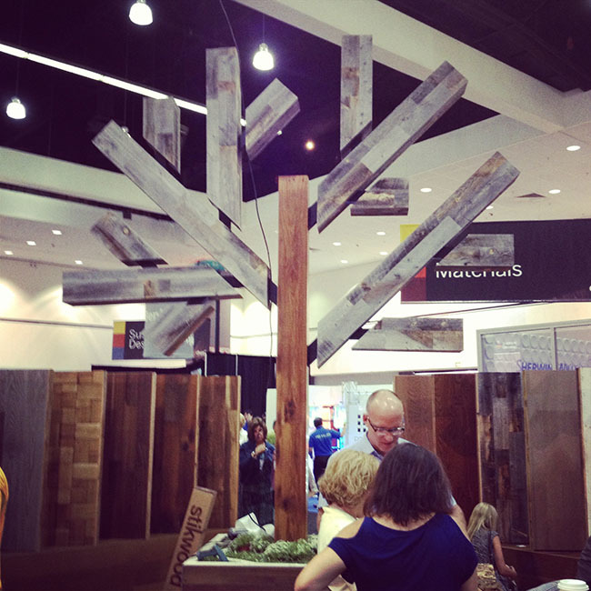
10. Reclaimed Wood by Restoration Timber/Stikwood and E&K Vintage Wood: Are you mindful of where your project materials come from? How about building your next bench from reclaimed wood? Restoration Timber and E&K Vintage Wood provides all things reclaimed wood, from floor to ceiling to the outdoors.
So there’s our list. Hope you found it useful. Would you use these products in your next project? Chime in below!
Lead image courtesy of Airplantman Designs; Photo by Art Grey.
All Images taken from each respective company’s website or courtesy of Tony Ignacio.
Dwell on Design Recap: A Weekend with Modern Design
(A collaborative article by Mitch Howard and Tony Ingacio)
The annual Dwell on Design (DoD) conference and exhibition held at the Los Angeles Convention Center on June 21st-June 23rd, was a designer’s paradise and high-end consumer’s extravaganza. It is considered the largest modern design event in the U.S., and for anyone with a modern tilt, it was a must attend event. Buzz on the floor was that the size and scope of this year’s event signaled a momentum of confidence; a strong belief in the solar powered LED at the end of the tunnel. This may be the case for the high-end consumer – we’ll keep our fingers crossed that this confidence translates throughout our industry.
Just a few numbers…300 vendors, 200+ speakers, 21 hours, and 4 stages in 3 days. All this, and architect and designer extraordinaire Michael Graves as keynote speaker, could we have asked for more? In the following days, we will be posting summaries of inspirational talks, the best of the latest products, profiles of forward-thinking firms/companies, and interesting take-aways from this past weekend. But to whet your appetite, here are some quick thoughts.
Dwell Outdoor; where the landscape literally took center stage
Trends:
What did we see? What is the next big thing? Below are a couple of trends we noticed over the weekend.
Bringing the Outdoors In
While at DoD, we noticed a couple of trends. Led by the guiding lights of Gill, Neutra, and Schindler among others, one of the most recognizable attributes of modernism as expressed in environmental design has been the blurring of the line between outdoor and indoor space. Yet this transposition across the threshold has more often than not gone in the direction of recreating “rooms” for outside living. Yet once again the retro bug has bitten high design. Just as in the late 60’s and into the 1970’s, we are seeing a reversal of the inside-out. Reclaimed wood planks and boards, and trunks of dead trees have been given a new zombie-like second life. They are coming at us in the form of flooring, interior wall panels (yes, wood paneled walls are back, and we have to admit, looking better than ever), cabinetry, tabletops and bases, and much more. Is this is a good thing? Maybe, but let’s keep in mind that 30 years from now, someone will once again haul that wood paneling and battered countertop to the nearest reclamation center.
Let’s talk Vertically
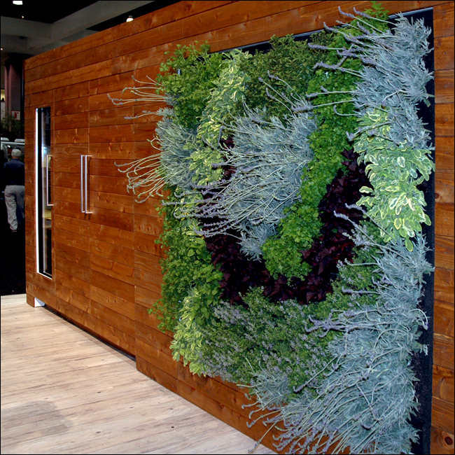
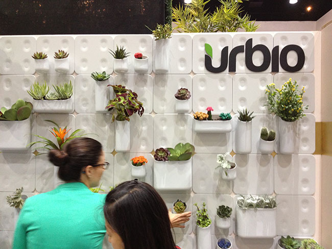
Adding to the aforementioned trend, every landscape-centric exhibitor had some element of verticality. From Airplantman Design’s Airplantframe to Urbio’s Wall Garden, companies wanted people to grow food and plants on their walls. We know as landscape professionals that growing plants on walls can have many benefits. Now that affluent urban dwellers see the light, we may see every project requiring tomato-lined walls.
Exhibits/Vendors:
Below is a quick list of some vendors and exhibitors that we will highlight in the next few days.
Restoration Timber/Stikwood; reclaimed wood applications
TerraTrellis; a collection of smartly designed and damn good-looking contemporary garden vining structures
AD Applications; interior and exterior lime based washes, paints and plasters, and protective coatings
Talks:
Inspirational landscape talks ranging from Landscaping the Classics and Born to ‘Rewild’ to the Dwell-specific seminars such as Greening Your Home and Designing for the New Affluent filled the weekend solid. Here is a glimpse of the ones we thought you might enjoy. We will also provide more in-depth interviews with the speakers in the next few days.
Keynote Address; Michael Graves
Native Plants and California Landscapes; FORMLA and Mountain States
Talks we will highlight:
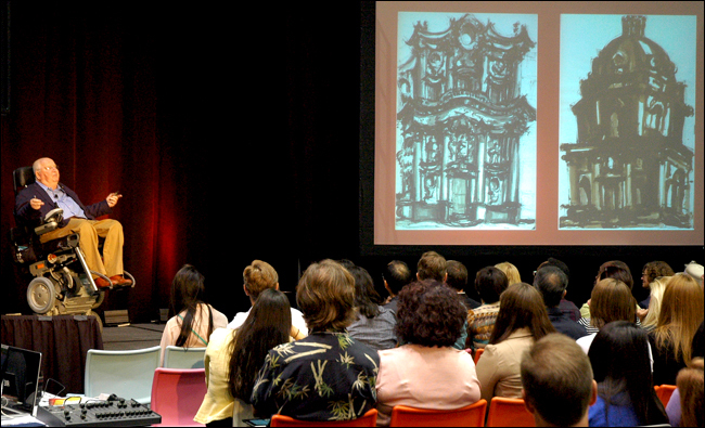
Keynote Address; Michael Graves, architect and “home product designer for the masses” discussed his two years at the American Academy as the Prix de Rome Fellowship recipient, and the influence that award has had on his life and work.
Landscaping the Classics; Bernard Trainor and Ive Haugeland shared their views and experiences on re-interpreting the mid-century landscapes of progressive real estate developer Joseph Eichler and others.
Kinetic Energy: The plan behind the lights at LAX; Paul Tzanetopoulos recounted the history behind his installation of LAX Gateway Pylon Project.
Born to ‘Rewild’: Green City Schemes; Margie Ruddick, promotes the “naturalization” of our urban parks and smaller gardens to reconnect the users with a more authentic landscape experience.
Native Plants and California Landscapes; FORMLA and Mountain States -Wholesale Nursery; Cassy Aoyagi and Wendy Proud of Mountain States Wholesale Nursery discussed the beauty, appropriateness, and water-wisdom of installing California native plants into the residential landscape.
Can Disaster Spur Innovation; Architecture for Humanity’s Kate Stohr and Sherry-Lea Bloodworth Botop bring their realistic, yet ultimately optimistic assessment to disaster response.
A Confederacy of Heretics; Frederick Fisher, Coy Howard, and SCI-Arc professor Mohamed Sharif discussed the reality and the myth behind their influence on contemporary architecture in Los Angeles.
Treehouse Workshop; Peter Nelson demonstrated the construction methods and materials of his treehouse construction system.
Firms/Companies:
Forward thinking firms contributed to DoD in many capacities. We hit up some major ones and will discuss their role at DoD in upcoming posts.
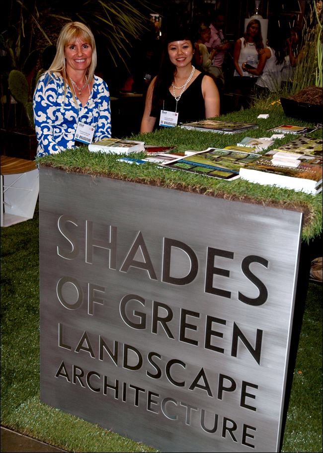
Shades of Green Landscape Architecture; Ive Haugeland and Liana Ramos
Firms and Companies we will highlight:
Shades of Green Landscape Architecture
Mountain States Wholesale Nursery
This post was written in collaboration with Mitch Howard. Check out our coverage on Instagram and stay tuned for more in-depth interviews and product highlights in the following days on Land8!
If you were there, tell us what you thought of the show below!
Learning with ‘Click That ‘Hood’
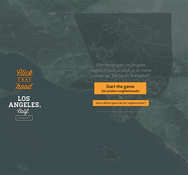
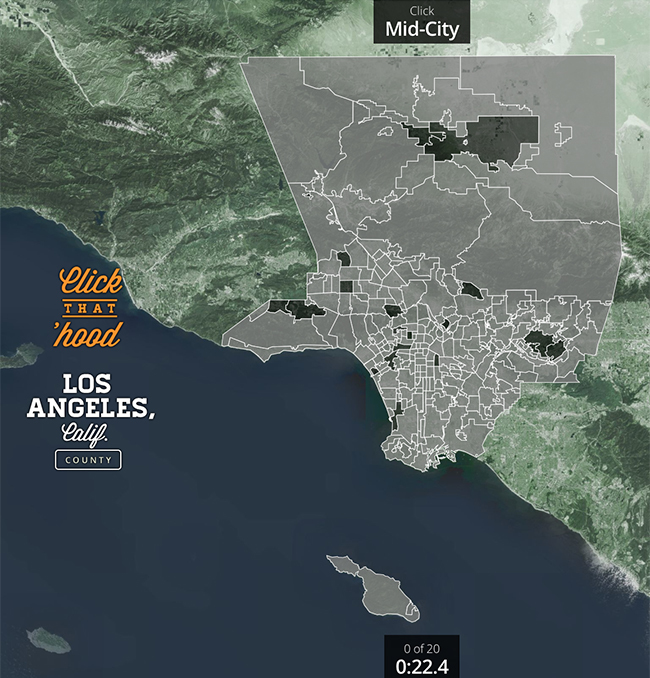
Summertime is a season of traveling to new destinations, whether it’s for an internship, a new job or a family vacation. But many times we are unfamiliar with the new surroundings of our new venture. This was the case for Marcin Wichary. Marcin is a Fellow for Code for America (CfA), a non-profit that helps governments work better for everyone with the people and the power of the web. Along with CfA Fellows Shaunak Kashyap and Sophia Parafina, Marcin conceived and developed a web-based, open-source game called Click That ‘Hood. This interactive game is very simple. As Marcin describes it you “choose a city you know, and then keep clicking on the neighborhoods the game asks you about, as quickly as possible! Then do it again and again – but now try to beat your (or your friend’s) best time.” Each neighborhood is a polygon derived from geo-spatial data provided by participating cities or open-source databases.
Originally, the data used for the game came from Marcin’s fellowship project creating crime visualization maps for the City of Louisville. But then one day he thought, “wouldn’t it be nice to reuse that code to build a simple game teaching us about a city we’ll be visiting and working with soon?” And from there Click That ‘Hood was conceived, and over a short period of time had grown to approximately 90 games covering cities all around the world. And since it is an open-source game, anyone can add their city/game to the site!
Hailing from Southern California I immediately tried my luck with Los Angeles County. As a landscape architect working in the Southern California region, I thought it would be a piece of cake. I won’t reveal my time, but let’s just say I need to study up on my local geography. I even tried the City of Louisville (where I grew up) and I crashed and burned. Even though I live or have lived in these cities that I was quizzed on, I still had a lot to learn. And this is the genius behind the game. Its simplicity keeps me playing, but at the same time I am learning about the spatial makeup of my communities.
Many of us have used geo-spatial data to create maps, analyze our communities and present data-driven information. And many would agree that navigating through this environment is very complex. So to bring this complicated realm to the masses is a great venture. As Marcin explains it, “There’s a universe, as it turns out, of various geo data formats – each one with its own caveats and idiosyncrasies.” He continues, “over time, as I learned to navigate those, the main challenge was writing instructions that would explain all those formats, and allow others to add their favorite location to Click That ’Hood much more easily.” As someone who has worked with geo-spatial data, this set of instructions is a great example of just how difficult it is to create ‘good’ data.
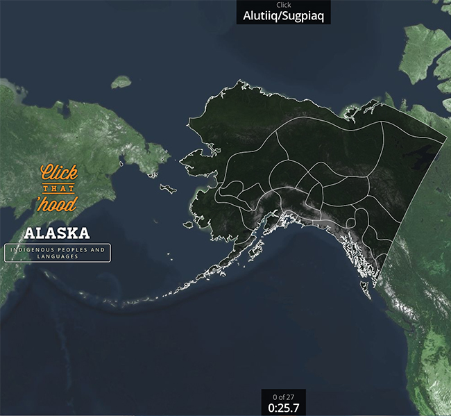
The popularity of the game has propelled the creators to potentially widen their scope. “I think the general idea could be expanded to do many more things,” explained Marcin. “(Maybe) cities in Silicon Valley, islands around New York, prefectures in Japan, even highways in Los Angeles!” “Recently someone sent in a map of indigenous peoples and languages of Alaska.” As Marcin continued explaining the potential for this game, he brought up a great quote by Charles Eames that has always inspired him, “Toys are not really as innocent as they look. They are the preludes to serious ideas.”
If Marcin can get people excited about their neighborhoods with a simple interactive web game, imagine how it can create excitement about our landscapes! I would love to see the game include the National Parks System, or State Parks of California. Heck, even the parks of my local neighborhood! A derivation called ‘Click That Park’, so to speak. We can have fun and learn at the same time, hopefully creating a better appreciation of our cultural and natural landscapes. Marcin and his team are always open for new submissions, so who’s up for adding a parks map?
For fun, post your City and Time below to see how you compare to your fellow Land8ers!
Images taken from click-that-hood.com


