Homelessness is a social problem that affects cities the world over. The image above depicts two very different ways of dealing with the issue. To the left: London. To the right: Vancouver.
You’ve probably already heard about the “anti-homeless” spikes that caused public outcry in London a few weeks ago. The stainless steel spikes were installed outside a luxury block of flats to deter rough sleepers from taking shelter in the doorway. The installation caused a chorus of disapproval and widespread condemnation, with Twitter users claiming the spikes treated the homeless like vermin. The bed of spikes has since been removed, after an online petition reached over 100,000 signatures and the Mayor Boris Johnson branded the spikes as “ugly, self-defeating and stupid”.
“Anti-homeless” spikes in London. Image taken by Twitter user Ethical Pioneer.
Unfortunately, these metal spikes are just the tip of a growing iceberg of hostility. Defensive architecture is slowly creeping its way into our urban environments in a multitude of guises – a slightly tilted bench; a strategically placed armrest; a line of small metal nodules. These seemingly insignificant details may go unnoticed by many, but to those who live on the streets, they engender a cruel and merciless city.
Hostile architecture in central London. Photographs by Linda Nylind for the Guardian
And it’s not just the homeless who are being ostracized by such callous design. Anti-skateboard devices, anti-graffiti paint, anti-teenager sound deterrents and anti-loitering seats are just some of the additional ways in which public behaviours are being manipulated and squeezed out. They all form part of an emerging urban architecture known as “hostile architecture”.
RELATED STORY: CHAIR>bench by The Agile Landscape Project
Of course, the primary intention of many of these manifestations is to reduce crime and anti-social behaviour. However, such crude solutions run the risk of destroying the very nature of public space. Public space should be exactly that: public; inclusive; for everyone.
The examples above demonstrate just how powerful design can be as a tool to manipulate behaviour. So how can we as designers use this power for good? How can we design to ensure that our cities are inclusive places?
Images via Spring Advertising
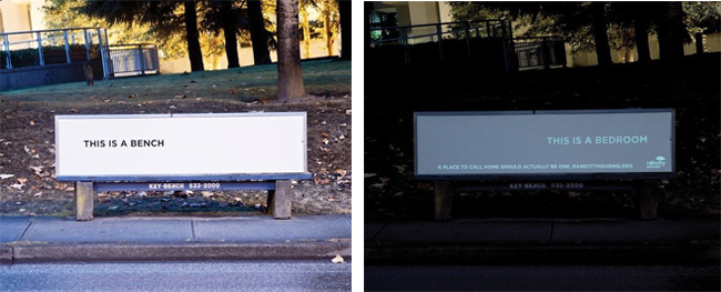
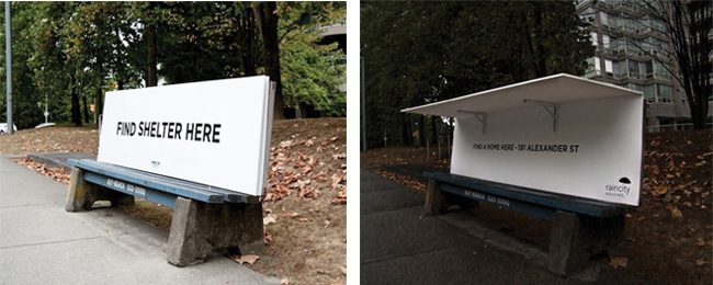
A recent project in Vancouver provides one such example and offers the perfect antidote to London’s “anti-homeless” spikes. Initiated by RainCity Housing, a Canadian charity that provides housing and support for the homeless, the project consists of five instant pop-up shelters that provide rough sleepers with respite from the wet Vancouver weather.

Images via Spring Advertising
The innovative design functions as a normal transit bench during the day and folds out into a shelter at night. When opened, it reveals the address of a RainCity refuge, encouraging the user to seek further help. Another design features UV letters which light up at night. During the day the words “this is a bench” display. When darkness falls, a set of separate letters emerge to say “this is a bedroom” and the user is directed to RainCity’s website. The dual purpose benches were designed by Vancouver-based creative agency Spring Advertising, as part of a month-long campaign last year entitled “Strange Acts of Kindness”.
How is the issue of homelessness dealt with in your city?
Published in Blog


Jonathan Romero
I don’t know that I fully agree with either approach. You don’t want to encourage either situation of implicit deterents or provided options in public areas. There are other means to deal with homelessness that would be more appropriate.