


I often see people painstakingly cutting out backgrounds that don’t need to be cut simply because they don’t fully understand the power of Blend Modes. I remember the day that I starting fully using these crazy things and it was a lot like the day I discovered Photoshop and the whole concept of layers…the amazing possibilities just blew me away.
If you have never used Blend Modes or you’ve played around with them and thought that they were interesting but you didn’t really how to control them, this one’s for you. I’ll try to break it down into some simple terms and point out the most useful ones in our type of rendering work with some examples.
First, here are the Blend Modes, grouped into their blending categories:
Normal (default setting, no blending)
Dissolve
These blend modes deal with Darkening
Darken
Multiply (*mode of choice for eliminating white backgrounds)
Color Burn
Linear Burn
These blend modes deal with Lightening
Lighten
Screen
Color Dodge
Linear Dodge
These blend modes deal with Light and Contrast
Overlay
Soft Light
Hard Light
Vivid Light
Linear Light
Pin Light
Hard Mix
These blend modes deal are Comparative, inverting the base color
Difference
Exclusion
These blend modes deal with Color
Hue
Saturation
Color
Luminosity
For a full description of how each one works, I’ve put together a pdf document which you can download. It’s just too much text for this tutorial. And who wants to read all that text? Let’s get down to some tutorialin’.
First, download this file so that you can follow along.
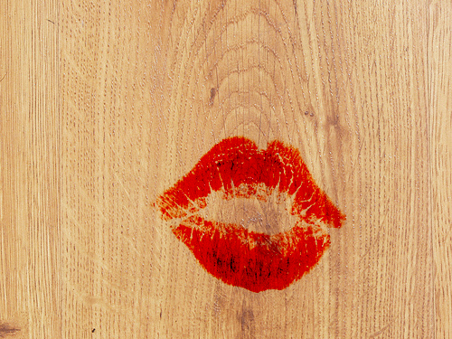
Let’s look at why we need blend modes and why simply cropping out an image or using transparency won’t cut it when it in certain situations. In this first example, let’s try to put a complicated image over a textured background with no cropping and no transparency but still allow the background to show through and have the image look like it’s meant to be there. In the spirit of February being the month of love, let’s put a smooch on a piece of wood. I grabbed two images, one of a heavily grained wood texture and another of a lipstick kiss.
When I put the kiss layer on top of the wood layer, this is the result:
So there’s that darn white background in the way. If you wanted to cut that kiss out, how would you do it? There’s really no good option is there? That’s where the magical blend modes come in. Take a look at your layers palette, which should look like the below image, and notice the area circled in red. This is where the Blend Modes are.
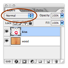
There are actually several options available to you. Normal is the default setting and actually means that no blending is applied. When you click on the drop down menu there circled in red in the above image, the full list of options comes into view.
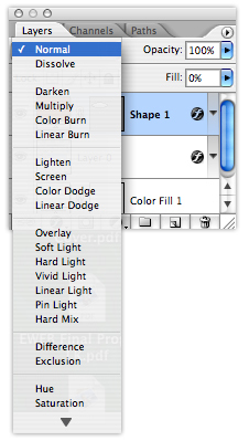
If you just simply want to get the white out, in fact multiply would be a good first choice. But when I do that, I notice that the kiss looks a little dark and unnatural. Since the point of multiply is to multiply the base color with the blend color the color will always be darks, thus the reason white always disappears allowing other colors to show through. But in this case, I don’t really want the kiss to look any darker, I just want the white to go away and the underlying grain to show through.
So what other blend modes can I choose? I have chosen to use Color Burn because it will take away the white and allow the grain to show through but since color applied to light areas remains unchanged, the kiss has less of a darkening effect over the light wood. Here’s the result using color burn:
With the idea of trying to get the white out, let’s look at a quickie that you will instantly take back and use at work. As designers, something we do ALL the time is draw something by hand or in the computer and then inevitably want to scan it or save it and it has a white background and then wish to superimpose it on top of something whether it’s an existing site image, an aerial or even another scan. So as an example, I grabbed a random aerial to use as a background and then some computer drawn topography. The original images are below, with a slight overlap to show that there is a white background that won’t let the aerial show through:
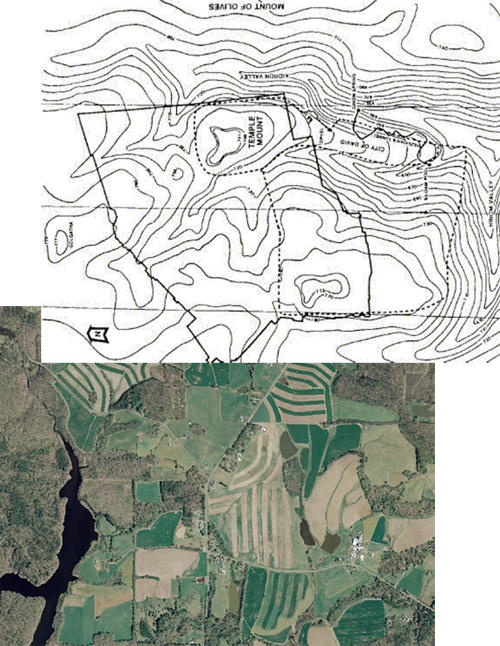
With both images on separate layers, put the topography layer on the top and then change the Blend Mode to Multiply. This mode eliminates the white, allow the contours to look like they are right on the aerial image, like below. This can be used for any scan or image that you want to eliminate the white.
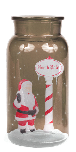
Now let’s look at making an object appear inside of something. A bottle is a great one to practice with because of all the complicated reflections on the glass. So I have a bottle and a santa figure, how might I make the santa look like it’s actually inside the bottle?
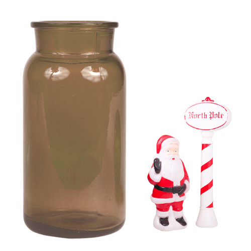
So I bet your first thinking that you have one layer of the bottle behind the santa and one in front and then you lower the opacity to see the santa, right? Well let’s see what that looks like….
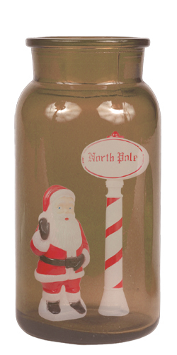
That’s not too bad but the santa looks really faded, like the glass is really dirty. The glass should be clear and have a shiny look to them with crisper reflections. Let’s see what this could look like utilizing a Blend Mode:
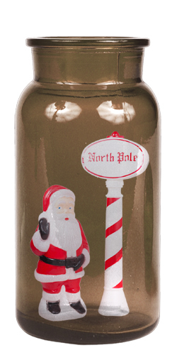
It looks a bit more convincing doesn’t it? Now let’s break it down…
Start with the bottle, then make a copy. The original bottle is a deep brownish color but with the copy, which will ultimately just be displaying the reflections, doesn’t need to have any color so that the blending can just focus on areas of light and dark.
To get the color out of the bottle just desaturate it. Image > Adjustment > Desaturate. Note: never change the image mode when trying to make something grayscale, always desaturate it and leave the mode in RGB. Your top most bottle layer should now look like the gray bottle below.
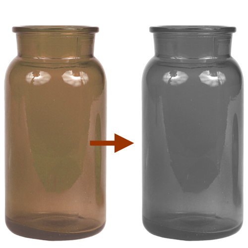
You should have two layers…the original brown bottle and the gray bottle. Now place any object in between those two layers. In my case, I’m using the santa. And just to complete the look, I’ve painted in a little bit of white around the base and a few dots within the bottle to look like snow. And the key to this whole look is how to blend the top most bottle layer.
Since the goal here is to reproduce the glass surface over the object inside, which really means the lights and darks in the reflections, then we are focusing on light. So that means we will want to use one of the Blend Modes that deals with Light and Contrast. Take a look at the different modes in the Light section. I chose to use the Hard Light mode because I didn’t want anything to look too fuzzy and warm, I just wanted it focus on the lights and darks and how it blended with the object below. Here’s the final image:
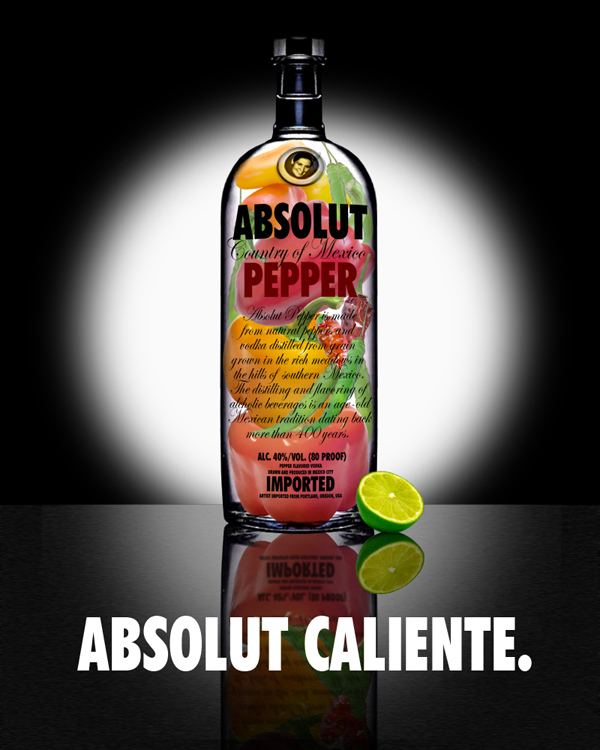
Lastly, just for fun I will share an image I made while teaching a Photoshop workshop in Mexico that also uses a bottle. This image was created from many different images to aid in the discussion of the art of selections and blending. Plus I love Absolut ads and just wanted to have some fun with making my own. This image definitely could not have been completed without the use of several different blend modes.
So that was only the tip of the iceburg on Blend Modes but the best thing to remember is that chances are, if the task of cropping something seems too difficult or even impossible, chances are using a Blend Mode is the key. Stay tuned for the March Photoshop Tutorial where I continue on this discussion of Blend Modes!
Published in Blog

Jaime Snyder
Wow Lisa this tutorial is great! Like you mentioned, these are actions that we always have to deal with working between the computer and hand graphics. I have gotten by with my self taught ways and made things look okay, but your instructions will help me by leaps and bounds! Thank you for posting these blogs!
Clayton Munson
somethings not working right for me. What tool are you using? Which layer is active? I’m trying with the rush set to color burn and the lips active. It burns the lips but does nothing to the white. See attached JPG. Thanks. Wood Kiss copy.jpg
Lisa Town
Hi Clayton, you’ve pointed out a bit of missing information in my tutorial. I forgot to note WHERE people can find the Blend Modes? Thank you! And I’ve adjusted my tutorial to include this information as well as added the psd file with the wood and kiss for people to download and follow along.
The problem that you are having is that you are using the “Burn” tool which is not the same as using a “Color Burn” Blend Mode. Blending Modes are not tools, they are found in a drop down list on the Layers Palette. The nice thing about Blend Modes is that they do not permanently alter your image. At any time, you can undo it by simply changing the Mode back to Normal, which means no blending.
Scroll up and check out the beginning of the wood/kiss portion of the tutorial and see that i have added a couple images of the layers palette, noting where the Blend Modes are. Best of luck and enjoy!
Clayton Munson
OK. Thanks I was selecting color burn from the tool mode drop down. not from the layer menu.
Lisa Town
Ah yes, when selecting a Blend Mode on a tool that will apply it directly to that tool and only where you use the tool on your layer. I usually tend to shy away from using blending right in with the tools because you can’t reverse it down the road like you can with layer blending.
Susana Isabel Rodrigues
Really nice tutorial! Thank you!
Lisa Town
Sure, great suggestion. If anyone else has things they’d like to know or topics they’d like covered in future tutorials, please feel free to leave a comment or send me an email and I’ll add it to the list! Thanks for the great feedback everyone!
Andrew Chance
Wow. This is very helpful. I will definitely be using the blend modes tool often. Thanks!
Ala AbuRaya
Great, Thanks