Landscape Architecture for Landscape Architects › Forums › GRAPHICS › Digital vs. Hand-Rendered etc.
- This topic has 1 reply, 36 voices, and was last updated 16 years, 2 months ago by
 nca.
nca.
-
AuthorPosts
-
December 30, 2008 at 10:00 pm #176668
 Ronald PizmohtParticipant
Everything in design, nay, life, is subjective. Did those “old school” landscape architects in the stone age scoff when the new generation started sketching site plans in their stone sketch tablets with a bronze stylus rather than a stone chip? Rendering with METAL? Oh, the heresy! At any rate, whether the human hand holds a pencil or hovers over a keyboard, the human imagination will out.
December 31, 2008 at 6:19 am #176667 Rob WilliamsParticipant
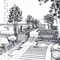
For me, I went through college prior to the proliferation of computers. Or at least they weren’t used like they are today. Yes they were invented….I am not that old. But I actually have artistic ability that isn’t attached to the computer. If you market yourself right, and you have hand rendering talent, you should be able to set yourself apart from the masses who are coming out of school with only the computer as a backup. I for one, can actually charge more and offer a unique service by doing hand renderings. Many whom I work for and consult for say my hand drawings tend to be more people freindly when you are doing presentations.
I find that very useful since I will do town meetings and have everyday people looking at my presentations. Something very rigid about most CAD drawn material that doesn’t propmote as much change and interaction from the people who are viewing it. I would like feedback especially in the design concept phase.Just a little rambling to share my own experiences.
December 31, 2008 at 6:45 am #176666 Lisa TownParticipant
That is very true! There are two people at my office that have that talent and they use it everyday. One of the biggest advantages is that they can go to workshops away from the office and draw up perspectives of ideas on the spot. In fact, this gets people opportunities because they get sent to workshops, competitions and other countries to be able to draw things as people are talking through the ideas. In fact, seeing just how useful it is has sent me back to the drawing board for more practice so I can hone my own hand rendering skills to be able to draw up amazing perspectives in minutes! I’m totally jealous of people like you Rob 🙂
December 31, 2008 at 7:35 pm #176665 Doug OlsenParticipant
I appreciate the link; I had missed this article. Several of the points in the thread have resonated with me: one, that there really isn’t a right or wrong tool, just whichever will be most effective; two, that there are any number of motivations for drawing/sketching, and one way may be more appropriate than another at any given point in time. Maybe there’s been a concern that hand sketching will disappear, which I don’t think will happen any time soon; or that, depending on one’s perspective, the “road not taken” is somehow less worthy…
January 12, 2009 at 5:57 am #176664 Rob WilliamsParticipant
Lisa, I appreciate the compliment but I have been cursed with having worked on some design teams with real “artists”. My abilities pail in comparison. I was ok till I saw real talent. Good thing is I have copied as much from them as I can. They say duplication is the greatest form of flattery!
January 18, 2009 at 8:06 am #176663 SyaryzadParticipant
I personally think hand sketches personalized the presentation as opposed to digital rendering. Although in digital rendering, you can easily amend any mistakes with a touch of few commands wherelse hand rendered, might be abit tricky to do so..
Presentation done using digital sometimes looked lifeless and hard.
I would prefer to have a simple coloured hand sketched perspective with a slight tweak using Photoshop to enhance the quality.But saying that, a really good hand sketch is just good enough to convey the concept and design~and it will only takes a few minutes to do so.
January 18, 2009 at 3:05 pm #176662 Om Khurjekar, RLA, ASLAParticipant
Hi Nick,
It definitely feels that hand graphics are becoming lost art, but the reality is they are not. Many designers still use hand graphics in a very effective way. I personally use hand sketches to demonstrate conceptual ideas. I feel that when you draw by hand there is a direct connection of one’s thoughts and feelings to the drawing or his or her design.
The digital graphics are great and important to study the design concept and help others understand it. My work has been a fusion of both of these and i see that happening more and more.
Yes the technology seems to have taken over our lives, but hand graphics will never go away. There is definitely a need for the young designers to learn both.
those are my two cents…..
January 27, 2009 at 5:21 am #176661 Lori MolitorParticipant
At the very least, being able to draw things out in a client meeting is good for communication and reinforces the fact you can do magic. It is a very good skill to establish credibility.
January 27, 2009 at 1:42 pm #176660 ncaParticipant
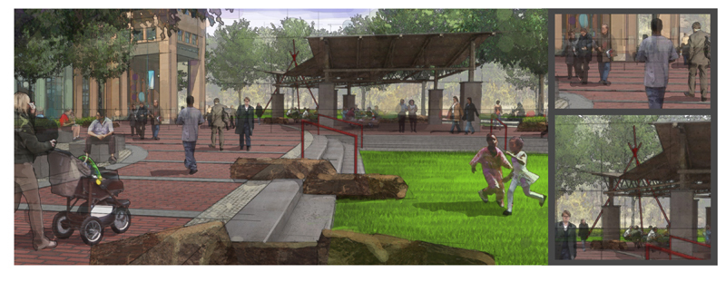
This is a collage of ideas that vaguely resemble a painting of an urban plaza, or you could just call it a perspective. My goal is to try and work iteratively in digital media. I still love to draw, but I choose to illustrate, typically, digitally.

Still, I think digital media can often lack the “jazz” factor, where it doesn’t look spontaneous and therefore doesn’t include that human feel and looks too easy, leading the client to assign it less value. I think most laypeople and professionals alike tend to believe that the computer does most or all of the work.
January 27, 2009 at 3:12 pm #176659 SyaryzadParticipant
Nick, nice work there!
🙂January 27, 2009 at 9:28 pm #176658 Jon QuackenbushParticipant
I’d love to know how you did that Nick… did you hand color it with a tablet in photoshop? Is it a series of filters? It is really well done.
January 28, 2009 at 1:59 am #176657 ncaParticipant
Stuart, I share similar feelings with you regarding process, though I tend to do a little more along the lines of what Lisa Town suggested earlier in moving (sometimes erratically) between cad, hand, model, etc. I am trying to make my digital renderings look less “generic” for several reasons. I think on larger scale public projects where emotions tend to run high it could be useful to show ideas in softer fashions. I also have entertained the notion that maybe one day I will develop a digital (and hand) style enough to get hired for illustration freelance.
Great work btw.
January 28, 2009 at 2:00 am #176656 ncaParticipant
Thanks Jon. I did use a tablet in photoshop.
January 28, 2009 at 2:11 am #176655 Lisa TownParticipant
Yeah, that drawing looks really nice and what I like the most about is that it accomplishes exactly what you say in putting that “jazz” back in the drawing. Computer drawings can so often lack that feeling of life. It actually reminds me of a series of drawings that were used on one of my projects that was in collaboration with Foster and Partners. They got a professional to do this cool painterly collage thing that had great effects with light, shadows and color.
One thing I found interesting is that at Atelier Dreiseitl we always used hand renderings and sketches in presentations. They would be drawn in ink and then colored in Photoshop. It was the style of choice whenever trying to sell conceptual designs. But an interesting thing happened when a similar style was submitted for a project in Asia…the client actually came back and requested that we redo the drawing in the computer because they felt hand drawings to be unacceptable. It just goes to show, it’s not even just about the phase but also about knowing the client.
So Nick, any tips on how you created some of the effects in your drawing? How about those trees, those look totally watercolor. Can we see a bigger version of one of those?
January 28, 2009 at 2:42 am #176654 ncaParticipant
Thanks Lisa..
I’ll try to crop a blow up thumb in a bit..I just do a little pshop paint over imagery and show my guides. Nothing too out of the ordinary I dont think. Its really just a matter of getting the “light” right. I designed the garden structures last semester and modeled them for another project. I needed something like that in this project so wallah..I re-sourced them..Another practical use in digital.
Thanks so much for the comments. Foster and partners may work on occasion with dennis allain and/or jeff stikeman, both excellent digital and hand illustrators and designers..http://www.dennisallain.com
-
AuthorPosts
- You must be logged in to reply to this topic.


