Landscape Architecture for Landscape Architects › Forums › GRAPHICS › Student looking for unique ways to indicate grasslands, meadows and prairies
- This topic has 1 reply, 10 voices, and was last updated 13 years, 5 months ago by
 Frank Varro.
-
AuthorPosts
-
July 17, 2011 at 8:58 pm #161502
Cal
ParticipantI am a beginning student learning to hand draw landscape graphics of plans (bird’s eye views). I’m not very happy with some of the drawing examples I’ve seen that are supposed to be representative of large areas of grasses, varied prairie plants and meadow landscapes. They just aren’t’ interesting and definitely don’t provide the feel of those kinds of spaces. This can be represented better in elevations, but I’m looking for examples of overhead plans that go beyond the usual series of circles and dots to show the textures, colors and variety of these areas. Xeriscaping and vast swaths of native plants and grasslands are all the rage in my corner of the world, so I expect this will come up often. If you have any advice or graphics to share I’d be so appreciative.
July 17, 2011 at 10:23 pm #161521 Frank VarroParticipant
I started a series of Photoshop tutorials a ways back, I didn’t get to prairie type areas, but the same techniques I used for turf-grass and dirt should work.
Turf: http://land8lounge.com/profiles/blogs/tuesday-tutorial-turf-and
Dirt: http://land8lounge.com/profiles/blogs/tuesday-tutorial-time-to-get
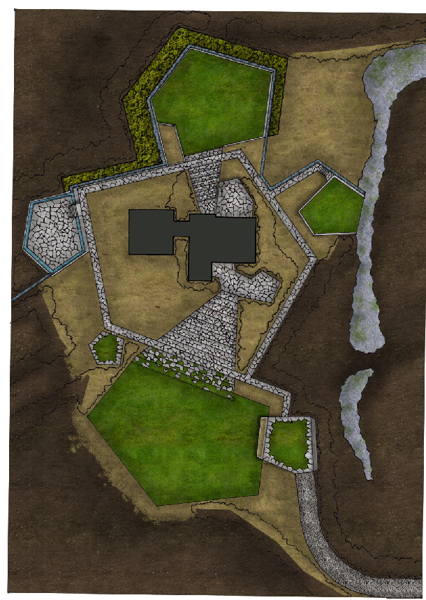
I did do a phase of this design with prairie type grasses, it came out like this:
 Its not the final render with trees, and you may be looking for more of a hand graphic idea, but this is the best I was able to come up with in my experimentation.July 18, 2011 at 7:17 am #161520
Cal
ParticipantWow, that’s an interesting solution. Thanks so much for sharing this. I’ll save it to my graphics library folder for future reference. I was indeed looking for a purely hand graphics solution, but this is certainly an option to consider and I find the juxtaposition of slightly altered photo imagery with hand drawn an interesting look. If I were to attempt translating your photo imagery into a hand drawn graphic then I’m noticing that a mottled textural effect (rather than a flat single color representation of green spaces) might enhance the rendering. However for me it’s still not communicating much about what different types of plants are present(particularly a meadow mix of flowers and tall grasses).
It may not be possible to achieve it in an overhead plan, even when the viewpoint is much closer up as for a small yard plan. For instance, I was attempting to show some beautiful tall feather reed grass from just above a yard design and ended up with a series of small circles. I suppose one option would be to show it at just enough of an angle to include some green stalks. At any rate, I thought it would be interesting to see how more experienced graphics people were addressing this issue.
So thank you for presenting one viable option!
July 18, 2011 at 1:41 pm #161519 Thomas J. JohnsonParticipantJuly 18, 2011 at 2:15 pm #161518
Mike G
ParticipantYou can almost measure the Fibinacchi Sequence in the some of those photos…Woahhh!!!
July 18, 2011 at 3:37 pm #161517 Jon QuackenbushParticipantJuly 18, 2011 at 4:29 pm #161516
Cal
ParticipantLOL!!!
There ought to be awards on this forum for most unique and humorous replies.
July 18, 2011 at 4:50 pm #161515Cal
ParticipantNice model and birdseye view of a field of daisies.
Did you photoshop the field of daisies into a photo of the model or is that part 3D too?
Love models and wish it was practical to do them more often. I prefer it even to virtually moving through
spaces on computer.
July 18, 2011 at 5:50 pm #161514 Jon QuackenbushParticipant
none of it is 3d. it is straight from autocad into photoshop and then rendered to give the appearance of depth.
i have a really nice palette of textures & patterns, which I would suggest you start to build if you want to render plans using photoshop.
the field with daisies is actually two textures blended together to give that effect using a proprietary technique (◕‿-)
July 18, 2011 at 6:28 pm #161513Cal
ParticipantWow, fooled again.
I haven’t ventured into computer software imagery just yet, but look forward to using it and creating my own graphics library, experimenting with different techniques, etc. Still, my heart is with hand drawing and the immediacy of pencil or ink to paper and the look/feel of that process. I’m guessing that one uses a different part of their brain for hand drawing as opposed to computer work, although I’m sure the software and drawing on a digital pad will, with practice, eventually feel more fluid and intuitive. But it’s a whole ‘nother medium unto itself.
July 18, 2011 at 7:35 pm #161512Anonymous
Inactivebut none the less, a medium that is worth learning, and learning very well. this is the direction a huge majority of firms have been going and will continue to go. projects that are done entirely by hand are next to extinct. computer graphics are faster, cheaper, easier, and you can get results that imitate hand graphics. however, good hand graphic skills on paper allow your personal style and technique to translate better when using a digital tablet. i feel hand graphic knowledge is something that should be taught as a stepping stone to learning “computer hand graphics.” but like you said it is another medium unto itself.
July 18, 2011 at 8:21 pm #161511 Thomas J. JohnsonParticipant
I was only partially kidding… 🙂
I might just have to try and create a “brush” in P-Shop from those baby heads… at the right scale in shades of brown, gold and green it would be pretty groovy, especially for a nice shaggy fescue.
July 18, 2011 at 8:49 pm #161510Cal
ParticipantBodyscaping. I think you’re onto something!
Doesn’t all good humor have shades of truth…and I especially enjoy unique perspectives that
cause me to laugh and think simultaneously. ;^) When I got up this morning I had no idea that
I’d be chuckling to myself about cowlicks all day. See what you’ve done!
July 19, 2011 at 6:50 pm #161509John.Dallinga
ParticipantJon,
When you rendered the trees, did you create them using a custom brush? Did you create several individual trees, render, and then disperse throughout the plan?
July 19, 2011 at 8:46 pm #161508 Jon QuackenbushParticipant
The latter. I don’t like uniformity, as it is unnatural looking. On a plan like that, you need at least 5-8 unique trees. While copying them around the plan, I would occasionally scale and rotate them slightly to trick the eye into thinking it was a different tree altogether.
-
AuthorPosts
- You must be logged in to reply to this topic.


