


Landscape Architecture for Landscape Architects › Forums › PORTFOLIO & RESUME › What do you think of my portfolio cover?
- This topic has 1 reply, 9 voices, and was last updated 13 years, 3 months ago by
 jennifer Bloch.
-
AuthorPosts
-
April 1, 2013 at 2:06 am #155255
 Luke MancusoParticipant
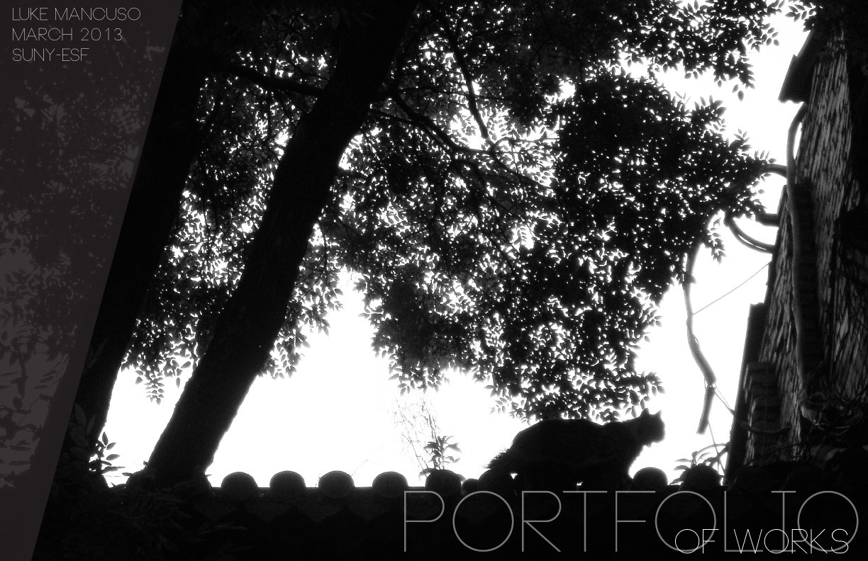 April 1, 2013 at 2:10 am #155272
 jennifer BlochParticipant
love it. (all the scale figures in my thesis were cats)
makes me think of rome and the cat population.
April 1, 2013 at 2:28 am #155271Luke MancusoParticipant@jennifer Bloch
thank you! I took this picture while in Beijing, I thought it would be good for the contrast needed to overlay white text
April 4, 2013 at 9:05 am #155270Ernst Glaeser
ParticipantLandscape or VET?
April 4, 2013 at 2:26 pm #155269Luke MancusoParticipantthx, thats what i ended up doing. I’ll post my portfolio sometime and see what ya’ll think!
April 4, 2013 at 5:06 pm #155268 Joshua Clayton HailParticipant
Dont be scared of your name. Make it bigger. Its what will stick out in the viewers line of sight
April 4, 2013 at 6:50 pm #155267 Andrew SpieringParticipant
Beautiful photo. I agree with Brian Lin, and recommend losing the “of works”. It is already implied and it also make the “I” look like a “T”.
Also, I have to agree with Ernst Glaeser. The cover is beautiful but it does not communicate “I am a Landscape Architect” instead “I am an awesome photographer!” Something to consider…
Other than that, I like how you used the shadows to highlight your text.
April 6, 2013 at 7:54 pm #155266 Andres F. PinedaParticipant
Portfolio covers have always been an interest of mine and I tend to have a personal and particular way of looking at them. I think that they can say so much about the content enclosed; of coarse opposite from the famous saying “don’t judge a book by its cover”. From my perspective I look at it as a blank canvas that can be used as a built up, to summarize or preview what I am yet to see; somewhat of a movie trailer.
Fonts, colors, images and organization can actually play such vital role in displaying and describing what the Author is about, how he or she is as a person. Things that we don’t particularly think of as we create the content, but subconsciously we are thinking of them without even noticing.
I would start of by saying prior to some constructive criticism, I like the simplicity that you’re trying to achieve through the use of font and monochrome colors of the image.
Prior to reading Andrew Spierings comment, my first though as soon as I saw the image was: Landscape architecture or Photography portfolio?
- I see a Photography portfolio.
Why?
Well, from an informational stand point, it is not specific to its content as it reads “PORTFOLIO of works” and I am given a photograph. From my experience most, photography portfolios begin with a photograph; so from prior knowledge I would take an educative guess that it will most likely be photography?
I think the title should be more specific as the word “works” can be so many things: Photography, Web design, Landscape architecture or … ?
Maybe you can change the title to something more specific such as: Landscape Architecture Portfolio, Portfolio of Landscape Architecture or something that conveys specifically what this portfolio is about.
Here are some points to take into consideration if you are thinking of modifying your cover:
If I were to ask you, Luke when you look at this image what can you possibly imagine there is behind this cover?
What does it tell you about the portfolio you are about to open?
If it’s in a pile with 20-50 other portfolios, does it capture your attention and if so why; what is it that pops out at you that it is making you grab this portfolio over others?
I think this field in particular, we are very visually driven in the way we express ourselves and sell our projects. With that in mind sell me your portfolio, make me want to pick it up over all the others.
Your name, why so hidden? I think YOU are the important piece here. It’s YOUR portfolio and you need to make sure that they know that. Give yourself a title, let them know who you are. Are you a student, do you have a Bachelors a Masters?
In more depth apart from the cover:
Remember, you are representing yourself through your portfolio. You are not there to speak for yourself, so the more information that you give them the better. Obviously, keep it suddle and elegant. Make it redundant, allow them to remember your name, who you are and how your experience and qualifications can be of use.
If you are interested and would like to know more, I did a short review for a fellow land8 members portfolio. I pointed out a lot of things that maybe as you create or modify your existing portfolio, you can watch out for and take a look at.
https://land8.com/forum/topics/need-feedback-on-portfolio?commentId=…
An additional point to consider in regards to Portfolio layout:
Recently, I have noticed that there are a number of firms who specify 8.5”x11” portfolio sizes. Not too sure why, but you can see the hassle someone can go through rearranging their 6”x6”portfolio size to meet requirements. I would suggest you go with more conventional size (8.5”x11”) layout, easier to print and more conventional; application wise, as well as for viewing in tablets and/or turning into an ebook.
Interestingly enough, I finished my portfolio a week ago, the cover was one of the most difficult things for me to do as I am so critical on this aspect: http://www.pinedandres.com/wp-content/uploads/Landscape%20Architect… (If you download the PDF you are able to see the magazine spread)
Well Luke, I hope my opinions give you some food for though and I hope it helps you achieve your goals.
April 8, 2013 at 3:05 am #155265Luke MancusoParticipantwow, thanks for all the awesome info! I have actually changed my cover since this version, and improved it in the ways you described. Your portfolio looks damn good too
April 8, 2013 at 3:32 am #155264Luke MancusoParticipant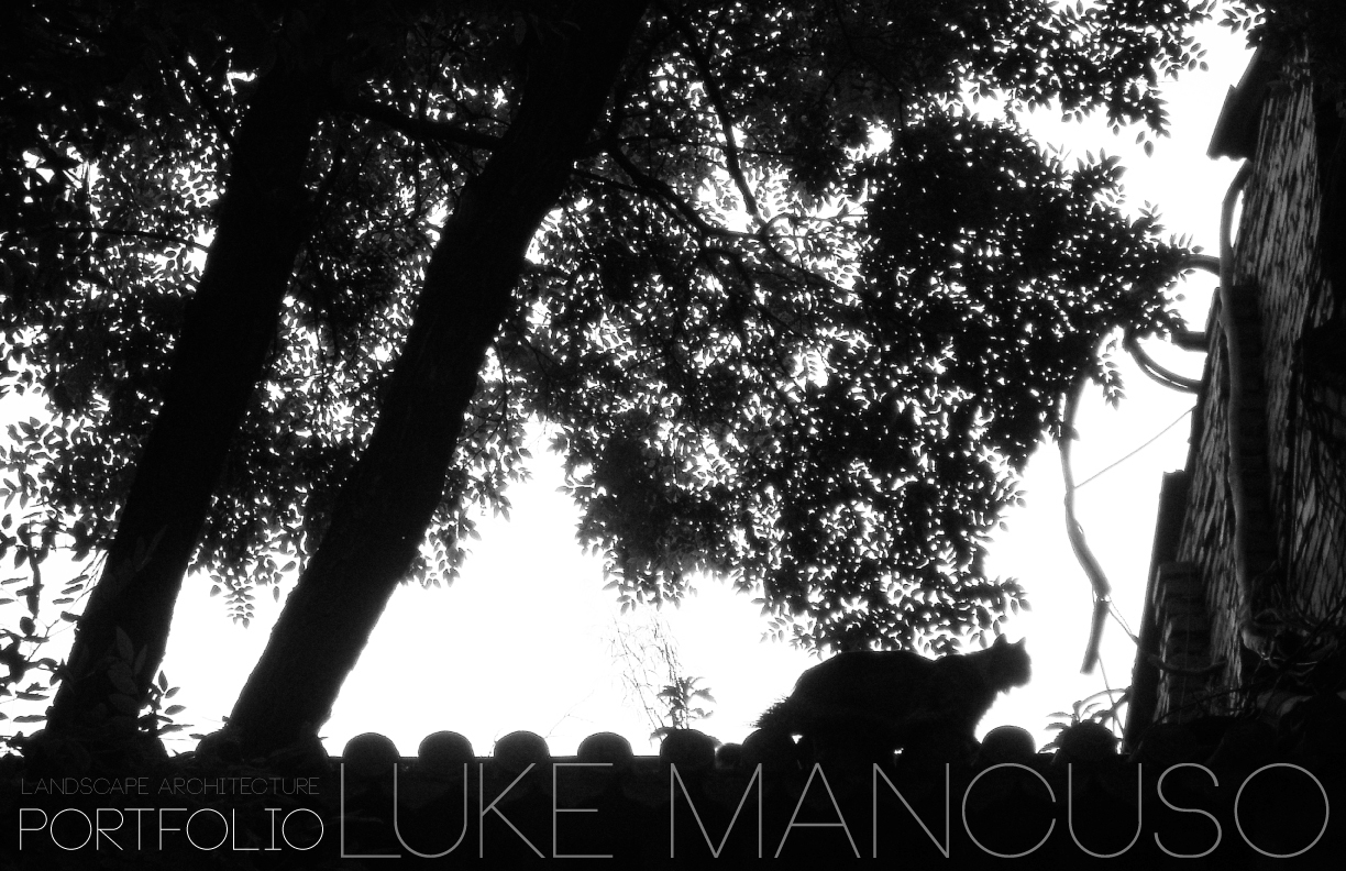 April 8, 2013 at 6:13 am #155263
 TTYParticipant
It’s interesting. But I am not sure if your cover gives any clue to your works in your portfolio, I think that would be more impressive and integrated if you do so.
April 11, 2013 at 9:49 pm #155262Andres F. PinedaParticipantLuke, looks better, but Landscape Architecture gets lost and blends in with the black background.
Take into consideration that all screens and their tonalities are different. The colors that might look good in your screen can look totally different to the recipient. Additionally, remember that when printing, colors might appear differently unless there is a color correction process.
In order to avoid all those issues, I would suggest that you increase the tonality of the color to “Landscape Architecture” and just as previously advice make “Landscape Architecture” more prominent and visible. Rember I am seeing what? from who? Ideally LUKE MANCUSO is showing me his LANDSCAPE ARCHITECTURE portfolio.
Define what is important to the viewer.
April 11, 2013 at 10:11 pm #155261 Rob HalpernParticipant
If you look at Andres’ cover it says, before you even notice a word, Someone designing, developing ideas, thinking horizontally and vertically. That image could stand on its own. This is someone to interview. He’ll have something to say.
Compare that to your cover, Luke. Your choice of photo and hesitant typology says everything about you, or at least about your relationship with your career.
Forget the pretty photo. Forget the things you want the employer to know about your other interests. Get back to the heart of it and think of what you can bring to this position, what the firm needs, and how dedicated you are to delivering it. Then create the cover. You may want the employer to know you have an eye for composition, but more important to her is that you are ready to work. Prioritize your message.
That is, I think, what Andres was saying above.
I suggest you set this cover aside and try to do something that is completely different. See what you come up with. That process may lead you eventually back to this cover (although I doubt it) but if it does, it will still give you a new perspective from which to design
April 12, 2013 at 11:43 pm #155260Luke MancusoParticipanti totally agree with you, i want to create my own cover. The problem i often feel is the urgency i need to get this portfolio out while doing college etc. i hope to work with the palisades parkway this summer
April 14, 2013 at 2:30 am #155259jennifer BlochParticipantHi Luke.
I’ve read the comments of others about not communicating Landscape Architecture. It spoke to me. I’m a licensed Landscape Architect. I would love to receive that portfolio on my desk and would be curious about the mind of the person who thought to do something a-typical and who had an artful eye. What kind of firm do you want to work for? I think this is important in creating your cover as it is the first key that could perhaps unlock a door for you.
I hope this helps. Don’t lose your unique way of seeing things.
-
AuthorPosts


- You must be logged in to reply to this topic.