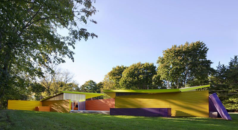
Landscape Architecture for Landscape Architects › Forums › GENERAL DISCUSSION › Why do we make built elements brown all the time?
- This topic has 1 reply, 12 voices, and was last updated 14 years, 8 months ago by
 Thomas J. Johnson.
-
AuthorPosts
-
August 7, 2011 at 10:18 am #161073
 Trace OneParticipant
I have decided I think brown is the ugliest color for built elements in the landscape..I think chinese gardens have some theory about making built elements red, something that Disney copied?
We are busy making another huge fred flintstone fake wall, imitating a stone of no recognizable geological origin (is it sedimentary? is it granite? It’s early Dino coupled with late what- the- contractor- is- used- to). It IS twenty-five feet high of light brown streaked with dark brown..Brown!!
UCSD has a color committe of about twelve distinguished professors (of things like French, history..nursing) and the color they came up with for a brand new building is viscerally scatological – shiny, natina, brown.
I hate brown in the landscape! Built elements should look BUILT!
August 7, 2011 at 3:34 pm #161094 Thomas J. JohnsonParticipant
Scatological! I might have to borrow that…
Nothing is worse than a material pretending to be something it’s not. A girlfriend once took me to see a waterfall in Vegas. It was big and brown and looked like painted concrete. She asked me what I thought… I told her, “I prefer the real thing” which I guess summarizes my opinion on Vegas in general… If I want to see a waterfall, I’ll go for a hike. I’d much rather see a creative use of materials and design in the built environment.
I’ve got nothing against brown, per se, but I don’t like crap. Cheap, preformed, block and gunite painted to look like stone are at the top of my $h!t list (pardon the language, just trying to stay on theme…)
Why don’t you enlighten the “designers” on the UCSD committee and show them some alternatives…”this is the expensive ugly wall you want to build and this is a less expensive, longer lasting, better looking alternative…”
August 7, 2011 at 4:01 pm #161093 Trace OneParticipant
the brown wall is for a different organization, not UCSD…I think I would kill myself rather than go before the academical committees again, trying to get something built..
I wish I could tell these guys that the fred flinstone wall is stupid and ugly – I actually already did, in a slightly earlier phase of the process..i.e., a few weeks ago..But Fred’s quarry was sole-sourced, it seems..You can’t always insult people you work with, and design, in fact many things, are often off limits, beyond some initial vague gesturings towards gathering opinions…It is so much more what the industry is used to doing..so I resort to anonymous whinings, and making huge vague design pronouncements, like, “I hate brown!”….
But I really do hate brown in the landscape, and I do think there is something in chinese gardens about making the built elements red..
August 7, 2011 at 11:05 pm #161092 Jason T. RadiceParticipant
Color in general seems to be a weak point in our profession. From your fake feces browns to that dyed red mulch that drives me nuts, I think it is more a case of material selection period than just the color. I can’t understand why the same hideous engineered wall systems keep being used when there are much more realistic options in much better colors, let alone better scale, that would look sooooo much better. Then there are the busy ground patterns that give you vertigo as you walk down a sidewalk. Ecccck.
Brown is somebody’s version of natural…earth tones. I’ll gladly take the natural orange/brown of corten steel patina, much of the rock around here is brownish,…even some clay bricks are a brown color. It is all down to how it is used. A 25′ monolith of any material should be broken up by some detail or architectural feature, or just use larger “stones” or a different pattern.
BTW Thomas..Vegas is awesome FOR its fakeness. It is the gaudy, tacky, over-the-top plaster and foam, shiny stamped concrete artificialness of it all…it is modern art on a HUGE scale. And the food is pretty good.
August 8, 2011 at 12:13 am #161091 BoilerplaterParticipant
Yeah, they just LOVE brown in the desert Southwest. I’ve read that its the hardest thing to get used to about the physical landscape. It was for me, after spending most of my life in the seasonally lush northeast.
Is this for a noise barrier? We tried so many different form liners and color applications when I was with the NJDOT. Some of them were rather cartoonish. My pet peeve was “mortar joints” that were the same color as the “stone”. Ashlar blocks on piers is another thing that doesn’t look right because if a pier was actually built that way it would not be structurally sound for the size of the piers. As for color holding up over time, the best way seems to be integral color and then a stain applied over that.
I think design by committee should be outlawed entirely. You always end up with mediocre compromises, bland design…everybody’s got to get their idea in…it just becomes a mess with no unity. I’m no Howard Roark, but the democratic process is best left out of design.
There are some really good fake rock contractors out there who know how to mimic natural rock, but of course they’re expensive and only get used at the best therm parks and resorts.
August 8, 2011 at 5:46 am #161090 idaParticipant
I think brown and white is the worst combination of all. By brown I mean dog poop brown.
August 8, 2011 at 7:37 pm #161089Gary Caraway
ParticipantI’ll add breifly to what Jason T Radice mentioned. Brown is used because it is an earthy tone. Rock walls generally should be brown because they blend with the environment around them. When you think landscape – you think brown and green (Notice the land8 page color scheme). In urban landscapes the use of bright colors is fine but, not in “naturalized” settings where it can be obtrusive.
With that being said, LA’s should use color more.
August 8, 2011 at 8:19 pm #161088August 8, 2011 at 9:15 pm #161087 Trace OneParticipant
Wow! I love it, Rob! Thanks!
August 8, 2011 at 10:50 pm #161086 Jason T. RadiceParticipant
Wow, that bottom photo looks like sick.
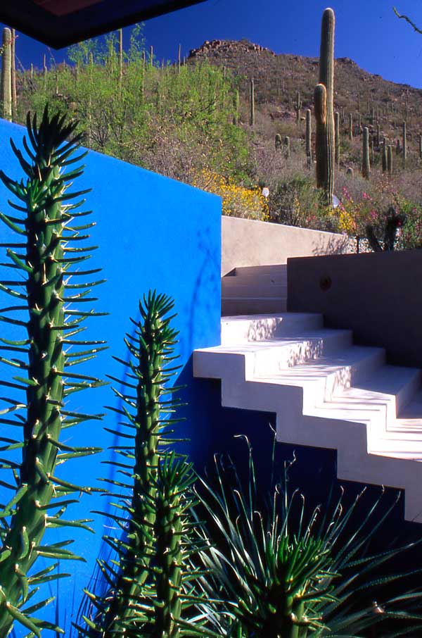
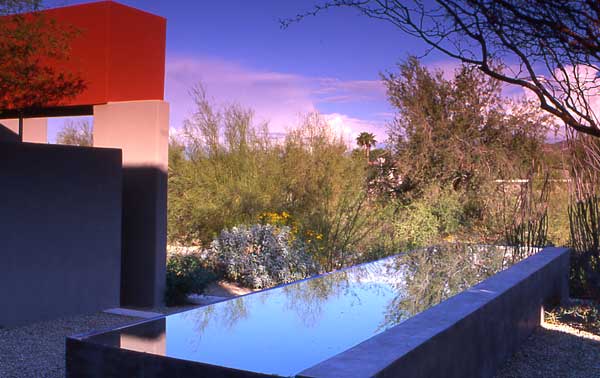
Try these…Steve Martino landscapes

 August 8, 2011 at 11:07 pm #161085
 Trace OneParticipant
sorry, don’t like the brown..just don’t like it..
what is the Chinese garden theory with red, anybody know? Dr. Sun, our visiting Chinese professor at Penn, clutched his fat stomach and laughed long and hard at my Chinese garden…but I appreciated it..a lot to learn..
August 8, 2011 at 11:12 pm #161084 Jason T. RadiceParticipant
Red is good luck in the Chinese culture. Much of the design and symbolism has to do with inviting luck in to the home and persons.
August 8, 2011 at 11:59 pm #161083 Alan Ray, RLAParticipant
I suggest you check out Luis Barragan’s work for color in architecture/landscape architecture….
go to barragan foundation for some cool pics
August 9, 2011 at 12:01 am #161082 Alan Ray, RLAParticipant
hence, the red chinese……
August 9, 2011 at 12:08 am #161081 Jason T. RadiceParticipant
Sweet…thanks for the tip. I’m lovin’ the mid-century modern!
-
AuthorPosts
- You must be logged in to reply to this topic.


