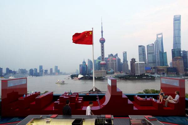
Article by Paula Uzarek – Total reading time 5 minutes Red Rouge, by 100architects, in Shanghai, China Do computer games influence landscape architecture; the art of arrangement of elements in a given space? When talking about inspiration, they sure do. It is also known that certain kind of games have an impact on our brain activity as they stimulate the processing of spatial elements. But what connects Tetris with public space design, and with the world of design itself? When looking at Red Rouge in Shanghai, it is striking that the simple, geometrical shapes of polyominoes from a popular tile-matching puzzle game can create an array of seating, tables, and walls in Bar Rouge terrace. This, Shanghai’s most privileged balcony, with a stunning view of the Pudong area, is enriched with a new, red, VIP Lounge area. Red Rouge maximizes the impact of the panorama, just as Tetris boosts our cognitive skills. So how does this project increase the value of landscape design?

Red Rouge. Image courtesy of 100architects
“
the thin boundaries between public leisure and urban marketing” and they do it here in a simple but very sophisticated way. Social dynamics and public interactions, as the company claims, happen also in “semi-public spaces”. They have an indubitable public character because people gather there, whilst the space is, simultaneously, the legal possession of a private individual or corporation. What we can recognize that people are talking about is that members of the public become users in these “semi-public spaces”. The characteristics of Bar Rouge are similar. This is a place of social interactions on the top of Shanghai’s Bund 18 mall complex. It was located on the rooftop of an historical Shanghai building by
VOL Group, a specialist and leader in the food and beverage industry in the city. These all factors really attract users.

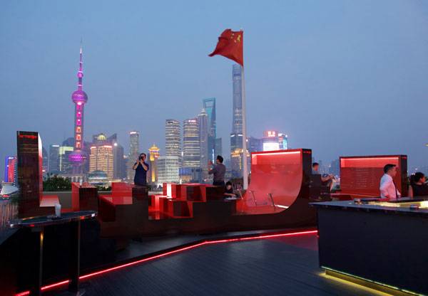
Red Rouge. Image courtesy of 100architects
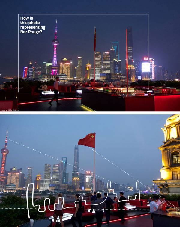
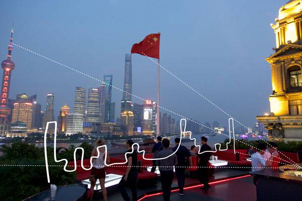
A simplified skyline of Shanghai is illustrated by the use of geometrical forms. Well-known Shanghai buildings were imitated in these Tetris-like forms, and simplified. This measure makes use of the most significant feature of the Bar Rouge and puts the view of the Pudong area in the spotlight. What has been assumed is that the visual impact should be escalated and the business activity of a place should not be disrupted. These conditions were the first and foremost thing that has been noticed during the design process. Such a view and location cannot be found in any other place in the world. Then the key words were established to set a framework – skyline, terrace, visual impact, and business activity.

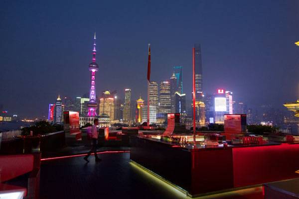
Red Rouge. Image courtesy of 100architects
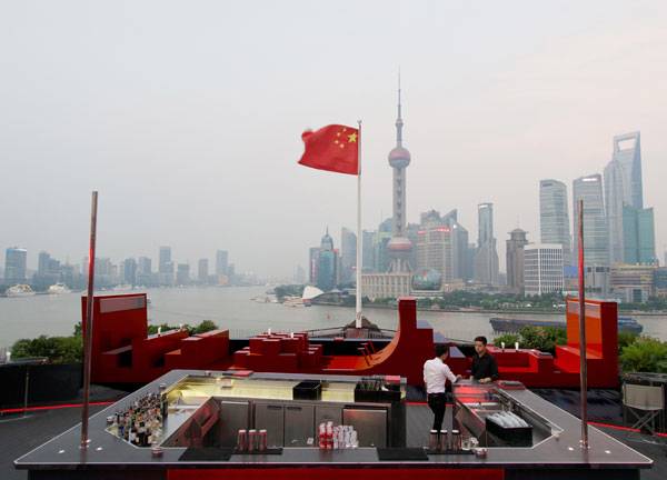
The concept is simple, but was not simple to implement. Existing lounge sofas were substituted with a new solution which boosts the background view through the use of shapes, colors, and the light. The attention of clients is definitely drawn to these functional objects. They can be treated as furniture, architectural elements, art, or anything that comes to your mind. Having multiple meanings, Red Rouge is a perfect solution that fits into a modern metropolitan VIP area and takes space design to a brand new level.
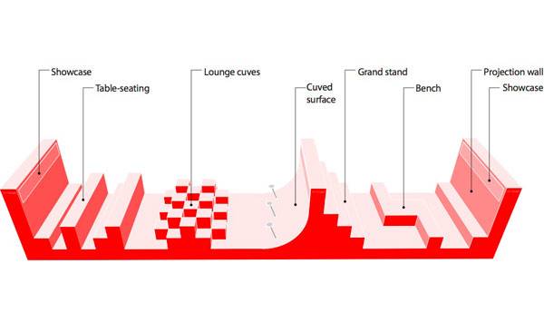
The Composition of Modules Each of the five shapes have their own way to activate users of the VIP area. The tableseating area is the first element, with a size of 3,15 meters of total length. Actually, each module has 45 centimeters of length that is arranged into Tetris-like dynamic shapes. The connections between each section are 90 centimeters; the one in the middle stretches 135 centimeters. The tables are a frequent place for groups to gather due to their capacity of hosting up to eight people. The wall behind the first seating area has a built-in showcase displaying drinks.

Red Rouge. Image courtesy of 100architects
The second area features lounge cubes, being a less-formal place for up to seven people to sit in multiple directions and a few more to stand nearby. The top view reminds one of a chessboard, while the side view still recalls Tetris cubes merged into various combinations. The total length here is 2,25 meters. The third section, behind the longest circulation route, is the slope, which arouses curiosity by its shape.

Red Rouge. Image courtesy of 100architects
It has three seating choices in the form of pins that stick out of the curved space. It introduces the grandstand, which looks like typical stairs, with three levels for a maximum of nine users. The slope is 1,8 meters long and the grandstand is 1,35 meters long. The fourth section is the simplest element in the Red Rouge. This bench can seat up to six users. And the last element, the projection wall, has two functions; it hosts three users and serves as a projector for images or movies. It closes the composition and is the mirror reflection of the Red Rouge first element. The texture and the color highlight the precise design of the shapes.

Red Rouge. Image courtesy of 100architects
The construction is completely made of Corian Solid Surface. This is a type of premium decorative material, primarily used for kitchen and bathroom surfaces. It is now more and more commonly used among designers and artists thanks to its characteristics. Corian Solid Surface is non-porous, stain resistant, and seamless. Moreover, it can be shaped into literally any contour thanks to its thermoformable features. As the
100architecs say, “
Since Red Rouge is an object that lies between furniture, sculpture, artwork, and public space, we consider it highly convenient and suitable to use this material, to boost its visual aesthetic impact.” And is the colour also a matter of a precise choice? Indeed, it is. Red makes the Red Rouge an energetic place. Its impact is noticeable from a distance. Shiny red, as the colour of attraction and strength, has a lot of energy. In psychology, it is said to make shy people open up. Red also stimulates the appetite. The purpose of using this colour is clear. Red Rouge is definitely a unique example of taking inspiration from other fields of our life, like computer games. Arranged in a sophisticated way that does not sting our eyes with too much simplicity, the Tetris connotations in the project boost the landscape architecture world with old ideas given in a new, fresh way. This design is really worth remembering as an example of incorporating game design into landscape design.
Go to comments 
Red Rouge. Image courtesy of 100architects
Full Project Credits For Red Rouge:
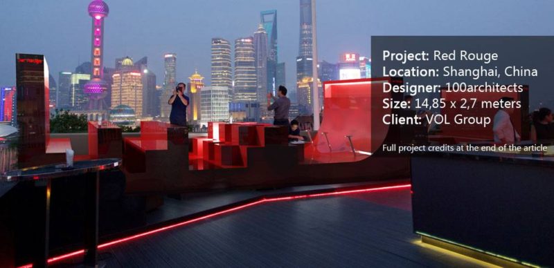
Project Name: Red Rouge Location: Shanghai, China Designer: 100architects Size: 14,85 x 2,7 meters Client: VOL Group Recommended Reading:
Article by Eni Çeka
Published in Blog