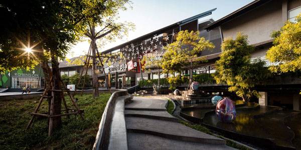
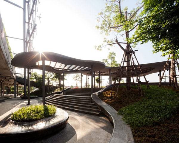
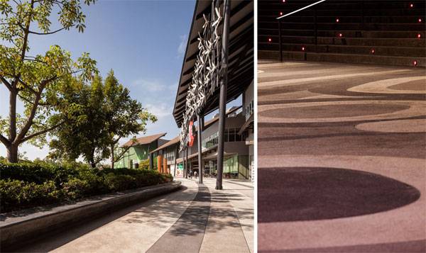
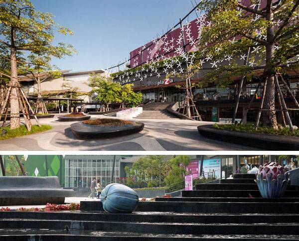
Mandela Park, by Karres en Brands Landscape, Almere, The Netherlands. Almere in The Netherlands is the perfect example of a low-density city constructed from zero. Architects had a great opportunity here to demonstrate to the world how innovative and contemporary design works. Mandela Park, which opened in 2011, was designed by Karres en Brands Landscape and planned by OMA as part of the master plan for the next stage in the development of Almere. This plan focuses on the location of future business areas.
Designing the Urban Rooftop
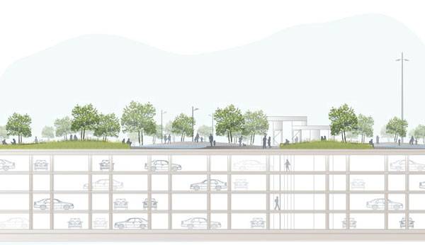
As you can imagine, creating a new business center means ensuring easy availability and providing for new parking needs in the area. In this case, four-layered underground parking garages provide service to three massive towers. But in Mandela Park, designers looked up — using a roof top for a park and reinforcing the identity of a place with no references.
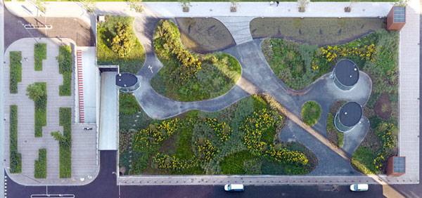
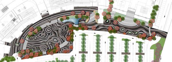
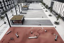
Human and Urban Scale Work Together The freed rectangular space of Mandela Park contrasts with the 120-meter-tall office towers in front of it. The scale of the park replies to its high-density surroundings and gives visual balance, even though the entire surface seems oversized from the point of view of human action. The designers took two existing channels crossing the place to start adjusting the scale, dividing the park into three smaller areas. One of these channels was softly redirected to work as a diagonal connection for pedestrians and the other as a means of direct transversal break. A secondary net of winding paths manages the internal circulation and creates a variable scheme of green islands among them. The Rules of a Place in Between Urban elements in direct contact with Mandela Park are basically four roads that limit the park’s extension and one that cuts it. There is a clear difference in how the park reacts to the transversal boundaries in comparison with the longest ones. As the 200-meter-long parking roof wanted to be shortened, Karres en Brands extended its transversal limits in the form of squares that don’t follow the general scheme of the park. They are an intermediate point between the language of the city and the park in terms of geometry and materials. A series of bar codes made of grass break the lines drawn by the roads and introduce the green into the gray, making the longitudinal transition a little softer and facing the curved design of the park in front of the three towers for a stronger connection. Related Articles:- London College Gets Funky Rooftop Design
- A Roof Garden That’s so Good, You Might Want to Work There!
- A Greener Housing Solution Reducing The Impacts in The Neighbourhood
The Giant Patchwork The designers worked with a range of different materials to form an awesome composition inside the three sub-areas of the park. All of them have the same curved scheme, very similar to a patchwork made of a mix of natural and artificial elements — which is a clever decision if you think of the park being seen by a lot of people from the high towers. It offers a doubly powerful visual experience.
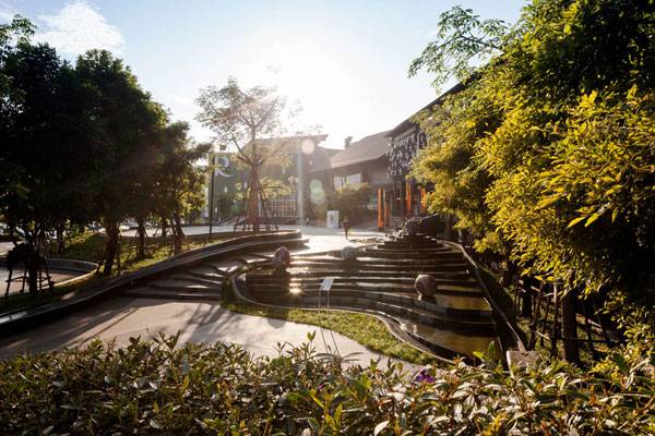
Materials have a key role in the final result of Mandela Park as a place for recreation. The paths are made of terrazzo asphalt that looks like the natural stone we find in the paving of the surroundings. Vegetation and water features bring nature to the park using ponds, grasses, and perennial and flowering shrubs. The image of the patchwork changes with the seasons like the beautiful and colorful landscape that it is. Wouldn’t you like have this view from the window of your office? Mandela Park has been featured in landscape magazines around the world because of the vegetal green roof. But we also find it interesting in terms of being an outdoor space that brings together different levels of work while preserving the nice sensation of living in the periphery even in the city’s business center. Recommended Reading:- Detail in Contemporary Landscape Architecture by Virginia McLeod
- Landscape Architecture: An Introduction by Robert Holden
Article written by Elisa García. Return to Homepage
Published in Blog


