


Author: Jay Boi


University of California San Francisco Regional Medical Center
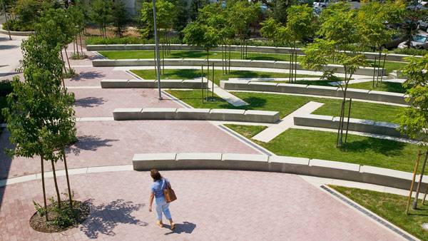
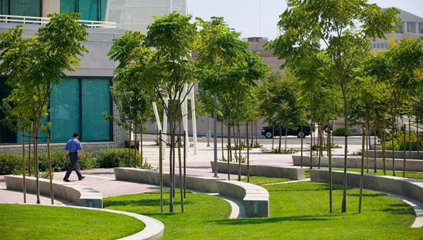
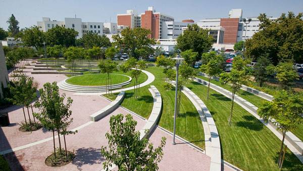
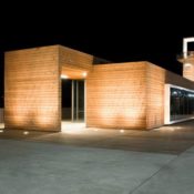
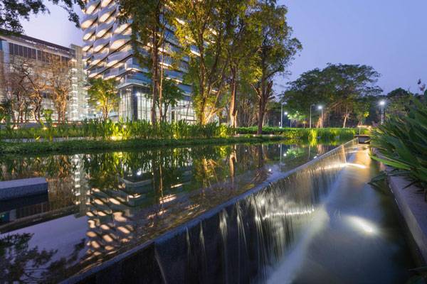
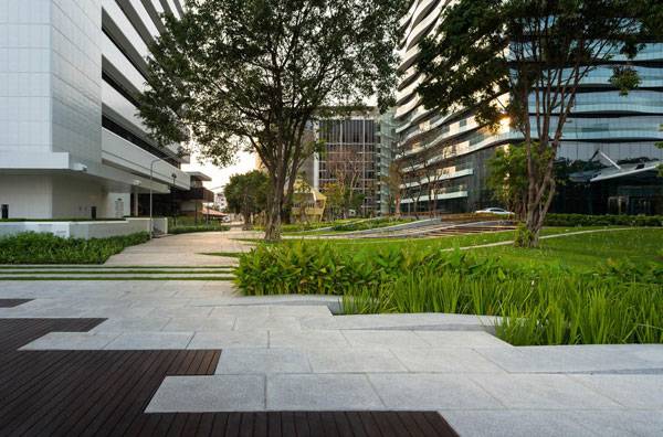
Article by Elisa García Nieto University of California San Francisco Regional Medical Center, by SWA, Fresno, California (USA) When working on a new project, landscape architects have to find suitable clues in their background and in the environment to define the best design strategy. We tend to think that contexts that do not impose a great number of conditions and limitations are more favorable to face. But there are vital challenges to overcome when sites seem not to have a clear identity of their own or references around them. The University of California San Francisco Medical Center is part of an ambitious plan consisting of multiple phases of development in a three-acre, empty area that had been divided into four regular regions, with a roundabout in the middle. The starting point was the creation of the educational building and its outside space in the northeast quadrant. The landscape architects of SWA were in charge of designing the public area.
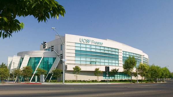
University of California San Francisco Regional Medical Center. Photo Credit: Tom Fox
University of California San Francisco Regional Medical Center
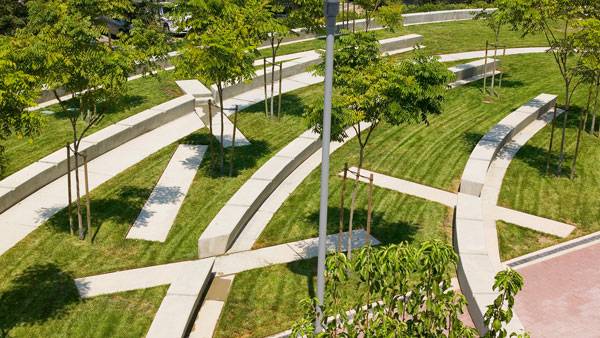
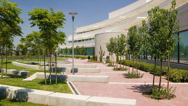
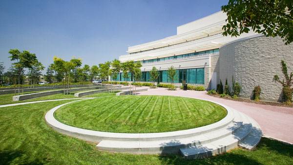
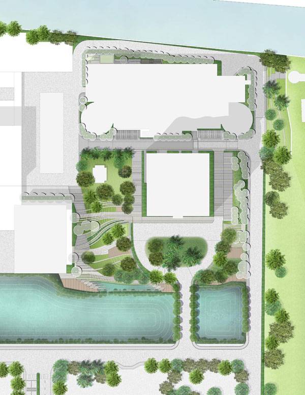
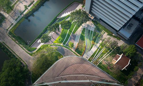
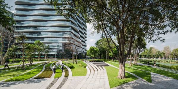
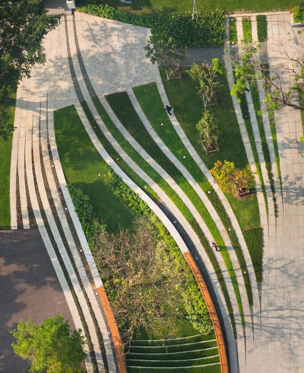
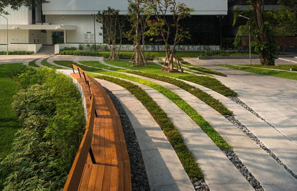
Working on Identity The most distinctive feature of the area was the rounded exterior perimeter, which was taken to align the educational building. The repetition of the curved geometry made it gain prominence through the architecture and created a vertical reference for the space. The landscape designers followed the same scheme, reinforcing what seemed to work as an identity footprint for the site, instead of entering a competition. Looking at the building and responding to its concave back facade, the design plays a mirror effect that tries to complete and enclose the pattern. Contrasting with the orthogonal borders of the plot, the curved geometry provides irregular walkways where both languages meet. The resulting space transmits a sense of unity and internal consistency.
University of California San Francisco Regional Medical Center. Photo Credit: Tom Fox
University of California San Francisco Regional Medical Center. Photo Credit: Tom Fox
University of California San Francisco Regional Medical Center. Photo Credit: Tom Fox
University of California San Francisco Regional Medical Center. Photo Credit: Tom Fox
University of California San Francisco Regional Medical Center. Photo Credit: Tom Fox
University of California San Francisco Regional Medical Center. Photo Credit: Tom Fox
University of California San Francisco Regional Medical Center. Photo Credit: Tom Fox
Full Project Credits For the University of California San Francisco Regional Medical Center:
Project Name: University of California San Francisco Regional Medical Center Type of Project: Exterior open space for medical education building Design: SWA Group (Landscape Architectural Services) Location: Fresno, California (USA) Client: FCA-Fong & Chan Architects Recommended Reading:
- Becoming an Urban Planner: A Guide to Careers in Planning and Urban Design by Michael Bayer
- Sustainable Urbanism: Urban Design With Nature by Douglas Farrs
Article by Elisa García Nieto


How One MSU Student Caught the Eye of the 2016 ASLA Jury
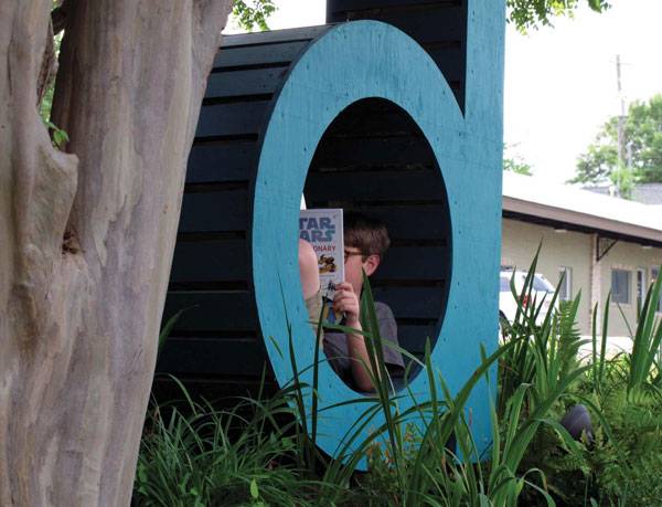
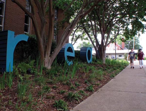
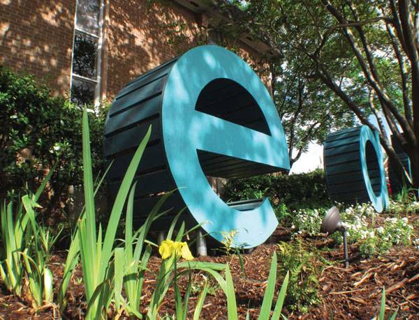
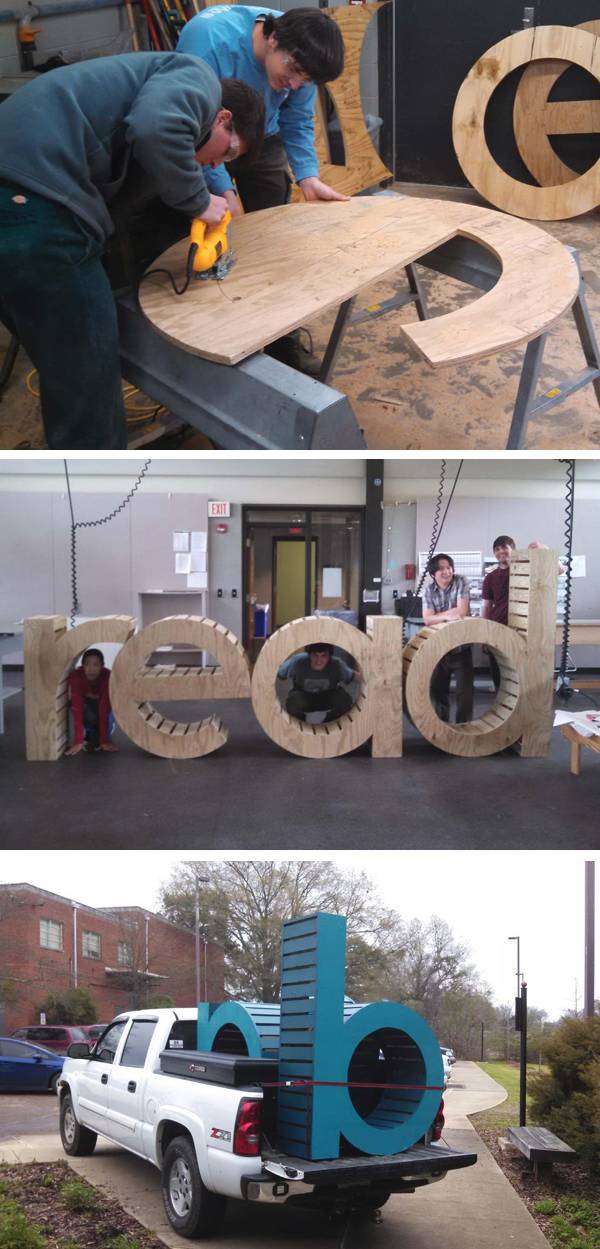
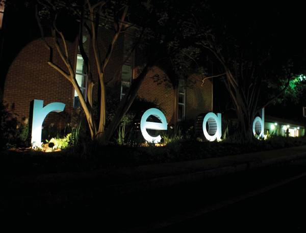
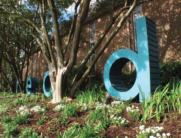
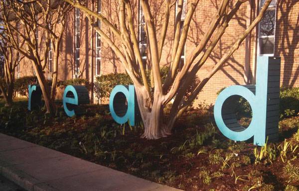
Written by Elisa García Nieto Starkville Public Library “read” Sculpture by Travis R. Crabtree (MSU Student) with project adviser Cory Gallo (associate professor) at Starkville Public Library, Mississippi (U.S.A.) Landscape architects know how many obstacles a project needs to overcome before jumping from the screen of their laptops. Building in the real world involves a wide range of factors and conditions which students, sometimes, do not have chance to face in the scholastic environment. And this is far away from that beloved haven for even the most restless of them. What can you do when you have plenty of ideas to put into action but you are still an undergraduate? How could you go beyond academic subjects and lead your own proposals? Well, there are alternative ways for students to contribute to the community while enlarging their education.
Public Library “read” Sculpture
Last year Travis R. Crabtree studied at MSU while he also took part in a service-learning scholarship program, and the resulting installation was selected for the well-known ASLA Student Awards. In this article, we will analyze the goals of his project, called Read, which consisted of creating an expressive landmark for the local public library in the form of a readable sculpture placed in its garden. With a small budget, limited experience, and simple but clever ideas, the team made a powerful impact.
Starkville Public Library “read” Sculpture by Travis R. Crabtree
Starkville Public Library “read” Sculpture by Travis R. Crabtree
Starkville Public Library “read” Sculpture by Travis R. Crabtree

Starkville Public Library “read” Sculpture by Travis R. Crabtree
Starkville Public Library “read” Sculpture by Travis R. Crabtree
Starkville Public Library “read” Sculpture by Travis R. Crabtree
Starkville Public Library “read” Sculpture by Travis R. Crabtree
Starkville Public Library “read” Sculpture by Travis R. Crabtree
Full Project Credits For The Starkville Public Library “read” Sculpture:
Project Name: Starkville Public Library “read” Sculpture Type of Project: Sculpture in garden Design: Travis R. Crabtree (Student) with project advisers Cory Gallo and Brian Templeton. Location: Starkville Public Library Garden, Mississippi (U.S.A.) Year of Completion: 2015 Client: Starkville Public Library Budget: $ 1,750 Awards: Honor 2015 ASLA Student Awards Recommended Reading:
- Becoming an Urban Planner: A Guide to Careers in Planning and Urban Design by Michael Bayer
- Sustainable Urbanism: Urban Design With Nature by Douglas Farrs
Written by Elisa García Nieto

The Best Way to Design a Lakefront for a City
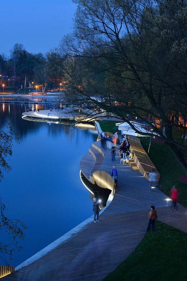
Article by Elisa García Nieto Redevelopment of the Eastern Shore of Paprocany Lake, by RS+, in Tychy, Poland Ever since the first significant redevelopments of waterfront areas happened in the United States in the 1970s, post-industrial urban contexts around the world have followed the same path. Have you ever thought about how many project opportunities this means for landscape architects? The reintegration of these gaps into the urban fabric is a contemporary and strategic field, requiring us to rethink public spaces and urban relationships with the environment. This vision has demonstrated many positive transformations, such as those Yuliya Georgeva analyzed in her article 10 Cities That Are Reinventing The Relationship With Their Rivers.
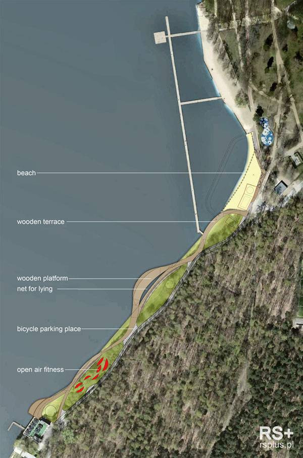
Masterplan. Image courtesy of RS+
Redevelopment of the eastern shore of Paprocany Lake
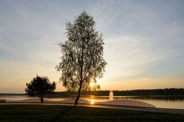
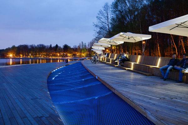
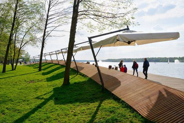
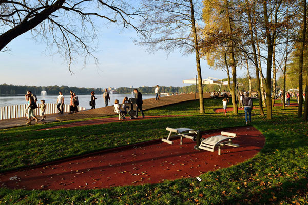
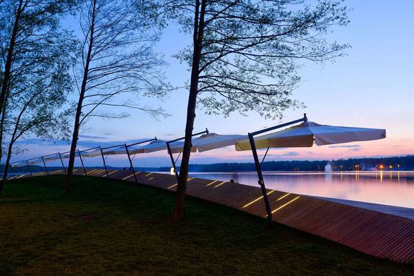
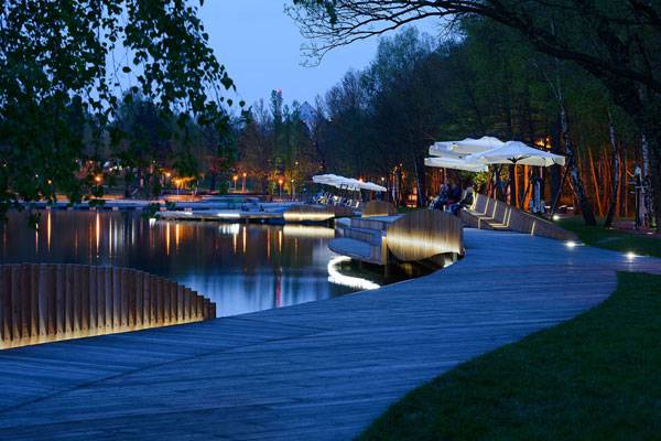
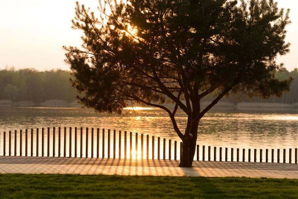
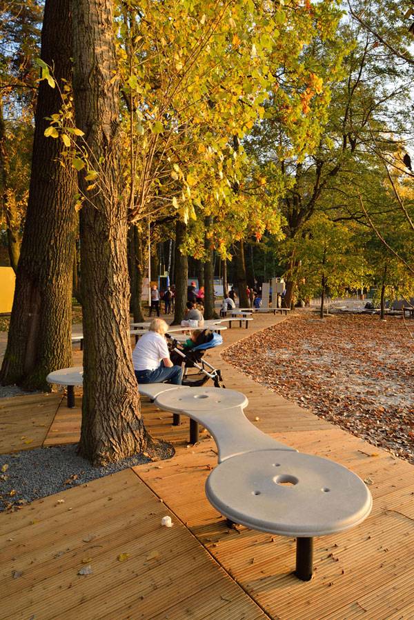
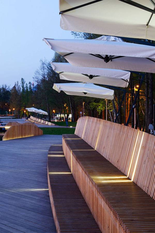
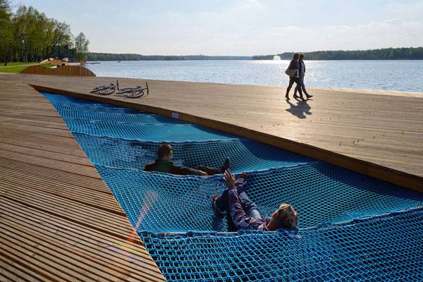
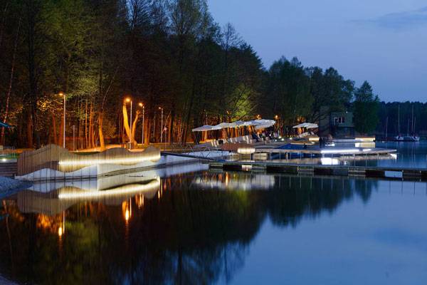
Here is another such project. In this article, you will read about an award-winning design in Tychy, a city questioning its relationship with the landscape years after its industrial purposes plummeted. The RS+ team redeveloped part of the city’s lakefront, turning it into a beloved landmark for citizens that improves their quality of life. The project proposes a walkway of dynamic lines flowing as intermediate space to reconnect urban recreation and nature while welcoming new public uses.
Redevelopment of the eastern shore of Paprocany Lake. Photo credit: Tomasz Zakrzewski
Redevelopment of the eastern shore of Paprocany Lake. Photo credit: Tomasz Zakrzewski
Redevelopment of the eastern shore of Paprocany Lake. Photo credit: Tomasz Zakrzewski
Redevelopment of the eastern shore of Paprocany Lake. Photo credit: Tomasz Zakrzewski
Redevelopment of the eastern shore of Paprocany Lake. Photo credit: Tomasz Zakrzewski
Redevelopment of the eastern shore of Paprocany Lake. Photo credit: Tomasz Zakrzewski
Redevelopment of the eastern shore of Paprocany Lake. Photo credit: Tomasz Zakrzewski

Redevelopment of the eastern shore of Paprocany Lake. Photo credit: Tomasz Zakrzewski
Redevelopment of the eastern shore of Paprocany Lake. Photo credit: Tomasz Zakrzewski
Redevelopment of the eastern shore of Paprocany Lake. Photo credit: Tomasz Zakrzewski
Redevelopment of the eastern shore of Paprocany Lake. Photo credit: Tomasz Zakrzewski
Redevelopment of the eastern shore of Paprocany Lake. Photo credit: Tomasz Zakrzewski
Redevelopment of the eastern shore of Paprocany Lake. Photo credit: Tomasz Zakrzewski
Full Project Credits For the Redevelopment of the eastern shore of Paprocany Lake:
Project Name: Redevelopment of the eastern shore of Paprocany Lake Designers: RS+ Architect: Robert Skitek Location: Paprocany Lake in Tychy, Poland Size: 400 meters length / 2 hectares Year of Completion: 2014 Client: U.M. Tychy Cooperation: Jakub Zygmunt, Jarosław Zieliński, Szymon Borczyk, Marcin Jamroż, Dorota Zwolak, Katarzyna Wiśniewska Photographs: Tomasz Zakrzewski Awards: SUPERJEDNOSTKA 2014 for the best realization in public space (winner). VIth edition LIVE IN ARCHITECTURE competition (finalist). Mies van der Rohe Award 2015 (nomination) Learn more about RS+: Website: www.rsplus.pl Facebook: www.facebook.com Blog: www.blog.rsplus.pl Recommended Reading:
- Becoming an Urban Planner: A Guide to Careers in Planning and Urban Design by Michael Bayer
- Sustainable Urbanism: Urban Design With Nature by Douglas Farrs
Article by Elisa García Nieto Return to Homepage

Is The 2015 MPavilion a Victory for Cultural Spaces?
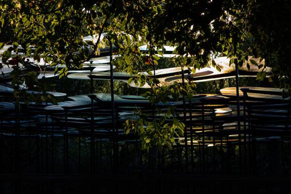
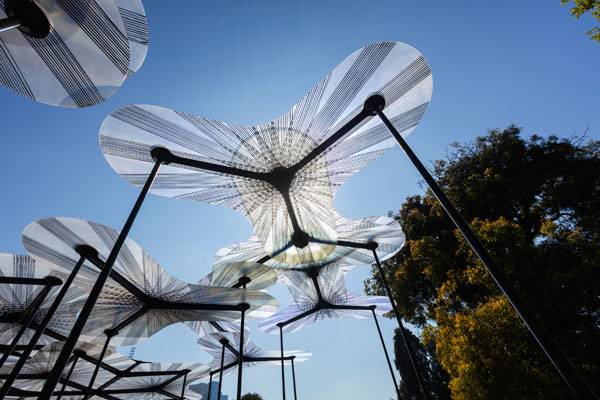
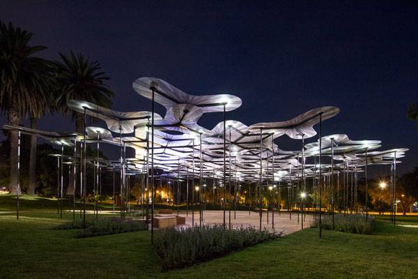
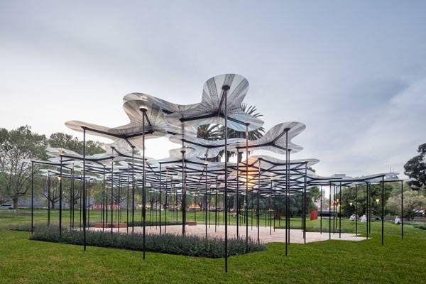
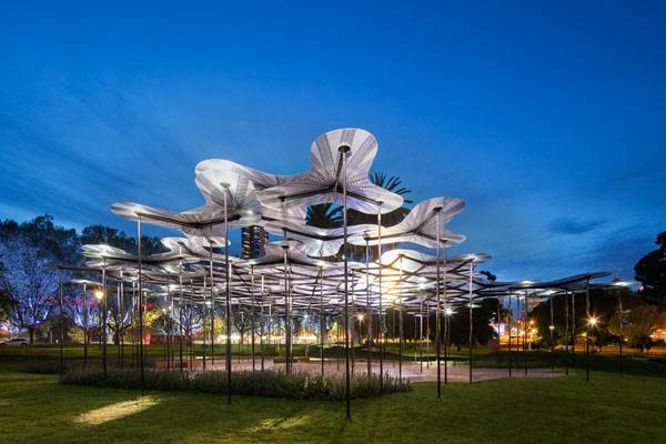
Article by Elisa García Nieto 2015 MPavilion, by A_LA, in Victoria Queen’s Gardens, Melbourne, Australia. If there is a function we should expect from public space, it is its contribution to reinforcing social cohesion, providing specific places where citizens can meet and share their diverse experiences. Cultural programs amplify this, and as such are an important factor in designing the urban landscape. In this article, we talk about how to rethink cultural spaces by taking a look at 2015 MPavilion, a recent edition to Melbourne. The idea is quite practical: Each year, commissioners knock at the door of an outstanding team, challenging it to design a temporary pavilion. In 2015, it was the A_LA team’s turn to provide a place for community and cultural industry. RIBA award-winning architect Amanda Levete designed an organic structure strongly inspired by nature. Levete’s 2015 MPavilion canopy uses innovative materials to grow a micro-forest of light and translucent colors that houses free cultural programs and encourages spontaneous appropriation.
2015 MPavilion. Photo credit: John Betts.
Is There an Inside Under This Canopy?
Thanks to exhibitions such as the annual one organized by The Serpentine Gallery , the British root of MPavilion, we have mountains of creative reflections on the idea of boundaries to temporarily enclose a space. This is the first point that 2015 MPavilion questions — and one of those making it truly interesting for us as landscape architects. What Levete proposed was to generate the perception of place by the combination of a roof high enough above our heads and vertical elements occupying the space more than drawing a lineal perimeter around the space.
2015 MPavilion. Photo credit: John Gollings
How Fixed Models Produce Flexible Results
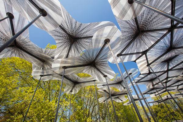
A singular model composes the pattern of this tree-like canopy, which gains meaning and a sense of whole structure through repetition. That is not an unknown design strategy, and it provides its own advantageous features. Starting with the beginning, let’s look at each piece individually: A species of plant consisting of three translucent petals with rounded contours is supported by three metallic columns instead of a central stalk. How do they join each other to form the canopy? They overlap their petals without touching others, thanks to a subtle difference in height among pieces. Petals of different units share the same column, offering multiple combinations that sometimes create figures able to cover larger spans.
2015 MPavilion. Photo credit: John Gollings
The Cookie Cutter Factor
As you can see, this modular system allows the designers to control a wide range of factors in a flexible and consistent way. Maybe the most evident one is the contour of the whole structure, which is defined by the addition of pieces in any direction and without hierarchy. It means that the canopy could be adapted to uncountable contour conditions and take any size — like cookie dough shaped by cutters.
- 2015 MPavilion. Photo credit: John Gollings
What is more, designers could control the eventual growth of the structure, its density, and uses if they distribute columns creating an irregular pattern that provides cleared areas. Going further, the system would allow designers to control levels of opacity by changing materials to adapt the petals to different climates, or just to provide more marked or colorful effects.
The Best Kept Secret of 2015 MPavilion
The well-developed design of the canopy owes its success to the choice of materials. Levete had a clear idea of how the pavilion should capture “this ethereal kind of dreamy,” but it would have been hardly impossible to get it if she had not looked at other disciplines. This out-of-the-box thinking resulted in an innovative use of materials and technologies from the aerospace industry. In fact, the spectacular translucent petals are made of fiberglass, which allows them to be just a few millimeters thick, but between three and five meters wide. In addition, the carbon fiber structure supporting the canopy provides an unexpected feature: Wind can softly move the pavilion, as if it really were flexible stalks in nature.
2015 MPavilion. Photo credit: John Gollings
How the Canopy Responds to the Environment
Interaction between the structure and natural elements is a main aspect that designers developed through openness. Openness refers to when the building of the canopy welcome and filter sunlight into a homogenous, clear light we can appreciate, when there are no enclosures, but a permeable assembly system for views and air to pass through. The canopy even allows wind to move it and amplifies its sound, making us conscious of the phenomenon. There is also a way for the structure to stay in the space: The pieces tend to decrease their concentration as they approach the limit, forming cutouts gradually. And at sunset, the petals give back light to the environment due to an integrated LED system that gracefully illuminates the scene.
2015 MPavilion. Photo credit: John Gollings
Full Project Credits For The 2015 MPavilion
Project Name: 2015 MPavilion Designer: A_LA Engineering: Arup Manufacturer: mouldCAM Construction: Kane Constructions Location: Victoria Queen’s Gardens, Melbourne, Australia Year of Completion: 2015 Client: Naomi Milgrom Foundation, City of Melbourne, and Victorian State Government Learn more about A_LA: Website: www.mpavilion.org Facebook: www.facebook.com/mpavilion Instagram: www.instagram.com/explore/locations Recommended Reading:
- Becoming an Urban Planner: A Guide to Careers in Planning and Urban Design by Michael Bayer
- Sustainable Urbanism: Urban Design With Nature by Douglas Farrs
Article by Elisa García Nieto Return to Homepage

5 Best Plants For Phytoremediation
We take a closer look at 5 of best plants for phytoremediation. One of our most basic natural resource, soil, is threatened. The soil has been neglected and contaminated for decades now. Although, the global map of contamination is difficult to define, the European Environment Agency has identified heavy metals and mineral oil as the main soil pollutants. Knowing that just in Europe the number of polluted sites is expected to increase by 50% in the next 10 years, it seems clear that one of our biggest environmental challenges is under our feet. As landscape architects, should we not be aware of all our potential to play a role on the solutions side?
What is Phytoremediation?
Clean techniques to remediation are getting more popular, and most likely, you are already familiar to phytoremediation. Through this article, you will find a useful guidance on plants with proven qualities to naturally reduce, degrade or remove contaminants from soil and water. Advantages are outstanding: they do not involve visual impact, expensive engines and toxic chemicals. Do you remember Top 10 Reused Industrial Landscapes by Lisa Tierney? Landschaftspark, number five on the list, is a great model of phytoremediation in recreational projects. WATCH: Landschaftspark Duisburg-Nord | Industrienatur + Industriekultur
Best Plants For Phytoremediation
1. Indian mustard (Brassica juncea L.) Info: Brassica juncea (L.) Czern. – Indian Mustard
As International Journal of Molecular Sciences has published, heavy metals affect not only industrial sites but also cultivated land, spreading risks for human health. Brassicaceae species are really useful to accumulate certain metals while producing high quantities of biomass in the process, and Indian mustard is the star of this group.
“Brassica juncea” by elminium. Licensed under Creative Commons 2.0 via Flickr
“mustard” by Sajith T S. Licensed under Creative Commons 2.0 via Flickr
2. Willow (Salix species). (White Willow)
The water loving plants beautify landscapes, however, it’s worth is not confined to its appearance only. They have a more interesting use for phytoremediation as well: their roots have demonstrated (Response of Salix alba L. to heavy metals and diesel) viability, accumulating lower levels of heavy metals than Brassicaceae, and they deal with Cd, Ni and Pb, and work even in mixed heavy metals like diesel fuel polluted sites.

“Bloedel Reserve Willow Tree” by Geaugagrrl – Own work. Licensed under Public Domain via Wikimedia Commons
Westergasfabriek Park. Image courtesy of Gustafson Porter
3. Poplar tree (Populus deltoides). (Populus deltoides W. Bartram ex Marshall eastern cottonwood)
The advantageous effect of poplar trees on soil and underwater has also been widely studied. Their secret lies in the naturally well-designed root system which take up large quantities of water.
“Populus deltoides” by Matt Lavin. Licensed under Creative Commons 2.0 via Flickr
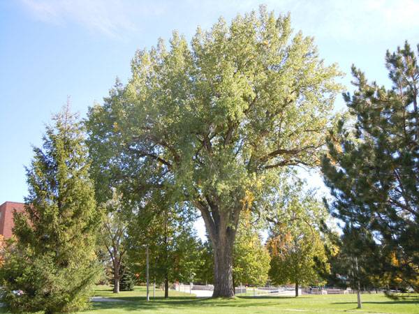
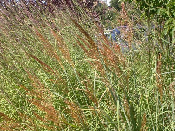
4. Indian grass (Sorghastrum nutans) (Sorghastrum nutans (L.) Nash)
Research looked at how this Midwestern U.S. native plant benefits soil and ground water around them. Many people can find Indian grass growing along the roadsides without noticing its power to detoxify common agro-chemical residues such as well-known pesticides and herbicides related to atrazine and metalochlor.
“Sorghastrum nutans (3912211191)” by Matt Lavin from Bozeman, Montana, USA – Sorghastrum nutansUploaded by Jacopo Werther. Licensed under CC BY-SA 2.0 via Wikimedia Commons
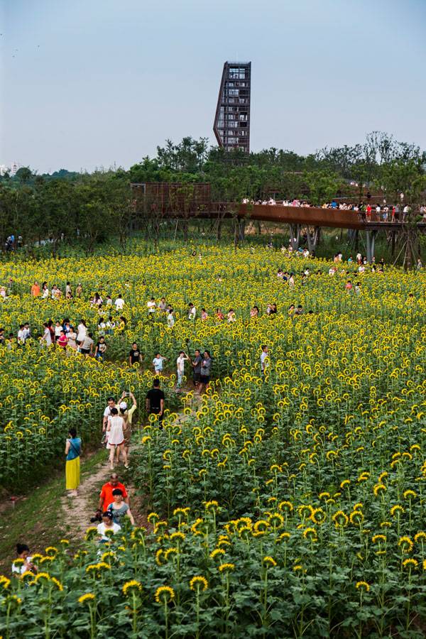
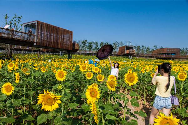
5. Sunflower (Helianthus Annuus L.) (Helianthus annuus L. common sunflower)
Experiments like Influence of the sunflower rhizosphere on the biodegradation of PAHs in soil reveals that sunflowers reduce different PAH level from soil, in an effective way, but what is really surprising is how varied range of contaminants they can accumulate. Heavy metals such as Pb, Zn (Heavy Metals Extraction Potential of Sunflower (Helianthus annuus) and Canola (Brassica napus)), N, P, K, Cd, Cu or Mn (Capability Of Heavy Metals Absorption By Corn, Alfalfa And Sunflower Intercropping Date Palm), seem to be its food, which is great news because sunflowers have a quick growth to start working soon.
Quzhou Luming Park. Photos courtesy of Turenscape.
Quzhou Luming Park. Photos courtesy of Turenscape.
Recommended Reading on Phytoremediation:
- Phytoremediation: Transformation and Control of Contaminants by Steven C. McCutcheon
- Phytoremediation: Role of Aquatic Plants in Environmental Clean-Up by Bhupinder Dhir
Article by Elisa García Nieto Return to Homepage

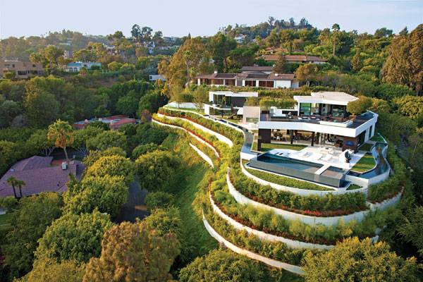
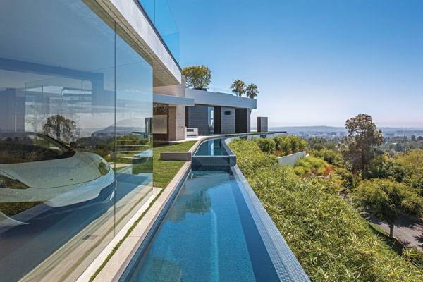
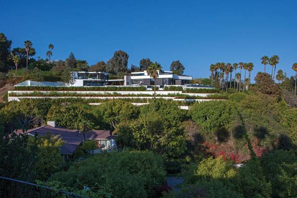
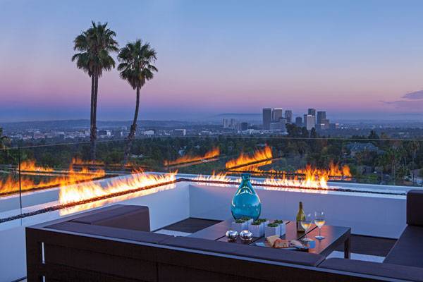
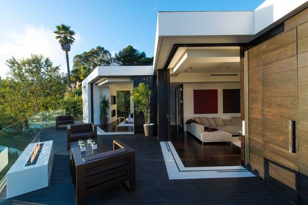
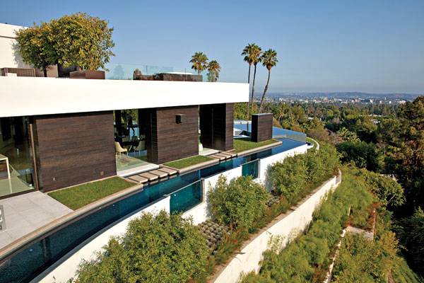
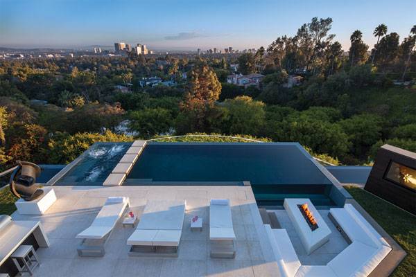
$36 Million Reveals the Stylish Gardens of Laurel Way by Whipple Russel Architects
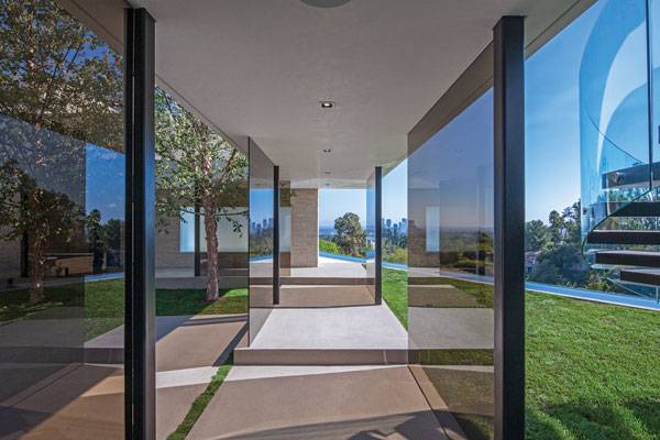
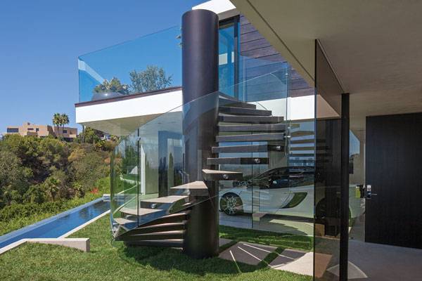
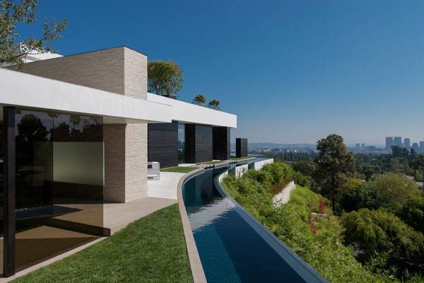
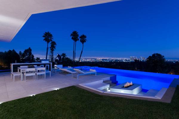
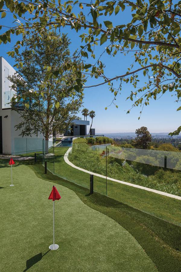
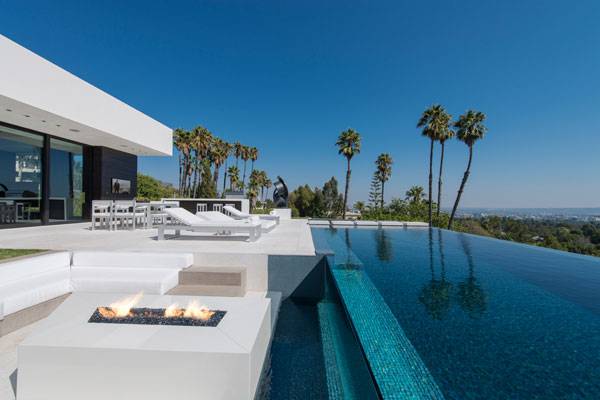
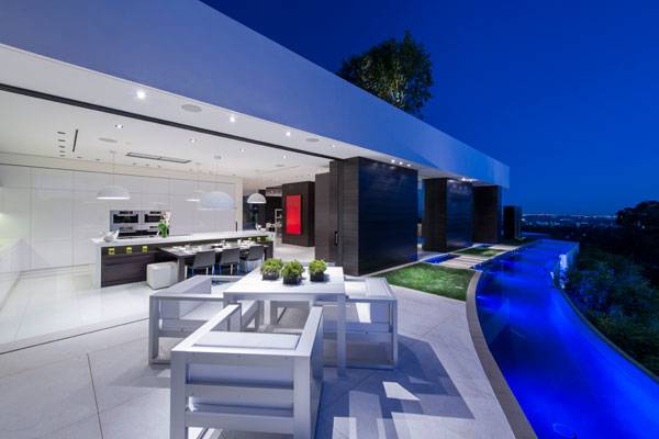
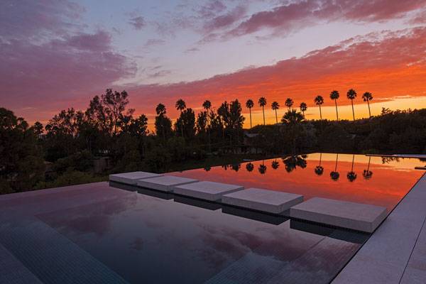
Laurel Way by Whipple Russel Architects, in Beverly Hills, California (U.S.A.) Collective imagination goes into overdrive when looking at such an iconic and well-known city as Beverly Hills. Most people know about its ostentatious properties and palm-fringed avenues, but today we will stay far from such commonplaces to introduce you to a project of a different standard. From the outside, Laurel Way Residence is a contemporary three-story house which greets Los Angeles from the top of an exuberant green terraced hill. Each internal environment of Laurel Way had to be a “jewel box; an individually conceived, precisely functional, and dramatic sensory experience” in words of the design team. This description is tempting, but not enough. Why does this project stand out, even in its luxury context? Well, because of the breathtaking way it develops an inside-outside connection.
Laurel Way. Image courtesy of Whipple Russel Architects
Laurel Way by Whipple Russel Architects
Whipple Russel Architects created an open landscaping concept that erases the conventional architectonic limits instead of utilizing vertical barriers for privacy, which is much more usual in the area. Matching the interior design and adding consistency to the whole project, we find balanced and surprising outdoor spaces. Let´s see why Laurel Way is truly special. WATCH: Laurel Way, Beverly Hills, CA
The Rules of the Game
Laurel Way is of considerable size and offers a variety of different environments, but at the same time it is still easy to perceive it as a unified concept. From the general to the detail, everything follows a similar approach. The house avoids giving a massive first impression and expresses a strong desire of obtaining openness and a connection with the outdoors, of suggesting lightness, and of offering a variety of experiences as well. We can appreciate it through its fragmented volumes, its glass facades, and through the irregular perimeter creating a number of independent gardens within the site.
Laurel Way. Image courtesy of Whipple Russel Architects
Laurel Way. Image courtesy of Whipple Russel Architects
A Landscape of Opposites
This project shows a great understanding of how relationships between opposing pairs of aspects work; outside-inside, natural-artificial, lightness-mass and curved shapes-orthogonal geometry. The secret is to put a bit of one into the other, like natural elements being part of the artificial indoor environment, for example, until they become integrated. See More Articles on LAN:
- Natural Swimming Pools Designed With Nature
- Unbelievable Conceptual Pool Design That Plays With Your Mind
- Rooftop Infinity Pool with Awesome Views
Laurel Way. Image courtesy of Whipple Russel Architects
Laurel Way. Image courtesy of Whipple Russel Architects
Laurel Way. Image courtesy of Whipple Russel Architects
Laurel Way. Image courtesy of Whipple Russel Architects
Exploring the Place
As you can appreciate through the images, the designers worked using the same short palette of neutral and sober colors for the entire project. Different materials, including the furniture, have been assimilated into the reduced color spectrum of green, blue, dark chocolate and the dominant creamy colors to create careful and studied sequences of contrasts and a sense of lightness. There are white terraces or green patches around the house, all limited by a continuous staggered water channel in a horseshoe shape. Those elements, closely dependent of the indoor spaces keep their orthogonal geometry in contrast with those more linked to nature, which adopt a more organic pattern.
Laurel Way. Image courtesy of Whipple Russel Architects
Laurel Way. Image courtesy of Whipple Russel Architects
Laurel Way. Image courtesy of Whipple Russel Architects
Practical Strategies to Gain Openness
One of the strategies intentionally avoided in Laurel Way was a reliance upon vertical barriers because those would reduce openness and break the connection between environments. Then, how did the designers differentiate areas and uses? Basically, they worked on changes in pavement material, floor level, or the dimensions of elements. For example, in front of the main living-room, a small water channel becomes a spectacular pool and jacuzzi for relaxing in, merely by changing its width.
Laurel Way. Image courtesy of Whipple Russel Architects
Laurel Way. Image courtesy of Whipple Russel Architects
How Laurel Way Connects Two Environments
The singular location of Laurel Way, including the green hill, plays a role in the urban landscape. The design team softly transforms the steep slope by creating planted terraces which respect its organic perimeter. Thanks to the visual reinforcement of the retaining walls in white, the solution absolutely matches with the house: when we see the horizontal white slabs floating on the glass facade, does the house not seem to blend into the terraced hill like its last platform?
Laurel Way. Image courtesy of Whipple Russel Architects
Laurel Way. Image courtesy of Whipple Russel Architects
Laurel Way. Image courtesy of Whipple Russel Architects
Full Project Credits For Laurel Way by Whipple Russell Architects
Project: Laurel Way Type of project: Residential Landscape Architect: Whipple Russell Architects Architect: Whipple Russell Architects Interior designer: Michael Palumbo Lighting design: Crestron Client: Richard Papalian Location: 1201 Laurel Way, Beverly Hills, California (U.S.A.) Year of completion: 2013 Size: 11,200 sq. ft Sold: $ 31,000,000 USD Architect: Marc Whipple AIA Project Manager: Andrew Takabayashi Photographers: William MacCollum, Art Gray Photography Website: www.whipplerussell.com Facebook: www.facebook.com/whipplerussell Pinterest: www.pinterest.com/whipplerussell Youtube: www.youtube.com/user/wrarchitects Twitter: www.twitter.com/whipplerussell LinkedIN: www.linkedin.com/company/whipple-russell-architects Google +: www.plus.google.com/+WhipplerussellLA Recommended Reading:
- Urban Design by Alex Krieger
- The Urban Design Handbook: Techniques and Working Methods (Second Edition) by Urban Design Associates
Article by Elisa García Nieto. Return to Homepage

Landscape Architecture Successfully Unites The SCG Headquarters
SCG Headquarters by Landscape Architects of Bangkok (LAB), in Bangkok, Thailand. When one of the most powerful Thai companies passed 100 years in the cement industry, it celebrated by constructing a green building at its office campus. In fact, the new Headquarters has been distinguished with LEED Platinum certification for both for core and shell, showing its engagement with the environment and the future. However, in terms of design, the company now had a collection of existing buildings and this new one; none of which matched each other stylistically. How could the new and existing buildings work as a whole, while highlighting the cohabitation and the sustainable values they were involved? Likely, there is no better glue to bind these disparate elements than a well-developed landscape architecture project.
The masterplan for the SCG Headquarters. Image courtesy of Landscape Architects of Bangkok
Competition Winners
The LAB team won the design competition, working on the complexity of the mixed buildings. They focused their purpose on making visible the abstract connections by using lines that reinforce the pedestrian circulation patterns, while keeping environmental elements, and using a multilayer concept as a traversal strategy. The result is a flexible space that has transformed its surroundings into an harmonic and attractive stage on which to enjoy the environment through a mix of the language of architecture and nature.
A bird’s eye view of newly designed SCG landscape through the preservation of its history with a contemporary form for the future. Image courtesy of Landscape Architects of Bangkok
Layers of Context
There are different aspects composing the context of any project, and in the case of the SCG New Headquarters it was impossible to overlook this. The designers faced the site working with the existing buildings, and the iconic 21-storey new-build, which together represented the coexistence of four generations.
Approaching the new head office building, the combination of a preserved Banyan Tree and landscape form provides a complimentary setting for the new architecture. Image courtesy of Landscape Architects of Bangkok
Keeping The Historical Context in Check
But there were also a variety of programs such as car parking or the staff of head office, which work there, and previous free space with certain features that had created a kind of ecological balance. In fact, trees and an existing water canal were conserved as added value. For the company, the idea of keeping its century of history, while at the same time looking ahead to its future was imperative.
The result, which can be seen in the aerial view, is a dynamic synchronization of permeable-impermeable, new-old, constructed-void space that provides different experiences for pedestrian users of the site. Image courtesy of Landscape Architects of Bangkok
How The Designers Dealt With Complexity
The position of the buildings draws a horseshoe shape of open space for the proposed landscape design. What the designers did was to create subtle ground level changes communicating the diversity of meaningful layers they had found. At the same time, it helped them to define smaller areas in the more than 15,000 square meter ground plane.
The elevated biofiltration pond system above the existing canal serves to filter, overflow, and recycle water runoff from the campus while also being a significant water feature that enhances the natural scenery. Image courtesy of Landscape Architects of Bangkok
Using Spatial Design to Marry The Elements
But that multilevel strategy was not the only method employed: it is really interesting to see how the curved geometry that organizes the space is integrated. Just a simple three-dimensional design pattern accompanied by the site furniture, and emphasized by materials. In the end, the composition is absolutely consistent.
A level change difference of 2.20 meters accommodates for existing trees & program. Image courtesy of Landscape Architects of Bangkok
A Flow of Lines to Create Links
Continuity, openness, movement, and connection, are all great words you could easily identify with SCG New Headquarters. That is not casual if we see how its base design works. First of all, the team took the buildings, the canal and the preexisting trees as elements that interfere with a system of longitudinal straight lines, operating differently in each case. These lines should connect the buildings conveniently parallel to the border of the canal but, then the pattern is broken by the retained trees. The abstract scheme is affected by the placement of the trees, altering the pattern to keep the soil level constant to create green patches to accommodate the trees. That is how the pattern gets its surprising lively touch of sinuous geometry.
From a Beautiful Layout to a Real Environment
Working with the lines as a physical element gave considerable scope to the design team. Do they not invite you to walk along them like following the footprints of the best circulation lanes? They have a powerful invigorating effect. Varying the width of the lines and interspersing materials such as grass and concrete, the designers can suggest where a path or an activity should be.
Custom bench seating follows the theme of the overall design and provides a touch of color and highlight for the primary, bounding curve. Image courtesy of Landscape Architects of Bangkok
Creating Visual Connections is Just as Important as Creating Physical Connections
At the same time they make the boundaries among surfaces more diffused. As a consequence of these choices the sensation of continuity is clear, and the place drives people intuitively and allows flexible uses. The lack of added vertical elements allows visual connections to be made, and a strong sense of openness to complete the landscape.
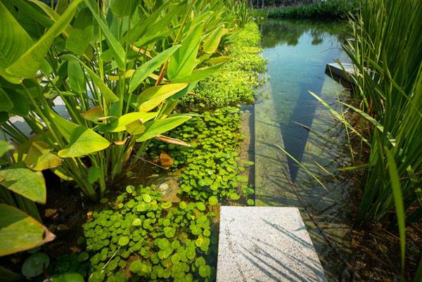
The pond edge is designed with different levels below the water surface to become a biofiltration medium that promotes the growth of submerged (Hydrilla), floating (Water Hyssop, Water Pennywort), and emergent (Powdery Thalia,
Canna Lily, Calamus) aquatic plantings. Image courtesy of Landscape Architects of Bangkok
Efficient Goals to be Proud of
The SCG Headquarters is a project that is thought to provide more than just a place to enjoy, but a place that will last a long time as a safe environment for native vegetation, such as the banyan tree. In exchange, the groups of trees shaded the garden from the first day. Furthermore, aquatic plants have been placed in the canal to work as a natural filter system to keep the water clean without chemical intervention.
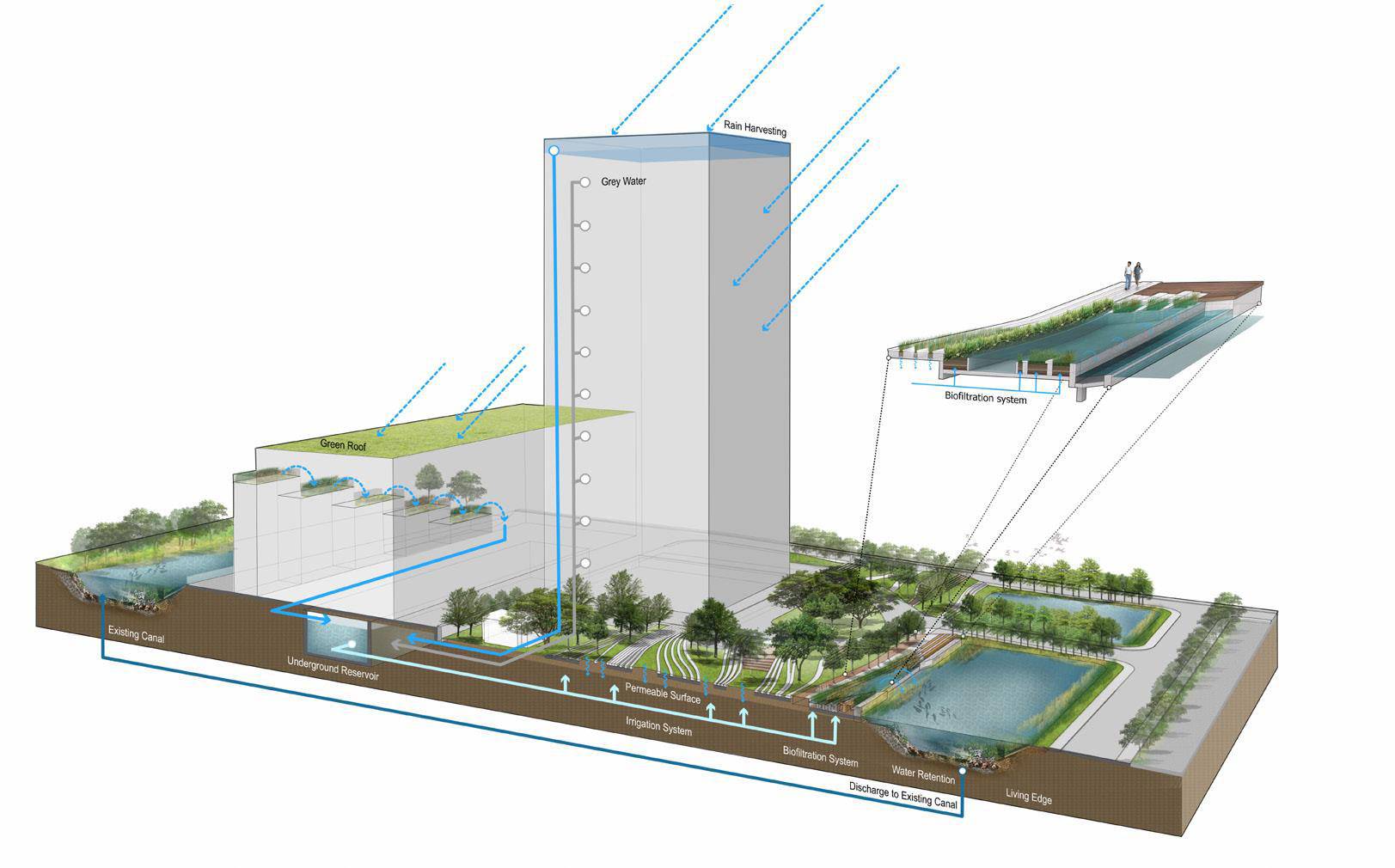
CLICK ON IMAGE for Full Size. The diagram shows the additional function of the design as a performative landscape that uses an integrative water management system of permeable surfaces and grey & rain harvest catchments, which helped the overall project achieve LEED Platinum rating. Image courtesy of Landscape Architects of Bangkok
Construction Efficiency And Understand Nature
Apart from that, the construction phase was simplified by the use of prefabricated modules of concrete, so the design was completed and ready to be used more quickly. A curved geometric pattern is not the easiest form language to work with, and it can easily become over complicated or noticeably capricious if a clear focus is not maintained. However, in this case the design stems from a true understanding of nature, and how dynamic it is.
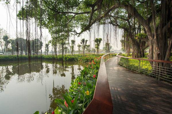
A footbridge meanders underneath a pair of preserved Weeping Figs along the edge of the existing canal, which was converted into a water retention pond and enhanced by a ‘living edge’ of colorful Canna.Image courtesy of Landscape Architects of Bangkok
Full Project Credits For SCG HeadQuarter
Project: SCG Head Quarter Landscape Architects: Landscape Architects of Bangkok (LAB) Architect: Design 103 Client: Siam Cement Group (SCG) Year of completion: 2014 Size: 15,650 sq.m Recommended Reading
- Landscape Architecture: An Introduction by Robert Holden
- Landscape Architecture, Fifth Edition: A Manual of Environmental Planning and Design by Barry Starke
Article by Elisa García Nieto

Bad Landscape Architecture Students, Can They Improve?
We look at the subject of the struggling landscape architecture student and see what hope there is for them to improve. Becoming a landscape architect is a demanding task that requires students to be involved at every stage of their studies to succeed. Whether you are a student now, or were years ago, it is likely that you are more than familiar with the specific routines and resources that are a great background to face this breathtaking profession. Once you have incorporated these subjects into your learning, it might seem to you that they have always been there. But the reality is that it takes time to perfect your skills and put them to practice in the most effective way. This process can be difficult and some students can appear to be left behind, even though a promising career in landscape architecture might be on the horizon. We know that it is frustrating but this a situation that is possible to reverse. What we propose to you today are some practical strategies to take better advantage of your potential and develop the required changes to set up an awesome practice. Let´s start checking out some ideas.
What do “YOU” Want to Learn?
This basic question is a great one to be asked regularly as it will keep you focused on your interests, and the aspects of landscape architecture that motivate you the most. When teachers present a new task for example, you can ask yourself what would you like to know more about, and chose something to explore in greater depth. In this way, apart from developing the content of the project, you could own it. There are plenty of aspects to work on through all exercises, such as environmental psychology, recycling rain water or low-cost design. By taking the chance to drive your learning and making it a little more personal, you will be more involved and it will make it seem effortless.
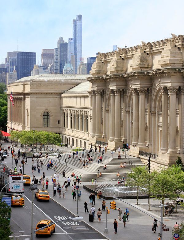
One of the referenced sites in our hit article on environmental psychology. David H. Koch Plaza at the Metropolitan Museum of Art © OLIN / Sahar Coston-Hardy
Being Well Organized Means Everything
It sounds like a very obvious and logical conclusion when facing any subject; but this is the key to successful project based tasks. Effective organization reduces the usual pressure before the deadline, and increases your productivity. Once you are tasked with a project, it is a good idea to identify the main structural aspects you have to develop and start there, instead of working without any prioritization. As time is limited, by being better organized you will be able to predict what you will need to work on, and have it available to avoid disruptions and taking too long on simple tasks. There are a lot of methods to organize yourself in detail that vary from person to person, but Get Things Done by David Allen is a great place to start. WATCH: Two Minutes with David Allen – Implementation Tips
What Useful Resources Should You Know?
It can be interesting to gain expertise using software that allows you to work quickly and show your ideas from any perspective, but you need to draw by hand as well. The task can seem overwhelming, but it need not be. Start by learning two or three versatile 3D programs such as SketchUp, which is a very good and well-known option, and match this with Adobe Photoshop to edit the images. It is easy to learn and works well. Furthermore, there are hundreds of online tutorials for both to help you. Thinking long term, it would be a good idea to be familiar with the AutoCAD suite, such as AutoCad MAP or AutoCAD Revit, which are both in demand in many countries. And if you need to check which plants best suit your site, then here is a specific browser Plantselectr to get an instant guide. WATCH: Sketchup Projects
In Search of Online Inspiration
Contemporary references are available every day on the Internet. That is interesting as you can refresh ideas and be aware of the latest technical solutions and trends. Our own website has a wealth of project reviews and practical advice to inspire you. Some of the other most varied websites focused on landscape architecture are Landezine or landscape + urbanism. For specifics fields you could check out an incredibly wide collection of playgrounds at Play-Scapes, or the urban spaces at Public Space or see this range of placemaking strategies or green roof projects.
Keep Yourself Curious And Enjoy
One of the singularities in our profession is its interdisciplinary character, and how it connects to unexpected fields. That is fantastic news because going further, even when doing free time activities, we feed our resources. In fact, it is highly recommended to develop and increase your true interests instead of limiting them to the ones you assume are the most useful. Your next great idea could come from literature, trips, or films, such as The Lord of the Rings inspiring sustainable hobbit style houses around the world
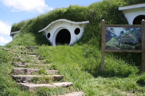
“Bag End” by Rob Chandler (Rob & Jules) – Flickr. Licensed under CC BY-SA 2.0 via Commons
How to Learn From Others
Apart from the world´s top landscape architects in books or in the media, there are many people to learn from around you if you are open to them. Why not take advantage of it? Asking questions of your teachers is a valuable source to clarify ideas and show interest. Their direct feedback could help you advance instead of figuratively walking around in circles. Be confident and ask them for advice! Classmates also provide interesting suggestions. As they have the same difficulties as you, attending public presentations or reviews of their work can enlarge your perspective and help you understand how they overcame their difficulties. This also provides the opportunity to to see what the teachers take a positive view of and you can then ask yourself why.
– Learning never ends, no matter your age or level of experience. Therefore, learning how to learn better sounds like a very good idea. Of course this can be challenging, but this is one of the first steps to progress, and every student must face it personally. What top tips would you give to a landscape architecture student who wants to improve? Recommended Reading:
- Drawing and Designing with Confidence: A Step-by-Step Guide by Mike W. Lin
- Landscape Perspective Drawing by Nicholas T. Dines
Article by Elisa García Nieto Return to Homepage Featured Image: “University Life 29” by Francisco Osorio. Licensed under CC-SA 2.0 via Flickr
Britain’s Got Talent: 10 Awesome Projects From the UK
We take a look at 10 projects that are excellent examples of landscape architecture in Britain. All of us know how important is to have interesting references to other projects as a learning resource and for inspiration. Today, we are happy to offer you a collection of great designs from one of the historically more passionate communities on landscaping – Great Britain. We recommend that you keep up with what is happening on these islands: There are plenty of projects worth knowing for their sustainable values, innovation, creativity, and even sense of humor.
1. Longleat Hedge Maze, Wiltshire (England), by Greg Bright (1975)
An interesting and creative play space, this garden challenges visitors to have fun in a simple but effective way. The classical maze of yew trees has been enhanced with bridges and an observation tower within its 13/4 miles of paths. Many people have walked through, finding different fortunes along the way. Would you dare to try one of the world’s longest mazes?
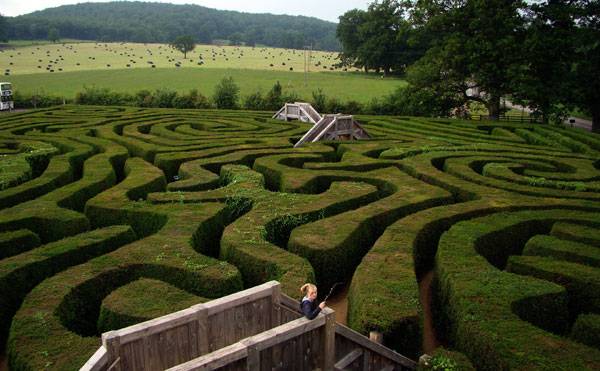
“Longleat Maze” by Jon Candy at Flickr. Licensed under CC BY-SA 2.0 via Commons.
2. Solar Lily on the River Clyde, Glasgow (Scotland), by ZM Architecture (2008)
In this project, solar panels have landed in the water to provide clean energy and be integrated into the urban waterfront. The lilies have motors that cause them to move and turn according to solar radiation. This idea has caught the attention of municipal agencies in different countries where the lilies could float as well.
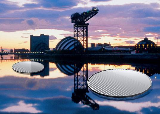
“Solar Lily 2.0 ” by 7_70 at Flickr. Licensed under CC BY-SA 2.0 via Commons.
3. The Hobbit House in the Hill, Wales, by Simon Dale
Going beyond its undeniable inspiration, the Hobbit House in the Hill is remarkable because it adds a strategy to that singular appearance. This is a sustainable building that uses organic shapes and natural materials to make it look like a landform. And it is still a low-cost project — £3,000 — with a simplified construction system based on sensible ideas. Are Hobbit houses the future solution for small-scale sites?
WATCH: Green future is possible! The eco house of Simon Dale WWW.GOODNEWS.WS
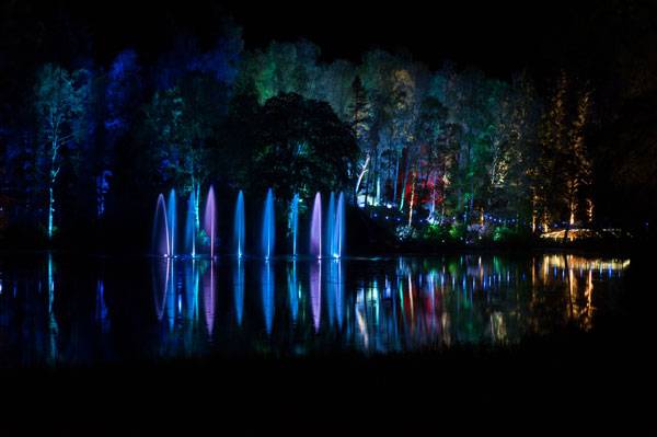
4. The Enchanted Forest Lighting Event at Faskally Wood, Pitlochry (Scotland), by Flux
Faskally Wood is an extensive forest in which a very special night show occurs each autumn. An awarded festival of lighting and sound takes the environment itself as an enchanted scenario, inviting visitors to be surprised. The lighting installation turns the trees and the water feature into bright colors, creating different sensations along the walk. Popular tales seems to come alive in this magical event.
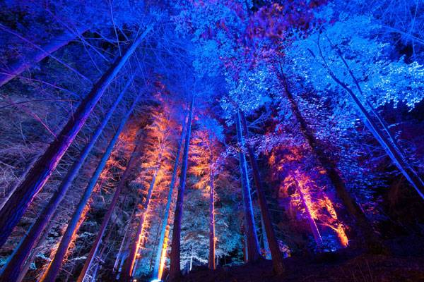
Courtesy of The Enchanted Forest Community Trust. Author: Graham Smith
Courtesy of The Enchanted Forest Community Trust. Author: Julie Broadfoot
5. Old Market Square, Nottingham (England), by Gustafson Porter (2007)
This great design by Gustafson Porter won a competition to redevelop the most ancient medieval square in the United Kingdom — and the second largest in size. Rethinking the original topography to provide a composition of water terraces and accessible surface for pedestrians was a key strategy. At the same time, the designers reinforced the diagonal connections, balancing the powerful presence of the City Council building. The project provides both contemporary style and excellent integration in its context.
WATCH: Old Market Square – Nottingham
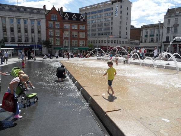
“Water Fountain in Market Square” by Shelley Rodrigo at Flickr. Licensed under CC BY-SA 2.0 via Commons.
6. Roof Gardens at Crossrail Place in Canary Wharf, London (England), by Foster + Partners and Gillespies (2015)
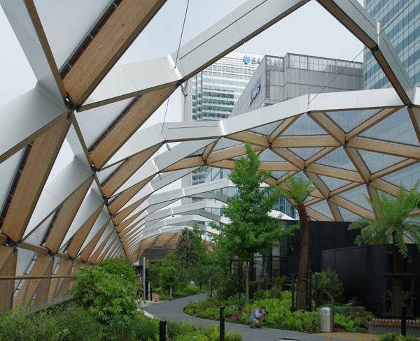
“Looking east through the garden above Crossrail’s Canary Wharf railway station.” by Matt Buck at Flickr. Licensed under CC BY-SA 2.0 via Commons.
7. Lost Gardens of Heligan, Cornwall (England)
These impressive gardens had been neglected for more than 70 years until they were discovered bit by bit in the 1990s as real “secret gardens”. Now, they are the largest restoration work in Europe, with subtropical jungle and Victorian gardens, among others. But many people identify the place thanks to surprising sculptures created by Susan and Pete Hill. Landscaping enthusiasts, here are more than 200 acres of mysterious gardens to explore and get lost in.
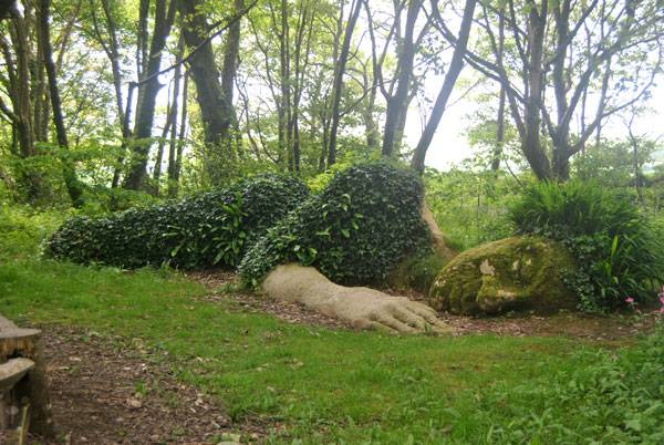
“SLEEPING GODDESS AT THE LOST GARDENS OF HELIGAN.” by Loco Steve at Flickr. Licensed under CC BY-SA 2.0 via Commons.
8. King’s Cross Pond Club, London (England), by Ooze Architects/Marjetica Potrc/BIOTOP (2015)
Its creators consider this sinuous pool a multidimensional project because it is a land artwork, a leisure urban piece, and an innovative installation. King’s Cross Pond is the first public pool in the United Kingdom to be maintained without chemicals, due to a design that takes into account the ability of wetlands and submerged plants to clean the water. The system keeps the 40-meter-long pool safe for swimming.
WATCH: King’s Cross Pond Club: Eva Pfannes and Sylvain Hartenberg discuss the project
9. The Gardens of Cosmic Speculation, Dumfries (Scotland), by Charles Jencks (1989)
It is difficult to overlook these unconventional Scottish gardens. Their 30-acre surface seems to question reality and rules with its sequence of curved landforms, challenging sculptures, bridges, and ingenious water features, all involved in a huge game of optical illusion. Charles Jencks always provides very personal perspectives on any landscape, creating abstract gardens that have their roots in mathematics and cosmology.
WATCH: حديقة التكهنات الكونية في أسكتلندا The Garden of Cosmic Speculation – Charles Jencks
10. The Eden Project, Cornwall (England), by Nicholas Grimshaw (2001)
The landscape of Cornwall is home to an impressive botanical garden formed by two indoor and one more outdoor environments. Each set of geodesic domes reproduces inside the Mediterranean Biome (the world’s largest in its class) and the Tropical Biome respectively, while you can find global temperate regions in the Outdoor Biome. The project has clear educational objectives as well as sustainability and conservation of vegetal species purposes.
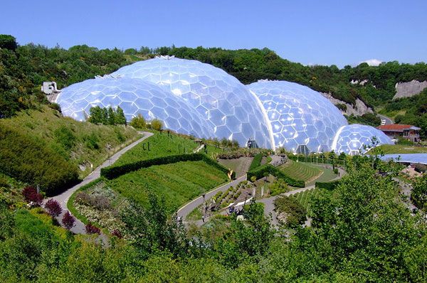
The iconic bio-domes of the Eden Project, Cornwall, England. Photo credit: originally posted to Flickr as The Biomes. Author – Jon. Licensed under CC-SA 2.0. Image source
- Drawing and Designing with Confidence: A Step-by-Step Guide by Mike W. Lin
- Landscape Perspective Drawing by Nicholas T. Dines
Article by Elisa García Nieto Return to Homepage

Thai Residents Get The Most Luxurious Gardens
The Key Sathorn-Ratchapreuk Bangkok, by XSiTE Design, in Bangkok, Thailand. Living in Bangkok´s luxury residential condominiums at The Key Sathorn-Ratchapreuk seems absolutely tempting: great apartments equipped with the latest amenities, great views, and facilities available to help you switch off after work. How could that list of strengths be even more attractive? By including an elegant, open landscape designed for the neighbors to enjoy. Providing a relaxing green space is important, given the fact that the complex includes about 800 homes in four massive buildings. One of the most consistent design teams in Thailand took on the challenge. XSiTE Design Studio, with expertise in developing high-quality gardens, proposed contemporary and unadorned community areas at the ground level that can be viewed from the vertical constructions.

The Key Sathorn-Ratchapreuk Bangkok. Photo credit: Rungkit Charoenwat
Key Sathorn-Ratchapreuk Bangkok
What was their secret to success when designing this project?
Welcoming two of the most desirable features into that context: a sense of privacy for its selected users and the addition of vegetation to the Asian city with the least amount of green space in 2011. The designers turned to simplicity to provide an effective and beautiful landmark that adds daily value to the urban lifestyle.

The Key Sathorn-Ratchapreuk Bangkok. Photo credit: Rungkit Charoenwat
The Strategic Sequence of Spaces
The Key Sathorn-Ratchapreuk consists of four buildings forming two “L” structures, leaving each with a wide, rectangular, cleared area for landscaping. The designers took those spaces and worked on an orthogonal geometric pattern to develop sub-areas for different uses. Each sub-area seems to be a garden itself, while at the same time being part of the overall composition.
Recommended Reading
- Natural Swimming Pools: Inspiration For Harmony With Nature by Michael Littlewood
- You Can Draw in 30 Days: The Fun, Easy Way to Learn to Draw in One Month or Less by Mark Kistler

The Key Sathorn-Ratchapreuk Bangkok. Photo credit: Rungkit Charoenwat
Creating Transtional Spaces While Keeping the Balance
How you walk across the project has been planned as a gradient of varied relaxing spaces. That sequence has a subtle hierarchical order, with the swimming pool area and the green ground with the pavilion as the main areas of focus. What stands out most is how the designers provided secondary zones that accompany and reveal the leading ones instead of competing with them. Because of this, intermediate spaces play an interesting role in creating coherent transitions and general balance.

The Key Sathorn-Ratchapreuk Bangkok. Photo credit: Rungkit Charoenwat
Why the Boundaries Blur Borders
XSiTE Design Studio organized the space using a clean pattern of lineal elements to enclose zones and drive circulation in a really well integrated way. Therefore, working on the boundaries became decisive. The designers created multilayer closings, adding depth and allowing permeability while providing distance among different zones.

The Key Sathorn-Ratchapreuk Bangkok. Photo credit: Rungkit Charoenwat
Vegetation Used as Barriers
Concrete walls surround the outer limits, but layers of hedges, trees, and shrubs draw the contour inside. In fact, vegetation was the main material used to create barriers, with hard walls just appearing to point the water jets and frame the views from the entrance. That multilayer factor makes the boundaries more diffuse and inclusive, as when the last green layer seems to have been separated to integrate the street or a pathway.

The Key Sathorn-Ratchapreuk Bangkok. Photo credit: Rungkit Charoenwat

The Key Sathorn-Ratchapreuk Bangkok. Photo credit: Rungkit Charoenwat
How XSiTE Design Studio Scaled the Place
Each garden is an experience, and the design team wanted to provide a number of them for The Key Sathorn-Ratchapreuk. When planning to divide the whole space into smaller areas, instead of working only on the materials, uses, or placement to make the difference, they provided a structural strategy to the project: creating terraces that match with the geometrical pattern.
Working on Many Levels
It is a clever approach, because it works to reinforce the sensation of being in a different space while unifying the whole design, adding consistency. The entrance and the swimming pool work in different platforms, but the effect is especially noticeable in the green ground. There, just three steps were enough to underline varied environments that have more to do with the domestic scale than with the public space they compose.

The Key Sathorn-Ratchapreuk Bangkok. Photo credit: Rungkit Charoenwat
What Colors Hide
A collection of main materials creates a range of surfaces in the gardens, but you perceive them as fewer in number. Why? Because the designers used just four families of color. Therefore, users have a more unified and simplified impression of the place, where everything seems to match in perfect affinity. The Key Sathorn-Ratchapreuk´s spectrum of colors reminds us of natural elements: green, a range of white-gray, blue, and earthy browns. Most of the vegetation is full green, whatever its function or type. The concrete walls are clad with brown stone blending with the wooden closings and pavement, as well as part of the gravel.

The Key Sathorn-Ratchapreuk Bangkok. Photo credit: Rungkit Charoenwat

The Key Sathorn-Ratchapreuk Bangkok. Photo credit: Rungkit Charoenwat
How Density Reinforces a Sense of Privacy
It is interesting to realize that the spaces are prepared to manage a certain density of users. If you have a look at the swimming pool area, it seems to be a really attractive place to spend time. Nevertheless, the design does not allow for a massive use, because there is not room around to lie down on the grass and the number of chaise lounges is also limited. Going to the green ground, furniture in the shady pavilion reminds us of a family room more than as a space to hold all of the hundreds of people who live there. Therefore, the neighbors can enjoy the advantages inherent to community places in terms of space, equipment, and maintenance while still experiencing the privacy and comfort of a personal garden. If you are interested in seeing more stunning Thai designs, you can click here.

The Key Sathorn-Ratchapreuk Bangkok. Photo credit: Rungkit Charoenwat
Full Project Credits for The Key Sathorn-Ratchapreuk
Name of Project: The Key Sathorn – Ratchapreuk Landscape Architect: XSiTE Design Studio Project Team: Director – Thotthanet Luekijna Client: Land and House PLC. Location: Bangkok, Thailand Use: High-rise residence Building: 4 Buildings, 23-storey, 7-storey, 3-storey residential building and 7-storey parking Total units: 834 Units Unit type : 1 bedroom and 2 bedroom Site Area: 12,230 sq. m Design Year: 2012 Completion year: 2014 Photographer: Rungkit Charoenwat Show on Google Maps
Recommended Reading
- Natural Swimming Pools: Inspiration For Harmony With Nature by Michael Littlewood
- You Can Draw in 30 Days: The Fun, Easy Way to Learn to Draw in One Month or Less by Mark Kistler
Article by Elisa García Nieto

Annenberg Center Builds a Landscape to Match LEED Architecture
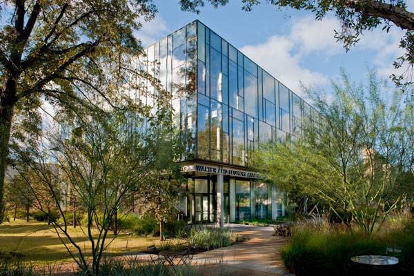
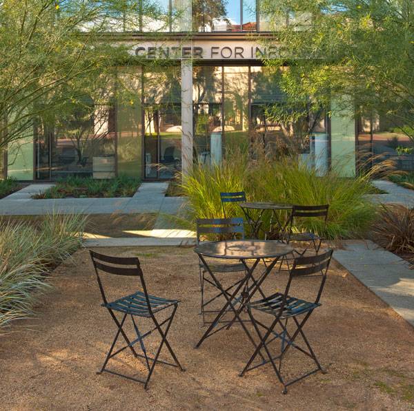
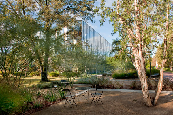
Annenberg Center for Information, Science, and Technology, by OJB, in Pasadena, California. There is a source of pride for researchers and students of the prestigious California Institute of Technology. They are talented, hardworking and lead advances in their fields of investigation, but for those who are placed in Annenberg Center for Information, Science and Technology, there is an additional source of pride. Their daily life occurs in an environment which applies sustainable principles so successfully that the building in which they work has even gotten a gold certification from LEED due to its water and energy efficiency. However, it has always been the garden in front of the building which delighted the community of academics.
CALTECH Annenberg – Image credit: The Office of James Burnett
Annenberg Center
As a design requirement of the brief, the garden had to emphasize the commitment to excellence and eco-friendly solutions. The question arose; could the designers plan a sustainable low-cost garden while still providing the advantages of natural green elements? Landscape architects from The Office of James Burnett rose to the challenge and developed a strategy to go further, creating a place which is able to engage its users. The design team shows us how to achieve those goals working with clever design choices more than large budgets.
CALTECH Annenberg. Photo credit: Hester+Hardaway
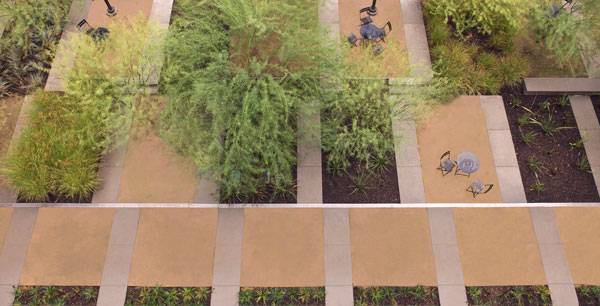
A Shared Design Pattern
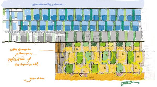
This project is a great example of how landscape architecture can be inspired by the field of architectural building design. If you look at the facade of the Annenberg Center, you can see how its homogeneous glass wall is broken by a series of colorful panels. The garden brings that vertical pattern to the ground plane.
More Top Articles on LAN
- 10 of the Most Common Mistakes People Make in Planting Design and How to Avoid Them
- Interested But Not Confident? – Know How to be Good at Hand Drawings
- Top 10 YouTube Tutorials for Technical Drawing
CALTECH Annenberg. Photo credit: Hester+Hardaway
Recommended Reading
- Landscape Architecture: An Introduction by Robert Holden
- Landscape Architecture, Fifth Edition: A Manual of Environmental Planning and Design by Barry Starke
CALTECH Annenberg. Photo credit: Office of James Burnett
Patches of Native Landscape
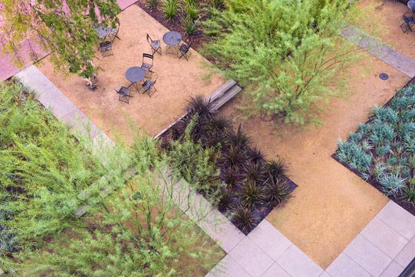
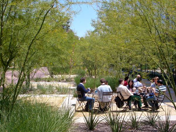
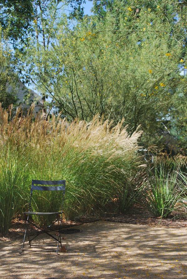
The clear pattern used to define the order in the garden affords a sense of privacy to a range of smaller areas. The designers took advantage of that condition, working on the different characters they could offer to their users. Every patch has a similar size, yet they are all unified through the use of one singular natural paving element. What is more interesting here is how they are placed creating an irregular sequence that reveals the color spectrum of the native landscape. The OJB team chose earthy paving, dark gravel, and white concrete for the paths while playing with vegetation for contrast as well. The planting contains samples of the understory of Pasadena, combining different types of shrubs and trees. That planting strategy provides shadows, creates permeable boundaries, and reinforces the perception of having a varying scenery.
CALTECH Annenberg. Photo credit: Hester+Hardaway
How Simplicity Makes it Flexible
People are the main characters for Annenberg Center´s garden. The space is entirely given over to pedestrians and is focused on giving a flexibility of use that can be used in a variety of ways. The variation of different spaces means that the number of experiences has been optimized, allowing them to work independently at the same time. In fact, it is not surprising to find outdoor lessons in a patch, and an informal meeting in another one. At first glance, there is a lack of seating in the beautiful garden, but this is not the case. The furniture is totally movable and simple, so users can take it out from the building and also store it inside when necessary. That clever strategy adds flexibility, allowing unexpected activities and the appropriation of the space, which is a key consideration to promote people´s engagement.
Why the Garden will Succeed in the Long Term
Plants that require less cultivation in designed landscape are those which were already naturally present. Looking at the natural surroundings of Annenberg Center, gives an indication of what kind of indigenous vegetation matches with that soil, range rain and temperatures. As Pasadena has a hot Mediterranean summer climate when the designers chose native plants, they dramatically decreased irrigation costs during the lifetime of the garden.
CALTECH Annenberg. Photo credit: Hester+Hardaway
More Top Articles on LAN
- 10 of the Most Common Mistakes People Make in Planting Design and How to Avoid Them
- Interested But Not Confident? – Know How to be Good at Hand Drawings
- Top 10 YouTube Tutorials for Technical Drawing
The Mirror Effect
At the ground level, the glass facade of the building reflects the image of the garden, making it appear larger. Behind the vegetation, students and researchers see that effect merging with the subtle pattern of the ‘bar code’ of the Annenberg Center. However, it is inside the building where you can better appreciate the garden for the patched carpet that it is. And this fact is not a secondary consideration because the glass facade and the three-floor height mean that the garden is going to be looked upon frequently.
CALTECH Annenberg. Photo credit: Hester+Hardaway
CALTECH Annenberg. Photo credit: Hester+Hardaway
Full Project Credits for Annenberg Center
Project: Annenberg Center for Information, Science, and Technology Architect: Frederick Fisher Partners Landscape Architecture: The Office of James Burnett Location: 305-16 Pasadena, California (U.S.A.) Date of completion: 2009 Show on Google Maps
Recommended Reading
- Landscape Architecture: An Introduction by Robert Holden
- Landscape Architecture, Fifth Edition: A Manual of Environmental Planning and Design by Barry Starke
Article by Elisa García Nieto


The Best Ways to Apply Environmental Psychology
We take a look at what makes people tick when it comes to environmental psychology. I invite you to face a little challenge: Take a minute to bring to mind three public places from your daily life that you consider successful. Maybe they have some obvious features in common, or perhaps they are successful in different ways. But they all seem to attract people so naturally. That’s because of environmental psychology – a holistic perspective developed in the 1960s around a key statement: People experiment and have an effect on the environment, while the environment influences people through the different senses. As landscape architects, we can take advantage of the principles involved in this relatively new science to effectively implement our designs.
David H. Koch Plaza at the Metropolitan Museum of Art © OLIN / Sahar Coston-Hardy
Environmental Psychology
Encourage Social Life and Community Identity The effectiveness of a public place is closely connected with its ability to satisfy its social function. William H. Whyte, who studied human behavior in the urban environment, determined the main factors that influence the social success of places. In his well known book, “The Social Life of Small Urban Spaces” (1980), he indicates that some of the aspects that make a place more attractive are: the amount of seating, flexible management, connection to the street, users’ ability to make decisions, encouragement of people´s appropriation of the space, location of urban elements in groups of three (triangulation), presence of natural elements, food to eat, and chances of meeting people as if they were not strangers. For more detailed information, you can check out this interesting video. WATCH: The Social Life of Small Urban Spaces: William H. Whyte
Evaluate How Successful a Place Is and Why Project for Public Spaces is a New York City-based organization that works on projects all around the world, using place making as a strategy to create successful spaces anywhere. It consists of encouraging people´s sense of ownership and works through Whyte´s ideas about social urban spaces at low cost. What is more, the group has developed a useful tool to evaluate any place according to four main principles and a collection of questions. You can check out the great The Place Diagram here. It allows us to know the weakest points of a project, giving us valuable clues about how to make improvements. Welcome or Brake Behaviors Comfort is a key aspect to manage when defining potential uses of urban space or even the desired length of those uses. When a place is convenient to host an activity, people are more likely to participate for longer periods of time. Occasionally, designers also use uncomfortable elements strategically, such as adding tubular benches to encourage short breaks, creating a sheet of water on the pavement to discourage occupation, or installing metal stoppers to halt skaters. Of course, it can be controversial to push people away rather than welcoming them. Top Related Articles:
- 10 of the Most Common Mistakes People Make in Planting Design and How to Avoid Them
- Interested But Not Confident? – Know How to be Good at Hand Drawings
- Top 10 YouTube Tutorials for Technical Drawing
Meet the Power of 10 In this case, Project for Public Spaces has gone to the numbers to provide advice for regional, neighborhood, or smaller-scale projects in terms of people´s engagement with a place. They start with the principles defined by Whyte, which call for providing at least 10 things to do or 10 reasons for people to be there. This can be extended to the neighborhoods, which should have 10 of those places, and finally to the whole city, which should have at least 10 such neighborhoods. In that way, the offerings are expected to be varied enough to attract a wide range of users, who will be motivated to take part in activities longer. Here is a step-by-step guide to organizing the process. Reduce Environmental Stressors In 1998, researchers from Cornell University (Ithaca, N.Y.) made a table of main interior design stressors — a source that is still widely accepted today for designing outdoor spaces. These stressors are related to how a place is readable and predictable for the users, who should be able to make deductions about functions, use, and organization while feeling safe.
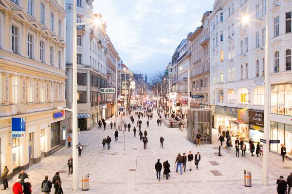
Can you see 10 reasons to be in this space? Mariahilferstrasse. Credit: Bureau B+B
Reinforce the Sensation of Being Seen The gaze of others seems to have a powerful impact on controlling individual acts. Experts from Crime Prevention Through Environment Design have discovered that when landscape architecture provides chances of natural surveillance, misbehavior tends to be reduced dramatically. To ensure visual exposure, designers offer elements such as lighting paths, visual connection to the surroundings, low vegetation, or the addition of curves to pathways, which multiply perspectives in a few steps. People should also be invited to come and stay, by promoting pedestrian use or scheduling activities. Going back to the beginning, we each made a list of great places. It could be really interesting to check out how they work after knowing a bit more about environmental psychology principles. Recommended Reading:
- Environmental Psychology: An Introduction by Linda Steg
- Environmental Psychology for Design by Dak Kopec
By Elisa García Nieto Return to Homepage
- 1
- 2