Article by Farah Afza Jurekh Manlleu Municipal Market, by Comas-Pont arquitectes, Pintor Guàrdia, Manlleu (Barcelona), Spain. We like to socialize. People are drawn towards places where they can interact with others. And the designing of such interactive spaces has always been one of the foci of architects. When the project is in an urban realm, the design of such interactive space can eventually grow as a community hub and can help stimulate the bonding of the neighborhood. Well, this is about one such project.
Manlleu Market
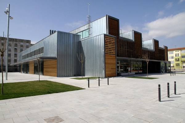
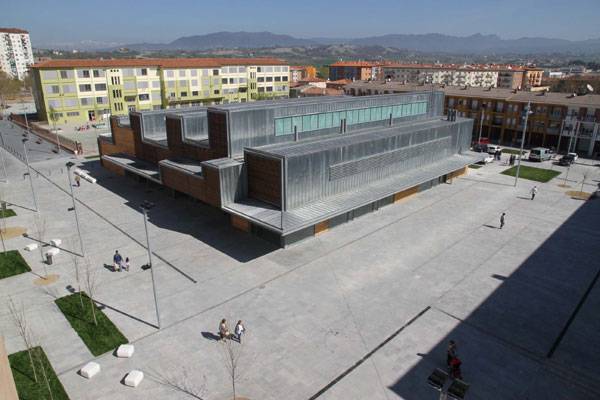
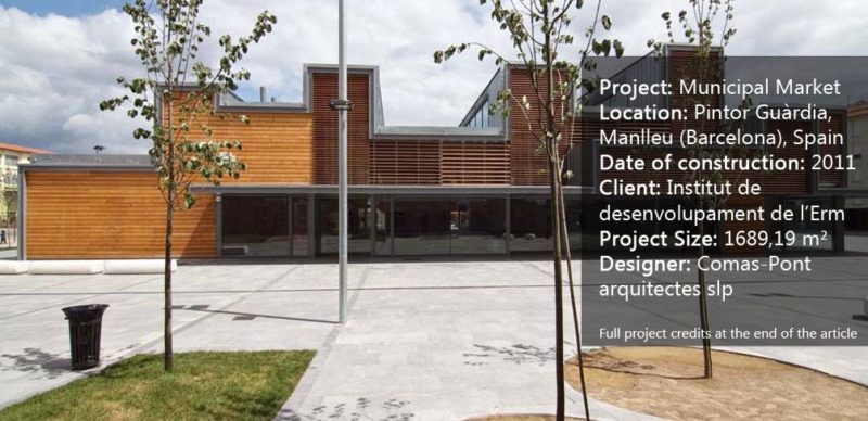
Located in Pintor Guàrdia, Manlleu (Barcelona), Spain, the municipal market is a fresh-product market designed by Comas-Pont arquitectes. If we take a closer look at this Mediterranean building and its site context, we get to know the importance of urban nodes, connected pedestrian streets, axes and hierarchy of streets, adjacent roads, movement of people, and obviously the surrounding building forms, in urban designing. All these have been taken into consideration to make it a successful design.

Manlleu Municipal Market. Photo courtesy of Comas-Pont arquitectes
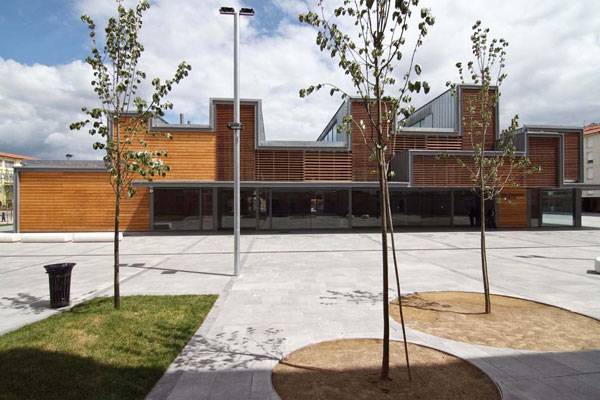
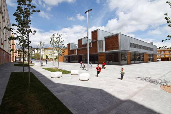
In an urban realm, the node plays an important part. The node overlooking the streets, if designed as an inviting place, can attract people and can act as a public meeting place. In order to achieve that, the node is designed as an open park zone with seating arrangements and green areas to generate various activities making it a vibrant place for the neighborhood people. The urbanization respects the existing street’s hierarchical ‘rank’ and emphasizes Pintor Guardia street, to turn it to a central spine of the neighborhood. It was emphasized so that it can be used as a pedestrian street and so that it may act as a connector between other public spaces.

Manlleu Municipal Market. Photo courtesy of Comas-Pont arquitectes
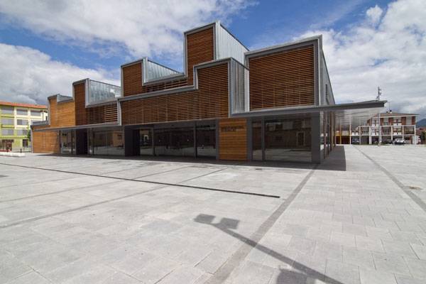
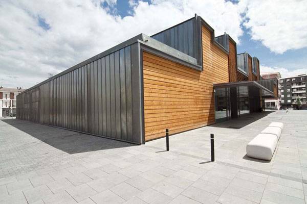
The key concept of the market building was to rehabilitate the neighborhood. Hence, the overall building form was overpowering in relation to the surrounding buildings. They designed a building which is permeable to the users and yet, at the same time, merges seamlessly with the forms and heights of the surrounding buildings. Although the use of a zinc skin and wooden slat system in the facade and its folding structure helps it to stand out from other buildings, in terms of proportion and scale, the municipal market building appears to be in a balanced composition.

Manlleu Municipal Market. Photo courtesy of Comas-Pont arquitectes
In every project, architects try to play with different elements of architecture. From the rich palette of elements, the architect’s team has chosen light to play as a protagonist.

Manlleu Municipal Market. Photo courtesy of Comas-Pont arquitectes
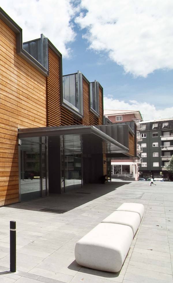
The wooden slat system filters light into the building, providing a controlled environment inside the building. Apart from that, the play of shade and shadow due to the light penetrating through the slits brings an artistic value to the interior of the market area. The zinc skin, continued up to the roof, unifies the building. The zinc facades are folded at different heights to create clerestories, which control the light entry into and overall natural ventilation of the building.
Benefits of Folded Structure Besides that, the folding structure was designed for two additional benefits. Firstly, the folds create spaces of different heights to house different function requirements. The different heights respond to specific programme necessities housed inside: the big sales space, opened through prefabricated metallic truss arches, holds the whole array of high and lineal windows on cover folds. Secondly, the massive scale of the municipal market building was scaled down because of the variations in heights breaking the massive volume of the building.
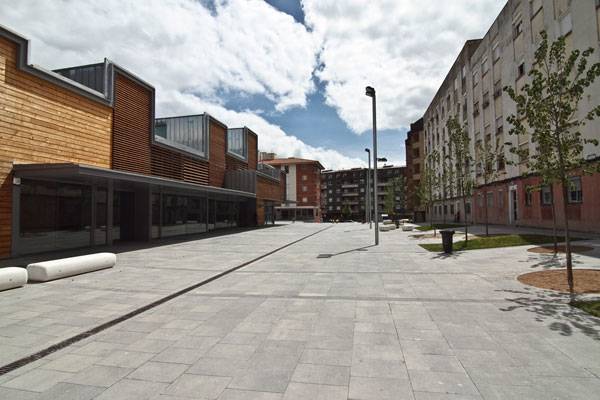
Permeability and Visual Connection The ground floor is almost transparent and emphasizes the visual connection between interior and exterior. This is reinforced with continuity on the interior pavement to the exterior porches below. The porch is formed by the extension of the folding structure. This covered area is projected with black strips of granite continuing to the exterior. This resulted in an enhanced connectivity between the exterior and interior of the building.

Manlleu Municipal Market. Photo courtesy of Comas-Pont arquitectes
Although the exterior area of the building is provided with furniture and defined areas of greenery, concrete pavers have blanketed the whole area. The use of such a concrete blanket is not appreciable as green pavers could easily replace these pavers and can reduce the air temperature. Moreover, the assigned areas for green seem to be very small compared to the size of the open area. The use of more trees and plants, especially the native species, would have been more appreciable, as well as easy to maintain and at the same time would attract native inhabitants.

Manlleu Municipal Market. Photo courtesy of Comas-Pont arquitectes
A dry, semi-industrialized construction system is used to fulfill short timing (8 months) and minimize the waste; metallic structure, sandwiched wood panels in large format, wood slats, zinc roof and facades and interior OSB panels. Zinc is used because of its flexibility which is essential for the folded structure, it requires little maintenance, is economic in terms of cost, and is 100% recyclable.

Manlleu Municipal Market. Photo courtesy of Comas-Pont arquitectes
The renewable-energy heating and cooling systems, rainwater collection provision on the roof and the use of recyclable building materials are the most appreciable approaches to an energy-efficient, sustainable building. Overall, this project shows us how a single building in an urban area can rehabilitate the neighborhood.
What do you think of this project? Let us know in the comments below! Go to comments 
Manlleu Municipal Market. Photo courtesy of Comas-Pont arquitectes
Full Project Credits For the Municipal Market:
Project Name: Municipal Market Location: Pintor Guàrdia, Manlleu (Barcelona), Spain Date of construction: 2011 Client: Institut de desenvolupament de l’Erm Project Size: 1689,19 m² Designer: Comas-Pont arquitectes slp Photographers: Jordi Comas / Pere Tordera Construction area: 2187 m² Recommended Reading:
Article by Farah Afza Jurekh
Published in Blog