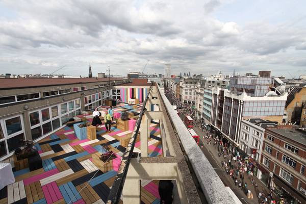
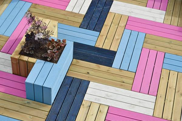
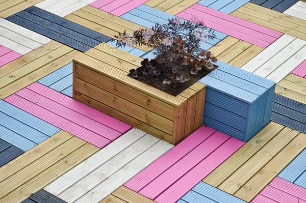
Studio Weave create high visual impact and welcoming outer space on this rooftop design. The architects from London based Studio Weave did not just add colors, but they used them to weave a new surface on the rooftop of the London College of Fashion building. With a bold color scheme, the roof garden has set a new pace in a landscape marked by the stability of gray and has become an attractive place where students can eat, chat or just relax. The design consists of applying timber decking painted in different colors to compose the floor, furniture and wall panels. This was a solution with low cost and rapid implementation that transformed the underutilized space atop the six-story building in a lively environment. Interviewed by Dezeen magazine, Studio Weave’s designer Eddie Bake explained his choice for the material: “The timber is just low-cost off-the-shelf larch decking. The idea was to find a super quick way of making something beautiful and colourful.”
Showing daring use of color, the architects have combined saturated light pink and blue and balanced these hues with elements of wood color and others painted in white and black. Laid on a herringbone scheme, timber decking units compose alternating sequence of colors. The patterns visually extended the rectangular space’s width, which is significantly smaller than the length. The design formed oblique axes on the floor that define the means through which people can move around the space. The contrast between the two bright colors and the neutral ones creates visual sensations of depth and height that simulate interweaved yarn which constitutes fabrics. The design team had been making experiences with weaving when they were asked to create the College building’s roof garden. They decided, then, to apply the idea in this project to relate it to the LCF’s textile heritage. This project was a unique opportunity to explore the ability of the construction material of giving a metaphoric meaning to the space. “The whole thing was done with reference to basket weave – trying to make timber look as if it’s woven” clarified Eddie Blake. In this environment personalized by a colorful floor, the absence of elements with stronger visual impact can be interpreted as a way of avoiding redundancy. So, to complete the space’s program, the designers came up with seats, tables and planters that are inserted in the oblique floor pattern, building them with the same material and painting them according to the already established color scheme. The plants were also chosen to gently complement the set without forming visual barriers or hindering the passage of people. Other components that reconfigured the rooftop of the concrete and glass building are the sequential “V” shaped panels and the stripped cylinder covering a mechanical system, both of them accentuating the multi-colored surfaces and keeping the concrete elements as their frame. Although the College building’s outdoor space was originally designed to work as a place for students to stay and relax, it has been used also for social, educational and professional purposes. The way the furniture was distributed has strongly contributed to enlarge the space’s program. The set of timber volumes, constructed with increasing heights to work as steps, seats and tables, divides the area in two environments with slightly different characteristics. Their informal layout does not limit their uses; however, one part of the divided area forms with the “V” shaped panels a room suitable for lectures and exhibitions while the other part, where tables and planters work as spots, is appropriate for social gatherings.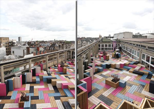
This design while outrageous, doe bring up the otherwise gray scene, making it a more desirable place to be. Credit: Studio Weave


