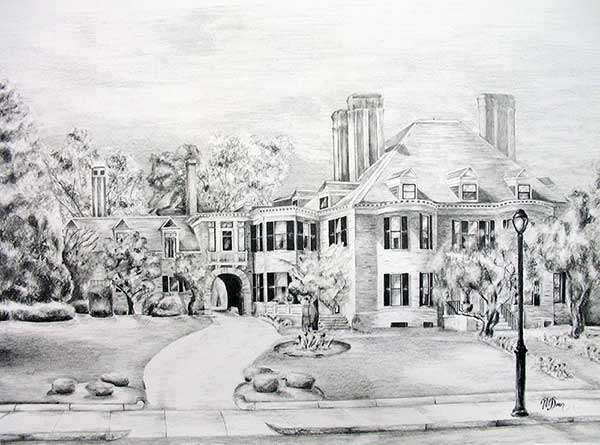
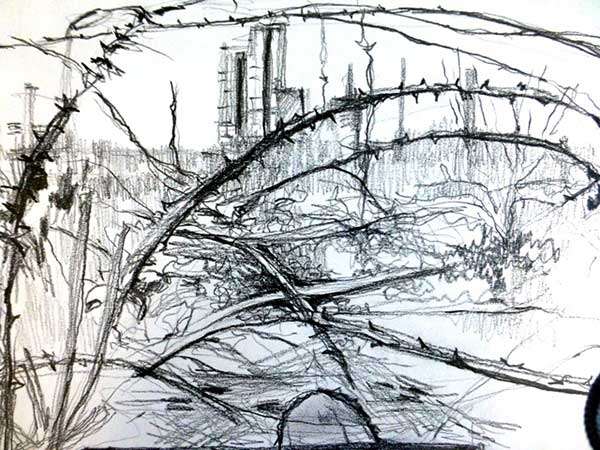
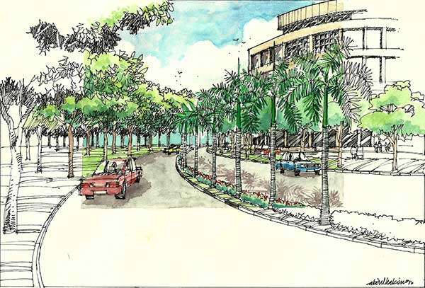
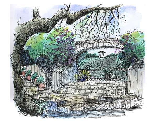
It’s been a while since our last Sketchy Saturday but we’re up and running with another edition: our 11th! We’ve once again reunited works of creativity, talent and detailing. Check it out and see more in our album! No. 10 by Ngoc Xuan Doan, MA Landscape Architecture student, United States
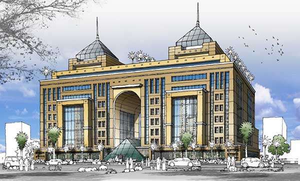
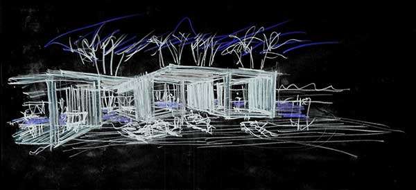
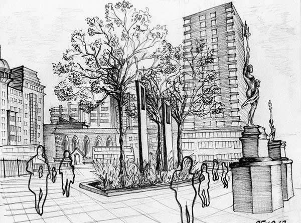
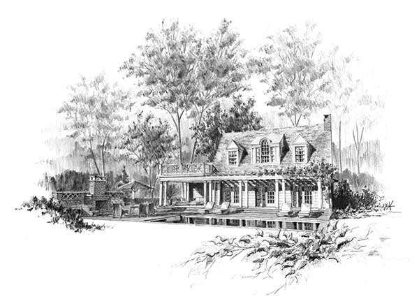
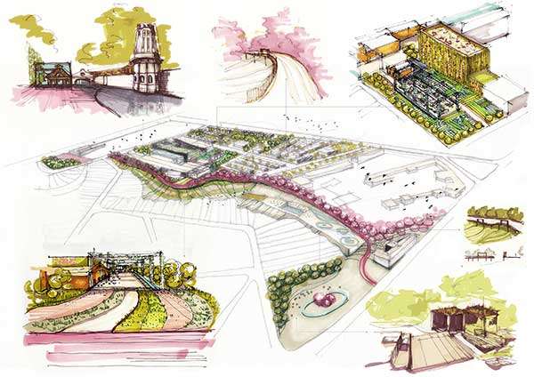
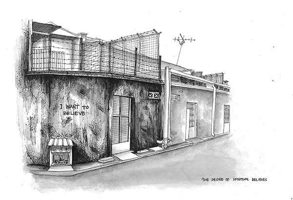
‘This is a sketch of the Davenport Memorial, home for the elderly, located in downtown Malden, Massachusetts. Working with graphite pencil, I used shading techniques, carefully studied light, shadows, and highlights, to represent form and materials. It is a wonderful method to exercise the mind to actively look at the landscape and build from microscopic details to boarder context.’ No. 9 by Julia Fogg, landscape architect in private practice, UK ‘This sketch is placed in the river landscape of Rye Harbour, East Sussex,UK. It is one of a series of 5 minute sketches capturing native planting of buckthorn and gorse – habit and texture – that grow on this marshy area inhabited by sheep. Cement works are looming on the opposite bank. The spiky nature of the plants morphs into a thing of beauty. The materials used aregraphite stick, 8 B soft pencil and lots of thumb rubbing.’ No. 8 by Abdul Hakim Bin Kussim This sketch shows a landscaped avenue with shade trees on both sides and the middle planted with a row of palms and flowering shrubs.The meandering avenue also shows a green space with clumps of trees and turf.The background shows part of the campus building which was also designed in a curve form to compliment the meandering avenue.’ No. 7 by Yuki Kanda, landscape architect ‘This drawing was done when I participated in a Mexico field trip held by the Louisiana State University. I used a pen and watercolour. This is trying to show that the plants and the man made structures are in harmony and make a comfortable space.’ No. 6 by Khalid Abou Baker ‘This is a renovation project for two existing buildings. I tried to make the design formal with modern ideas to change the 35 year old buildings to resemble new five stars hotels in the centre of the big city.’ No. 5 by Javier Sergio ‘This is a very quick sketch for a cabin design done with charcoal, later just inverted in Photoshop to create a more dramatic effect.This cabin is part of the program for a pool deck of a high-end Condo in Miami Beach Florida facing the Atlantic Ocean. The geometry presents a continuous roof, and lateral openings to accomplish the communication between these four independent spaces.At the same time, views to the main pool in front of the structure and views to the Ocean in a different direction were equally important as well.’ No. 4 by Desislava Kushelieva ‘The sketch is specially drawn for The Denis Mason – Jones competition, 2013. I tried to capture the spirit of a very busy city centre in Leeds, Yorkshire. The way that the women statues compliment the look of the city centre inspired me. This is City Square, close to the railway station. For this sketch, I used pencil first to do the basic outlines and afterwards I used a different number pens to highlight the contours and used barely any shading. My main aim was to show how beautiful this place is and what a great city Leeds is in general. Its rich historical background is depicted by all the gold and bronze statues in the city and in this sketch as well.’ No. 3 by Devin Kimmel ‘This is a sketch for a proposed cottage renovation and new garden. The project includes a new porch, pool, terrace, outdoor fireplace and landscape. The sketch was intended to help the client understand the feeling and look of the new design. I like to draw the existing trees in the background because it gives the drawing scale and helps to create the scene. This sketch was drawn with graphite on vellum.’ No. 2 by Loredana Micu, landscape and territory Masters Student, Romania ‘These sketches are part of a school project, illustrating the proposed interventions at different scales for the conversion of the Old Matches Factory and its surroundings, in Bucharest, Romania. They were made in pen, pencil and markers and later scanned and arranged in a layout in order to emphasize the large scale proposal and the location of some of its focal activity areas.’ No. 1 by Lim Yee Zhing, architecture student, Taylor’s University Lakeside Campus, Malaysia ‘This is the back alley beside a wall painting in Penang Island, Malaysia. There are a lot of wall paintings that can be found in the streets in Penang Island. People there actually try to express their feelings spiritually through those wall paintings but unfortunately some of them are not being conserved properly in this country due to some restrictions in freedom of speech. “I want to believe” is what exactly the people in this country wishing for, they wish for protection.’ This concludes our new edition of Sketchy Saturday, which we hope you enjoyed! If you’ve missed it, our tenth anniversary edition of Sketchy was a real success as well! Check back next week for more sketchy examples of real talent and skill in traditional drawing. Article written by Oana Anghelache. Published in BlogLogin
Lost Password
Register
If this is your first time on the new site, please click "Forgot your password?". Follow the steps to reset your password. It may be the same as your old one.


