Welcome to the 6th edition of Sketchy Saturday, sponsored by Sprout Pencil, a pencil that grows! This week we had a particularly hard time making our selection and choosing the winner not only because all the drawings you sent us were awesome, but also because we have a reward for the best sketch! The winner will receive a lovely gift from Sprout Pencil! Nevertheless, here it is – a brand new selection of our readers’ drawings. We hope you enjoy it as much as we did!
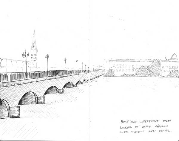
10. Scott Simbler
“This sketch was created on a rainy day sitting at a coffee shop on the east side of the river bank in the city of Bordeaux. I tried to capture the depth in which the colossal bridge links the two sides of the city with the beautiful skyline in the distance.”
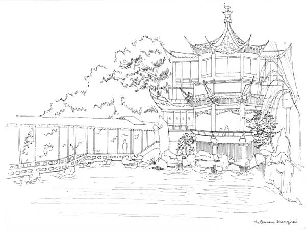
9. Lindsey Tabor
“The Yu Garden is ironically located in Shanghai’s Chinatown. I completed this sketch in 2010 while traveling abroad with fellow design students from Ball State University. I fell in love with the wooden structure’s architecture, as well as its surroundings that seemed inevitable and produced by nature, although clearly a designer is responsible for this effect. “
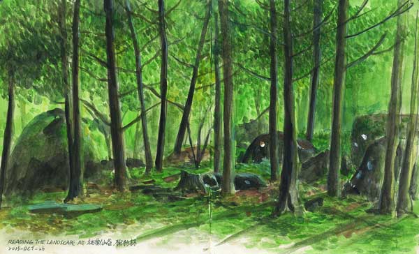
8. Leo Lee, a student at Chung Yuan Christian University, Taiwan
“This is the valley terrain at north Taiwan’s mountain, about 500~700m above sea level.Taiwan is a sea-island so we don’t have a long river. Our river is very short and flows fast.This is why we have so many huge stones. Thousands of years ago, before the erosion occurred, this place was also a valley. At that time, turbulent waters brought many huge stones along with it. After thousands of years, erosion made the river change its path. The stone remained,and the tree growth became woodland. That is why we see this landscape.”
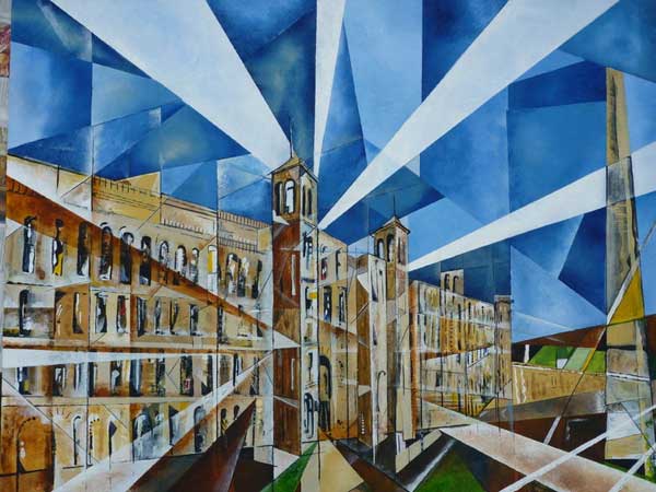
7. Mael Matthews, Landscape architect and art educator
“This is an interpretation of Salts Mill in Yorkshire, UK. It was produced for a client who wanted the vibrant mixed use of the site to be represented. The building houses a gallery, shops, cafés and performance spaces. I decided to focus on a futurist approach to the piece. The work was produced in acrylic paint on board after extensive site visits which involved site sketches and photographic recording.”
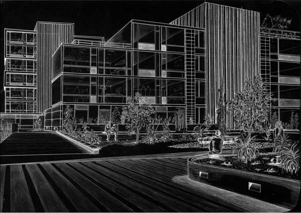
6. Andres de la Bastida, architecture student, Ecuador
“This is the internal patio view of a low density housing project. Drawn using markers and a creta color pencil on a black cardboard I used a three point perspective technique and my rulers.”
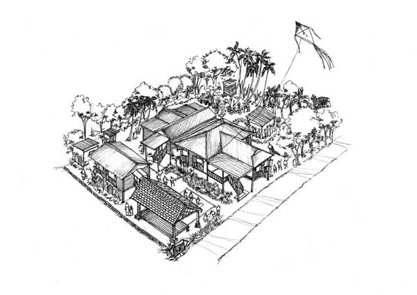
5. Nur Alia A.Rashid, landscape architect at Lineworks and Space Sdn Bhd
“The sketch is all about a traditional house located at Kampung Endah, Bantimg, Selangor state, Malaysia. The house was built about 70 years ago. The owner hasn’t changed the architectural features of the house. The small shelter outside their house also functions as a wedding venue where people can come and cook together for the wedding. Also, open lawn in front of the house allows kids to play with kites or other traditional games from Malay culture. Behind their house a small room was built which used to be an outdoor toilet in the past.”
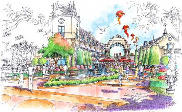
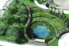
4. Pelagio Jimmy Arguelles Murallon III, project designer, Manila, Philippines
“This sketch is part of our company’s project in China with a classical French design theme. It shows a commercial plaza where one can immediately interact with the people utilizing the space. An intricately stylized water feature surrounded by lush green topiary in unvarying formation makes the scene more dramatic.”
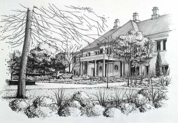
3. Damian Ayarza, Argentina
“The black and white sketch belongs to a project in the north of the city of Buenos Aires. This is the access to the residence. It is drawn in different hardness pencils on paper.”
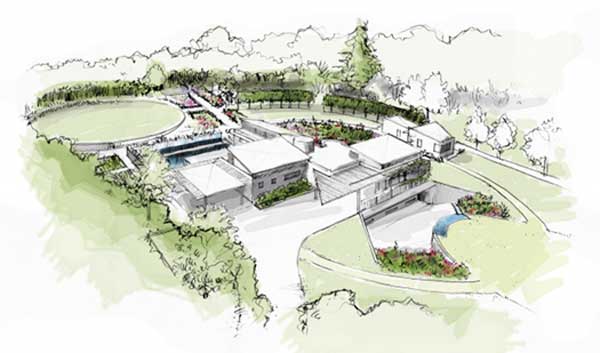
2. Ian Jakeway, United Kingdom
“This sketch is the main bird’s eye view of a series of sketch views for a garden design proposal. The design comprises of a series of raised terraces that radiate away from the house to form a series of semi-circular courtyards, tiered gardens, sloping flowerbeds and water features. The sketches were drawn using pencil on trace paper, scanned and then colour ‘washed’ in Photoshop. I am now increasingly being requested to produce hand sketches to communicate design proposals to clients in preference to pure CAD. Client: Thomas Hoblyn Landscape and Garden Design.”
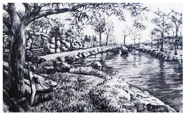
1. Inhwa Park, South Korea
“The river seems to flow towards one tree, the biggest on the river bank. This place is an artificial space, not made by nature, but it looks natural due to the original trees and rocks; you could see lots of crag rock, rough trees and the grass. I felt freedom on the rough bench which is in the foreground, facing the river which diverts its course towards a particular tree.”
This drawing concludes today’s Sketchy Saturday sponsored by Sprout Pencil. We congratulate the winner and we assure you, that we admire the talent, skills and imagination shining through in all the submitted drawings.
If you feel you can do just as well, why not try your luck and send us your work for a chance of winning a wonderful gift from Sprout Pencil?
Article written by Marta Ratajszczak.
Published in Blog


