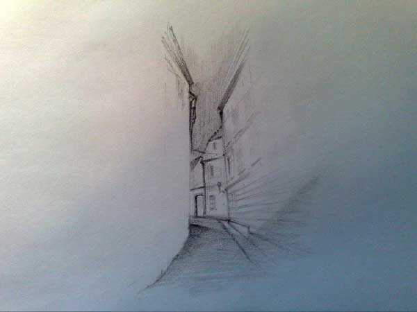
This Top Ten showcases the most beautiful, intriguing, and inventive sketches by some of our talented Landscape Architects Network readers. So we return with another batch of creative and beautiful works by our beloved and devoted readers. Sketches are getting better and better, and selecting the top ten is becoming a heavy task. We still base our criteria on beauty, technique, imagination, and well executed drawings. So without further a due, here’s the Top Ten! 10. by Andrej Žinić “This is a narrow and small street in an old part of Zagreb. One of many sketches made for a 1st year sketchbook capturing details of architecture and landscapes surrounding us, mainly using slightly softer pencils.”
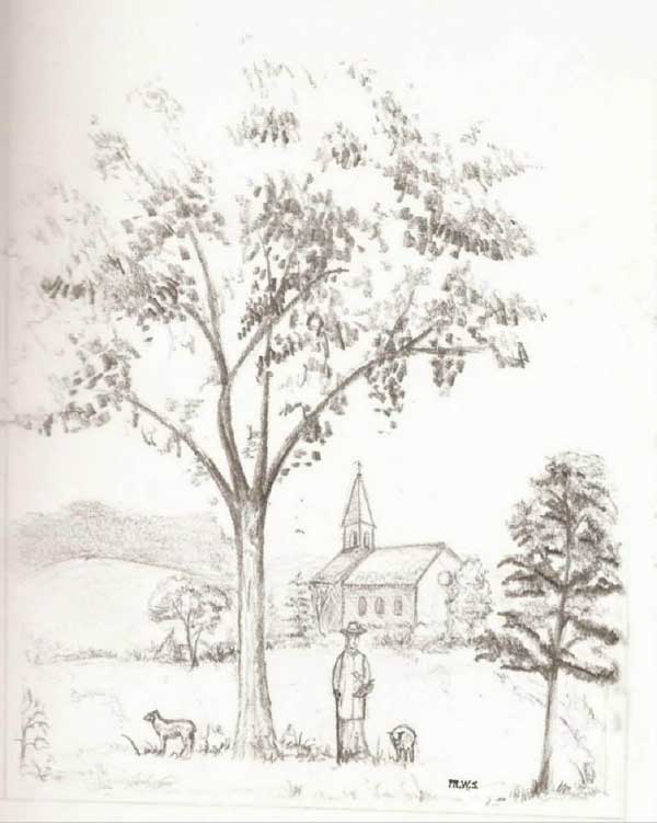
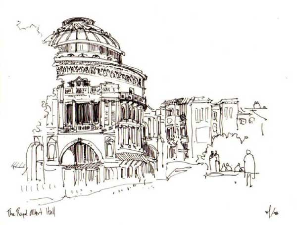
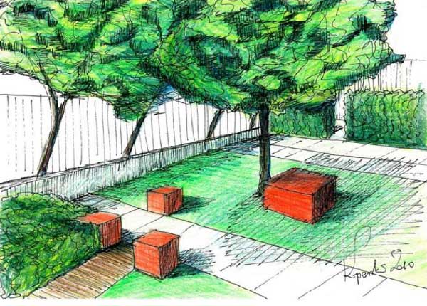
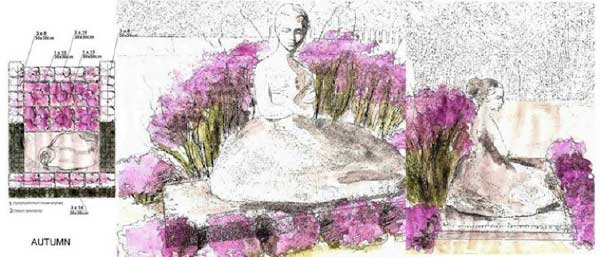
9. by Marcus Stevenson “I imagined solitude, peace, simplicity, serenity in the beauty of nature and a connection to God. This is often lost in our fast-paced society. This is a peaceful day in the 1700’s depicting an older pastor/shepherd going for a walk through the meadow to taking a break from his studies and pick some flowers to bring home to his wife. I express my art in garden design and sketch what I can, although I don’t consider myself developed. Subject matter and a story are more important to me than technique. My father is a pastor, thus the spiritual influence here. I often sketched in class in college, because it seemed to help me focus better.” 8. by Miguel Lievano, Australia “This sketch of London’s Royal Albert Hall was completed in Spring 1998. As can be imagined, the weather was not ideal. I sketched the drawing fast, trying to capture both the beauty of the building and mood of the neighbourhood.” 7. by Marek Wieronski “In my studies, each student had a sketchbook. This sketch is one page from mine, which accompanied me to different places, sometimes even on the bus or tram, because I never knew when I might see something that I would like to capture. This sketch is my attempt to understand the landscape and capture the most important elements, mixing black dots and dashes of varying pitch and length.” 6. by Maciej Koperski, Warsaw “The image shows a patio in one of the theatres in Warsaw. The space was designed especially for actors and employees, the red boxes playing the role of movable seats which allow the space flexibility. The patio was divided intogeometrical and rectangular spaces filled with plants pruned into geometrical forms.” 5. by Magdalena Subocz, Poland “My inspiration was a sculpture of a dancer in Warsaw’s sculpture park. I designed a composition of plants around the sculpture. The project is simple and the plants that I chose give it a more dynamic character. The composition of plants refers to dance and the emotion it envokes. I tried to a show variety of emotion by seasonal colours, especially green in Spring and purple in Autumn.” 4. by Cathy Vivies “My design based on ‘The Giant’s Causeway’ an artificial mineral garden, which mimics rugged land and stimulates the imagination in order to alter our perception of the space. We can see a pathway around a pond that flows thanks to the circulation of fresh running water. Moss and flowers will be planted between the stones and grow up from the narrow cracks.”
Design concept based on ‘The Giant’s Causeway’ uses moss and flowers to grow up the cracks in the rugged terrain by Cathy Vivies


