Landscape Architecture for Landscape Architects › Forums › GENERAL DISCUSSION › What’s wrong with this picture?
- This topic has 1 reply, 9 voices, and was last updated 12 years, 7 months ago by
 Tosh K.
-
AuthorPosts
-
August 20, 2013 at 2:36 pm #154292
 Jason T. RadiceParticipant
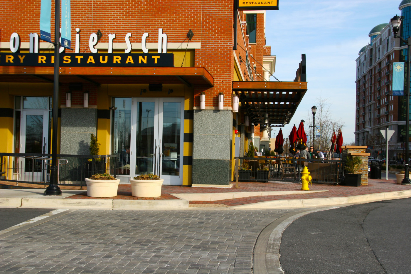
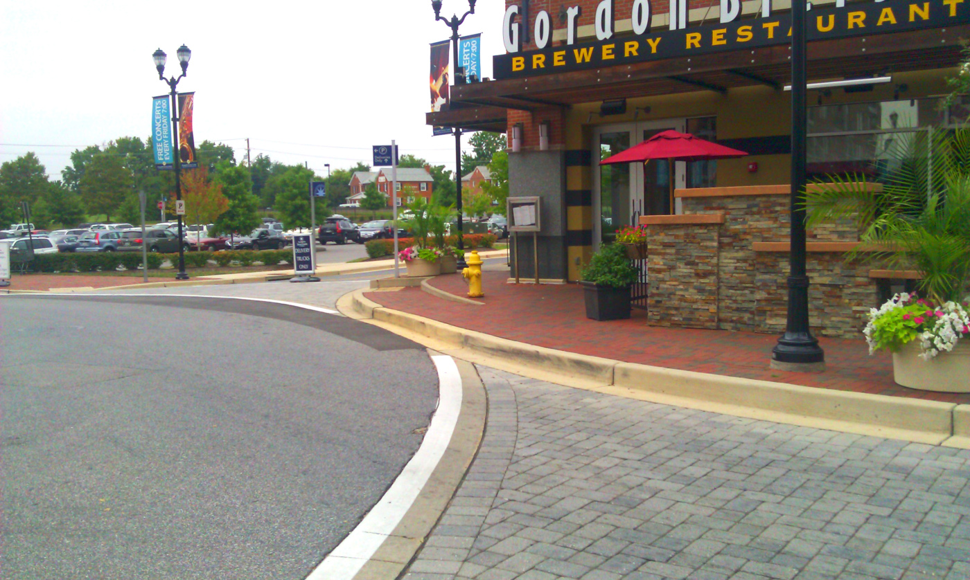
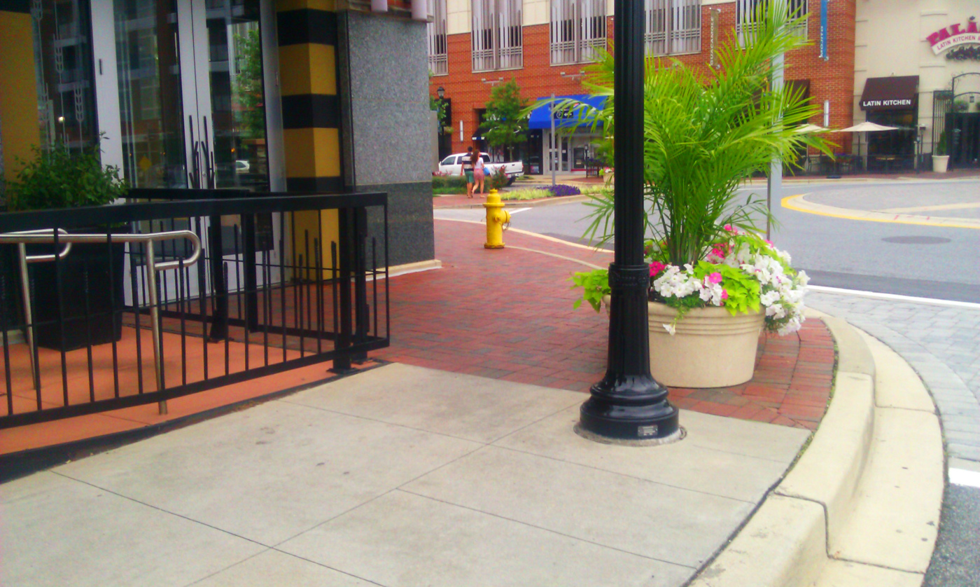
Continuing on with what I hope this series will become…see what is not quite up to snuff here and post your guesses in the comments.
Feel free to post your own using the new ‘Design Over-Site” category!
August 20, 2013 at 3:36 pm #154306 Tosh KParticipant
This’ll be a fun spot to watch people waltz out of the pub.
August 20, 2013 at 4:16 pm #154305 Goustan BODINParticipant
that handicap ramp doesnt seem to stop properly unless wheelchairs now have ABS breaking options. Then, that yellow fire thingy bothers me there.
Also, like Tosh said, that ramp and the planters are just right where you dont want to find them at night after a few beers …
But well, the pedestrian crossing should be much wider than that to be certain not to miss a thing. And I’d plant a few large thorny fruit trees right in front of it. In these nice concrete planters, may be ? 🙂
August 20, 2013 at 5:38 pm #154304 Andrew SpieringParticipant
What do you mean? I sure would like to step out of the street right into two large planters… oh wait, I should hang a right, then trip over a curb and slam into a fire hydrant. Sure would need a cold brew after that…
Only thing missing from this mess is a guard rail! 🙂
August 20, 2013 at 7:18 pm #154303 Trace OneParticipant
They spelled Beer wrong.
August 20, 2013 at 10:41 pm #154302 Jason T. RadiceParticipant
Some good guesses so far…but there is still more. You can click on the pickiture to enlarge it.
Oh, and BTW, this is on a pedestrian unfriendly roundabout/traffic circle, which is why the crosswalk looks soooooo funky.
And Bierch is a proper name (one of the founders, the other named Gordon). Is is coincidental that they brew bier.
August 21, 2013 at 12:01 am #154301 Andrew SpieringParticipant
Ok, now you have me squinting! Haha… 😉
August 21, 2013 at 3:24 am #154300 Wyatt Thompson, PLAParticipant
Was there an earthquake? The center of the third floor of the building on the far right looks off-kilter. Maybe it’s just a perspective thing. I agree that the accessible ramp is really funky. On a positive note, I like the colors on the restaurant.
August 21, 2013 at 3:28 am #154299 Goustan BODINParticipant
there is a red emergency push button on the right side of the building, outside. That button is obviously at the wrong place : it should be inside, right at the bar, so you can smash it with your head after you’ve had too much and really can’t take anymore…
Other than that, you can’t use the sidewalk to walk past the bar because of the planters, ligtht post and bar fence.
August 21, 2013 at 4:40 pm #154298 Brian J WethingtonParticipant
1. Well, as near as I can tell, a person in a wheel chair can’t actually get to the accessible ramp to the building (on the left side). The “accessible route” between the wall of the ramp and the corner of the building looks too narrow for a wheel chair to get past…not to mention the gate and fence that prevents access to the ramp (although I am assuming that is someone accessible to those that need it).
2. The “crosswalk” is nearly completely blocked.
3. That someone is paying money to eat at Gordon Biersch…that place is expensive and the food is mediocre at best.
August 22, 2013 at 1:16 am #154297 Jason T. RadiceParticipant
Good work everybody! I’ll post my analysis on Friday…but you guys are hitting the major points pretty well!
August 22, 2013 at 7:09 am #154296 landplannerParticipant
Well Mr. Radice, most of the other comments so far are spot-on so I will not be a redundant Captain Obvious here. But since you asked for opinion and design point-of-view (some will give that the relative value of the common orifices we all share alike…) I will state that:
- this drinking establishment looks like it was taken right out of the “pattern book” for kitsch, catalogue based pubs to be placed in so-called “lifestyle (just whose lifestyle anyway ?) centers. This place has to be in the ‘burbs.
- The fenced-off outdoor dining corral looks very respectful of design guidelines or code driven requirements. We could learn a lot from the more experimental and avant-garde design and built street parking/parklets that San Francisco has made semi-famous and certainly trendy (New York, the City of Angels and Philly are latecomers. Finally, Portland and Seattle are not at the front of the pack of taking audacious chances like that !!)
- What happened during design review, if there was even such a process….? If there was, how was this mishmash missed ?
- I believe the fireplug was placed where it is situated for not only being close to a building that might look better with some burn marks but also in case the line inside the men’s bathroom was too long on a busy night.
- And finally, whomever the landscape architect/site planner/architect is that was responsible for this minor league travesty, well a two week banishment to a gulag might get them to think things over and not do this again.
August 24, 2013 at 1:44 am #154295 J. Robert (Bob) WainnerParticipant
Keith……..my LIST is very close to your’s.
And I’ll add this…..looking closely at the handicap adjacent to the curb – not sure that surface should have “pavers”. Plus, if you look at the “grades” on that pavestone handicap ramp, it appears that it is NOT a FLAT even surface…but, has a dip in the center of it being used for drainage?
The blue banners tend to block the restaurant’s sign (at least partially) from view.
Maybe there could be (1) concrete planter behind the Fire Hydrant?
As far as the “crosswalk” on the street is concerned…I would have liked to see the same “red pavestone pavers” used that are used on the restaurant walk surface.
August 27, 2013 at 11:59 am #154294 Goustan BODINParticipant
are we Friday yet ?
September 11, 2013 at 4:39 am #154293 Jason T. RadiceParticipant
Sorry it took me a while to get back to you all on this, but I wanted to be totally fair and precise, so I went back to this site to do some clandestine measurements.
Most of you spotted that the main issue here is the ramp. It certainly is unconventional for the circumstances. For those of you who guessed the ramp was a bit steep, you were mostly correct. I took my digital inclinometer (article coming soon) and took a few quick measurements. Being that the ramp has a pronounced crown in it, it was hard to get it to read properly, but the results were between a perfectly legal 8% and a non-compliant 10%.
But the real issue here is the design of the curb ramp itself. Most of you got the location of the fire hydrant and the terribly located planters as being obstructions, and they are, for a reason. For a curb ramp with a returned curb, meaning no side ramps, areas around the ramp must be inaccessible to pedestrians in order to avoid injury from the sidewalk sloping away and the unexpected drop of the curb. And that’s what the obstacles do, make the area inaccessible. Fine, that is compliant, only there is a larger problem here as they missed blocking the entire length of the sloping ramp, the most dangerous part! Technically, this should have a side ramp at no more than 1:12 slope to be in full compliance. But that kind of defeats the purpose of the side-slope curb ramp you say? Exactly, as if there was the room to do that, you would not need this type of ramp in the first place. A fence or other type of barrier needs to be installed to prevent pedestrian flow from the sidewalk directly on to the ramp, but then that prevents pedestrians from getting onto the sidewalk at all.
A standard curb ramp probably was not installed here due to the proximity of a pair of main ingress/egress doors on the side of the restaurant, but to my eye there may indeed room for a traditional ramp. Let’s just assume there isn’t. If this is a path of egress defined by the IBC code, which as an entry door it likely is, then a landing is required at the doors. Landings are required to be the full width of the door and extend 44” in the direction of travel from the threshold. As well, the landing must be level across the opening with a maximum slope in the direction of travel of 1:50 or 2%. The accessible ramp cannot intrude on that landing in any way. If that were to be the case, the doors facing the ramp should not have been installed, as the primary set is off of the same vestibule, only facing the “main street”. Additionally, any sheer drop such as curb face or a stair along an accessible or egress route can only be between 4” and 7”. The sloped ramp breaks this code without question, which is why we must pay VERY close attention to stairs that go across grade for compliance. If you got them fancy stairs that disappear into the sidewalk, they aren’t legal on egress routes. Your local code may vary, but the most stringent code is the always the best to follow.
“What we have here is a failure to communicate.” The LA who did the streetscape should have caught this, as should have the civil engineer. The issue could have been communicated to the developer and to the building architects who could have modified the door location, or just chose to install one set of doors, and a standard compliant ramp installed instead. As landscape architects, it is very often in our scope of work to be the bridge between the civil engineer and the building architect. It is our job, our responsibility, and our liability to be on the lookout for code and accessibility issues like this on every project we touch and coordinate the issues with the engineer or architect. Remember, the primary enforcement of the ADA is not through building code which rarely checks exterior compliance, but through litigation or ‘interested parties.’ You don’t want to needlessly wind up in court when you can easily avoid it.
Questions or comments? Post a reply. Or even post your own “Design Over-Site.” Stay tuned for another round, coming soon…
-
AuthorPosts
- You must be logged in to reply to this topic.


