


Landscape Architecture for Landscape Architects › Forums › GRAPHICS › what to render beyond edge of site?
- This topic has 1 reply, 8 voices, and was last updated 13 years ago by
 Nathan Slawinski.
-
AuthorPosts
-
August 20, 2013 at 1:04 pm #154333
 Nathan SlawinskiParticipant
You could try to obtain an a aerial image(google earth ect…) and use this as a base image by masking out the areas you don’t need and de-saturating the image in photoshop
August 20, 2013 at 3:47 pm #154332 Goustan BODINParticipant
i like your blocks.
Like Nathan said. Desaturation or opacity to 50% or both (adjust up to your feelings) work well. If you cant find your exact site on GEarth, just take any nearby forest snapshot.
I like to make sure it does not conflict graphically with the contents of the plan (keep it light), because your plan is what you want to stand out.
Have fun ^^
August 20, 2013 at 10:01 pm #154331 Katherine JacobsParticipant
Thanks, both of you! I’ve used aerial images with the opacity reduced before, but I’m having trouble getting an image that is high enough resolution to make a cutting edge along the tree line that isn’t pixelated. When the site edge is straight, along a property line or a building, the quality of the images I got from google earth hasn’t been as much of an issue.
Any ideas on how to create an edge that doesn’t suck with 72dpi?
August 21, 2013 at 3:49 am #154330Goustan BODINParticipanteasy, whatever the definition :
– make your selection (for mask or deletion)
– use feather to blur the edge of your selection (before applying mask/deleting) : either a tiny edge blur (2 to 5 pixels) just to smoothen that edge up, or a large blur (20 to 100 px)
try it up, experiment, have fun 🙂
don’t waste too much time on it ! 😉
August 21, 2013 at 8:40 am #154329 J. Robert (Bob) WainnerParticipant
Katherine……Of course, I’m accounting for the fact that your are a “University LA Student”. Everything now for you is trial and error.
Personally, I’ve never been big on “photoshop” or “autoCAD”….unless they are extremely well done.
And remember….great graphics should ALWAYS accompany a great design…the two go hand in hand.
As far as the Forest Edge on your plan…I’d go with a variety of tree sizes (not just one size)…no 2 trees in a true forest are the SAME size. You could also add some pastel colors to those forest trees…3 or 4 shades of green.
The plan could use a little LIFE…..some dimension. Some shading and shadowing where you can would be a big improvement.
Tree groupings work best when graphically, you show the trees touching and overlapping….many of your trees are sort of grouped, but don’t touch. Grouping trees in ODD numbers is also something that many LAs have found work well. Trees in a straight line work well in a streetscape situation, but not so well in a more informal design situation.
With all due respect…and I understand you are a student. Your overall design is “weak”. It’s going to be “extremely important” that your University Portfolio is nothing less than “outstanding” when you graduate. There is a TON of competition out there, even for “entry level jobs”…..so, my suggestion to you is to ensure ALL of your designs are well thought out….with very strong graphic appeal. I feel sure you have really talented LA professors to accomplish that.
GOOD LUCK…..and please let me know if I can be of ANY help to you, OK.
Kind Regards,
J. Robert (Bob) Wainner
August 21, 2013 at 2:14 pm #154328 Andrew Garulay, RLAParticipant
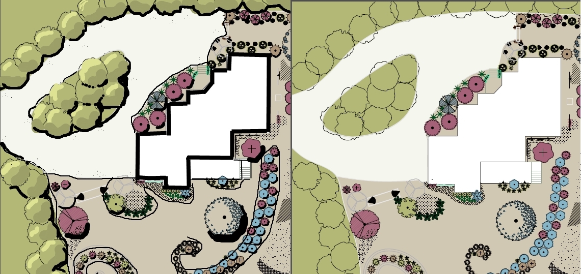
Whether you draw with CAD, photoshop, or hand, it still makes sense to apply the same techniques taught to us in our hand graphics classes. I’m anything but a graphics guru, but I believe that starts with line weights (also known as line hierarchy). As the plan comes together, light, shade, and shadow add that “life” that J. Robert is talking about.
Shadowing the tree line, adding a darker tone to the shade the shadow side of the trees, adding a lighter tone to highlight the sun side of those perimeter trees, and having a black line define the edge of the forest on the ground plane will sink your landscape into the forest without adding google earth, aerial photos, or not even additional line work.
The landscape within is very flat and undefined. Your buildings don’t pop nor is the alternative technique of having everything else pop to make the buildings a negative space employed. All the edges are weak because there is no use or improper use of line weight.
Think as though you are drawing by hand. Make the line work stand alone. Use color to enhance it. Use light, shade, and shadow to further enhance it.
I think that the biggest problem that people have in using CAD is that they believe the CAD will do the drafting work and they don’t pay attention to the fundamentals of drawing.
Ask yourself what you would do to achieve what you are trying to achieve if you were doing it by hand. Use your CAD to do the same thing and all will be well.
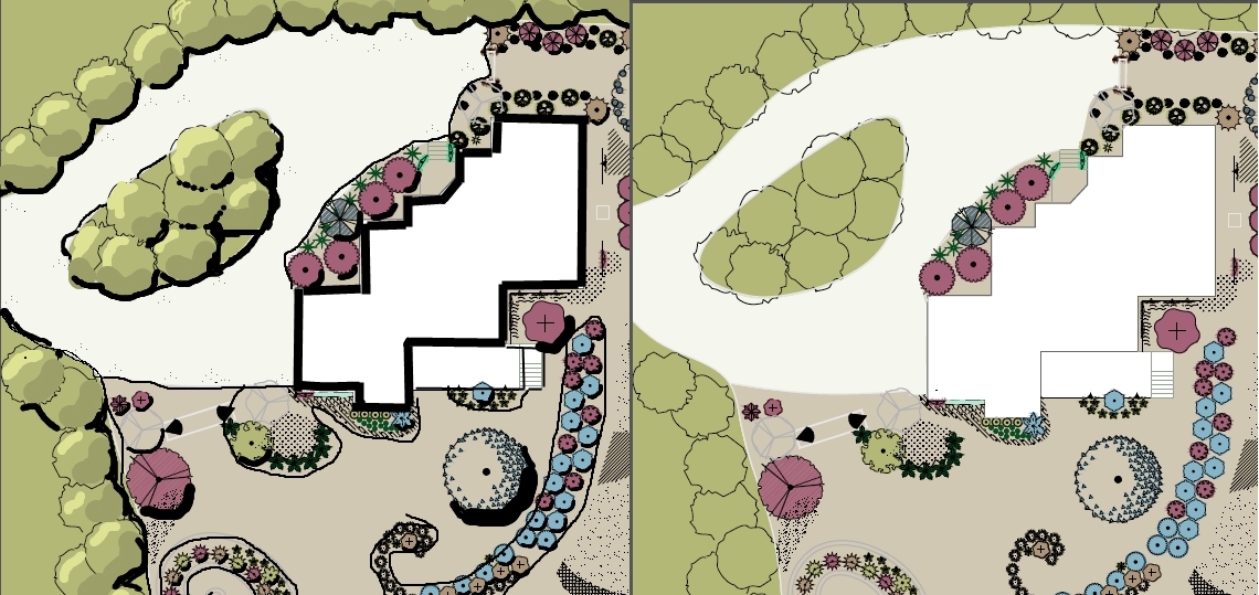 I don’t draw well with my hands and certainly not in a hurry with a mouse on a tiny picture, but you get the ideaAugust 21, 2013 at 4:08 pm #154327
Anonymous
InactiveKatherine to add to what Rob stated, I strongly recommend that you focus on the design as opposed to the best way to render the surrounding context. I understand that you’re a student and you aren’t able to formally present your design, but I’m really trying hard to see your design intent. Who are the people that live here and how would they use what you designed? The foundation plantings seem pretty straight forward (and not necessarily in a good way), and then it all seems to fall apart from there. The one thing I do find quite pleasant is the circulation (minus the dead ends on the curly-Q thingys) and it appears to be the only thing tying everything together. But, in the same breath I have to say that one of the biggest problems with the design it gives a feeling that it’s all circulation, kind of like circulation for circulation sake. I don’t think you need to trash the design, but I do think that you need to show less of something – what that is I don’t know. I feel the best way for you to pull this one off is to reinforce your idea using less stuff. Think about the quality of the space(s) that you’re designing for humans and less about decorating two dimensionally on your computer screen.
[Cue Old Dude Rant]
This is the kind stuff that chaps my fanny. Students and young designers understand the CAD language and how to operate all of the latest CAD programs before they understand basic design. Time spent mastering Rhino, Photoshop, AutoCAD, SketchUp, 3D Viz, etc. is time students should be learning how to design. LA Students should demand more emphasis on design and pro practice. Becoming a master CAD operator is not going to help you make principal as much as knowing how to design and sell will. It seems like a lot of university programs are producing career CAD Jockeys.
Sometimes I wish I heard more LAs talk about form, space, and order, and less about JPEGS and pixels.
August 21, 2013 at 5:05 pm #154326Katherine JacobsParticipantI appreciate hearing your feedback, but you are responding to an image rather than a full presentation- of course the design doesn’t make sense without having all the information!
If you are interested:
It’s a “food forest”/edible landscape, which makes access by wheelbarrows extremely important to the design– I think that’s why you read the circulation so strongly. That also probably reads particularly strongly because you happen to be looking at a plan.
The edible design intent is also why the design seems in this graphic to feel like there is a lot of “stuff.” One of the design goals is to provide a variety of food/medicine/herbs year round, which necessitated a more complex plant palate.
The ‘curly-Q thingys’ are fractal spirals, a formal response to the client’s interest in a “whimsical” feel (their word) and their interest in a metaphysical connection between humans, plants, landscape and the universe– fractals being a formal expression of a pattern, or underlying logic, that connects many species/natural processes. Of course they won’t experience the forms as fractals on the ground, but they view them as such from their 2nd floor kitchen window, which looks down over the space.
-And as you can see from the graphic I posted, I’m pretty bad at graphics.
August 21, 2013 at 5:56 pm #154325J. Robert (Bob) WainnerParticipantI totally AGREE with what BOTH Craig & Andrew have stated here. Andrew, the drawing you added is a 100% improvement. What you did is something University LA Professors SHOULD be teaching their students. Helping them to get their University Design Portfolios to be the very best they can be – so, they will be prepared to interview for that first LA job. Even “entry level” jobs for LA’s are extremely difficult to find these days…LA students need to be fully prepared for serious competition.
Craig, what you wrote is very well stated. I admit, I’m NOT an autoCAD person (I’m old school)…but, I feel I understand good design and good graphics….and how to make those both happen together. As I mentioned before….every project must have BOTH great design & great graphics – they go hand in hand.
You’re exactly right, Craig….way too many University LA students are all wrapped up with the various computer software programs. They need to focus on design & graphics and also hand sketching skills……Doesn’t matter if you use computer software OR hand drawn methods…..the “design & graphics” HAVE to be there….it’s what we do in the “real world”. College is NOT the “real world”….it’s fantasy land. With all due respect to every LA Professor…part of their job is to prepare their students for what they are about to face as “Professional LA’s”…and I’m just not convinced all of them are doing this.
August 21, 2013 at 7:35 pm #154324InactiveThank you for the additional info. Now that you mentioned the edible landscape and wheelbarrow access I have a much better understanding of what you were trying to achieve. I also understand the reason why there are so many parts and pieces. But you’re a designer it’s your job to make sense of the chaos. In other words make all the stuff into one harmonious composition. Think about grouping items (even more) and/or larger beds, but less of them. The key word for you is ‘structure’. I feel you’re on your way, but not quite there yet.
Fractal spirals eh? I’ll buy that, maybe you might want to think about a fractal or even three fractals. I just think you’re losing something with the number of spirals that you have. The thing that really sucks is to make your design stronger you might have to subtract the very thing that gives it a whimsical quality. The interesting thing I find is that all of the fun is happening between the major curly-Q thingys.
That said, I have to commend you on taking and responding to a crit like a real professional. As long as you maintain your excellent attitude you’ll go far. IMO I wouldn’t sweat the graphic too much. Sure you could kick it up a notch to make things pop, but I’d rather you spend that time refining your design. Graphics are important and will come with exposure and repetition. Design skills and attitude is what will make you stand out from the crowd. Lucky for you it appears you already possess what’s most important.
August 21, 2013 at 9:10 pm #154323InactiveFunny Bob, we’ve discussed this before. I guess I’d rather an LA spend just enough time to do ok to good graphics so that he/she can spend the most time striving for a perfect built design. Even though I say this I still struggle with when to stop “prettying up” a drawing. My problem is I just love to draw whether it’s on a computer or with a pen and paper. Sometimes I have to remind myself that all the hand lettering, stippling and color blending is for me. Most of my clients could care less. Since I went out on my own my standard is to lay a base of color on an AutoCAD drawing in Photoshop, quickly add some colored pencil strokes and finish off with black lines and shadows by hand.
I agree with you about the universities failing the students. I think they are producing CAD wizards with poor design skills. Some will eventually learn how to design on the job, but those are the fortunate ones. Many will never design or will just go out and do poor designs that get built.
August 22, 2013 at 12:29 am #154322J. Robert (Bob) WainnerParticipantHey Craig. Well, I’m sort of the same way when it comes to “graphics”. I have loved drawing & well, architectural drafting & hand sketching too since I was about 12 yrs. old.
I know too…that much of my graphic efforts are for me. But, it’s also a personal pride thing too. I’ve always strived to be the best I can be…to improve even now. Though, I’m not nearly as active as an LA as I was 4 or 5 yrs. ago.
I’ve seen a LOT of University LA Student Portfolios (looking at many that are posted on asla.org’s web site). There are some that are really “incredible”. But, there are way too many that are just plain “bad”. And, when I see poor student presentation or autoCAD drawings…it makes me wonder HOW & WHY they were issued an LA degree. Oh, I forgot…those Professors have to have students or they would not have a teaching job. I don’t intend disrespect towards University LA Professors…but, just think too many are dropping the ball – they’re NOT getting their students fully prepared for the “real world”.
When I was a student at A&M, I was fortunate that several of my LA professors who had previous professional practice experience. One, Don Austin, became the Head of our LA program when I was a Senior. Don Austin is the “A” in the previously named LA firm…..EDAW. So, I felt that I was getting some really good – real life input from most of my LA professors. STILL, I know I was clueless my first couple of years after I graduated. As you know, the University LA world and the “real world” of Landscape Architecture are almost “light years apart”….but, I don’t really think it has to be that way.
I have to say, I really feel for new LA graduates these days. It’s been rough on LA grads for the past 4 to 5 years. I’m sort of guessing, but, I doubt that unless an LA grad is in the TOP 5% of their Landscape Architecture class these days…..they’re going to be very hard pressed to even find an “entry level” job in any type of firm. The economy just has a LONG WAYS TO GO before it’s anywhere close to being normal again.
August 22, 2013 at 6:09 am #154321 landplannerParticipant
Mr. Anthony:
The old fart music is playing in the background as I write this. Sage advice from an able and proven practicioner. I could not have stated it any better myself.
I have been away from this site for quite sometime, but may be making some impromptu, drive-by postings from time-to-time in the not so near future.
For now, praiseworthy words. Amen, brother and pass the ammunition and Glenlevit while your at it.
August 22, 2013 at 6:14 am #154320landplannerParticipantHenry:
A profoundly simple and powerful thought.
Imagine trying that time-worn and proven method first and then converting to a digitally expressive form of communication when idea is more worked out, has a bit of a luster and client buy-in.
What a concept.
August 22, 2013 at 7:06 am #154319J. Robert (Bob) WainnerParticipantYes…..good IDEA, Henry! Agree with you also “Landplanner”.
Over the years, I have learned that most of the elite LA firms around the Country…..EDSA, Belt Collins, EDAW (their old name)……the projects they design are extremely complex and normally very large in scope. But, I know those firms…they all spend time using “hand drawn sketches”…developing the DESIGNS.
I have also had dealings with LA firms that use a “combination” of color markers along with autoCAD on the same drawing….I was very impressed with that technique. Because, a lot of photoshop type drawings I have seen (even in professional LA firms) look too much to me like “paint by number”…the color presentation drawings have little depth or life to them. I know, I sort of keep pushing the “graphic” end of things…but, the DESIGN should be the major focus….However, great graphics really do help “sell” your design ideas to your clients.
The Color Preliminary Residential (pool area) that I recently posted….it’s a new project on my drawing board. After using a LOT of tracing paper….many overlays to work out the DESIGN…..I went with black pentel pens to hardline the DESIGN…on white tracing paper. Then, I used colored markers on the BACK side of the tracing paper to add sort of a light background color – to the pool, pool deck, lawn areas and some of the plants. Then, I went onto the FRONT of the tracing and used “colored pencils” to get the punch I wanted…adding BLACK shadows to add a more 3D look….just a side note here about SHADOWS…for “graphic purposes”…regardless of which direction the SUN is actually coming from…running your shadows to the LOWER RIGHT seems to work best – it’s sort of a “visual” thing. For Preliminary Drawings like this, I prefer to use “calligraphy” type lettering…gives a drawing a more personal touch. I realize to most of you….this may seem “old fashion”…but, it works and when you get the process down, it’s really not that time consuming.
I think sometimes, when an LA presents a Photoshop type Color Presentation Drawing to a client….it looks to FINAL. So, some clients feel that maybe they really don’t have opportunities to make changes to the DESIGN. With my Residential Client…I left them a set of color Xerox copies of all areas I designed – basically, the entire property. I wanted to give them a week or so to review the DESIGN and the Preliminary Cost Estimates. This process has worked well for me for MANY years…and when you completed these drawings…the Color Xeroxes come out looking BETTER than the “originals. The color drawing I posted is a digital photo…so, the quality of that photo is not really very good.
I guess my point is…..though lengthy…..is, don’t be afraid to use some “hand drawing” skills when you are a LA student or an LA Professional. Try not to get buried in all of the computer software programs…..remember, that your objective is to produce GREAT DESIGNS…regardless of HOW you arrive.
-
AuthorPosts
- You must be logged in to reply to this topic.