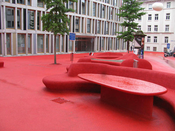
Stadtlounge, St Gallen, Switzerland, by Carlos Martinez Architekten and Pipilotti Rist If you think the color of landscape architecture is green, you had better think again. Stadtlounge plaza design by Carlos Martinez Architekten, in collaboration with the artist Pipilotti Rist, is an astonishing project designed to contrast with many of our preconceptions.
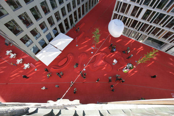
Photo Credit: Stadtlounge, St Gallen, Switzerland, by Carlos Martinez Architekten and Pipilotti Rist
Form, Scale and Material in this Stunning Plaza Design
The plaza design tackles with form, scale, and material in an extraordinary way and appears to be very well received by the citizens of St. Gallen, Switzerland. St. Gallen is the capital of St. Gallen Canton in northeastern Switzerland, and has approximately 73,000 inhabitants. The Raiffeisen bank and the municipality of St. Gallen held an architectural competition to reorganize the town’s central business district. There had appeared to be a lack of coherence in the urban tissue, which had formed a number of voids between buildings. These voids, with irregular shapes and a lack of connection to each other, had to be articulated somehow, and acquire an homogenous identity. That was the primary target of the architectural competition won by Carlos Martinez and Pipilotti Rist.
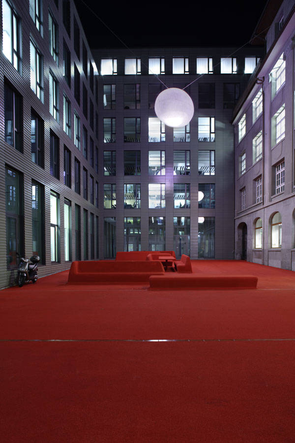
Photo Credit: Stadtlounge, St Gallen, Switzerland, by Carlos Martinez Architekten and Pipilotti Rist
An Urban Lounge Plaza Design
“Stadt” is the word for “public” in German. So, Stadtlounge is actually what its name suggests: an urban lounge. A group of public “rooms” articulates the free space between the buildings. The different areas/rooms vary in terms of function, structure, and shape. What actually creates a sense of connection between them is the material application. The pedestrian and recreation areas are coated with red, solid-colored rubber granules, whereas the lanes and movement areas are covered with red asphalt. A material that has been closely associated with athletic facilities has been relieved of any sports connotation and has been used for the purpose of a new concept, allowing new forms and possibilities to rise.
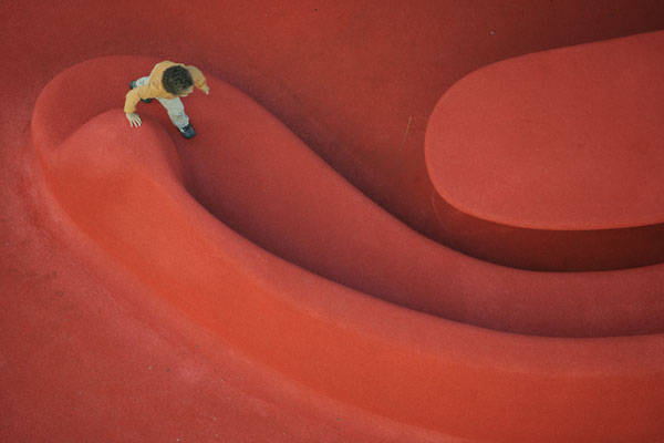
Photo Credit: Stadtlounge, St Gallen, Switzerland, by Carlos Martinez Architekten and Pipilotti Rist
- Top 10 Public Squares of the World
- Sculptor Creates Major Public Square!
- Revitalizing London’s Finsbury Avenue Square
The different areas/rooms that Stadtlounge is divided into are the following:
- The Reception Area: This is the “entrance” to the Stadlounge. This is where visitors enter the building complex and the “Lounge”. The sitting areas encourage meetings in small groups, while the access toward the main part is open and welcoming.
- Coffee Shop: There is no lounge, open-air or not, that does not offer such facilities. This is a pleasant area where the inner part of the complex as well as the city’s vibrations can be observed in a relaxing state.
- Relaxation Lounge: This is the lounge’s main area. There has always been a “plaza” here. All the pre-existing elements, such as trees and water fountains, have been preserved or transformed according to the new design guidelines.
- Business Lounge: The space created by the recess of the bank building forms another area with a special identity. The urban furniture located here has been designed in order to accommodate meetings and bring the bank’s activity closer to city life.
- Sculpture Park, Reading Corner: This is the most intriguing part of the intervention. Interior qualities have been brought into the urban context, accompanied by a very subtle sense of humor and creativity. A large vase made of tartan reminds us that this is a lounge, as cozy as our sitting room and as accessible as the city square.
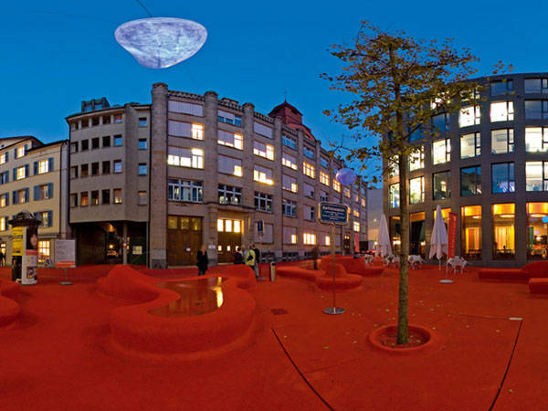
Photo Credit: Stadtlounge, St Gallen, Switzerland, by Carlos Martinez Architekten and Pipilotti Rist
- Urban Design by Alex Krieger
- The Urban Design Handbook: Techniques and Working Methods (Second Edition) by Urban Design Associates
Article by Eleni Tsirintani Return to Homepage
Published in Blog


