Article by Win Phyo Good design is in the details – We take a look at 10 landscape architecture projects that show the power of detail in design. It is often the little things that count and a combination of little things usually end up amounting to something worthy, touching and extraordinary. This applies to nearly everything in life but guess what? It also applies to landscape designs too! As designers working for many kinds of clients, our job is to paint an exciting big picture. However, what happens when your design gets implemented? In the end, it is the visitors and users of your site that count. It is they who will gush over a tiny detail in design, remember how they felt, what they heard and the small personal interactions they had with your design. This is exactly why, in this article, we are going to be celebrating many types of details in landscape designs and show you how they matter.
The Power of Detail in Design
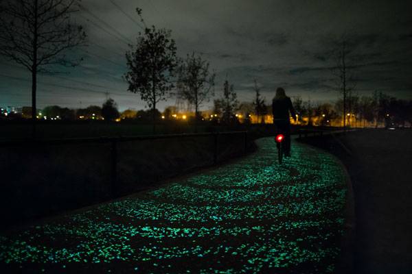
10. Starry Bicycle Path Nestled within the hometown of Vincent Van Gogh is a one-kilometre-long, energy-efficient bicycle path that glows in the dark. Inspired by Van Gogh’ painting “Starry Night” and embedded within this bike lane are 50,000 stones coated in phosphorescent paint and solar-powered LEDs to imitate the beauty of the painting in real life. During the day, it is an ordinary bike lane but the special paint gathers energy to create a magical, unique experience for cyclists commuting during the night. If all bicycle pathways were like this, perhaps people would be inclined to cycle more. Nevertheless, this is what happens when practicality, energy-consciousness and beauty is combined in a simple but powerful detail in design.
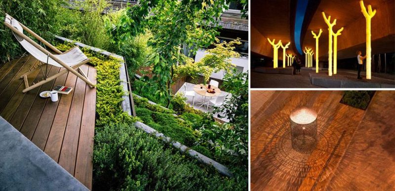
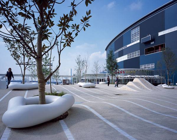
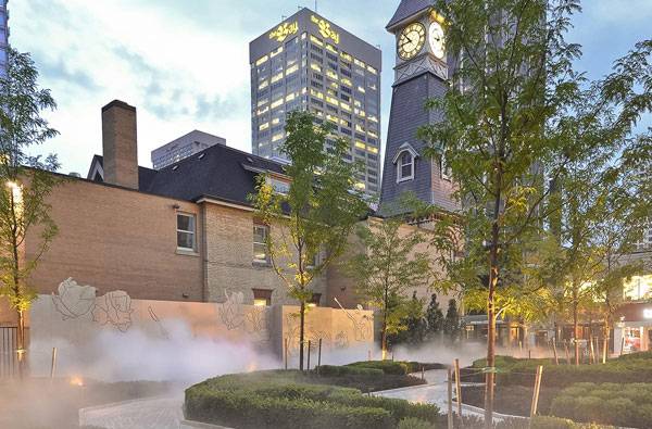
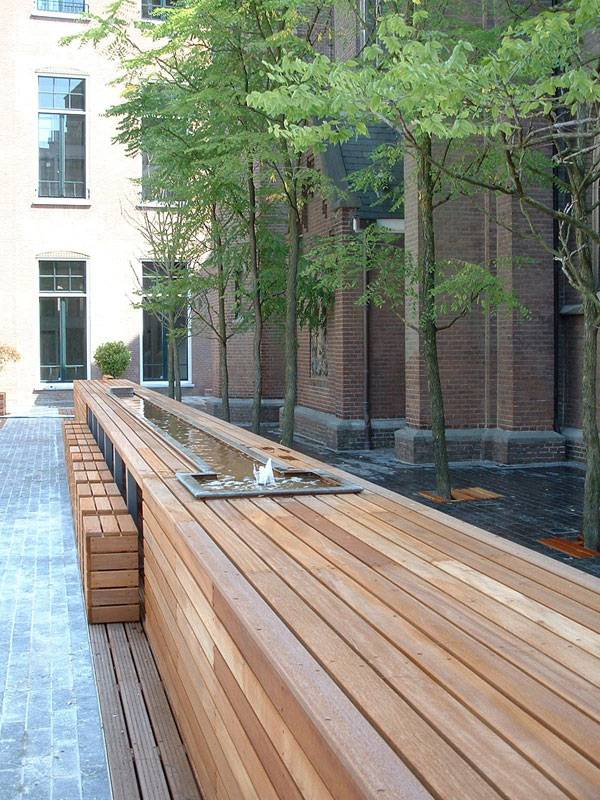
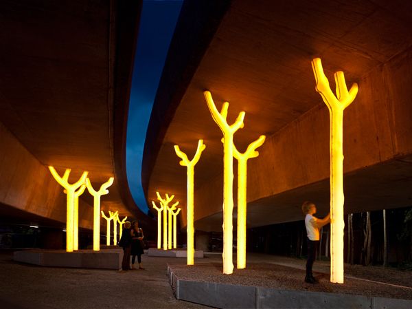
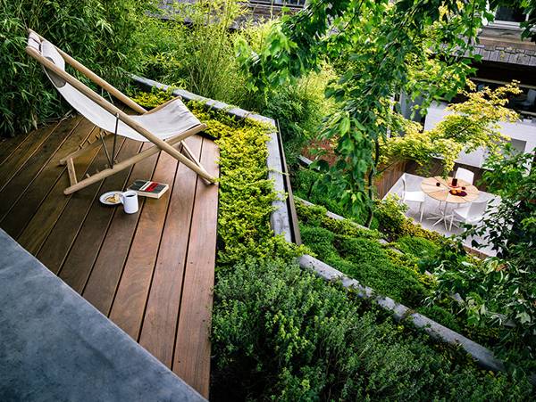
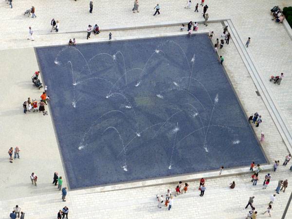
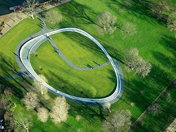
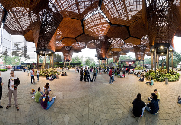
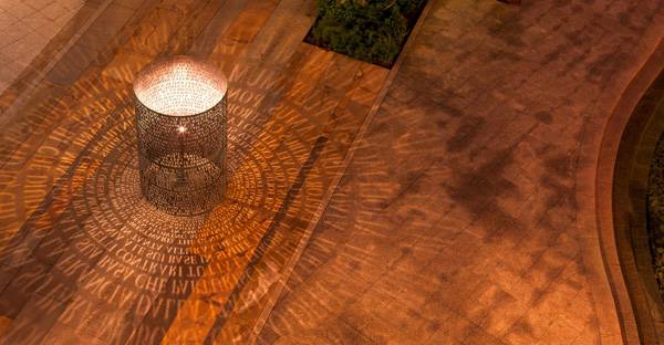
9. LaLaport Toyosu There are many great things that can be said about this site in Tokyo. In comparison to our first example, this is a complete contrast. What happened to subtlety? Well, this project shows how details in repetition that follow a particular theme can create a fun experience. The former dock and port site has followed an oceanic theme. Take a look at how the paving follows the waves of the ocean and how in certain places, it raises up to create a play feature. Have you seen the benches, made to look like a clump of coral, that are pure white, and how the trees poke through, like sticks in shallow water? 8. The Four Seasons Hotel and Residences Here, we take it up a notch to reveal detail in design created on a bigger scale. The landscape is set between a 21st century skyscraper and a 19th century Victorian home. This may not be everyone’s cup of tea, however, this project is a true example of a conceptual design executed in a bold manner. Sitting in front of the hotel entrance to welcome guests is a pixelated, rose-patterned “urban carpet” paving with a grand, cast iron fountain four stories high. Adjacent to this is a rose-shaped garden to compliment the patterns. This creates a branding image for the famous hotel – its bold, startling details are sure to stay in everyone’s minds! 7. Choorstraat Papenhulst The clean execution of the furniture detailing in this project is awe-inspiring. Within this courtyard, all of the furniture is made out of the same wood, including the lattice work of the paving upon which these features sit. There is some seating shaped like blocks and modern benches; however, the star attraction is the long picnic-bench-like table with a water fountain that doubles as a wine cooler. Elegantly placed in the courtyard, the residents of this site will be made to feel like characters in Da Vinci’s Last Supper. 6. Aspire Public Art Lighting Project This community-focused public art work lies in an underpass and allows residents from the nearby suburbs to feel safe walking through it at night. The figures are shaped like trees which glows during night time and are made to look like structures holding up the highway. They are made out of high density polyethylene, a popular plastic commonly used for packaging. It is a subtle yet striking detail in design, fitting into its surrounding context and during the night, it transforms the space into something more meaningful. 5. Hilgard Garden Within this garden is a material palette that consists of cedar wood, used as bench-planters, concrete used for a retaining wall/ planter feature, granite paving, and COR-TEN steel fence and retaining panels. These materials are used in a purposeful manner to differentiate the function of the small spaces within the garden and to create a strong visual axis. The end result is truly breath-taking. The project is an example of how a hardscape material palette can create a strong textural detail, which strengthens the overall shape and form. 4. Place Lazare Goujon There are many good thigs that can be said about this project. However, we want you to focus on only one thing for this site and that is the fountains. Yes, they are grand and fit in very well to the existing buildings which surround the public square. However, if you walk a few steps in to take a closer look at these giants, you will see tiny pieces of blue and gold paste pieces with words on them. These look fun and at the same time, elegant, against the blue background of the basin. The designer has worked alongside an artist to create this and we can imagine this detail shimmering from a distance. 3. Diana Memorial Fountain This circular water fountain was made as a memorial, representing the inclusive and loveable personality of Princess Diana. The fountain feature has textural details that influence the sound and character of the water as it flows in a circular motion around the fountain. This is made from computer-machined pieces of granite connected at intervals. In some areas, the water flows freely and calmly and in others, its speed quickens, splashing or gurgling, accompanied by the soft and loud sounds of its journey. 2. Orquideorama This 50-foot high canopy is made out of steel and wood and takes inspiration from honeycombs. The steel structure allows the canopy to expand far and wide and the latticework of the wood creates interlocking shadows. Each structure funnels rainwater downwards and the overall shape and form connects the built and the natural together in this Columbian botanical garden. The beauty of this project is in turning a simple concept into a highly technical and well-detailed design. 1. North Bethesda Market This project is a true demonstration of the “importance of the little things” we have mentioned in the beginning of this article. It is set amongst a luxurious shopping facility and apartments and the different spaces within reflect a place for people of all ages. Our favourite detail in this project is the use of locally-sourced granite in different colours and shapes, used in many features ranging from steps to waterfalls to paving. What tops this project off is the implementation of perforated copper waterjet-cut texts, mounted in sculptures that edge the steps. One particular piece named “Alluvium” has lighting inside which illuminates the words and creates shadows beneath the floor!Appreciating Detail in Design
By now, we realise we have taken you on a whirlwind journey of details today. From elegant subtlety to striking boldness, they vary by form, material, and themes but one thing is for sure- the details compliment the context in which the site is set. Whether through strong visual images, a collection of simple features, or the deliberate use of certain materials, we can say that none of these projects have simply taken the standard way out of detailing. They show us that it is important and worthwhile to take the time to consider the impact of the little things and design them artfully. Which project has made the deepest impression on you? Let us know in the comment section below!
Recommended Reading:
- Becoming an Urban Planner: A Guide to Careers in Planning and Urban Design by Michael Bayer
- Sustainable Urbanism: Urban Design With Nature by Douglas Farrs
Article by Win Phyo
Published in Blog


