


Author: Land8: Landscape Architects Network


How Rike Park Merged a Historical Space With a Modern One
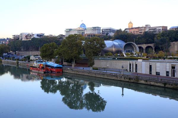
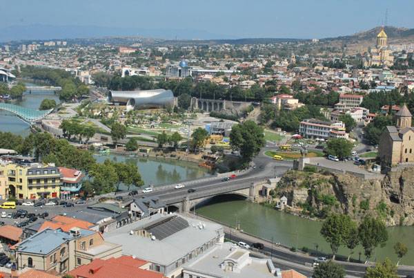
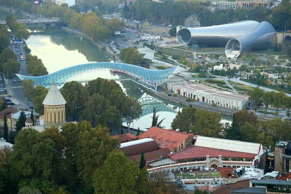
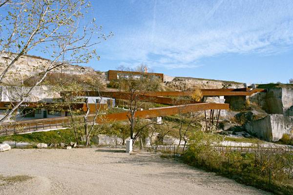
Article by Paula Uzarek Rike Park, by CMD Ingenieros, Tbilisi, Georgia. Is there a recipe to join two different districts, a historical and a modern one? A recently opened area, one of the most modern parks in Georgia, gives the answer to these questions and enlists the essential elements of a public park. The first ingredient of every urban space is location. Placement of Rike Park in proximity of Tbilisi Old Town is undoubtedly opportune. The office of the Presidential administration and ancient Narikala Fortress situated at the opposite side, overlook the whole scene.
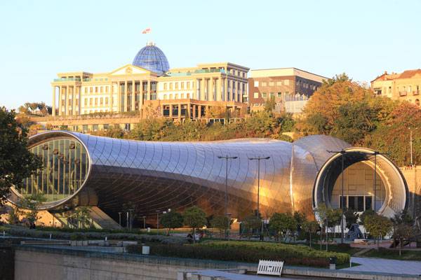
The hall and Presidential Place. Photo credit: George Darchiaschvili
Rike Park
What about the access? There are at least three ways. The most common one is to cross the Peace Bridge. The modern construction joins the eastern and the western banks of Mtkvari River. There is also another way to get to the park, descending the stairs from Alvabari district that adjoins the Old Tbilisi. Third, the aerial tramway, takes tourists right from the bank of the river to the feet of Narikala Fortress.
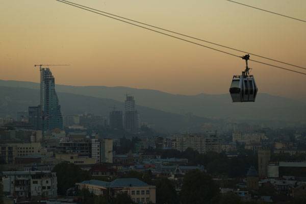
One way to get to Narikala Fortress. Photo credit: George Darchiaschvili
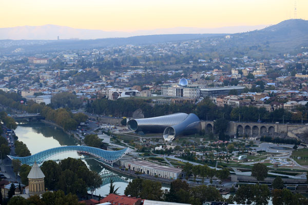
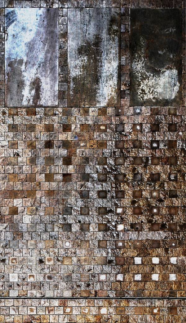
A view of Rike Park. Photo credit: George Darchiaschvili
A view of Rike Park. Photo credit: George Darchiaschvili
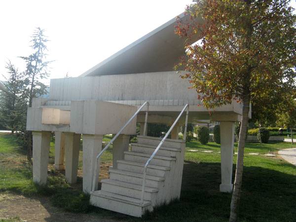
Huge grand piano. Photo credit: Barbara Mikolajczyk
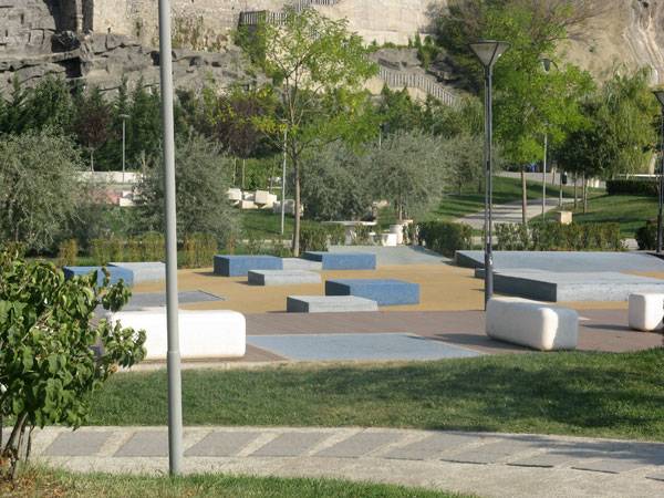
Cuboid seatings. Photo credit: Barbara Mikolajczyk
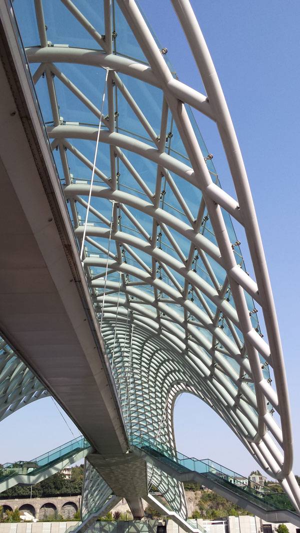
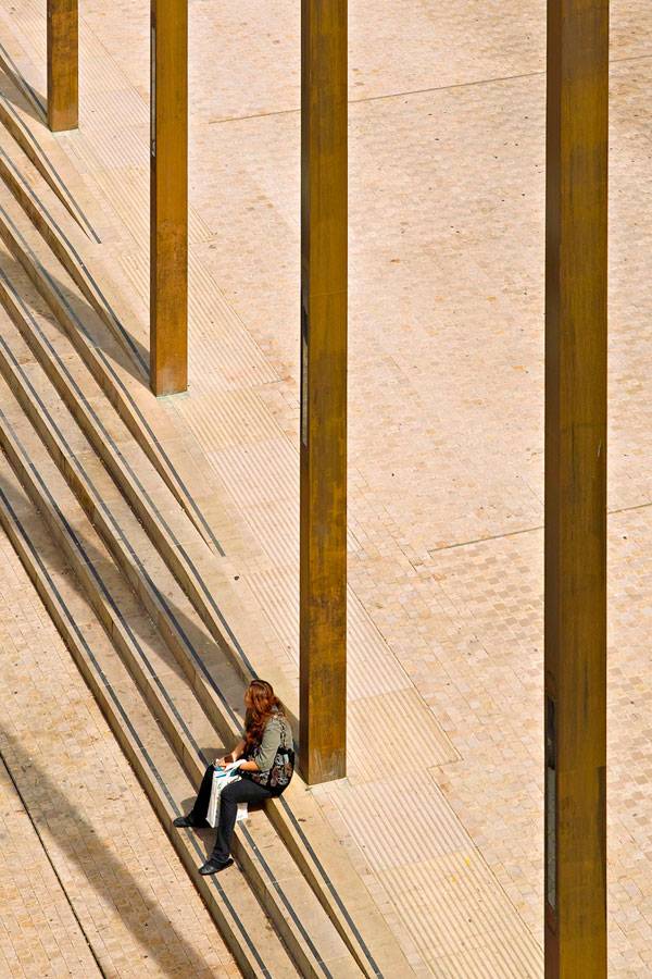
The Peace Bridge. Photo credit: Paula Uzarek
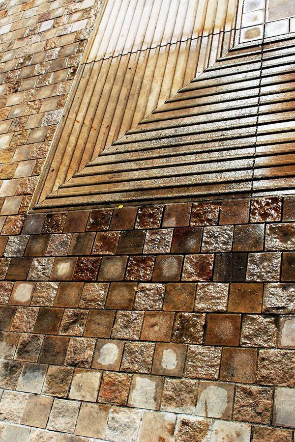
A view of Rike Park. Photo credit: Paula Uzarek
A view of Rike Park. Photo credit: George Darchiaschvili
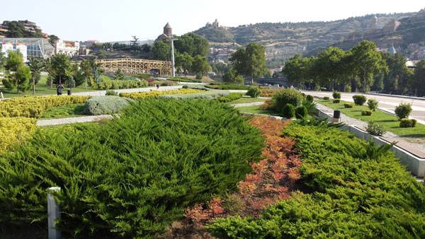
Greenery in Rike Park. Photo credit: Paula Uzarek
Full Project Credits For Rike Park
Project Name: Rike Park Location: Tbilisi, Georgia Project Address: GE-1000 Tbilisi Landscape Architects: CMD Ingenieros, Valencia, Spain Budget: 2,400,000 Euro Date of Design: 2010 Date of Construction: 2011 Client: Old City Rehabilitation & Development Fund Get Social with CMD Ingenieros: Website: www.cmdingenieros.com Facebook: www.facebook.com/cmdingenieros YouTube: www.youtube.com/user/cmdingenieros/videos Twitter: www.twitter.com/cmdingenieros LinkedIN: www.linkedin.com/company/cmd-ingenieros Recommended Reading:
- Becoming an Urban Planner: A Guide to Careers in Planning and Urban Design by Michael Bayer
- Sustainable Urbanism: Urban Design With Nature by Douglas Farrs
Article by Paula Uzarek Return to Homepage

Is This What Every Major Park in The World Needs?
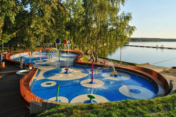
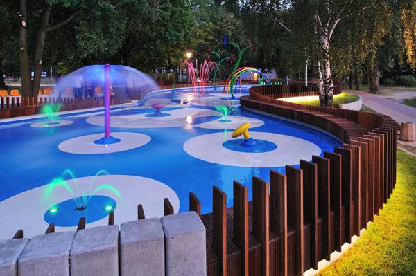
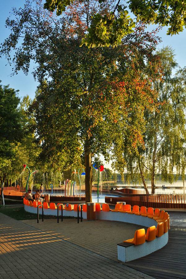
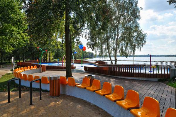
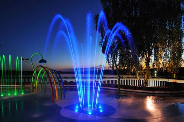
Article by Paula Uzarek Water Playground, by RS+, in Tychy, Poland. Playgrounds are a topic inseparable from landscape design. How do landscape architects create them? It is important to include colors, shapes, fun and safety in a form adjusted to the space that designer has at their disposal. Yet motives and themes echoed over and over again are imprinted in our minds, making the existence of innovative designing processes almost impossible. When correlating minimalism and the quiet harmony of nature with a colorful, energetic playground, the task seems to be unrealistic. Fortunately, landscape architects move beyond the typical schemes. The water Playground in Tychy is an excellent example of inspiring and intelligent play area design and the first such project in Poland.
Water Playground, by RS+, in Tychy, Poland. Photo credit: Tomasz Zakrzewski
Tychy, Water Playground
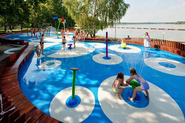
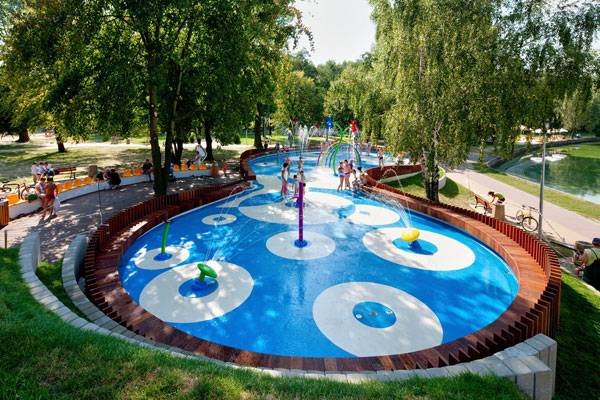
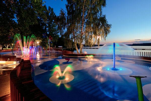
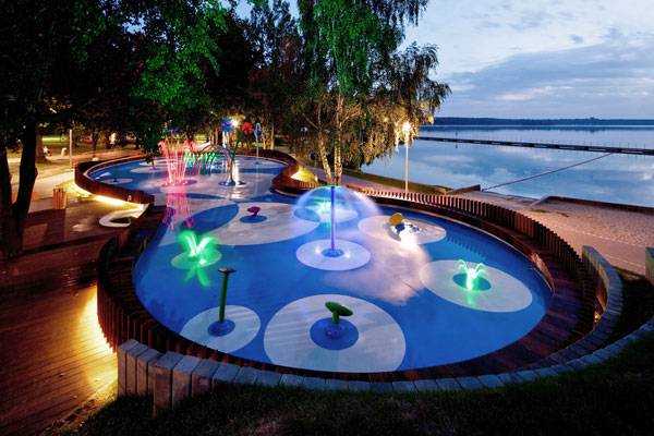
It is good to understand the larger setting before seeing the water playground area itself. A scenic reservoir of Paprocańskie Lake, situated in the purlieus of forest at the south-west of Tychy, this area has been a top place of recreation for many years. After modernization of the site was conducted recently, it gained even more popularity. The new elements that catch a visitor’s attention at the lake are parkways and a huge pier that has two possible points of entry. Gentle strolls are possible right next to bike rides.
Water Playground, by RS+, in Tychy, Poland. Photo credit: Tomasz Zakrzewski
The Site in Context
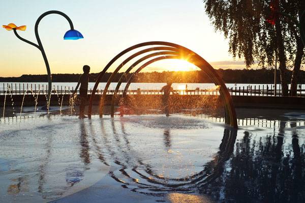
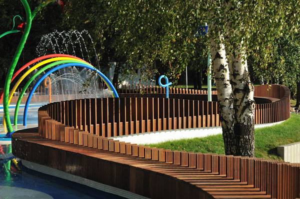
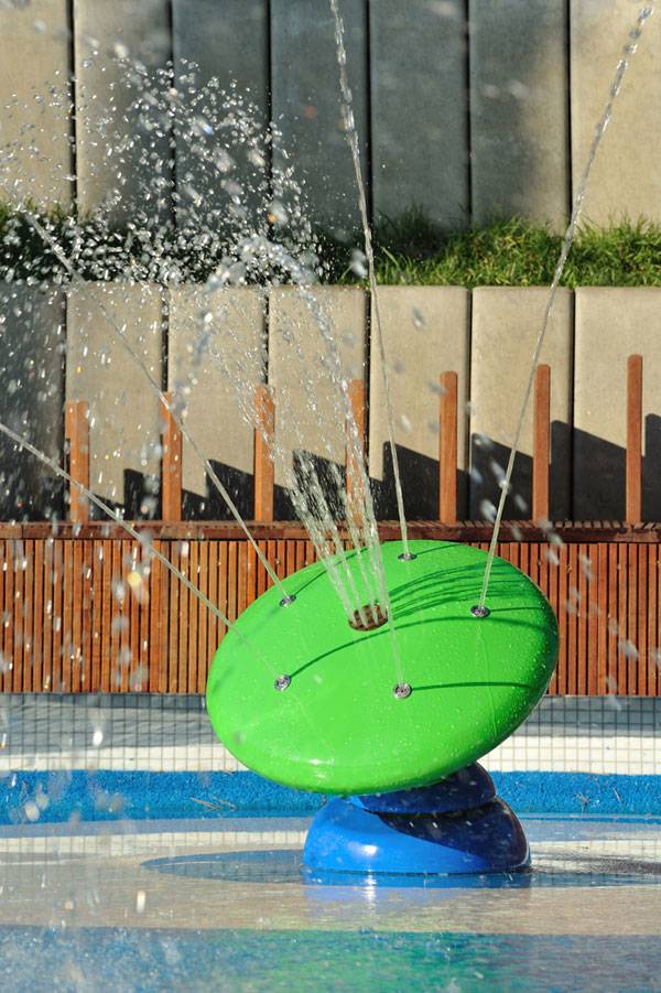
Starting with a traditional playground, the first area there has many recesses, steps, climbing nets, two open slides and one tube slide. Ropes are used in another part. A second area contains a hidden cafe. One might think that this amount of recreation facilities would be enough. But is it really? Is there anything more a designer can do here? Evidently yes. The main attraction is the colorful water playground incorporated into the landscape. Especially on hot days, it entices children and their parents with the use of multiple colorful fountains which stimulate the imagination.
Water Playground, by RS+, in Tychy, Poland. Photo credit: Tomasz Zakrzewski
The Water Playground and How it Fits Into The Greater Scheme
The water playground itself was opened on a portion of the Paprocany resort in Tychy. In 2010, Robert Skitek, with his architectural studio’s design team RS+, created the design of shallow basins and fountains destined to delight many adults and children alike. The space for kids is over 300 square meters and its shape, especially the water part, is harmoniously adjusted to the surroundings of trees growing in the park.
Water Playground, by RS+, in Tychy, Poland. Photo credit: Tomasz Zakrzewski
Water Playground, by RS+, in Tychy, Poland. Photo credit: Tomasz Zakrzewski
Water Playground, by RS+, in Tychy, Poland. Photo credit: Tomasz Zakrzewski
Water Playground, by RS+, in Tychy, Poland. Photo credit: Tomasz Zakrzewski
Water Playground, by RS+, in Tychy, Poland. Photo credit: Tomasz Zakrzewski
Water Playground, by RS+, in Tychy, Poland. Photo credit: Tomasz Zakrzewski
Water Playground, by RS+, in Tychy, Poland. Photo credit: Tomasz Zakrzewski
Dividing the Park By Age Group
For the youngest children, water is splashed from fountains with small strength. Older users in the second part have to work with fountains which spray a little bit harder. Children enjoy wading and paddling inside basins running around the blooming water features. To replenish the water playground design, at night it becomes a fantastic fountain illuminated with highly-colored LED lights.
Water Playground, by RS+, in Tychy, Poland. Photo credit: Tomasz Zakrzewski
Water Playground, by RS+, in Tychy, Poland. Photo credit: Tomasz Zakrzewski
Full Project Credits For The Water Playground, by RS+
Project Name: Water Playground Location: Tychy, Poland Cooperation: stud.WAPŚl Jakub Zygmunt, stud.WAPŚl Szymon Borczyk Technology: Arras Date of Design: 2010 Date of Construction: 2011 Architect: RS+ Robert Skitek Investor: Tychy Town Council Project Team: Robert Skitek, Jakub Zygmunt, Szymon Borczyk Water engineering: Maciej Papiurek, Krzysztof Wacek, Anna Terentjew Completion: 2011 Project area: 354 sqm Photographs: Tomasz Zakrzewski www.archifolio.pl Get Social with RS+: Website: www.rsplus.pl Facebook: www.facebook.com/RS-Robert-Skitek Recommended Reading:
- Becoming an Urban Planner: A Guide to Careers in Planning and Urban Design by Michael Bayer
- Sustainable Urbanism: Urban Design With Nature by Douglas Farrs
Article by Paula Uzarek Return to Homepage
Top 10 Stories in the World of Landscape Architecture
News report by Brett Lezon 21-December-2015 The Latest News in Landscape Architecture 2015 is sponsored by ZinCo – Life on Green Roofs – Ecological and Economical Green Roofs, worldwide. In this week’s Latest News in Landscape Architecture we feature several pedestrian-friendly concepts from Dallas to New York, highlight a newly proposed public pier in Traverse City, and announce a collection of principles useful for landscape architects of all ages. 10 of the Best Stories in This Week’s Latest News in Landscape Architecture:
- Arup Releases Report Envisioning a Greener Madrid
- Traverse City Public Pier > A New Iconic Destination for the Great Lakes
- Uptown’s Crescent Is Getting a Makeover, Emphasizing Openness
- A Winter Installation of 30 Giant Seesaws in Montreal
- What If We Turned New York’s Longest Street Into A Giant Park
- 7 Ways Cities Will Get Better When Driverless Cars Hit the Streets
- Ten Random Principles to Consider When Starting Your Career in Landscape Architecture
- Scientists Hope Vacant Lot Gardens Keep Detroit Water Clean
- Sowing the Seeds of Gardening-Based Change at Masdar City
- The Greening of Split: Trees to Be Planted in City Centre
(Click the headline for the full story)
Madrid has partnered with Arup’s Foresight + Research + Innovation and Madrid’s Sustainability Master Planning and Landscape Architecture team to develop a series of guidelines to address climate change. The progressive report offers several solutions to nature-based approaches to regulate Madrid’s urban environment, while responding to pollution, strong storm events, drought, and biodiversity loss. Download the report here Related Article: 280 Million Euros Invested into Urban Revitalisation Project
- Traverse City Public Pier > A New Iconic Destination for the Great Lakes: Traverse City Public Pier
Traverse City, Michigan’s proposed Public Pier is a 550-foot public space projecting out into the West Arm of Grand Traverse Bay on Lake Michigan. This iconic Great Lakes destination will provide enhanced public access to the water, featuring dramatic views of the bay and city, and supporting a wide range of uses, including deep-water fishing for non-boaters. Custom seating, LED lighting, shade structures, interpretive signage, and other amenities create a distinctive user experience. Aquatic habitat enhancement, shoreline erosion control structures, and cultural and economic linkages make the Pier part of a holistic, sustainable waterfront. Traverse City worked closely with SmithGroupJJR to develop an inclusive, participatory public process to inform decision-making and design. The project was designed in Revit, utilizing a new built-in parametric/algorithmic modeling tool called Dynamo . WATCH: Traverse City Public Pier
An 11-acre mixed-use development in Uptown Dallas known as The Crescent is getting a major makeover. This French-Renaissance style building constructed in 1985 will be modernized, according to the development team. Designed by The Office of James Burnett Landscape Architecture (OJB), Staffelbach, and GDA Architects the renovation is intended to increase curb appeal. Ultimately, the property will become more pedestrianized in addition to proposed gathering spots to meet friends. Collectively, the team aims to “create a more porous and welcoming environment.” Related Article: Does The Klyde Warren Park in Dallas, Bridge the Gap to a Greener City?
- A Winter Installation of 30 Giant Seesaws in Montreal: World Landscape Architecture
Each year, (for the last six) a winter installation transforms the Place des Festivals in Montreal. This year features 30 giant seesaws and video projections. Created by the Toronto-based firm Lateral Office, Montreal-based CS Design, in collaboration with EGP Group—the design team has established a joyous wintry space for all ages. “Every year, we are eager to give Montrealers a new creative winter experience in the heart of the Quartier des Spectacles. Luminothérapie’s public installations transform our relationship with the city, beautify it, and give it a wonderful friendly touch,” said Chantal Rossi, Ville de Montréal Associate Councillor Culture, Heritage and Design. Impulse runs from December 10, 2015 to January 31, 2016. Related Article: How Place d’Youville is Teaching us That Artificial is Not Fake! WATCH: Making of – Luminothérapie 2015-2016
While the design began as part of a fellowship program, the Green Line, which is a proposal for a 40-block linear park in the center of Manhattan—the concept is receiving loads of attention. Instead of improving underused infrastructure, this new park seeks to advance roads for other means such as bioswales, rain gardens, and other treatments to address stormwater. Since Times Square and Herald Square closed to automobile traffic in 2010, Broadway has seen fewer cars and many experts contend that will only continue. “I think the bigger sort of trajectory is driving is becoming less attractive for people, and more people are walking and biking and taking public transit,” says Jonathan Cohn, principal at Perkins Eastman, the architecture firm that created the renderings. “In general, there’s a lot of interest in making spaces that are more pedestrian-friendly.” Related Article: The Urban Revitalisation That Inspired New York City’s High Line Park More Top Stories in the News This Week:
- 7 Ways Cities Will Get Better When Driverless Cars Hit the Streets: Gizmodo
- Ten Random Principles to Consider When Starting Your Career in Landscape Architecture: Public.Realm.Advocate
- Scientists Hope Vacant Lot Gardens Keep Detroit Water Clean: Washington Times
- Sowing the Seeds of Gardening-Based Change at Masdar City: The National
- The Greening of Split: Trees to Be Planted in City Centre: Total Croatia News
– Have something to say about this week’s news stories Go to comments For all of the hottest news continue to follow us on Facebook and Twitter. Have news to share? Send to office@landarchs.com News report by Brett Lezon Return to Homepage

5 Reasons Why Planting Fruit Trees Along Sidewalks is a Terrible Idea
Article by Taylor Stapleton We take a look at 5 Reasons Why Planting Fruit Trees Along Sidewalks is a Terrible Idea. Landscape architecture has often been touted as a profession that can solve urban problems, but sometimes we get a little ahead of ourselves. Recently going viral is the idea to replace street trees in our cities with fruit trees, providing food for the homeless during the summer and fall. While a nice thought in theory, this would actually be a terrible idea, and here is why:

Do we really need more slip hazzards in our lives? Photo credit: CC0 Public Domain
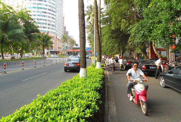
Would this be a good environment for a fruit tree? Image: “Haikou street and bike lane – 01” by Anna Frodesiak – Own work. Licensed under CC0 via Commons
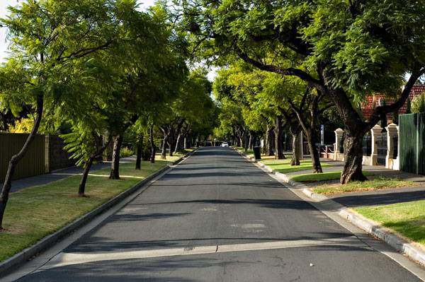
Can we make sure the fruit trees get enough sunlight on the street? Image: “Toorak Gardens Street” by Dally Horton at the English language Wikipedia. Licensed under CC BY-SA 3.0 via Commons
An Unrealistic But Well-Meaning Idea
Fruit trees replacing street trees to grow food for the homeless is an unrealistic but well-meaning idea. While this wouldn’t work, it is heading in the right direction. A better idea would be to have community orchards that are freely accessible to the homeless to harvest. Combining urban farming with social outreach is an idea that is taking off in many cities. For example, look to what is happening in Detroit. WATCH: Hantz Farms: Detroit’s Saving Grace
Several different non-profit organizations, including Urban Farming and Michigan Urban Farming Initiative, are repurposing abandoned plots throughout the downtown area as urban farms. Each plot has been set up to grow a variety of fruits and vegetables that are maintained either by the group or by the community, allowing everyone to harvest. This concept doesn’t face the same problems posed by fruit trees as street trees. The trees and plants within the abandoned plots have enough space and sunlight to grow well, and they live much longer without the harmful affects of relentless car pollution. It is cost effective, as all maintenance can be done by the community. And with more people to maintain and harvest, less food will be wasted. As well, any food that is not used by the homeless or community members can be given to local soup kitchens. So while the idea going viral is not the best solution to a social problem, it does get people thinking. If you find this idea intriguing, I encourage you to start your own urban farming project or encourage your local government to follow in the footsteps of Detroit. What do you think is planting trees along the sidewalk a terrible idea? Let us know in the comments below! Go to comments Recommended Reading:
- Becoming an Urban Planner: A Guide to Careers in Planning and Urban Design by Michael Bayer
- Sustainable Urbanism: Urban Design With Nature by Douglas Farrs
Article by Taylor Stapleton Return to Homepage Featured image: “Haikou street and bike lane – 01″ by Anna Frodesiak – Own work. Licensed under CC0 via Commons. Modified by SDR
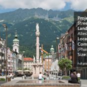

Look What This Competition Did For This Austrian Street
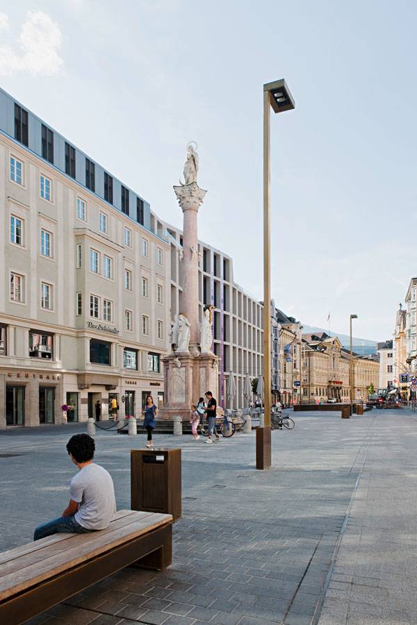
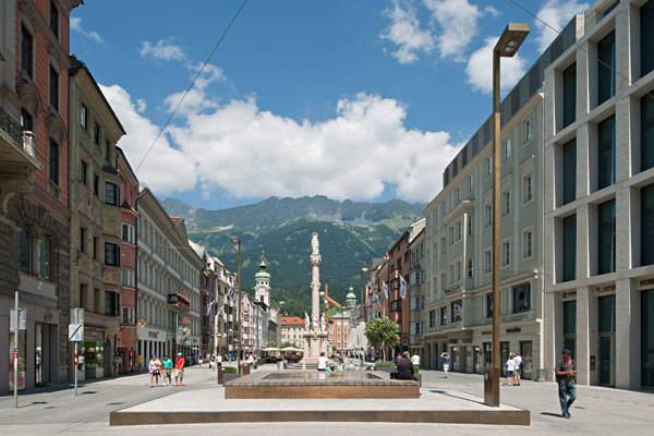
Article by Rose Buchanan Maria Theresa Street, by Alleswirdgut, in Innsbruck, Austria. The traditional shopping street is a fantastic notion of bright shop windows, bustling pedestrians, and the buzzing activity of traffic. The reality, however, is often not so pleasant. There is nowhere to sit, one can barely look into a shop without being shoved by passersby, and the desire to quickly look into the shop across the road is met with treacherous traffic crossings. Maria Theresa Street in Innsbruck, Austria, was no exception to this, and while the beautiful buildings and tourist attractions such as the Golden Roof created a spectacular urban street, it was not user-friendly. In 2006, the city realized the need to revive the street, and launched a competition to design an attractive public “lounge”. The idea was to make a pedestrian zone in the northern portion of the street while accommodating the functional street requirements to the south.
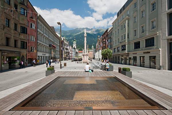
Maria Theresa Street. Photo credit: © Hertha Hurnaus
Maria Theresa Street
The competition was won by Alleswirdgut, which managed to combine the dual functionality of the street in a sensitive and complex manner. Five years of planning and construction followed, with the northern pedestrian area being completed in 2009 and the southern public transport area in 2011. The street was opened with a street party on Aug. 6, 2011, in a celebration of public space. Let’s have a look at how this street was successfully transformed:
Unifying the Space Through a Carpet of Paving
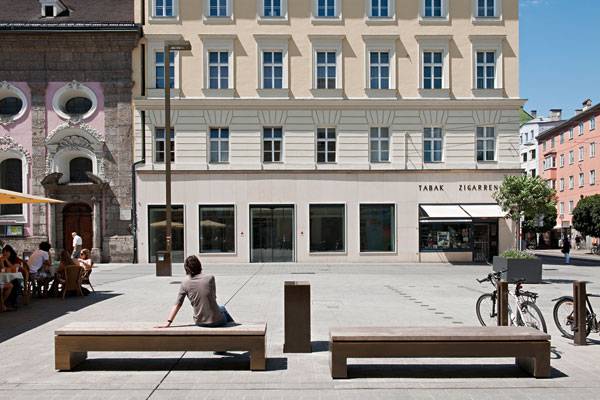
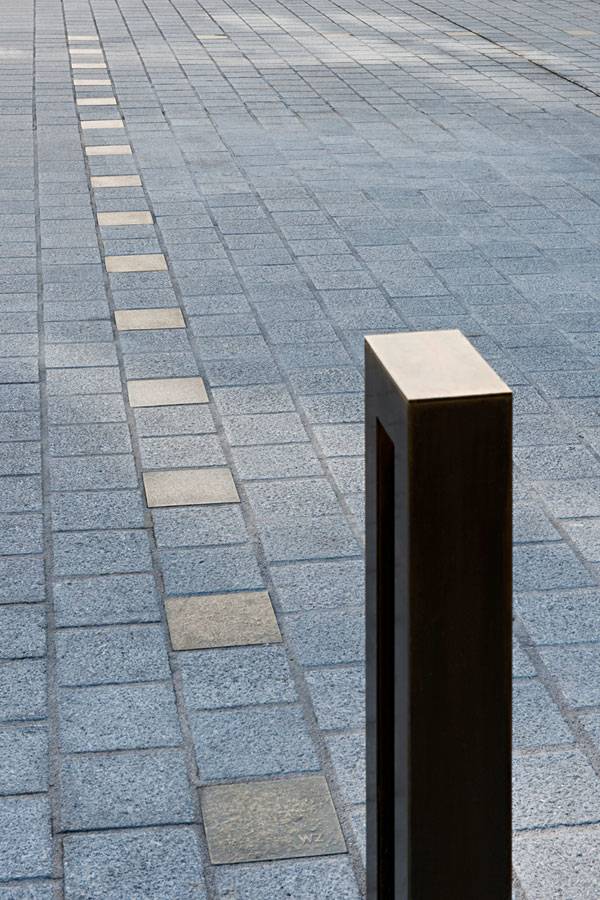
The goal of the project was to create an urban site with a rich atmosphere. The designers strove to transform the street into a public space that invites strolling along, wandering comfortably in and out of shops, and relaxing on street benches or in dining areas. Alleswirdgut aimed to maintain the identity of the traditional street against the dramatic backdrop of an Austrian mountain while creating a rich, new public space. The landscape architects achieved this by unifying the space by applying a carpet of four different types of Austrian granite, which runs from the famous Triumph Gate to the Old Town.
Maria Theresa Street. Photo credit: © Hertha Hurnaus
Design of Contrasts
This project relied on the simplicity of contrasts to highlight the tension between the urban site and the natural panoramic view. In this manner, the design created contrast between the past and future, as well as between the specific character of the space and a connection to the urban identity of Innsbruck. These contrasts allow for the experience of strolling along the generous pedestrian spaces to become a powerful sequence of facades and public activity. At night, the movement zones along the edges of the buildings are brightly lit, while the central spaces glow softly with low light, keeping the silhouette of the mountain backdrop in view.
Maria Theresa Street. Photo credit: © Hertha Hurnaus
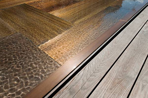
Central Public Space
Alleswirdgut created a central space in the street that defines a more intimate area for outside dining and relaxing. Three broad steps lead up to the space, accommodating changes in level while providing a stage-like area for events. Within this central space is a large water basin that serves as a place of interest halfway between the Golden Roof and the Triumph Arch. The beauty of this water feature lies in the purity of the construction – its rectangular, brass tray base with dark ash wood seating and a water level that is gently adjusted with waves. The water in the basin is continuously fed from the drinking fountain network, making the pool of water a continuously clear and sparkling feature within the complex urban surroundings.
Maria Theresa Street. Photo credit: © Hertha Hurnaus
Integrated Street Furniture
Street furniture including benches, lighting, and dust bins were carefully integrated into the design, emerging from brass inlays as pure elements of brass and timber. These elements respond to the linear nature of the paving, providing functional public space requirements while highlighting the traditional buildings through their aesthetic contrasts. Unlike the traditional approach of linear street planting, Alleswirdgut consciously did not implement any permanent planting, as the designers felt this would reduce the impact of the uniform space treatment. They therefore opted to plant Oleander trees in large plant containers, which correspond to the outdoor dining and tourist areas.
Maria Theresa Street. Photo credit: © Hertha Hurnaus
Maria Theresa Street. Photo credit: © Hertha Hurnaus
Full Project Credits For Maria Theresa Street
Project Name: Maria Theresa Street Landscape Architect: AllesWirdGut ZT GmbH Location: 6020 Innsbruck – A Auftraggeber Stadt, Innsbruck, Austria Competition: 10.2006 Start of Planning: 09.2007 Construction: 2008 Completion: 10.2009 (Phase 1) 2011 (phase 2) Size: 7,500m² Team: Alexandra Seip, Johanna Kropp, Jan Schröder, Lena-Maria Philipp, Martina Arend Special Experts: Pokorny Lichtarchitektur Photos: © Hertha Hurnaus Get Social with Alleswirdgut: Website: www.alleswirdgut.cc Twitter: www.twitter.com/AllesWirdGut_ZT Facebook: www.facebook.com/AllesWirdGut.Architektur Recommended Reading:
- Becoming an Urban Planner: A Guide to Careers in Planning and Urban Design by Michael Bayer
- Sustainable Urbanism: Urban Design With Nature by Douglas Farrs
Article by Rose Buchanan Return to Homepage


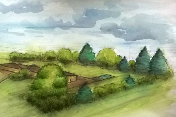
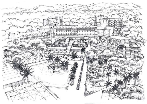
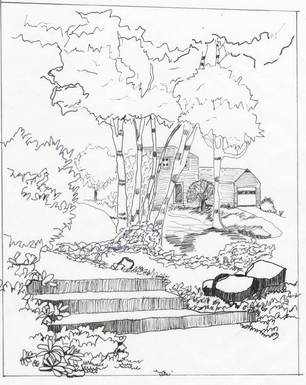
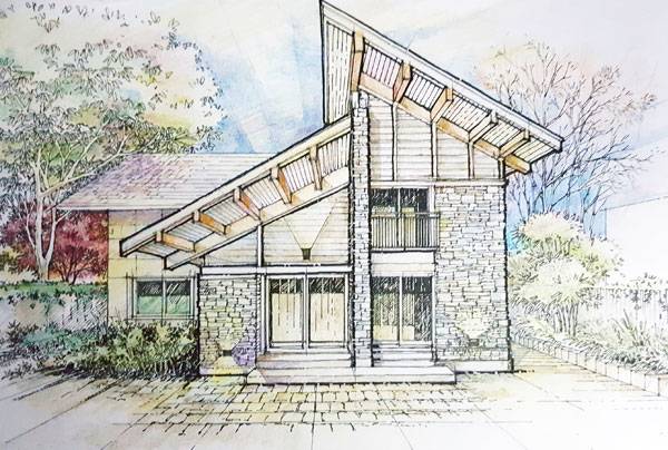
Top 10 Sketches From Around the World – Sketchy Saturday No.043
This week’s Sketchy Saturday Top 10. Sketchy Saturday is back for another week of awesome Sketchy Saturday talent, highlighting the best sketches of the growing LAN community (Currently 1,185,018 fans on Facebook) up 20,287 fans since our last Sketchy Saturday edition. Incredible 🙂 This edition took several weeks to compile as we had a lot of sorting through to do and of course, waiting on people to send us back their descriptions slows down the process, but it is a process worth waiting on, as we get a variety of opinions directly from the people who created the works, making each one of our Sketchy Saturday editions unique and worth reading for insights. Take a look at this week’s highlights and who knows perhaps you’ll be featured in the next one.
Enjoy this week’s Sketchy Saturday Top 10
10 by. Francois van Rooyen, director Red Landscape Architects in Stellenbosch, Western Cape, South Africa
By Francois van Rooyen.
By Simon Paulais
By CHARAIRAT BOWORNWATTANA
By Katarína Fuková
By İsa Eren AKBIYIK

By Jack Tremblay
By Christopher Pugh
ByBibek Chatterjee
By Damian Ayarza
By Linda Farrington
- Sketching from the Imagination: An Insight into Creative Drawing by 3DTotal
- Architectural Drawing Course by Mo Zell
Article by Scott D. Renwick Return to Homepage

How to Embrace Seasonal Change to Create an Outstanding Landscape
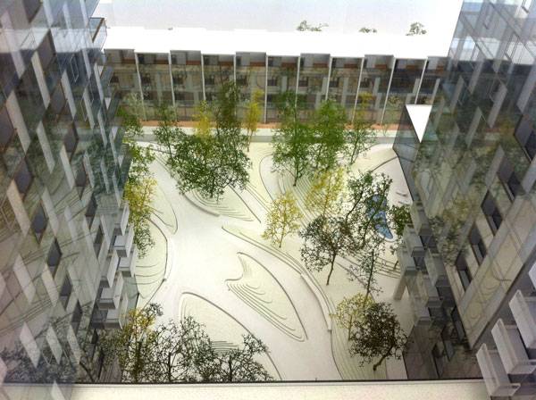
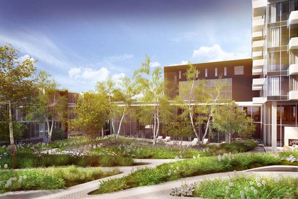
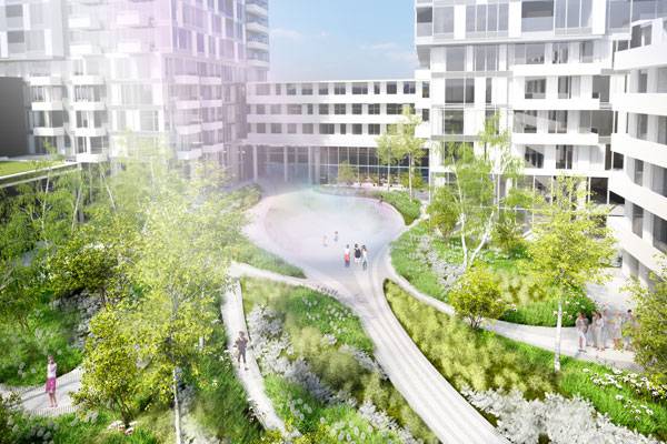
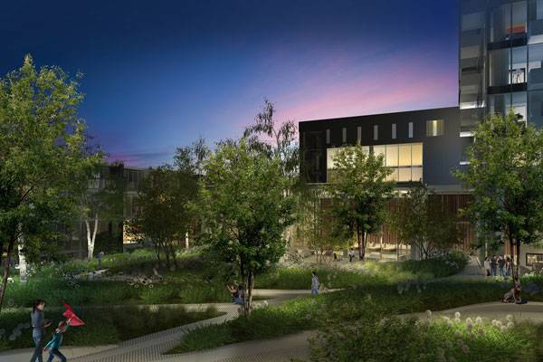
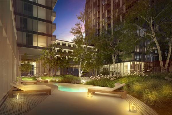
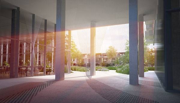
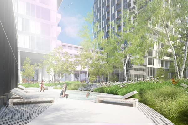
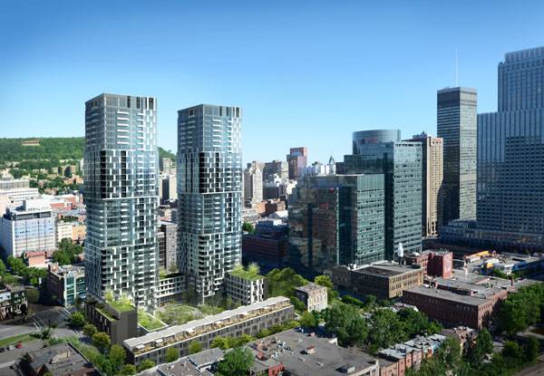
Article by Ruth Coman YUL Condominium & YUL Sales Office, by NIPpaysage, Montreal (Quebec), Canada Citizens have a year-round interest in landscape and nature. This issue raises the question of how a design can give a proper answer to their enthusiasm. The surrounding natural landscape has to fulfill everyday needs like recreation and relaxation throughout the whole year for city dwellers. Residential and private ‘green spaces’, especially, have to be versatile and must not become boring. Recognizing this issue, NIPpaysage landscape architects chose to create a four-season design for the future inhabitants of YUL Condominium.
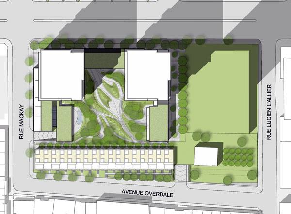
Masterplan of the YUL Condominium. Image courtesy of NIPpaysage
YUL Condominium & YUL Sales Office
YUL provides the ultimate in luxurious urban living in Montreal. Between stylish condominiums, limited-edition penthouses, and unique townhouses, the interior courtyard of unusually large proportions is the heart of the project. It is a unique space, dedicated to its inhabitants. The main inspiration for the design of the courtyard was the sculptural aspect of winter landscapes. The magical air was transposed through different compositional frames during the whole year.
YUL Condominium. Image courtesy of NIPpaysage
YUL Condominium. Image courtesy of NIPpaysage
Working With Mounds to Create a Strong Spatial Experience
To implement the four-season landscape design in an effective way, NIPpaysage chose to work with mounds. These earthworks are the main elements in the project’s structure. The source of the material for the mounds is the excavation of the building foundation and is thus cost-effective. Following the fact that in nature very little is symmetrical, NIPpaysage created mounds of irregular shape. The sinuous shapes and well-planned slopes will support plants and will avoid erosion problems.
YUL Condominium. Image courtesy of NIPpaysage
YUL Condominium. Image courtesy of NIPpaysage
YUL Condominium. Image courtesy of NIPpaysage
4-Season Landscape Design in YUL Condominium
Designing a year-round courtyard ensures that the inhabitants of YUL will be surrounded by different landscapes and spark interest through all four seasons. For the most important aspect of such design – choosing the appropriate plants for that region – NIPpaysage chose the combination of blooming perennials, grasses, and birches. During the first part of the year – in the springtime – the mounds will be grass-covered combined with white blooming perennials.
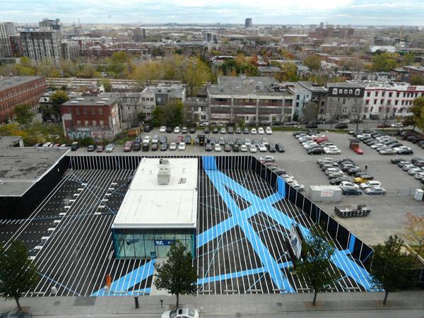
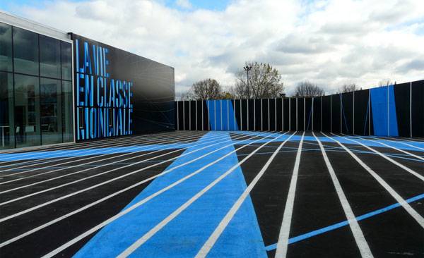
YUL Sales Office
Until YUL Condominium is built, people have the chance to admire and visit the YUL sales office, also designed by NIPpaysage. Drawing on the inspiration of airport runways, the space includes pedestrian circulation and a parking lot. While the prominent white lines on a black background will attract you to the core – the sales office – of the site, the broad blue strips will remind you of the blue sky and flying experiences.
YUL Sales Office. Image courtesy of NIPpaysage
YUL Sales Office. Image courtesy of NIPpaysage
YUL Condominium. Image courtesy of NIPpaysage
YUL Condominium. Image courtesy of NIPpaysage
YUL Condominium. Image courtesy of NIPpaysage
Full Project Credits For The YUL Condominium & YUL Sales Office
Project: YUL Condominium & YUL Sales Office Location: Montreal (Quebec), Canada Designers: NIPpaysage Planning: 2013 – 2014 Client: Kheng Ly Team: Mathieu Casavant, Michel Langevin, Mélanie Mignault, Josée Labelle, Emilie, Bertrand-Villemure, Benjamin Deshaies, Sylvain Lenoir, Mélanie Pelchat, Johanna Ballhaus, Catherine Blain, Claude Cournoyer Collaboration: MSDL Architectes, SYGMA Group architecture Get Social With NIPpaysage: Website: www.nippaysage.ca/en Twitter: www.twitter.com/NIPpaysage Facebook: www.facebook.com/nippaysage Recommended Reading:
- Becoming an Urban Planner: A Guide to Careers in Planning and Urban Design by Michael Bayer
- Sustainable Urbanism: Urban Design With Nature by Douglas Farrs
Article by Ruth Coman Return to Homepage

How Ika Meditation Spot is Changing the Way People Experience the Natural World
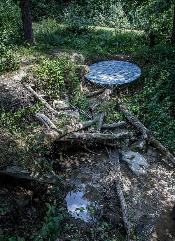
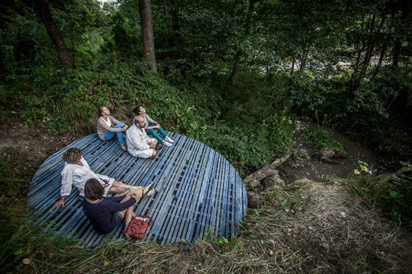
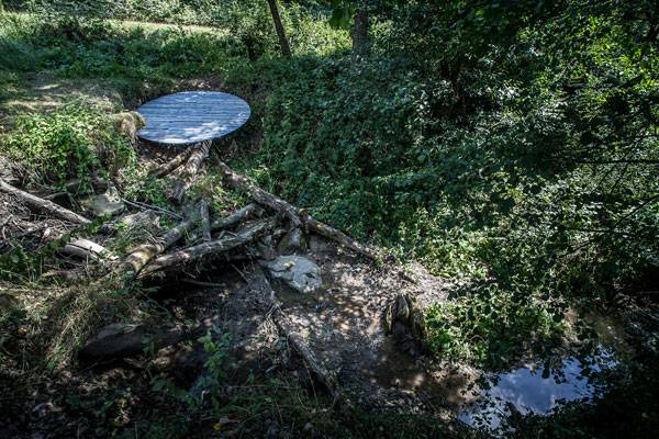
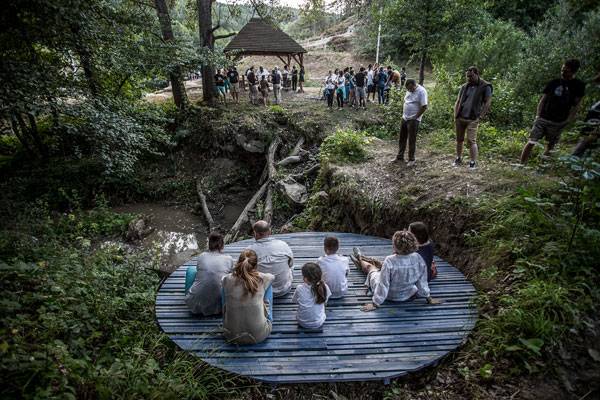
Article by Elisa A.M. Varetti Ika Meditation Spot, by Batlab Architects and Studio Nomad, in Csernaton, Transylvania, Romania. Everybody knows how human beings affect the environment with all of their activities, as LAN writer Harkyo Hutri Baskoro reminds us in his article 10 Fascinating Climate Change Facts You Should Know. We all need to start changing our lifestyles to save the planet. But what you might not know is that there are other ways in which human beings are destroying the natural world; for example, by neglecting natural places. We need to start treating Mother Nature better if we want to avoid unpleasant results. That doesn’t only mean that we have to reduce pollution; we also need to start protecting our natural resources. Landscape architects are once more called upon to make people understand how the natural world and the different ecosystems are important for ourselves and for our planet. In order to do so, they need to focus on critical situations. That is exactly what Batlab Architects and Studio Nomad have done with their project Ika Meditation Spot, which they collaborated on with the CsomòPont Team for the Noise Workshop 2015, in the Csernation Region of Transylvania in Romania.
Ika Meditation Spot. Photo credit: Bence Pásztor
Ika Meditation Spot
A Spot to Save Nature from Abandonment
We all know names hold great power, and Ika Meditation Spot is no exception. The name refers to a decayed portion of the stream Ika, on which the designers wanted people to reflect. The focus of the project is to create a spot where visitors can feel in harmony with nature and discover again the beauty of this place, with the hope that this will lead to its restoration and maintenance.
Less is More
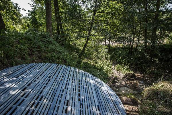
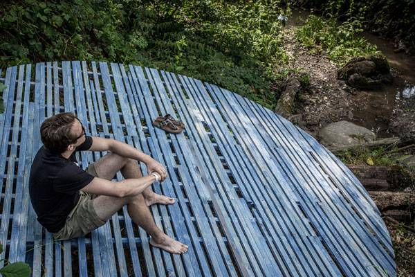
The real strength of the project is its simple design. As Mies Van Der Rohe used to say, “less is more” and indeed he was right! Ika Meditation Spot is basically composed of a wooden disc with a diameter of four meters. But it is capable of creating a magical connection between visitors and the surrounding environment. Like two sides of the same coin, its design is simple, but at the same time it has a deep meaning that it manages to evoke from those visiting it.
Ika Meditation Spot. Photo credit: Bence Pásztor
Constructing with Nature
One of the most interesting things about the design is that it takes advantage of the natural elements already existing in the environment, such as the peculiar geometry of the site deriving from the collapsed bank of the brook. Here, the trunk of a fallen tree forms the basis of the meditation spot, giving it a slight angle pointing toward the stream. Cantilevered beams clamped by wooden columns buried in the ground support the wooden disc. “By installing the disc, a new place is born,” the designers say.
Ika Meditation Spot. Photo credit: Bence Pásztor
Different Levels of Reflection
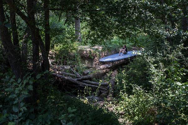
The project provides visitors with a number of things to reflect on, from the neglected situation of the stream Ika to our planet’s status, by giving them a place where they can relax in close contact with nature. Its special position — in the very heart of a natural ecosystem — offers people an intimate connection with the environment. Ika Meditation Spot will be left to serve its function until nature reclaims it.
Ika Meditation Spot. Photo credit: Bence Pásztor
Awareness is the First Step Toward Change
The final aim of this project is, of course, to focus people’s attention on the forgotten situation of this area of the stream, which has been abandoned in the past. Batlab Architects and Studio Nomad have designed a space capable of growing interest in those visiting it, and it is most likely that they’ll manage to make them understand the importance of protecting the environment of this stream. Raising awareness in people’s minds is an ambitious but important task to which we all have to contribute, and these two firms clearly know how to do it. Their action is likely to lead to the restoration and maintenance of this area in Transylvania.
Ika Meditation Spot. Photo credit: Bence Pásztor
Restoring Natural Environments
This project clearly shows what landscape architects can do to make people reflect upon the status of the natural environment. In the last few years, we have seen how different countries have been dealing with this same situation. All of a sudden, they seem to have realized the importance of a natural environment for people’s welfare. Every now and then, river parks are created to restore industrial spaces, abandoned environments, and neglected areas.
Ika Meditation Spot. Photo credit: Bence Pásztor
Ika Meditation Spot. Photo credit: Bence Pásztor
Full Project Credits For The Ika Meditation Spot
Project Name: Ika Meditation Spot Location: Csernaton Region, Transylvania, Romania Date of Construction: 2015 Designers/Architects: Gergő Batizi-Pócsi and Péter Batizi-Pócsi /Batlab Architects Bence Pásztor /Studio Nomad Team Members: Botond Bölöni, Zoltán Gál /CsomóPont/ Photography: Bence Pásztor Get Social With Batlab Architects: Website: www.batlab.hu Facebook: www.facebook.com/batlab.blog Recommended Reading:
- Becoming an Urban Planner: A Guide to Careers in Planning and Urban Design by Michael Bayer
- Sustainable Urbanism: Urban Design With Nature by Douglas Farrs
Article by Elisa A.M. Varetti Return to Homepage
How You Get 6,000 People Into A Quarry
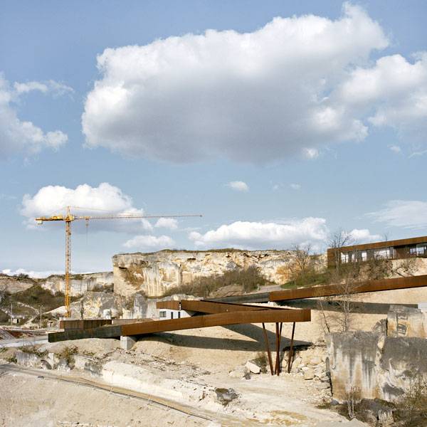
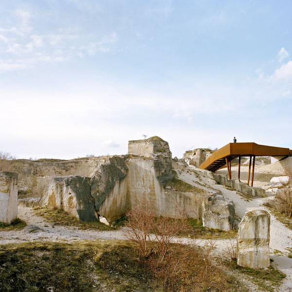
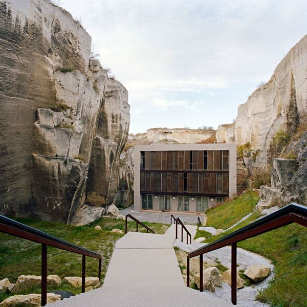
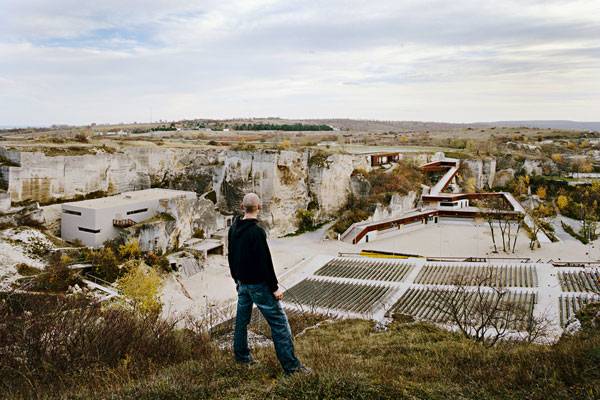
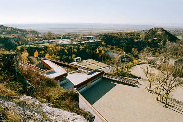
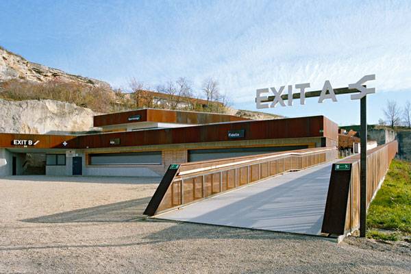
The Austrian quarry in St. Margarethen, by AllesWirdGut Architektur, in St. Margarethen, Burgenland, Austria. The Austrian quarry in St. Margarethen is one of the oldest in Europe, considered part of the UNESCO World Cultural Heritage Sites since 2001 as one of the most beautiful and imposing open-air areas in Europe. This unique landscape was used by the “Symposium of European Sculptors” as the site of an exhibition of numerous stone sculptures, initiated by Karl Prantl in 1959. The transformation of this area was part of a competition in 2005, won by AllesWirdGut Architektur, who turned it into an open space arena. Here, events of all kinds – from opera festivals to theatrical plays to rock concerts – take place surrounded by a natural atmosphere with intense visual and spatial experiences.
The Austrian quarry in St. Margarethen. Image courtesy of AllesWirdGut Architektur. Photographers names listed in the credits at the end of the article.
The Design
The basic idea of the design is to extend the ambiance of the magnificent rock-face scenery to all parts of the theatrical arena so as to make it a more palpable and visually enveloping experience. It takes time and studies to transform a quarry into something else without compromising its meaning and to allow a natural feature to interact with man-made construction the way this design does. It speaks the “simple language of nature and shapes” and at the same time, it works as a perfect scenario for artists and summer plays in a constructed yet not constructed way. The scenery is characterized by precise cutting edges, worked surfaces and subtraction of the ground.
The Austrian quarry in St. Margarethen. Image courtesy of AllesWirdGut Architektur. Photographers names listed in the credits at the end of the article.
The Austrian quarry in St. Margarethen. Image courtesy of AllesWirdGut Architektur. Photographers names listed in the credits at the end of the article.
Materials
Quarry-related materials were used in construction especially for surfaces under the open sky areas. In the foyer, visitors can find a “carpet” made of different sorts of grit, which are converted into a water-bound cover that guarantees necessary infiltration areas and avoids the formation of dust over the dry summer months. All the added curvatures and edges are covered with oxidized steel plates, a material used because of the history of the quarry with heavy construction machinery. Additionally, the steel guarantees protection from weather and vandalism during the winter time due to its already controlled oxidized surface. White fiber-cement sheeting was used to create a more refined note in contrast to the rough sandstone and the rusted steel in areas.
The Austrian quarry in St. Margarethen. Image courtesy of AllesWirdGut Architektur. Photographers names listed in the credits at the end of the article.
Construction
As simple as it may seem, the idea of making a quarry look “untouched” is not that easy. The designers had to find a way to work with the materials found in the place and to complete the rest of the design with complementary materials, without making it look “over-constructed”. The entrance area and VIP rooms were made with exposed concrete, playing all the time with “clean” aspects of construction. However, there are spaces finished with conventional steel structures, like ramps, toilets, and other VIP areas. The rest of the areas were completed with prefabricated materials. The allocation of the backstage area into two autonomous parts allows two different construction phases, according to requirements.
Illumination Concept
The illumination of the whole area is mainly reached by an accentuation of the existing rock faces and rock edges. The goal is to keep the sky clear of disturbing spot lights or lanterns and offer an unobstructed view to the firmament. The use of “wall washers”, transforms the quarry into unique offstage scenery. The edge of the premises in the visitor’s catering area also becomes a carrier of linear lighting. The pond is full of swimming lights, similar to water lilies, which emphasize the atmosphere. The individual picnic areas have lights which are combined into the benches and spread soft streaks of light to the ground.
The Austrian quarry in St. Margarethen. Image courtesy of AllesWirdGut Architektur. Photographers names listed in the credits at the end of the article.
The Austrian quarry in St. Margarethen. Image courtesy of AllesWirdGut Architektur. Photographers names listed in the credits at the end of the article.
The Austrian quarry in St. Margarethen. Image courtesy of AllesWirdGut Architektur. Photographers names listed in the credits at the end of the article.
Full Project Credits For The Austrian Quarry in St. Margarethen
Project: The Austrian quarry in St. Margarethen Architects: AllesWirdGut Architektur Location: St. Margarethen, Burgenland, Austria Collaborators: Ecki Csallner, Elmir Smajic, Ferdinand Kersten, Maria Magina, Mareike Kuchenbecker, Martin Brandt, Michael Sohm Client: Fürst Esterházy Familienprivatstiftung Competition: 2005 Start of construction: December 2006 End of construction: May 2008 Gross floor area: 5.580 sq.m Outdoor spaces: 4.430 sq.m Photographers: Miss Petra Schneidhofer and Hertha Hurnaus Get Social With 3GATTI: Website: www.alleswirdgut.cc/en Twitter: www.twitter.com/AllesWirdGut_ZT Facebook: www.facebook.com/AllesWirdGut.Architektur Recommended Reading:
- Becoming an Urban Planner: A Guide to Careers in Planning and Urban Design by Michael Bayer
- Sustainable Urbanism: Urban Design With Nature by Douglas Farrs
Article by Tahío Avila Return to Homepage


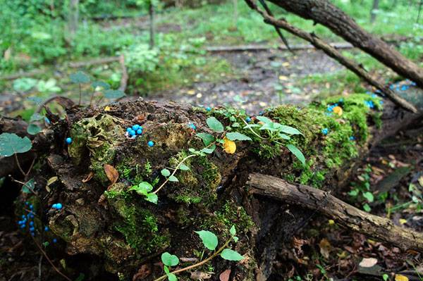
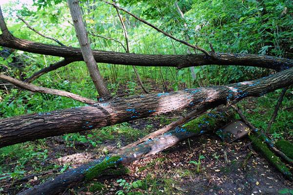
Can Art Teach You Something About Life?
Article by Valentina Ferrari
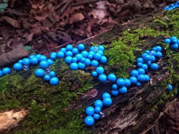
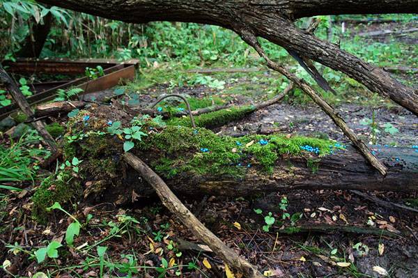
A review of art piece entitled “Generation – Circulation of Life” by Toshihiko Shibuya, a Japanese artist from Muroran.
Are you a prisoner of the daily grind, neglecting or forgetting everything that transcends your work or routine? Embracing art could help you restore balance in your daily life and aid you in focusing outside your boundaries, allowing you to see new horizons. All you need is to be open minded, have listening and sensibility skills, sincerely watch, and then accept that the message will not always be immediately understood. Be patient. The meaning of an artwork — which at your very first could be charming or mysterious or even funny — is hidden within the artist’s mind. Once you understand the artist’s thought process, the artwork will take on a deeper meaning. Clearly, having some sort of guide makes the process easier and the rise of empathy cleaner, but what it comes down to are the emotions the artwork provokes in each of us, which develop when the message arrives at the destination with a resonance effect.
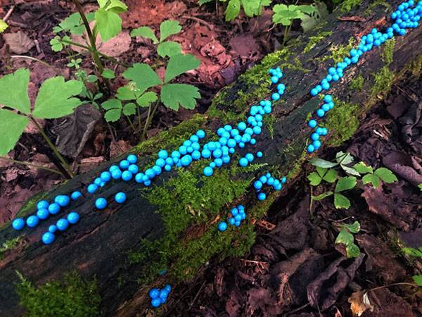
Generation – circulation of life by Toshihiko Shibuya.
“Generation – Circulation of Life” by Toshihiko Shibuya
Harukayama Art Fort
Take the artwork of Toshihiko Shibuya, a Japanese artist from Muroran who was born in 1960 and works in Sapporo. Shibuya’s work has been inserted into an outdoor contemporary art museum known as Harukayama Art Fort, at the foot of Mount Haruka in the coastal tourist zone of Hokkaido island, near the city of Sapporo. The museum sits next to a hotel built 40 years ago, which was ruined after the Great East Japan Earthquake of March 2011. In the last few years, the art show that takes place here between August and September has seen an increasing number of works (67 this year). The artists focus mainly on the relationship between art and environment.
Generation – circulation of life by Toshihiko Shibuya.
A Wasteland Landscape
The landscape is a wasteland, where a neglected and abandoned woods evokes the idea of a land without maintenance. In this woodsy context — even a bit wild — the leitmotiv results in a tidy theme, constant in shape and rhythm, reminiscent of the cycle of life.
Generation – circulation of life by Toshihiko Shibuya.
After the terrible earthquake of 2011, Shibuya said he lost his ability to create. But paradoxically, what permitted him to revive the creative process was working in that same damaged landscape, which gave him a chance to express what he felt and elaborate on it. “The rundown hotel and the fallen trees gave me a drive to express regeneration, symbiosis, coexistence of nature and human beings,” he said.

Generation – circulation of life by Toshihiko Shibuya.
From Mushrooms to the Cycle of Life
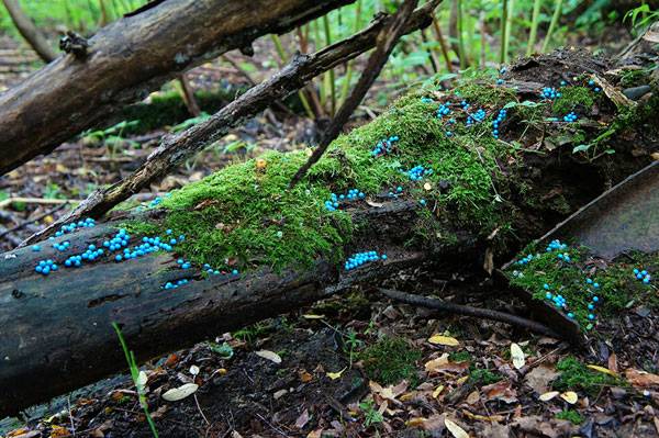
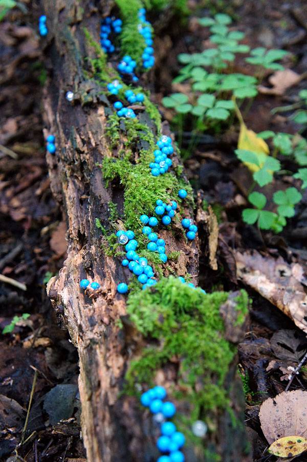
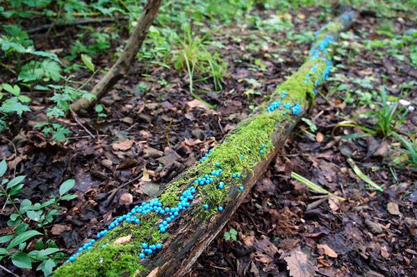
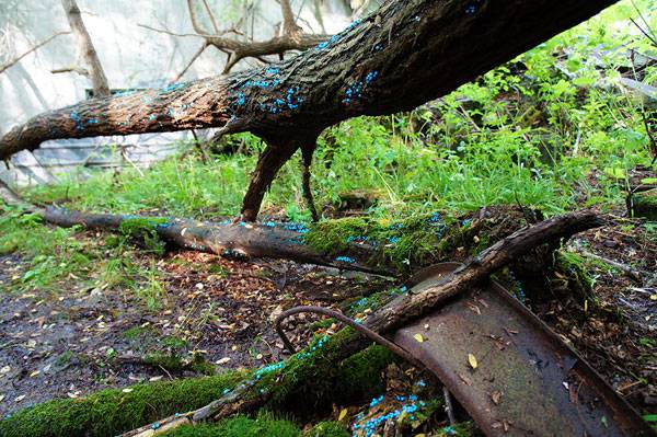
Shibuya created his “White mushrooms breeding project” in 2011, followed by “Generation 1 – circulation of life” in 2013 and “Generation 2” in 2015. All of them have the same theme, with similar material, but with a few differences: In the 2011 work, there are bright pink pins settled on the trunks of fallen trees. On the bark, the passage of time has left its mark with the growth of mosses; the artist added his own touch — families of pins resembling stylized mushrooms.
Generation – circulation of life by Toshihiko Shibuya.
In 2013, on the same trees, he added ethereal, little pin spheres following a scheme, seeming to represent the translucent eggs of some mystery animal, maybe frogspawn. The spheres are transparent, and the lower part was coated with a luminous paint, communicating a kind of fantastic scenery reflected in the moonlight or by flashlight. Then in 2015, Shibuya installed 3,500 blue pushpins on the same trees, evoking the image of spawning life.
The Symbology
It’s a fairy-tale context with a clear symbology. Year after year, the temporary installation renews itself and assumes new connotations, developing a theme or narrating the evolution of life itself throughout the mutation of the pushpins. In this way, the pins that had plate and stylized pink hats have assumed rounded and transparent shapes, with the newer blue pins arriving in a sort of continuous evolution, much like the cycle of life. I wonder how it will look in a few more years.
Generation – circulation of life by Toshihiko Shibuya.
As the artist says, “The law of ‘natural cycles’ has begun to be lost little by little. I will question again how my artwork performs as media to re-encounter the environment surrounding me and my life, rather than just placing the artwork to face nature.”
Generation – circulation of life by Toshihiko Shibuya.
The Inner Cycle
Nature itself is bound to a continuous cycle of life and death; there is no life without death, and vice versa. The metaphor is clear: As natural forces push the regeneration process and create new life from decomposition, so does the artist send a message of rebirth, both physical and spiritual. Everything that happens in our lives – from the monumental to the seemingly inconsequential – leaves its mark and becomes the substratum for the growth of something else.
Generation – circulation of life by Toshihiko Shibuya.
We cannot know what the future holds. But one thing is certain – change will come. With an often imperceptible slowness, life starts to flow again, reaching its maximum peak, whether it’s the wood’s climax, the evolution of big civilizations, or an individual’s realization.
Generation – circulation of life by Toshihiko Shibuya.
Let it Flow: It’s Not a Challenge
Personally, I love the circulating life, death, and rebirth concept. It has its own meaning, both in the strict sense and broadly speaking: It is a fascinating idea, that all the obstacles could be demolished and we could start again, even if it seems like a fairy tale. The good news is that it is not a fairy tale; it will simply happen. Something will happen — let it flow as the artist does in this artwork. But even if you can’t force the process, and you have to face your monsters, don’t be blind. You have to be patient — For a while, you will be like those mushrooms, grown over the ruin of fallen trees. Remember that life goes on, in its own continuous cycle. What did you think of this art feature? Let us know in the comments below! Go to comments
Generation – circulation of life by Toshihiko Shibuya.
Recommended Reading on Phytoremediation:
- Phytoremediation: Transformation and Control of Contaminants by Steven C. McCutcheon
- Phytoremediation: Role of Aquatic Plants in Environmental Clean-Up by Bhupinder Dhir
Article by Valentina Ferrari

How Kic Park Went From Forgotten Space Into a Space People Care About
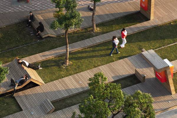
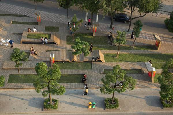
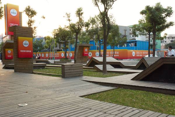
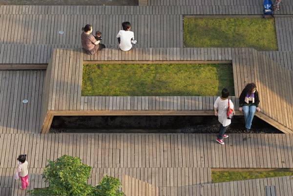
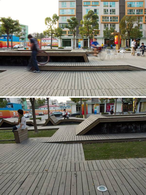
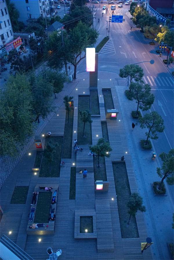
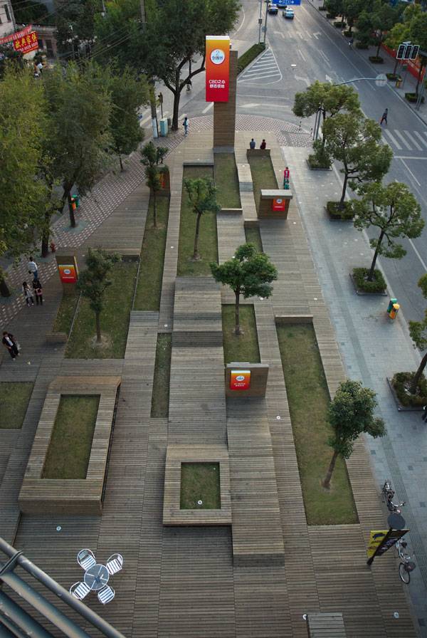
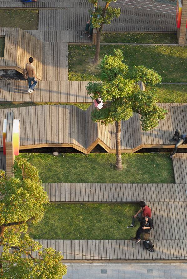
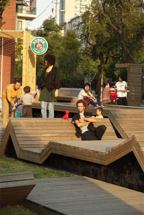
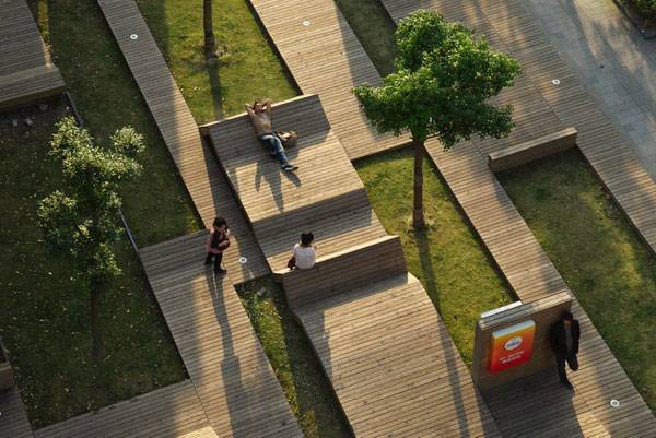
Kic Park, by 3GATTI, in Shanghai, China. The spaces between urban buildings and interstitial spaces are often difficult ones to deal with in terms of design. Many turn into surface parking lots, small buildings, or paved spaces devoid of any character, sense of place, and any natural elements. It is these very spaces that can become very important as a unifying element of an area, such as a city, where development and redevelopment create fragments that are unrelated to each other, and where ‘nature’ in its basic sense is, often, forgotten. So, how did one small urban park in Shanghai, China, achieve a functional yet attractive space that entices visitors to gather and be influenced by nature?
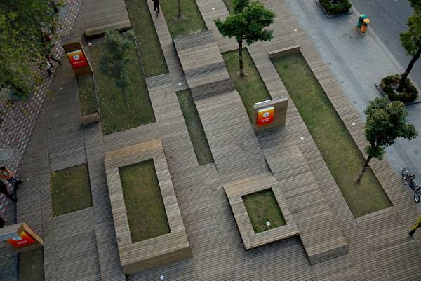
Kic Park. Photo credit: Shen Qiang
Kic Park
Kic Park, designed by Francesco Gatti of 3GATTI Architects has proven that these interstitial spaces can be created with a purpose, and in this specific case, the purpose was to serve as a place where people can gather and pause, and reflect on their surroundings in an otherwise busy urban centre, as well as have a bit of fun with the playful nature of the park. Creating various levels and viewpoints and the use of a variety of different materials set this park apart from its urban and concrete surroundings, and draws the passersby into the space, encouraging various activities and social engagements.
Kic Park. Photo credit: Shen Qiang
The Urban Setting
Urban settings are scenes of development, bustling with people, traffic, construction, and a constant buzz of busyness. In a place like China, whose urban centres are heavily populated and congested, public spaces can often be hard to come by since real estate is at a premium, and the need for housing and business development comes at a high price.
Kic Park. Photo credit: Shen Qiang
Kic Park. Photo credit: Shen Qiang
Kic Park – The Small But Mighty Park
Kic Park is an interstitial place; a small piece of property in between a variety of buildings and streets that it likely proved difficult to develop as a park due to encroaching building development. However, designer Francesco Gatti viewed this as a place with promise, and a place that had the potential to turn into a great public space that people could stop and engage with while commuting in and around the city.
Kic Park. Photo credit: Shen Qiang
Kic Park. Photo credit: Shen Qiang
Kic Park. Photo credit: Shen Qiang
It’s All in The Details
Details, details, and details. Everything is always in the details, and this is something that makes this park so appealing as an engaging place. The areas that promote circulation are all planked wood, in boardwalk style. The boardwalk encompasses most of the park, which helps to create the sense of unique place, and draws people into the site. The boardwalk is set at heights keeping in mind the human scale and can be used as areas to sit, or to ride a bike over and perform tricks, with some areas of the decking extending straight up and doubling as a base for signage. The varying heights, widths, and angles of the boards are, therefore, playful, and appear as though it is almost asking visitors to be imaginative in how they use it. Is one supposed to sit on the edges, or lean against the angled boards that look like they can be a backrest?
Kic Park. Photo credit: Shen Qiang
Kic Park. Photo credit: Shen Qiang
Kic Park. Photo credit: Shen Qiang
Kic Park. Photo credit: Shen Qiang
Full Project Credits For Kic Park
Project Name: Kic Park Programme: Public open spaces, gardens, playgrounds, resting areas, advertising supports. Architecture firm: 3GATTI Chief architect: Francesco Gatti Project manager: Summer Nie Collaborators: Nicole Ni, Francesco Negri, Dalius Ripley, Michele Ruju, Muavii Sun, Charles Mariambourg Client: Shui On Development Limited Location: KIC VILLAGE Blok8-2, Zhengmin Road, Yangpu District, 200433 Shanghai, China. Total floor area: 1100 m² Design and construction period: 2009 Materials: Wooden deck, steel structure, brick walls, acrylic boards. Photographer: Shen Qiang Get Social With 3GATTI: Website: www.3gatti.com Facebook: www.facebook.com/3GATTI/ LinkedIN: www.linkedin.com/company/3gatti Vimeo: www.vimeo.com/3gatti YouTube: www.youtube.com/user/studio3gatti Recommended Reading:
- Becoming an Urban Planner: A Guide to Careers in Planning and Urban Design by Michael Bayer
- Sustainable Urbanism: Urban Design With Nature by Douglas Farrs
Article by Kaila Johnson Return to Homepage

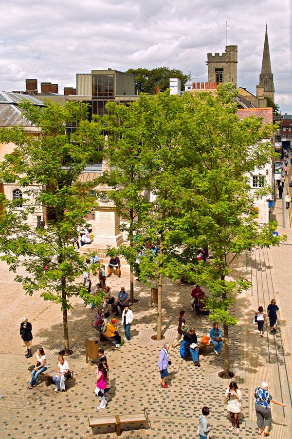
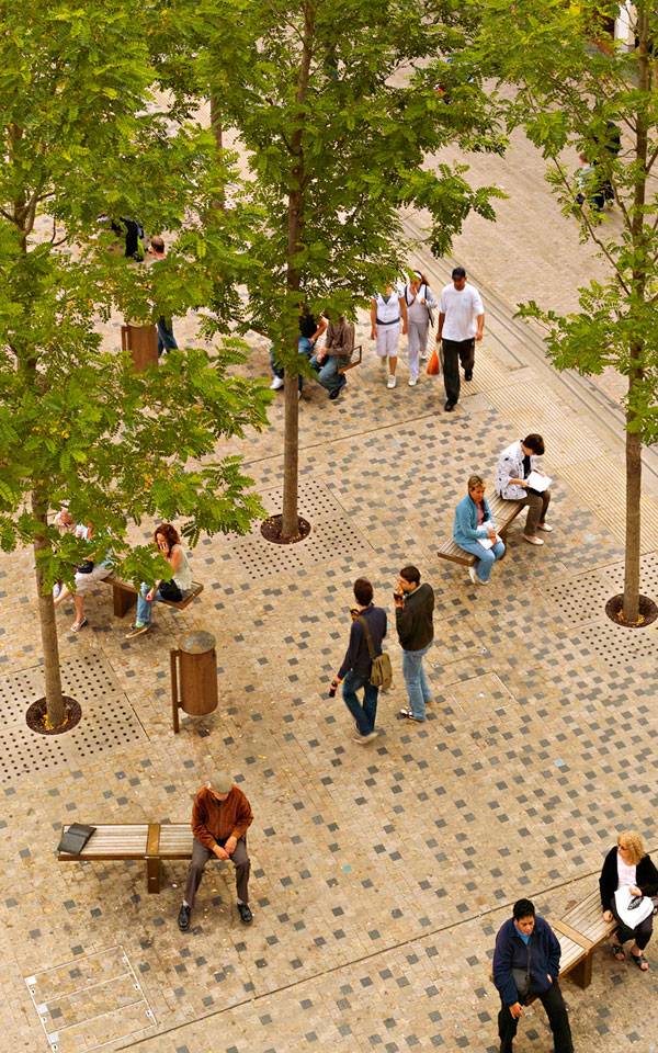
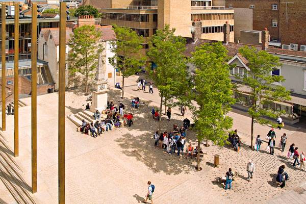
How Bonn Square Brought The Old and New World Together
Bonn Square, by Graeme Massie Architects, in Oxford City, United Kingdom. The city of Oxford is a unique place with a strong historic university identity. Like many cities built around universities, its public activity is focused on the spaces surrounding the campus buildings. Students and lecturers spend most of their time in these spaces, with the result that very little public space is developed outside of university property. Bonn Square is, therefore, one of the few public spaces in Oxford, and its transformation from a derelict, forgotten place into a contemporary yet historic square is worth exploring.
Bonn Square. Photo credit: David Stewart Photography
Bonn Square
A Catalyst for Urban Regeneration
Bonn Square falls within the boundary of the Oxford Central Conservation Area, which includes the old city and the university. It was formed in a piecemeal fashion over the years and includes historic structures, with various land parcels under separate ownership. The square occupies an important intersection of four major routes, but its fragmented form had meant that it had no definite function or character. Modernization of the city functions and a reduction in natural surveillance resulted in a slow degradation of the square, turning it into a neglected and unsafe city space.
Bonn Square. Photo credit: David Stewart Photography
The Beginning of an Urban Regeneration
By the end of the 20th century, Oxford City Council members realized that they needed to revive parts of the historic city and begin urban regeneration. The redesign of Bonn Square was flagged as a catalyst project, and a RIBA open international design competition was held in 2005. This was won by Graeme Massie Architects, which successfully met the principal design challenge of transforming the neglected square into a welcoming, modern, and flexible public space. The design received planning permission in 2006, and the new square opened in 2008.
Bonn Square. Photo credit: David Stewart Photography
Uniting the Old and the New
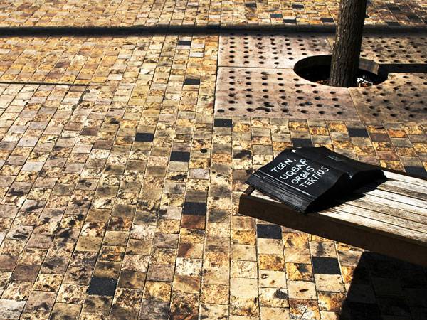
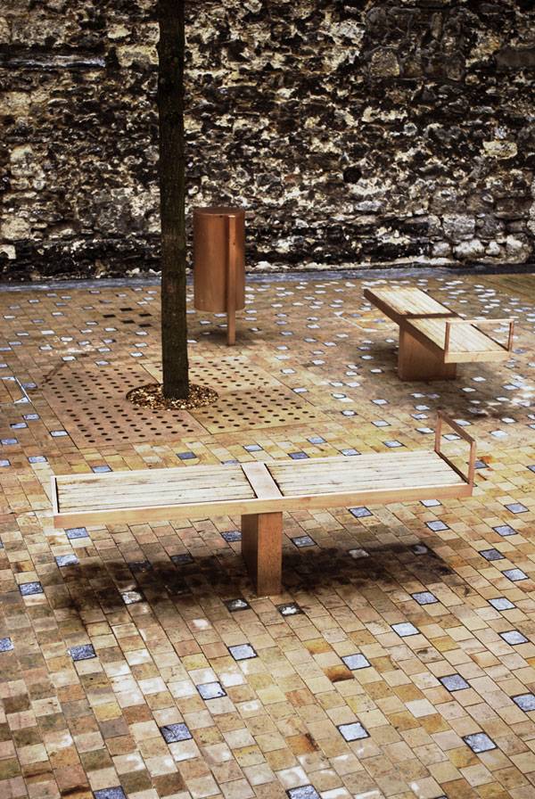
Graeme Massie’s concept for the design of Bonn Square was simple: Create a contemporary open space while preserving and enhancing the important historic assets of the square. One of the key factors in achieving this was the use of sandstone paving to pull the elements of the square together, creating spatial clarity and improving permeability.
Bonn Square. Photo credit: Graeme Massie Architects
Bonn Square. Photo credit: Graeme Massie Architects
Time as an Element of Design
An important aspect of the design was the introduction of “time” as an element, using materials in a contemporary manner that reflects and references the past. For instance, the use of sandstone as a paving material meant that the surface would change over time as the space is used. This molding of the materials recalls a similar change in time in the old stone stairs of the university. Other references to time include bronze furniture and fittings, which will patinate and stain as time goes on, and tree species that were selected for the manner in which they change throughout the year.
Key Design Elements
The design of Bonn Square is defined by four key elements. The first is the variegated sandstone surface that unites the square’s components and connects the space to the historic fabric of Oxford. The second is a central ramped area, which allows the square to be easily accessed by all users while accommodating the archaeological remains of St. Peter-le-Bailey Church and its cemetery. The third is a grove of Robinia pseudoacacia trees, which recall trees commonly found in the university college while shading a collection of bespoke bronze street furniture. The fourth is four 15-meter-high bronze lighting columns that act as landmark features within the cityscape and provide lighting for the square.
Bonn Square. Photo credit: Graeme Massie Architects
Bonn Square. Photo credit: Graeme Massie Architects
New City Function
Bonn Square has demonstrated that it is possible to combine the preservation of historic value with the current public space needs. The project has radically altered the character of Bonn Square and created a flexible space that provides a safe and accessible venue for formal and informal civic events. Its reference to the historic fabric allows the square to connect the new and the old, forming a backdrop to the future life of the city. What is clear about this project is that sometimes all it takes is a deep understanding of the context and a careful manipulation of materials to transform a public space. Do you like this project? Let us know in the comments below! Go to comments
Bonn Square. Photo credit: David Stewart Photography
Full Project Credits For Bonn Square
Project Name: Bonn Square Landscape Architect: Graeme Massie Architects Location: Oxford City, United Kingdom Date of Construction: 2008 Size: 1,200 m² Client: Oxford City Award: Oxford Preservation Trust Environmental Award, October 2009 Website: www.graememassie.com Facebook: www.facebook.com/graememassiearchitects Recommended Reading:
- Becoming an Urban Planner: A Guide to Careers in Planning and Urban Design by Michael Bayer
- Sustainable Urbanism: Urban Design With Nature by Douglas Farrs
Article by Rose Buchanan Return to Homepage