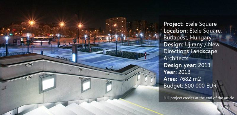
Etele Square, by Ujirany / New Directions, in Budapest, Hungary. Waiting for a train and it’s delayed again. Sitting in the waiting hall, counting the seconds, and suddenly finding yourself in awe of the market art on the seats. Or perhaps you’re just sitting there counting the tiles on the floor. The wait seems to be never-ending, and you’re feeling as if the boredom couldn’t get any worse. Sound familiar? Then you are probably a commuter and, just like me, you have seen plenty of waiting halls in your life. They are all pretty much the same: tall and noisy, with gray walls and chairs that are rather uninviting. As a commuter myself, waiting for buses, trains, or trams has become a monotonous and sometimes unbelievably boring routine, more or less due to the places where I have to wait. But have you ever wondered what the waiting hall would look if it was taken … outside? Do waiting halls always have to be indoors? Could they be placed outdoors?
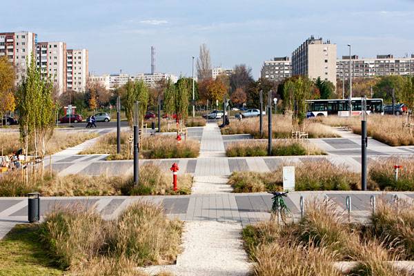
Etele Square. Photo credit: Ujirany / New Directions, Tamás Bujnovszky. See the Full Gallery on Page 2
Let’s have a look at Etele Square
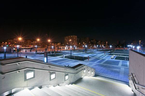
Located in the heart of Hungary’s capital, Budapest, Etele Square takes urban landscape design to a whole new level by moving the qualities of an indoor space outside. The designers responsible for this twist are Ujirany / New Direction. The designers rearranged the space in such a way that people waiting for the metro or bus can choose to wait outside, simply by enlarging the space and removing the roof of what has already been functioning for years — the indoor waiting hall. Thousands of people walk by Etele Square every day, thanks to its proximity to the metro and bus stations. The square is a connecting feature between the two buildings and, after the transformation it has undergone, not only serves as a park for the nearby living areas but also as an enormous waiting hall for the two stations.
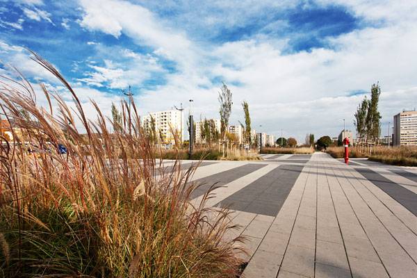
Etele Square. Photo credit: Ujirany / New Directions, Tamás Bujnovszky. See the Full Gallery on Page 2
Square Meadow
Strictly based on its regular, square-shaped features, Etele Square shines a completely new light on geometric shapes in urban spaces. If you imagined a space of 7,682 square meters covered in chess-like combinations of planting and paving, you would think that the square would seem monotonous and unexciting. But that is not the case. The square system organizes the whole space, rather than defining it. The strict pattern of the pathways is broken up by grassy vegetation squares, filled with two different species of grass. Planted in such a way as to create a linear effect, the grasses are meant to continue the striped pattern of the black and white pavement surrounding them. When seen from a distance, this use of planting may look as if it was an “uninterrupted” regular meadow in the middle of a city, but as soon as you walk closer, you realize the meadow is actually made up of separate squares. This technique also allows users to take limitless routes around the square.
More Top Articles on LAN
- 10 of the Most Common Mistakes People Make in Planting Design and How to Avoid Them
- Interested But Not Confident? – Know How to be Good at Hand Drawings
- Top 10 YouTube Tutorials for Technical Drawing
The striped effect is continued vertically through the use of columnar trees planted around the square. The use of perpendicular lines optically encloses the whole square, giving the impression that the space is much smaller (and thus more comfortable to look at and be in) than it actually is.
Etele Square. Photo credit: Ujirany / New Directions, Tamás Bujnovszky. See the Full Gallery on Page 2
Living Corridors
The use of color here is not accidental — the combination of colors reduces the monumentality of the square. Picture the square as a big room in your houses, rather than as an outdoor space: The black and white of the paving gives the impression of walking on a carpet, and the contrasting green grasses are like the walls. Combined, the “carpets” and “walls” make a strong impression of walking along several corridors, rather than being overwhelmed by the vastness of the space. Because the space is an outdoor waiting hall, the designers had to think of resting areas for the people using the square. Turned backward to the grassy squares, we can find plenty of seating located along the pathways – all easily accessible and visible, but at the same time offering a little bit of privacy…
Recommended Reading
- Landscape Architecture: An Introduction by Robert Holden
- Landscape Architecture, Fifth Edition: A Manual of Environmental Planning and Design by Barry Starke
Continue Reading to PAGE 2 and View the Full Gallery >>>
Published in Blog- 1 2


