


Landscape Architecture for Landscape Architects › Forums › GENERAL DISCUSSION › Bad font decisions, yes I’m talking to you Papyrus users!
- This topic has 1 reply, 29 voices, and was last updated 14 years, 3 months ago by
 Andrew Garulay, RLA.
-
AuthorPosts
-
June 12, 2011 at 8:31 pm #162081
 ALEX PParticipant
It has become apparent that landscape architects / LA students seem to believe that choosing a good typeface is NOT a necessity/priority. I have seen more than enough papyrus to make anyone sick, we do not live in the time of Moses, or work in Mesopotamia. No im not prescribing that everyone use a sans serif, such as helvetica, but I am just suggesting that people stop using myriad pro, papyrus, comic sans, et cetra. We are not a generic profession, so why use a generic, default font? Typefaces matter more than most people want to believe. No, no one will say “wow great font” but it is a subtle thing that people like me cringe over. I am quite curious what other typeface enthusiast think about the latest trends, or lack there of, regarding typeface choices. Is bank gothic the new papyrus?
June 12, 2011 at 9:22 pm #162224 Andrew Garulay, RLAParticipant
Just think how much more of advantage you have over those using crappy fonts. If it makes a difference, why not own the advantage?
June 12, 2011 at 9:25 pm #162223 Heather SmithParticipant
Do you think Moses was using any of these fonts? haha. I think he was more into etching…in stone…haha.
June 12, 2011 at 9:27 pm #162222 RobotParticipant
I cringe too when I see papyrus font. And city blueprint drives me nuts as well. Comic sans…pfff. Keep it simple, people. But I must be immune to some of the font subtleties that seem to irk you, Alex (I’ve also got to admit that I know little to nothing about fonts). What is so irksome about Myriad Pro. It seems rather simple, and somewhat similar to helvetica.
June 12, 2011 at 9:45 pm #162221Andrew Garulay, RLAParticipantI was trained by people who used to use Leroy lettering and they stuck with the same style in CAD within the plans – simplex. …not so rigid in street names, water bodies, tileblocks, logos, etc,..
June 12, 2011 at 10:09 pm #162220 Jason T. RadiceParticipant
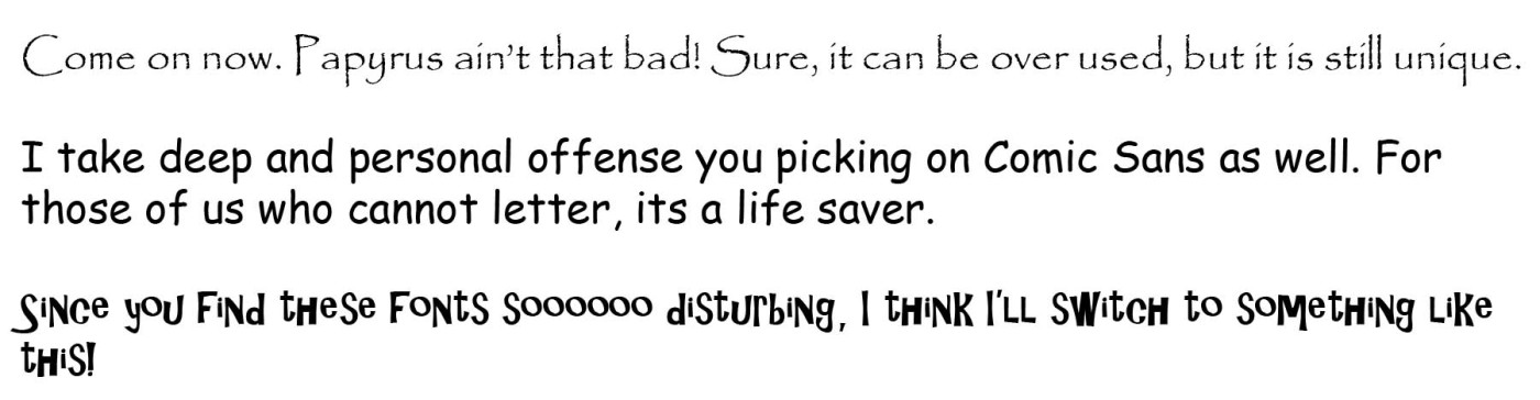 June 12, 2011 at 10:24 pm #162219Heather SmithParticipant
haha
June 12, 2011 at 10:30 pm #162218ALEX PParticipantWell, to me anything that is the default ie myriad pro, cambira, calibri, times new roman, are for default people. I dont mind it when boring people use it, but we are not boring default people. also it is the apple font, and lets be honest, none of us are making an iPad, or Macbook Air.. so lets leave the Myriad pro up to them. It take approx. 2 more seconds to change the font to helvetica neue bold, and thats what character styles are for. Most programs have hundreds if not thousands of fonts to chose from, why chose one that is chosen for you. Heck i would rather use arial before myriad pro.. and i dont use arial.
June 12, 2011 at 10:33 pm #162217ALEX PParticipantall great case studies.
June 13, 2011 at 12:22 am #162216Andrew Garulay, RLAParticipant1. It needs to read well.
2. If you exchange files with others and have text within blocks, don’t use something weird because it will get converted to something else (see this a lot with LA and Arch firm’s logos that go right off the sheet).
3. After that, it is a reflection upon your office and up to your office how you/your employer want(s) to present your office. If Big Jim Associates wants to use papyrus, it isn’t going to change my life unless people hate using him and come to me instead (go for it Big Jim).I’ve never sold a design because my fonts were cooler than someone else’s and I’m pretty sure no one beat me out based on their fonts either.
Its your thing, do what you want to do.
June 13, 2011 at 12:46 am #162215ALEX PParticipantTrue. but, a bit untrue. No one has ever said wow great font, but even my mom has said how bad a font looks. I mean how can you not say that there are some aweful fonts, why do you use the font you use? I mean why not Curlz mt? I dont understand papyrus? It has been used and abused way to often: ie anything wanting to look “natural” Im not some font-oholic It just irks me when people have a great design, and then pollute it with an aweful font. Maybe Big Jim Associates font choices do effect you. you should watch the documentary helvetica (its not just for helvetica, it is about how fonts really do matter). There is a reason why there are so many websites dedicated to a dislike of some fonts such as comic sans: http://bancomicsans.com/ I just want to see firms/people make responsible font choices (or a choice at all). In reality it is not as simple as 1,2,3
June 13, 2011 at 2:26 am #162214Andrew Garulay, RLAParticipantI grew up in the seventies, but there is not enough flamable vegetation available over here to get me to look at a website devoted to dislike of a font, never mind dedicate a website to it.
There are stupid looking fonts. I like to think that I don’t use them, but I really don’t care what others use with the exception of those odd fonts embedded in an attributed block that get substituted to something else that does not fit. That is a bad reflection on someone else which I have no reason to be bothered by outside of what I explained above.
If some other LA wants to use something that does not read well or leaves people with a negative impression, well, that could only make my plans and my image look a little better, don’t you think?
The mediocrity of others does not bring you down. Don’t worry about them. See it as one more opportunity for you to out perform your competition. Use your own sense to do better rather than get frustrated by those who you can outshine. It is a very competitive time. Leave them in the dust.
June 13, 2011 at 2:52 am #162213ALEX PParticipantI understand your point, I am just one of those people who wants to make the world a more well designed place. Yes, that maybe a bit naive, but im 23. I just dont like it when it makes our profession as a whole look bad. yes Big Jim Assoc. can use some bad font, but why? I guess thats my main question. I guess i had a revelation when i realized that only making myself look good, kinda just makes people mad at you for having that level of arrogance. An personally it does bring me down.
In regards to the burning vegetation, I guess this generation of young LA’s seem to be engulfed with social media, and media in general. I think its important to stay in tune with the zeitgeist of contemporary society, and dumb websites like that are part of it. I just think its a bit strange your neglect for this issue when the very instituiton that is we are under (ASLA) completely “revamped” its magazine. To me that is some sort of sign. That craggy old out dated magazine needed some refreshing, and it is us 20-30 somethings that demand this kind of design. Its called design for a reason.
June 13, 2011 at 4:07 am #162212Jason T. RadiceParticipantI’m looking at it more from a professional practice issue. Not everybody has all the fonts loaded on their machine, and many do not print well. Some are also very illegible when running prints or copies of prints (remeber, original documents are hardly ever sent into the field, and are more likely bad copies). I don’t know how many times I had to clear up dimensions for the last firm I worked with whos lettering font was designed to work with pen plotters and they never updated their corporate standards. They liked the look of the font, but by gen 3 of the copies (which is what the subs get), much of the dimensioning was illegible. Because it wa all caps as well, it made reading notes and specs a real chore.
Even with transmitting PDF, if you don’t include the font in the package, it might not appear correctly on the other end. Same with e-mails. Funky fonts and large type don’t always look right, and fancy fonts really are kind of unprofessional for corporate communications. Forget about using colors. You may be trying to be different or set yourself apart, but all you are really doing is impeding professional communications and making yourself look gimmiky.
June 13, 2011 at 4:26 am #162211 earthworkerParticipant
Agreed. With autocad e-transmittals you can’t count on another firm having all your fancy fonts so you must stick with standard, preloaded fonts……Alex, I find it odd that with all the failings of the industry, the ineptitude of ASLA and their magazine, and the dire economic conditions affecting our profession as a whole, you choose to make Fonts your battle cry. Buddy,….. this is the least of our problems.
-
AuthorPosts

- You must be logged in to reply to this topic.