


Landscape Architecture for Landscape Architects › Forums › GENERAL DISCUSSION › Bad font decisions, yes I’m talking to you Papyrus users!
- This topic has 1 reply, 29 voices, and was last updated 14 years, 3 months ago by
 Andrew Garulay, RLA.
-
AuthorPosts
-
March 16, 2012 at 2:58 am #162105
 RobotParticipant
Your not alone I went to public school to. Its a wander we maid it this far! By the way I hate papyrus font to it is the worst.
March 16, 2012 at 1:47 pm #162104Anonymous
Inactive[Crickets]
March 16, 2012 at 2:30 pm #162103 Leslie B WagleParticipant
Well it took me until today to read this thread. Like most topics, there emerged some validity to both of the main “sides,” but I’m wondering if the overuse of Papyrus might have been a student problem more than a characteristic of professional plans seen? I plowed through a fair mountain of permit submissions from a lot of firms (granted, mostly LA’s were sub consultants) while I was a city’s landscape ordinance compliance reviewer for 15 years and never recall it popping up anywhere. But maybe my region is just not as prone to using expressive fonts?
(Caution: Thread turn ahead) In the meantime, there is a movement to cease teaching future citizens the use of cursive handwriting. While being as fluent printing as any old timey drafting student had to be, I have some concerns if that happens. It seems to me that once you get the hang of cursive, it becomes a much more fluid means of catching thoughts and taking notes on the run. I think young’uns just have to be pushed over that “hump” when it “feels bad,” just like certain stages of anything before they can reap the rewards. And we don’t have to teach it as rigidly or obsessively as in the old one room schoolhouse that gave out “penmanship” medals etc.
But in a “Future World” where nobody does cursive, will we be more concerned with print fonts as they will fill in the vacuum left by practicing less personal flourishes from the hand?
March 19, 2012 at 3:56 am #162102 Noah BilligParticipant
I’m not sure if someone mentioned this (I haven’t read through all the threads), but you mean “typeface,” not “font.” If you’re going to be an armchair typographer, you might want to learn the correct terminology.
March 19, 2012 at 1:48 pm #162101Leslie B WagleParticipantI think since our context is using CAD and Word, Photoshop, etc. and the menus say “fonts,” and that is where we make our style choices on drawings, it is that frame of reference in the posts. I don’t think I’ve even seen a familiar creative software that uses the term typeface…maybe QuarkXPress or such in another realm?
March 19, 2012 at 6:20 pm #162100Noah BilligParticipantOkay, but it is still preferable to use “typeface.” As I understand it, a font is something that sets the type, while a typeface is what we see on the page and/or screen.
March 19, 2012 at 9:53 pm #162099 Jason T. RadiceParticipant
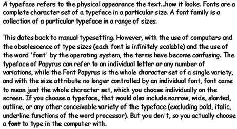 March 19, 2012 at 11:02 pm #162098RobotParticipant
 March 20, 2012 at 3:37 am #162097
 ALEX PParticipant
two shay (purposefully spelled wrong)
March 20, 2012 at 3:58 am #162096ALEX PParticipantIll take a second to recede and digest your comment, but im not backing down. Call it what you will, It matters. If you want to look like an organic potato farmer/ plant nursery in the midwest/ edible arrangements, then yes, use your dorky TYPEFACE. I just want ‘our’ profession to be taken seriously, and not be confused with these potato farmers and or plant nurseries. No, not everyone uses it, and yes, it may just be that I just graduated and it was ALL over just about everyones presentations, but it’s not just Papyrus. Papyrus just seems to be the easiest most known example of a bad TYPEFACE.
March 20, 2012 at 11:22 am #162095 Andrew Garulay, RLAParticipant
This is the type of stuff that matters when nothing else matters. While some will adjust how they do business, how they market, and what deliverables they produce in order to function in this economy, others are going to attempt to adapt through font or type face selection. Brilliant!
April 5, 2012 at 6:45 pm #162094 Chris WhittedParticipant
This thread has grown a little since I last read through it, but I stumbled across a handy flowchart a couple of weeks ago that I’ve been meaning to post here. Hopefully it isn’t buried in the thread already.
http://inspirationlab.wordpress.com/2010/04/16/so-you-need-a-typeface/
Made me think of the many subdivision naming charts, such as this one:
http://denverinfill.com/blog/2006/09/guide-to-suburban-denver-subdivision.html
April 5, 2012 at 6:55 pm #162093 Heather SmithParticipant
Jon had a guy that responded to our employment ad completely in lower case letters. Maybe on his phone? It was weird.
As I typed this I wondered what I was messing up. haha.
April 5, 2012 at 6:57 pm #162092Heather SmithParticipantI’m partial to hand graphics…specifically the type used to fill out checks to us. 🙂
April 7, 2012 at 9:09 pm #162091 Bob LutherParticipant
First off, it takes a huge amount of restraint not to just rip into how… Oh I almost went there. Two things graphic presentation (preliminary design) fonts may make a difference to give a theme or feeling, construction documents need clear crisp legible font/typeface so that a contractor can read and install the design.
A quick question, where in the LARE exam are fonts covered? Oh that’s right they are not, our industry is about a lot more than some silly letters on a page, if you were trying to piss people off, well done. If you were trying to get a discussion of over 100 posts, well done, if you really think fonts are important go to grad school or find another profession. I don’t mean to get pissy but I just wasted an hour reading all of these posts for nothing! -
AuthorPosts


- You must be logged in to reply to this topic.