


Landscape Architecture for Landscape Architects › Forums › GRAPHICS › Bringing Back hand Lettering
- This topic has 1 reply, 7 voices, and was last updated 15 years, 4 months ago by
 Miles Barnard.
-
AuthorPosts
-
June 4, 2011 at 9:56 pm #162432
mark foster
Participantjr,
You may want to look at Mike Lin’s first book.
Also this is kind of interesting: http://aext.net/2009/08/20-awesome-handwriting-fonts-for-a-beautiful-design-you-should-not-miss/ Might give you a starting point.
Point is to develop your own style– I do a lot of hand lettering (am D/B too), and I just evolved a lower/upper case style which fits me. You are exactly correct in your aim “clean and consistent, but still kind of loose”– I find a lot of my clients are turned off by the strict “architect” style.
June 4, 2011 at 9:57 pm #162431 Nick MitchellParticipant
Mike Lin’s book Drawing and Designing with Confidence does a great job.
http://www.amazon.com/Drawing-Designing-Confidence-Step-Step/dp/0471283908
I also like a video from Doug Patt’s Youtube series on lettering.
http://www.youtube.com/watch?v=Ky5p-L_m6BQ
June 7, 2011 at 4:22 am #162430 jrcirelloParticipant
Hey thanks you guys. I appreciate the responses.
Jim
June 7, 2011 at 5:58 am #162429 Jason T. RadiceParticipant
You could also troll free font websites for handwriting fonts you may like. Simply print out an uppercase and lowercase alphabet and start tracing them. After you get the feel of writing them, you can try writitng them without tracing. Of course, you will want to adjust the spacing, but you get the idea. You are building muscle memory instead of using your natural style (which is what I do, since my natural style is pretty much stylized lettering anyway.
I used to dread having to practice “proper” lettering using straight-edges and lettering guides when I was early in school. Then came the sticky-backs which saved my bacon on many occasions. Of course, with CAD and elecrostatic plotting now…paradise. I still hand letter concept sketches from time to time, but not that often as I like to keep my graphics clean and end up labeling in the computer with scans of the graphics.
June 7, 2011 at 12:09 pm #162428 Miles BarnardParticipant
Jim I like your thinking. We could have a whole dicussion about not only the loss of good hand lettering, but graphics as a whole. I see some really terrible drawings being produced these days. I’m not the best hand letterer, but when I was in school I significantly and quickly improved my lettering by using some of those aids you mentioned. I didn’t need to use them for very long, but they did seem to help train my hand so that I could get rid of them and still do a pretty good job. I have attached a few things. The lettering guide that helped me out, couple drawings from an architect I work with the still does things by hand, and then some pages out of a book I have about hand lettering. My mantra is that other than built things, the only thing we produce and leave behind are drawings. Let’s make them great. Good luck!
June 7, 2011 at 12:43 pm #162427 Jon QuackenbushParticipant
I simply made a TT font out of my lettering, that way it looks handwritten but it is scalable, auto aligned and editable. It took about 5 hours, but it was worth it. Really personalizes a portfolio. You could then draw a couple of pilot lines with a ruler and scan them, place them on the periphery of the text to really make it look hand lettered. It is simultaneously digital and analog.
It is cheating to a degree, but it is paramount to be able to edit things later on, which is why all the hand stuff (unfortunately) has fallen out of practice.
June 7, 2011 at 12:48 pm #162426Miles BarnardParticipantJon can you explain HOW you did what you did? What software are you using? Sounds interesting. -Miles
June 7, 2011 at 1:23 pm #162425Jon QuackenbushParticipantIt was a combination of different software.
- photoshop
- illustrator
- High-Logic FontCreator
I printed a character map so I could reference all the characters, numbers, punctuation and symbols I wished to include in the font and hand wrote them several times. I then scanned the image in photoshop. I did the tracings of the best written letters and such in illustrator to make it vector based and somehow brought it into FontCreator. I did it a couple of years ago, so I can’t remember the specifics, however there are many tutorials on how to do this online, and many different font software to choose from.
[insert shameless plug here] http://www.jon-quackenbush.com has the finished product on the portfolio images that include a background of a sketchbook if you’d like to see it.
It isn’t your typical drafting font, but an actual font of my personal handwriting.
June 7, 2011 at 2:22 pm #162424jrcirelloParticipantThere are a few online offerings that do all of this for you as well. You just print out their pdf grid in which you put all of your letters and symbols, scan it, submit it and you’ve got a font back in a few minutes.
While I might geek out and waste a whole bunch of time downloading, learning and attempting to use FontLab http://www.fontlab.com/ I know that my time is better spent doing something else. So I’ll probably just end up going to one of the following…
http://www.yourfonts.com/ $9.95 (this one seems to be the most referred. Pr3eview and only pay if you like how it came out)
http://www.cheapfontgenerator.com/ $4.99
June 7, 2011 at 2:25 pm #162423jrcirelloParticipantSweet. Thanks Miles. How did you upload pdfs? It tells me only can do jpg, gif or png?
June 7, 2011 at 3:18 pm #162422Jon QuackenbushParticipantI am a nerd and wanted to do it myself! Good finds though.
Are the fonts produced scalable? The one I made is vector based, so no matter what size I make it it will always look great. I am not sure the ones offered at the service there are, which may not be a problem for some, but for me it would be.
June 7, 2011 at 3:35 pm #162421Miles BarnardParticipantJim I just browsed for them and uploaded. Never got a message that said pdf’s weren’t allowed. Ignorance is bliss I guess. Jon thanks for the info, a bit over my head, but I might check out some of those websites. -Miles
June 7, 2011 at 4:44 pm #162420jrcirelloParticipantI didn’t even see the Upload Files button. Was trying to do it as an image.
Here are some notes.
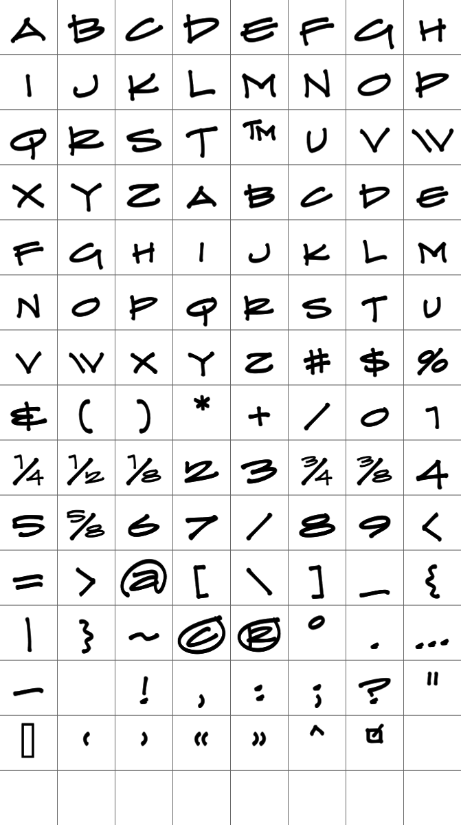
June 7, 2011 at 4:46 pm #162419jrcirelloParticipantThis is a pretty sweet font that’s out there – Prov Architect NDP
 June 7, 2011 at 5:04 pm #162418Jason T. RadiceParticipant
AHRRRRRGGGG…FLASHBACKS!!!!!!!!
-
AuthorPosts

- You must be logged in to reply to this topic.