Article by Eleni Tsirintani We review how a slope was used in the Ladeira da Barroquinha project by METRO ARQUITETOS, Salvador, Brazil. Landscape projects tackle two fundamental states of being; motion and stillness. They usually focus on balancing between these two opposite conditions. However, there are projects that are enjoyed and appreciated only through the act of moving through them. Ladeira da Barroquinha is an efficiently designed pedestrian access in the center of Salvador that embraces human motion and forms a new narrative for walking in the city. Salvador is the capital of Bahia, a large region of Brazil. The sea’s proximity and a unique topography are principal elements of the city. Salvador is a colorful, vibrant city, that preserves, alive, the signs of its past as a Portuguese colony. Salvador de Bahia is an eminent example of Renaissance urban structuring adapted to a colonial site according to UNESCO. Therefore it has been included in the World Heritage List. Small- and grand-scale buildings form the existing urban tissue in Salvador’s center. They give a sense of dispersion and fragmentation that inevitably is reflected in the public spaces, as well.

Ladeira da Barroquinha. Image courtesy of METRO ARQUITETOS
Ladeira (slope) da Barroquinha
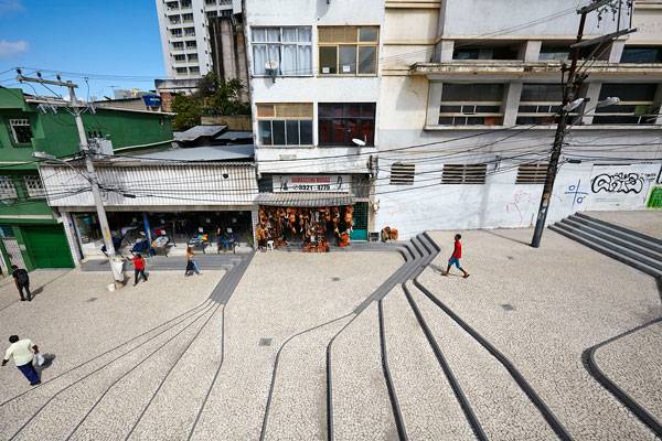
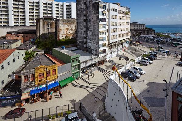
The Brazilian office, Metro Arquitetos, were assigned the new design of Ladeira da Barroquinha in order to connect the public space renovations for the Glauber Rocha Theatre and the Gregorio de Mattos Foundation cultural area based at Barroquinha Church.

Ladeira da Barroquinha. Image courtesy of METRO ARQUITETOS
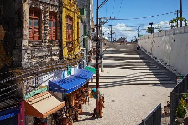
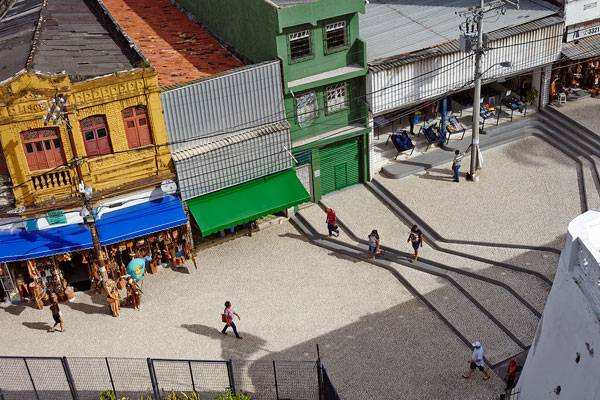
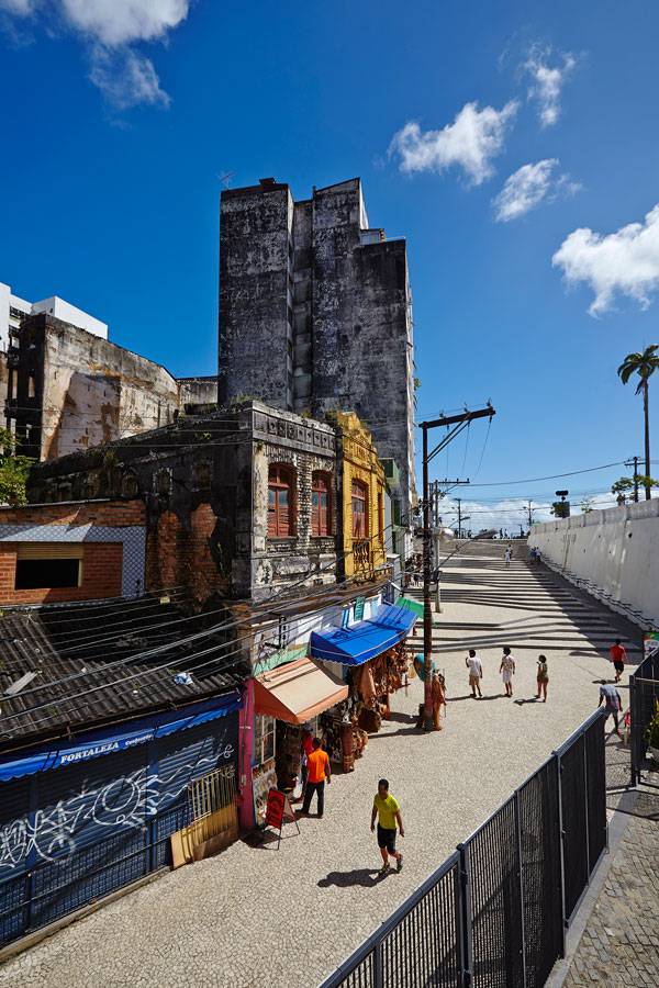
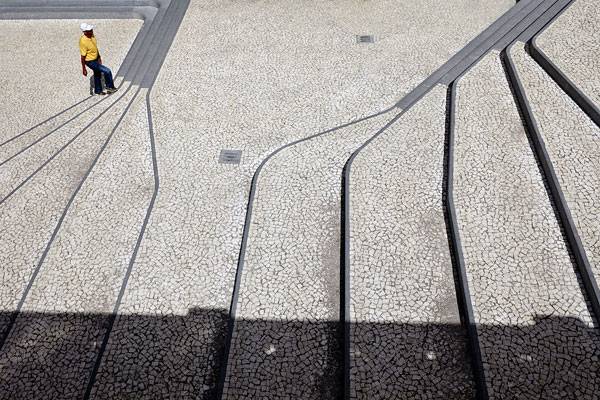
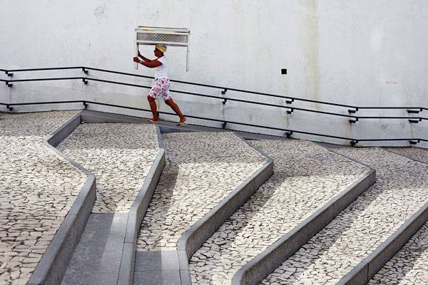
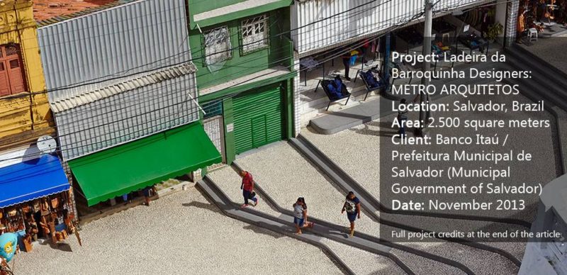
“Ladeira” means, in Portuguese, “Slope”. The project functions as a link between the newly designed public spaces and, at the same time, organizes the entrances to the buildings that face the slope at different levels. There are both shop and residence entrances that unravel along the “Ladeira”. All had to be accommodated with the proper access and outdoor space. The topography has been modified into terraces of varying widths. The terraces are formed like waves that expand toward the lower level of the site. The ramp for wheelchairs unfolds across the adjacent retaining wall and it is gradually integrated into the stairs in the higher part of the project.

Ladeira da Barroquinha. Image courtesy of METRO ARQUITETOS
New paths with different speeds and open plateaus for permanency are created. In addition to the slope itself, which is used exclusively for pedestrian circulation, the project expands toward the square next to the cinema, located at a higher-level plateau, using the same design principles.

Ladeira da Barroquinha. Image courtesy of METRO ARQUITETOS
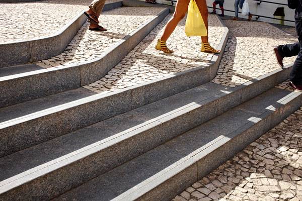
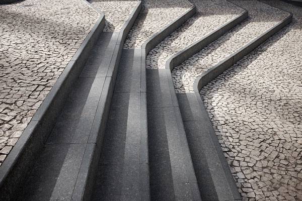
All materials used on the project are found already on the streets of Salvador; however, the innovative design has shed a new light onto their application in public space. The terraces have been constructed with ceramic tiles. This is a reference to the Portuguese tradition in Salvador. The city used to be the first capital of Brazil from 1549 to 1763.

Ladeira da Barroquinha. Image courtesy of METRO ARQUITETOS
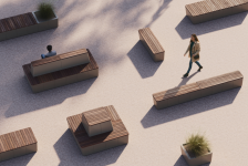
Modern techniques, however, like water jet cutting, allowed the traditional tiles to be shaped into a new form with rounded edges and multi-angular shapes. The terrace edging and the sitting benches are made of grey granite.
Ladeira da Barroquinha: Quality Variations The project appears to have many features to examine and become inspired by.It combines a variety of walking expressions; the high speed walking of those who hurry to catch the bus in the nearby terminal, the slow motion of people who go shopping, the relaxed passes of visitors and tourists. Combining different walking speeds in a single design gesture is a demanding and complex task.

Ladeira da Barroquinha. Image courtesy of METRO ARQUITETOS
The act of moving in the city has a number of design challenges; one can research these in the book “
Street Design: The Secret to Great Cities and Towns” presented in LAN book reviews. The project tackles the dispersion and the fragmentation of its context. It values and respects the existing elements such as the small shops and the narrow entrances, and accommodates their needs with care and precision.

Ladeira da Barroquinha. Image courtesy of METRO ARQUITETOS
The material application in such a dispersed space has been creative and imaginative. The simplicity of the selection; ceramic tiles and granite, combined with their innovative elaboration, create a coherent and beautiful result. Obviously, opting for the best kind of paving is not a trivial matter. Everything you need to know regarding paving and how to avoid possible mistakes is covered in the article : “
8 Common Mistakes People Make When Specifying Paving, and How to Avoid Them” This should be one of the very few landscape projects where the total absence of vegetation is not a disadvantage or an omission. There seems to be no need for any plants and that is also part of the project’s success.

Ladeira da Barroquinha. Image courtesy of METRO ARQUITETOS
The project bears a strong connection to its surroundings. That is evident not only in terms of geometry but also on a more profound, conceptual level. It embraces randomness and discontinuity. It does not impose anything on the pre-existing elements; it simply connects and articulates them. This should be considered the greatest value of Ladeira da Barroquinha. Instead of opting for the easy way, which would be to turn its surroundings into a blurred background for the new intervention to emerge, it facilitates its context to “make more sense” through a discreet and sensible design.
Can you think of more projects that actually accomplish that? Go to comments 
Ladeira da Barroquinha. Image courtesy of METRO ARQUITETOS
Full Project Credits For Ladeira da Barroquinha:
Project Name: Ladeira da Barroquinha Designers: METRO ARQUITETOS Design Development: Gustavo Cedroni, Martin Corullon Collaborators: Marcelo Macedo, Miki Itabashi, Flavio Bragaia, Isadora Marchi, Luis Tavares, Rafael de Sousa Light design: Ricardo Heder Landscape design: Ricardo Vianna Infrastructure: P.K.M. e Usina de Projetos Location: Salvador, Brazil Area: 2.500 square meters Client: Banco Itaú / Prefeitura Municipal de Salvador (Municipal Government of Salvador) Project date: November 2013 Recommended Reading:
Article by Eleni Tsirintani
Published in Blog