Continued….
The Beauty of Material Contrasts
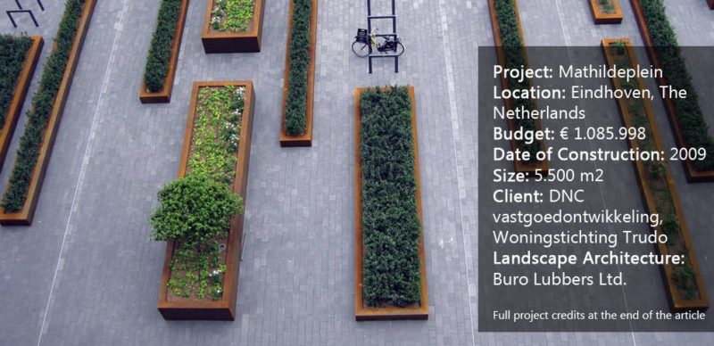
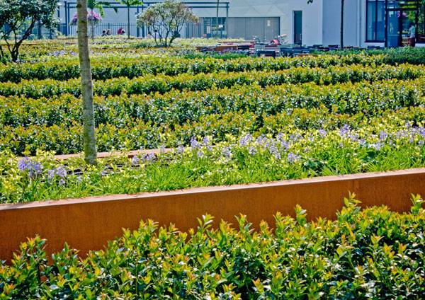
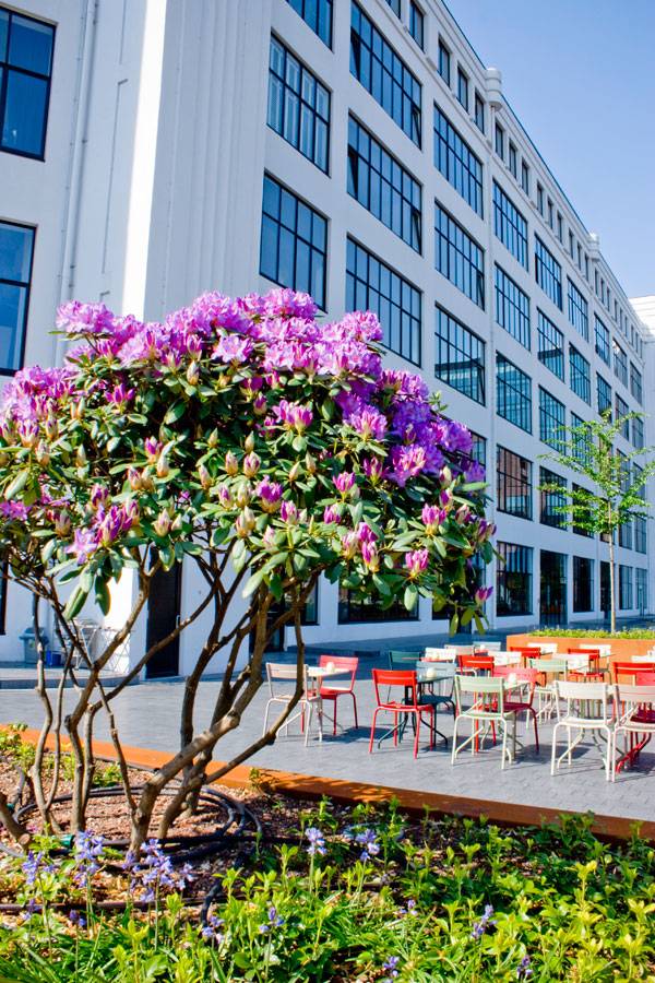
While this may sound like a pretty straightforward design solution, the beauty of this project lies in the combination and contrasts created between the materials and planting. Lubbers chose to use a carpet of dark gray concrete pavers whose stone-like texture contrasts and highlights the white, gray, and black tones of the Light Tower. In turn, he chose contrasting Cor-TEN steel for the planter boxes, bringing color into the space and speaking to the memory of the site’s former industrial nature The size of these boxes corresponds directly to the size of the paving, preventing any cutting of pavers and ensuring that clean, continuous lines are maintained in the design. Overlaid onto these planters are timber seating, and their placement — combined with the size of the planters — allows the space to relate to human scale, providing a sense of comfort and intimacy
Mathildeplein. Photo courtesy of Buro Lubbers.
Planting for All Seasons
Above all, the most spectacular aspect of the project is the planting. Lubbers chose to continue the concept of contrasts by combining evergreen plantings, such as Holly Hagen, with bold and seasonal color accents. Perennials and bulbs provide color at various times of the year while rhododendrons and daffodils create bursts of color in the springtime. Plantings along the periphery consist of wisteria and roses, which overflow the pergola, providing passersby with a glimpse into the green oasis.
Avoiding a Structural Nightmare
The planting also required specific technical execution in order to prevent the planter boxes from becoming too heavy for the roof structure. Planter boxes were filled with only 400 mm of nutrient-rich substrate, then filled with lightweight Zincoilt to provide growing medium. Trees were also only planted above structural columns that could carry their heavy weight.
Mathildeplein. Photo courtesy of Buro Lubbers.
More Top Articles on LAN
- 10 of the Most Common Mistakes People Make in Planting Design and How to Avoid Them
- Interested But Not Confident? – Know How to be Good at Hand Drawings
- Top 10 YouTube Tutorials for Technical Drawing
Mathildeplein is the perfect example of a clean and refined design solution that takes into account its context and functional requirements while providing a beautiful and green landscape. And after all, doesn’t everyone need a place in the city to simply sit and smell the flowers?
Full Project Credits for Mathildeplein
Project Name: Mathildeplein Location: Eindhoven, The Netherlands Budget: € 1.085.998 Date of Construction: 2009 Size: 5.500 m2 Client: DNC vastgoedontwikkeling, Woningstichting Trudo Landscape Architecture: Buro Lubbers Ltd. Sculpture: awg Architects, Hoen Architects Photos: Buro Lubbers Show on Google Maps
Recommended Reading
- Landscape Architecture: An Introduction by Robert Holden
- Landscape Architecture, Fifth Edition: A Manual of Environmental Planning and Design by Barry Starke
Article by Rose Buchanan
Pages 1 / 2
Published in Blog- 1 2


